HMCS Max Bernays Pre-Deployment Brief (May 2024).pptx
Conclusion
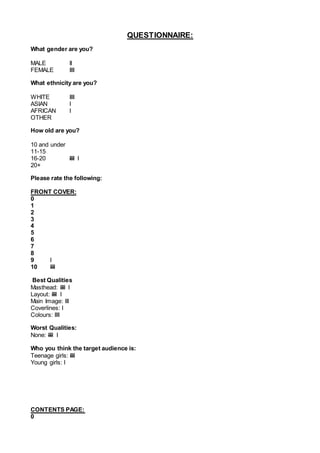
1. QUESTIONNAIRE:
What gender are you?
MALE II
FEMALE IIII
What ethnicity are you?
WHITE IIII
ASIAN I
AFRICAN I
OTHER
How old are you?
10 and under
11-15
16-20 IIII I
20+
Please rate the following:
FRONT COVER:
0
1
2
3
4
5
6
7
8
9 I
10 IIII
Best Qualities
Masthead: IIII I
Layout: IIII I
Main Image: III
Coverlines: I
Colours: IIII
Worst Qualities:
None: IIII I
Who you think the target audience is:
Teenage girls: IIII
Young girls: I
CONTENTS PAGE:
0
2. 1
2
3
4
5
6
7
8 I
9 II
10 III
Best Qualities
Layout: IIII I
Pillars: III
Images: I
Colours: II
Worst Qualities:
Editorial: I
More images: III
None: II
Who you think the target audience is:
Teenage girls: IIII
Young girls: I
DOUBLE PAGE SPREAD:
0
1
2
3
4
5
6
7
8
9 III
10 III
Best Qualities
Image: II
Layout: IIII
Typography: IIII
Worst Qualities:
None: III
Caption: III
Who you think the target audience is:
Teenage girls: IIII I
CONCLUSION
3. From this information I found that the best part of the main task is
the front cover. This is because from the focused group, they liked
the layout and the masthead. Also, as they said nothing needed to
be improved I think that this was the best part of my magazine. The
contents page was also quite good because people really liked the
layout. However, the thing they said needed to be improved was the
editorial letter. This is because the yellow was too bright and bold,
and they thought the shape needed to be changed. People also
said that I lacked images, therefore if I were to create this magazine
I would include more images because it would make the contents
more intriguing. The double page spread is another section of the
magazine, which people enjoyed. My focus group said they really
liked the font of the ‘Q&A’, however, they didn’t think the caption
was needed.