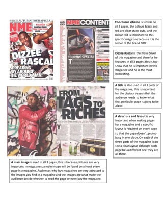
The color scheme of black and red are prominently featured on all three pages to represent the brand of NME magazine. Dizzee Rascal is the main focus as he appears on each page to show his importance to the magazine as the most interesting artist. Images are a key element on every page since pictures are very effective at attracting readers and influencing whether they buy the magazine. Each part also has a title to inform readers of the topic and a clear layout is used on all pages to avoid clutter despite the pages having different designs.
1. The colour scheme is similar on
all 3 pages, the colours black and
red are clear stand outs, and the
colour red is important to this
specific magazine because it is the
colour of the brand NME.
Dizzee Rascal is the main driver
of this magazine and therefor he
features in all 3 pages, this is too
show that he is important in this
magazine and he is the most
interesting.
A main image is used in all 3 pages, this is because pictures are very
important in magazines, a main image will be found on almost every
page in a magazine. Audiences who buy magazines are very attracted to
the images you find in a magazine and the images are what make the
audience decide whether to read the page or even buy the magazine.
A title is also used in all 3 parts of
the magazine, this is important
for the obvious reason that the
audience needs to know what
that particular page is going to be
about.
A structure and layout is very
important when making pages
for a magazine and a specific
layout is required on every page
so that the page doesn’t get too
busy in one place. On each of the
three parts of the magazine I can
see a clear layout although each
page has a different one they are
all there.