
Recommended
More Related Content
What's hot
What's hot (20)
Viewers also liked
Viewers also liked (20)
Similar to Dizzee rascal nme contents page analysis
Similar to Dizzee rascal nme contents page analysis (20)
Dizzee rascal nme contents page analysis
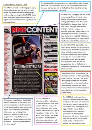
- 1. Analysis of music magazine 1 NME The MASTHEAD on the contents page is, again, clear and because it is in the same font and colour, the reader knows that the two pages are linked. By repeating the MASTHEAD, it also helps to create a brand for the magazine. It is slightly smaller on the contents page because it is less significant. The MAIN IMAGE is a medium shot of a reported from NME besides a tour bus. This is significant because the audience have learnt that this issue is a ‘tour special’ so the fact that she is standing next to a tour bus helps to suggest the theme. The BAND INDEX along the left side of the contents page follows the clear colour scheme of the magazine by using the striking red and bold black. Because the BAND INDEX is situated along the left hand side of the page, the size of the writing is irrelevant because our attention is naturally drawn towards this side and therefore to the BAND INDEX. Also, the fact that the BAND INDEX takes up the whole length of the page suggests how full the content of the magazine is. The title ‘CONTENTS’ is one of the first things we see because it is clear and bold and because of the black background, it’s colour (white) completely contrasts against the background making it more noticeable. It is important that this is included because it tells the reader exactly what this page is as it is not always obvious due to the fact that it could be on any page from 2-6 because of advertisements. The CONTENTS LIST, again, follows the clear colour scheme of the magazine by using the colours red, black and white. The headings stand out to the reader and although the smaller sub-headings are less visible, this does not matter because the reader would tend to read down the list anyway to find out the page numbers. The contents page follows the RULE OF THIRDS convention by placing the most entertaining and important information in the hot spots of the page. It also uses boxes and boarders to separate the information and to highlight the amount of content included in the magazine. By using the fly case to boarder the editorial supports the fact that this is a music magazine and that it is a ‘tour special’ The use of this small advertisement for a subscription of the magazine also attracts the reader’s attention because it doesn’t follow the same colour scheme of the rest of the page; it instead uses yellow for the main words ‘subscription’. This draws the reader’s attention to the advertisement and so they will then read on and find out more. The EDITORIAL is introduced in an informal, friendly manner and, again, links back to the same colour scheme that has been used throughout. The fact that the title (‘touring special’) is bigger than the rest of the text emphasises the fact that this is a special issue of the magazine. Because the title is on a slant and the font used is in a style that is slightly faded, relates to the rebellious attitude the magazine connotes.