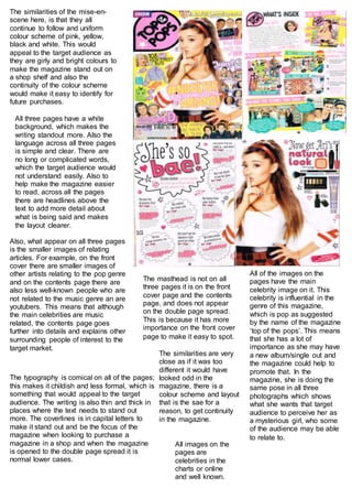
1. The similarities of the mise-en-
scene here, is that they all
continue to follow and uniform
colour scheme of pink, yellow,
black and white. This would
appeal to the target audience as
they are girly and bright colours to
make the magazine stand out on
a shop shelf and also the
continuity of the colour scheme
would make it easy to identify for
future purchases.
All of the images on the
pages have the main
celebrity image on it. This
celebrity is influential in the
genre of this magazine,
which is pop as suggested
by the name of the magazine
‘top of the pops’. This means
that she has a lot of
importance as she may have
a new album/single out and
the magazine could help to
promote that. In the
magazine, she is doing the
same pose in all three
photographs which shows
what she wants that target
audience to perceive her as
a mysterious girl, who some
of the audience may be able
to relate to.
The masthead is not on all
three pages it is on the front
cover page and the contents
page, and does not appear
on the double page spread.
This is because it has more
importance on the front cover
page to make it easy to spot.
Also, what appear on all three pages
is the smaller images of relating
articles. For example, on the front
cover there are smaller images of
other artists relating to the pop genre
and on the contents page there are
also less well-known people who are
not related to the music genre an are
youtubers. This means that although
the main celebrities are music
related, the contents page goes
further into details and explains other
surrounding people of interest to the
target market.
All three pages have a white
background, which makes the
writing standout more. Also the
language across all three pages
is simple and clear. There are
no long or complicated words,
which the target audience would
not understand easily. Also to
help make the magazine easier
to read, across all the pages
there are headlines above the
text to add more detail about
what is being said and makes
the layout clearer.
The typography is comical on all of the pages;
this makes it childish and less formal, which is
something that would appeal to the target
audience. The writing is also thin and thick in
places where the text needs to stand out
more. The coverlines is in capital letters to
make it stand out and be the focus of the
magazine when looking to purchase a
magazine in a shop and when the magazine
is opened to the double page spread it is
normal lower cases.
The similarities are very
close as if it was too
different it would have
looked odd in the
magazine, there is a
colour scheme and layout
that is the sae for a
reason, to get continuity
in the magazine.
All images on the
pages are
celebrities in the
charts or online
and well known.