
Recommended
More Related Content
What's hot
What's hot (20)
Viewers also liked
Similar to RollingSone Magazine Analysis
Similar to RollingSone Magazine Analysis (20)
Recently uploaded
Recently uploaded (20)
RollingSone Magazine Analysis
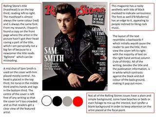
- 1. Rolling Stone’s title (masthead) is on the top third, reading left to right. The masthead is almost always the same colour (red) and is always the same font. From my research, I haven’t found a copy on the front page where the artist in the picture hasn’t got their head coving a part of the title, which I am personally not a big fan of because to a newcomer the title reads ‘RgStone’ which can be misleading. A mid shot of Sam Smith is used on the cover with him placed mostly central ; his head is placed in the top third, his torso in the middle third and his hands and legs in the bottom third. The centre of the cover is left free of any writing so that the cover isn’t too crowded and so that readers get a clear view of the featured artist. This magazine has a rocky aesthetic with lots of black involved to indicate seriousness. The font as well (FB Moderno) has an edge to it, appealing to people inclined to liking rock music. The layout of the text resembles a backwards F which initially would cause the reader to see the title, then view the cover left to right- with the majority of text on the right hand vertical column (rule of thirds). All of the writing, besides the title and the publication information, is in white which contrasts against the black and dull colour of the back ground, making it pop out more. Not all of the Rolling Stones issues have a plain and simple background, some have beaches or beds or even foliage to mix up the interest, but I prefer a blank background in order to keep attention on the artist placed at the focal point.
- 2. This contents page is laid out with pictures on the left and the writing on the right, forming a golden ratio- both the photos and the writing are split into 3 main sections with subtitles in red, and size of the photo corresponds to the size of the content information. None of the photos used have ill-fitting colours and none of the people in the photo are actually looking towards the camera which gives a spontaneous and un-cliché feel to this magazine. The contents page doesn’t have the page numbers in an ascending order which could be confusing to readers, however is split into sections with subheadings so the navigation isn’t made too hard. In addition, the contents page numbers are in red, as well as the subtitles and the headings for the pages are in bold, communicating to the reader that the information is important. The font on the contents page is the same which makes it seem mature and professional – also hinting that the target audience are of a 20-50 age range. A banner with the word ‘contents’ is placed as a wob at the top of the page. This contents page banner for the Rolling Stone magazine always stays the same and carries the red theme through the magazine pages.
- 3. There isn’t much of an article on this page, only a large paragraph which isn’t split into sections/columns which can be seen as a positive for the reader as there is effectively less to read. Adele’s close up takes up the majority of this double page spread, and she isn’t looking into the camera, suggesting that she will be sharing personal information in this article and making eye contact would have made her seem too confident. The title of this article takes up the first half of the recto when joined with the standfirst and byline which, due to its size, is very eye catching and seems to be of importance. The font used seems very classic and sophisticated which gives an immediate feel to how the article will be. The title, along with the dropcap ‘I’ is put in bold to singnify its importance in relation to the rest of the writing. The standfirst is written in italics to break it up from the rest of the page because it involves information about the article itself and is more of a side note written by the journalist than the actual story on Adele. I think the standfirst adds a nice touch to the page as it makes the reader aware of the middleman between us and the star. The colour scheme of this page is monotonous which creates a serious and classic feel to the artist as well as the article.