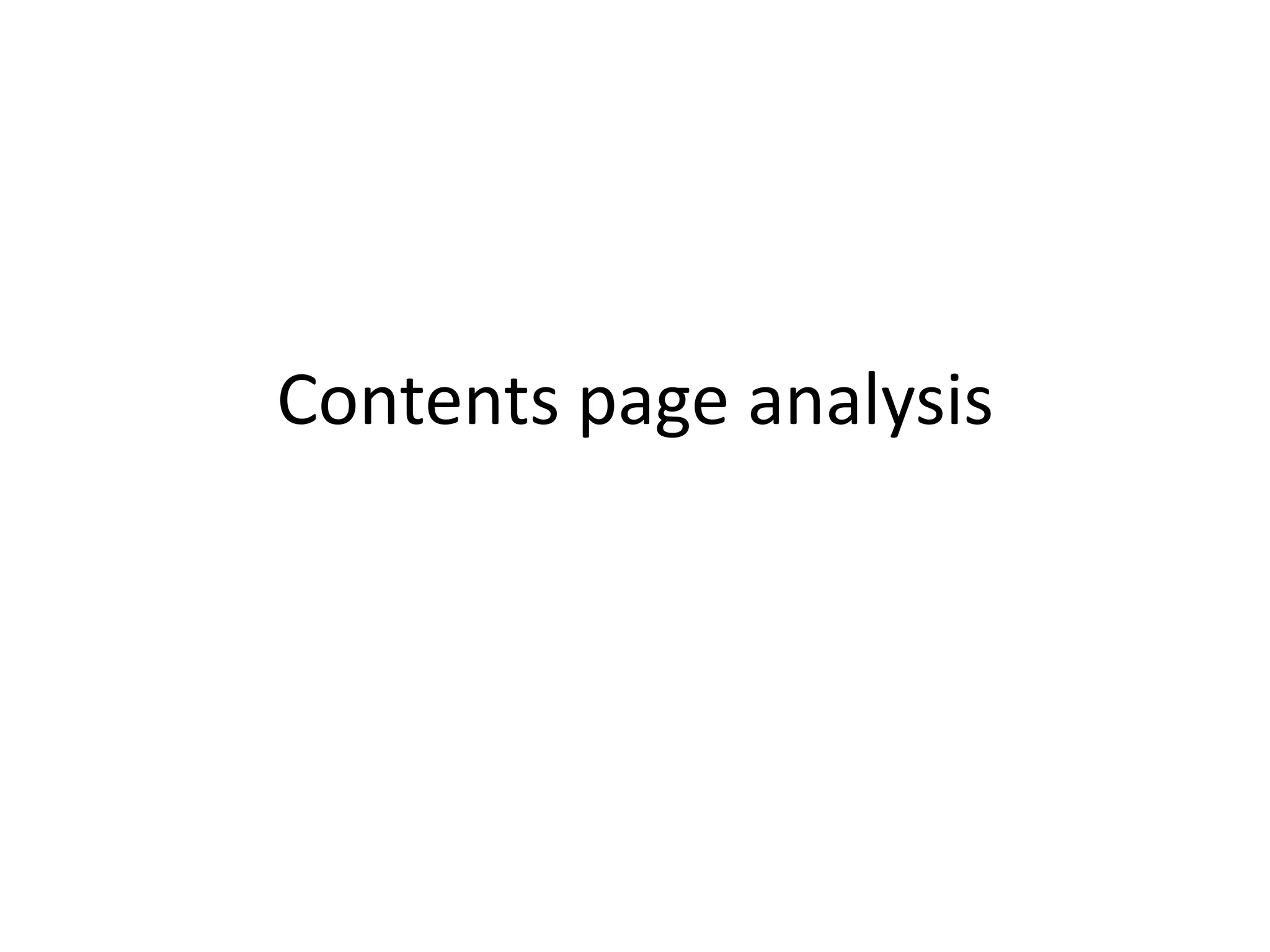
The Q magazine contents page uses red, black, and white as its main colors throughout. It has a thick red strip along the top with the logo and issue number in white. The title "Contents" is in black to stand out. The page is split into two columns to fit imagery and text without being cramped. Images from cover stories are included to preview content. Red lines separate sections and columns use the magazine's colors to match the top strip.
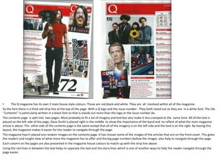
The NME contents page retains a newspaper-like style from its origins. It has a headline "Inside this Week" instead of "Contents" and a similar font. Article page numbers in black stand out on photos. The main colors of white and black do
2. The Q magazine has its own 3 main house style colours. Those are red,black and white. They are all involved within all of the magazine. So the fore there is a thick red strip line at the top of the page. With a Q logo and the issue number . They both stand out as they are in a white font. The tile ‘’Contents’’ is particularly written in a black font so that is stands out more than the logo or the issue number do. The contents page is split into two pages. Most probably to fit a lot of imagery and text but also make it less cramped at the same time. All of the text is placed on the left side of the page, Dave Grohl is placed right in the middle to show the importance of the band and to reflect of what the main magazine article is about. The other side of the contents page is the same except that all of the imagery is on the left side and the text is on the right. By having this layout, the magazine makes it easier for the reader to navigate through the page. The magazine hasn’t placed any random images on the contents page. It has chosen some of the images of the articles that are on the front cover. This gives the readers and insight view of what more the magazine has to offer and the big page numbers bellow the images also help to navigate through the page. Each column on the pages are also presented in the magazine house colours to match up with the strip line above. Using the red lines in between the text helps to separate the text and the story lines which is one of another ways to help the reader navigate through the page easier.
3. NME I PERSONALLY DON’T LIKE THIS MAGAZINE CONTENTS PAGE AS TO ME DIDN’T LOOK LIKE A CONTENTS PAGE AT FIRST AND SEEMS TO BE VERY CRAMPED BUT, THERE IS A REASON WHY NME HAS MADE IT LIKE THAT. BACK IN 1953 NME WERE A NEWSPAPER AND ONLY LATER ON THEY’VE BECAME A MAGAZINE, SO THEREFORE THEY’VE STILL KEPT A LIL BIT OF THAT NEWSPAPER STYLE. THEY’RE HEADLINE IS PLACED RIGHT IN THE MIDDLE AND DOESN’T SAY ‘’CONTENTS’’ LIKE A REGULAR MAGAZINE DOES… THEY HEADLINE SAYS ‘’INSIDE THIS WEEK’’ WHICH IS SOMETHING A NEWSPAPER WOULD SAY… THEY HAVE ALSO CHOSEN A SIMILAR TYPEFACE A NEWSPAPER HAS AND THEY’VE STILL KEPT THAT NEWSPAPER FOR THEY PAGES INSTEAD OF A SHINY/GLOSSY NEWSPAPER A REGULAR MAGAZINE HAS TODAY. THEY’VE PLACED NUMBERS IN THE CORNERS OF THEIR PHOTOGRAPHS IN BLACK FONT AGAINST THE WHITE BACKGROUND, WHICH MAKES THEM STAND OUT AND HELPS THE READER A LITTLE BIT MORE TO NAVIGATE TROUGH THE PAGE AS IS TELLS THEM CLEARLY WHAT PAGE THE ARTIST OR THE ARTICLE IS ON. THE MAIN COLOURS ON THIS CONTENTS PAGE ARE WHITE AND BLACK WHICH DO NOT CONTINUE FROM THE FRONT COVER WHICH MEANS THAT THE FONT COVER AND THE CONTENTS PAGE DON’T CORRESPOND WITH EACH OTHER. THIS COULD MAKE THE CONTENTS PAGE LOOK AS IF ITS COMPLETELY OUT OF ANOTHER MAGAZINE OR NEWSPAPER. ALTHOUGH THE MAIN ARTICLE IS ABOUT BEADY EYE, THERE IS NO SIGN OR ANY IMPORTANCE OF IT SHOWN ON THE CONTENTS PAGE WHICH MIGHT CONFUSE THE AUDIENCE.