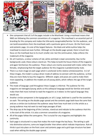
1. One component that all 3 of the pages include is the Masthead. Using a masthead means that
NME are following the common conventions of a magazine. This masthead is an essential part of
branding for this company and makes the title easily recognisable/familiar for the audience, and
can build associations from the masthead, with a particular genre of music. On the front cover
and contents page, it is one of the largest features- the black and white outline helps the
masthead to stand out even further. Although on the double page spread, there is much less
focus on the masthead due to its much smaller size- but the continuation, helps enforce the
trademark of the magazine.
On all 3 sections, a colour scheme of red, white and black is kept consistently. Due to the
backgrounds used, these colours stand out. This helps to build the house theme of the magazine
and again familiarises the audience. These colours are mainly associated with males rather than
females, emphasising that the target audience for this magazine is predominantly male.
There is a main image on each page which is anchored to the relative article/coverline. In 2 of
these images, the model is using a direct mode of address to connect with the audience, so that
they are more likely to buy the magazine. Different angles and poses are used to make them
more appealing. In addition the models are all young adults, which reflects the age of the target
audience.
The mode of language used throughout these 3 pages is informal. The audience for this
magazine are teenagers/young adults so this colloquial language would be familiar and would
make them feel more inclined to read the magazine as it relates to the typical language they
would use.
Another similar component is the typography on all 3. Large, bold text is used for the coverlines
on each. The writing on the double page spread and the contents page both have the same font
and are a similar size to distract the audience away from how much text is in the article as a
young audience may not want to read large passages of text.
The drop cap at the beginning of the 2 articles, stand out and indicate to the audience that this
is the start of the article. It is also a common convention of a magazine.
All of the pages follow the same genre. This is crucial for any magazine and highlights the
continuity.
Each page is structured in a way that makes the main image the key focus. The writing is split
into distinctive columns; some are larger/smaller than others which indicate importance. Rule of
thirds is put into place on the front cover and contents page and a grid-type structure has been
used when editing the double page spread.