
Recommended
More Related Content
What's hot
What's hot (20)
Viewers also liked
Viewers also liked (14)
Similar to Music Magazine Research and Analysis
Similar to Music Magazine Research and Analysis (20)
Recently uploaded
Recently uploaded (20)
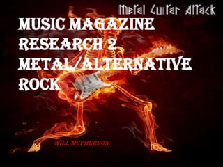
Music Magazine Research and Analysis
- 2. Magazine Analysis 1 Content page displays several photographs, showing different music artists. The photographs advertise the content of the magazine, notified by the page number in picture. The text in the content, is coloured yellow, to standout from it’s black boarder. This has also been done so that the reader can easily read whats in the magazine. This has also applied to the contents title, to stand out from the rest of the page. Also the black text is bold to allow the reader to read it easily This page also shows the magazine in the top left hand corner. The text on the side provides detail about the magazine. This will then allow the consumer to make a subscriptions, and find out more about the magazine.
- 3. Magazine Analysis 2 This page has a set colour scheme red ,black and white. This has been done to lock presentable, but the sections of red can also catch the readers eye. The layout of the text is in columns, which looks formal, with the page numbers marked on the left hand side. Combined with colour scheme , it makes it very easy for the consumers to read. The font used in all of the content, stands out, and bares a resemblance to old English MT. There is also a small comparison to the way a British new headline is presented, giving a formal appearance. This content provides a small section, entirely dedicated to the editor. This gives the reader an inside to a specific topic that the editor has decided to talk about. Content page has pictures, of different artist, that are relatable to the magazine. This further advertises the content in the magazine.
- 4. Magazine Analysis 3 Bright tones of red have been used to stand out from dark background. The page numbers and content titles are boxed off from the main image. Whilst this makes it easy to read, it’s not obvious to notice over the large image.. This image takes up a larger percentage of the content page, in comparison to the text. This can again indicate that there is a sizable amount of content dedicated to this person. A iconic figure in the industry, has been a title in the content page, that stands out completely from the colour scheme. This can indicate that there is a fairly large section dedicated to this figure.
- 5. Magazine Analysis 4 The image is part of the content page, which can give the consumer a clearer idea on what the article is about. The page number and content title, is clearly show, due the colour scheme. The layout of the page has been separated into thirds, with the content titles to the right. This allows for a more visual appeal, with the photographs in the middle, but allows the consumer to see where everything is. A section has been dedicated to the editor, who gives details on the current issue. This gives the editor opinion on the issue, also revelling some the content of the magazine.
- 6. Magazine Analysis 5 The top half of the layout, displays two double spreads, along with a musician. The lack of written detail gives a visual explanation, of the content of the magazine. Also the size of the image of the artist, indicates that the magazine is dedicating a large section to that area. The text is coloured yellow, to standout from the black background. This makes it easy for the consumer to read. Also the Kerrang title is the same as the front cover title, which works well with the following words. The combinations looks like a shout, to show what is in the magazine. The layout of the content page has been split in half, with the content titles at the bottom. This looks like everything has been constricted at the bottom, however dose look formal.