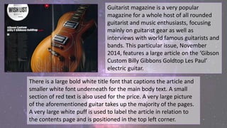
1. Guitarist magazine is a very popular
magazine for a whole host of all rounded
guitarist and music enthusiasts, focusing
mainly on guitarist gear as well as
interviews with world famous guitarists and
bands. This particular issue, November
2014, features a large article on the ‘Gibson
Custom Billy Gibbons Goldtop Les Paul’
electric guitar.
There is a large bold white title font that captions the article and
smaller white font underneath for the main body text. A small
section of red text is also used for the price. A very large picture
of the aforementioned guitar takes up the majority of the pages.
A very large white puff is used to label the article in relation to
the contents page and is positioned in the top left corner.
2. The very large image of the Les Paul resides
across the two main pages, standing clear against
the deep blue background; this follows the rule
of thirds with the main image taking up the
middle and right thirds, and the text adopting the
left. The studio lighting makes the golden colours
stand out and instantly attracts the reader’s
attention to the beautifully crafted guitar
masterpiece.
By grabbing the reader’s initial attention, the
image then attracts the reader to discover move
about the product by reading the text on the
other side. The rule of thirds is also followed as
the images uses the two right-hand thirds, while
the text and puff adopts the left third.
3. This layout makes the page
clearer and more pleasing for the
reader’s eye. The dark colours
used in the image reflect the dark
and moody tones of the sound of
the guitar, creating a visual
representation of the guitars
sound.
4. The title text uses a solid white font to
snap the reader’s attention toward it then
be enticed to read the body text; the
white text stands out very effectively
against the dark blue background, creative
an even more striking image.
The very neutral and plain colours of the
text create a balanced theme that doesn’t
attract to anyone in particular. All the
colours used are gender neutral as the
magazine has a very balanced readership
between men and women.
5. The main body of the text uses a similar
simple white font to the title, standing out
against the dark, moody background
creating clear and concise text. The drop
cap ‘H’ at the beginning provides a classy
start to the text and signifies the start of
the article; it also catches the reader’s eye
as they scan the page and their eyes are
drawn towards it.
6. The small gutter and line between the
texts gives the script better spacing and a
more uniformed style; this is more
pleasing to the eye and makes the article
look more professional and smarter. The
text also follows the ‘Z pattern’ flowing
from top-to-bottom then left-to-right; this
helps the text to become easier to read
and follow, this is also helped by splitting
to article into two columns so the text
isn’t overcrowded into one large chunk.
7. A small ‘G’ in a white box is used to signify
the end of an article; this is common with
all articles in this magazine and creates a
more professional and stylistic theme. The
slightly bolder text used for contact
information uses a slightly bolder font;
this sets it aside from the text and allows
it to be more prominent on the page.
8. The very simple and classy layout attracts a
lot more to a hard-core guitarists, with a
high disposable income, who maybe be
interested in buying such an eccentric
instrument.