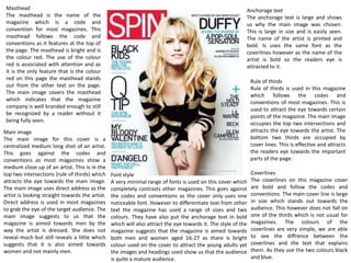
1. Anchorage text
The anchorage text is large and shows
us why the main image was chosen.
This is large in size and is easily seen.
The name of the artist is printed and
bold. Is uses the same font as the
coverlines however as the name of the
artist is bold so the readers eye is
attracted to it.
Rule of thirds
Rule of thirds is used in this magazine
which follows the codes and
conventions of most magazines. This is
used to attract the eye towards certain
points of the magazine. The main image
occupies the top two intersections and
attracts the eye towards the artist. The
bottom two thirds are occupied by
cover lines. This is effective and attracts
the readers eye towards the important
parts of the page.
Coverlines
The coverlines on this magazine cover
are bold and follow the codes and
conventions. The main cover line is large
in size which stands out towards the
audience. This however does not fall on
one of the thirds which is not usual for
magazines. The colours of the
coverlines are very simple, we are able
to see the diffrence between the
coverlines and the text that explains
them. As they use the two colours black
and blue.
Masthead
The masthead is the name of the
magazine which is a code and
convention for most magazines. This
masthead follows the code and
conventions as it features at the top of
the page. The masthead is bright and is
the colour red. The use of the colour
red is associated with attention and as
it is the only feature that is the colour
red on this page the masthead stands
out from the other text on the page.
The main image covers the masthead
which indicates that the magazine
company is well branded enough to still
be recognized by a reader without it
being fully seen.
Main image
The main image for this cover is a
centralized medium long shot of an artist.
This goes against the codes and
conventions as most magazines show a
medium close up of an artist. This is in the
top two intersections (rule of thirds) which
attracts the eye towards the main image.
The main image uses direct address as the
artist is looking straight towards the artist.
Direct address is used in most magazines
to grab the eye of the target audience. The
main image suggests to us that the
magazine is aimed towards men by the
way the artist is dressed. She does not
reveal much but still reveals a little which
suggests that it is also aimed towards
women and not mainly men.
Font style
A very minimal range of fonts is used on this cover which
completely contrasts other magazines. This goes against
the codes and conventions as the cover only uses one
noticeable font. However to differentiate text from other
text the magazine has used a range of sizes and two
colours. They have also put the anchorage text in bold
which will also attract the eye towards it. The style of the
magazine suggests that the magazine is aimed towards
both men and women aged 16-27 as there is bright
colour used on the cover to attract the young adults yet
the images and headings used show us that the audience
is quite a mature audience.
2. Masthead
The masthead on this page is the same
masthead on the front cover. This shows
how the magazine is professional and
adds a consistent format to the magazine.
Again the masthead is covered by the
main image which shows how well
branded the magazine is. Under the
masthead we also see the date of the
magazine which helps show the reader
which issue that they are actually reading.
The placement of the masthead and the
date underneath it follows the codes and
conventions of common music magazines.
Image
There is only one image on this page and
it is of the artist who is also featured on
the front cover. She takes up most of the
page which shows how important she
must be. Her right side falls on the two
right hand side intersections of the rule
of thirds. This image uses direct address
as she is looking straight at the reader
whilst her arm is also reaching towards
them. Direct address is commonly used
to attract the readers eye and to
convince them to look at he magazine.
Grab quote
A grab quote is used on this page in the top right hand
corner. This is a quote from the article of the main
artist for this issue. This shows us how important the
article is and how much that the magazine wants its
views to read it. This is commonly used in most
magazines
Page numbers
Page numbers are used to show a reader
where they can find the main articles.
These numbers are large in size and they
are also in another colour which
highlights the numbers to the reader.
This follows the codes and conventions
as a lot of magazines highlight the page
numbers on this page.
Direct address
Direct address is used in the main image.
The artist that is being featured is looking
straight towards the reader and also her
hand is stretched out towards the reader.
This us used to grab the attention of the
reader. Drawing them into the magazine
and more importantly towards what the
main image is showing.
Font
On this page we can see a range of fonts.
This is usually fro a professional magazine
as it helps the reader differentiate from
the main text and the subtext. For
example in the features section we can
see the names of the featured artists and
some text underneath that tells us about
Colour scheme
A minimal colour scheme is used on this
page. It has colour however the colour is
not overused. This indicates to us the
target audience is not teens and the
magazine is aimed towards more young
adults. The colours used attracts the eye
towards the main features of the page.
For example the main image is wearing
dull clothing. However this allows the
attention to be drawn towards the pink
ukulele and the blue of her eyes which
links towards the use of direct address.
the article. The use of two fonts is commonly used
and they have also used a bold text to help outline
the featured artists. This also allows the magazine to
use the same colour for the features as if another
colour was used it would make the features section
look messy.
Puff
A puff is used to credit the main image and
the stylists and people that were involved.
The puff is a different colour which draws
attention to it and also separates it from
everything else. This is commonly used in
most magazines.
3. Font size
A range of font sizes are used on this page. In the box
on the left hand side page the font size decreases by
each line. This highlights the first line to the reader.
This draws the reader into the article and gets them
to continue reading. As it is outlined it is the first thing
the reader will read. This is usually seen in double
page spreads.
Main image
The main image shows an image of the artist that is being featured this issue. She
has been printed on the front cover and the contents page. The artist wears the
same outfit which adds continuity to the issue. Her clothes also indicate the target
audience to us. She is wearing quite casual clothing which suggests how the
magazine isn't a formal magazine, however the clothes are not revealing showing us
that the target audience are more mature.
Colour scheme
A very minimal colour scheme is used on this
page. The colour scheme mainly consists of
creamy tones and black and white. This also
indicates the target audience to us. This
focuses the eye towards the article.
Different paragraph formats
A drop cap is used in this particular article. This
is commonly used and this magazine follows the
codes and conventions. This is commonly used
to help highlight where the start of an article is.
This also makes the article seem as thought it is
not just plain text. If it was then the reader
might not want to read the article. This then
reflects on the magazine.
Use of columns
This is a code and conventions for double page spreads. this article is split
into two columns. Columns are used to split text. It also makes it easier for a
reader to read the article and also allows for more text to fit on the page. If
columns were not used then the text would look long winded and the
reader may not want to read the article.