Download to read offline
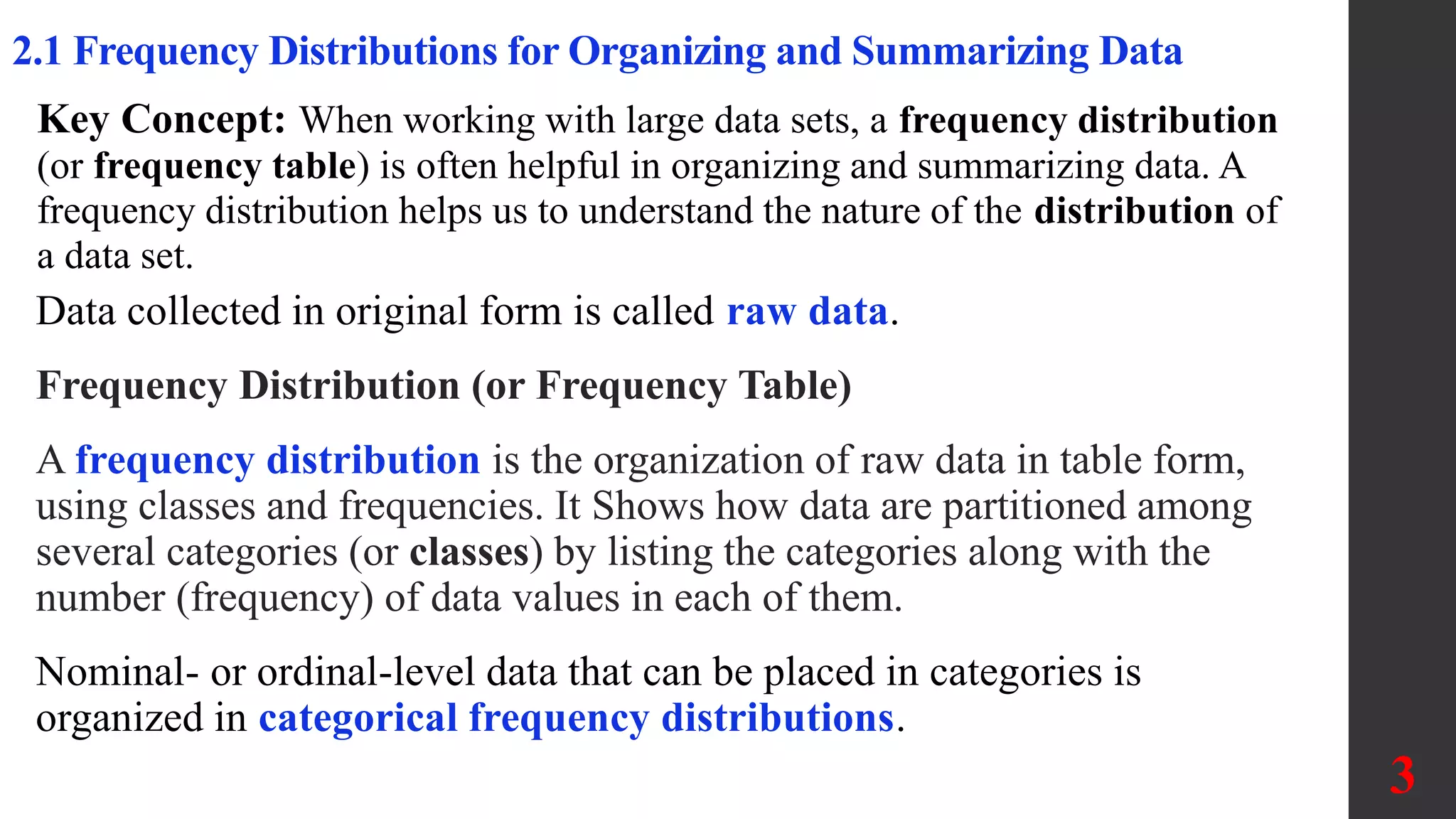
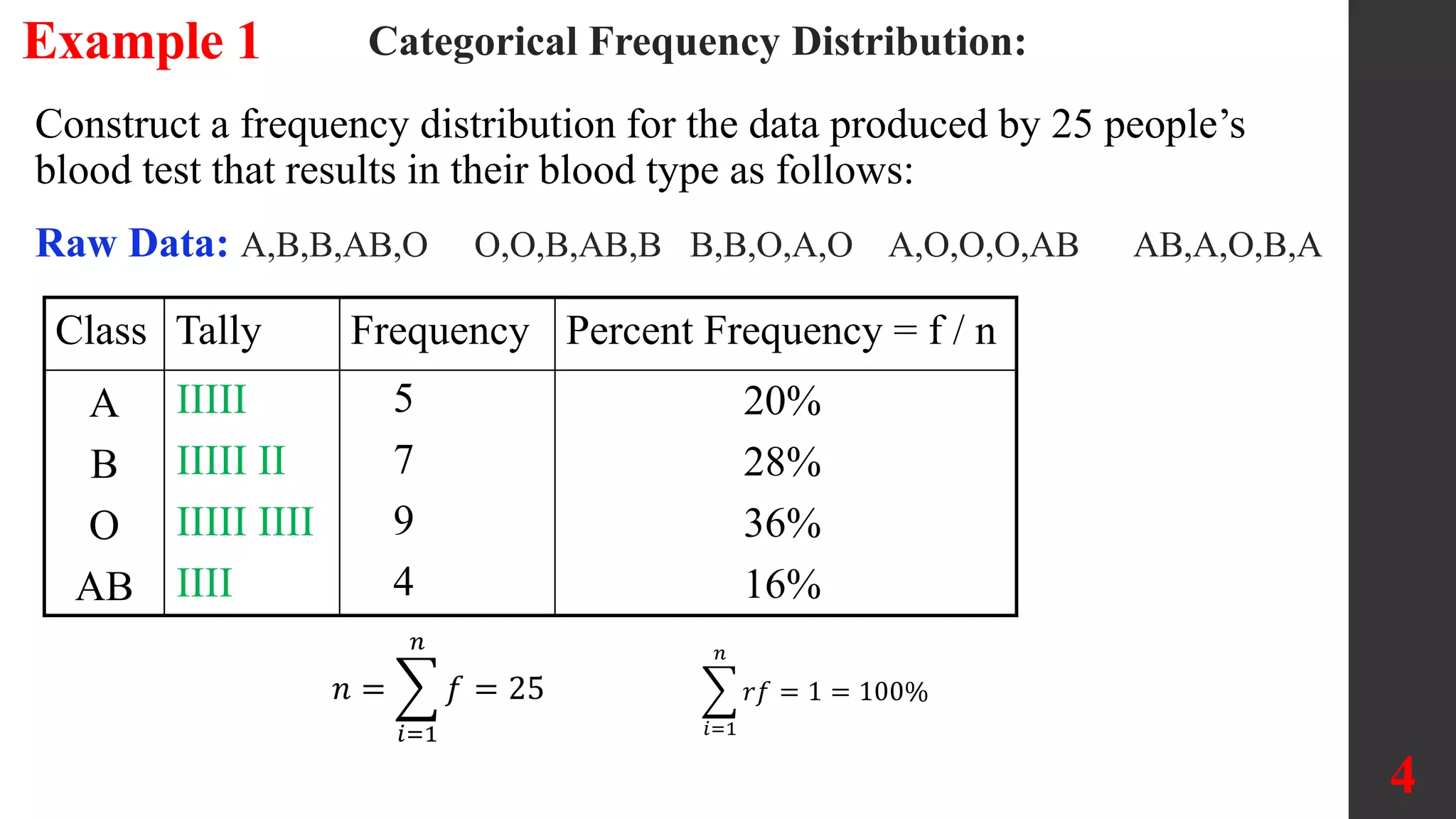
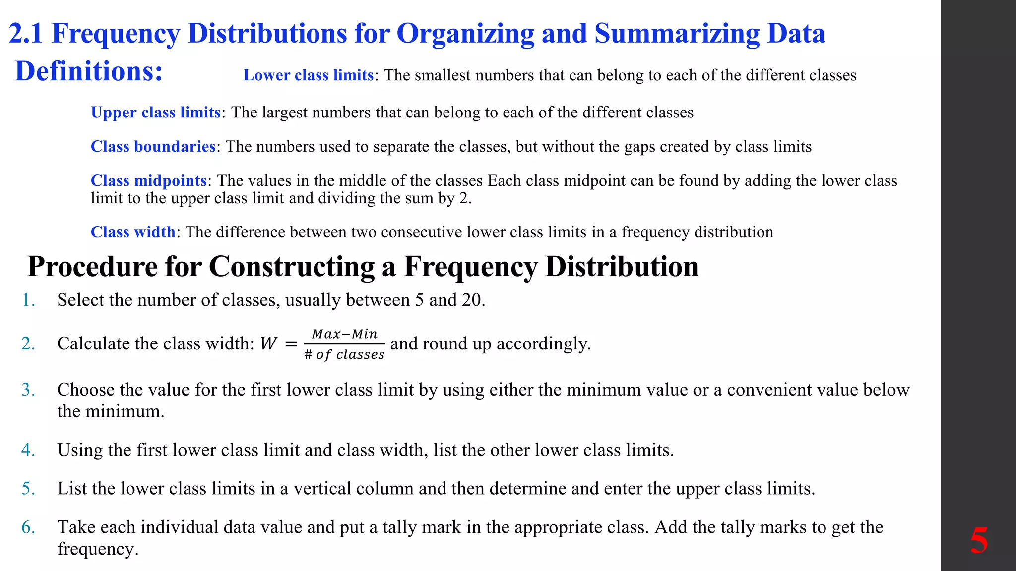
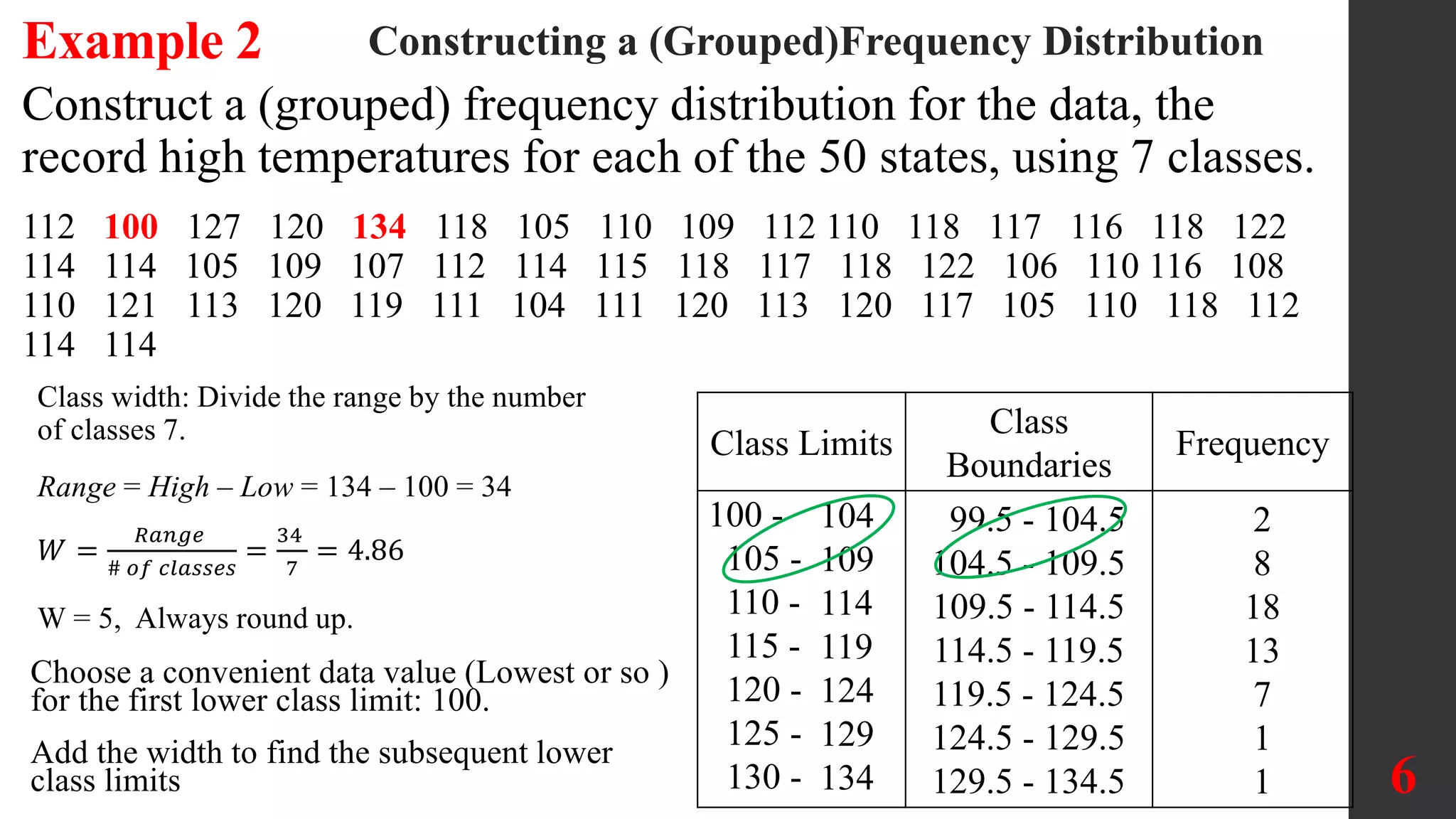
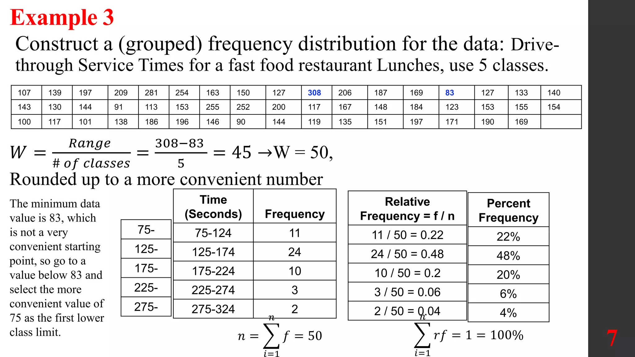
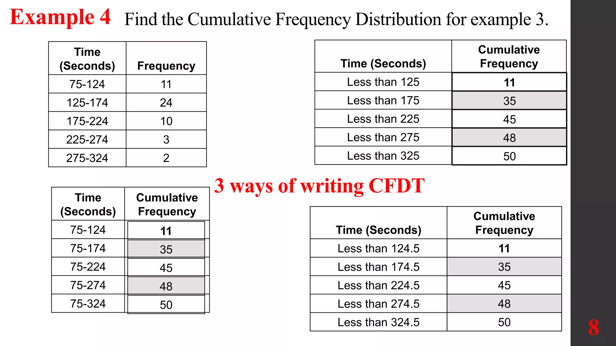
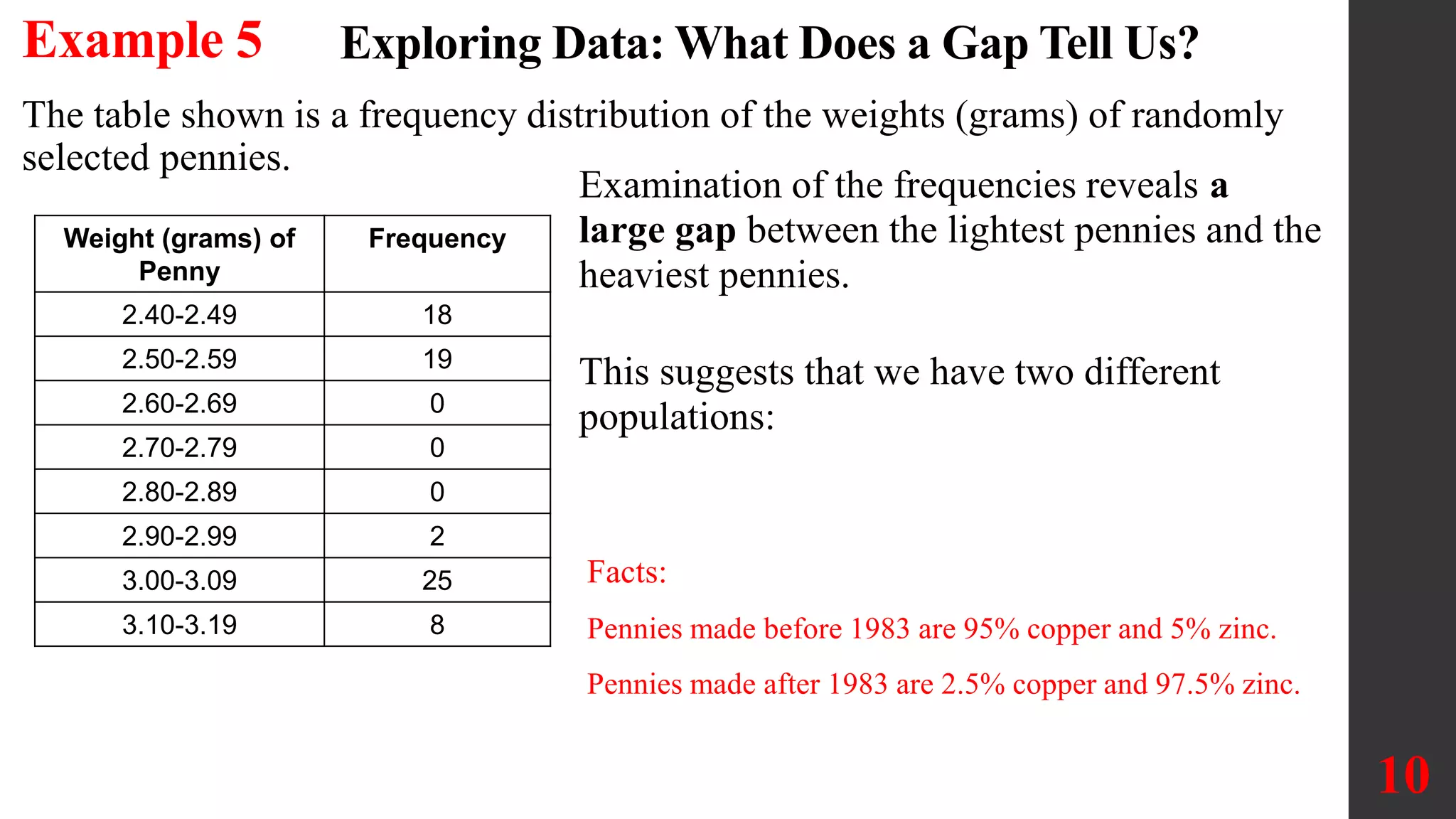
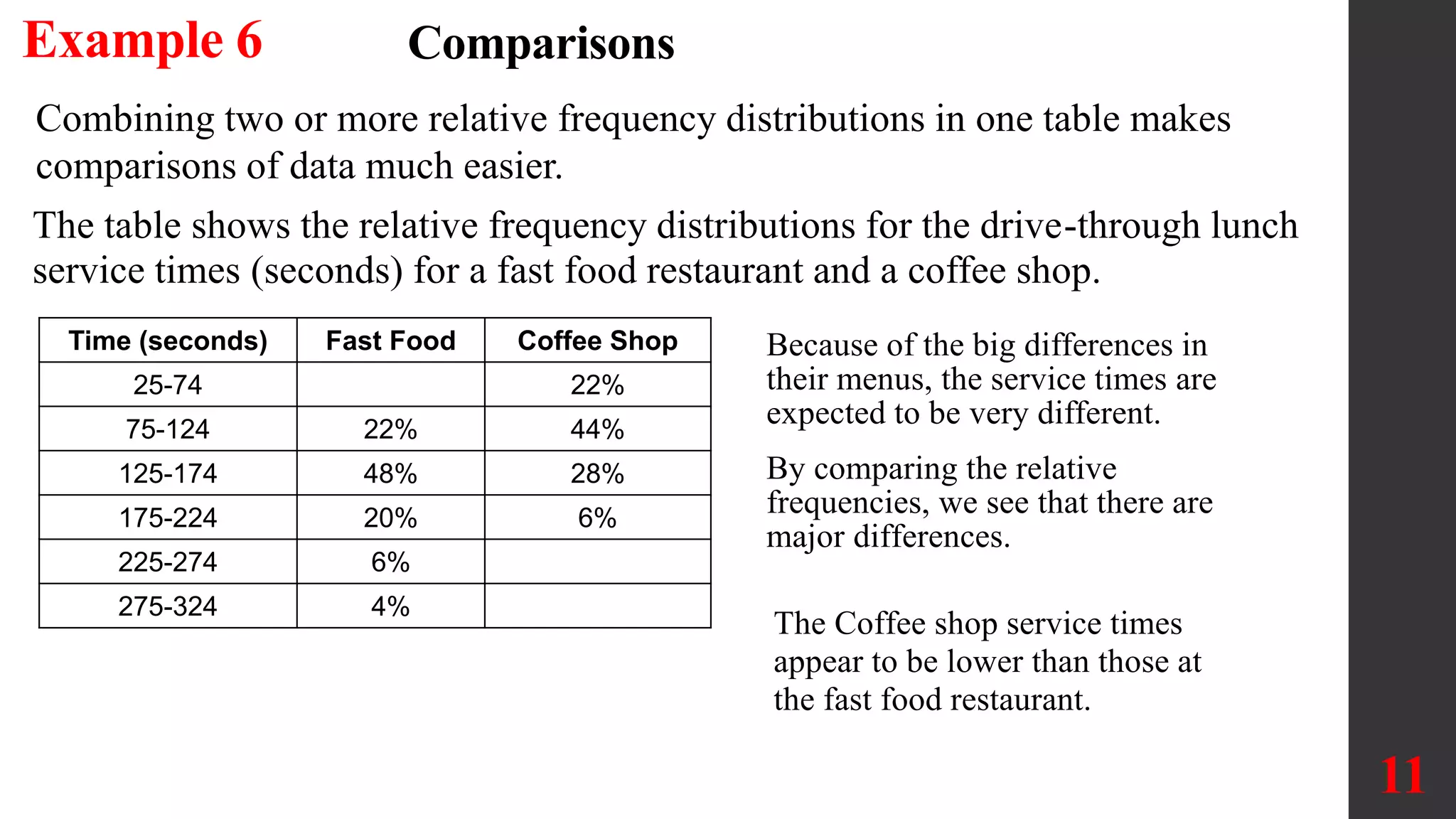
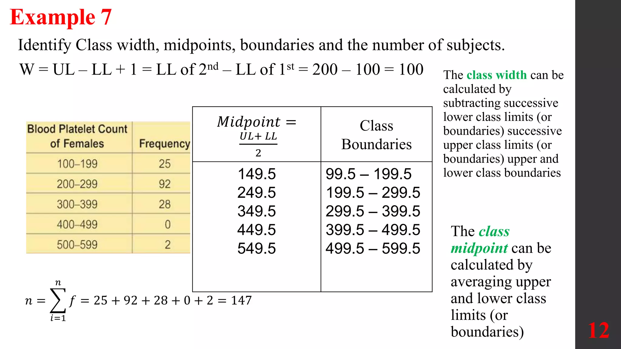
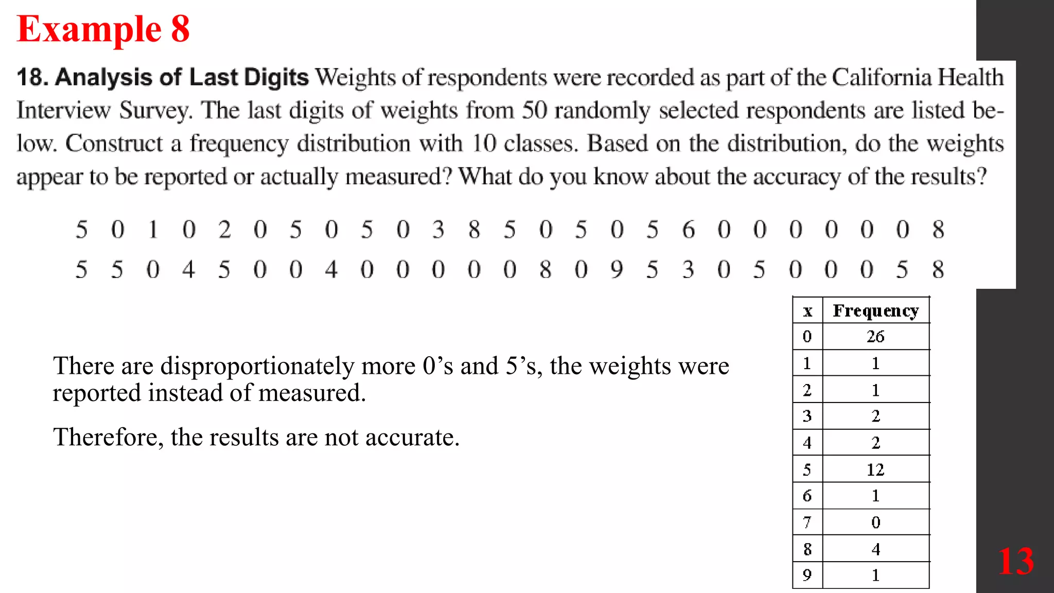
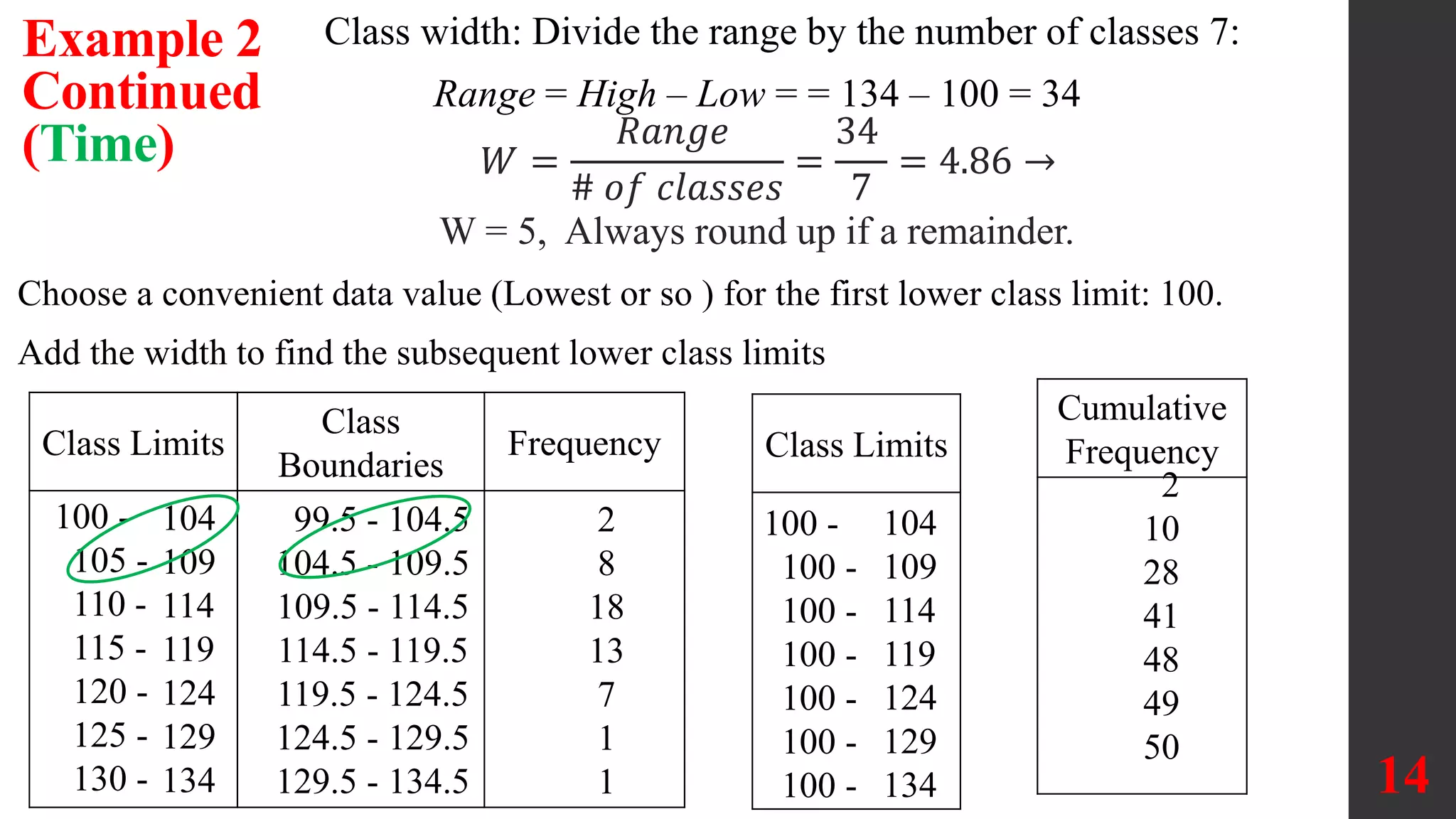

The document discusses organizing and summarizing data using frequency distributions. It defines key terms like frequency distribution, class width, boundaries, and midpoints. Examples are provided to demonstrate how to construct frequency distributions, calculate values, and interpret results. Comparing distributions can reveal differences in datasets. Gaps may indicate separate populations in the data. [END SUMMARY]