SlideShare a Scribd company logo
1
1
Chapter 2
Descriptive Statistics: Tabular and
Graphical Methods
Graphically Summarizing Qualitative Data
Graphically Summarizing Quantitative Data
Stem-and-leaf Display
Misleading Graphs and Charts
2
2.1 Graphically Summarizing Qualitative Data
 With qualitative data, names identify the different
categories
 This data can be summarized using a frequency
distribution
 Frequency distribution: A table that summarizes
the number (or frequency) of items in each of
several non-overlapping classes.
2-3
Describing Pizza Preferences
 A business entrepreneur plans to open a pizza restaurant
in a college town, and wishes to study the pizza
preferences of the college students.
 Table 2.1 lists pizza preferences of 50 college students
 Table 2.1 does not reveal much useful information
Table 2.1
Example 2.1
4
 A frequency distribution is a
useful summary
 The frequency distribution
shows us how the
preferences are distributed
among the six restaurants.
 Papa’s John’s is the most popular restaurant.
 Papa’s John’s is roughly twice as popular of the next three
runners up – Bruno’s, Little Caesars, and Will’s.
 Pizza Hut and Domino’s are the least
preferred restaurants
Table 2.2
5
Relative Frequency and Percent Frequency
 Relative frequency summarizes the proportion (or fraction)
of items in each class
 If the data set consists of n observations,
 Multiply times 100 to obtain the percent frequency.
Table 2.3
2-6
Bar Charts and Pie Charts
 Bar chart: A vertical or horizontal rectangle
represents the frequency for each category
 Height can be frequency, relative frequency, or
percent frequency
 Pie chart: A circle divided into slices where
the size of each slice represents its relative
frequency or percent frequency
2-7
Excel Bar and Pie Chart of the Pizza
Preference Data
Figures 2.1 and 2.2
8
Exercise 2.1
Jeep Model
Frequency Relative
Frequency
Percent
Frequency
Commander 71 0.2829 28.29%
Grand Cherokee 70 0.2789 27.89%
Liberty 80 0.3187 31.78%
Wrangler 30 0.1195 11.95%
251 1.0000 100.00%
Table 2.4
 Table 2.4 is the frequency distribution of
vehicles sold in 2006 by the Greater
Cincinnati Jeep dealers.
 Please find the relative frequency and
percent frequency.
9
9
Comparison
Percentage of Automobiles Sold by Manufacturer, 1970
versus 1997
Figures 2.3 and 2.4
2-10
2.2 Graphically Summarizing Quantitative
Data
 Often need to summarize and describe the shape of
the distribution of a population or sample of
measurements.
 Summarize quantitative data by using
 frequency distribution:
a list of data classes with the count or “frequency” of values
that belong to each class
 “Classify and count”
 The frequency distribution is a table
 histogram:
a picture of the frequency distribution
11
11
Constructing the frequency distribution
 Steps in making a frequency distribution:
1. Determine the number of classes K
2. Determine the class length
3. Form non-overlapping classes of equal width
4. Tally and count the number of measurements in
each class
5. Graph the histogram
12
12
Example 2.2
The Payment Time Case: Reducing
Payment Times
In order to assess the effectiveness of the system, the
consulting firm will study the payment times for invoices
processed during the first three months of the system’s
operation.
During this period, 7,823 invoices are processed using
the new system. To study the payment times of these
invoices, the consulting firm numbers the invoices from
0001 to 7823 and uses random numbers to select a
random sample of 65 invoices. The resulting 65 payment
times are given in Table 2.5
13
13
22 29 16 15 18 17 12 13 17 16 15
19 17 10 21 15 14 17 18 12 20 14
16 15 16 20 22 14 25 19 23 15 19
18 23 22 16 16 19 13 18 24 24 26
13 18 17 15 24 15 17 14 18 17 21
16 21 25 19 20 27 16 17 16 21
Table 2.5 A Sample of Payment Times (in Days)
for 65 Randomly Selected Invoices.
Example 2.2 #2
Table 2.5
14
14
 Group all of the n data into K number of classes
 K is the smallest whole number for which
2K  n
 In Examples 2.2 , n = 65
 For K = 6, 26 = 64, < n
 For K = 7, 27 = 128, > n
 So use K = 7 classes
Step1: The number of classes K
15
15
 Class length L is the step size from one to the next
 In Examples 2.2, The Payment Time Case, the largest
value is 29 days and the smallest value is 10 days, so
 Arbitrarily round the class length up to 3 days/class
K
L
value
smallest
-
value
Largest

days/class
7143
2
classes
7
days
19
classes
7
days
10
-
29
.
L 


Step2: Class Length L
16
 The classes start on the smallest data value. This is the lower
boundary of the first class. The upper boundary of the first
class is smallest value +L.
• In the example 2.2, the lower boundary of the first class is 10, the
upper boundary of the first class is 10+3=13. So the first class -10
days and less than 13 days (10≤n<13)- includes 10,11,and 12 days.
 The lower boundary of the second class is the upper boundary of
the first class. The upper boundary of the second class is adding
L to this lower boundary.
 In the example 2.2, the second class-13 days and less than 16 days
(13≤n<16)- -includes 13,14, and 15 days.
 And so on
Step 3: Form non-overlapping class of equal width
(Define the boundaries of classes)
17
17
Classes (days) Tally Frequency
10 < 13 ||| 3
13 < 16 |||| 14
16 < 19 ||| 23
19 < 22 || 12
22 < 25 ||| 8
25 < 28 |||| 4
28 < 31 | 1
65
||||
||||
||||
|||| ||||
||||
||||
||||
||||
Check: All frequencies must sum to n
Step 4: Tallies and Frequencies
Table 2.6
18
Step 5: Graph the histogram
Show the frequency distribution in a histogram
Figure 2.5
19
 A graph in which rectangles represent the
classes
 The base of the rectangle represents the class
length
 The height of the rectangle represents
 the frequency in a frequency histogram, or
 the relative frequency in a relative frequency
histogram
Histogram
20
 The relative frequency of a class is the proportion or
fraction of data that is contained in that class
 Calculated by dividing the class frequency by the total
number of data values
For example:
 Relative frequency may be expressed as either a
decimal or percent (percent frequency distribution)
 A relative frequency distribution is a list of all the data
classes and their associated relative frequencies
Relative Frequency, Percent Frequency
Classes (days) Frequency Relative Frequency Percent Frequency
10 < 13 3 3/65 = 0.0462 4.62%
13 < 15 14 14/65 = 0.2154 21.54
… … …
21
21
Classes (days) Frequency Relative Frequency
10 < 13 3 3/65 = 0.0462
13 < 16 14 14/65 = 0.2154
16 < 19 23 0.3538
19 < 22 12 0.1846
22 < 25 8 0.1231
25 < 28 4 0.0615
28 < 31 1 0.0154
65 1.0000
Check: All relative frequencies must sum to 1
Relative Frequency: Example 2.2
Table 2.7
22
22
Relative Frequency Histogram
Example 2.2: The Payment Times Case
Figure 2.6
The tail on the right appears to be longer than the tail on
the left. We say: the distribution is skewed to the right.
23
Remarks
 The procedure introduced is not the only way to
construct a histogram.
 e.g. it is not necessary to
set the lower boundary of
the 1st class equal to the
smallest measurement.
 Sometimes it is desirable to let the nature of the
problem determine the histogram classes.
 e.g. 10-year lengths for ages of the residents in a city
 Sometimes histogram with unequal class
lengths is better. e.g. open-ended classes
Figure 2.7
24
Some common distribution shapes
Right Skewed
Left Skewed Symmetric
Figure 2.8
25
25
Skewness(偏度)
Skewed distributions are not symmetrical about their
center. Rather, they are lop-sided with a longer tail on
one side or the other.
• A population is distributed according to its relative
frequency curve
• The skew is the side with the longer tail
Right Skewed
Left Skewed Symmetric
Figure 2.9
26
Frequency Polygons
 Plot a point above each class midpoint at a height
equal to the frequency of the class
 Useful when comparing two or more distributions
Table 2.8
Example 2.3 Comparing Two Grade Distribution
32 63 69 85 91
45 64 69 86 92
50 64 72 87 92
56 65 76 87 93
58 66 78 88 93
60 67 81 89 94
61 67 83 90 96
61 68 83 90 98
Scores for Statistics Exam 1
(in increasing order)
Classes Frequency Percent
Frequency
27
Scores for Statistics Exam 2
(in increasing order)
55 74 80 87 93
62 74 82 88 94
63 74 83 89 94
66 75 84 90 95
67 76 85 91 97
67 77 86 91 99
71 77 86 92
73 78 87 93
Table 2.9 and Figures 2.11, 2.12, 2.13
2-28
Cumulative Distributions
 Another way to summarize a distribution is to
construct a cumulative distribution
 To do this, use the same number of classes, class
lengths, and class boundaries used for the
frequency distribution
 Rather than a count, we record the number of
measurements that are less than the upper
boundary of that class
 In other words, a running total
2-29
Various Frequency Distribution
Table 2.10
2-30
Ogive
 Ogive: A graph of a cumulative distribution
 Plot a point above each upper class boundary at
height of cumulative frequency
 Connect points with line segments
 Can also be drawn using:
 Cumulative relative frequencies
 Cumulative percent frequencies
Figure 2.14
2-31
2.3 Stem-and-Leaf Displays
 Purpose is to see the overall pattern of the
data, by grouping the data into classes
 the variation from class to class
 the amount of data in each class
 the distribution of the data within each class
 Best for small to moderately sized data
distributions
2-32
Car Mileage Example
Table 2.11
Example 2.4
33
33
The stem-and-leaf display of car mileages:
29 8
30 13455677888
31 0012334444455667778899
32 011123344557788
33 03
29 + 0.8 = 29.8
33 + 0.0 = 33.0
33 + 0.3 = 33.3
Figure 2.15
Stem unit =1, Leaf unit =0.1
34
34
Splitting The Stems
 There are no rules that dictate the number of stem
values, so we can split the stems as needed
 Starred classes (*) extend from 0.0 to 0.4
 Unstarred classes extend from 0.5 to 0.9
29 8
30 * 1 3 4
30 5 5 6 7 7 8 8 8
31 * 0 0 1 2 3 3 4 4 4 4 4
31 5 5 6 6 7 7 7 8 8 9 9
32 * 0 1 1 1 2 3 3 4 4
32 5 5 7 7 8
33 * 0 3
Figure 2.16
35
35
 Looking at the last stem-and-leaf display, the
distribution appears almost “symmetrical” (对称的)
 The upper portion of the display…
 Stems 29, 30*, 30, and 31*
 … is almost a mirror image of the lower portion of
the display
 Stems 31, 32*, 32, and 33*
36
36
Constructing a Stem-and-Leaf Display
1. Decide what units will be used for the stems and the
leaves. As a general rule, choose units for the stems so
that there will be somewhere between 5 and 20 stems.
2. Place the stems in a column with the smallest stem at
the top of the column and the largest stem at the
bottom.
3. Enter the leaf for each measurement into the row
corresponding to the proper stem. The leaves should
be single-digit numbers (rounded values).
4. If desired, rearrange the leaves so that they are in
increasing order from left to right.
2-37
Constructing a Stem-and-Leaf Display
 It is possible to construct a stem-and-leaf display
from measurements containing any number of digits.
Example 2.5
Table 2.13
Number of DVD players sold
for each of last 12 months
Stem and Leaf plot
for
Players
Sold
stem unit =1000
leaf unit =100
Frequency Stem Leaf
1 13 5
2 14 3 7
3 15 2 7 9
3 16 1 5 7
2 17 1 9
0 18
1 19 0
12
13,502 15,932 14,739
15,249 14,312 17,111
19,010 16,121 16,708
17,886 15,665 16,475
Figure 2.17
Back-to-Back Stem-and-Leaf Display
 Exam1 Exam2
 2 3
 3
 4
 5 4
 0 5
 8 6 5 5
 4 4 3 1 1 0 6 2 3
 9 9 8 7 6 5 6 6 7 7
 2 7 1 3 4 4 4
 8 6 7 5 6 7 7 8
 3 3 1 8 0 2 3 4
 9 8 7 7 6 5 8 5 6 6 7 7 8 9
 4 3 3 2 2 1 0 0 9 0 1 1 2 3 3 4 4
 8 6 9 5 7 9
We can construct a Back-
to-Back Stem-and-Leaf
Display if we wish to
compare two distributions.
Conclusion:
Exam 1: two concentrations
of scores (bimodal)
Exam 2: almost single
peaked and somewhat
skewed to the left
Figure 2.18
Example 2.6
Description of Quantitative 定量 data
Table and Graph
Stem-and-leaf display (茎叶图)
Frequency distributions (频率分布)
Histogram (直方图)
Dot plot (点图 )
40
40
2.4 Misleading Graphs and Charts
Scale Break
Break the vertical scale to exaggerate effect
Mean Salaries at a Major University, 2002 - 2005
Figure 2.19
41
41
Misleading Graphs and Charts:
Scale Effects
Compress vs. stretch the vertical axis to exaggerate or minimize
the effect
Mean Salary Increases at a Major University, 2002 - 2005
Figure 2.20
42
Chapter Summary
 Frequency distribution
 Bar chart and pie chart
 Histogram
 Shape of the distribution
 Stem-and-leaf display
 Misleading graphs and charts
43
Appendix:
Excel -- Bar chart and Pie Chart
44
Appendix: MegaStat

More Related Content

Similar to DATA ANALYSIS FOR BUSINESS ch02-Discriptive Statistics_Tabular and Graphical Methods.ppt

Sta2023 ch02
Sta2023 ch02Sta2023 ch02
Sta2023 ch02
Savita Nagariya
 
Frequency Tables, Frequency Distributions, and Graphic Presentation
Frequency Tables, Frequency Distributions, and Graphic PresentationFrequency Tables, Frequency Distributions, and Graphic Presentation
Frequency Tables, Frequency Distributions, and Graphic Presentation
ConflagratioNal Jahid
 
Chapter 2
Chapter 2Chapter 2
Chapter 2
Rose Jenkins
 
Chapter 2
Chapter 2Chapter 2
Chapter 2
guest3720ca
 
Statistik Chapter 2
Statistik Chapter 2Statistik Chapter 2
Statistik Chapter 2
WanBK Leo
 
Frequency Distribution
Frequency DistributionFrequency Distribution
Frequency Distribution
TeacherMariza
 
frequency distribution
 frequency distribution frequency distribution
frequency distribution
Unsa Shakir
 
Chapter 02 (1).pdf
Chapter 02 (1).pdfChapter 02 (1).pdf
Chapter 02 (1).pdf
nanifaiz
 
Introduction to Statistics presentation
Introduction to Statistics presentationIntroduction to Statistics presentation
Introduction to Statistics presentation
fazli khaliq
 
8407195.ppt
8407195.ppt8407195.ppt
8407195.ppt
AizaArcena
 
Probability and statistics (frequency distributions)
Probability and statistics (frequency distributions)Probability and statistics (frequency distributions)
Probability and statistics (frequency distributions)
Don Bosco BSIT
 
Chapter 02
Chapter 02Chapter 02
Chapter 02
conalep
 
Algebra unit 9.2
Algebra unit 9.2Algebra unit 9.2
Algebra unit 9.2
Mark Ryder
 
Graphs, charts, and tables ppt @ bec doms
Graphs, charts, and tables ppt @ bec domsGraphs, charts, and tables ppt @ bec doms
Graphs, charts, and tables ppt @ bec doms
Babasab Patil
 
SBE11ch02a.pptx
SBE11ch02a.pptxSBE11ch02a.pptx
SBE11ch02a.pptx
Ferly Urday Luna
 
Chapter 2: Frequency Distribution and Graphs
Chapter 2: Frequency Distribution and GraphsChapter 2: Frequency Distribution and Graphs
Chapter 2: Frequency Distribution and Graphs
Mong Mara
 
lesson-data-presentation-tools-1.pptx
lesson-data-presentation-tools-1.pptxlesson-data-presentation-tools-1.pptx
lesson-data-presentation-tools-1.pptx
AnalynPasto
 
collectionandrepresentationofdata1-200904192336.pptx
collectionandrepresentationofdata1-200904192336.pptxcollectionandrepresentationofdata1-200904192336.pptx
collectionandrepresentationofdata1-200904192336.pptx
aibakimito
 
Tabular and Graphical Representation of Data
Tabular and Graphical Representation of Data Tabular and Graphical Representation of Data
Tabular and Graphical Representation of Data
Sir Parashurambhau College, Pune
 
Data organization and presentation (statistics for research)
Data organization and presentation (statistics for research)Data organization and presentation (statistics for research)
Data organization and presentation (statistics for research)
Harve Abella
 

Similar to DATA ANALYSIS FOR BUSINESS ch02-Discriptive Statistics_Tabular and Graphical Methods.ppt (20)

Sta2023 ch02
Sta2023 ch02Sta2023 ch02
Sta2023 ch02
 
Frequency Tables, Frequency Distributions, and Graphic Presentation
Frequency Tables, Frequency Distributions, and Graphic PresentationFrequency Tables, Frequency Distributions, and Graphic Presentation
Frequency Tables, Frequency Distributions, and Graphic Presentation
 
Chapter 2
Chapter 2Chapter 2
Chapter 2
 
Chapter 2
Chapter 2Chapter 2
Chapter 2
 
Statistik Chapter 2
Statistik Chapter 2Statistik Chapter 2
Statistik Chapter 2
 
Frequency Distribution
Frequency DistributionFrequency Distribution
Frequency Distribution
 
frequency distribution
 frequency distribution frequency distribution
frequency distribution
 
Chapter 02 (1).pdf
Chapter 02 (1).pdfChapter 02 (1).pdf
Chapter 02 (1).pdf
 
Introduction to Statistics presentation
Introduction to Statistics presentationIntroduction to Statistics presentation
Introduction to Statistics presentation
 
8407195.ppt
8407195.ppt8407195.ppt
8407195.ppt
 
Probability and statistics (frequency distributions)
Probability and statistics (frequency distributions)Probability and statistics (frequency distributions)
Probability and statistics (frequency distributions)
 
Chapter 02
Chapter 02Chapter 02
Chapter 02
 
Algebra unit 9.2
Algebra unit 9.2Algebra unit 9.2
Algebra unit 9.2
 
Graphs, charts, and tables ppt @ bec doms
Graphs, charts, and tables ppt @ bec domsGraphs, charts, and tables ppt @ bec doms
Graphs, charts, and tables ppt @ bec doms
 
SBE11ch02a.pptx
SBE11ch02a.pptxSBE11ch02a.pptx
SBE11ch02a.pptx
 
Chapter 2: Frequency Distribution and Graphs
Chapter 2: Frequency Distribution and GraphsChapter 2: Frequency Distribution and Graphs
Chapter 2: Frequency Distribution and Graphs
 
lesson-data-presentation-tools-1.pptx
lesson-data-presentation-tools-1.pptxlesson-data-presentation-tools-1.pptx
lesson-data-presentation-tools-1.pptx
 
collectionandrepresentationofdata1-200904192336.pptx
collectionandrepresentationofdata1-200904192336.pptxcollectionandrepresentationofdata1-200904192336.pptx
collectionandrepresentationofdata1-200904192336.pptx
 
Tabular and Graphical Representation of Data
Tabular and Graphical Representation of Data Tabular and Graphical Representation of Data
Tabular and Graphical Representation of Data
 
Data organization and presentation (statistics for research)
Data organization and presentation (statistics for research)Data organization and presentation (statistics for research)
Data organization and presentation (statistics for research)
 

Recently uploaded

一比一原版加拿大渥太华大学毕业证(uottawa毕业证书)如何办理
一比一原版加拿大渥太华大学毕业证(uottawa毕业证书)如何办理一比一原版加拿大渥太华大学毕业证(uottawa毕业证书)如何办理
一比一原版加拿大渥太华大学毕业证(uottawa毕业证书)如何办理
uevausa
 
Sample Devops SRE Product Companies .pdf
Sample Devops SRE  Product Companies .pdfSample Devops SRE  Product Companies .pdf
Sample Devops SRE Product Companies .pdf
Vineet
 
一比一原版卡尔加里大学毕业证(uc毕业证)如何办理
一比一原版卡尔加里大学毕业证(uc毕业证)如何办理一比一原版卡尔加里大学毕业证(uc毕业证)如何办理
一比一原版卡尔加里大学毕业证(uc毕业证)如何办理
oaxefes
 
Telemetry Solution for Gaming (AWS Summit'24)
Telemetry Solution for Gaming (AWS Summit'24)Telemetry Solution for Gaming (AWS Summit'24)
Telemetry Solution for Gaming (AWS Summit'24)
GeorgiiSteshenko
 
Namma-Kalvi-11th-Physics-Study-Material-Unit-1-EM-221086.pdf
Namma-Kalvi-11th-Physics-Study-Material-Unit-1-EM-221086.pdfNamma-Kalvi-11th-Physics-Study-Material-Unit-1-EM-221086.pdf
Namma-Kalvi-11th-Physics-Study-Material-Unit-1-EM-221086.pdf
22ad0301
 
Digital Marketing Performance Marketing Sample .pdf
Digital Marketing Performance Marketing  Sample .pdfDigital Marketing Performance Marketing  Sample .pdf
Digital Marketing Performance Marketing Sample .pdf
Vineet
 
一比一原版(uob毕业证书)伯明翰大学毕业证如何办理
一比一原版(uob毕业证书)伯明翰大学毕业证如何办理一比一原版(uob毕业证书)伯明翰大学毕业证如何办理
一比一原版(uob毕业证书)伯明翰大学毕业证如何办理
9gr6pty
 
一比一原版(uom毕业证书)曼彻斯特大学毕业证如何办理
一比一原版(uom毕业证书)曼彻斯特大学毕业证如何办理一比一原版(uom毕业证书)曼彻斯特大学毕业证如何办理
一比一原版(uom毕业证书)曼彻斯特大学毕业证如何办理
osoyvvf
 
How To Control IO Usage using Resource Manager
How To Control IO Usage using Resource ManagerHow To Control IO Usage using Resource Manager
How To Control IO Usage using Resource Manager
Alireza Kamrani
 
Sid Sigma educational and problem solving power point- Six Sigma.ppt
Sid Sigma educational and problem solving power point- Six Sigma.pptSid Sigma educational and problem solving power point- Six Sigma.ppt
Sid Sigma educational and problem solving power point- Six Sigma.ppt
ArshadAyub49
 
Overview IFM June 2024 Consumer Confidence INDEX Report.pdf
Overview IFM June 2024 Consumer Confidence INDEX Report.pdfOverview IFM June 2024 Consumer Confidence INDEX Report.pdf
Overview IFM June 2024 Consumer Confidence INDEX Report.pdf
nhutnguyen355078
 
06-20-2024-AI Camp Meetup-Unstructured Data and Vector Databases
06-20-2024-AI Camp Meetup-Unstructured Data and Vector Databases06-20-2024-AI Camp Meetup-Unstructured Data and Vector Databases
06-20-2024-AI Camp Meetup-Unstructured Data and Vector Databases
Timothy Spann
 
Open Source Contributions to Postgres: The Basics POSETTE 2024
Open Source Contributions to Postgres: The Basics POSETTE 2024Open Source Contributions to Postgres: The Basics POSETTE 2024
Open Source Contributions to Postgres: The Basics POSETTE 2024
ElizabethGarrettChri
 
reading_sample_sap_press_operational_data_provisioning_with_sap_bw4hana (1).pdf
reading_sample_sap_press_operational_data_provisioning_with_sap_bw4hana (1).pdfreading_sample_sap_press_operational_data_provisioning_with_sap_bw4hana (1).pdf
reading_sample_sap_press_operational_data_provisioning_with_sap_bw4hana (1).pdf
perranet1
 
一比一原版英属哥伦比亚大学毕业证(UBC毕业证书)学历如何办理
一比一原版英属哥伦比亚大学毕业证(UBC毕业证书)学历如何办理一比一原版英属哥伦比亚大学毕业证(UBC毕业证书)学历如何办理
一比一原版英属哥伦比亚大学毕业证(UBC毕业证书)学历如何办理
z6osjkqvd
 
[VCOSA] Monthly Report - Cotton & Yarn Statistics March 2024
[VCOSA] Monthly Report - Cotton & Yarn Statistics March 2024[VCOSA] Monthly Report - Cotton & Yarn Statistics March 2024
[VCOSA] Monthly Report - Cotton & Yarn Statistics March 2024
Vietnam Cotton & Spinning Association
 
一比一原版南昆士兰大学毕业证如何办理
一比一原版南昆士兰大学毕业证如何办理一比一原版南昆士兰大学毕业证如何办理
一比一原版南昆士兰大学毕业证如何办理
ugydym
 
Template xxxxxxxx ssssssssssss Sertifikat.pptx
Template xxxxxxxx ssssssssssss Sertifikat.pptxTemplate xxxxxxxx ssssssssssss Sertifikat.pptx
Template xxxxxxxx ssssssssssss Sertifikat.pptx
TeukuEriSyahputra
 
PyData London 2024: Mistakes were made (Dr. Rebecca Bilbro)
PyData London 2024: Mistakes were made (Dr. Rebecca Bilbro)PyData London 2024: Mistakes were made (Dr. Rebecca Bilbro)
PyData London 2024: Mistakes were made (Dr. Rebecca Bilbro)
Rebecca Bilbro
 
一比一原版悉尼大学毕业证如何办理
一比一原版悉尼大学毕业证如何办理一比一原版悉尼大学毕业证如何办理
一比一原版悉尼大学毕业证如何办理
keesa2
 

Recently uploaded (20)

一比一原版加拿大渥太华大学毕业证(uottawa毕业证书)如何办理
一比一原版加拿大渥太华大学毕业证(uottawa毕业证书)如何办理一比一原版加拿大渥太华大学毕业证(uottawa毕业证书)如何办理
一比一原版加拿大渥太华大学毕业证(uottawa毕业证书)如何办理
 
Sample Devops SRE Product Companies .pdf
Sample Devops SRE  Product Companies .pdfSample Devops SRE  Product Companies .pdf
Sample Devops SRE Product Companies .pdf
 
一比一原版卡尔加里大学毕业证(uc毕业证)如何办理
一比一原版卡尔加里大学毕业证(uc毕业证)如何办理一比一原版卡尔加里大学毕业证(uc毕业证)如何办理
一比一原版卡尔加里大学毕业证(uc毕业证)如何办理
 
Telemetry Solution for Gaming (AWS Summit'24)
Telemetry Solution for Gaming (AWS Summit'24)Telemetry Solution for Gaming (AWS Summit'24)
Telemetry Solution for Gaming (AWS Summit'24)
 
Namma-Kalvi-11th-Physics-Study-Material-Unit-1-EM-221086.pdf
Namma-Kalvi-11th-Physics-Study-Material-Unit-1-EM-221086.pdfNamma-Kalvi-11th-Physics-Study-Material-Unit-1-EM-221086.pdf
Namma-Kalvi-11th-Physics-Study-Material-Unit-1-EM-221086.pdf
 
Digital Marketing Performance Marketing Sample .pdf
Digital Marketing Performance Marketing  Sample .pdfDigital Marketing Performance Marketing  Sample .pdf
Digital Marketing Performance Marketing Sample .pdf
 
一比一原版(uob毕业证书)伯明翰大学毕业证如何办理
一比一原版(uob毕业证书)伯明翰大学毕业证如何办理一比一原版(uob毕业证书)伯明翰大学毕业证如何办理
一比一原版(uob毕业证书)伯明翰大学毕业证如何办理
 
一比一原版(uom毕业证书)曼彻斯特大学毕业证如何办理
一比一原版(uom毕业证书)曼彻斯特大学毕业证如何办理一比一原版(uom毕业证书)曼彻斯特大学毕业证如何办理
一比一原版(uom毕业证书)曼彻斯特大学毕业证如何办理
 
How To Control IO Usage using Resource Manager
How To Control IO Usage using Resource ManagerHow To Control IO Usage using Resource Manager
How To Control IO Usage using Resource Manager
 
Sid Sigma educational and problem solving power point- Six Sigma.ppt
Sid Sigma educational and problem solving power point- Six Sigma.pptSid Sigma educational and problem solving power point- Six Sigma.ppt
Sid Sigma educational and problem solving power point- Six Sigma.ppt
 
Overview IFM June 2024 Consumer Confidence INDEX Report.pdf
Overview IFM June 2024 Consumer Confidence INDEX Report.pdfOverview IFM June 2024 Consumer Confidence INDEX Report.pdf
Overview IFM June 2024 Consumer Confidence INDEX Report.pdf
 
06-20-2024-AI Camp Meetup-Unstructured Data and Vector Databases
06-20-2024-AI Camp Meetup-Unstructured Data and Vector Databases06-20-2024-AI Camp Meetup-Unstructured Data and Vector Databases
06-20-2024-AI Camp Meetup-Unstructured Data and Vector Databases
 
Open Source Contributions to Postgres: The Basics POSETTE 2024
Open Source Contributions to Postgres: The Basics POSETTE 2024Open Source Contributions to Postgres: The Basics POSETTE 2024
Open Source Contributions to Postgres: The Basics POSETTE 2024
 
reading_sample_sap_press_operational_data_provisioning_with_sap_bw4hana (1).pdf
reading_sample_sap_press_operational_data_provisioning_with_sap_bw4hana (1).pdfreading_sample_sap_press_operational_data_provisioning_with_sap_bw4hana (1).pdf
reading_sample_sap_press_operational_data_provisioning_with_sap_bw4hana (1).pdf
 
一比一原版英属哥伦比亚大学毕业证(UBC毕业证书)学历如何办理
一比一原版英属哥伦比亚大学毕业证(UBC毕业证书)学历如何办理一比一原版英属哥伦比亚大学毕业证(UBC毕业证书)学历如何办理
一比一原版英属哥伦比亚大学毕业证(UBC毕业证书)学历如何办理
 
[VCOSA] Monthly Report - Cotton & Yarn Statistics March 2024
[VCOSA] Monthly Report - Cotton & Yarn Statistics March 2024[VCOSA] Monthly Report - Cotton & Yarn Statistics March 2024
[VCOSA] Monthly Report - Cotton & Yarn Statistics March 2024
 
一比一原版南昆士兰大学毕业证如何办理
一比一原版南昆士兰大学毕业证如何办理一比一原版南昆士兰大学毕业证如何办理
一比一原版南昆士兰大学毕业证如何办理
 
Template xxxxxxxx ssssssssssss Sertifikat.pptx
Template xxxxxxxx ssssssssssss Sertifikat.pptxTemplate xxxxxxxx ssssssssssss Sertifikat.pptx
Template xxxxxxxx ssssssssssss Sertifikat.pptx
 
PyData London 2024: Mistakes were made (Dr. Rebecca Bilbro)
PyData London 2024: Mistakes were made (Dr. Rebecca Bilbro)PyData London 2024: Mistakes were made (Dr. Rebecca Bilbro)
PyData London 2024: Mistakes were made (Dr. Rebecca Bilbro)
 
一比一原版悉尼大学毕业证如何办理
一比一原版悉尼大学毕业证如何办理一比一原版悉尼大学毕业证如何办理
一比一原版悉尼大学毕业证如何办理
 

DATA ANALYSIS FOR BUSINESS ch02-Discriptive Statistics_Tabular and Graphical Methods.ppt

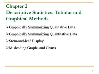
  • 1. 1 1 Chapter 2 Descriptive Statistics: Tabular and Graphical Methods Graphically Summarizing Qualitative Data Graphically Summarizing Quantitative Data Stem-and-leaf Display Misleading Graphs and Charts
  • 2. 2 2.1 Graphically Summarizing Qualitative Data  With qualitative data, names identify the different categories  This data can be summarized using a frequency distribution  Frequency distribution: A table that summarizes the number (or frequency) of items in each of several non-overlapping classes.
  • 3. 2-3 Describing Pizza Preferences  A business entrepreneur plans to open a pizza restaurant in a college town, and wishes to study the pizza preferences of the college students.  Table 2.1 lists pizza preferences of 50 college students  Table 2.1 does not reveal much useful information Table 2.1 Example 2.1
  • 4. 4  A frequency distribution is a useful summary  The frequency distribution shows us how the preferences are distributed among the six restaurants.  Papa’s John’s is the most popular restaurant.  Papa’s John’s is roughly twice as popular of the next three runners up – Bruno’s, Little Caesars, and Will’s.  Pizza Hut and Domino’s are the least preferred restaurants Table 2.2
  • 5. 5 Relative Frequency and Percent Frequency  Relative frequency summarizes the proportion (or fraction) of items in each class  If the data set consists of n observations,  Multiply times 100 to obtain the percent frequency. Table 2.3
  • 6. 2-6 Bar Charts and Pie Charts  Bar chart: A vertical or horizontal rectangle represents the frequency for each category  Height can be frequency, relative frequency, or percent frequency  Pie chart: A circle divided into slices where the size of each slice represents its relative frequency or percent frequency
  • 7. 2-7 Excel Bar and Pie Chart of the Pizza Preference Data Figures 2.1 and 2.2
  • 8. 8 Exercise 2.1 Jeep Model Frequency Relative Frequency Percent Frequency Commander 71 0.2829 28.29% Grand Cherokee 70 0.2789 27.89% Liberty 80 0.3187 31.78% Wrangler 30 0.1195 11.95% 251 1.0000 100.00% Table 2.4  Table 2.4 is the frequency distribution of vehicles sold in 2006 by the Greater Cincinnati Jeep dealers.  Please find the relative frequency and percent frequency.
  • 9. 9 9 Comparison Percentage of Automobiles Sold by Manufacturer, 1970 versus 1997 Figures 2.3 and 2.4
  • 10. 2-10 2.2 Graphically Summarizing Quantitative Data  Often need to summarize and describe the shape of the distribution of a population or sample of measurements.  Summarize quantitative data by using  frequency distribution: a list of data classes with the count or “frequency” of values that belong to each class  “Classify and count”  The frequency distribution is a table  histogram: a picture of the frequency distribution
  • 11. 11 11 Constructing the frequency distribution  Steps in making a frequency distribution: 1. Determine the number of classes K 2. Determine the class length 3. Form non-overlapping classes of equal width 4. Tally and count the number of measurements in each class 5. Graph the histogram
  • 12. 12 12 Example 2.2 The Payment Time Case: Reducing Payment Times In order to assess the effectiveness of the system, the consulting firm will study the payment times for invoices processed during the first three months of the system’s operation. During this period, 7,823 invoices are processed using the new system. To study the payment times of these invoices, the consulting firm numbers the invoices from 0001 to 7823 and uses random numbers to select a random sample of 65 invoices. The resulting 65 payment times are given in Table 2.5
  • 13. 13 13 22 29 16 15 18 17 12 13 17 16 15 19 17 10 21 15 14 17 18 12 20 14 16 15 16 20 22 14 25 19 23 15 19 18 23 22 16 16 19 13 18 24 24 26 13 18 17 15 24 15 17 14 18 17 21 16 21 25 19 20 27 16 17 16 21 Table 2.5 A Sample of Payment Times (in Days) for 65 Randomly Selected Invoices. Example 2.2 #2 Table 2.5
  • 14. 14 14  Group all of the n data into K number of classes  K is the smallest whole number for which 2K  n  In Examples 2.2 , n = 65  For K = 6, 26 = 64, < n  For K = 7, 27 = 128, > n  So use K = 7 classes Step1: The number of classes K
  • 15. 15 15  Class length L is the step size from one to the next  In Examples 2.2, The Payment Time Case, the largest value is 29 days and the smallest value is 10 days, so  Arbitrarily round the class length up to 3 days/class K L value smallest - value Largest  days/class 7143 2 classes 7 days 19 classes 7 days 10 - 29 . L    Step2: Class Length L
  • 16. 16  The classes start on the smallest data value. This is the lower boundary of the first class. The upper boundary of the first class is smallest value +L. • In the example 2.2, the lower boundary of the first class is 10, the upper boundary of the first class is 10+3=13. So the first class -10 days and less than 13 days (10≤n<13)- includes 10,11,and 12 days.  The lower boundary of the second class is the upper boundary of the first class. The upper boundary of the second class is adding L to this lower boundary.  In the example 2.2, the second class-13 days and less than 16 days (13≤n<16)- -includes 13,14, and 15 days.  And so on Step 3: Form non-overlapping class of equal width (Define the boundaries of classes)
  • 17. 17 17 Classes (days) Tally Frequency 10 < 13 ||| 3 13 < 16 |||| 14 16 < 19 ||| 23 19 < 22 || 12 22 < 25 ||| 8 25 < 28 |||| 4 28 < 31 | 1 65 |||| |||| |||| |||| |||| |||| |||| |||| |||| Check: All frequencies must sum to n Step 4: Tallies and Frequencies Table 2.6
  • 18. 18 Step 5: Graph the histogram Show the frequency distribution in a histogram Figure 2.5
  • 19. 19  A graph in which rectangles represent the classes  The base of the rectangle represents the class length  The height of the rectangle represents  the frequency in a frequency histogram, or  the relative frequency in a relative frequency histogram Histogram
  • 20. 20  The relative frequency of a class is the proportion or fraction of data that is contained in that class  Calculated by dividing the class frequency by the total number of data values For example:  Relative frequency may be expressed as either a decimal or percent (percent frequency distribution)  A relative frequency distribution is a list of all the data classes and their associated relative frequencies Relative Frequency, Percent Frequency Classes (days) Frequency Relative Frequency Percent Frequency 10 < 13 3 3/65 = 0.0462 4.62% 13 < 15 14 14/65 = 0.2154 21.54 … … …
  • 21. 21 21 Classes (days) Frequency Relative Frequency 10 < 13 3 3/65 = 0.0462 13 < 16 14 14/65 = 0.2154 16 < 19 23 0.3538 19 < 22 12 0.1846 22 < 25 8 0.1231 25 < 28 4 0.0615 28 < 31 1 0.0154 65 1.0000 Check: All relative frequencies must sum to 1 Relative Frequency: Example 2.2 Table 2.7
  • 22. 22 22 Relative Frequency Histogram Example 2.2: The Payment Times Case Figure 2.6 The tail on the right appears to be longer than the tail on the left. We say: the distribution is skewed to the right.
  • 23. 23 Remarks  The procedure introduced is not the only way to construct a histogram.  e.g. it is not necessary to set the lower boundary of the 1st class equal to the smallest measurement.  Sometimes it is desirable to let the nature of the problem determine the histogram classes.  e.g. 10-year lengths for ages of the residents in a city  Sometimes histogram with unequal class lengths is better. e.g. open-ended classes Figure 2.7
  • 24. 24 Some common distribution shapes Right Skewed Left Skewed Symmetric Figure 2.8
  • 25. 25 25 Skewness(偏度) Skewed distributions are not symmetrical about their center. Rather, they are lop-sided with a longer tail on one side or the other. • A population is distributed according to its relative frequency curve • The skew is the side with the longer tail Right Skewed Left Skewed Symmetric Figure 2.9
  • 26. 26 Frequency Polygons  Plot a point above each class midpoint at a height equal to the frequency of the class  Useful when comparing two or more distributions Table 2.8 Example 2.3 Comparing Two Grade Distribution 32 63 69 85 91 45 64 69 86 92 50 64 72 87 92 56 65 76 87 93 58 66 78 88 93 60 67 81 89 94 61 67 83 90 96 61 68 83 90 98 Scores for Statistics Exam 1 (in increasing order) Classes Frequency Percent Frequency
  • 27. 27 Scores for Statistics Exam 2 (in increasing order) 55 74 80 87 93 62 74 82 88 94 63 74 83 89 94 66 75 84 90 95 67 76 85 91 97 67 77 86 91 99 71 77 86 92 73 78 87 93 Table 2.9 and Figures 2.11, 2.12, 2.13
  • 28. 2-28 Cumulative Distributions  Another way to summarize a distribution is to construct a cumulative distribution  To do this, use the same number of classes, class lengths, and class boundaries used for the frequency distribution  Rather than a count, we record the number of measurements that are less than the upper boundary of that class  In other words, a running total
  • 30. 2-30 Ogive  Ogive: A graph of a cumulative distribution  Plot a point above each upper class boundary at height of cumulative frequency  Connect points with line segments  Can also be drawn using:  Cumulative relative frequencies  Cumulative percent frequencies Figure 2.14
  • 31. 2-31 2.3 Stem-and-Leaf Displays  Purpose is to see the overall pattern of the data, by grouping the data into classes  the variation from class to class  the amount of data in each class  the distribution of the data within each class  Best for small to moderately sized data distributions
  • 32. 2-32 Car Mileage Example Table 2.11 Example 2.4
  • 33. 33 33 The stem-and-leaf display of car mileages: 29 8 30 13455677888 31 0012334444455667778899 32 011123344557788 33 03 29 + 0.8 = 29.8 33 + 0.0 = 33.0 33 + 0.3 = 33.3 Figure 2.15 Stem unit =1, Leaf unit =0.1
  • 34. 34 34 Splitting The Stems  There are no rules that dictate the number of stem values, so we can split the stems as needed  Starred classes (*) extend from 0.0 to 0.4  Unstarred classes extend from 0.5 to 0.9 29 8 30 * 1 3 4 30 5 5 6 7 7 8 8 8 31 * 0 0 1 2 3 3 4 4 4 4 4 31 5 5 6 6 7 7 7 8 8 9 9 32 * 0 1 1 1 2 3 3 4 4 32 5 5 7 7 8 33 * 0 3 Figure 2.16
  • 35. 35 35  Looking at the last stem-and-leaf display, the distribution appears almost “symmetrical” (对称的)  The upper portion of the display…  Stems 29, 30*, 30, and 31*  … is almost a mirror image of the lower portion of the display  Stems 31, 32*, 32, and 33*
  • 36. 36 36 Constructing a Stem-and-Leaf Display 1. Decide what units will be used for the stems and the leaves. As a general rule, choose units for the stems so that there will be somewhere between 5 and 20 stems. 2. Place the stems in a column with the smallest stem at the top of the column and the largest stem at the bottom. 3. Enter the leaf for each measurement into the row corresponding to the proper stem. The leaves should be single-digit numbers (rounded values). 4. If desired, rearrange the leaves so that they are in increasing order from left to right.
  • 37. 2-37 Constructing a Stem-and-Leaf Display  It is possible to construct a stem-and-leaf display from measurements containing any number of digits. Example 2.5 Table 2.13 Number of DVD players sold for each of last 12 months Stem and Leaf plot for Players Sold stem unit =1000 leaf unit =100 Frequency Stem Leaf 1 13 5 2 14 3 7 3 15 2 7 9 3 16 1 5 7 2 17 1 9 0 18 1 19 0 12 13,502 15,932 14,739 15,249 14,312 17,111 19,010 16,121 16,708 17,886 15,665 16,475 Figure 2.17
  • 38. Back-to-Back Stem-and-Leaf Display  Exam1 Exam2  2 3  3  4  5 4  0 5  8 6 5 5  4 4 3 1 1 0 6 2 3  9 9 8 7 6 5 6 6 7 7  2 7 1 3 4 4 4  8 6 7 5 6 7 7 8  3 3 1 8 0 2 3 4  9 8 7 7 6 5 8 5 6 6 7 7 8 9  4 3 3 2 2 1 0 0 9 0 1 1 2 3 3 4 4  8 6 9 5 7 9 We can construct a Back- to-Back Stem-and-Leaf Display if we wish to compare two distributions. Conclusion: Exam 1: two concentrations of scores (bimodal) Exam 2: almost single peaked and somewhat skewed to the left Figure 2.18 Example 2.6
  • 39. Description of Quantitative 定量 data Table and Graph Stem-and-leaf display (茎叶图) Frequency distributions (频率分布) Histogram (直方图) Dot plot (点图 )
  • 40. 40 40 2.4 Misleading Graphs and Charts Scale Break Break the vertical scale to exaggerate effect Mean Salaries at a Major University, 2002 - 2005 Figure 2.19
  • 41. 41 41 Misleading Graphs and Charts: Scale Effects Compress vs. stretch the vertical axis to exaggerate or minimize the effect Mean Salary Increases at a Major University, 2002 - 2005 Figure 2.20
  • 42. 42 Chapter Summary  Frequency distribution  Bar chart and pie chart  Histogram  Shape of the distribution  Stem-and-leaf display  Misleading graphs and charts
  • 43. 43 Appendix: Excel -- Bar chart and Pie Chart