(PRIYANKA) Katraj Call Girls Just Call 7001035870 [ Cash on Delivery ] Pune E...
Contents page analysis
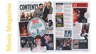
1.
2. Buttons-
There are two buttons overall used in this double page contents page . The
smallest of the two is located near the top right hand side of the page. This is a
good place to locate a button as it will catch the readers eye as they are about to
turn the page. The button that really catches my eye is located in the middle of
the left page. It clearly strikes as being more important that the other button as its
more larger and has the effect that its been previously crunched up and stuck onto
the magazine.
Images-
Most of the images are on the left page of the contents
page. This results in providing us with an attractive and
well created page that is fairly easy to locate around as
most of the writing is on the right page. The different
images highlight how many new and exciting things the
magazine has for its readers. This gives of the effect that it
worthy to be read by us due to its well organisation and
eye-catching skills.
In total there are 14 different images being presented on
this contents page in which all but one consist of one or
more people featured in the image. Just by looking at the
images, I can easily tell that the overpowering images are
ones of mid-shots or close ups. The only images with a full
body image is the black and white image located at the
bottom left of the left page. This image is of 4 people all
doing different posses wearing the exact same costume.
This symbolises that they could be in a band together due
to the similarities of costume. The reason for only having
one full bodied image is to highlight that the magazine
mostly focuses on the present news of the singer which is
featured rather than their journey they walked in order to
get to where they are now. Additionally looking at it on a
more logical scale, these mid –shots and close ups could be
to instantly provide the reader with physical information of
who the singer is rather than having a full bodied image
that is hard to interpret. The low angle shot image on the
right page is particularly exciting as it gives of the effect
that the orange dressed singer portrayed on the image is
very well respected. We can get this consumption from the
spot light behind the singers head, giving him a God like
represent ive.
There are four images which consist of the singer facing
side ways to the camera. This is a mysterious pose as it
hides half of the singers bodies which suggests that they all
have a secret or some exciting hidden past that Q magazine
could have information on.
Layout-
The layout of this magazine provides
us with a fun and enjoyable feel
which the magazine gives of. This is
due to the various colourful images
being illustrated around the
magazine.
Most of the images are clustered
together which looks well organised.
However the information about
each article are presented more
separated and spread out from each
other. This could be done to show
that they aren't related and are
individual and unique stories. I quite
like the fact the writings are spread
of through the right page as it makes
navigating around the article fairly
simple. There is a subscribe box
concerning social media, at the
bottom right hand corner of the
right page. Placing the subscribe box
here is advantageous as we
normally grab around that area in
order to turn the pages. This means
most readers will remember to
subscribe to the magazine on social
media as it is the last thing they
would see of that page.
Articles + Sections-
The articles illustrated are located on the right page of the article. The articles names are in a red sans serif font which follow the
theme of the red in the logo of the magazine which is more eye-catching and easy to search for a certain article. The numbers of each
article are inserted in a square, grey box. This makes them stand out for the rest of the writings. The articles are split into three
different sections however it is fairly hard to see where each section is split up due to images being placed between some of the
sections. I would stay away from this idea as it makes the page look a bit messy and unorganised which isn't the effect id be willing to
give of.
3.
4. Images-
The images on this magazine follows a different layout from the previous magazine’s content page. The images are presented near the middle of the magazine whilst the information are
then placed on the left and right hand side of the page. In terms of presentation, I really like this theme as it isn't all over the place like the previous contents page. The images location
provide the magazine with a formal and professional effect. However I could argue that this layout might not be well suited for a music magazine as the genre is more “IDGAF” and
rebellious themed. In addition, the actual genre for this magazine is film which explains why the layout is so different. I find it helpful that ive analysed a film contents page as well as a
music contents page because it gives me warnings on what to avoid so my music magazine keeps the traditional genre effect.
Its easy to pick up the colour theme that was issued to the magazine (Blue) The image on the top right page is of a close up of a girl. Her eye shadow and costume are presented as the
same blue that the text includes. The page numbers that are placed on the images are also in the same blue which is a very pleasant and warm colour to have. However the one themed
colour is fairly boring and doesn't catch your eye as the previous magazine did. Some of the images portrayed are overlapping each other which highlights which article is more important in
the hierarchy. In fact the images are placed in a way, as if the images themselves have come to life and are fighting on their importance. This is seen by the two tilted images in front of
much larger images in this contents page. There are also images of articles that are featured inside the magazine, on the contents page. This is useful as it gives the reader a detailed
image of what they need to look for in order to find that certain article.
Layout-
The layout of this magazine is very formal and provides us with an easy to read contents page. All the images are located in the middle of the
contents page while the description of each article is provided on both sides of the magazine. The masthead is located at the top left side of the
left page which then follows a list of articles running along the left side. The attention is mainly drawn to the images in the middle of the page.
This is because the particular area is the only place in the whole double page spread where there is a variety of colour and things going on in one
place. In fact the structure used whilst placing the images follows more of an informal effect rather than the writing along the edges of the
magazine which follows a formal theme.
Sections-
There are 4 sections in which the articles are divided in.
The feature section is the longest section which could
highlight it is at the top of the hierarchy, however the
smaller section (regulars) could also be interpreted as top
of the hierarchy as there is not much articles included. This
means that that those articles are limited and special. The
“in cinemas” section is different from the layout used in
the other sections. This could be done to highlight the
importance of these particular articles.
Articles-
The articles on here are in a format where
the page numbers are highlighted in bold and
are on the left hand side of the writing. The
colour used for the article descriptions are all
blue. The article names are in capitals to
emphasise the importance of these writings.
Furthermore the font is a formal, sans serif
font. The descriptions are located right
below the page number and article name.
Overall the articles follow a smart and formal
looking structure which makes navigating
through the contents page fairly easy.
5. What ideas can I take
from these magazines?
Buttons-
• The large button from the first magazine caught my eyes it consisted of a
crunched up effect which fitted the theme of punk rock as it presented the
messy, ‘IDGAF’ vibe you receive from that type of genre. Additionally I rarely
see buttons that look as appealing as this particular one which is why I want
to use it in my magazine.
Layout of images-
• I analysed two different genre magazines, music and film, in
which my intentions were to compare what was different from
each genre and what I should avoid doing in my own
magazine. This would mean I would have no trouble with
making sure my contents page screamed music magazine. The
biggest difference that struck out to me was the layout
between the two. The first magazine I analysed (music)
provided a messy and fun layout using the images. However
the film magazines layout was more formal. In fact all the
images were placed in a traditional square layout in the
middle of the page in various similar sizes, I didn't see one
massive image placed next to a extremely miniature image to
highlight contrast.
Images of Articles
• The second magazine consists of images of some of the articles that are
featured in this particular article. This is a useful idea to use as it lets the
reader know what sort of things will be included in this issue. Furthermore
having little images of the articles looks fun and eye-catching along with the
other images provided in my contents page.
Subscribe Box-
• Having a subscribe box in my contents page would be useful as it would
give my magazine a professional and highly successful appearance due to
the success on social media. Additionally it would also be a smart way to
advertise my magazine from print media to media on the screen.
Overlapping images-
• I really liked how the images on the second magazine
overlap each other frequently as it highlights conflict
between the images as to which is more important.
This is a really nice effect because it makes it look like
the images themselves have come to life! Using this
effect on my magazine (if done correctly) would make
my contents page look an extra mile better.