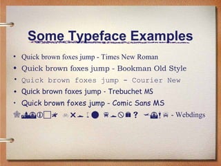
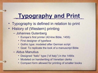
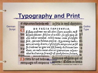
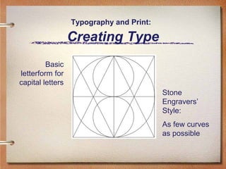
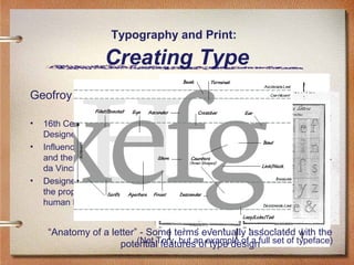
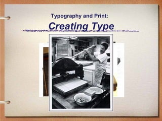
History of Typography
(History of Digital Font)
Robin Chin
November 7, 2006
What is “Typography?”
• The art and technique of printing
• The study and “process” of typefaces
– “Study”
•
•
•
•

Legibility or readability of typefaces and their layout
Attractiveness of typefaces and their layout
Functionality and effectiveness of typefaces and their layout
How a typeface/layout combo “enhances” or “honors” content

– “Process”
• Artistic composition of individual type
• Setting and arrangement of type
• Basic elements of “desktop publishing”

– Typeface
• A full set of type made to a particular design (size and style)
• A font
Some Typeface Examples
• Quick brown foxes jump - Times New Roman
• Quick brown foxes jump - Bookman Old Style
• Quick brown foxes jump - Courier New
• Quick brown foxes jump - Trebuchet MS
• Quick brown foxes jump - Comic Sans MS
  - Webdings
Typography and Print
• Typography is defined in relation to print
• History of (Western) printing
– Johannes Gutenberg
•
•
•
•

Europe’s first printer (42-line Bible, 1455)
First designer of typeface
Gothic type: modeled after German script
Goal: To replicate the look of a manuscript Bible

– Aldus Manutius
• Designed “Italic” type (“of Italy”) in the 1490s
• Modeled on handwriting of Venetian clerks
• Compact form allowed for printing of smaller books
Typography and Print
German
Script

Gothic
Type

Manutius’
Italic
Typography and Print:

Creating Type
Basic
letterform for
capital letters
Stone
Engravers’
Style:
As few curves
as possible
Typography and Print:

Creating Type
Geofroy Tory
•
•

•

16th Century French
Designer
Influenced by architecture
and the work of Leonardo
da Vinci
Designed his typeface on
the proportions of the
human body

“Anatomy of a letter” - Some terms eventually associated with the
(Not features of type design
potentialTory, but an example of a full set of typeface)
Typography and Print:

Creating Type
 Design of the typeface
 Creation of physical “type”





The
“form”

Type: (n.) piece of metal in which letter(s) are cast
Gutenberg’s innovation: movable, reusable type
See Robin Chin’s website on “Portability”

From physical type to printed page

{






The composing sticks: words formed, placed into sticks
The galley: sticks placed together, spaced apart
The chase: galley placed inside, wedges add margins
The form: inked, then placed in the printing press
Typography and Print:

Creating Type
Typography and Print:

The Power of Typography
• Theory: “Typography honors content”
• Related theory: typography honors industry and content
• Italics example: designed to fit business innovation

• Modernist theory: Typography as functional with content
• Modernist era: late 19th - early 20th century
• Political potential of (experimental) typography
• Different “rules” of typographic design - to encourage and
discourage certain values in the reading public

– Some political artistic groups of the time
• Futurist writers (Italy) - destruction is beautiful and necessary!
• Imagist poets (England) - the image itself is speech!
• Constructivists (Russia) - modernism is functionality!
Typography and Print:

The Power of Typography
• Typography takes an
• F.T. Marinetti
active Italian poet and founder of Futurism
– role in the content

– From Les mots en
• Visible as well as audibleliberté futuristes, 1919
• “I am
poetic elementstarting a typographic revolution, directed above

all against the idiotic, sick-making conception of the oldfashioned Poetry Book, with its hand-made paper, its
• Helped inspire later
sixteenth century style, decorated with galleons,
Minervas, Apollos,
modernist typographers to great initials …”
• “The book must
use strong contrasts in be the futuristic expression of our
futuristic thought.
type sizes and design, and Better: my revolution is against
among other things
new angles of typewhich is inthe so-called typographic harmony of
the page,
complete opposition to the style
which the page allows.”
Typography and Print:

The Power of Typography
• El Lissitzky

Sans-serif

– Russian constructivist and major artist of “new typography”
– “Topgraphy of Typography,” from the magazine Merz, 1922
• “On the printed page words are seen, not heard.”

Bold, basic colors of Expression - visual, not phonetic.”
• “Economy
• “The new book demands the new writer. Ink-pots and goosequills are dead.”
Use of photography
• “The printed page transcends time and space. The technology)
(new-ish printed
page, the infinity of the book, must be transcended. THE ELECTROLIBRARY.”

– Distinct break from old typography: total discarding of
decorative concepts and a turn to functional design
Typography and Print:

The Power of Typography
• Importance of “new typography” today
– A case where the form of printing adapted to fit the
conditions of modern life
– Declares that “form is not independent, but grows out
of function (purpose), out of the materials used
(organic or technical), and out of how they are used.”*
– Declares that clarity and not beauty is the essence of
typography
– Declares that asymmetry is generally more optically
effective than symmetry
* Jan Tschichold
Typography and Print:

The Power of Typography
• Importance of “new typography” today
– Considered blank space to be as much as a formal
element of typography as black type
– Continued to encourage standardization
– Blurred the line between “high art” and “mass media”
– Blurred the distinction between image and language
– Predicted the future importance of typographic design
to advertising
Typography Today
• Typography in the digital environment
– New process of typeface design
• computer programs vs. hand design and casting

– New possibilities for layout with the screen
• computer programs vs. galleys, etc.

– New elements of expression
• text and images
• sound and animation
• screen brightness and contrast

– New concept of materiality
• pixels vs. ink
• links, buttons, IP addresses
Digital Typography
• Some digitally adopted typefaces
– Times New Roman
• 1932, The Times of London Newspaper

– Bookman Old Style
• 1858, A.C. Phemister in Edinburgh, Scotland

– Courier New
•
•
•
•

1955, Howard Kettler
Designed as a typewriter face
Commissioned by IBM
Design as a monospaced font (hence easy to align as
columns of text) makes it a valuable typeface for coding
Digital Typography
• Some digitally created typefaces
– Trebuchet MS
• 1996, Microsoft typeface designed to be readable at small
sizes and at low resolutions
• Based on humanist sans serif typeface designs of the
1920s and 30s

– Comic Sans MS
• 1994 (developed), released as part of Windows 95 Plus!
Pack
• Based on the generic lettering style of comic strips

  (Webdings)
• 1997, designed in response to web designers’ need for
easy method of incorporating graphics in their pages
Conclusion:
Online Reading Practices
• Lesson from early history of print
– Typographic design is an essential issue in the printing
revolution and print culture

• Lesson from modernist typography
– “Form is not independent, but grows out of function
(purpose), out of the materials used (organic or technical),
and out of how they are used” - i.e. new reading practices

• Lesson from the development of digital fonts
– As the webpage borrows from the printed page, so digital
font has borrowed heavily from printed typefaces
– As the webpage develops further uses distinct from the
page, so grows the need to revisit typography, its history,
and its future
Conclusion:
Online Reading Practices
• Aesthetics and computing courses
– MAS 962: Digital Typography

• Records of digital typographic development
– Microsoft typography research group

• Digital typography programs
– Font-Lab

• Publications on digital typography
– Donald Knuth’s Digital Typography series
Some Printed Sources and
Resources
• Drucker, Johanna. The Visible Word: Experimental
Typography and Modern Art, 1901-1923 (Chicago:
University of Chicago Press, 1994).
• McGann, Jerome. The Visible Language of
Modernism (Princeton: Princeton University Press,
1993).
• Tschichold, Jan. The New Typography: A Handbook
for Modern Designers, trans. Ruari McLean
(Berkeley: University of California Press, 1995).

Typography

  • 1.
    History of Typography (Historyof Digital Font) Robin Chin November 7, 2006
  • 2.
    What is “Typography?” •The art and technique of printing • The study and “process” of typefaces – “Study” • • • • Legibility or readability of typefaces and their layout Attractiveness of typefaces and their layout Functionality and effectiveness of typefaces and their layout How a typeface/layout combo “enhances” or “honors” content – “Process” • Artistic composition of individual type • Setting and arrangement of type • Basic elements of “desktop publishing” – Typeface • A full set of type made to a particular design (size and style) • A font
  • 3.
    Some Typeface Examples •Quick brown foxes jump - Times New Roman • Quick brown foxes jump - Bookman Old Style • Quick brown foxes jump - Courier New • Quick brown foxes jump - Trebuchet MS • Quick brown foxes jump - Comic Sans MS   - Webdings
  • 4.
    Typography and Print •Typography is defined in relation to print • History of (Western) printing – Johannes Gutenberg • • • • Europe’s first printer (42-line Bible, 1455) First designer of typeface Gothic type: modeled after German script Goal: To replicate the look of a manuscript Bible – Aldus Manutius • Designed “Italic” type (“of Italy”) in the 1490s • Modeled on handwriting of Venetian clerks • Compact form allowed for printing of smaller books
  • 5.
  • 6.
    Typography and Print: CreatingType Basic letterform for capital letters Stone Engravers’ Style: As few curves as possible
  • 7.
    Typography and Print: CreatingType Geofroy Tory • • • 16th Century French Designer Influenced by architecture and the work of Leonardo da Vinci Designed his typeface on the proportions of the human body “Anatomy of a letter” - Some terms eventually associated with the (Not features of type design potentialTory, but an example of a full set of typeface)
  • 8.
    Typography and Print: CreatingType  Design of the typeface  Creation of physical “type”     The “form” Type: (n.) piece of metal in which letter(s) are cast Gutenberg’s innovation: movable, reusable type See Robin Chin’s website on “Portability” From physical type to printed page {     The composing sticks: words formed, placed into sticks The galley: sticks placed together, spaced apart The chase: galley placed inside, wedges add margins The form: inked, then placed in the printing press
  • 9.
  • 10.
    Typography and Print: ThePower of Typography • Theory: “Typography honors content” • Related theory: typography honors industry and content • Italics example: designed to fit business innovation • Modernist theory: Typography as functional with content • Modernist era: late 19th - early 20th century • Political potential of (experimental) typography • Different “rules” of typographic design - to encourage and discourage certain values in the reading public – Some political artistic groups of the time • Futurist writers (Italy) - destruction is beautiful and necessary! • Imagist poets (England) - the image itself is speech! • Constructivists (Russia) - modernism is functionality!
  • 11.
    Typography and Print: ThePower of Typography • Typography takes an • F.T. Marinetti active Italian poet and founder of Futurism – role in the content – From Les mots en • Visible as well as audibleliberté futuristes, 1919 • “I am poetic elementstarting a typographic revolution, directed above all against the idiotic, sick-making conception of the oldfashioned Poetry Book, with its hand-made paper, its • Helped inspire later sixteenth century style, decorated with galleons, Minervas, Apollos, modernist typographers to great initials …” • “The book must use strong contrasts in be the futuristic expression of our futuristic thought. type sizes and design, and Better: my revolution is against among other things new angles of typewhich is inthe so-called typographic harmony of the page, complete opposition to the style which the page allows.”
  • 12.
    Typography and Print: ThePower of Typography • El Lissitzky Sans-serif – Russian constructivist and major artist of “new typography” – “Topgraphy of Typography,” from the magazine Merz, 1922 • “On the printed page words are seen, not heard.” Bold, basic colors of Expression - visual, not phonetic.” • “Economy • “The new book demands the new writer. Ink-pots and goosequills are dead.” Use of photography • “The printed page transcends time and space. The technology) (new-ish printed page, the infinity of the book, must be transcended. THE ELECTROLIBRARY.” – Distinct break from old typography: total discarding of decorative concepts and a turn to functional design
  • 13.
    Typography and Print: ThePower of Typography • Importance of “new typography” today – A case where the form of printing adapted to fit the conditions of modern life – Declares that “form is not independent, but grows out of function (purpose), out of the materials used (organic or technical), and out of how they are used.”* – Declares that clarity and not beauty is the essence of typography – Declares that asymmetry is generally more optically effective than symmetry * Jan Tschichold
  • 14.
    Typography and Print: ThePower of Typography • Importance of “new typography” today – Considered blank space to be as much as a formal element of typography as black type – Continued to encourage standardization – Blurred the line between “high art” and “mass media” – Blurred the distinction between image and language – Predicted the future importance of typographic design to advertising
  • 15.
    Typography Today • Typographyin the digital environment – New process of typeface design • computer programs vs. hand design and casting – New possibilities for layout with the screen • computer programs vs. galleys, etc. – New elements of expression • text and images • sound and animation • screen brightness and contrast – New concept of materiality • pixels vs. ink • links, buttons, IP addresses
  • 16.
    Digital Typography • Somedigitally adopted typefaces – Times New Roman • 1932, The Times of London Newspaper – Bookman Old Style • 1858, A.C. Phemister in Edinburgh, Scotland – Courier New • • • • 1955, Howard Kettler Designed as a typewriter face Commissioned by IBM Design as a monospaced font (hence easy to align as columns of text) makes it a valuable typeface for coding
  • 17.
    Digital Typography • Somedigitally created typefaces – Trebuchet MS • 1996, Microsoft typeface designed to be readable at small sizes and at low resolutions • Based on humanist sans serif typeface designs of the 1920s and 30s – Comic Sans MS • 1994 (developed), released as part of Windows 95 Plus! Pack • Based on the generic lettering style of comic strips   (Webdings) • 1997, designed in response to web designers’ need for easy method of incorporating graphics in their pages
  • 18.
    Conclusion: Online Reading Practices •Lesson from early history of print – Typographic design is an essential issue in the printing revolution and print culture • Lesson from modernist typography – “Form is not independent, but grows out of function (purpose), out of the materials used (organic or technical), and out of how they are used” - i.e. new reading practices • Lesson from the development of digital fonts – As the webpage borrows from the printed page, so digital font has borrowed heavily from printed typefaces – As the webpage develops further uses distinct from the page, so grows the need to revisit typography, its history, and its future
  • 19.
    Conclusion: Online Reading Practices •Aesthetics and computing courses – MAS 962: Digital Typography • Records of digital typographic development – Microsoft typography research group • Digital typography programs – Font-Lab • Publications on digital typography – Donald Knuth’s Digital Typography series
  • 20.
    Some Printed Sourcesand Resources • Drucker, Johanna. The Visible Word: Experimental Typography and Modern Art, 1901-1923 (Chicago: University of Chicago Press, 1994). • McGann, Jerome. The Visible Language of Modernism (Princeton: Princeton University Press, 1993). • Tschichold, Jan. The New Typography: A Handbook for Modern Designers, trans. Ruari McLean (Berkeley: University of California Press, 1995).