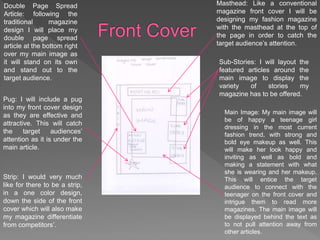
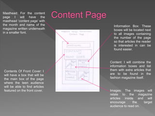
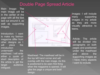
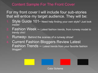
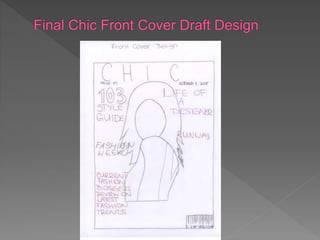
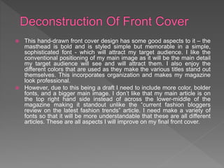
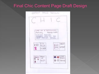
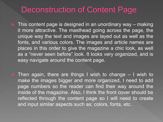
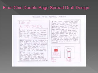
For my preproduction Media Studies Foundation
Portfolio Task I achieved a various amount of
research into existing magazines and their
presentation through front covers, content pages
and double page spread articles. I analyzed how
magazines designed their front covers, content
pages and double page spreads and saw how I
could incorporate some techniques into my own
fashion magazine. I have worked towards
designing and developing my magazine in order
for my magazine to allure to the precise target
audience.
Double Page Spread
Article: following the
traditional magazine
design I will place my
double page spread
article at the bottom right
over my main image as
it will stand on its own
and stand out to the
target audience.
Strip: I would very much
like for there to be a strip,
in a one color design,
down the side of the front
cover which will also make
my magazine differentiate
from competitors’.
Pug: I will include a pug
into my front cover design
as they are effective and
attractive. This will catch
the target audiences’
attention as it is under the
main article.
Masthead: Like a conventional
magazine front cover I will be
designing my fashion magazine
with the masthead at the top of
the page in order to catch the
target audience’s attention.
Sub-Stories: I will layout the
featured articles around the
main image to display the
variety of stories my
magazine has to be offered.
Main Image: My main image will
be of happy a teenage girl
dressing in the most current
fashion trend, with strong and
bold eye makeup as well. This
will make her look happy and
inviting as well as bold and
making a statement with what
she is wearing and her makeup.
This will entice the target
audience to connect with the
teenager on the front cover and
intrigue them to read more
magazines. The main image will
be displayed behind the text as
to not pull attention away from
other articles.
Masthead: For the content
page I will have the
masthead ‘content page’ with
the month and name of the
magazine written underneath
in a smaller font.
Contents Of Front Cover: I
will have a box that will be
the main box of the page
where the teen audience
will be able to find articles
featured on the front cover.
Information Box: These
boxes will be located next
to all images containing
the number of the page
so that articles the reader
is interested in can be
found easier.
Content: I will combine the
information boxes and list
them with extra articles that
are to be found in the
fashion magazine itself.
Images: The images will
relate to the magazine
articles inside and will
encourage the target
audience to read on.
Main Image: The
main image will be
in the center of the
page with all the text
laid out around it, as
well as supporting
images.
Images: I will include
many supporting
images in my article
as they are more
visually attractive to
teens.
Article: The article
will be divided into
paragraphs on both
pages and positioned
under the masthead
and above the
supporting images as
I have many aspects
I want to include.
Introduction: I want
to make my fashion
magazine differ from
other designs as I
will place the
introduction
underneath the
masthead. I will write
either a quote of
short description of
the article to get the
target audience
intrigued.
Masthead: The masthead will be in
the top left hand corner and will
overlap with the main image. As this
is positioned to be seen first thing
when the magazine is opened. It will
gibe the page a unique and bold
design.
For my front cover I will include four sub-stories
that will entice my target audience. They will be:
1. Style Guide 101- Need help finding your own style? Just look
inside!
2. Fashion Week – Latest fashion trends, from runway model to
trendy chic!
3. Runway- Behind the scenes of a runway show!
4. Current Fashion Bloggers Review Latest
Fashion Trends – Latest trends from your favorite fashion
blogger!
Color Scheme
 This hand-drawn front cover design has some good aspects to it – the
masthead is bold and is styled simple but memorable in a simple,
sophisticated font - which will attract my target audience. I like the
conventional positioning of my main image as it will be the main detail
my target audience will see and will attract them. I also enjoy the
different colors that are used as they make the various titles stand out
themselves. This incorporates organization and makes my magazine
look professional.
 However, due to this being a draft I need to include more color, bolder
fonts, and a bigger main image. I don’t like that my main article is on
the top right hand side instead of across the lower-middle of the
magazine making it standout unlike the “current fashion bloggers
review on the latest fashion trends” article. I need make a variety of
fonts so that it will be more understandable that these are all different
articles. These are all aspects I will improve on my final front cover.
 This content page is designed in an unordinary way – making
it more attractive. The masthead going across the page, the
unique way the text and images are layed out as well as the
fonts, and various colors. The images and article names are
places in this order to give the magazine a chic look, as well
as a “never seen before” look. It looks very organized, and is
easy navigate around the content page.
 Then again, there are things I wish to change – I wish to
make the images bigger and more organized, I need to add
page numbers so the reader can find their way around the
inside of the magazine. Also, I think the front cover should be
reflected through the content page so I will need to create
and input similar aspects such as; colors, fonts, etc.
 I have designed an unconventional double page spread with
various ideas to go with it, I like how the masthead is in the
middle of the left hand side so that it can grab the attention of
the target audience. I like that I put an introduction to the article
under the masthead to give the reader a little taste of what they
will be reading in the article. I like that I have photos from the
fashion show she has this year for her new collection.
 On the other hand this double page spread is not as easy to do
as I only have a few images from her fashion show, of make up,
accessories etc. Even though the idea of the magazine is make
up, make-overs, fashion, etc. Even though the idea of the life of
a designer is quite unique there are limited things you can say
as well as images you can use. I will explore other article
subject ideas for my final design.
For my double page spread I will include an article done on a Serbian Fashion
Designer founded in Dubai.
Jelena Bin Drai is our well-known “Miss Yugoslavia”. She has been in the fashion
and modeling business since as far as she can remember. She now juggles the life
of being a mother of three, a loving wife and, as if her plate is not full enough, she
is a fashion designer as well.
As she lives in Dubai, UAE she targets her audience by creating appropriate
apparel. For example, long dresses, skirts, and makes them designer chic in
various colors, as well as lengths.
 For my initial designs I have assessed the positive and
negative aspects. I have developed my existing ideas
and I have eliminated ideas that neglect my idea from
becoming a reality.
 On the content page I have retained the same layout.
After seeing that my “Life Of A Designer” double page
spread article was unrealistic, and incomplete I decided
to write a whole new double page spread that is about
the same topic “Life Of A Designer.” I added an interview
to make it more interesting to my target audience, as well
as photos from photo-shoots and fashion shows.

AS Media Magazine design layout

  • 2.
    For my preproductionMedia Studies Foundation Portfolio Task I achieved a various amount of research into existing magazines and their presentation through front covers, content pages and double page spread articles. I analyzed how magazines designed their front covers, content pages and double page spreads and saw how I could incorporate some techniques into my own fashion magazine. I have worked towards designing and developing my magazine in order for my magazine to allure to the precise target audience.
  • 4.
    Double Page Spread Article:following the traditional magazine design I will place my double page spread article at the bottom right over my main image as it will stand on its own and stand out to the target audience. Strip: I would very much like for there to be a strip, in a one color design, down the side of the front cover which will also make my magazine differentiate from competitors’. Pug: I will include a pug into my front cover design as they are effective and attractive. This will catch the target audiences’ attention as it is under the main article. Masthead: Like a conventional magazine front cover I will be designing my fashion magazine with the masthead at the top of the page in order to catch the target audience’s attention. Sub-Stories: I will layout the featured articles around the main image to display the variety of stories my magazine has to be offered. Main Image: My main image will be of happy a teenage girl dressing in the most current fashion trend, with strong and bold eye makeup as well. This will make her look happy and inviting as well as bold and making a statement with what she is wearing and her makeup. This will entice the target audience to connect with the teenager on the front cover and intrigue them to read more magazines. The main image will be displayed behind the text as to not pull attention away from other articles.
  • 5.
    Masthead: For thecontent page I will have the masthead ‘content page’ with the month and name of the magazine written underneath in a smaller font. Contents Of Front Cover: I will have a box that will be the main box of the page where the teen audience will be able to find articles featured on the front cover. Information Box: These boxes will be located next to all images containing the number of the page so that articles the reader is interested in can be found easier. Content: I will combine the information boxes and list them with extra articles that are to be found in the fashion magazine itself. Images: The images will relate to the magazine articles inside and will encourage the target audience to read on.
  • 6.
    Main Image: The mainimage will be in the center of the page with all the text laid out around it, as well as supporting images. Images: I will include many supporting images in my article as they are more visually attractive to teens. Article: The article will be divided into paragraphs on both pages and positioned under the masthead and above the supporting images as I have many aspects I want to include. Introduction: I want to make my fashion magazine differ from other designs as I will place the introduction underneath the masthead. I will write either a quote of short description of the article to get the target audience intrigued. Masthead: The masthead will be in the top left hand corner and will overlap with the main image. As this is positioned to be seen first thing when the magazine is opened. It will gibe the page a unique and bold design.
  • 7.
    For my frontcover I will include four sub-stories that will entice my target audience. They will be: 1. Style Guide 101- Need help finding your own style? Just look inside! 2. Fashion Week – Latest fashion trends, from runway model to trendy chic! 3. Runway- Behind the scenes of a runway show! 4. Current Fashion Bloggers Review Latest Fashion Trends – Latest trends from your favorite fashion blogger! Color Scheme
  • 10.
     This hand-drawnfront cover design has some good aspects to it – the masthead is bold and is styled simple but memorable in a simple, sophisticated font - which will attract my target audience. I like the conventional positioning of my main image as it will be the main detail my target audience will see and will attract them. I also enjoy the different colors that are used as they make the various titles stand out themselves. This incorporates organization and makes my magazine look professional.  However, due to this being a draft I need to include more color, bolder fonts, and a bigger main image. I don’t like that my main article is on the top right hand side instead of across the lower-middle of the magazine making it standout unlike the “current fashion bloggers review on the latest fashion trends” article. I need make a variety of fonts so that it will be more understandable that these are all different articles. These are all aspects I will improve on my final front cover.
  • 12.
     This contentpage is designed in an unordinary way – making it more attractive. The masthead going across the page, the unique way the text and images are layed out as well as the fonts, and various colors. The images and article names are places in this order to give the magazine a chic look, as well as a “never seen before” look. It looks very organized, and is easy navigate around the content page.  Then again, there are things I wish to change – I wish to make the images bigger and more organized, I need to add page numbers so the reader can find their way around the inside of the magazine. Also, I think the front cover should be reflected through the content page so I will need to create and input similar aspects such as; colors, fonts, etc.
  • 14.
     I havedesigned an unconventional double page spread with various ideas to go with it, I like how the masthead is in the middle of the left hand side so that it can grab the attention of the target audience. I like that I put an introduction to the article under the masthead to give the reader a little taste of what they will be reading in the article. I like that I have photos from the fashion show she has this year for her new collection.  On the other hand this double page spread is not as easy to do as I only have a few images from her fashion show, of make up, accessories etc. Even though the idea of the magazine is make up, make-overs, fashion, etc. Even though the idea of the life of a designer is quite unique there are limited things you can say as well as images you can use. I will explore other article subject ideas for my final design.
  • 15.
    For my doublepage spread I will include an article done on a Serbian Fashion Designer founded in Dubai. Jelena Bin Drai is our well-known “Miss Yugoslavia”. She has been in the fashion and modeling business since as far as she can remember. She now juggles the life of being a mother of three, a loving wife and, as if her plate is not full enough, she is a fashion designer as well. As she lives in Dubai, UAE she targets her audience by creating appropriate apparel. For example, long dresses, skirts, and makes them designer chic in various colors, as well as lengths.
  • 16.
     For myinitial designs I have assessed the positive and negative aspects. I have developed my existing ideas and I have eliminated ideas that neglect my idea from becoming a reality.  On the content page I have retained the same layout. After seeing that my “Life Of A Designer” double page spread article was unrealistic, and incomplete I decided to write a whole new double page spread that is about the same topic “Life Of A Designer.” I added an interview to make it more interesting to my target audience, as well as photos from photo-shoots and fashion shows.