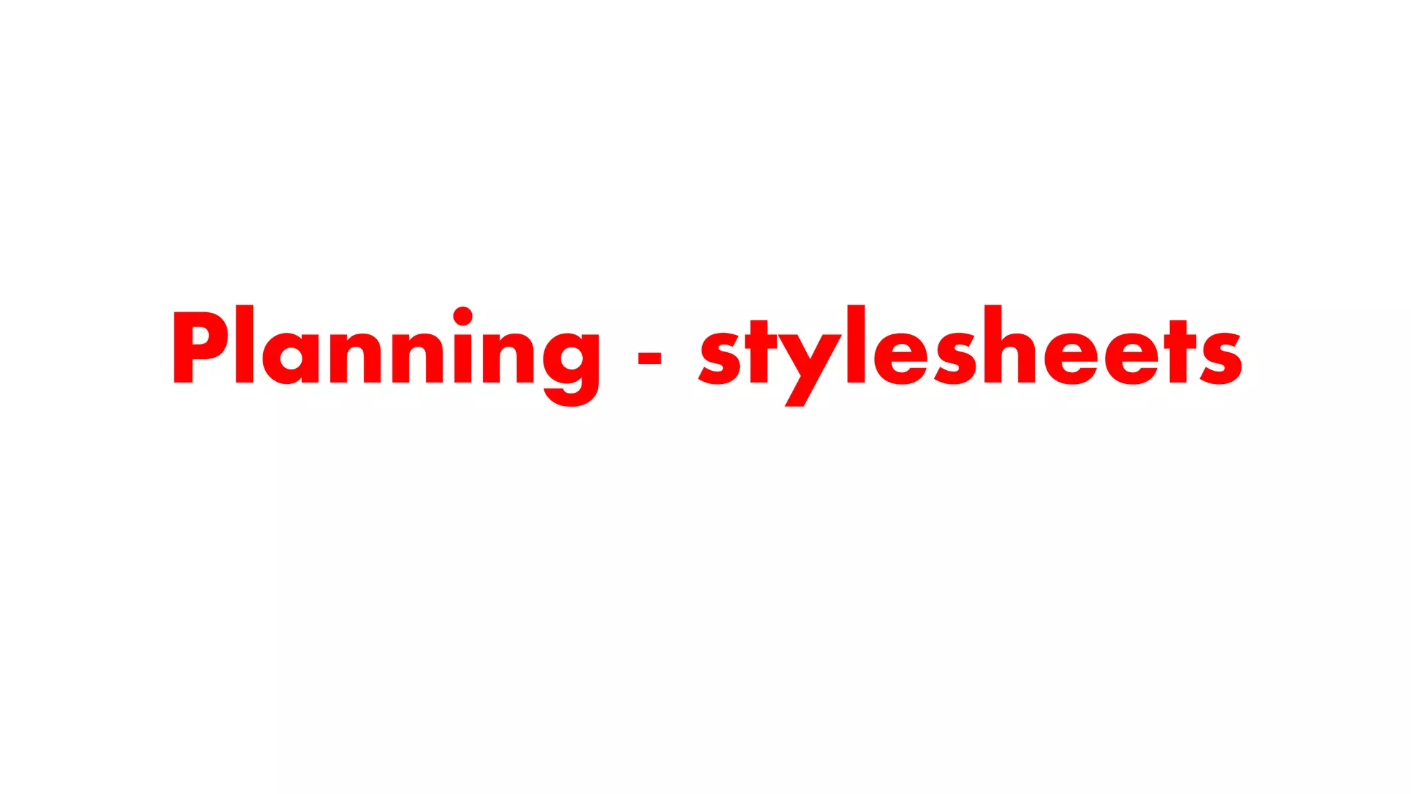
The document discusses planning the stylesheets for a magazine, including:
1) Choosing a gender-neutral color scheme of red, white, and black to appeal to a wide audience.
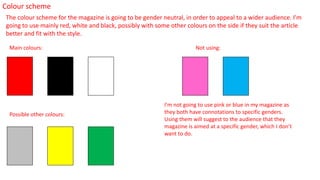
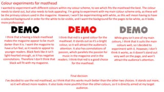
2) Brainstorming masthead ideas and selecting "Demo" as it closely relates to discussing new music releases.
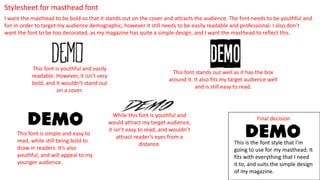
3) Choosing a bold yet youthful, readable font for the masthead that reflects the simple design.
4) Experimenting with different masthead colors and deciding on red as it stands out and has passionate connotations.
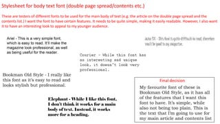
5) Testing body text fonts to be simple but interesting for younger readers.
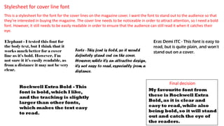
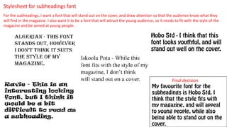
6) Choosing fonts for cover lines, subheadings and ensuring they