SlideShare a Scribd company logo
Evaluation 1: In what ways does your media product use, develop or challenge forms and conventions of real media products.
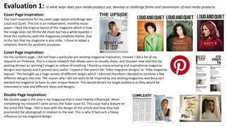
Cover Page inspiration:
The main inspiration for my cover page layout and design was
Loud and Quiet. This too is an independent, monthly music
paper. I liked the original layout of the magazine which is how
the image does not fill the A4 sheet but has a white boarder. I
think this conforms with the magazines simplistic theme. Due
to the fact that my magazine is also indie, I chose to adapt a
simplistic theme for aesthetic purposes.
Cover Page inspiration:
For my contents page, I did not have a particular pre existing magazine inspiration. Instead, I did a lot of my
research on Pinterest. This is a social network that allows users to visually share, and discover new interests by
posting (known as 'pinning') images or videos of anything. I found so many amazing and inspirational magazine
designs and layouts and it proved very useful. I typed in the search bar ‘indie magazine designs’ or ‘indie magazine
layouts’. This brought up a huge variety of different deigns which I admired therefore I decided to combine a few
different designs into one. The reason why I did not want to be inspired by any existing magazines was because I
wanted my magazine to have its own unique feature. This would attract my target audience as they would be
interested in new and different ideas and designs.
Double Page inspiration:
My double page is the area o my magazine that is most heavily influenced. When
completing my research I came across the Fader issue 91. This issue had a feature on
the artist FKA Twigs. I fell in love with the design of this article and how they had
positioned the photograph in relation to the text. This is why it had such a heavy
influence on my magazine design.
The title of the magazine:
The name of my magazine is ’The Upside’. The idea came after the research of my target audience. I needed something that would target
all their interest but also be reasonably short and simple. I was inspired by the saying ’everything has its downsides’. Meaning that nothing
in life is perfect, everything has negatives. However, I wanted my magazine to give more positive vibes to the reader, therefore I wanted to
focus on the positives in life – so I came up with The Upside (opposing the downside in the quote). Because my magazine is targeting a
reasonably creative audience, I feel that. My masthead was heavily influenced by the popular music magazines ’Loud and Quiet’, ‘Fader’
and ’Dazed’. As previously mentioned, due to the indie genre of my music magazine I wanted to follow popular indie magazine
conventions by keeping my magazine simplistic. However, simultaneously I loved that I could manipulate the meaning of the title to do
something unconventional and different to make the title more memorable. Although ‘The Upside’ represents the good times in life, I also
used the meaning literally by rotating the letter ’i’ upisde down. Therefore I chose a standard and prominent font type Ariel. Not only was
this font well suited for the aesthetics of my magazine but choosing a non-complex font type was also important to me as I wanted the
masthead to be eye catching and very easy to read. This would mean that even from the corner of someone's eye, you would be able to
make out the title. Again this is another reason why I chose to keep the title black on white. After researching Karl Borgrgrafe’s tests to see
which colours worked best together and looking at his taxonomy of colour mixes, I discovered that black text on a white background was
5th most legible. This would therefore decrease the difficulty of reading the title from a distance or whilst moving.
Graphology/ Page layouts:
Due to the fact that my main inspirations were other indie music magazines like Clash, Loud and Quiet and Fader, I was following
the simplistic theme as it appears clean and professional. Therefore, for my choice of fonts, I didn’t have a huge range. For most of
my text on the cover page, I used ‘Arial Bold’. This was because it was simplistic and didn’t draw to much attention away from the
photograph, which was my main focus on the cover page. I wanted this to be the main focus as Clive Edwards advice on layout
included a quote from Rodger Black which states “A cover should be a poster. A single image of a human will sell more copies than
multiple images or all type. Always has, always will.”. Therefore, by following this advice I hoped that my magazine would be more
successful. In addition, when looking at Clash, Fader and Loud and Quiet, they too had a very similar font choice. Furthermore, my
more contrasting fonts were ‘EDO Sz’ and ‘Bodoni 72 bold’ I used these fonts when I wanted to focus the audience’s attention to an
extra detail and add some individual style to my magazine. Something that would set me apart from other magazines, say Fader.
The sizing of the masthead and coverlines decreased in size due to the level of importance. The masthead is by far the biggest in
size as this is how the audience can identify my magazine in relation to other magazines. Next is the name of my main feature artist
and the name of her article in the magazine. I used the ‘EDO Sz’ for this text as, although the sizing wasn’t the biggest because it
wasn’t the most important feature, I still wanted the audience to acknowledge it. I also changed the colour of the text to the same
as the models lipstick, so it would not look out of place and to further focus the audience’s attention to
her name. Ideally this would be a selling point for my magazine as the audience would know my artist, as
she is a recognizable figure to the indie culture, and want to purchase the magazine so they could read
about her. Following this, my other coverline text which is placed next to the image and is my third most
important text on the cover page. This too is promoting other feature artists which may capture my target
audience. I decided to put this text on the right hand side of the artist as her head is slightly tilted the left
and would therefore prevent there being an empty space. Simultaneously, the issue number of my
magazine and price is equal in size as it is giving the audience important information. The smallest text on
the page is the tag lines placed at the bottom of the page. This text is a brief summary of everything that
the magazine includes. It is not essential for the audience to see, however if they were undecided on
whether to purchase the magazine they could always refer to this text to see if it persuades them further. I
love the overall colour palette of my cover page as I believe each colour compliments one another well. It
also creates a muted, vintage feel to my magazine. I think this would attract my audience as it is
aesthetically pleasing. For the contents page I stuck to a similar colour palette as I wanted it to be a
recurring theme through out my magazine as it will tie everything together. My double page was heavily
influenced from the Fader magazine featuring FKA Twigs. I loved the unconventional style of this page. It
displayed the same white borders as my cover, which once again would help my magazine to come
together as a whole. I also loved the originality of the text, how it is purposely placed behind the image.
This is an unconventional feature as it is not featured in any other magazines in my genre. And although
the artists name is covered by the image, it is not overly important. My artist is, supposedly, so
recognizable and her name is clearly established everywhere else in the magazine, that it shouldn’t
confuse the audience.
Here’s the example
of the Fader article
that inspired the
layout for my
double page spread.
You can see how the
layout is similar.
Costumes, props, iconography used to reflect genre:
My model, ‘Margot Lee’s’ outfit was chosen very carefully. I stuck to a very simplistic overall look as I wanted her style to appear innate. I chose to only dress her in black and white clothes as
any other colour may distract the audience from her facial features. I also thought it would give me more flexibility when effecting my final image and colouring the text in my magazine. By
adding coloured text and an effected image, I thought that it would set my magazine apart from other indie magazines like Fader and Clash and add individuality. For the final outfit, I chose a
loose fitting white top which could give the impression that her outfit didn’t take too much thought. However, the colour would connote a fresh and clean look. I also chose a black lace
bralette that would be visible over the shoulder. The lace added a bit of individuality and stopped the outfit from looking too plain. In addition, it also brings a feminine and elegant feel to the
outfit. As a part of the costume, I also chose to add a simple sliver necklace. Once again, this would add some more detail to the outfit. I also thought that it would add some personality to
the costume to stop the model from looking too ‘fake’. The necklace is supposed to represent a sentimental gift from a family member which I thought would demonstrate to the audience
that she is caring and loving, in the hope that she would appear more appealing. Additionally, I also accessorised with some hoop earrings. When completing my research for my artist’s style,
I found that I loved this trend which is incorporated from a typical 90’s style. Therefore, by adding them to the outfit I thought my artist would look very trendy. This conforms to the genre of
indie music magazines as they are heavily associated with fashion. Lastly, in one of the pictures on my contents page, I have featured a wooden stool. I chose to use this opposed to a plastic
chair as I thought it would reflect my indie genre more accurately. Since the wooden chair is battered and clearly worn with age, it appears vintage. This means that it is one of a kind and
therefore reflects styling in the indie/alternative culture.
Camera work, lighting and framing images:
Although the majority of my work follows the common codes and conventions of other indie
magazines, I have also attempted to add some unconventional features. The conventional
features are areas where I have included predominantly mid/ mid-close up shots throughout
my magazine focusing on style, facial expression and makeup. Also, in most my photographs,
the model remains in the centre of the image so that the audience’s attention is drawn to
her each time. However, the photograph on my cover page, the model is tilting her head to
left. This makes the model appear slightly off centre, following the thirds rule in
photography meaning that a professional photo has been created to allow my magazine to
look realistic. Having researched lots of photography inspiration, I discovered that I love the
photographs where there is a light shadow cast across the face. I love that it highlights the
facial feature presenting my model as very beautiful. According to Laura Mulvey and her
theory about the male gaze, this would cater for my male audience as they would be
attracted to the beauty of my artist. Therefore when I was taking the pictures, I positioned
two light boxes to the right hand side of my model whilst keeping the other directly in front.
This would prevent the photographs from being too contrasted and concealing the left-hand
side of the face whilst creating a soft shadow. I was really pleased with how they turned out,
although I did have to brighten the images and lower the contrast as the photo was still a
little too dark. Out of the two photographs on my contents page, one is a simple close-up
shot whilst the other is a little more interesting. I chose to seat my model on a wooden
stool. This idea came from my photography inspiration mood board. I loved it because I
thought it would allow me to become more experimental with my poses whilst featuring the
whole costume. As this is an indie magazine, I thought that the originality of the phot would
capture my audience.
Article, header etc font and style:
Unlike my contents page, where I didn’t have a direct influence from any other magazine – my double page spread is heavily influenced by an article
in the Fader magazine. The Fader magazine issue 91 included an article with FKA Twigs was a huge inspiration in the layout of my double page spread.
The main photograph is on the left hand side of the page with a white boarder around the outskirts. I thought by including the white boarder I would
consolidate the influence from the Loud and Quiet magazine (which was evident on my cover). Further more, I also used the font ‘Edo Sz’ to connect
the artist’s name on the title with the article. It is also different and quirky which adds some individuality to the article. I used the font ‘Futura’ which
I found on the website fontinuse.com. I loved the simplicity of it and thought that it would fit perfectly with my minimalistic theme. I also thought
that it would be easy to read in such a small font size in my article.
Genre and how the magazine cover, contents and double page spread suggests it:
My magazine conforms to the common conventions and styling of typical indie magazines. With its white
and black minimalistic theme it creates a fresh and clean look. On top of the modern feel, it is
complimented with some smaller details which makes the magazine unlike any other magazine. This is
always important when designing an indie magazine because although there is a clear style to follow each
magazine is different in some way making it original. The unique details is what will make the audience
more inclined to purchase it. Having researched numerous other indie magazines, I learnt to follow the
one thing they all had in common - having the photography at the center of attention throughout the
magazine.
How the artist is represented:
In order do captivate my audience demographic effectively, I decided that I wanted to portray my artist
as an idealistic character for my reader. By portraying her in this way, the audience will look up to her.
The key traits I wanted my artist to represent was confidence, creativity, intelligence, to be caring and
fashionable. I didn’t want her to be especially feminine which is why she doesn’t wear to much pink (a
colour generically associated with women). Despite this did want her to appear elegant, hence why for
her costume I chose to add lace. In this way she connotes other indie female artists like Lorde and
Birdy. I specifically wanted the confidence to shine through in my photography to highlight the strength
of female roles in the indie scene as it is mostly dominated by mole artists. I thought that this would
attract a greater audience in my magazine as the indie culture is surrounded by the idea of
experimenting with new and unique ideas.
Colour scheme:
For my colour scheme, I maintained a muted tone throughout my magazine. It was important to me
that the colour scheme remained consistent throughout my magazine to tie my product together as a
whole. I followed the typical conventions of an indie magazine by using a simplistic black on white
foundation. Therefore when taking my photographs I kept the outfit black and white too. I also kept my
images monochrome so that it would allow me to effect my images after taking them. On many of the
indie magazine photographs (particularly Loud and Quiet magazine) the images had an effect that gave
the impression the image was taken on a film camera. This is a trend I had noticed a lot when
researching the indie culture therefore I thought it was important to feature it in my magazine.

More Related Content

What's hot

Music Magazine Evaluation
Music Magazine Evaluation Music Magazine Evaluation
Music Magazine Evaluation katiebird1996
 
In what ways does your music magazine use, develop or challenge forms and con...
In what ways does your music magazine use, develop or challenge forms and con...In what ways does your music magazine use, develop or challenge forms and con...
In what ways does your music magazine use, develop or challenge forms and con...Toddy888
 
Question 1
Question 1Question 1
Question 18210_SK
 
Evaluation:
Evaluation:Evaluation:
Evaluation:07tjames
 
Research and Planning- Media Studies- Main Task
Research and Planning- Media Studies- Main TaskResearch and Planning- Media Studies- Main Task
Research and Planning- Media Studies- Main TaskEvieTheodore
 
Research
ResearchResearch
Magazine Pre-production Planning Stage
Magazine Pre-production Planning StageMagazine Pre-production Planning Stage
Magazine Pre-production Planning Stage
GeorginaMediaStudies
 
Evaluation Question 1
Evaluation Question 1Evaluation Question 1
Evaluation Question 1alicebarrett
 
Media evaluation
Media evaluationMedia evaluation
Media evaluation
faithsavory
 
Magazine analyse
Magazine analyseMagazine analyse
Magazine analyse
juliajulia97
 
Evaluation question 1 fin
Evaluation question 1  finEvaluation question 1  fin
Evaluation question 1 fin
QuinnMacarthur
 
Music magazine evaluation complete email
Music magazine evaluation complete emailMusic magazine evaluation complete email
Music magazine evaluation complete emailJoe Barron
 
Question 1
Question 1Question 1
Question 1
pregnault99
 
Analysis of front page and contents page
Analysis of front page and contents pageAnalysis of front page and contents page
Analysis of front page and contents page
emilyilett
 
Sixth form magazine presentation
Sixth form magazine presentationSixth form magazine presentation
Sixth form magazine presentation
emilyilett
 
Presentation for evaluation question one
Presentation for evaluation question onePresentation for evaluation question one
Presentation for evaluation question oneRiah Amelle Andrews
 
Generationpresentation
GenerationpresentationGenerationpresentation
GenerationpresentationBeckie Wickham
 

What's hot (20)

Music Magazine Evaluation
Music Magazine Evaluation Music Magazine Evaluation
Music Magazine Evaluation
 
In what ways does your music magazine use, develop or challenge forms and con...
In what ways does your music magazine use, develop or challenge forms and con...In what ways does your music magazine use, develop or challenge forms and con...
In what ways does your music magazine use, develop or challenge forms and con...
 
Question 1
Question 1Question 1
Question 1
 
Evaluation:
Evaluation:Evaluation:
Evaluation:
 
Research and Planning- Media Studies- Main Task
Research and Planning- Media Studies- Main TaskResearch and Planning- Media Studies- Main Task
Research and Planning- Media Studies- Main Task
 
Research
ResearchResearch
Research
 
Magazine Pre-production Planning Stage
Magazine Pre-production Planning StageMagazine Pre-production Planning Stage
Magazine Pre-production Planning Stage
 
Evaluation Question 1
Evaluation Question 1Evaluation Question 1
Evaluation Question 1
 
Media evaluation
Media evaluationMedia evaluation
Media evaluation
 
Magazine analyse
Magazine analyseMagazine analyse
Magazine analyse
 
Evaluation question 1 fin
Evaluation question 1  finEvaluation question 1  fin
Evaluation question 1 fin
 
Music magazine evaluation complete email
Music magazine evaluation complete emailMusic magazine evaluation complete email
Music magazine evaluation complete email
 
Evaluation
EvaluationEvaluation
Evaluation
 
Question 1
Question 1Question 1
Question 1
 
Inspiration
InspirationInspiration
Inspiration
 
Evaluation 1
Evaluation 1Evaluation 1
Evaluation 1
 
Analysis of front page and contents page
Analysis of front page and contents pageAnalysis of front page and contents page
Analysis of front page and contents page
 
Sixth form magazine presentation
Sixth form magazine presentationSixth form magazine presentation
Sixth form magazine presentation
 
Presentation for evaluation question one
Presentation for evaluation question onePresentation for evaluation question one
Presentation for evaluation question one
 
Generationpresentation
GenerationpresentationGenerationpresentation
Generationpresentation
 

Viewers also liked

Slideshare
Slideshare Slideshare
Slideshare
Cata Vargas
 
Anonymisierung und Risikomanagement mit ARX
Anonymisierung und Risikomanagement mit ARXAnonymisierung und Risikomanagement mit ARX
Anonymisierung und Risikomanagement mit ARX
arx-deidentifier
 
Slideshare garcia deina 10 5
Slideshare garcia deina 10 5Slideshare garcia deina 10 5
Slideshare garcia deina 10 5
Deina Garcia
 
Ερμής Πραξιτέλη
Ερμής ΠραξιτέληΕρμής Πραξιτέλη
Ερμής Πραξιτέλη
Dimitra Mylonaki
 
Lizeth natalia aldana 10 5
Lizeth natalia aldana  10 5Lizeth natalia aldana  10 5
Lizeth natalia aldana 10 5
Lizeth Natalia Aldana Ballesteros
 
Ante proyecto graffiti
Ante proyecto graffitiAnte proyecto graffiti
Ante proyecto graffiti
Estefania Gomez Parra
 
Informativo SIDESC
Informativo SIDESCInformativo SIDESC
Informativo SIDESC
Inácio Tabosa
 
Cap11 l1
Cap11  l1Cap11  l1
Cap11 l1
Camilo Forero
 
Una investigación de facultad de psicología aborda los principales cambios de...
Una investigación de facultad de psicología aborda los principales cambios de...Una investigación de facultad de psicología aborda los principales cambios de...
Una investigación de facultad de psicología aborda los principales cambios de...
Dr.Carlos Pittamiglio
 
Plantilladelproyectobloqueiv alejandra
Plantilladelproyectobloqueiv alejandraPlantilladelproyectobloqueiv alejandra
Plantilladelproyectobloqueiv alejandra
alejandra0806
 
Artículo científico la revolución de la inteligencia
Artículo científico la revolución de la inteligenciaArtículo científico la revolución de la inteligencia
Artículo científico la revolución de la inteligencia
Eberlindes Valero
 
отчет 2016 год
отчет 2016 годотчет 2016 год
отчет 2016 год
shkola2110
 
Ekialde hurbileko gerrak
Ekialde hurbileko gerrakEkialde hurbileko gerrak
Ekialde hurbileko gerrak
juanicastro
 
La caridad
La caridadLa caridad
La caridad
robertakary
 
Aula membrana e transporte celular
Aula membrana e transporte celular Aula membrana e transporte celular
Aula membrana e transporte celular
Andre Luiz Nascimento
 
S4 tarea4 ocjoj
S4 tarea4 ocjojS4 tarea4 ocjoj
S4 tarea4 ocjoj
juana octavo joaquin
 
Parkinson - Fernando Galán, Maria Esperanza Callejón
Parkinson - Fernando Galán, Maria Esperanza CallejónParkinson - Fernando Galán, Maria Esperanza Callejón
Parkinson - Fernando Galán, Maria Esperanza Callejón
Nuria Rodriguez Bernabeu
 
Articulos de muestra
Articulos de muestraArticulos de muestra
Articulos de muestra
ASAMI SPA
 

Viewers also liked (19)

Slideshare
Slideshare Slideshare
Slideshare
 
Anonymisierung und Risikomanagement mit ARX
Anonymisierung und Risikomanagement mit ARXAnonymisierung und Risikomanagement mit ARX
Anonymisierung und Risikomanagement mit ARX
 
Slideshare garcia deina 10 5
Slideshare garcia deina 10 5Slideshare garcia deina 10 5
Slideshare garcia deina 10 5
 
Вредные привычки
Вредные привычкиВредные привычки
Вредные привычки
 
Ερμής Πραξιτέλη
Ερμής ΠραξιτέληΕρμής Πραξιτέλη
Ερμής Πραξιτέλη
 
Lizeth natalia aldana 10 5
Lizeth natalia aldana  10 5Lizeth natalia aldana  10 5
Lizeth natalia aldana 10 5
 
Ante proyecto graffiti
Ante proyecto graffitiAnte proyecto graffiti
Ante proyecto graffiti
 
Informativo SIDESC
Informativo SIDESCInformativo SIDESC
Informativo SIDESC
 
Cap11 l1
Cap11  l1Cap11  l1
Cap11 l1
 
Una investigación de facultad de psicología aborda los principales cambios de...
Una investigación de facultad de psicología aborda los principales cambios de...Una investigación de facultad de psicología aborda los principales cambios de...
Una investigación de facultad de psicología aborda los principales cambios de...
 
Plantilladelproyectobloqueiv alejandra
Plantilladelproyectobloqueiv alejandraPlantilladelproyectobloqueiv alejandra
Plantilladelproyectobloqueiv alejandra
 
Artículo científico la revolución de la inteligencia
Artículo científico la revolución de la inteligenciaArtículo científico la revolución de la inteligencia
Artículo científico la revolución de la inteligencia
 
отчет 2016 год
отчет 2016 годотчет 2016 год
отчет 2016 год
 
Ekialde hurbileko gerrak
Ekialde hurbileko gerrakEkialde hurbileko gerrak
Ekialde hurbileko gerrak
 
La caridad
La caridadLa caridad
La caridad
 
Aula membrana e transporte celular
Aula membrana e transporte celular Aula membrana e transporte celular
Aula membrana e transporte celular
 
S4 tarea4 ocjoj
S4 tarea4 ocjojS4 tarea4 ocjoj
S4 tarea4 ocjoj
 
Parkinson - Fernando Galán, Maria Esperanza Callejón
Parkinson - Fernando Galán, Maria Esperanza CallejónParkinson - Fernando Galán, Maria Esperanza Callejón
Parkinson - Fernando Galán, Maria Esperanza Callejón
 
Articulos de muestra
Articulos de muestraArticulos de muestra
Articulos de muestra
 

Similar to Evaluation 1

Evaluation Question 1
Evaluation Question 1Evaluation Question 1
Evaluation Question 1stephdagg
 
Evaluation 1
Evaluation 1Evaluation 1
Evaluation 1
doaa elmnayneh
 
Question 1 Evaluation
Question 1 EvaluationQuestion 1 Evaluation
Question 1 Evaluationcherzza
 
Evaluation #1
Evaluation #1Evaluation #1
Evaluation #1
megsrowlands
 
Evaluation Question 1
Evaluation Question 1Evaluation Question 1
Evaluation Question 1
taylzz1
 
Media Evaluation
Media EvaluationMedia Evaluation
Media EvaluationJennieTott
 
Evaluation
EvaluationEvaluation
Evaluation
judytakulpa
 
Media evaluation
Media evaluationMedia evaluation
Media evaluationmegan
 
Magazine Planning
Magazine PlanningMagazine Planning
Magazine Planning2033x
 
Media Evaluation
Media Evaluation Media Evaluation
Media Evaluation
LucyBennett10
 
Evaluation
EvaluationEvaluation
EvaluationHazieee
 
Evaluation
EvaluationEvaluation
EvaluationHazieee
 
Evaluation
EvaluationEvaluation
EvaluationHazieee
 
Evaluation
EvaluationEvaluation
Evaluation
georgiaread1
 
Media Evaluation Lewis Cooke
Media Evaluation Lewis CookeMedia Evaluation Lewis Cooke
Media Evaluation Lewis Cookeguest8e34681
 
Evaluationneed to finish
Evaluationneed to finishEvaluationneed to finish
Evaluationneed to finishsarahwalley
 
Magazine evaluation
Magazine evaluationMagazine evaluation
Magazine evaluationjpriest17
 
Evaluation Question 1
Evaluation Question 1Evaluation Question 1
Evaluation Question 1beccawhitmore
 

Similar to Evaluation 1 (20)

Evaluation Question 1
Evaluation Question 1Evaluation Question 1
Evaluation Question 1
 
Evaluation 1
Evaluation 1Evaluation 1
Evaluation 1
 
Question 1 Evaluation
Question 1 EvaluationQuestion 1 Evaluation
Question 1 Evaluation
 
Evaluation #1
Evaluation #1Evaluation #1
Evaluation #1
 
Evaluation Question 1
Evaluation Question 1Evaluation Question 1
Evaluation Question 1
 
Media Evaluation
Media EvaluationMedia Evaluation
Media Evaluation
 
Evaluation
EvaluationEvaluation
Evaluation
 
Question 5
Question 5Question 5
Question 5
 
Media evaluation
Media evaluationMedia evaluation
Media evaluation
 
Magazine Planning
Magazine PlanningMagazine Planning
Magazine Planning
 
Media Evaluation
Media Evaluation Media Evaluation
Media Evaluation
 
Evaluation
EvaluationEvaluation
Evaluation
 
Evaluation
EvaluationEvaluation
Evaluation
 
Evaluation
EvaluationEvaluation
Evaluation
 
Evaluation
EvaluationEvaluation
Evaluation
 
Evaluation
EvaluationEvaluation
Evaluation
 
Media Evaluation Lewis Cooke
Media Evaluation Lewis CookeMedia Evaluation Lewis Cooke
Media Evaluation Lewis Cooke
 
Evaluationneed to finish
Evaluationneed to finishEvaluationneed to finish
Evaluationneed to finish
 
Magazine evaluation
Magazine evaluationMagazine evaluation
Magazine evaluation
 
Evaluation Question 1
Evaluation Question 1Evaluation Question 1
Evaluation Question 1
 

More from Steph2000

My Filter Bubble
My Filter BubbleMy Filter Bubble
My Filter Bubble
Steph2000
 
My Filter Bubble
My Filter BubbleMy Filter Bubble
My Filter Bubble
Steph2000
 
Magazine Advert And Digipak Evaluation 3
Magazine Advert And Digipak Evaluation 3Magazine Advert And Digipak Evaluation 3
Magazine Advert And Digipak Evaluation 3
Steph2000
 
Magazine Advert Evaluation Question 1
Magazine Advert Evaluation Question 1Magazine Advert Evaluation Question 1
Magazine Advert Evaluation Question 1
Steph2000
 
Digipak Evaluation Question 1
Digipak Evaluation Question 1Digipak Evaluation Question 1
Digipak Evaluation Question 1
Steph2000
 
Evaluation Question 1 Inspiration
Evaluation Question 1 Inspiration Evaluation Question 1 Inspiration
Evaluation Question 1 Inspiration
Steph2000
 
Further Theorists Evaluation Question 1
Further Theorists Evaluation Question 1Further Theorists Evaluation Question 1
Further Theorists Evaluation Question 1
Steph2000
 
Evaluation Question 1 Inspiration
Evaluation Question 1 InspirationEvaluation Question 1 Inspiration
Evaluation Question 1 Inspiration
Steph2000
 
Stages Of Magazine Advert
Stages Of Magazine AdvertStages Of Magazine Advert
Stages Of Magazine Advert
Steph2000
 
Stages Of Digipak
Stages Of DigipakStages Of Digipak
Stages Of Digipak
Steph2000
 
Digipak Planning
Digipak PlanningDigipak Planning
Digipak Planning
Steph2000
 
Magazine Advert Analysis
Magazine Advert AnalysisMagazine Advert Analysis
Magazine Advert Analysis
Steph2000
 
Lighting Plans
Lighting PlansLighting Plans
Lighting Plans
Steph2000
 
Digipak Moodboard Front Cover
Digipak Moodboard Front CoverDigipak Moodboard Front Cover
Digipak Moodboard Front Cover
Steph2000
 
Digipak CD Mood Board
Digipak CD Mood BoardDigipak CD Mood Board
Digipak CD Mood Board
Steph2000
 
Digipak Analysis
Digipak AnalysisDigipak Analysis
Digipak Analysis
Steph2000
 
Digipak Analysis
Digipak AnalysisDigipak Analysis
Digipak Analysis
Steph2000
 
Narrative Theorists
Narrative TheoristsNarrative Theorists
Narrative Theorists
Steph2000
 
Storyboard Progress
Storyboard ProgressStoryboard Progress
Storyboard Progress
Steph2000
 
Lighting Ideas and Planning
Lighting Ideas and PlanningLighting Ideas and Planning
Lighting Ideas and Planning
Steph2000
 

More from Steph2000 (20)

My Filter Bubble
My Filter BubbleMy Filter Bubble
My Filter Bubble
 
My Filter Bubble
My Filter BubbleMy Filter Bubble
My Filter Bubble
 
Magazine Advert And Digipak Evaluation 3
Magazine Advert And Digipak Evaluation 3Magazine Advert And Digipak Evaluation 3
Magazine Advert And Digipak Evaluation 3
 
Magazine Advert Evaluation Question 1
Magazine Advert Evaluation Question 1Magazine Advert Evaluation Question 1
Magazine Advert Evaluation Question 1
 
Digipak Evaluation Question 1
Digipak Evaluation Question 1Digipak Evaluation Question 1
Digipak Evaluation Question 1
 
Evaluation Question 1 Inspiration
Evaluation Question 1 Inspiration Evaluation Question 1 Inspiration
Evaluation Question 1 Inspiration
 
Further Theorists Evaluation Question 1
Further Theorists Evaluation Question 1Further Theorists Evaluation Question 1
Further Theorists Evaluation Question 1
 
Evaluation Question 1 Inspiration
Evaluation Question 1 InspirationEvaluation Question 1 Inspiration
Evaluation Question 1 Inspiration
 
Stages Of Magazine Advert
Stages Of Magazine AdvertStages Of Magazine Advert
Stages Of Magazine Advert
 
Stages Of Digipak
Stages Of DigipakStages Of Digipak
Stages Of Digipak
 
Digipak Planning
Digipak PlanningDigipak Planning
Digipak Planning
 
Magazine Advert Analysis
Magazine Advert AnalysisMagazine Advert Analysis
Magazine Advert Analysis
 
Lighting Plans
Lighting PlansLighting Plans
Lighting Plans
 
Digipak Moodboard Front Cover
Digipak Moodboard Front CoverDigipak Moodboard Front Cover
Digipak Moodboard Front Cover
 
Digipak CD Mood Board
Digipak CD Mood BoardDigipak CD Mood Board
Digipak CD Mood Board
 
Digipak Analysis
Digipak AnalysisDigipak Analysis
Digipak Analysis
 
Digipak Analysis
Digipak AnalysisDigipak Analysis
Digipak Analysis
 
Narrative Theorists
Narrative TheoristsNarrative Theorists
Narrative Theorists
 
Storyboard Progress
Storyboard ProgressStoryboard Progress
Storyboard Progress
 
Lighting Ideas and Planning
Lighting Ideas and PlanningLighting Ideas and Planning
Lighting Ideas and Planning
 

Recently uploaded

Inter-Dimensional Girl Boards Segment (Act 3)
Inter-Dimensional Girl Boards Segment (Act 3)Inter-Dimensional Girl Boards Segment (Act 3)
Inter-Dimensional Girl Boards Segment (Act 3)
CristianMestre
 
一比一原版UPenn毕业证宾夕法尼亚大学毕业证成绩单如何办理
一比一原版UPenn毕业证宾夕法尼亚大学毕业证成绩单如何办理一比一原版UPenn毕业证宾夕法尼亚大学毕业证成绩单如何办理
一比一原版UPenn毕业证宾夕法尼亚大学毕业证成绩单如何办理
beduwt
 
CLASS XII- HISTORY-THEME 4-Thinkers, Bes
CLASS XII- HISTORY-THEME 4-Thinkers, BesCLASS XII- HISTORY-THEME 4-Thinkers, Bes
CLASS XII- HISTORY-THEME 4-Thinkers, Bes
aditiyad2020
 
The Last Polymath: Muntadher Saleh‎‎‎‎‎‎‎‎‎‎‎‎
The Last Polymath: Muntadher Saleh‎‎‎‎‎‎‎‎‎‎‎‎The Last Polymath: Muntadher Saleh‎‎‎‎‎‎‎‎‎‎‎‎
The Last Polymath: Muntadher Saleh‎‎‎‎‎‎‎‎‎‎‎‎
iraqartsandculture
 
一比一原版(DU毕业证)迪肯大学毕业证成绩单
一比一原版(DU毕业证)迪肯大学毕业证成绩单一比一原版(DU毕业证)迪肯大学毕业证成绩单
一比一原版(DU毕业证)迪肯大学毕业证成绩单
zvaywau
 
一比一原版(qut毕业证)昆士兰科技大学毕业证如何办理
一比一原版(qut毕业证)昆士兰科技大学毕业证如何办理一比一原版(qut毕业证)昆士兰科技大学毕业证如何办理
一比一原版(qut毕业证)昆士兰科技大学毕业证如何办理
taqyed
 
The Legacy of Breton In A New Age by Master Terrance Lindall
The Legacy of Breton In A New Age by Master Terrance LindallThe Legacy of Breton In A New Age by Master Terrance Lindall
The Legacy of Breton In A New Age by Master Terrance Lindall
BBaez1
 
Memory Rental Store - The Chase (Storyboard)
Memory Rental Store - The Chase (Storyboard)Memory Rental Store - The Chase (Storyboard)
Memory Rental Store - The Chase (Storyboard)
SuryaKalyan3
 
ART FORMS OF KERALA: TRADITIONAL AND OTHERS
ART FORMS OF KERALA: TRADITIONAL AND OTHERSART FORMS OF KERALA: TRADITIONAL AND OTHERS
ART FORMS OF KERALA: TRADITIONAL AND OTHERS
Sandhya J.Nair
 
2137ad - Characters that live in Merindol and are at the center of main stories
2137ad - Characters that live in Merindol and are at the center of main stories2137ad - Characters that live in Merindol and are at the center of main stories
2137ad - Characters that live in Merindol and are at the center of main stories
luforfor
 
acting board rough title here lolaaaaaaa
acting board rough title here lolaaaaaaaacting board rough title here lolaaaaaaa
acting board rough title here lolaaaaaaa
angelicafronda7
 
thGAP - BAbyss in Moderno!! Transgenic Human Germline Alternatives Project
thGAP - BAbyss in Moderno!!  Transgenic Human Germline Alternatives ProjectthGAP - BAbyss in Moderno!!  Transgenic Human Germline Alternatives Project
thGAP - BAbyss in Moderno!! Transgenic Human Germline Alternatives Project
Marc Dusseiller Dusjagr
 
ashokathegreat project class 12 presentation
ashokathegreat project class 12 presentationashokathegreat project class 12 presentation
ashokathegreat project class 12 presentation
aditiyad2020
 
2137ad Merindol Colony Interiors where refugee try to build a seemengly norm...
2137ad  Merindol Colony Interiors where refugee try to build a seemengly norm...2137ad  Merindol Colony Interiors where refugee try to build a seemengly norm...
2137ad Merindol Colony Interiors where refugee try to build a seemengly norm...
luforfor
 
Sundabet | Slot gacor dan terpercaya mudah menang
Sundabet | Slot gacor dan terpercaya mudah menangSundabet | Slot gacor dan terpercaya mudah menang
Sundabet | Slot gacor dan terpercaya mudah menang
Sundabet | Situs Slot gacor dan terpercaya
 
Codes n Conventionss copy (2).pptx new new
Codes n Conventionss copy (2).pptx new newCodes n Conventionss copy (2).pptx new new
Codes n Conventionss copy (2).pptx new new
ZackSpencer3
 
IrishWritersCtrsPersonalEssaysMay29.pptx
IrishWritersCtrsPersonalEssaysMay29.pptxIrishWritersCtrsPersonalEssaysMay29.pptx
IrishWritersCtrsPersonalEssaysMay29.pptx
Aine Greaney Ellrott
 
Caffeinated Pitch Bible- developed by Claire Wilson
Caffeinated Pitch Bible- developed by Claire WilsonCaffeinated Pitch Bible- developed by Claire Wilson
Caffeinated Pitch Bible- developed by Claire Wilson
ClaireWilson398082
 
Memory Rental Store - The Ending(Storyboard)
Memory Rental Store - The Ending(Storyboard)Memory Rental Store - The Ending(Storyboard)
Memory Rental Store - The Ending(Storyboard)
SuryaKalyan3
 

Recently uploaded (20)

Inter-Dimensional Girl Boards Segment (Act 3)
Inter-Dimensional Girl Boards Segment (Act 3)Inter-Dimensional Girl Boards Segment (Act 3)
Inter-Dimensional Girl Boards Segment (Act 3)
 
一比一原版UPenn毕业证宾夕法尼亚大学毕业证成绩单如何办理
一比一原版UPenn毕业证宾夕法尼亚大学毕业证成绩单如何办理一比一原版UPenn毕业证宾夕法尼亚大学毕业证成绩单如何办理
一比一原版UPenn毕业证宾夕法尼亚大学毕业证成绩单如何办理
 
European Cybersecurity Skills Framework Role Profiles.pdf
European Cybersecurity Skills Framework Role Profiles.pdfEuropean Cybersecurity Skills Framework Role Profiles.pdf
European Cybersecurity Skills Framework Role Profiles.pdf
 
CLASS XII- HISTORY-THEME 4-Thinkers, Bes
CLASS XII- HISTORY-THEME 4-Thinkers, BesCLASS XII- HISTORY-THEME 4-Thinkers, Bes
CLASS XII- HISTORY-THEME 4-Thinkers, Bes
 
The Last Polymath: Muntadher Saleh‎‎‎‎‎‎‎‎‎‎‎‎
The Last Polymath: Muntadher Saleh‎‎‎‎‎‎‎‎‎‎‎‎The Last Polymath: Muntadher Saleh‎‎‎‎‎‎‎‎‎‎‎‎
The Last Polymath: Muntadher Saleh‎‎‎‎‎‎‎‎‎‎‎‎
 
一比一原版(DU毕业证)迪肯大学毕业证成绩单
一比一原版(DU毕业证)迪肯大学毕业证成绩单一比一原版(DU毕业证)迪肯大学毕业证成绩单
一比一原版(DU毕业证)迪肯大学毕业证成绩单
 
一比一原版(qut毕业证)昆士兰科技大学毕业证如何办理
一比一原版(qut毕业证)昆士兰科技大学毕业证如何办理一比一原版(qut毕业证)昆士兰科技大学毕业证如何办理
一比一原版(qut毕业证)昆士兰科技大学毕业证如何办理
 
The Legacy of Breton In A New Age by Master Terrance Lindall
The Legacy of Breton In A New Age by Master Terrance LindallThe Legacy of Breton In A New Age by Master Terrance Lindall
The Legacy of Breton In A New Age by Master Terrance Lindall
 
Memory Rental Store - The Chase (Storyboard)
Memory Rental Store - The Chase (Storyboard)Memory Rental Store - The Chase (Storyboard)
Memory Rental Store - The Chase (Storyboard)
 
ART FORMS OF KERALA: TRADITIONAL AND OTHERS
ART FORMS OF KERALA: TRADITIONAL AND OTHERSART FORMS OF KERALA: TRADITIONAL AND OTHERS
ART FORMS OF KERALA: TRADITIONAL AND OTHERS
 
2137ad - Characters that live in Merindol and are at the center of main stories
2137ad - Characters that live in Merindol and are at the center of main stories2137ad - Characters that live in Merindol and are at the center of main stories
2137ad - Characters that live in Merindol and are at the center of main stories
 
acting board rough title here lolaaaaaaa
acting board rough title here lolaaaaaaaacting board rough title here lolaaaaaaa
acting board rough title here lolaaaaaaa
 
thGAP - BAbyss in Moderno!! Transgenic Human Germline Alternatives Project
thGAP - BAbyss in Moderno!!  Transgenic Human Germline Alternatives ProjectthGAP - BAbyss in Moderno!!  Transgenic Human Germline Alternatives Project
thGAP - BAbyss in Moderno!! Transgenic Human Germline Alternatives Project
 
ashokathegreat project class 12 presentation
ashokathegreat project class 12 presentationashokathegreat project class 12 presentation
ashokathegreat project class 12 presentation
 
2137ad Merindol Colony Interiors where refugee try to build a seemengly norm...
2137ad  Merindol Colony Interiors where refugee try to build a seemengly norm...2137ad  Merindol Colony Interiors where refugee try to build a seemengly norm...
2137ad Merindol Colony Interiors where refugee try to build a seemengly norm...
 
Sundabet | Slot gacor dan terpercaya mudah menang
Sundabet | Slot gacor dan terpercaya mudah menangSundabet | Slot gacor dan terpercaya mudah menang
Sundabet | Slot gacor dan terpercaya mudah menang
 
Codes n Conventionss copy (2).pptx new new
Codes n Conventionss copy (2).pptx new newCodes n Conventionss copy (2).pptx new new
Codes n Conventionss copy (2).pptx new new
 
IrishWritersCtrsPersonalEssaysMay29.pptx
IrishWritersCtrsPersonalEssaysMay29.pptxIrishWritersCtrsPersonalEssaysMay29.pptx
IrishWritersCtrsPersonalEssaysMay29.pptx
 
Caffeinated Pitch Bible- developed by Claire Wilson
Caffeinated Pitch Bible- developed by Claire WilsonCaffeinated Pitch Bible- developed by Claire Wilson
Caffeinated Pitch Bible- developed by Claire Wilson
 
Memory Rental Store - The Ending(Storyboard)
Memory Rental Store - The Ending(Storyboard)Memory Rental Store - The Ending(Storyboard)
Memory Rental Store - The Ending(Storyboard)
 

Evaluation 1

  • 1. Evaluation 1: In what ways does your media product use, develop or challenge forms and conventions of real media products. Cover Page inspiration: The main inspiration for my cover page layout and design was Loud and Quiet. This too is an independent, monthly music paper. I liked the original layout of the magazine which is how the image does not fill the A4 sheet but has a white boarder. I think this conforms with the magazines simplistic theme. Due to the fact that my magazine is also indie, I chose to adapt a simplistic theme for aesthetic purposes. Cover Page inspiration: For my contents page, I did not have a particular pre existing magazine inspiration. Instead, I did a lot of my research on Pinterest. This is a social network that allows users to visually share, and discover new interests by posting (known as 'pinning') images or videos of anything. I found so many amazing and inspirational magazine designs and layouts and it proved very useful. I typed in the search bar ‘indie magazine designs’ or ‘indie magazine layouts’. This brought up a huge variety of different deigns which I admired therefore I decided to combine a few different designs into one. The reason why I did not want to be inspired by any existing magazines was because I wanted my magazine to have its own unique feature. This would attract my target audience as they would be interested in new and different ideas and designs. Double Page inspiration: My double page is the area o my magazine that is most heavily influenced. When completing my research I came across the Fader issue 91. This issue had a feature on the artist FKA Twigs. I fell in love with the design of this article and how they had positioned the photograph in relation to the text. This is why it had such a heavy influence on my magazine design.
  • 2. The title of the magazine: The name of my magazine is ’The Upside’. The idea came after the research of my target audience. I needed something that would target all their interest but also be reasonably short and simple. I was inspired by the saying ’everything has its downsides’. Meaning that nothing in life is perfect, everything has negatives. However, I wanted my magazine to give more positive vibes to the reader, therefore I wanted to focus on the positives in life – so I came up with The Upside (opposing the downside in the quote). Because my magazine is targeting a reasonably creative audience, I feel that. My masthead was heavily influenced by the popular music magazines ’Loud and Quiet’, ‘Fader’ and ’Dazed’. As previously mentioned, due to the indie genre of my music magazine I wanted to follow popular indie magazine conventions by keeping my magazine simplistic. However, simultaneously I loved that I could manipulate the meaning of the title to do something unconventional and different to make the title more memorable. Although ‘The Upside’ represents the good times in life, I also used the meaning literally by rotating the letter ’i’ upisde down. Therefore I chose a standard and prominent font type Ariel. Not only was this font well suited for the aesthetics of my magazine but choosing a non-complex font type was also important to me as I wanted the masthead to be eye catching and very easy to read. This would mean that even from the corner of someone's eye, you would be able to make out the title. Again this is another reason why I chose to keep the title black on white. After researching Karl Borgrgrafe’s tests to see which colours worked best together and looking at his taxonomy of colour mixes, I discovered that black text on a white background was 5th most legible. This would therefore decrease the difficulty of reading the title from a distance or whilst moving. Graphology/ Page layouts: Due to the fact that my main inspirations were other indie music magazines like Clash, Loud and Quiet and Fader, I was following the simplistic theme as it appears clean and professional. Therefore, for my choice of fonts, I didn’t have a huge range. For most of my text on the cover page, I used ‘Arial Bold’. This was because it was simplistic and didn’t draw to much attention away from the photograph, which was my main focus on the cover page. I wanted this to be the main focus as Clive Edwards advice on layout included a quote from Rodger Black which states “A cover should be a poster. A single image of a human will sell more copies than multiple images or all type. Always has, always will.”. Therefore, by following this advice I hoped that my magazine would be more successful. In addition, when looking at Clash, Fader and Loud and Quiet, they too had a very similar font choice. Furthermore, my more contrasting fonts were ‘EDO Sz’ and ‘Bodoni 72 bold’ I used these fonts when I wanted to focus the audience’s attention to an extra detail and add some individual style to my magazine. Something that would set me apart from other magazines, say Fader. The sizing of the masthead and coverlines decreased in size due to the level of importance. The masthead is by far the biggest in size as this is how the audience can identify my magazine in relation to other magazines. Next is the name of my main feature artist and the name of her article in the magazine. I used the ‘EDO Sz’ for this text as, although the sizing wasn’t the biggest because it wasn’t the most important feature, I still wanted the audience to acknowledge it. I also changed the colour of the text to the same
  • 3. as the models lipstick, so it would not look out of place and to further focus the audience’s attention to her name. Ideally this would be a selling point for my magazine as the audience would know my artist, as she is a recognizable figure to the indie culture, and want to purchase the magazine so they could read about her. Following this, my other coverline text which is placed next to the image and is my third most important text on the cover page. This too is promoting other feature artists which may capture my target audience. I decided to put this text on the right hand side of the artist as her head is slightly tilted the left and would therefore prevent there being an empty space. Simultaneously, the issue number of my magazine and price is equal in size as it is giving the audience important information. The smallest text on the page is the tag lines placed at the bottom of the page. This text is a brief summary of everything that the magazine includes. It is not essential for the audience to see, however if they were undecided on whether to purchase the magazine they could always refer to this text to see if it persuades them further. I love the overall colour palette of my cover page as I believe each colour compliments one another well. It also creates a muted, vintage feel to my magazine. I think this would attract my audience as it is aesthetically pleasing. For the contents page I stuck to a similar colour palette as I wanted it to be a recurring theme through out my magazine as it will tie everything together. My double page was heavily influenced from the Fader magazine featuring FKA Twigs. I loved the unconventional style of this page. It displayed the same white borders as my cover, which once again would help my magazine to come together as a whole. I also loved the originality of the text, how it is purposely placed behind the image. This is an unconventional feature as it is not featured in any other magazines in my genre. And although the artists name is covered by the image, it is not overly important. My artist is, supposedly, so recognizable and her name is clearly established everywhere else in the magazine, that it shouldn’t confuse the audience. Here’s the example of the Fader article that inspired the layout for my double page spread. You can see how the layout is similar. Costumes, props, iconography used to reflect genre: My model, ‘Margot Lee’s’ outfit was chosen very carefully. I stuck to a very simplistic overall look as I wanted her style to appear innate. I chose to only dress her in black and white clothes as any other colour may distract the audience from her facial features. I also thought it would give me more flexibility when effecting my final image and colouring the text in my magazine. By adding coloured text and an effected image, I thought that it would set my magazine apart from other indie magazines like Fader and Clash and add individuality. For the final outfit, I chose a loose fitting white top which could give the impression that her outfit didn’t take too much thought. However, the colour would connote a fresh and clean look. I also chose a black lace bralette that would be visible over the shoulder. The lace added a bit of individuality and stopped the outfit from looking too plain. In addition, it also brings a feminine and elegant feel to the outfit. As a part of the costume, I also chose to add a simple sliver necklace. Once again, this would add some more detail to the outfit. I also thought that it would add some personality to the costume to stop the model from looking too ‘fake’. The necklace is supposed to represent a sentimental gift from a family member which I thought would demonstrate to the audience that she is caring and loving, in the hope that she would appear more appealing. Additionally, I also accessorised with some hoop earrings. When completing my research for my artist’s style, I found that I loved this trend which is incorporated from a typical 90’s style. Therefore, by adding them to the outfit I thought my artist would look very trendy. This conforms to the genre of indie music magazines as they are heavily associated with fashion. Lastly, in one of the pictures on my contents page, I have featured a wooden stool. I chose to use this opposed to a plastic chair as I thought it would reflect my indie genre more accurately. Since the wooden chair is battered and clearly worn with age, it appears vintage. This means that it is one of a kind and therefore reflects styling in the indie/alternative culture.
  • 4. Camera work, lighting and framing images: Although the majority of my work follows the common codes and conventions of other indie magazines, I have also attempted to add some unconventional features. The conventional features are areas where I have included predominantly mid/ mid-close up shots throughout my magazine focusing on style, facial expression and makeup. Also, in most my photographs, the model remains in the centre of the image so that the audience’s attention is drawn to her each time. However, the photograph on my cover page, the model is tilting her head to left. This makes the model appear slightly off centre, following the thirds rule in photography meaning that a professional photo has been created to allow my magazine to look realistic. Having researched lots of photography inspiration, I discovered that I love the photographs where there is a light shadow cast across the face. I love that it highlights the facial feature presenting my model as very beautiful. According to Laura Mulvey and her theory about the male gaze, this would cater for my male audience as they would be attracted to the beauty of my artist. Therefore when I was taking the pictures, I positioned two light boxes to the right hand side of my model whilst keeping the other directly in front. This would prevent the photographs from being too contrasted and concealing the left-hand side of the face whilst creating a soft shadow. I was really pleased with how they turned out, although I did have to brighten the images and lower the contrast as the photo was still a little too dark. Out of the two photographs on my contents page, one is a simple close-up shot whilst the other is a little more interesting. I chose to seat my model on a wooden stool. This idea came from my photography inspiration mood board. I loved it because I thought it would allow me to become more experimental with my poses whilst featuring the whole costume. As this is an indie magazine, I thought that the originality of the phot would capture my audience. Article, header etc font and style: Unlike my contents page, where I didn’t have a direct influence from any other magazine – my double page spread is heavily influenced by an article in the Fader magazine. The Fader magazine issue 91 included an article with FKA Twigs was a huge inspiration in the layout of my double page spread. The main photograph is on the left hand side of the page with a white boarder around the outskirts. I thought by including the white boarder I would consolidate the influence from the Loud and Quiet magazine (which was evident on my cover). Further more, I also used the font ‘Edo Sz’ to connect the artist’s name on the title with the article. It is also different and quirky which adds some individuality to the article. I used the font ‘Futura’ which I found on the website fontinuse.com. I loved the simplicity of it and thought that it would fit perfectly with my minimalistic theme. I also thought that it would be easy to read in such a small font size in my article.
  • 5. Genre and how the magazine cover, contents and double page spread suggests it: My magazine conforms to the common conventions and styling of typical indie magazines. With its white and black minimalistic theme it creates a fresh and clean look. On top of the modern feel, it is complimented with some smaller details which makes the magazine unlike any other magazine. This is always important when designing an indie magazine because although there is a clear style to follow each magazine is different in some way making it original. The unique details is what will make the audience more inclined to purchase it. Having researched numerous other indie magazines, I learnt to follow the one thing they all had in common - having the photography at the center of attention throughout the magazine. How the artist is represented: In order do captivate my audience demographic effectively, I decided that I wanted to portray my artist as an idealistic character for my reader. By portraying her in this way, the audience will look up to her. The key traits I wanted my artist to represent was confidence, creativity, intelligence, to be caring and fashionable. I didn’t want her to be especially feminine which is why she doesn’t wear to much pink (a colour generically associated with women). Despite this did want her to appear elegant, hence why for her costume I chose to add lace. In this way she connotes other indie female artists like Lorde and Birdy. I specifically wanted the confidence to shine through in my photography to highlight the strength of female roles in the indie scene as it is mostly dominated by mole artists. I thought that this would attract a greater audience in my magazine as the indie culture is surrounded by the idea of experimenting with new and unique ideas. Colour scheme: For my colour scheme, I maintained a muted tone throughout my magazine. It was important to me that the colour scheme remained consistent throughout my magazine to tie my product together as a whole. I followed the typical conventions of an indie magazine by using a simplistic black on white foundation. Therefore when taking my photographs I kept the outfit black and white too. I also kept my images monochrome so that it would allow me to effect my images after taking them. On many of the indie magazine photographs (particularly Loud and Quiet magazine) the images had an effect that gave the impression the image was taken on a film camera. This is a trend I had noticed a lot when researching the indie culture therefore I thought it was important to feature it in my magazine.