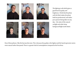
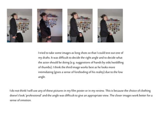
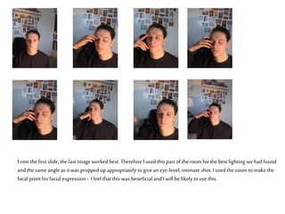
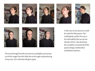
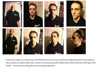
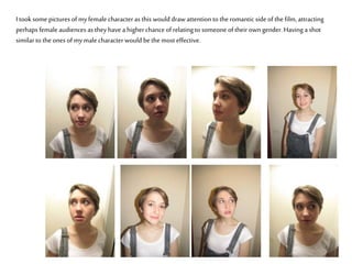
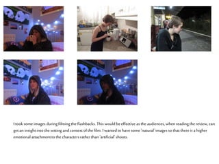
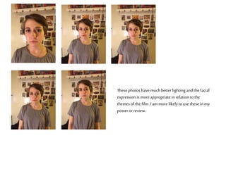
Thelighting is soft which gives a
good level of quality and
brightness. I think that the photo
with the flash makesthe photo
look less professional, and rather
just a picture being takenon any
day – thevalue of the natural
sunlight and softer lamp
backgroundlight works better.
Out of these photos, I like the last two the most. This is because the quality is the highest and the facial expression seems
more naturalratherthan posed. Thereis a greater look of contemplation compared to thefirst three.
I triedto take some images as long shots so that Icould test out one of
mydrafts. It was difficult to decide the rightangle and to decide what
the actor should bedoing (e.g. suggestions of hands byside/twiddling
of thumbs). I think the thirdimage works best as he looks more
intimidating (gives a sense of foreboding of his reality) dueto the low
angle.
I do not thinkI will use anyof these picturesin myfilm poster or in myreview. Thisis because the choice of clothing
doesn’t look ‘professional’ and the angle was difficult to give an appropriate view. Thecloser images workbetter for a
sense of emotion.
From thefirst slide, the last image worked best. ThereforeI used this part of the room for the best lighting wehad found
and the same angle as it was propped upappropriately to give an eye-level,intimate shot. I used the zoom to makethe
focal point his facial expression - I feel that this was beneficial and Iwill be likelyto use this.
A side view of mycharacterwould
beuseful for film posters. This
could signify a police line-up, or
his vulnerability that wecan see
all sides of him. Ialso thinkthat
this would be conventional of film
posters design and therefore
would draw attention.
Thesecond image from the second row is probably myfavourite
out of the images from this slide due to the angle and positioning
of myactor. Heis close but still gives space.
I took some images on a separate day. Ifeel that these havemore sharp and dramatic lighting however lower quality as
theyare taken on a phone ratherthana camera. Itis also questionable whethertheywill be useful due to the logo on the
hoodie – I maylook into editing this out and makingit fully black.
I took some pictures of myfemale characteras this would draw attention to the romanticside of the film, attracting
perhaps female audiences as they have a higherchanceof relating to someone of their own gender. Having a shot
similar to the ones of mymale characterwould bethe most effective.
I took some images during filming the flashbacks. This would beeffective as the audiences, whenreading the review, can
get aninsight into the setting and context of the film. I wanted to havesome ‘natural’images so that thereis a higher
emotional attachment to thecharacters ratherthan ‘artificial’ shoots.
Thesephotos havemuch better lighting and thefacial
expression is moreappropriate inrelation to the
themes of the film. I am more likelyto use these in my
poster orreview.

Photoshoots

  • 1.
    Thelighting is softwhich gives a good level of quality and brightness. I think that the photo with the flash makesthe photo look less professional, and rather just a picture being takenon any day – thevalue of the natural sunlight and softer lamp backgroundlight works better. Out of these photos, I like the last two the most. This is because the quality is the highest and the facial expression seems more naturalratherthan posed. Thereis a greater look of contemplation compared to thefirst three.
  • 2.
    I triedto takesome images as long shots so that Icould test out one of mydrafts. It was difficult to decide the rightangle and to decide what the actor should bedoing (e.g. suggestions of hands byside/twiddling of thumbs). I think the thirdimage works best as he looks more intimidating (gives a sense of foreboding of his reality) dueto the low angle. I do not thinkI will use anyof these picturesin myfilm poster or in myreview. Thisis because the choice of clothing doesn’t look ‘professional’ and the angle was difficult to give an appropriate view. Thecloser images workbetter for a sense of emotion.
  • 3.
    From thefirst slide,the last image worked best. ThereforeI used this part of the room for the best lighting wehad found and the same angle as it was propped upappropriately to give an eye-level,intimate shot. I used the zoom to makethe focal point his facial expression - I feel that this was beneficial and Iwill be likelyto use this.
  • 4.
    A side viewof mycharacterwould beuseful for film posters. This could signify a police line-up, or his vulnerability that wecan see all sides of him. Ialso thinkthat this would be conventional of film posters design and therefore would draw attention. Thesecond image from the second row is probably myfavourite out of the images from this slide due to the angle and positioning of myactor. Heis close but still gives space.
  • 5.
    I took someimages on a separate day. Ifeel that these havemore sharp and dramatic lighting however lower quality as theyare taken on a phone ratherthana camera. Itis also questionable whethertheywill be useful due to the logo on the hoodie – I maylook into editing this out and makingit fully black.
  • 6.
    I took somepictures of myfemale characteras this would draw attention to the romanticside of the film, attracting perhaps female audiences as they have a higherchanceof relating to someone of their own gender. Having a shot similar to the ones of mymale characterwould bethe most effective.
  • 7.
    I took someimages during filming the flashbacks. This would beeffective as the audiences, whenreading the review, can get aninsight into the setting and context of the film. I wanted to havesome ‘natural’images so that thereis a higher emotional attachment to thecharacters ratherthan ‘artificial’ shoots.
  • 8.
    Thesephotos havemuch betterlighting and thefacial expression is moreappropriate inrelation to the themes of the film. I am more likelyto use these in my poster orreview.