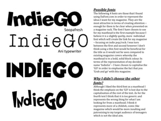
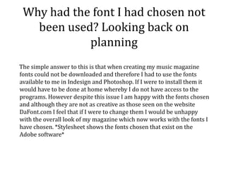
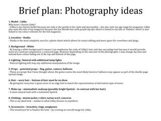
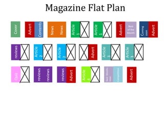
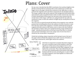
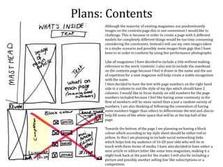
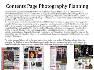
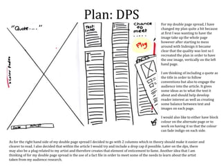
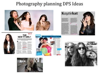
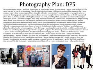
Zoë Bulmer plans the content and design of her indie music magazine. She takes inspiration from NME magazine covers, focusing on their use of block color. For her magazine name, she chooses "IndieGo" to represent the indie music genre and link to her color scheme. She develops plans for the cover, including placing the masthead left-aligned and using a studio photo of her model, Libby. Her contents page will feature columned text on the right and block colors at the bottom with social media links.
Darley is the premier UK supplier of labels into the brewing, water and soft drink markets and also supplies Patient Information Leaflets to over 50 Pharmaceutical companies.
The digital marketing industry is changing faster than ever and those who don’t adapt with the times are losing market share. Where should marketers be focusing their efforts? What strategies are the experts seeing get the best results? Get up-to-speed with the latest industry insights, trends and predictions for the future in this panel discussion with some leading digital marketing experts.
When most people in the industry talk about online or digital reputation management, what they're really saying is Google search and PPC. And it's usually reactive, left dealing with the aftermath of negative information published somewhere online. That's outdated. It leaves executives, organizations and other high-profile individuals at a high risk of a digital reputation attack that spans channels and tactics. But the tools needed to safeguard against an attack are more cybersecurity-oriented than most marketing and communications professionals can manage. Business leaders Leaders grasp the importance; 83% of executives place reputation in their top five areas of risk, yet only 23% are confident in their ability to address it. To succeed in 2024 and beyond, you need to turn online reputation on its axis and think like an attacker.
Key Takeaways:
- New framework for examining and safeguarding an online reputation
- Tools and techniques to keep you a step ahead
- Practical examples that demonstrate when to act, how to act and how to recover
Short video marketing has sweeped the nation and is the fastest way to build an online brand on social media in 2024. In this session you will learn:- What is short video marketing- Which platforms work best for your business- Content strategies that are on brand for your business- How to sell organically without paying for ads.
How to Run Landing Page Tests On and Off Paid Social PlatformsVWO
Join us for an exclusive webinar featuring Mariate, Alexandra and Nima where we will unveil a comprehensive blueprint for crafting a successful paid media strategy focused on landing page testing.With escalating costs in paid advertising, understanding how to maximize each visitor’s experience is crucial for retention and conversion.
This session will dive into the methodologies for executing and analyzing landing page tests within paid social channels, offering a blend of theoretical knowledge and practical insights.
The Pearmill team will guide you through the nuances of setting up and managing landing page experiments on paid social platforms. You will learn about the critical rules to follow, the structure of effective tests, optimal conversion duration and budget allocation.
The session will also cover data analysis techniques and criteria for graduating landing pages.
In the second part of the webinar, Pearmill will explore the use of A/B testing platforms. Discover common pitfalls to avoid in A/B testing and gain insights into analyzing A/B tests results effectively.
SMM Cheap - No. 1 SMM panel in the worldsmmpanel567
Boost your social media marketing with our SMM Panel services offering SMM Cheap services! Get cost-effective services for your business and increase followers, likes, and engagement across all social media platforms. Get affordable services perfect for businesses and influencers looking to increase their social proof. See how cheap SMM strategies can help improve your social media presence and be a pro at the social media game.
Search Engine Marketing - Competitor and Keyword researchETMARK ACADEMY
Over 2 Trillion searches are made per day in Google search, which means there are more than 2 Trillion visits happening across the websites of the world wide web.
People search various questions, phrases or words. But some words and phrases are searched
more often than others.
For example, the words, ‘running shoes’ are searched more often than ‘best road running
shoes for men’
These words or phrases which people use to search on Google are called Keywords.
Some keywords are searched more often than others. Number of times a keyword is searched
for in a month is called keyword volume.
Some keywords have more relevant results than others. For the phrase “running shoes” we
get more than 80M relevant results, whereas for “best road running shoes for men” we get
only 8.
The former keyword ‘running shoes’ has way more competition from popular websites to
new and small blogs, whereas the latter keyword doesn’t have that much competition. This
search competition for a keyword is called search difficulty of a keyword or keyword
difficulty.
In other words, if the keyword difficulty is ‘low’ or ‘easy’, there won’t be any competition
and if you target such keywords on your site, you can easily rank on the front page of Google.
Some keywords are searched for, just to know or to learn some information about something,
that’s their search intention. For example, “What shoe size should I choose?” or “How to pick
the right shoe size?”
These keywords which are searched just to know about stuff are called informational
keywords. Typically people who are searching this type of keywords are top of a Conversion
funnel.
Conversion funnel is the journey that search visitors go through on their way to an email
subscription or a premium subscription to the services you offer or a purchase of products
you sell or recommend using your referral link.
For some buyers, research is the most important part when they have to buy a product.
Depending on that, their journey either widens or narrows down. These types of buyers are
Researchers and they spend more time with informational keywords.
Conversion is the action you want from your search visitors. Number of conversions that you
get for every 100 search visitors is called Conversion rate.
People who are at different stages of a conversion funnel use different types of keywords.
It's another new era of digital and marketers are faced with making big bets on their digital strategy. If you are looking at modernizing your tech stack to support your digital evolution, there are a few can't miss (often overlooked) areas that should be part of every conversation. We'll cover setting your vision, avoiding siloes, adding a democratized approach to data strategy, localization, creating critical governance requirements and more. Attendees will walk away with actions they can take into initiatives they are running today and consider for the future.
In this presentation, Danny Leibrandt explains the impact of AI on SEO and what Google has been doing about it. Learn how to take your SEO game to the next level and win over Google with his new strategy anyone can use. Get actionable steps to rank your name, your business, and your clients on Google - the right way.
Key Takeaways:
1. Real content is king
2. Find ways to show EEAT
3. Repurpose across all platforms
The What, Why & How of 3D and AR in Digital CommercePushON Ltd
Vladimir Mulhem has over 20 years of experience in commercialising cutting edge creative technology across construction, marketing and retail.
Previously the founder and Tech and Innovation Director of Creative Content Works working with the likes of Next, John Lewis and JD Sport, he now helps retailers, brands and agencies solve challenges of applying the emerging technologies 3D, AR, VR and Gen AI to real-world problems.
In this webinar, Vladimir will be covering the following topics:
Applications of 3D and AR in Digital Commerce,
Benefits of 3D and AR,
Tools to create, manage and publish 3D and AR in Digital Commerce.
Most small businesses struggle to see marketing results. In this session, we will eliminate any confusion about what to do next, solving your marketing problems so your business can thrive. You’ll learn how to create a foundational marketing OS (operating system) based on neuroscience and backed by real-world results. You’ll be taught how to develop deep customer connections, and how to have your CRM dynamically segment and sell at any stage in the customer’s journey. By the end of the session, you’ll remove confusion and chaos and replace it with clarity and confidence for long-term marketing success.
Key Takeaways:
• Uncover the power of a foundational marketing system that dynamically communicates with prospects and customers on autopilot.
• Harness neuroscience and Tribal Alignment to transform your communication strategies, turning potential clients into fans and those fans into loyal customers.
• Discover the art of automated segmentation, pinpointing your most lucrative customers and identifying the optimal moments for successful conversions.
• Streamline your business with a content production plan that eliminates guesswork, wasted time, and money.
Mastering Multi-Touchpoint Content Strategy: Navigate Fragmented User JourneysSearch Engine Journal
Digital platforms are constantly multiplying, and with that, user engagement is becoming more intricate and fragmented.
So how do you effectively navigate distributing and tailoring your content across these various touchpoints?
Watch this webinar as we dive into the evolving landscape of content strategy tailored for today's fragmented user journeys. Understanding how to deliver your content to your users is more crucial than ever, and we’ll provide actionable tips for navigating these intricate challenges.
You’ll learn:
- How today’s users engage with content across various channels and devices.
- The latest methodologies for identifying and addressing content gaps to keep your content strategy proactive and relevant.
- What digital shelf space is and how your content strategy needs to pivot.
With Wayne Cichanski, we’ll explore innovative strategies to map out and meet the diverse needs of your audience, ensuring every piece of content resonates and connects, regardless of where or how it is consumed.
Digital Money Maker Club – von Gunnar Kessler digital.focsh890
Title One is a comprehensive examination of the impact of digital technologies on
modern society. In a world where technology continues to advance rapidly, this article delves into the nuances and complexities of the digital age, exploring Its implications across various sectors and aspects of life.
The digital marketing industry is changing faster than ever and those who don’t adapt with the times are losing market share. Where should marketers be focusing their efforts? What strategies are the experts seeing get the best results? Get up-to-speed with the latest industry insights, trends and predictions for the future in this panel discussion with some leading digital marketing experts.
Mastering Local SEO for Service Businesses in the AI Era is tailored specifically for local service providers like plumbers, dentists, and others seeking to dominate their local search landscape. This session delves into leveraging AI advancements to enhance your online visibility and search rankings through the Content Factory model, designed for creating high-impact, SEO-driven content. Discover the Dollar-a-Day advertising strategy, a cost-effective approach to boost your local SEO efforts and attract more customers with minimal investment. Gain practical insights on optimizing your online presence to meet the specific needs of local service seekers, ensuring your business not only appears but stands out in local searches. This concise, action-oriented workshop is your roadmap to navigating the complexities of digital marketing in the AI age, driving more leads, conversions, and ultimately, success for your local service business.
Key Takeaways:
Embrace AI for Local SEO: Learn to harness the power of AI technologies to optimize your website and content for local search. Understand the pivotal role AI plays in analyzing search trends and consumer behavior, enabling you to tailor your SEO strategies to meet the specific demands of your target local audience. Leverage the Content Factory Model: Discover the step-by-step process of creating SEO-optimized content at scale. This approach ensures a steady stream of high-quality content that engages local customers and boosts your search rankings. Get an action guide on implementing this model, complete with templates and scheduling strategies to maintain a consistent online presence. Maximize ROI with Dollar-a-Day Advertising: Dive into the cost-effective Dollar-a-Day advertising strategy that amplifies your visibility in local searches without breaking the bank. Learn how to strategically allocate your budget across platforms to target potential local customers effectively. The session includes an action guide on setting up, monitoring, and optimizing your ad campaigns to ensure maximum impact with minimal investment.
Videos are more engaging, more memorable, and more popular than any other type of content out there. That’s why it’s estimated that 82% of consumer traffic will come from videos by 2025.
And with videos evolving from landscape to portrait and experts promoting shorter clips, one thing remains constant – our brains LOVE videos.
So is there science behind what makes people absolutely irresistible on camera?
The answer: definitely yes.
In this jam-packed session with Stephanie Garcia, you’ll get your hands on a steal-worthy guide that uncovers the art and science to being irresistible on camera. From body language to words that convert, she’ll show you how to captivate on command so that viewers are excited and ready to take action.
3. Inspiration from Mood Board
All of the magazine covers I looked at specifically for my mood board
are from NME because this is the magazine I aspire to be like through
creating my own. A lot of these magazines use block colour in some
way either on the cover or as part of the DPS as seen on the HAIM
edition. This is something that I would like to adopt in my magazine
and work towards with my planning. Here I have been able to focus on
particular conventions that NME follow as well as look at the
construction which will help me adapt to the style associated with
indie music as I am working on due to the audience research. With this
I quite like the style of the Lana Del Rey cover whereby the headline
and quote are splashed slightly sideways over the studio image. I also
like the use of colour co-ordination used on most of the covers on my
mood board which link the brand name (NME) with the colour of the
cover lines, eg On the Lady Gaga cover the name is written in blue as is
her name which I like the representation of similarity and success
between the two but also a way of connecting colour to draw attention
to the page as well as the image that is on there.
4. Magazine Name Ideas and Analysis
• IndiePop
• Music4Teens
• #indie
• IndieGo
• Curve
• Music Matters
• Elite Rocker
• Effortless
These are a small list of names that I brain stormed as part of trying to
decide what to call my music magazine. IndiePop was something created
when I was considering mashing two genres together and it basically is
what it says. Although it is simplistic and clear I think that it is too cliché
and not creative. Music4Teens is also basic and I think that this one
suggests that it is for a very young audience like young teens and preteens
which is not what I was going for as it would most definitely discourage
my intended audience.
Curve, Music Matters, Elite Rocker and Effortless are all quite disconnected
in terms of linking them to the genre because I feel that they would be
more associated with peaceful and quiet music, not music that is supposed
to be unique and edgy like most in the indie genre. Therefore all 4 of these
are ruled out because I feel they are not appropriate to represent the genre
I have chosen for my magazine and if I were to use them then I would be
creating incorrect assumptions about both my audience and chosen genre.
Therefore my final two choices were #Indie and IndieGo. I though that
#Indie was too simplistic and not challenging enough to be able to create a
whole marketed product around. I also felt like a magazine name needs to
have a ring to it and it would be too long for people to say ‘hashtag indie’
yet just saying ‘Indie magazine’ is boring. You don’t hear of ‘Rock Magazine’
or ‘Dance Magazine’. Instead I chose to go with IndieGo and use it as a play
on words in order to associate Indigo the colour as part of my colour
scheme – linking to the deep purple and navy colours suggested by Taynie
in my interview.
5. Soopafresh
Ani typewriter
Possible fonts
The following 4 fonts are those that I found
using DaFont.com in order to represent the
ideas I want for my magazine. They are the
most attractive in terms of creating attention –
enough for them to be clear when presented on
a magazine rack. The font I have chosen to use
for my masthead is the first example because I
believe it is a slightly quirky, more individual
font which will create the link for my magazine
– focusing on indie pop/rock. I was torn
between the first and second however I don’t
think using a thin font would be beneficial for
the title as it would not be seen compared to
existing magazine covers whereby the
masthead is in a bold, solid block colour. In
terms of the representation of my decided
name ‘IndieGo’ – I have chosen to capitalise the
‘GO’ in order to emphasise the fact that you
‘Grab and go’ with this magazine.
Why I didn’t choose the other
fonts?
Although I liked the third font as a masthead I
think the emphasis on the ‘GO’ is lost due to the
capitalisation of the rest of the text. As for the
fourth text I think that it is too generic and
represents the wrong thing for what I am
looking for from a masthead. I think it
represents more of a childish, comic like
magazine which would be more insulting and
patronising to my target audience of teenagers
which is not the ideal aim.
6. Why had the font I had chosen not
been used? Looking back on
planning
The simple answer to this is that when creating my music magazine
fonts could not be downloaded and therefore I had to use the fonts
available to me in Indesign and Photoshop. If I were to install them it
would have to be done at home whereby I do not have access to the
programs. However despite this issue I am happy with the fonts chosen
and although they are not as creative as those seen on the website
DaFont.com I feel that if I were to change them I would be unhappy
with the overall look of my magazine which now works with the fonts I
have chosen. *Stylesheet shows the fonts chosen that exist on the
Adobe software*
7. Brief plan: Photography ideas
1. Model – Libby
Why have I chosen Libby?
- Libby is my chosen model because not only is she quirky in her style and personality – she also suits my age range for magazine. Libby
also suits the title of my magazine because she has blonde hair with purple dip dye which is linked to my title of ‘IndieGo’ which is also
linked to my colour schemes for the full magazine.
2. Location – Studio
- Studio is the most simplistic area for a photo shoot which allows for easier editing and more space for coverlines and plugs.
3. Background – White
- By having a white background it means I can emphasise the ends of Libby’s hair and also any indigo text because it would provide
more of a contrast compared to a coloured page. However depending on the outcome of the photographs, I may change my idea and
instead have colour fading out at the top and bottom of the page.
4. Lighting –Natural with additional lamp lights
- Natural lighting will stop any additional manipulation of the image.
5. Props - potential props – flag, guitar, camera, balloons
- These are props that I have thought about, the guitar seems the most likely however balloons may appear as part of the double page
spread image.
6. Hair – wavy hair – bottom of hair must be on show
- By giving her wavy hair it gives more of an edgy feel to match the representation of alternative type of music.
7. Make-up – minimalistic makeup (possibly bright lipstick – in contrast with her hair)
- A more natural look with a statement lipstick
8. Clothing – denim jacket, t-shirt, tartan scarf, converse
- This is my ideal look – similar to what Libby dresses in anywhere
9. Accessories – bracelets, rings, sunglasses
- This would just be to finalise the look – by creating an overall image for Libby
9. Plans: Cover
For my cover, I decided that like NME I would place the masthead slightly to the
left due to the fact that we read from left to write and because it will be the
biggest text on the page it should direct attention to the right place in order to
promote the magazine name and what it represents for my intended audience.
The image is going to take up the majority of the background with limited white
space however some around the head in order to make room for the cover lines
to which should help to fill the space but also leave some contrast from the
overall colour of the image. I will then use a plug towards the top under my
masthead in order to entice the audience straight way by causing them to look at
the magazine.
The cover lines are placed towards the bottom of my magazine cover with the
purpose that everything that attracts the audience in terms of ascetics is seen
first, then the content of the magazine is revealed. I think that by having the
magazine full with content at the bottom, more so than at the top it balances
the quantities of what is there. For example by having a large masthead and
image – whereby the head will be at the top it means that there is a limited
space around it and if there were to be a large some of cover lines here it
would lose the overall effect I am going for.
I think that including a plug is important and by having it nearer the top of
the page it shows off what the magazine has to offer in terms of freebies or
ways to get connected etc, which again attracts the audience.
I feel that it is important to include alternative images on
the cover to include as part of the headline to show the
significance of that story to the magazine but it is also
what makes it individual to all the other magazines on the
shelf at the current time. This is then followed by the use
of 3 cover lines predominantly at the bottom of the page,
finished with the barcode and selling line in order to draw
the whole magazine cover back together as a fluent and
consistent piece.
10. Headline:
L1berty:Exclusive interviews and Tour Dates and more
with
L1berty
Simplistic and straight to the point to direct the
readers attention to my main aim of the
magazine on the subject I have chosen. It then
provides that link between splash image and
headline. I think that this is as simplistic as it can get and therefore
limits the confusion that could occur. Other then general band
information the second most popular thing to come out of my survey
was Interviews and therefore by including these I am reaching the
needs of my intended audience which is 16-20 year olds.
Coverline 1:
All the latest IndieGOss
By including the title in the name of the gossip factor it helps initiate
that the gossip is exclusive to this magazine and this should make the
audience curious as this is a new upcoming magazine.
Coverline 2:
Indies Biggest and Best Quiz of the Year.
Something to intrigue the readers into reading
and test their own knowledge of indie music by
talking the biggest Quiz of the year. I think that
by having and including this on the cover it not
only acts as a coverline but can also work
alongside the plug to be more persuasive.
Coverline 3:
•60 Must Have songs
Giving information as to the latest songs that the reader should know by
the best of indie.
1
2
3
Plug:
Issue 1 Join us
This entices the reader to not only buy the magazine but
also to become a part of what makes it successful
through the link to social media to which everyone in
the target audience is in touch with already. By using
this as the plug it instigates a fan base for those who
pick up the magazine but also shows the fact that it it
broadening any horizons in order to maximise success.
Selling line:
*PEACE, Bastille, HAIM, Vampire Weekend,
Nina Nesbitt*
This also entices however in small font so once the
customer has picked up the magazine. This means that
this is more for people who have an interest in who is in
the magazine each month. This relates to what is in the
magazine as a whole and therefore links it to what is
popular within indie as a collective music genre.
12. Photography Planning: Cover
In terms of the location, I would like my photographs to be in a studio because this is a common convention of a cover image
and therefore to replicate this I will do the same – plus it will mean I can control variables such as lighting and the overall
environment. For the front cover I would like my photo to be a medium long shot and central to the page – however any
props used may go outside the guiding lines for where the cover lines will appear on my cover. The image will be completely
focused with lighting influencing the overall look given. This would include lighting directed at the face – providing a
contrast from the rest of the image. The image itself will appear in full colour to allow for the link between my model and
the magazine masthead to be clear however effects will be used to improve the quality of the overall image. Although
through the majority of imagery on the covers I have looked eg Kerrang, MixMag and NME – I want the direct focus to be on
the face – and eye contact should be maintained. However due to my audience I would like the image not to be serious
because I feel that the interest would be gained through more of an enthusiastic and entertaining cover – as it would be
somewhat relatable to my female audience 16-20. When doing market research I found that NME in particular has a variety
of serious and non-serious covers and so despite not being a niche in the market as such, it would be taking a style in
consideration of the market research to which lead my intended audience to say that the cover is how they are attracted to a
magazine, over the cover lines or plugs.
In terms of terms of the cover my model will be wearing clothing representative of what is classified as ‘indie’ in todays
society. The type of clothing I had in mind would be a denim jacket, with shorts or leggings with a rucksack wearing Dr
Martins or Converse with a quirky t-shirt. My chosen model is Libby and I believe the way she choses to dress is an accurate
representation of what I would like my music magazine to be all about and therefore I would consider her a suitable model
for the cover, particularly as she is also in my target audience age range – making my magazine further relatable. For the
cover I would like the use of props to be minimalistic because the attention would be diverted by the use of this. I think that
the one prop I would certainly use would be the guitar to provide a more individual look to match the type of music she is
representing.
13. Plans: Contents
Although the majority of existing magazines use predominantly
images on the contents page this is one convention I would like to
challenge. This is because in order to create a page with 6 different
models for completely different things would be too time consuming
considering the constraints. Instead I will use my own images taken
in a studio scenario and possibly some images from gigs that I have
been to in order to conform by using live performance photographs.
Like all magazines I have decided to include a title without making
reference to the work ‘contents’. I also aim to include the masthead
on the contents page because I feel it draws in the name and the use
of repetition for a new magazine will help create a stable recognition
with the name.
I then decided to have the text with page numbers on the right hand
side in a column to suit the style of my dps which should have 2
columns. I would like to focus mainly on odd numbers for the page
numbers included because I feel like having some continuity in the
flow of numbers will be more suited than a just a random variety of
numbers. I am also thinking of following the convention of having
some numbers bigger than others to differentiate the text and also to
help fill some of the white space that will be at the top half of the
page.
Towards the bottom of the page I am planning on having a block
colour which according to my style sheet should be either red or
yellow. In this I am planning to include social networking links
which helps link my audience of 16-20 year olds who will be in
touch with these forms of media. I have also decided to have either a
mini article or editors letter like some teen magazines, making it a
slight look back at the past for the reader. I will also be including a
picture and possibly another selling line like subscriptions or a
competition.
14. Contents Page Photography Planning
For my contents page I have decided that there will be 2 feature images, the first will be of Libby, my model to
establish the article about her. The second will be an image I have collected myself from a Kodaline gig. As well as an
image I may include copies of other covers by my own magazine ,eg ‘what’s new next month’ in order to further
entice and suggest but not give away as to what may be in the next issue however this is dependent on the amount of
time I have left to complete my contents.
The examples below have helped me analyse what would be the best way for me to organise my contents page. For
example, the first image includes only one large image and a sample subscription. I think that this is how I am most
likely to do my magazine contents page because all of the content will be my own and in the time space it would be
very difficult to get photographs of the other people I would want to write about in my magazine. I have therefore
decided to use only 3 images on the contents page and the rest will be colour space or white space. In order to
minimise space and avoid the page looking empty I am going to use the masthead down the side of the page and the
bottom of the page will either be a yellow or red box. So although they are not images they will determine the overall
positing of the images.
The studio images of Liberty will be the same style as those on the cover and the DPS and therefore it allows for
continuity. The Kodaline picture is that taken from a gig and is therefore unplanned but works well to give the live
look which makes the music seem more realistic. This is following the convention set by 3 of the 4 examples below.
15. Plan: DPS For my double page spread, I have
changed my plan quite a bit because
at first I was wanting to have the
image take up the whole page
however after starting to mess
around with Indesign it became
clear that the quality was lost so I
recreated the plan in order to have
the one image, vertically on the left
hand page.
I am thinking of including a quote as
the title in order to follow
conventions but also to engage the
audience into the article. It gives
some ideas as to what the text it
about and should help develop
reader interest as well as creating
some balance between text and
images on each page.
I would also like to either have block
colour on the alternate page or to
work on having it so that the colour
can fade indigo on each side.
As for the right hand side of my double page spread I decided to go with 2 columns which in theory should make it easier and
clearer to read. I also decided that within the article I would try and include a drop cap if possible. Later on the dps, there
may also be a plug related to my artist and therefore creates that element of enticement to fame. Another idea that I am
thinking of for my double page spread is the use of a fact file in order to meet some of the needs to learn about the artist
taken from my audience research.
17. Photography Plan: DPS
For my double page spread I would like the photos to be more fun and almost messing around – getting more involved with the
props to create an overall exciting image. I have decided to do this because it follows conventions of the magazines that I have
analysed as part of my textual analysis. I have decided to follow the conventions of a music magazine by having the artist as a
more real – linking again to my intended audience. Below are some examples that I would like to base my double page spread
photo shoot on. Starting from the left, this photo is black and white, something I have decided not to do because by using no
extravagant colours I would be loosing the effect of my model and the links this has to the title. However I do like the positioning
of the models in the shot because they are facing the camera on an angle which gives a almost cold look to match possible
connotations of this associated music genre but eye contact is maintained which means that the reader still feels the level of
involvement they somewhat require in order to maintain interest. The second photo, I chose this as an example because
although it isn’t an inside studio shoot the use of props eg the balloons is similar to some of the ideas I have had about the
photos I could include for my own magazines. From this image I can also gather ideas about what would be classifies as ‘indie’
fashion and considering the style variety within the one photo magazine. The third image is an example I chose because it is not
a serious photo – something that I have thought about when creating my own photos. I like the use of a block colour as the
background as an alternative to white which is something that I am still unsure of at this point – having not taken my
photographs yet – however if they are successful and will work with a block colour background this is something I will consider
changing. The final photo and my main inspiration is HAIM – despite the fact that there are 3 models compared to my one
however I think that the seriousness used is portrayed as more of sarcasm through imagery – as 2 of the 3 look more happy
than serious. With this photograph I can also take some of their style as a more modern indie band – influenced by fashion.
18. Article plan
• Interview
• About the artist– Introduction
• Image
• Quote
• Drops cap
• Colours
• Plug? Meet Liberty
The initial decision to write an interview stems from both my interview and audience research to which there was an
equal balance between about the artist and an interview however I chosen an interview because I believe it is the best
way to learn about someone new by asking their reaction to it all. It gives the ‘are they or are they not big headed’?
Which often leads to creating an opinion to which everyone needs to about Liberty because she is a new artist on the
indie scene. I think that it gives Liberty a character by giving her a voice, rather than focusing on a boring article about
the majority of stuff people don’t care about. I have then decided to go with a fact file to go along with the dps which
will help determine who she is and acts as the about the artist part that people in my target audience also voted highly
for.
In my article I am to use some exaggerated and yet emotive language in order to portray the excitement of the situation
but also to show off the nervs that come with it which help clarify that my chosen artist is new to the industry. By
showing nervousness I believe that it builds up the character but also gives her human feelings to which the audience
can empathise with her – which makes her even more inspiring to the young women who read it. I want my article to
show that everyone can achieve so not only providing an insight to a music career, I also want to show a positive female
role model who although hasn’t had much success so far, is well on the way to being a successful singer song writer and
therefore challenging society and the media who set out a certain image to young women to look and be a certain way.
At the same time I don’t want my article to be controversial because it is a first edition and so by slated anything
greatly it will not be well publicised but it’s about showing people that talent can be shown in a realistic light.
With the language I use, there will be some light expletives to help engage the audience with the sort of language they
would use in an informal setting and therefore exemplifies the fact that Libby is still a normal young woman just like
the audience and therefore reader.