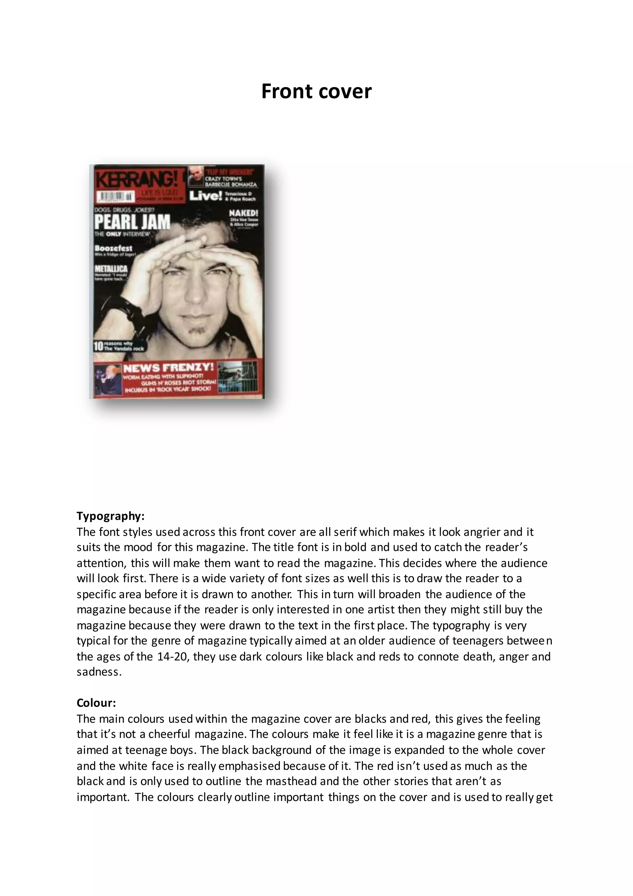
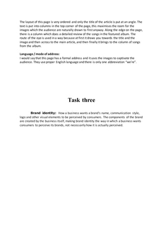
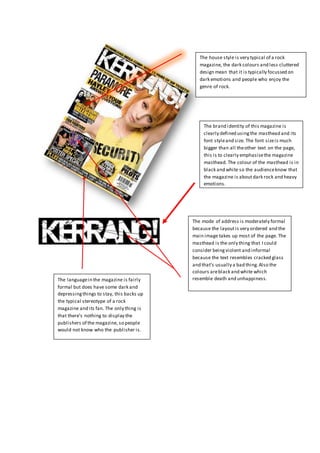
The document analyzes the design elements of a rock music magazine cover and contents pages. It discusses the typography, colors, images, layout, and language used on the different pages. Serif fonts in bold are used on the cover to draw attention, with a variety of sizes. Blacks and reds set a dark, angry mood. Images feature rock artists. The formal layout guides the eye across important elements. The same design conventions carry through the contents pages to maintain a consistent brand identity that positions the magazine for its target audience of teenage rock fans.