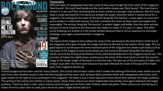
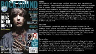
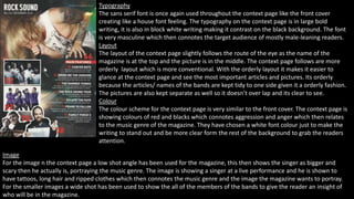
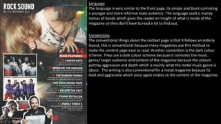
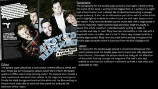
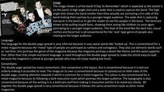
1. Typography
Different types of typography have been used all they way through the front cover of the magazine
‘Rock Sound’. The mast head stands out the most which simply says ‘Rock Sound’. The mast head is
written in a sans serif font connoting that its more aimed at a younger male audience. Also the mast
head is made very bold for it to stand out and get the buyers attention which is conventional for a
magazine. The writing for the name of the band ‘Bring Me The Horizon’ is once again is in sans serif
and is written in a distorted manner, this then connotes the music as black, dark and maybe even
meaningful. The writing ‘Bring Me The Horizon’ is written bigger and bolder then the other articles
because its more important and they want the reader to notice it. It is also in s apary The other
article headings are written in a lot smaller written because they're not as important as the larger
headings, once again conventional for a magazine.
Layout
The layout of the magazine does follow the route of the eye because the mast head is at the top of
the magazine and it goes through the image and then to the text on the bottom of the page. This is a
good layout to use because the most important parts of the magazine are shown quite easily such as
the name of the magazine rock sound stands out, the name of the band ‘Bring Me The Horizon’
stands out and the writing at the bottom of the other bands featured in the magazine stands out. The
principle of triples has slightly been used because the name of the main band is on the line and the
image of the leader singer of the band is in this this area. The lack use of the principles of triples isn’t
a major issue with this front cover because they have followed the route of the eye which makes
Colour parts f the magazine stands out.
A black background has been used for many reasons. One reason why its been used is that it makes the writing of the front cover stands out and
look more clear. Another reason is that the black background has been used because black connotes death and unhappiness which then once
again relates to the type of music portrayed in the magazine. The black is also a more masculine colour which then portrays the target audience.
The writing of the articles are written in a blue/ green colour, these colours are more related with masculinity, once again relating to the target
audience. There has been a clear colour scheme used through out the front cover of black, white and green. These colours are used because it
makes the front cover clear to read, given the front cover a slight formal side to it.
2. Images
The image used is of the lead singer (Oli Sykes) of the band ‘Bring Me The Horizon’.
They have used a medium close up because they want to show the emotion on Sykes
face, he is shown to have a depressing and dull emotion. The medium close up shot
also shows what he’s wearing which is a plain darkish t-shirt and he has all of his
tattoos on show and he has the dark sweepy hair, this is done because it portrays the
genre of music and the creators of the magazine want the image to relate to the
context of the magazine. Low key lighting has been used because it gives the effective
of moodiness and mysterious once again relating to the genre of music. The singer is
also shown to be pale making him look ghostly like and depressing this then connotes
that he is tortured artist.
Language
The language used is very simple, short and blunt this then connotes that the
magazine is more informal and aimed at a younger audience. The language used its
quite dramatic making the reader interested to read more. Finally the language used
throughout the front cover is mainly names of bands meaning that if a buyer sees a
band that they like they may be interested in reading the magazine.
Conventions
The magazine cover is conventional because the masthead is in large writing across
the top of the magazine drawing attention towards it, the image is of the musician and
is spread across the front cover which is conventional. Also having the all the small
articles on it is conventional because they’re giving the reader an insight of what's in
the magazine. It is finally conventional because it has a limited colour scheme and
limited fonts meaning that it makes the front cover accessible to read.
3. Typography
The sans serif font is once again used throughout the context page like the front cover
creating like a house font feeling. The typography on the context page is in large bold
writing, it is also in block white writing making it contrast on the black background. The font
is very masculine which then connotes the target audience of mostly male-leaning readers.
Layout
The layout of the context page slightly follows the route of the eye as the name of the
magazine is at the top and the picture is in the middle. The context page follows are more
orderly layout which is more conventional. With the orderly layout it makes it easier to
glance at the context page and see the most important articles and pictures. Its orderly
because the articles/ names of the bands are kept tidy to one side given it a orderly fashion.
The pictures are also kept separate as well so it doesn’t over lap and its clear to see.
Colour
The colour scheme for the context page is very similar to the front cover. The context page is
showing colours of red and blacks which connotes aggression and anger which then relates
to the music genre of the magazine. They have chosen a white font colour just to make the
writing to stand out and be more clear form the rest of the background to grab the readers
attention.
Image
For the image n the context page a low shot angle has been used for the magazine, this then shows the singer as bigger and
scary then he actually is, portraying the music genre. The image is showing a singer at a live performance and he is shown to
have tattoos, long hair and ripped clothes which then connotes the music genre and the image the magazine wants to portray.
For the smaller images a wide shot has been used to show the all of the members of the bands to give the reader an insight of
who will be in the magazine.
4. Language
The language is very similar to the front page, its simple and blunt connoting
a younger and more informal male audience. The language used is mainly
names of bands which gives the reader an insight of what is inside of the
magazine so they don’t have to read a lot to find out.
Conventions
The conventional things about the context page is that it follows an orderly
layout, this is conventional because many magazines use this method to
make the content page easy to read. Another convention is the dark colour
scheme. They use a dark colour scheme because it connotes the music
genre/ target audience and content of the magazine because the colours
portray aggression and death which is mainly what the metal music genre is
about. The writing is also conventional for a metal magazine because its
bold and aggressive which once again relates to the content of the magazine.
.
5. Typography
The typography for the double page spread is once again in bold writing.
The name of the band is writing in the biggest font. It is written in a slight
high school manner and is looked like its sketched connoting a younger
target audience. It also has an information part about what's in the article
and its highlighted in white to make it stand out and seem important to
the reader. They have also broken up the article text with a large quote in
white to make the reader want to read and know what this quote is
about. The article is written in standard white writing to make it
accessible and easy to read. They have also started the article text with a
large bold latter, so in this case it’s the ’Y’ this is very conventional for a
double page spread. They have also used white writing throughout the
double page spread to make it stand out from the black background
Layout
The layout for the double page spread is conventional because they
used a picture over the double page and is mainly one side separated
from the text, this makes the picture stand out and grab the attention
of the reader looking through the magazine. The text is also kept
orderly to one side and is written in columns to make it look neat and
Colour accessible to read.
The double page spread has a clear colour scheme of black, white and
blue. These are very masculine colours which then reflects the target
audience of the mainly male-leaning reader. The colours also connote a
dark, mysterious side which then relates to the magazine music genre.
Finally the black background contrast the white and the blue writing so
they're more accessible to read and they stand out and grab the
attention of the reader.
6. Image
The image shown is of the band ‘A Day To Remember’ which is expected as the article is
on this band. A high angle shot and a wide shot is used to capture the band. The high
angle shot shows the band smaller then they actually are connoting a fun side of the
band making them portray to a younger target audience. The wide shot is capturing
everyone in the band so its get the reader to see the people in the band. The band are
shown to be pulling stupid faces, showing them acting like children so once again
portraying to a younger target audience. The look of the band like the dark hair, casual
clothes and facial hair is all conventional for the ‘rock’ type genre of people also
relating to the target audience.
Language
The language for the double page spread is very informal because it uses swear words like ‘fucked up’. This is conventional for a
metal magazine because the ‘metal’ type of people are portrayed as ruthless and outrageous. They also use demonic words such
as ‘sacrifice’, this portrays the genre of the magazine because the magazine portrays a death like theme and this word supports
that. Other than that simple and blunt language is used throughout the double page spread to make the article easy to read
because the magazine is aimed at younger people who may not enjoy reading too much.
Conventions
The double page spread has many conventions. One convention is the layout, this is conventional because it is laid out
orderly making it accessible to read. The image on its own is conventional because its spread out on both sides of the
double page, creating attention towards it which is common for a metal magazine. The colour is also conventional for a
metal magazine because its following a dark masculine route which portrays the target audience. The typography is also
conventional because all the writing is in a bold sans serif font making it masculine and for it to stand out clearly. All
together the double page spread is very conventional because it follows the same convention route as other metal
magazines.