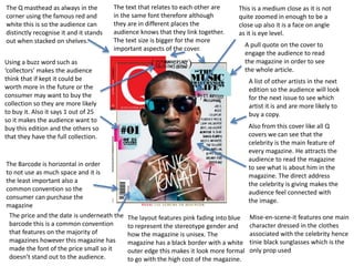
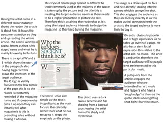
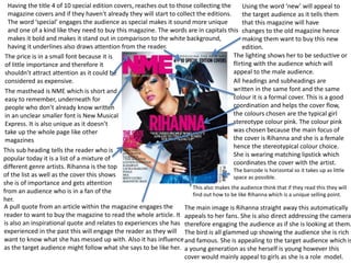
This document provides a detailed analysis and summary of the key design elements and conventions used across magazine covers and interior pages. Some of the main points summarized are:
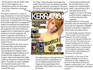
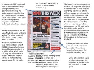
- Magazine covers use celebrity images, pull quotes from articles, and lists of features to attract and engage readers. Interior pages employ columnar text, varied image sizes, and lists of articles to guide readers through content.
- Common conventions like placement of barcodes, prices and mastheads are analyzed. Design choices aim to highlight important information while de-emphasizing less important details.
- Color schemes, fonts, image compositions and other mise-en-scene elements are chosen deliberately based on the target audience and topic. For example, a music
10 Video Ideas Any Business Can Make RIGHT NOW!
You'll never draw a blank again on what kind of video to make for your business. Go beyond the basic categories and truly reimagine a brand new advanced way to brainstorm video content creation. During this masterclass you'll be challenged to think creatively and outside of the box and view your videos through lenses you may have never thought of previously. It's guaranteed that you'll leave with more than 10 video ideas, but I like to under-promise and over-deliver. Don't miss this session.
Key Takeaways:
How to use the Video Matrix
How to use additional "Lenses"
Where to source original video ideas
It's another new era of digital and marketers are faced with making big bets on their digital strategy. If you are looking at modernizing your tech stack to support your digital evolution, there are a few can't miss (often overlooked) areas that should be part of every conversation. We'll cover setting your vision, avoiding siloes, adding a democratized approach to data strategy, localization, creating critical governance requirements and more. Attendees will walk away with actions they can take into initiatives they are running today and consider for the future.
Core Web Vitals SEO Workshop - improve your performance [pdf]Peter Mead
Core Web Vitals to improve your website performance for better SEO results with CWV.
CWV Topics include:
- Understanding the latest Core Web Vitals including the significance of LCP, INP and CLS + their impact on SEO
- Optimisation techniques from our experts on how to improve your CWV on platforms like WordPress and WP Engine
- The impact of user experience and SEO
SEO as the Backbone of Digital MarketingFelipe Bazon
In this talk Felipe Bazon will share how him and his team at Hedgehog Digital share our journey of making C-Levels alike, specially CMOS realize that SEO is the backbone of digital marketing by showing how SEO can contribute to brand awareness, reputation and authority and above all how to use SEO to create more robust global marketing strategies.
Digital Commerce Lecture for Advanced Digital & Social Media Strategy at UCLA...Valters Lauzums
E-commerce in 2024 is characterized by a dynamic blend of opportunities and significant challenges. Supply chain disruptions and inventory shortages are critical issues, leading to increased shipping delays and rising costs, which impact timely delivery and squeeze profit margins. Efficient logistics management is essential, yet it is often hampered by these external factors. Payment processing, while needing to ensure security and user convenience, grapples with preventing fraud and integrating diverse payment methods, adding another layer of complexity. Furthermore, fulfillment operations require a streamlined approach to handle volume spikes and maintain accuracy in order picking, packing, and shipping, all while meeting customers' heightened expectations for faster delivery times.
Amid these operational challenges, customer data has emerged as an important strategy. By focusing on personalization and enhancing customer experience from historical behavior, businesses can deliver improved website and brand experienced, better product recommendations, optimal promotions, and content to meet individual preferences. Better data analytics can also help in effectively creating marketing campaigns, improving customer retention, and driving product development and inventory management.
Innovative formats such as social commerce and live shopping are beginning to impact the digital commerce landscape, offering new ways to engage with customers and drive sales, and may provide opportunity for brands that have been priced out or seen a downturn with post-pandemic shopping behavior. Social commerce integrates shopping experiences directly into social media platforms, tapping into the massive user bases of these networks to increase reach and engagement. Live shopping, on the other hand, combines entertainment and real-time interaction, providing a dynamic platform for showcasing products and encouraging immediate purchases. These innovations not only enhance customer engagement but also provide valuable data for businesses to refine their strategies and deliver superior shopping experiences.
The e-commerce sector is evolving rapidly, and businesses that effectively manage operational challenges and implement innovative strategies are best positioned for long-term success.
Search Engine Marketing - Competitor and Keyword researchETMARK ACADEMY
Over 2 Trillion searches are made per day in Google search, which means there are more than 2 Trillion visits happening across the websites of the world wide web.
People search various questions, phrases or words. But some words and phrases are searched
more often than others.
For example, the words, ‘running shoes’ are searched more often than ‘best road running
shoes for men’
These words or phrases which people use to search on Google are called Keywords.
Some keywords are searched more often than others. Number of times a keyword is searched
for in a month is called keyword volume.
Some keywords have more relevant results than others. For the phrase “running shoes” we
get more than 80M relevant results, whereas for “best road running shoes for men” we get
only 8.
The former keyword ‘running shoes’ has way more competition from popular websites to
new and small blogs, whereas the latter keyword doesn’t have that much competition. This
search competition for a keyword is called search difficulty of a keyword or keyword
difficulty.
In other words, if the keyword difficulty is ‘low’ or ‘easy’, there won’t be any competition
and if you target such keywords on your site, you can easily rank on the front page of Google.
Some keywords are searched for, just to know or to learn some information about something,
that’s their search intention. For example, “What shoe size should I choose?” or “How to pick
the right shoe size?”
These keywords which are searched just to know about stuff are called informational
keywords. Typically people who are searching this type of keywords are top of a Conversion
funnel.
Conversion funnel is the journey that search visitors go through on their way to an email
subscription or a premium subscription to the services you offer or a purchase of products
you sell or recommend using your referral link.
For some buyers, research is the most important part when they have to buy a product.
Depending on that, their journey either widens or narrows down. These types of buyers are
Researchers and they spend more time with informational keywords.
Conversion is the action you want from your search visitors. Number of conversions that you
get for every 100 search visitors is called Conversion rate.
People who are at different stages of a conversion funnel use different types of keywords.
The What, Why & How of 3D and AR in Digital CommercePushON Ltd
Vladimir Mulhem has over 20 years of experience in commercialising cutting edge creative technology across construction, marketing and retail.
Previously the founder and Tech and Innovation Director of Creative Content Works working with the likes of Next, John Lewis and JD Sport, he now helps retailers, brands and agencies solve challenges of applying the emerging technologies 3D, AR, VR and Gen AI to real-world problems.
In this webinar, Vladimir will be covering the following topics:
Applications of 3D and AR in Digital Commerce,
Benefits of 3D and AR,
Tools to create, manage and publish 3D and AR in Digital Commerce.
Mastering Local SEO for Service Businesses in the AI Era is tailored specifically for local service providers like plumbers, dentists, and others seeking to dominate their local search landscape. This session delves into leveraging AI advancements to enhance your online visibility and search rankings through the Content Factory model, designed for creating high-impact, SEO-driven content. Discover the Dollar-a-Day advertising strategy, a cost-effective approach to boost your local SEO efforts and attract more customers with minimal investment. Gain practical insights on optimizing your online presence to meet the specific needs of local service seekers, ensuring your business not only appears but stands out in local searches. This concise, action-oriented workshop is your roadmap to navigating the complexities of digital marketing in the AI age, driving more leads, conversions, and ultimately, success for your local service business.
Key Takeaways:
Embrace AI for Local SEO: Learn to harness the power of AI technologies to optimize your website and content for local search. Understand the pivotal role AI plays in analyzing search trends and consumer behavior, enabling you to tailor your SEO strategies to meet the specific demands of your target local audience. Leverage the Content Factory Model: Discover the step-by-step process of creating SEO-optimized content at scale. This approach ensures a steady stream of high-quality content that engages local customers and boosts your search rankings. Get an action guide on implementing this model, complete with templates and scheduling strategies to maintain a consistent online presence. Maximize ROI with Dollar-a-Day Advertising: Dive into the cost-effective Dollar-a-Day advertising strategy that amplifies your visibility in local searches without breaking the bank. Learn how to strategically allocate your budget across platforms to target potential local customers effectively. The session includes an action guide on setting up, monitoring, and optimizing your ad campaigns to ensure maximum impact with minimal investment.
In this presentation, Danny Leibrandt explains the impact of AI on SEO and what Google has been doing about it. Learn how to take your SEO game to the next level and win over Google with his new strategy anyone can use. Get actionable steps to rank your name, your business, and your clients on Google - the right way.
Key Takeaways:
1. Real content is king
2. Find ways to show EEAT
3. Repurpose across all platforms
The digital marketing industry is changing faster than ever and those who don’t adapt with the times are losing market share. Where should marketers be focusing their efforts? What strategies are the experts seeing get the best results? Get up-to-speed with the latest industry insights, trends and predictions for the future in this panel discussion with some leading digital marketing experts.
Mastering Local SEO for Service Businesses in the AI Era is tailored specifically for local service providers like plumbers, dentists, and others seeking to dominate their local search landscape. This session delves into leveraging AI advancements to enhance your online visibility and search rankings through the Content Factory model, designed for creating high-impact, SEO-driven content. Discover the Dollar-a-Day advertising strategy, a cost-effective approach to boost your local SEO efforts and attract more customers with minimal investment. Gain practical insights on optimizing your online presence to meet the specific needs of local service seekers, ensuring your business not only appears but stands out in local searches. This concise, action-oriented workshop is your roadmap to navigating the complexities of digital marketing in the AI age, driving more leads, conversions, and ultimately, success for your local service business.
Key Takeaways:
Embrace AI for Local SEO: Learn to harness the power of AI technologies to optimize your website and content for local search. Understand the pivotal role AI plays in analyzing search trends and consumer behavior, enabling you to tailor your SEO strategies to meet the specific demands of your target local audience. Leverage the Content Factory Model: Discover the step-by-step process of creating SEO-optimized content at scale. This approach ensures a steady stream of high-quality content that engages local customers and boosts your search rankings. Get an action guide on implementing this model, complete with templates and scheduling strategies to maintain a consistent online presence. Maximize ROI with Dollar-a-Day Advertising: Dive into the cost-effective Dollar-a-Day advertising strategy that amplifies your visibility in local searches without breaking the bank. Learn how to strategically allocate your budget across platforms to target potential local customers effectively. The session includes an action guide on setting up, monitoring, and optimizing your ad campaigns to ensure maximum impact with minimal investment.
2. This is a medium close as it is not
quite zoomed in enough to be a
close up also it is a face on angle
as it is eye level.
The price and the date is underneath the
barcode this is a common convention
that features on the majority of
magazines however this magazine has
made the font of the price small so it
doesn’t stand out to the audience.
The Barcode is horizontal in order
to not use as much space and it is
the least important also a
common convention so the
consumer can purchase the
magazine
Using a buzz word such as
‘collectors’ makes the audience
think that if kept it could be
worth more in the future or the
consumer may want to buy the
collection so they are more likely
to buy it. Also it says 1 out of 25
so it makes the audience want to
buy this edition and the others so
that they have the full collection.
A pull quote on the cover to
engage the audience to read
the magazine in order to see
the whole article.
A list of other artists in the next
edition so the audience will look
for the next issue to see which
artist it is and are more likely to
buy a copy.
The layout features pink fading into blue
to represent the stereotype gender and
how the magazine is unisex. The
magazine has a black border with a white
outer edge this makes it look more formal
to go with the high cost of the magazine.
The Q masthead as always in the
corner using the famous red and
white this is so the audience can
distinctly recognise it and it stands
out when stacked on shelves.
Also from this cover like all Q
covers we can see that the
celebrity is the main feature of
every magazine. He attracts the
audience to read the magazine
to see what is about him in the
magazine. The direct address
the celebrity is giving makes the
audience feel connected with
the image.
The text that relates to each other are
in the same font therefore although
they are in different places the
audience knows that they link together.
The text size is bigger for the more
important aspects of the cover.
Mise-en-scene-it features one main
character dressed in the clothes
associated with the celebrity hence
tinie black sunglasses which is the
only prop used
3. A small image of the front cover is
featured, this is a reminder of
what engaged the reader in the
first place e.g. what they wanted
to read.
The main feature is Cheryl Cole the image is a
long shot she is looking down at the floor which
creates mystery and is flirtatious so it engages
the male readers. This links in with the cover and
the page number is in a bigger font size than the
others to express that the main feature of the
magazine is Cheryl and the reader should go to
that page first and as it takes half the page and
forces people to acknowledge it.
Secondary images pulled from the article to
engage the reader it tells them a little bit
more of what can be found inside . They
each have a page number so the audience
can find the article and they would only be
the most popular with the audience, thus is
persuading the reader to buy the magazine.
This is the list of the main
features of the magazine in
ascending order not all
page lists are featured as
there are not that
important. The red line
separates the different
articles so it is clear to the
audience. Underneath each
heading is a little
explanation about what the
article is about which
makes it more interesting to
the reader.
The regular features of the
magazine are listed here
such as a quiz these are
features that are in
majority of magazines.
The masthead –Q is
featured in the top left
hand corner the same as
on the cover.
The issue number is
featured in white using
the house style colours
Continue use of
house style colours
are red white and
black
The writing in columns
because that’s how we know
to read, it flows across the
page to meet the audience
needs as the target audience
is quite young so they wont
read a lot of writing. The
images are collaged to engage
the target audience and flow
across the page as the target
audience skim through pages.
The secondary
images are different
sizes as the bigger
the picture the more
it is featured in the
magazine the target
audience is drawn to
big pictures.
They have a larger readership so they
have a large variety of different
articles to keep the readership. The
language used is informal as the
target audience is a young audience
16-25 so it engages the reader.
The contents pages is split
half and half with texts to
images on the page.
4. There is a capital W and a
S which shows the start
of the paragraph also
having bigger letters
draws the attention of the
target audience.
This style of double page spread is different to
those commonly used as the majority of the space
is taken up by the picture and the title this is
meeting the target audience needs as there needs
to be a higher proportion of pictures to text.
Therefore this is attaining the readership as it is
using the target audience interests to design the
magazine so they keep buying the magazine.
Having the artist name in a
different colour instantly
shows the reader the article
is about him, it draws the
consumer attention so they
end up reading the whole
article. The Cent is written in
capital letters as that is his
staged name and what he is
mainly known by to his fans.
50 cent is obviously popular
and of high significance as he
takes up over half a page. He
also has a stern facial
expression this relates to the
artist and his music. The artist
is a rnb artist therefore the
target audience will be people
who are interested in this
particular music.
The image is a close up of his face
and he is directly looking into the
camera which is an eye line shot.
This shot engages the audience as
they are looking directly at us this
makes us feel connected with the
artist so the target audience is more
likely to buy it.
The Q logo is visibly
featured in the low corner
of the page this is so the
reader is constantly
reminded of the magazine
name and if someone else
picks it up open they can
instantly tell what
magazine it is this is
promoting sales without
making it obvious.
A pull quote from the
articles engages the
audience who are
interested in r n b music
and rappers who have a
‘rough edge’ to them as the
quote states about getting
shot didn’t hurt that much.
The font is small and
simple as the text is
insignificant as the main
focus is the celebrity
rather than what he has
to say so it keeps the
emphasis on the photo.
The photo uses a dark
colour scheme and has
shading from a baseball
cap showing the artist
himself is shady and
mysterious
5. The Kerrang masthead used
for the title of every issue
always has a shattered glass
effect to go with the rock n
roll rebel theme of the
magazine. Its also in the same
position of every magazine as
it’s the trademark of the
magazine.
The white background gives full focus
to the musician on the cover of the
magazine. The artist is wearing
security on her top which follows the
rock n roll trend. The artist uses eye
shadow matching her hair and the
image is a medium close up and she is
posing sweetly which is controversial
to the magazine making the reader
think she had a rebel background or
the music she sings does.
The subheadings are disorganised and
not structured the subheadings are
sort of scattered around the main
image and are spaced apart from
each other which follows the rock n
roll theme.
The house style for this front cover is
black and yellow representing the
police tape as it shows sort of a
warning about the magazine which
will engage the target audience as it is
unique to other magazines and it
features rebel artists which the target
audience will admire and want to read
about. The yellow is used to highlight
the important words used in the
headings on the cover for example the
name of the artist.
The top banner tells the reader what
else is in the magazine e.g. a
competition so they are more likely
to buy it as it features a chance to
win a prize.
The caption ‘paramore’ is shown in
large and bold as it is the main heading
of the cover and the group is the focus
of the issue. It is positioned at the top
close to the image this is to engage the
readers first attention but allowing the
text to be seen clearly it also features a
pull quote from the article within the
magazine this is to persuade the target
audience to buy the magazine. The
quote is inspiring to the reader as it
shows confidence and that she has a
story to tell therefore convincing the
reader to buy it.
The target audience is the young
generation who are interested in rock
music and the readership is 396,000
therefore to keep their readership
they include up to date articles.
The ‘huge 7-day rock guide’ encourages the
reader to buy this issue as it features over 800
gigs that the audience could attend. The use of
the yellow, black and white highlights key words
to engage the audience.
The barcode is in the corner of the
magazine although it is not tiny in
comparison to other magazines this
gives off a rebel vibe as it shows the
magazine company don’t care. The price
is £2.20 which is affordable to the target
audience.
6. Features the same broken
glass effect banner as the
cover therefore reminding the
audience what magazine there
reading and what on the cover
they were intrigued by in
order to turn the page.
The content is in a column form
with easy subtitles so the reader
can quickly and easily find what
they are looking for and it’s a clear
structure although the layout is
the only thing structured
throughout the whole magazine, it
doesn’t really fit the genre.
This shows what the main focus of this
weeks magazine is as it has a small
close up photo and a detailed
paragraph briefing what the article is
about. It also has a bold heading to the
paragraph to engage the reader to
carry on reading.
It features an easy method to receive the magazine without
having to go out and buy the magazine every week, this is
important as our generation has become lazy. It says for ‘just
£6’ which shows advertising as it tells the reader this is a
cheap price and a good value for money as the magazine itself
is £2.20 so you save around £2.80 a month. This would suit
the target audience as young adults would normally be short
of money.
This image and text of Leeds festival is
bigger because it shows it is of
importance, and is more important
than any other feature of this content
page. It lists the main and popular
bands attending the festival this
engages the reader to buy and read the
magazine in order to find out more.
Also the double page spread showing
previews of Leeds and reading will
engage the reader to buy the magazine
and it intrigues them to find out the full
listings of bands.
The contents uses red highlight over
the black text to draw attention and
engage the audience this makes it
stand out and the use of poster
special makes the reader more
persuaded to buy the magazine to
have the posters.
Blink 182 takes up half the page with
just one image of how the guitarist is
seen by the audience e.g. playing on
stage. There is no accompanying text as
none is needed, the audience can just
seen the article featuring blink 182 will
either be something to do with a
concert, the band itself or new
album's/songs.
The house
style is still
yellow and
black.
The contents features a star with a circle used
as sort of a bullet point which says cover story.
This helps the audience find what reminded
them/ intrigued them on the cover so they can
find the page quickly.
7. The house style is pink
and red with a black
background, this is going
against gender colour
stereotypes.
The title of the spread is the
name of one of their songs,
this is unusual to have the
song titling the page rather
than the bands name.
However secrets is written in
capital letters and bright red
letters symbolising danger.
Using the song as a title
shows that the article is
revealing secrets and other
information unknown to the
public this will engage the
target audience to buy the
article.
The main photo is a long shot,
the leader of the band is in the
middle showing that he is of
more importance. He is
dressed in red and pink like the
articles house style.
The secondary images are close
ups, a medium long shot and a
two shot. These images are in
grayscale this can engage the
audience as it is bold in contrast
to colour.
A pull quote from the
article is enlarged, so
the reader is engaged
to read the article in
order to find what
context the quote is
from as it is
interesting.
They have a larger readership so their
articles need to appeal to all criteria's of
the audience needs. Such as information
on the bands, new album's and songs
which this article provides. The language
used is informal as the target audience is a
young audience 16-25 so it engages the
reader.
This is an eye line shot of the band.
This shot engages the audience as
they are looking directly at the
audience this makes them feel
connected with the artist so the
target audience is more likely to buy
it.
The spread has a small
banner which tells us the
name of the band The
All-American Rejects.
The text is easy to follow it
follows down in columns, it
flows across the page to meet
the audience needs as the
target audience is quite
young so they wont read a lot
of writing . It has the main
question and answer from
each band member .
Crew is used which is
informal and reaches out
to the target audience as
it is familiar language
used amongst young
adults.
8. Using the word ‘new’ will appeal to
the target audience as it tells them
that this magazine will have
changes to the old magazine hence
making them want to buy this new
edition.
Having the title 4 of 10 special edition covers, reaches out to those collecting the
magazine covers and if they haven't already they will start to collect the editions.
The word ‘special’ engages the audience as special makes it sound more unique
and one of a kind like they need to buy this magazine. The words are in capitals this
makes it bold and makes it stand out in comparison to the white background,
having it underlines also draws attention from the reader.
This sub heading tells the reader who is
popular today it is a list of a mixture of
different genre artists. Rihanna is the top
of the list as well as the cover this shows
she is of importance and gets attention
from an audience who is in a fan of the
her.
The barcode is horizontal so it takes up as little
space as possible.
The price is in a small font because it is
of little importance and therefore it
shouldn’t attract attention as it could be
considered as expensive.
The masthead is NME which is short and
easy to remember, underneath for
people who don’t already know written
in an unclear smaller font is New Musical
Express. It is also unique as it doesn’t
take up the whole page like other
magazines
All headings and subheadings are
written in the same font and the same
colour it is a formal cover. This is a good
coordination and helps the cover flow,
the colours chosen are the typical girl
stereotype colour pink. The colour pink
was chosen because the main focus of
the cover is Rihanna and she is a female
hence the stereotypical colour choice.
She is wearing matching lipstick which
coordinates the cover with the artist.
A pull quote from an article within the magazine engages the
reader to want to buy the magazine to read the whole article. It
is also an inspirational quote and relates to experiences she has
experienced in the past this will engage the reader as they will
want to know what she has messed up with. Also it has influence
as the target audience might follow what she says to be like her.
The main image is Rihanna straight away this automatically
appeals to her fans. She is also direct addressing the camera
therefore engaging the audience as if she is looking at them.
The bird is all glammed up showing the audience she is rich
and famous. She is appealing to the target audience which is
a young generation as she herself is young however this
cover would mainly appeal to girls as she is a role model.
This also makes the audience think that if they read this they will
find out how to be like Rihanna which is a unique selling point.
The lighting shows her to be seductive or
flirting with the audience which will
appeal to the male audience.
9. It features the NME mast head
logo so it adds to consistency
through the magazine
constantly reminding the
audience what magazine they
are reading. Having this week
rather than contents page gives
a different edge to the
magazine as it tells the
audience this is all new articles.
The house style colours are the
usual NME red, black, white and
yellow. The colours are used
effectively to make certain
words stand out.
The layout is the same as previous
issues of the magazine. The layout
is also very clear to read because
everything is sectioned off into
different categorises allowing the
reader to find exactly what they
are looking for. There is clearly
one main story as only the photo
from this article is used and no
other photos are shown. One
popular aspect of this page is the
band index so if a reader is
particularly interested in a certain
band they can clearly look them
up and persuades them to buy
the magazine to find out about
the band.
Unlike other content pages
in other issues this is not
dedicated to the pop genre
it is dedicated to a rock
genre.
Having an arrow pointing to the
next page in bright red
persuades the audience to buy
the magazine in order to find
out about when the gigs start
this is a good advertising idea.
It also has how to subscribe
for a month and says for just
£5.57 this is useful as it makes
it sound like a good price. It is
in bright yellow which is eye
catching and attractive to the
reader.. It features an email
address to make ordering
quick and easy for the reader.
It also has little arrows which
point out which articles are
featured on the contents
which is what engaged the
audience in the first place.
It is one of very few articles to
feature an article on the
contents page.
readership of
411,000.
The circulation of the
magazine currently
however it needs
updating is 19,491
(ABC Jul - Dec 2013)
10. The mast head is very large
and covers a large
proportion of the page this
has two contrasting fonts in
order to engage the reader
The artist name is written
in a simple, bold font and is
pink like this artist.
The first letter of the article
is much bigger and bold than
the rest, in order to make it
clear where it starts, this is
common with magazine
articles.
The main audience of
this double page
spread is the younger
generation and
mainly at girls as
these are the type of
people that would
listen to Nicki minaj.
This page has an
extremely girl and
feminine look which
would attract her fans
and fits in with a pop
genre.
The main image is bold
and the artist is wearing
matching pink lipstick
which compliments the
pink background colour.
The artist is wearing a
unique bold costume with
a direct address to the
audience and the image is
a medium close up.
The layout of the text is different compared to
other magazines as it is split into different topics
which would appeal to the target audience. Pull
quotes are used to engage the reader and attract
attention to the most important parts of the
interview.
The design is informal
which gives it a more
exciting edge and makes
it more appealing to the
target audience. There
is not a balance
between image and text
and the image is quite
big on the right hand
side of the page.
They have a larger readership of on
average 411,000, so they have a
large variety of different articles to
keep the readership. The language
used is informal as the target
audience is a young male audience
men aged 17-40 so it engages the
reader.