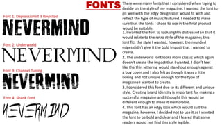
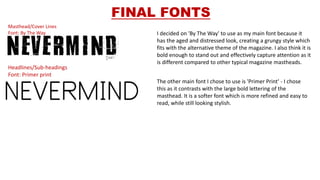
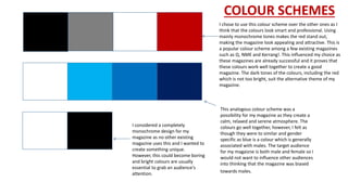
STYLE SHEETS
Font 1: Depressionist 3 Revisited
Font 2: Underworld
Font 3: Channel Tuning
Font 4: Shank Font
FONTS There were many fonts that I considered when trying to
decide on the style of my magazine. I wanted the font to
go well with the edgy design so it would fit with and
reflect the type of music featured. I needed to make
sure that the fonts I chose to use in the final product
would be suitable.
1. I wanted the font to look slightly distressed so that it
would relate to the retro style of the magazine; this
font fits the style I wanted, however, the rounded
edges didn't give it the bold impact that I wanted to
create.
2. The underworld font looks more classic which again
doesn't create the impact that I wanted. I didn't feel
like the thin lettering would stand out enough against
a buy cover and I also felt as though it was a little
boring and not unique enough for the type of
magazine I wanted to create.
3. I considered this font due to its different and unique
style. Creating brand identity is important for making a
successful magazine and I thought this would be
different enough to make it memorable.
4. This font has an edgy look which would suit the
magazine, however, I decided not to use it as I wanted
the font to be bold and clear and I feared that some
readers would not find this style legible.
FINAL FONTS
Masthead/Cover Lines
Font: By The Way
Headlines/Sub-headings
Font: Primer print
I decided on 'By The Way' to use as my main font because it
has the aged and distressed look, creating a grungy style which
fits with the alternative theme of the magazine. I also think it is
bold enough to stand out and effectively capture attention as it
is different compared to other typical magazine mastheads.
The other main font I chose to use is 'Primer Print' - I chose
this as it contrasts with the large bold lettering of the
masthead. It is a softer font which is more refined and easy to
read, while still looking stylish.
COLOUR SCHEMES
I chose to use this colour scheme over the other ones as I
think that the colours look smart and professional. Using
mainly monochrome tones makes the red stand out,
making the magazine look appealing and attractive. This is
a popular colour scheme among a few existing magazines
such as Q, NME and Kerrang!. This influenced my choice as
these magazines are already successful and it proves that
these colours work well together to create a good
magazine. The dark tones of the colours, including the red
which is not too bright, suit the alternative theme of my
magazine.
This analogous colour scheme was a
possibility for my magazine as they create a
calm, relaxed and serene atmosphere. The
colours go well together, however, I felt as
though they were to similar and gender
specific as blue is a colour which is generally
associated with males. The target audience
for my magaizne is both male and female so I
would not want to influence other audiences
into thinking that the magazine was biased
towards males.
I considered a completely
monochrome design for my
magazine as no other existing
magazine uses this and I wanted to
create something unique.
However, this could become boring
and bright colours are usually
essential to grab an audience's
attention.

Style sheets (1)

  • 1.
  • 2.
    Font 1: Depressionist3 Revisited Font 2: Underworld Font 3: Channel Tuning Font 4: Shank Font FONTS There were many fonts that I considered when trying to decide on the style of my magazine. I wanted the font to go well with the edgy design so it would fit with and reflect the type of music featured. I needed to make sure that the fonts I chose to use in the final product would be suitable. 1. I wanted the font to look slightly distressed so that it would relate to the retro style of the magazine; this font fits the style I wanted, however, the rounded edges didn't give it the bold impact that I wanted to create. 2. The underworld font looks more classic which again doesn't create the impact that I wanted. I didn't feel like the thin lettering would stand out enough against a buy cover and I also felt as though it was a little boring and not unique enough for the type of magazine I wanted to create. 3. I considered this font due to its different and unique style. Creating brand identity is important for making a successful magazine and I thought this would be different enough to make it memorable. 4. This font has an edgy look which would suit the magazine, however, I decided not to use it as I wanted the font to be bold and clear and I feared that some readers would not find this style legible.
  • 3.
    FINAL FONTS Masthead/Cover Lines Font:By The Way Headlines/Sub-headings Font: Primer print I decided on 'By The Way' to use as my main font because it has the aged and distressed look, creating a grungy style which fits with the alternative theme of the magazine. I also think it is bold enough to stand out and effectively capture attention as it is different compared to other typical magazine mastheads. The other main font I chose to use is 'Primer Print' - I chose this as it contrasts with the large bold lettering of the masthead. It is a softer font which is more refined and easy to read, while still looking stylish.
  • 4.
    COLOUR SCHEMES I choseto use this colour scheme over the other ones as I think that the colours look smart and professional. Using mainly monochrome tones makes the red stand out, making the magazine look appealing and attractive. This is a popular colour scheme among a few existing magazines such as Q, NME and Kerrang!. This influenced my choice as these magazines are already successful and it proves that these colours work well together to create a good magazine. The dark tones of the colours, including the red which is not too bright, suit the alternative theme of my magazine. This analogous colour scheme was a possibility for my magazine as they create a calm, relaxed and serene atmosphere. The colours go well together, however, I felt as though they were to similar and gender specific as blue is a colour which is generally associated with males. The target audience for my magaizne is both male and female so I would not want to influence other audiences into thinking that the magazine was biased towards males. I considered a completely monochrome design for my magazine as no other existing magazine uses this and I wanted to create something unique. However, this could become boring and bright colours are usually essential to grab an audience's attention.