Download as PDF, PPTX

![Typesetter’s Punctuation
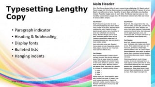
•
•
•
•
•
•
•
•
•
•
•
Apostrophes
Brackets of various kinds [ ], ( ), { }, ⟨ ⟩
Colons and semicolons
Commas
Dashes and hyphens ‒, –, —, ―
Ellipsis
Exclamation and question marks
Quotation
Marks
Slashes
Special characters ©®¼½¾
Image source: http://www.newrepublic.com/article/113101/smart-quotes-are-killing-apostrophe](https://image.slidesharecdn.com/typemlv-140205195649-phpapp02/85/Type-21-320.jpg)
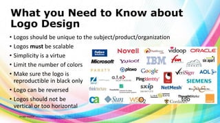
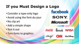


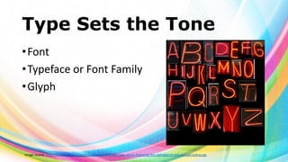
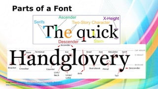
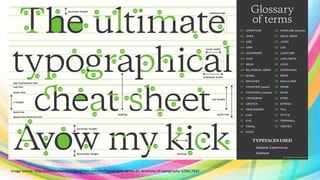
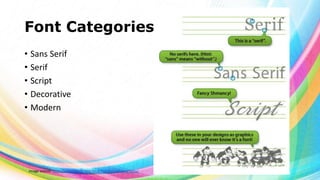
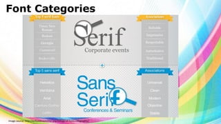
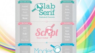
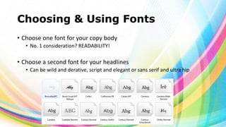
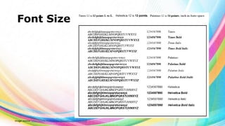
This document provides an overview of typography and font design. It discusses different font categories including serif, sans serif, script, decorative, and modern. It describes font elements such as typeface, glyph, and kerning. It provides tips for choosing fonts for different purposes and platforms. The document also discusses logo design principles such as simplicity, scalability, and readability in different color modes.


![[DevDay2019] Spacing and Typography, keys to a professional UI design - By Ng...](https://cdn.slidesharecdn.com/ss_thumbnails/duongnguyen-typographyspacing-190408082945-thumbnail.jpg?width=640&height=640&fit=bounds)


