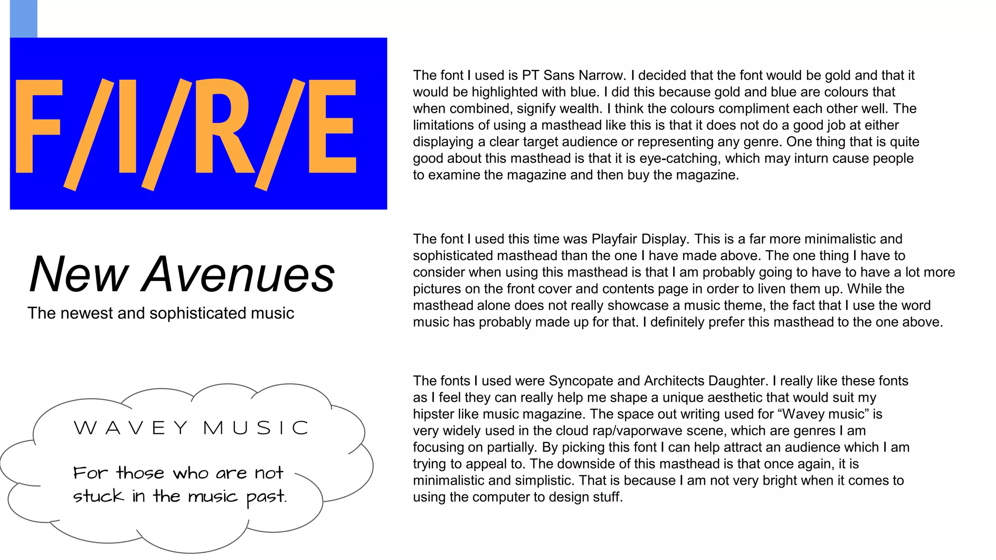
The document discusses three different magazine masthead designs. The first uses gold and blue fonts to signify wealth and complement each other well, but does not clearly display the target audience or genre. The second uses a more minimalist and sophisticated font that will require more pictures to liven up the cover. The third uses fonts that fit the aesthetic of genres like cloud rap and vaporwave to attract that intended audience, but is simplistic due to the author's limited design skills.