Download to read offline
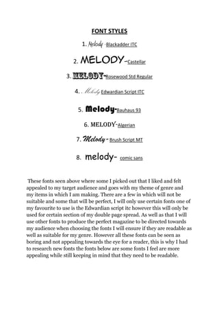
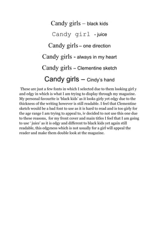

This document discusses font styles that could be used for a magazine targeted towards girls. It lists initial font options like Melody-Blackadder ITC and Melody-Edwardian Script ITC. The author notes they will only use certain fonts in certain sections. Additional fonts are suggested like "Candy girls – black kids" that are more appealing while keeping readability in mind. The author's favorite is "black kids" as it is girly yet edgy. They decide not to use "Clementine sketch" as it is hard to read. "Juice" is selected for the front cover as it is edgy in an appealing way.


