PRECEDENT AS A SOURCE OF LAW (SAIF JAVED).pptxOmGod1
Precedent, or stare decisis, is a cornerstone of common law systems where past judicial decisions guide future cases, ensuring consistency and predictability in the legal system. Binding precedents from higher courts must be followed by lower courts, while persuasive precedents may influence but are not obligatory. This principle promotes fairness and efficiency, allowing for the evolution of the law as higher courts can overrule outdated decisions. Despite criticisms of rigidity and complexity, precedent ensures similar cases are treated alike, balancing stability with flexibility in judicial decision-making.
Military Commissions details LtCol Thomas Jasper as Detailed Defense CounselThomas (Tom) Jasper
Military Commissions Trial Judiciary, Guantanamo Bay, Cuba. Notice of the Chief Defense Counsel's detailing of LtCol Thomas F. Jasper, Jr. USMC, as Detailed Defense Counsel for Abd Al Hadi Al-Iraqi on 6 August 2014 in the case of United States v. Hadi al Iraqi (10026)
Car Accident Injury Do I Have a Case....Knowyourright
Every year, thousands of Minnesotans are injured in car accidents. These injuries can be severe – even life-changing. Under Minnesota law, you can pursue compensation through a personal injury lawsuit.
ASHWINI KUMAR UPADHYAY v/s Union of India.pptxshweeta209
transfer of the P.I.L filed by lawyer Ashwini Kumar Upadhyay in Delhi High Court to Supreme Court.
on the issue of UNIFORM MARRIAGE AGE of men and women.
RIGHTS OF VICTIM EDITED PRESENTATION(SAIF JAVED).pptxOmGod1
Victims of crime have a range of rights designed to ensure their protection, support, and participation in the justice system. These rights include the right to be treated with dignity and respect, the right to be informed about the progress of their case, and the right to be heard during legal proceedings. Victims are entitled to protection from intimidation and harm, access to support services such as counseling and medical care, and the right to restitution from the offender. Additionally, many jurisdictions provide victims with the right to participate in parole hearings and the right to privacy to protect their personal information from public disclosure. These rights aim to acknowledge the impact of crime on victims and to provide them with the necessary resources and involvement in the judicial process.
NATURE, ORIGIN AND DEVELOPMENT OF INTERNATIONAL LAW.pptxanvithaav
These slides helps the student of international law to understand what is the nature of international law? and how international law was originated and developed?.
The slides was well structured along with the highlighted points for better understanding .
In 2020, the Ministry of Home Affairs established a committee led by Prof. (Dr.) Ranbir Singh, former Vice Chancellor of National Law University (NLU), Delhi. This committee was tasked with reviewing the three codes of criminal law. The primary objective of the committee was to propose comprehensive reforms to the country’s criminal laws in a manner that is both principled and effective.
The committee’s focus was on ensuring the safety and security of individuals, communities, and the nation as a whole. Throughout its deliberations, the committee aimed to uphold constitutional values such as justice, dignity, and the intrinsic value of each individual. Their goal was to recommend amendments to the criminal laws that align with these values and priorities.
Subsequently, in February, the committee successfully submitted its recommendations regarding amendments to the criminal law. These recommendations are intended to serve as a foundation for enhancing the current legal framework, promoting safety and security, and upholding the constitutional principles of justice, dignity, and the inherent worth of every individual.
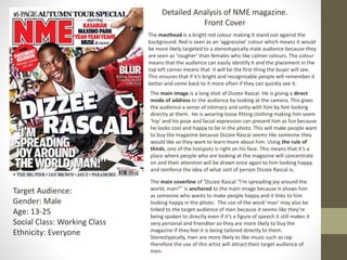
1. Detailed Analysis of NME magazine.
Front Cover
The masthead is a bright red colour making it stand out against the
background. Red is seen as an ‘aggressive’ colour which means it would
be more likely targeted to a stereotypically male audience because they
are seen as ‘rougher’ than females who like calmer colours. The colour
means that the audience can easily identify it and the placement in the
top left corner means that it will be the first thing the buyer will see.
This ensures that if it’s bright and recognisable people will remember it
better and come back to it more often if they can quickly see it.
Target Audience:
Gender: Male
Age: 13-25
Social Class: Working Class
Ethnicity: Everyone
The main image is a long shot of Dizzee Rascal. He is giving a direct
mode of address to the audience by looking at the camera. This gives
the audience a sense of intimacy and unity with him by him looking
directly at them. He is wearing loose fitting clothing making him seem
‘hip’ and his pose and facial expression can present him as fun because
he looks cool and happy to be in the photo. This will make people want
to buy the magazine because Dizzee Rascal seems like someone they
would like so they want to learn more about him. Using the rule of
thirds, one of the hotspots is right on his face. This means that it’s a
place where people who are looking at the magazine will concentrate
on and their attention will be drawn once again to him looking happy
and reinforce the idea of what sort of person Dizzee Rascal is.
The main coverline of ‘Dizzee Rascal “I'm spreading joy around the
world, man!”’ is anchored to the main image because it shows him
as someone who wants to make people happy and it links to him
looking happy in the photo. The use of the word ‘man’ may also be
linked to the target audience of men because it seems like they’re
being spoken to directly even if it’s a figure of speech it still makes it
very personal and friendlier so they are more likely to buy the
magazine if they feel it is being tailored directly to them.
Stereotypically, men are more likely to like music such as rap
therefore the use of this artist will attract their target audience of
men.
2. The mise-en-scene of the set and background being covered in
graffiti suggests what sort of music Dizzee Rascal makes even if
someone didn’t know before as things such as graffiti are usually
associated with hip-hop therefore it will give a person an idea of
what they are looking at. The clothing is the same; Dizzee Rascal is
represented as a typical rapper so the audience knows what they’re
buying.
The other coverlines discuss a variety of different artists and
genres. This widens the potential market for NME from the niche
market it would have with just coverlines about rap. It means that
it will sell more and talking about bands such as Kasabian and
Muse which are rock and alternative bands attracts people with
more varied music tastes rather than people who are interested
just in once genre. The bands mentioned are mostly rock bands
which are stereotypically more liked by men due to being ‘louder’
and ‘rougher’. Most of the bands mentioned are mostly male
anyway so the target audience of men are more likely to identify
and see themselves in the people who are talked about so they’re
more likely to buy it.
The colour scheme for the magazine is mostly red and white. Red can
be seen as an ‘aggressive’ colour which is something more masculine
therefore this is used to attract a male audience.
3. Contents Page
The contents page uses the same font but in different colours and sizes. This
keeps the contents page clean and organised looking while at the same time
drawing attention to where it’s meant to be.
The main image uses a direct mode of address. It keeps the audience interested
and engaged because it gives the a feeling of privacy. Its anchored to the image
as there's a tour bus in the background and the title of the main piece of writing
is titled ‘Touring special’ showing what the main piece of writing will be about.
The image is of a young female and as a magazine that’s marketed to men it’s
quite unusual and her pose is quite opening and causal rather than sexual which
might be expected.
The date is under the contents title. It’s in white and in contrast to the black
but in a small font as it isn’t very important. It’s filling out white space which
would be empty otherwise. The white colour fits in with the colour scheme.
The title for the contents page is bold and the largest writing on the page, next
to the masthead for NME. This clearly indicated what the page is. It is also in
black on a white background which gives it a contrast. The masthead is in red
and is right next to the title and keeps the branding for the magazine.
There is only one image and it doesn’t have a caption but it isn’t linked
directly to an article but to the writing below it which gives it more
information and page numbers to the articles.
4. Contents Page
The page numbers are in red next to black writing which makes them stand out
in contrast. This means that this is the first thing the reader will look at may just
go straight there because they know these will be in main things in the
magazine. The titles sub-titles are writer in bold writing in white against the
black. This means that if the reader knows what they’re looking for they might
just go straight there because it’s the boldest thing and doesn't need the extra
information underneath.
5. Double Page Spread
The double page spread is spread between a page with a
main image and then a page with the article. The article is
spread into four columns and isn’t too long. Which can
once again indicate a younger audience because they don’t
have the same attention span as an adult and won’t be
bothered to read for as long.
The title is crooked and uneven which fits in with the theme
of the issue and the artist that they're talking about as the
artist is a rap artist and they’re not something that is seen as
organised or neat.
The font for the main article is easy to read and follows
conventions because it’s how the audience would expect the
article to look. This means that the reader doesn’t have to
struggle so they are more likely to read the article because
its something that they are familiar with. The same fonts are
used for the byline at the top but bigger so that it’s familiar
and still easy to read but stands out.
The article uses a lot of informal language which is
anchored by the causal poses in the image. There
is a lot of slang and swearing used which shows
that the magazine is targeted males because
they're seen as more ‘crude’ and would feel better
about that language being used. Swearing also has
connotations to being informal and comfortable
which can be linked to it being a conversation and
making people feel more involved. This also fits
into the genre of the magazine and the artist as
it’s a rap artist and it would be expected to use
informal language.
The drop cap is used at the start of article. This follows the
code and conventions of magazines as most magazines use
drop caps to distinguish the start of a magazine in an easy to
find way.
6. Double Page Spread
There is one main image. The image isn’t giving a direct mode
of address which doesn’t follow the codes of conventions of a
magazine, and is unusual because it can be seen as stand
offish rather than inviting the people to carry on reading but
fits in with the genre of the rap music which doesn’t follow
musical conventions either. The pose however is casual which
enforces the idea that this is a conversation and can attract
the male audience because it makes them feel even with the
person being interviewed rather then the celebrity being
superior to them as they most likely wouldn’t like to be seen
as they're being talked down to, so that may make them more
compelled to carry on reading.
There is no white space on the double page spread. This
means that the whole page is filled with different things and
where the article isn’t writer there are secondary images. This
keeps the magazine original and easy to read but not boring
to look at and will keep the audience interested.
The branding of the magazine is kept through the font of the
title which is the same as the contents page and NME but in
a different layout. The jacket of the artist is red which can be
seen to be kept in the colour scheme of the magazine
through that as there isn’t much red anywhere else of the
double page.
7. What do these have in common?
All of these follow the same colour scheme of red, white
and black. This means that the magazine keeps its brand
throughout the whole issue and is easily recognisable.
The mise-en-scene of the front cover and the two page
spread are the same with the graffiti background. This keeps
the theme the same and the branding stays the same
throughout the main features of the magazine.
The masthead is featured on the contents and the front
cover. This keeps the branding recognisable throughout the
magazine.