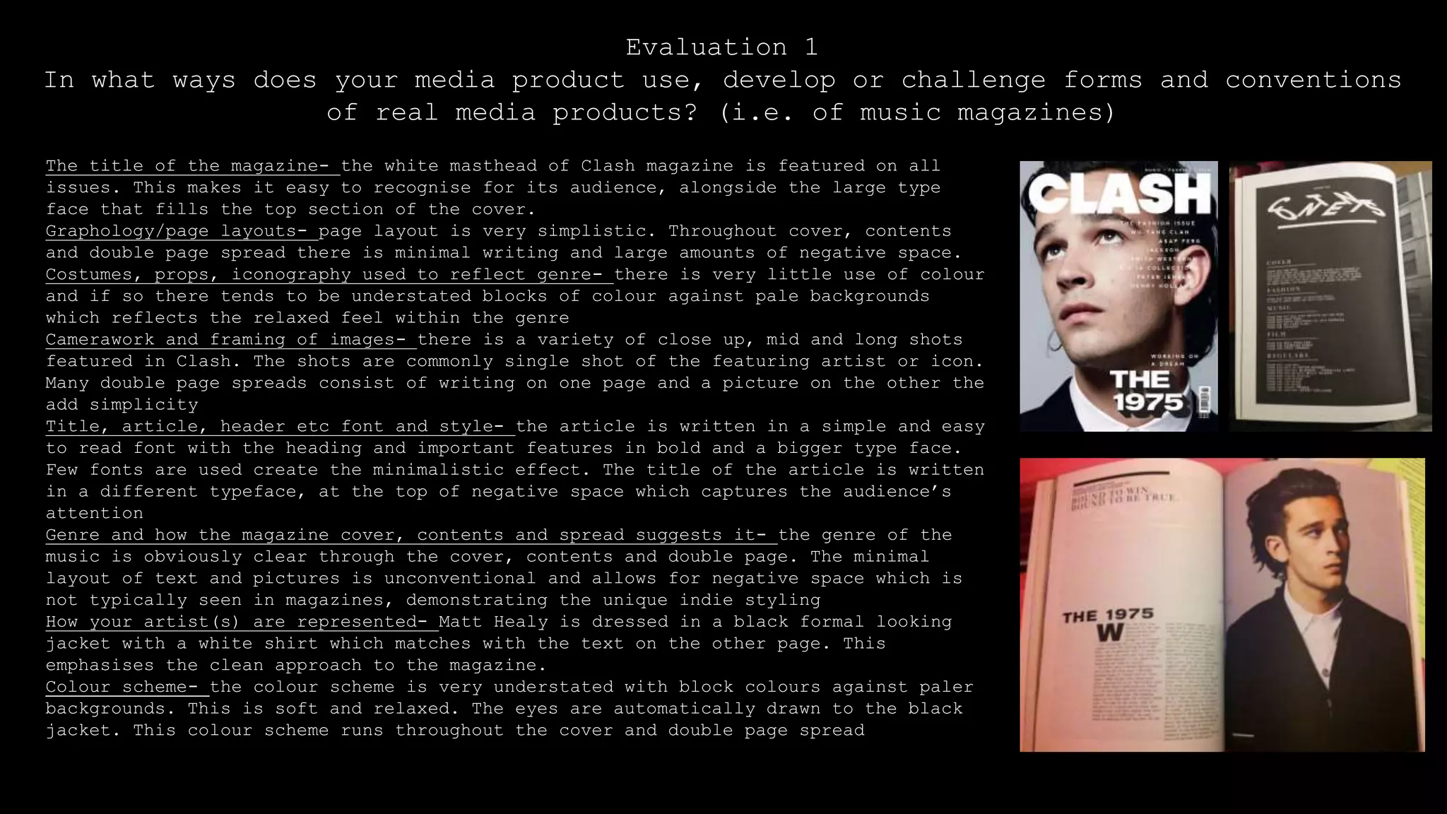
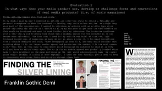
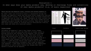
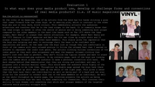
Lucknow 💋 Escorts Service Lucknow Phone No 8923113531 Elite Escort Service Av...
Evaluation 1 final presentation
1. Evaluation 1
In what ways does your media product use, develop or challenge forms and conventions
of real media products? (i.e. of music magazines)
The title of the magazine- the white masthead of Clash magazine is featured on all
issues. This makes it easy to recognise for its audience, alongside the large type
face that fills the top section of the cover.
Graphology/page layouts- page layout is very simplistic. Throughout cover, contents
and double page spread there is minimal writing and large amounts of negative space.
Costumes, props, iconography used to reflect genre- there is very little use of colour
and if so there tends to be understated blocks of colour against pale backgrounds
which reflects the relaxed feel within the genre
Camerawork and framing of images- there is a variety of close up, mid and long shots
featured in Clash. The shots are commonly single shot of the featuring artist or icon.
Many double page spreads consist of writing on one page and a picture on the other the
add simplicity
Title, article, header etc font and style- the article is written in a simple and easy
to read font with the heading and important features in bold and a bigger type face.
Few fonts are used create the minimalistic effect. The title of the article is written
in a different typeface, at the top of negative space which captures the audience’s
attention
Genre and how the magazine cover, contents and spread suggests it- the genre of the
music is obviously clear through the cover, contents and double page. The minimal
layout of text and pictures is unconventional and allows for negative space which is
not typically seen in magazines, demonstrating the unique indie styling
How your artist(s) are represented- Matt Healy is dressed in a black formal looking
jacket with a white shirt which matches with the text on the other page. This
emphasises the clean approach to the magazine.
Colour scheme- the colour scheme is very understated with block colours against paler
backgrounds. This is soft and relaxed. The eyes are automatically drawn to the black
jacket. This colour scheme runs throughout the cover and double page spread
2. Evaluation 1
In what ways does your media product use, develop or challenge forms and conventions
of real media products? (i.e. of music magazines)
The title of my magazine
The title of my magazine, VINYL, follows typical convention of existing
magazines. Mine closely follows the codes and conventions of Clash and Dazed
as it is short and has a dominance on the page due to the wide, block font,
(Bolts SF). The masthead comes two thirds into the page, this does not follow
typical convention of clash and dazed magazines, however I felt for the rest
of the positioning of my magazine, the masthead being to the left of the page
suited my cover more. In this instance my magazine follows the conventions of
Fader as it has the same prominence on the page, making it a memorable title
for my audience and is an immediate attraction for the consumer’s eyes without
then consciously realizing which would have a huge benefit for the audience
that I am trying to attract. The masthead is in black which stands out and
pops on the page as it is sitting on a pale grey background. I chose the name
‘Vinyl’ as it has a close musical link and refers to listening to music on a
vinyl record. As technology has become more modernized, many no longer listen
to music on a vinyl records which makes it a less conventional way of
listening to music. I felt that this was relevant to the indie genre, as the
population who listen to the indie genre is much smaller than those who listen
to pop and r&b. I wanted to follows these codes as Clash and Dazed were my
original influence for my own magazine.
3. Evaluation 1
In what ways does your media product use, develop or challenge forms and conventions
of real media products? (i.e. of music magazines)
Graphology/page layout
I wanted to keep the layout of my magazine very minimal and simplistic so I only used three fonts for the
headings and smaller features of my page decor which were, Bolts SF, chanson heavy SF and franklin gothic demi. I
chose these fonts as they are very clean and bold, with straight edges and lines. I wanted to steer away from
rounded and curly fonts as it would have taken away the simplicity which I was trying to achieve. I followed the
conventions set out by roger black using “only one or two typefaces.” The added features on my cover, outlining
plus features of the magazine, are written in pink which has been taken from the colour of Alfie’s top which
makes a subtle link between them and makes their connection seamless. The same colour pink is also taken to make
the pull quotes pop for the reader. The shade of pink is pale enough to follow the relaxed and minimal effect I
was aiming for but is vibrant enough to be easy to read. On the cover I have used the ‘Z’ pattern page layout
which helps the audience see each aspect of the page. First the mast head, then through the hands of Alfie to
attract my audience to the band and then across the bottom of the page to the band name. This makes sure that the
consumer has subconsciously seen all areas of the cover. The barcode was positioned at the top of the page,
alongside the mast head to fill negative space that would have been there. The measurements of my cover is 22 x
28.5 which follows the measurements and conventions of ‘Q’ magazine. For my contents page, I followed the
conventions of clash magazine and had a black background with a white border to make the text on the contents
pop. This pay layout follows the conventions of niche magazine titles such as Clash, however does not follow
conventions of mainstream magazines as they tend to stick to black text on a white background which follows
conventions set out by Roger Black, “White for background, black for text”. I wanted very little text on my
context to achieve the clean look. When planning and researching, I noticed that Clash didn’t feature many or any
pictures on the contents page, however I preferred the mid/ close up shot of the artist to break up the text and
bring colour to the page and interest my audience. This also meant the page didn’t look empty and filled some
negative space. The majority of the headings and page décor are written in black to follow conventions of double
pages in Clash which I followed when doing my research and planning. Specific words from the title such as
‘silver lining’ on my double page are written in a grey colour to subconsciously attract the consumer to the
title of the double page. The title is the most important part of the double page and I wanted this to stand out
and allow variety for the consumer. Also the title of the double page is situated on the right hand side of the
double page, with the pictures on the left. This is not so commonly seen and goes against most magazine codes and
conventions, however during research and planning, Clash had many pages where this pattern occurred which I
thought was unique and made my artists the main feature and the first selling point. The uniqueness of this set
up shows the individuality of the indie genre.
4. Evaluation 1
In what ways does your media product use, develop or challenge forms and conventions
of real media products? (i.e. of music magazines)
Costumes, props, iconography used to reflect genre
My artists, The Reign, were styled in a couple of different outfit as the images were
taken over a few days to create diversity and a different side to each of the
artists. I wanted the artists to be wearing clothing that had very little colour,
mostly black, white and navy to alliterate the minimal and clean approach, however I
did want to have a single accent colour throughout my magazine. I chose pink to
emphasis the fact that my magazine was aimed at both a male and female audience and
to add that feminine aspect. I took the shade of pink that is use throughout my
magazine from the colour of the top that my lead singer was wearing to further
connote that he was an important member of the band and to link the two so that my
colour scheme was fluent and seamless throughout. The boys are all wearing black
jeans to keep it consistent. Two of the band members are wearing dark, oversized
items of clothing which in some pictures are layered to create the relaxed and indie
vibe, also known as the homeless fit.
Camerawork and framing of images
The camera that I used to take the images throughout my magazine was the Nikon
D32100. When using the camera, I changed the settings on the camera to get the
desired look that I thought gave the appropriate styling. Some images were taken
with the flash and others were not. I used other settings such as portrait to
achieve the images. Throughout my magazine I follow current conventions of leading
magazines by using mostly mid and mid/long shots with a few close up shots where I
tried to focus on the artist’s facial expressions and their posture, to really
connect with the audience. When working on the cover, I made sure that they were
central and were positioned symmetrically. I made sure that the lead singer was
directly in the middle of the image meaning that his hands were the main focus of
the magazine to draw in the consumer’s attention on my cover. On my cover an
double page spread on of the band members if facing down the left which
demonstrates his character, personality and role in the band.
5. Title, article, header etc. font and style
On my double page spread I combined an article and interview style to create a friendly and
personal atmosphere so when the consumer is reading they could relate and feel as though they
were part of the conversation. I wanted to introduce my artists with an article type style
before beginning the article as I wanted to allow my audience to get know the band members so
they would be intrigued and want to read further into my interview. The interview continues
with a very chatty and friendly vibe which makes reading easier for the consumer as it can
become more relatable. The font that I used for my article was Arial at size ten. This
followed conventions of magazines as many do not go above a size 11. I followed conventions
from a notable designer who said, “Some newspapers go down to 8, and many would consider that
anything above 11 is too large, wastes space, and patronises the reader. 9 is the most common
size.” This font is very easy to read which would encourage my audience to read it as they
will not have to strain their eyes. The title for my double spread was gradually layered which
made it more prominent on the page and broke up the text would subconsciously make the reader
pause whilst reading it giving it more emphasis. I used the font Franklin gothic demi to keep
it consistent with other fonts and stick to minimal clean look.
Evaluation 1
In what ways does your media product use, develop or challenge forms and conventions
of real media products? (i.e. of music magazines)
Size 8
Size 9
Size 10
Size 10.5
Size 11
Size 12
Franklin Gothic Demi
6. Evaluation 1
In what ways does your media product use, develop or challenge forms and conventions
of real media products? (i.e. of music magazines)
Genre and how the magazine cover, contents and spread suggests it
My indie/ indie rock alternative genre is represented through the
minimal and simplistic layout and the block colour scheme with calm and
relaxing accent colours, in my case pastel pink, following conventions
of magazines such as clash and Dazed. Throughout my cover contents and
double page I am consistent with my layout and colour scheme and also
represent my genre through the artists clothing. They are all wearing
dark block colour pieces of clothing such as oversized box t-shirts,
worn jeans and shoes with oversized jackets.
Colour scheme
Throughout my magazine I used a very simple colour scheme.
Mostly black, white and grey was used with an accent colour to
provide variation and interest for my audience. This followed
the conventions set out by Roger Black, “The first colour is
white. The second colour is black. The third colour is red.”
However, for my genre I thought that red would be too harsh so I
chose pastel pink instead to conform with the relaxed, calm
vibes. I used the pink from my lead singer’s top as the accent
colour so show consistency throughout and to make my magazine
look seamless. I used these colours as they are very understated
and calming to look at which creates the relaxed feel that I
wanted to achieve for my audience.
Cover Contents Double page Spread
7. Evaluation 1
In what ways does your media product use, develop or challenge forms and conventions
of real media products? (i.e. of music magazines)
How the artist is represented?
On the cover of my magazine, one of my artists from the band has his hands striking a pose
that comes forward from the other boys. He is wearing pink, which in contrast to the other
boys who are in very dark, block colours. This immediately attracts the audiences
attentions and connotes that he is the lead singer in the band. It is commonly known that
the lead singer in bands is often the centre of photos and is doing something more unique
compared to the other members in the band like bands such as The 1975 where the lead
singer, Matt Healy’ is always then centre attraction. For example, where Matt Healy and
The 1975 feature in Clash magazine and Matt has his own close up single shots and it
always standing forward of the other band members. This stance gives the impression that
the boys are outgoing and want to encourage their fan base to be confident with
aspirations and goals. At the same time the boys look as though they are comfortable in
front of the camera with very relaxed posture to follow the relaxed feel that I wanted to
achieve to represent the indie rock genre. The artists clothing follows conventions of the
indie genre as they each show uniqueness and wear the baggier relaxed clothing that
doesn’t look over done or perfect. They don’t follow the typical brands and want to stand
out from the mainstream pop audience. On my contents page, each of the boys are looking
into the camera which allows the audience to make a personal connection with band. The
dark shadow behind them demonstrates that they are strong and confident and want to
progress into a serious musical carer. This would make the audience think highly of the
band and aspire to be like them. Through-out my double page spread the boys have there
individual close up shots which take up the whole of the right page. This gives a sense
that the boys have their own individuality as well as being part of a band and can also
allow for the audience to connect with one of the band members as an individual. As well
as the shots throughout my double page, the interview presents the artists as being
bright, adventurous boys who want to make something for themselves. This connotes their
ability to turn dreams into something real which most younger members of the targeted
audience would possibly struggle with.