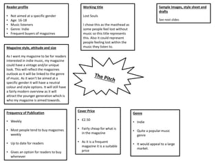
This document outlines plans for a new indie music magazine, including:
- The working title "Lost Souls" represents people feeling lost without or within music.
- The magazine will focus on the indie genre and aim to appeal to a large, 16-18 year old audience of music listeners.
- It will be published weekly for $2.50, providing up-to-date content for readers.
- The magazine's style will have a vintage, unique look to reflect the indie genre while appealing to younger readers.
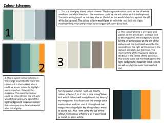
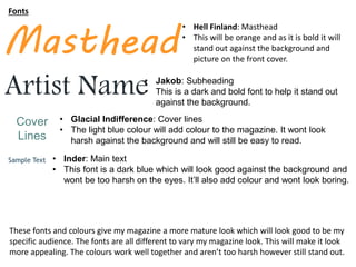
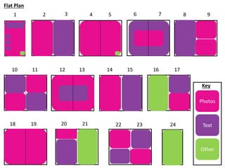
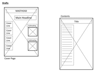
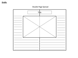
- Sample color schemes, fonts, and draft page layouts are presented for a light, orange-accented design appealing to the target audience.