This is Tom's answer to question 1 of the evaluation for our music magazine. The question is, "In what way does your media product use, develop or challenge codes and conventions of real media products?".
This is Tom's answer to question 1 of the evaluation for our music magazine. The question is, "In what way does your media product use, develop or challenge codes and conventions of real media products?".
Welcome to the new Mizzima Weekly !
Mizzima Media Group is pleased to announce the relaunch of Mizzima Weekly. Mizzima is dedicated to helping our readers and viewers keep up to date on the latest developments in Myanmar and related to Myanmar by offering analysis and insight into the subjects that matter. Our websites and our social media channels provide readers and viewers with up-to-the-minute and up-to-date news, which we don’t necessarily need to replicate in our Mizzima Weekly magazine. But where we see a gap is in providing more analysis, insight and in-depth coverage of Myanmar, that is of particular interest to a range of readers.
‘वोटर्स विल मस्ट प्रीवेल’ (मतदाताओं को जीतना होगा) अभियान द्वारा जारी हेल्पलाइन नंबर, 4 जून को सुबह 7 बजे से दोपहर 12 बजे तक मतगणना प्रक्रिया में कहीं भी किसी भी तरह के उल्लंघन की रिपोर्ट करने के लिए खुला रहेगा।
01062024_First India Newspaper Jaipur.pdfFIRST INDIA
Find Latest India News and Breaking News these days from India on Politics, Business, Entertainment, Technology, Sports, Lifestyle and Coronavirus News in India and the world over that you can't miss. For real time update Visit our social media handle. Read First India NewsPaper in your morning replace. Visit First India.
CLICK:- https://firstindia.co.in/
#First_India_NewsPaper
Future Of Fintech In India | Evolution Of Fintech In IndiaTheUnitedIndian
Navigating the Future of Fintech in India: Insights into how AI, blockchain, and digital payments are driving unprecedented growth in India's fintech industry, redefining financial services and accessibility.
03062024_First India Newspaper Jaipur.pdfFIRST INDIA
Find Latest India News and Breaking News these days from India on Politics, Business, Entertainment, Technology, Sports, Lifestyle and Coronavirus News in India and the world over that you can't miss. For real time update Visit our social media handle. Read First India NewsPaper in your morning replace. Visit First India.
CLICK:- https://firstindia.co.in/
#First_India_NewsPaper
हम आग्रह करते हैं कि जो भी सत्ता में आए, वह संविधान का पालन करे, उसकी रक्षा करे और उसे बनाए रखे।" प्रस्ताव में कुल तीन प्रमुख हस्तक्षेप और उनके तंत्र भी प्रस्तुत किए गए। पहला हस्तक्षेप स्वतंत्र मीडिया को प्रोत्साहित करके, वास्तविकता पर आधारित काउंटर नैरेटिव का निर्माण करके और सत्तारूढ़ सरकार द्वारा नियोजित मनोवैज्ञानिक हेरफेर की रणनीति का मुकाबला करके लोगों द्वारा निर्धारित कथा को बनाए रखना और उस पर कार्यकरना था।
27052024_First India Newspaper Jaipur.pdfFIRST INDIA
Find Latest India News and Breaking News these days from India on Politics, Business, Entertainment, Technology, Sports, Lifestyle and Coronavirus News in India and the world over that you can't miss. For real time update Visit our social media handle. Read First India NewsPaper in your morning replace. Visit First India.
CLICK:- https://firstindia.co.in/
#First_India_NewsPaper
ys jagan mohan reddy political career, Biography.pdfVoterMood
Yeduguri Sandinti Jagan Mohan Reddy, often referred to as Y.S. Jagan Mohan Reddy, is an Indian politician who currently serves as the Chief Minister of the state of Andhra Pradesh. He was born on December 21, 1972, in Pulivendula, Andhra Pradesh, to Yeduguri Sandinti Rajasekhara Reddy (popularly known as YSR), a former Chief Minister of Andhra Pradesh, and Y.S. Vijayamma.
role of women and girls in various terror groupssadiakorobi2
Women have three distinct types of involvement: direct involvement in terrorist acts; enabling of others to commit such acts; and facilitating the disengagement of others from violent or extremist groups.
In a May 9, 2024 paper, Juri Opitz from the University of Zurich, along with Shira Wein and Nathan Schneider form Georgetown University, discussed the importance of linguistic expertise in natural language processing (NLP) in an era dominated by large language models (LLMs).
The authors explained that while machine translation (MT) previously relied heavily on linguists, the landscape has shifted. “Linguistics is no longer front and center in the way we build NLP systems,” they said. With the emergence of LLMs, which can generate fluent text without the need for specialized modules to handle grammar or semantic coherence, the need for linguistic expertise in NLP is being questioned.
31052024_First India Newspaper Jaipur.pdfFIRST INDIA
Find Latest India News and Breaking News these days from India on Politics, Business, Entertainment, Technology, Sports, Lifestyle and Coronavirus News in India and the world over that you can't miss. For real time update Visit our social media handle. Read First India NewsPaper in your morning replace. Visit First India.
CLICK:- https://firstindia.co.in/
#First_India_NewsPaper
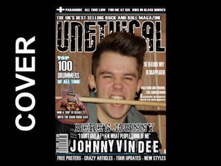
2. Cover Conventions
I structured my cover around the conventions of a Kerrang! magazine cover. This focused on the
general music magazine conventions such as a masthead, cover lines, a main image,
advertisements, a selling line, headline, price and barcode. As my magazine is a rock one, it
seemed appropriate to follow the structure of Kerrang! to keep in with the conventions of a rock
magazine I took a range of images and chose from the most aggressive. I also added in some
inappropriate language to engage the particular audience and link to the title ‘UNETHICAL’.
Inappropriate language to follow rock magazine
conventions.
Artist eye contact is conventional of music
magazines to make the magazine feel more
personal to the audience.
I decided to follow conventions, rather than break them, because it is what an audience is used
to. They are familiar with the structure and like it. They know their way around it and feel
comfortable. It is popular. However, if I had broken conventions people may not understand and
like to stick with what they already know.
3. Cover Forms
My cover’s forms follow a house style throughout each of the pages in order to show a
connection and to make the audience feel comfortable. These forms include:
• Colours
The colours used in my cover are featured throughout the rest of my magazine. The colours are
black and white, as they re contrasting and have a conventional rock association. And also a light
blue, which is the same colour on the artist’s clothes.
• Images
I took my own images in a photo-shoot and manipulated them in Photoshop to add into the
cover. It is then conventionally positioned central in the page.
• Text
I used a range of sizes for the text as the larger and bolder text is the most interesting and
engaging to capture the audience’s attention. The smaller text is slightly more detail of the main
titles and Headings.
• Fonts
I used a house font throughout each of the pages for the smaller text and a bold, unique and
edgy font for the Masthead, which is conventionally positioned at the top of my magazine.
Black, white and blue text, linking with house
style colour scheme.
HEADLINE FONT INITIAL IDEAS
5. Contents Conventions
The layout of my Contents page has followed a similar structure to one of Kerrang!’s contents
pages. I did this because Kerrang! are the most popular rock magazine and know how to
appropriately appeal to the particular audience. It is conventional of a contents page to feature
the name of the magazine, the date and issue number, a variety of images and follow a house
style and colour scheme. As the contents is a navigation page it tends to feature page numbers,
references and small snapshots of particular articles. Each article or feature tends to come
under a particular category which is clearly stated.
An editor’s letter is
conventional of a contents
page. They are not always
TITLE OF PAGE AND
featured every issue but
MAGAZINE NAME
certainly on the first issue
and perhaps special editions.
ISSUE NUMBER
AND DATE
THE
KERRANG!
ISSUE I
BASED MY
STRUCTURE
ON.
PAGE NUMBERS AND CATEGORIES
6. Contents Forms
My content’s forms allow it to stand out to my audience and
fit the conventions that they are used to in rock magazines.
• COLOURS
I used the same colours as in my cover to keep in with the
house style. This then gives more of a comfortable feel to
the magazine.
• IMAGES
I used a large range of images in my contents to make it
look as visual and busy as possible. I used large and small
images that related to the information in the contents page.
This meant that the audience can infer what each
article/section is about and makes it look more wild and
jagged.
• TEXT
The text I used related most to the information within the
magazine in context but visually linked to the font used in
my cover. It is bold and simple so it is easy and clear to read.
I focussed more on what it looked like rather than the
context because the audience who like this style of music
tend to prefer images rather than text.
8. Article Conventions
I wanted my article layout to represent more than the genre of rock but also have a serious and
quite dark twist to it. An article page I found was about a band break up, was simple but
represented sadness so I decided to follow its structure. My magazine article follows the
conventions of a title, a main image, quotations, an article, a sub heading (possibly more of a
revelation into the article).
HEADLINE
SUB-HEADDING, LOCATED JUST BELOW THE HEADLINE
QUOTATIONS
LOCATED
THROUGH
ARTICLE
PAGES
MAIN
IMAGE
FOR A
SERIOUS
EFFECT
9. Article Forms
The forms in my article page are similar to those in both my cover and contents pages. They
allow the page to meet the needs of the target audience and appeal to them.
• COLOURS
I used the same colours as in my cover and contents to keep in with the house style. This then
gives more of a comfortable feel to the magazine and allows the pages to all be connected.
• TEXT
The text is the main focus of this page so I used a clear
and readable font in a colour that allowed it to be
easily read against the background. I changed the
colour of the quotes to the blue colour featured
throughout the magazine. This was so that they would
be separated and different to the rest of the text. The
main article is smaller in size than the heading so that
the title stands out clearly and is the first thing noticed
on the page. It is also conventionally positioned to the
top-left hand of the page.
• IMAGES
I used one main image as it is
conventional of music magazine
articles to have one main image. It is
positioned to the right hand side and
the text is positioned to the left.
WHITE TEXT WITH BLUE
QUOTES
ONE MAIN
IMAGE
10. Challenging Conventions
The aspects that make up my magazine cover, contents and article pages tend to follow the
conventions of a Rock magazine. It follows the dark, aggressive and wild nature of the genre.
However, it does challenge the conventions of music magazines in general.
For example the inappropriate language used on the cover is not subtle and is quite bold and
obvious. This breaks the conventions of music magazines as they tend to ‘play it safe’ and don’t
take risks such as this, but rock is not afraid to as it is expected from the readers… It’s what they
like. The audience like the rebellious features and it’s what they specifically look for in a rock
magazine because they don’t get it anywhere else.
Furthermore, some of the images of weird characters are unexpected in normal music
magazines. The idea of a clown or zombie may put people off, however in rock magazines the
strange nature draws them towards it.
11. Existing Magazine Conventions
I based my work around many different aspects of existing rock magazines. The main one I used
was Kerrang! I did this because Kerrang! uses conventions that the audience I was aiming at like.
Its what they are used to and expect.
Kerrang! feature a range of bands and artists throughout all following a particular style. They
make the cover look busy and jam packed with cover lines, and freebies etc. I wanted to make
my magazine busy and wild like Kerrang! in order to meet the needs of my target audience.
These three images are the ones I based my pages from. There are some similarities in structure
and style but other aspects I wanted to change in order to make a more personal stamp on it.