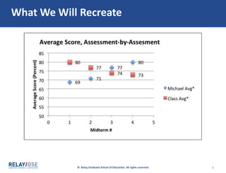
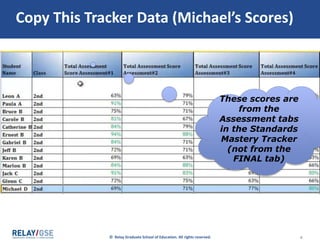
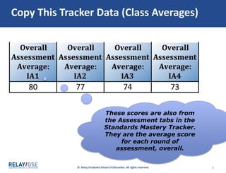
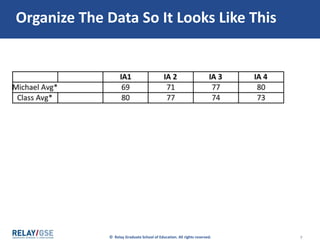
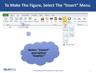
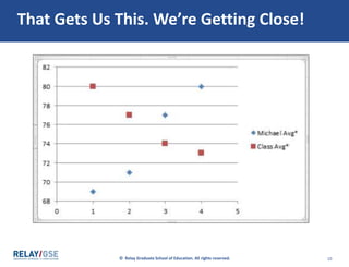
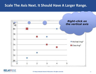
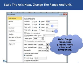
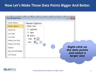
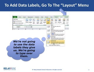
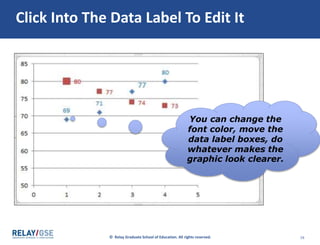
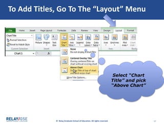
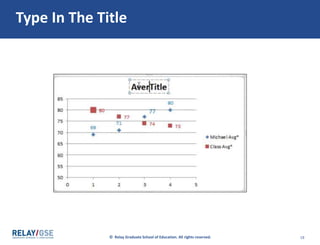
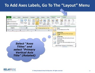
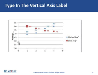
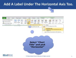
The document provides instructions for creating a bar graph in Excel using student assessment data. It involves copying assessment scores and student initials from a tracker into a new workbook, sorting the data by score, organizing it with boys on the right and girls on left, highlighting the organized data, selecting "Insert" then "2-D Column" to generate an initial graph, widening the graph to see all initials, and adding titles, labels and captions through the "Layout" menu to make the graph accessible. The graph will visually display and compare students' mastery of standards.


![Data driven ppt_presentation[1]](https://cdn.slidesharecdn.com/ss_thumbnails/datadrivenpptpresentation1-100710102551-phpapp02-thumbnail.jpg?width=640&height=640&fit=bounds)


