© Relay Graduate School of Education. All rights reserved. 1
DISPERSION
© Relay Graduate School of Education. All rights reserved. 22
AGENDA OBJECTIVES
Agenda and Objectives
• Descriptive statistics
• Dispersion
• Aggregate data
• The right questions and graphics
• Closing
 Compare basic descriptive statistics
and identify their limitations
 Describe common mistakes associated
with analyzing "on average" data
 Explain the purpose of the Data
Narrative analyses
 Evaluate research questions against
criteria for quality
2 2
© Relay Graduate School of Education. All rights reserved. 33
In the last activity, we
realized our need for
more descriptors of
the data beyond just
mean, median, mode,
range and n-count
© 2014 Relay Graduate School of Education. All rights reserved. 4
Increase quality control testing
Customer Satisfaction Improvement Plan
Tree of Statistical Terminology
BASIC
DESCRIPTIVE
STATISTICS
Dataset
contents
Measures of
central
tendency
Dispersion
Variables
Missing data
Mean
Median
Range & Outliers
Standard Deviation
Distributions
Frequency/Quantiles
Mode
Raw data
© Relay Graduate School of Education. All rights reserved. 5
Frequency/Quantiles
• Quantiles: ranges of scores, partitioned into bins of the same
size
• Can be divided up in quintiles, quartiles, deciles, etc
• Allows us to determine the frequency of scores in each range
© Relay Graduate School of Education. All rights reserved. 66
Let’s create a frequency
table of our own
© Relay Graduate School of Education. All rights reserved. 7
• How were the intervals partitioned (binned) for this sample?
• What did we learn about the samples by looking at the frequencies?
• What is another way we could have partitioned (binned) the intervals?
Practice With Frequency Tables
1
Click ahead when
you’ve completed the
appropriate section
of your Handout
© Relay Graduate School of Education. All rights reserved. 9
Check Your Work
© Relay Graduate School of Education. All rights reserved. 10
Check Your Work
© Relay Graduate School of Education. All rights reserved. 11
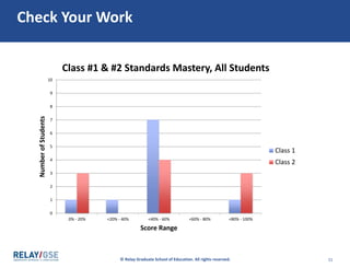
• The intervals were binned into quintiles, in ranges of 20%
• When we partitioned the data in this manner, we could see that the
distribution of performance in Class #1 was indeed different from Class
#2.
– Class #2 has 3 students who are “passing” and Class #1 has only 1. But,
class #2 also has 3 students who are FAR below passing in the 0-20%
range.
• We could have partitioned the intervals by 10% range. We could have
seen more clearly how many students reached the Proficient Goal. But we
only had 10 students in each class, so that wouldn’t have worked well.
– When deciding what range to use for creating the bins, there is no
better rule of thumb than to use your noodle!
Check Your Work
© Relay Graduate School of Education. All rights reserved. 1212
Let’s try another
frequency table
© Relay Graduate School of Education. All rights reserved. 13
Frequency Tables: Changing the Bin Size
• What did we learn about the two samples by looking at the
frequencies?
• What is a helpful rule of thumb we can use for partitioning
frequencies into appropriate intervals?
Click ahead when
you’ve completed the
appropriate section
of your Handout
© Relay Graduate School of Education. All rights reserved. 15
Check your work
© Relay Graduate School of Education. All rights reserved. 16
Check your work
5
5
5
5
© Relay Graduate School of Education. All rights reserved. 17
Check your work
• This makes it look like Class #1 and Class #2 performed equally!
• When deciding what range to use for creating the bins, there is no
better rule of thumb than to use your noodle!
5
5
5
5
© Relay Graduate School of Education. All rights reserved. 1818
“Remember, 71.3% of all
statistics…
© Relay Graduate School of Education. All rights reserved. 1919
“Remember, 71.3% of all
statistics…
are made up on
the spot!”
© Relay Graduate School of Education. All rights reserved. 2020
“Remember, 71.3% of all
statistics…
are made up on
the spot!”
Oops. This
should say
“81.3%”, not
71.3%.
© 2014 Relay Graduate School of Education. All rights reserved. 21
Increase quality control testing
Customer Satisfaction Improvement Plan
Tree of Statistical Terminology
BASIC
DESCRIPTIVE
STATISTICS
Dataset
contents
Measures of
central
tendency
Dispersion
Variables
Missing data
Mean
Median
Range & Outliers
Standard Deviation
Distributions
Frequency/Quantiles
Mode
Raw data
© Relay Graduate School of Education. All rights reserved. 22
Standard Deviation: Technical Definition
• The average distance of the data from the mean
(average)
© Relay Graduate School of Education. All rights reserved. 23
Standard Deviation: Technical Definition
• The average distance of the data from the mean
(average)
• Formula is:
• You do not need to calculate with the formula, but…
• You should understand the conceptual meaning
© Relay Graduate School of Education. All rights reserved. 24
Standard Deviation: Conceptual Meaning
A “low” standard deviation - data are clustered close to the
mean
A “high” standard deviation - data are spread across the range
of values
© Relay Graduate School of Education. All rights reserved. 25
Standard Deviation: Conceptual Meaning
A “low” standard deviation - data are clustered close to the
mean
A “high” standard deviation - data are spread across the range
of values
What constitutes “low” or “high”? Let’s look at Class 1 and
Class 2.
© Relay Graduate School of Education. All rights reserved. 26
Standard Deviation: Class 1 vs Class 2
• What class’ scores have greater average distance from the mean?
(remember that the mean is 50 for both classes)
Click ahead when
you’ve completed the
appropriate section
of your Handout
© Relay Graduate School of Education. All rights reserved. 28
Check Your work
© Relay Graduate School of Education. All rights reserved. 29
Check Your Work
• Class #1 has a lower standard deviation. Its data points have a
lower average distance from the average.
© Relay Graduate School of Education. All rights reserved. 30
Check Your Work
• Class #1 has a lower standard deviation. Its data points have a
lower average distance from the average.
We won’t focus on
what this number
24.2 means, we’ll
just notice that it’s
lower than Class #2
© Relay Graduate School of Education. All rights reserved. 31
Check Your Work
• Here’s a graphical way of seeing that Class #1 has data points
that are more clustered around the average score
0
20
40
60
80
100
120
Class #1
0
20
40
60
80
100
120
Class #2
© Relay Graduate School of Education. All rights reserved. 32
Standard Deviation: Follow up questions
• The standard deviation would be even lower if the points were
clustered even closer to the mean
• If everybody scored the same score, the standard deviation
would be zero
© Relay Graduate School of Education. All rights reserved. 3333
“Remember…Even if you are a
one-in-a-million kind of guy,
© Relay Graduate School of Education. All rights reserved. 3434
“If you are a one-in-a-
million kind of guy,
in China and India
© Relay Graduate School of Education. All rights reserved. 3535
“If you are a one-in-a-
million kind of guy,
in China and India
there are thousands
more just like
you!!”
© Relay Graduate School of Education. All rights reserved. 3636
“If you are a one-in-a-
million kind of guy,
in China and India
there are thousands
more just like
you!!”
Numbers only have
meaning in context!
“High” or “Low”
standard deviation
means nothing without
additional info!
© 2014 Relay Graduate School of Education. All rights reserved. 37
Increase quality control testing
Customer Satisfaction Improvement Plan
Tree of Statistical Terminology
BASIC
DESCRIPTIVE
STATISTICS
Dataset
contents
Measures of
central
tendency
Dispersion
Variables
Missing data
Mean
Median
Range & Outliers
Standard Deviation
Distributions
Frequency/Quantiles
Mode
Raw data
© Relay Graduate School of Education. All rights reserved. 38
How Does This Relate To The Data Narrative Requirements?
This is in
your
Handout
© Relay Graduate School of Education. All rights reserved. 3939
Here’s what is meant in
the rubric by…
All students’ academic
achievement, displayed
relative to the Proficient
and Ambitious Goal
© Relay Graduate School of Education. All rights reserved. 40
Displayed Relative to the Proficient and Ambitious Goal
This is for
Class #1.
© Relay Graduate School of Education. All rights reserved. 41
Displayed Relative to the Proficient and Ambitious Goal
10 students in total.
9 scored under 70%.
1 scored above 80%.
© Relay Graduate School of Education. All rights reserved. 42
Histogram: The Columns Represent Numerical Ranges
We call this a
histogram because
the columns
represent
numerical ranges
© Relay Graduate School of Education. All rights reserved. 4343
Here’s what is meant in
the rubric by…
Distribution of academic
performance for all
students
© Relay Graduate School of Education. All rights reserved. 44
Distribution of Academic Performance for All Students
0
10
20
30
40
50
60
70
80
90
100
CS CT RL SG LL S LJ AC MB SW
Score
Individual Students
Class #1 Standards Mastery, All Students
This is for
Class #1.
10 students
in total. 10
columns.
© Relay Graduate School of Education. All rights reserved. 45
Bar Graphs: The Columns Represent Individuals
0
10
20
30
40
50
60
70
80
90
100
CS CT RL SG LL S LJ AC MB SW
Score
Individual Students
Class #1 Standards Mastery, All Students
We call this
a bar graph
because
each column
represents
an individual
© Relay Graduate School of Education. All rights reserved. 46
Bar Graphs: The Columns Represent Individuals
0
10
20
30
40
50
60
70
80
90
100
CS PH BC TB CT RL JT SG LL B S LJ AC TF MM MB HC JD SW MA
Score
Individual Students
Class #1 & #2 Standards Mastery, All Students
Class 1
Class 2
© Relay Graduate School of Education. All rights reserved. 4747
Your turn
© Relay Graduate School of Education. All rights reserved. 48
Histograms: Your Turn
0
1
2
3
4
5
6
7
8
9
10
0% - 20% <20% - 40% <40% - 60% <60% - 80% <80% - 100%
NumberofStudents
Score Range
Class #1 & #2 Standards Mastery, All Students
Class 1
Class 2
• Does this histogram do a good job displaying the results from Class #1 and
Class #2? Why or why not?
• Given that 70% is an important threshold for how we measure Standards
Mastery (it’s the Proficient Goal), how else could we have binned the
frequency table and histogram?
Click ahead when
you’ve completed the
appropriate section
of your Handout
© Relay Graduate School of Education. All rights reserved. 50
Check Your Work
© Relay Graduate School of Education. All rights reserved. 51
Check Your Work
0
1
2
3
4
5
6
7
8
9
10
0% - 20% <20% - 40% <40% - 60% <60% - 80% <80% - 100%
NumberofStudents
Score Range
Class #1 & #2 Standards Mastery, All Students
Class 1
Class 2
© Relay Graduate School of Education. All rights reserved. 52
Histograms: Your Turn
0
2
4
6
8
10
0% -
20%
<20% -
40%
<40% -
60%
<60% -
80%
<80% -
100%
NumberofStudents
Score Range
Class #1 & #2 Standards
Mastery, All Students
Class 1
Class 2
• This histogram does a decent job showing the results, but it doesn’t
account show performance relative to the Proficient Goal at 70%.
• We could have binned the data with ranges of 10%...but there aren’t
enough data points to do that effectively
• We never use different size bins on the same histogram! That’s confusing.
© Relay Graduate School of Education. All rights reserved. 5353
“Before you create a
graphical display…
© Relay Graduate School of Education. All rights reserved. 5454
“Before you create a
graphical display…
Figure out what you want
to say.”
© Relay Graduate School of Education. All rights reserved. 5555
“Before you create a
graphical display…
Figure out what you want
to say.”
Like “Figure 1.1” –
get it?!?
© Relay Graduate School of Education. All rights reserved. 56
Distributions
• A graphical display of individual data points or quantile bins
• A way for us to visualize dispersion
You need to know:
• how to create and interpret a graph (plot)
• some basic distribution shapes (normal, skewed, and bimodal)
You do not need to know:
• the theoretical implications of distributions for statistical models
© Relay Graduate School of Education. All rights reserved. 57
Normal Distribution
• Most commonly discussed distribution
• Aka Bell Curve
• We don’t want this kind of distribution of score results
57
© Relay Graduate School of Education. All rights reserved. 58
Skewed Distribution
• Looks exactly as it sounds – “skewed”.
• “Skewed left” means that the tail points left, i.e. that we have
very few data points on the lower end of performance
• We do want this kind of distribution of score results!
58
Skewed right
Skewed left
© Relay Graduate School of Education. All rights reserved. 59
Skewed Left Distribution
• Looks exactly as it sounds – “skewed”
• Do we want this kind of distribution of score results?
59
Skewed right
Skewed left
© Relay Graduate School of Education. All rights reserved. 60
Bimodal Distribution
• Bimodal = two modes (two most common values)
• We don’t want this kind of distribution of score results
60
© 2014 Relay Graduate School of Education. All rights reserved. 61
BASIC
DESCRIPTIVE
STATISTICS
Dataset
contents
Measures of
central
tendency
Dispersion
Increase quality control testing
Variables
N-count and missing data
Mean
Median
Range & Outliers
Standard Deviation
Distributions
Frequency/Quantiles
Customer Satisfaction Improvement Plan
Basic Descriptive Statistics Tree
Mode
© Relay Graduate School of Education. All rights reserved. 6262
We’ve reviewed everything
in our tree of statistical
terminology.
Now it’s time to further
analyze and interpret these
descriptive statistics!

Dispersion

  • 1.
    © Relay GraduateSchool of Education. All rights reserved. 1 DISPERSION
  • 2.
    © Relay GraduateSchool of Education. All rights reserved. 22 AGENDA OBJECTIVES Agenda and Objectives • Descriptive statistics • Dispersion • Aggregate data • The right questions and graphics • Closing  Compare basic descriptive statistics and identify their limitations  Describe common mistakes associated with analyzing "on average" data  Explain the purpose of the Data Narrative analyses  Evaluate research questions against criteria for quality 2 2
  • 3.
    © Relay GraduateSchool of Education. All rights reserved. 33 In the last activity, we realized our need for more descriptors of the data beyond just mean, median, mode, range and n-count
  • 4.
    © 2014 RelayGraduate School of Education. All rights reserved. 4 Increase quality control testing Customer Satisfaction Improvement Plan Tree of Statistical Terminology BASIC DESCRIPTIVE STATISTICS Dataset contents Measures of central tendency Dispersion Variables Missing data Mean Median Range & Outliers Standard Deviation Distributions Frequency/Quantiles Mode Raw data
  • 5.
    © Relay GraduateSchool of Education. All rights reserved. 5 Frequency/Quantiles • Quantiles: ranges of scores, partitioned into bins of the same size • Can be divided up in quintiles, quartiles, deciles, etc • Allows us to determine the frequency of scores in each range
  • 6.
    © Relay GraduateSchool of Education. All rights reserved. 66 Let’s create a frequency table of our own
  • 7.
    © Relay GraduateSchool of Education. All rights reserved. 7 • How were the intervals partitioned (binned) for this sample? • What did we learn about the samples by looking at the frequencies? • What is another way we could have partitioned (binned) the intervals? Practice With Frequency Tables 1
  • 8.
    Click ahead when you’vecompleted the appropriate section of your Handout
  • 9.
    © Relay GraduateSchool of Education. All rights reserved. 9 Check Your Work
  • 10.
    © Relay GraduateSchool of Education. All rights reserved. 10 Check Your Work
  • 11.
    © Relay GraduateSchool of Education. All rights reserved. 11 • The intervals were binned into quintiles, in ranges of 20% • When we partitioned the data in this manner, we could see that the distribution of performance in Class #1 was indeed different from Class #2. – Class #2 has 3 students who are “passing” and Class #1 has only 1. But, class #2 also has 3 students who are FAR below passing in the 0-20% range. • We could have partitioned the intervals by 10% range. We could have seen more clearly how many students reached the Proficient Goal. But we only had 10 students in each class, so that wouldn’t have worked well. – When deciding what range to use for creating the bins, there is no better rule of thumb than to use your noodle! Check Your Work
  • 12.
    © Relay GraduateSchool of Education. All rights reserved. 1212 Let’s try another frequency table
  • 13.
    © Relay GraduateSchool of Education. All rights reserved. 13 Frequency Tables: Changing the Bin Size • What did we learn about the two samples by looking at the frequencies? • What is a helpful rule of thumb we can use for partitioning frequencies into appropriate intervals?
  • 14.
    Click ahead when you’vecompleted the appropriate section of your Handout
  • 15.
    © Relay GraduateSchool of Education. All rights reserved. 15 Check your work
  • 16.
    © Relay GraduateSchool of Education. All rights reserved. 16 Check your work 5 5 5 5
  • 17.
    © Relay GraduateSchool of Education. All rights reserved. 17 Check your work • This makes it look like Class #1 and Class #2 performed equally! • When deciding what range to use for creating the bins, there is no better rule of thumb than to use your noodle! 5 5 5 5
  • 18.
    © Relay GraduateSchool of Education. All rights reserved. 1818 “Remember, 71.3% of all statistics…
  • 19.
    © Relay GraduateSchool of Education. All rights reserved. 1919 “Remember, 71.3% of all statistics… are made up on the spot!”
  • 20.
    © Relay GraduateSchool of Education. All rights reserved. 2020 “Remember, 71.3% of all statistics… are made up on the spot!” Oops. This should say “81.3%”, not 71.3%.
  • 21.
    © 2014 RelayGraduate School of Education. All rights reserved. 21 Increase quality control testing Customer Satisfaction Improvement Plan Tree of Statistical Terminology BASIC DESCRIPTIVE STATISTICS Dataset contents Measures of central tendency Dispersion Variables Missing data Mean Median Range & Outliers Standard Deviation Distributions Frequency/Quantiles Mode Raw data
  • 22.
    © Relay GraduateSchool of Education. All rights reserved. 22 Standard Deviation: Technical Definition • The average distance of the data from the mean (average)
  • 23.
    © Relay GraduateSchool of Education. All rights reserved. 23 Standard Deviation: Technical Definition • The average distance of the data from the mean (average) • Formula is: • You do not need to calculate with the formula, but… • You should understand the conceptual meaning
  • 24.
    © Relay GraduateSchool of Education. All rights reserved. 24 Standard Deviation: Conceptual Meaning A “low” standard deviation - data are clustered close to the mean A “high” standard deviation - data are spread across the range of values
  • 25.
    © Relay GraduateSchool of Education. All rights reserved. 25 Standard Deviation: Conceptual Meaning A “low” standard deviation - data are clustered close to the mean A “high” standard deviation - data are spread across the range of values What constitutes “low” or “high”? Let’s look at Class 1 and Class 2.
  • 26.
    © Relay GraduateSchool of Education. All rights reserved. 26 Standard Deviation: Class 1 vs Class 2 • What class’ scores have greater average distance from the mean? (remember that the mean is 50 for both classes)
  • 27.
    Click ahead when you’vecompleted the appropriate section of your Handout
  • 28.
    © Relay GraduateSchool of Education. All rights reserved. 28 Check Your work
  • 29.
    © Relay GraduateSchool of Education. All rights reserved. 29 Check Your Work • Class #1 has a lower standard deviation. Its data points have a lower average distance from the average.
  • 30.
    © Relay GraduateSchool of Education. All rights reserved. 30 Check Your Work • Class #1 has a lower standard deviation. Its data points have a lower average distance from the average. We won’t focus on what this number 24.2 means, we’ll just notice that it’s lower than Class #2
  • 31.
    © Relay GraduateSchool of Education. All rights reserved. 31 Check Your Work • Here’s a graphical way of seeing that Class #1 has data points that are more clustered around the average score 0 20 40 60 80 100 120 Class #1 0 20 40 60 80 100 120 Class #2
  • 32.
    © Relay GraduateSchool of Education. All rights reserved. 32 Standard Deviation: Follow up questions • The standard deviation would be even lower if the points were clustered even closer to the mean • If everybody scored the same score, the standard deviation would be zero
  • 33.
    © Relay GraduateSchool of Education. All rights reserved. 3333 “Remember…Even if you are a one-in-a-million kind of guy,
  • 34.
    © Relay GraduateSchool of Education. All rights reserved. 3434 “If you are a one-in-a- million kind of guy, in China and India
  • 35.
    © Relay GraduateSchool of Education. All rights reserved. 3535 “If you are a one-in-a- million kind of guy, in China and India there are thousands more just like you!!”
  • 36.
    © Relay GraduateSchool of Education. All rights reserved. 3636 “If you are a one-in-a- million kind of guy, in China and India there are thousands more just like you!!” Numbers only have meaning in context! “High” or “Low” standard deviation means nothing without additional info!
  • 37.
    © 2014 RelayGraduate School of Education. All rights reserved. 37 Increase quality control testing Customer Satisfaction Improvement Plan Tree of Statistical Terminology BASIC DESCRIPTIVE STATISTICS Dataset contents Measures of central tendency Dispersion Variables Missing data Mean Median Range & Outliers Standard Deviation Distributions Frequency/Quantiles Mode Raw data
  • 38.
    © Relay GraduateSchool of Education. All rights reserved. 38 How Does This Relate To The Data Narrative Requirements? This is in your Handout
  • 39.
    © Relay GraduateSchool of Education. All rights reserved. 3939 Here’s what is meant in the rubric by… All students’ academic achievement, displayed relative to the Proficient and Ambitious Goal
  • 40.
    © Relay GraduateSchool of Education. All rights reserved. 40 Displayed Relative to the Proficient and Ambitious Goal This is for Class #1.
  • 41.
    © Relay GraduateSchool of Education. All rights reserved. 41 Displayed Relative to the Proficient and Ambitious Goal 10 students in total. 9 scored under 70%. 1 scored above 80%.
  • 42.
    © Relay GraduateSchool of Education. All rights reserved. 42 Histogram: The Columns Represent Numerical Ranges We call this a histogram because the columns represent numerical ranges
  • 43.
    © Relay GraduateSchool of Education. All rights reserved. 4343 Here’s what is meant in the rubric by… Distribution of academic performance for all students
  • 44.
    © Relay GraduateSchool of Education. All rights reserved. 44 Distribution of Academic Performance for All Students 0 10 20 30 40 50 60 70 80 90 100 CS CT RL SG LL S LJ AC MB SW Score Individual Students Class #1 Standards Mastery, All Students This is for Class #1. 10 students in total. 10 columns.
  • 45.
    © Relay GraduateSchool of Education. All rights reserved. 45 Bar Graphs: The Columns Represent Individuals 0 10 20 30 40 50 60 70 80 90 100 CS CT RL SG LL S LJ AC MB SW Score Individual Students Class #1 Standards Mastery, All Students We call this a bar graph because each column represents an individual
  • 46.
    © Relay GraduateSchool of Education. All rights reserved. 46 Bar Graphs: The Columns Represent Individuals 0 10 20 30 40 50 60 70 80 90 100 CS PH BC TB CT RL JT SG LL B S LJ AC TF MM MB HC JD SW MA Score Individual Students Class #1 & #2 Standards Mastery, All Students Class 1 Class 2
  • 47.
    © Relay GraduateSchool of Education. All rights reserved. 4747 Your turn
  • 48.
    © Relay GraduateSchool of Education. All rights reserved. 48 Histograms: Your Turn 0 1 2 3 4 5 6 7 8 9 10 0% - 20% <20% - 40% <40% - 60% <60% - 80% <80% - 100% NumberofStudents Score Range Class #1 & #2 Standards Mastery, All Students Class 1 Class 2 • Does this histogram do a good job displaying the results from Class #1 and Class #2? Why or why not? • Given that 70% is an important threshold for how we measure Standards Mastery (it’s the Proficient Goal), how else could we have binned the frequency table and histogram?
  • 49.
    Click ahead when you’vecompleted the appropriate section of your Handout
  • 50.
    © Relay GraduateSchool of Education. All rights reserved. 50 Check Your Work
  • 51.
    © Relay GraduateSchool of Education. All rights reserved. 51 Check Your Work 0 1 2 3 4 5 6 7 8 9 10 0% - 20% <20% - 40% <40% - 60% <60% - 80% <80% - 100% NumberofStudents Score Range Class #1 & #2 Standards Mastery, All Students Class 1 Class 2
  • 52.
    © Relay GraduateSchool of Education. All rights reserved. 52 Histograms: Your Turn 0 2 4 6 8 10 0% - 20% <20% - 40% <40% - 60% <60% - 80% <80% - 100% NumberofStudents Score Range Class #1 & #2 Standards Mastery, All Students Class 1 Class 2 • This histogram does a decent job showing the results, but it doesn’t account show performance relative to the Proficient Goal at 70%. • We could have binned the data with ranges of 10%...but there aren’t enough data points to do that effectively • We never use different size bins on the same histogram! That’s confusing.
  • 53.
    © Relay GraduateSchool of Education. All rights reserved. 5353 “Before you create a graphical display…
  • 54.
    © Relay GraduateSchool of Education. All rights reserved. 5454 “Before you create a graphical display… Figure out what you want to say.”
  • 55.
    © Relay GraduateSchool of Education. All rights reserved. 5555 “Before you create a graphical display… Figure out what you want to say.” Like “Figure 1.1” – get it?!?
  • 56.
    © Relay GraduateSchool of Education. All rights reserved. 56 Distributions • A graphical display of individual data points or quantile bins • A way for us to visualize dispersion You need to know: • how to create and interpret a graph (plot) • some basic distribution shapes (normal, skewed, and bimodal) You do not need to know: • the theoretical implications of distributions for statistical models
  • 57.
    © Relay GraduateSchool of Education. All rights reserved. 57 Normal Distribution • Most commonly discussed distribution • Aka Bell Curve • We don’t want this kind of distribution of score results 57
  • 58.
    © Relay GraduateSchool of Education. All rights reserved. 58 Skewed Distribution • Looks exactly as it sounds – “skewed”. • “Skewed left” means that the tail points left, i.e. that we have very few data points on the lower end of performance • We do want this kind of distribution of score results! 58 Skewed right Skewed left
  • 59.
    © Relay GraduateSchool of Education. All rights reserved. 59 Skewed Left Distribution • Looks exactly as it sounds – “skewed” • Do we want this kind of distribution of score results? 59 Skewed right Skewed left
  • 60.
    © Relay GraduateSchool of Education. All rights reserved. 60 Bimodal Distribution • Bimodal = two modes (two most common values) • We don’t want this kind of distribution of score results 60
  • 61.
    © 2014 RelayGraduate School of Education. All rights reserved. 61 BASIC DESCRIPTIVE STATISTICS Dataset contents Measures of central tendency Dispersion Increase quality control testing Variables N-count and missing data Mean Median Range & Outliers Standard Deviation Distributions Frequency/Quantiles Customer Satisfaction Improvement Plan Basic Descriptive Statistics Tree Mode
  • 62.
    © Relay GraduateSchool of Education. All rights reserved. 6262 We’ve reviewed everything in our tree of statistical terminology. Now it’s time to further analyze and interpret these descriptive statistics!

Editor's Notes

  • #2 Say: Greetings friends. Happy to have you with us.   We will circle back to the warm up throughout the next 90 minutes, as we work tirelessly toward being able to answer those three questions.
  • #3 Give: G/S’s 30 seconds to read today’s objectives, also on your interactive handout, pg. 1   Say: Here’s our agenda for the day, also in your interactive handout pg. 1. A couple thoughts on our pacing for the day…
  • #5 We're making great progress here
  • #6  Say: Frequency/Quantiles: a way to partition scores into buckets (bins) of same size representing ranges of scores   We are still trying to answer the question of ‘which class did better?’ Here we are producing some tabular descriptive statistics.   Let’s see an example
  • #8 Give: G/S’s a moment to calculate how many scores are in each range for each class.  
  • #10 Highlight Class 2 has 3 students who are “passing” and Class 1 has only 1 But, class 3 also has 3 students who are FAR below passing in the 0-20% range.
  • #11 Highlight Class 2 has 3 students who are “passing” and Class 1 has only 1 But, class 3 also has 3 students who are FAR below passing in the 0-20% range.
  • #12 Give: G/S’s a moment to calculate how many scores are in each range for each class.  
  • #14 Say Don’t let the raw data tell the wrong story. What if we partition the bins in different ways? The classes look the same again. Say Determining the groupings for partitioning, or ‘cutting’ data is not always intuitive; attempting several different groupings can show the patterns more clearly.   For your purposes, you may want to bin by 10% groupings, to allow us to see Achievement Floor vs. Ambitious Goal cut points. Bin sizes should be the same, if you’re going to create a frequency table
  • #16 Say Don’t let the raw data tell the wrong story. What if we partition the bins in different ways? The classes look the same again. Say Determining the groupings for partitioning, or ‘cutting’ data is not always intuitive; attempting several different groupings can show the patterns more clearly.   For your purposes, you may want to bin by 10% groupings, to allow us to see Achievement Floor vs. Ambitious Goal cut points. Bin sizes should be the same, if you’re going to create a frequency table
  • #17 Say Don’t let the raw data tell the wrong story. What if we partition the bins in different ways? The classes look the same again. Say Determining the groupings for partitioning, or ‘cutting’ data is not always intuitive; attempting several different groupings can show the patterns more clearly.   For your purposes, you may want to bin by 10% groupings, to allow us to see Proficient Goal vs. Ambitious Goal cut points. Bin sizes should be the same, if you’re going to create a frequency table
  • #18 Say Don’t let the raw data tell the wrong story. What if we partition the bins in different ways? The classes look the same again. Say Determining the groupings for partitioning, or ‘cutting’ data is not always intuitive; attempting several different groupings can show the patterns more clearly.   For your purposes, you may want to bin by 10% groupings, to allow us to see Proficient Goal vs. Ambitious Goal cut points. Bin sizes should be the same, if you’re going to create a frequency table
  • #19 71.3% of statistics are made up on the spot…oops, that was supposed to say 81.3%
  • #20 71.3% of statistics are made up on the spot…oops, that was supposed to say 81.3%
  • #21 71.3% of statistics are made up on the spot…oops, that was supposed to say 81.3%
  • #23 Say: Standard deviation is a way to measure of spread. It is the average distance of the data points from the mean. You don't need to know how to calculate, but you should understand the concept.
  • #24 Say: Standard deviation is a way to measure of spread. It is the average distance of the data points from the mean. You don't need to know how to calculate, but you should understand the concept.
  • #25 Review: A “low” standard deviation - data are clustered close to the mean A “high” standard deviation - data are spread across the range of values
  • #26 Review: A “low” standard deviation - data are clustered close to the mean A “high” standard deviation - data are spread across the range of values
  • #27 Ask: Which class had a greater average distance from the mean? Remember the mean here is 50 for both classes. [Take response on his fingers 1 vs. 2] ASR: Class 2   Say: I’m going to give you the values of the standard deviation here so you can compare. Ask: What would make the standard deviation absolutely lowest? ASR: If everybody had the same score, the standard deviation would be 0.
  • #29 Say To look at this visually check out these scatter plots of the data from each class. Now look at how the data lies in relation to the mean which is indicated by this red line. Notice how there is more spread in the class with the higher standard deviation. Ask: So which class did better? [Take response on his fingers 1 vs. 2] ASR: Class 2 because it had less spread from the mean   Say: Again, you just need to understand the conceptual meaning. So when there is a greater spread of data relative to the mean, the higher the standard deviation. A low standard deviation when your class has a high average or mean means there isn’t a group of students WAY above or WAY below the mean, which is typically good for student achievement.
  • #30 Say To look at this visually check out these scatter plots of the data from each class. Now look at how the data lies in relation to the mean which is indicated by this red line. Notice how there is more spread in the class with the higher standard deviation. Ask: So which class did better? [Take response on his fingers 1 vs. 2] ASR: Class 2 because it had less spread from the mean   Say: Again, you just need to understand the conceptual meaning. So when there is a greater spread of data relative to the mean, the higher the standard deviation. A low standard deviation when your class has a high average or mean means there isn’t a group of students WAY above or WAY below the mean, which is typically good for student achievement.
  • #31 Say To look at this visually check out these scatter plots of the data from each class. Now look at how the data lies in relation to the mean which is indicated by this red line. Notice how there is more spread in the class with the higher standard deviation. Ask: So which class did better? [Take response on his fingers 1 vs. 2] ASR: Class 2 because it had less spread from the mean   Say: Again, you just need to understand the conceptual meaning. So when there is a greater spread of data relative to the mean, the higher the standard deviation. A low standard deviation when your class has a high average or mean means there isn’t a group of students WAY above or WAY below the mean, which is typically good for student achievement.
  • #32 Say To look at this visually check out these scatter plots of the data from each class. Now look at how the data lies in relation to the mean which is indicated by this red line. Notice how there is more spread in the class with the higher standard deviation. Ask: So which class did better? [Take response on his fingers 1 vs. 2] ASR: Class 2 because it had less spread from the mean   Say: Again, you just need to understand the conceptual meaning. So when there is a greater spread of data relative to the mean, the higher the standard deviation. A low standard deviation when your class has a high average or mean means there isn’t a group of students WAY above or WAY below the mean, which is typically good for student achievement.
  • #33 Say To look at this visually check out these scatter plots of the data from each class. Now look at how the data lies in relation to the mean which is indicated by this red line. Notice how there is more spread in the class with the higher standard deviation. Ask: So which class did better? [Take response on his fingers 1 vs. 2] ASR: Class 2 because it had less spread from the mean   Say: Again, you just need to understand the conceptual meaning. So when there is a greater spread of data relative to the mean, the higher the standard deviation. A low standard deviation when your class has a high average or mean means there isn’t a group of students WAY above or WAY below the mean, which is typically good for student achievement.
  • #34 "One in a million" joke – remember that all data references rely on their context! Numbers only have meaning in context. High or low really means nothing without additional information.
  • #35 "One in a million" joke – remember that all data references rely on their context! Numbers only have meaning in context. High or low really means nothing without additional information.
  • #36 "One in a million" joke – remember that all data references rely on their context! Numbers only have meaning in context. High or low really means nothing without additional information.
  • #37 "One in a million" joke – remember that all data references rely on their context! Numbers only have meaning in context. High or low really means nothing without additional information.
  • #38 Say:   Now that you have the knowledge you need about descriptive statistics, let’s talk about how to specifically use descriptive statistics in your Data Narrative. For distributions: While some of you know about regression models and normally distributed error terms – this is not required for your Data Narrative   However, in your Data Narrative, you WILL show the distribution of your student achievement. You will need to make decisions about how to best show this data through the use of different chats.
  • #39 Take a moment to review the rubric for this assessment. Let’s look at few examples to answer the questions: When is it preferable to use a bar chart? When is it better to use a histogram?
  • #41 Review 2 Examples of Histograms   Ask: Histogram: When we talk about “All students’ academic achievement, relative to the Floor and the Goal”, we mean a histogram. What will each column represent? ASR: The number of students in the range.
  • #42 Review 2 Examples of Histograms   Ask: Histogram: When we talk about “All students’ academic achievement, relative to the Floor and the Goal”, we mean a histogram. What will each column represent? ASR: The number of students in the range.
  • #43 Review 2 Examples of Histograms   Ask: Histogram: When we talk about “All students’ academic achievement, relative to the Floor and the Goal”, we mean a histogram. What will each column represent? ASR: The number of students in the range.
  • #45 Review 3 Examples of Bar Graphs   Ask: When we talk about the “Distribution of Academic Performance for All Students”, we usually mean a bar graph. What will each column represent? ASR: The performance of the individual student being represented by that bar  
  • #46 Review 3 Examples of Bar Graphs   Ask: When we talk about the “Distribution of Academic Performance for All Students”, we usually mean a bar graph. What will each column represent? ASR: The performance of the individual student being represented by that bar  
  • #47 Slide 55: Here we’ve combined Class #1 and Class #2, and we’d still consider this a ‘bar graph’. This is a nice way of looking at the results across both classes.
  • #48 Say: Now it’s your turn to create histograms and bar graphs.
  • #49 Ask: What does each column represent now? ASR: Each column represents the number of students in each bin   Give: G/S’s a minute to complete the histogram for class #1 and class #2.
  • #51 Ask: Does this histogram do a good job displaying the results from Class #1 and Class #2? Why or why not? ASR: It shows distribution, but could be binned better to show performance relative to the AF / AG.   Ask: Given that 70% is an important threshold for how we measure Standards Mastery (it’s the Achievement Floor), how else could we have binned the frequency table and histogram? ASR: We could have binned them in groups of 10%
  • #52 Ask: Does this histogram do a good job displaying the results from Class #1 and Class #2? Why or why not? ASR: It shows distribution, but could be binned better to show performance relative to the AF / AG.   Ask: Given that 70% is an important threshold for how we measure Standards Mastery (it’s the Achievement Floor), how else could we have binned the frequency table and histogram? ASR: We could have binned them in groups of 10%
  • #53 Ask: Does this histogram do a good job displaying the results from Class #1 and Class #2? Why or why not? ASR: It shows distribution, but could be binned better to show performance relative to the AF / AG.   Ask: Given that 70% is an important threshold for how we measure Standards Mastery (it’s the Achievement Floor), how else could we have binned the frequency table and histogram? ASR: We could have binned them in groups of 10%
  • #57 Say: So What do we mean by 'distribution'? We mean a visual representation of the data dispersion. Review: Need to Know vs. Do Not Need to Know on Slide
  • #58 Review: Normal Distribution: The bell curve. The distribution is not really smooth. It’s a line drawn on top of a series of columns representing scores. So for this distribution, the majority of people fell somewhere in the middle, and fewer people fell outside the middle.
  • #59 Review: Skewed Distribution: Opposite direction that you would expect. A skewed left distribution is exactly what we want.
  • #60 Review: Skewed Distribution: Opposite direction that you would expect. A skewed left distribution is exactly what we want.
  • #61 Review: Bimodal Distribution: two modes. Example might be assessment results from a math classroom composed of half ELL and half native speakers – question stems might be difficult for the ELL cohort, and thus there are almost two groups of scores. Or maybe you would notice this trend for students who attend class versus truant students. Say: If you're more interested in these distributions and how they work, and why they matter so much for statistics, stay tuned to the end of the session today and we'll talk about ways you can learn more.