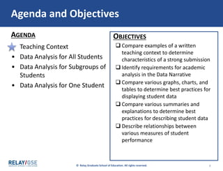
The document outlines an agenda for a data analysis training which includes:
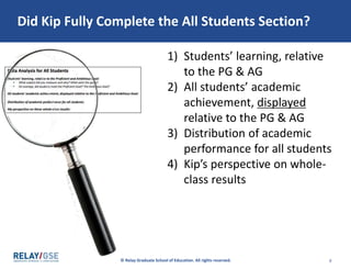
1) Analyzing data for all students in a class and comparing it to grade-level benchmarks
2) Analyzing subgroups of students based on factors like gender or race
3) Analyzing individual student data
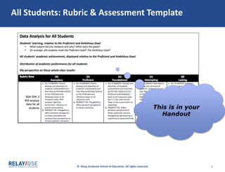
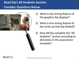
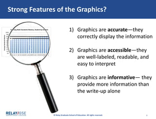
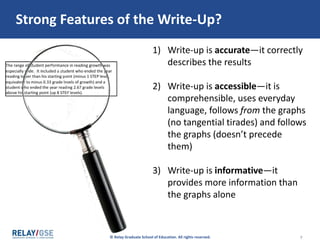
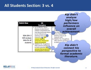
It then provides examples from a sample analysis, focusing on the section analyzing data for all students in the class. The sample analysis graphs the class results, compares them to benchmarks, and analyzes the distribution of scores. The document discusses strengths of the sample analysis' graphics and written explanations.


![The Road to Talent [Infographic]](https://cdn.slidesharecdn.com/ss_thumbnails/the-road-to-talent-hireright-infographic-150326145908-conversion-gate01-thumbnail.jpg?width=640&height=640&fit=bounds)


![State-by-State Medical Marijuana Laws [Infographic]](https://cdn.slidesharecdn.com/ss_thumbnails/hirerightmedical-marijuana-states-2015-infographic-161104230608-thumbnail.jpg?width=640&height=640&fit=bounds)
![Bases de las bolsas de empleo de Correos [Convocatoria 22 de junio de 2011]](https://cdn.slidesharecdn.com/ss_thumbnails/basesconvocatoriabolsasdeempleoa22dejunio-160730123013-thumbnail.jpg?width=640&height=640&fit=bounds)


![Procedimiento trabajadores especialmente sensibles [Correos]](https://cdn.slidesharecdn.com/ss_thumbnails/procedimientotrabajadoresespecialmentesensibles-160919225659-thumbnail.jpg?width=640&height=640&fit=bounds)


![[WeFocus] 특허실무기초(3) 명세서작성기초 김성현](https://cdn.slidesharecdn.com/ss_thumbnails/blt3-161229010510-thumbnail.jpg?width=640&height=640&fit=bounds)


