SlideShare a Scribd company logo
1 of 7
Download to read offline
Presenting Questionnaire Data (Robert Croker) Page 1
Presenting Data Effectively
It is important to present your data effectively. Here are two examples. The first one is a pie chart,
and the second one is a column chart.
Example 1: A pie chart
Things to note:
1. The chart is numbered (Chart 1).
2. The chart has a label (How much do you enjoy sleeping in class?).
3. The legend is on the right hand side, and is labelled (not at all, somewhat, a lot, very much).
Note that these labels do not use capital letters.
4. The number of responses is written outside the pie chart (5, 3, 16, 21). Note that you could write
the percentages (%) as well as the numbers.
5. The source of the data is written at the bottom (Source: Survey ā€“ question 7).
6. The number of responses for that question is written (n=45).
Example 2: A column chart
Things to note:
1. The chart is numbered (Chart 2).
2. The chart has a label (Where do you usually study English?).
3. The legend is on the right hand side, and is labelled (Class 3).
4. The number of responses is written outside the top of each column (29, 19, 12). Columns are
organized from left to right from the largest (29) to the smallest (12). Note that you could write the
percentages (%) as well as the numbers.
5. The source of the data is written at the bottom (Source: Survey ā€“ question 10).
6. The number of responses for that question is written (n=43).
7. Each axis is labelled. Use capital letters for axis labels (Location) but not for items (home).
5
3
16
21
not at all
somewhat
a lot
very much
Chart 1: How much do you enjoy sleeping in
class?
Source: Survey - question 7 (n=45)
0
6
12
18
24
30
home library train/bus
29
19
12
Class 3
Chart 2: Where do you usually study English?
(multiple answers possible)
Location
Source: Survey - question 10 (n=43)
Number
of
Students
Presenting Data Effectively
Presenting Questionnaire Data (Robert Croker) Page 2
How do you create these charts?
You can produce charts easily using Excel or Word, or applications on tablet computers. Another
simple way is at this website: http://nces.ed.gov/nceskids/createagraph/
Creating graphs here is an easy step-by-step process. Itā€™s very simple to use ā€“ you can learn to
use it by yourself without reading the following explanation. However, if you are the type of person
who likes to read the manual before you drive, then you might find this explanation useful.
If you get lost, there are explanations of terms in the left hand tabs and a ā€˜create a graph tutorialā€™.
To illustrate this site, this guide will walk you through making the column chart from Example 2.
This chart took just a few minutes to make.
1. Select your chart:
First, select the type of chart you want to create: bar, line, area, pie, or XY.
Simply click on the icon of chart that you want to make. But which chart should you use?
Bar charts: best for showing totals
a) Use a column chart if you want to clearly show the total number of responses to a question.
Note: If respondents can choose more than one response (e.g. Where do you usually study
English? multiple answers possible), use a column chart not a pie chart.
Note: A vertical bar chart is often called a column chart.
Line charts: best for showing changes over time
a) For example, for showing how population, income, or consumption changes over time. You can
show more than one line.
Pie charts: best for showing proportions
a) For questions where you want to show how many respondents chose an answer when they
could only choose one response (e.g. gender, age, hometown, yes-no).
b) For scale questions (e.g. strongly agree, agree, disagree, strongly disagree / love, like, dislike, hate).
Note: if you have more than five slices in a pie it becomes difficult to read, so use a bar chart instead.
XY charts: best for showing relationships between X values and Y values
a) For example, to show age/income or answers to scale questions/time spent in another country,
use a scatter or bubbles graph. This can illustrate whether these scores cluster together, and
where they do so.
Note that this website does not calculate the relationships, it only displays the data that you put in.
Presenting Data Effectively
Presenting Questionnaire Data (Robert Croker) Page 3
2. Design:
This tab automatically appears when you click on the chart you have chosen to create.
On this tab, you choose the basic design of your graph.
For a column chart, you can choose the direction of the columns, and whether to ā€˜stackā€™ them or
not.
You can also choose their shape and whether you would like them in a pattern (colour is the
default).
For other types of chart, there are different choices offered.
When you have finished, click on the ā€˜Dataā€™ tab on the right hand side. You do not need to click on
ā€˜Updateā€™.
Presenting Data Effectively
Presenting Questionnaire Data (Robert Croker) Page 4
3. Data:
If you havenā€™t already done so, click on the ā€˜Dataā€™ tab on the right hand side.
In the top panel, write the graph title. Remember to write a chart number (e.g. Chart 2). Capitalize
only the first word of the question or statement afterwards. For example:
Chart 2: Where do you usually study English?
Chart 2: Where students usually study English
If students could choose more than one answer, state that here (i.e. multiple answers possible).
Then, write the X Axis and Y Axis labels. Capitalize the first letter of each word (Number of
Students).
Then, state the source. Remember to write the survey question number (Source: Survey ā€“
question 10) and the number of students who answered that question (n=43).
Next, specify the dimensions of your data set - the number of items (in this case, 3: home, library,
train/bus) and the number of groups (only one class, so 1). However, if you want to ā€˜stack your
columnsā€™ and add more classes, you can increase the number of groups.
Then, write the names of the items (home, library, train/bus) and input the data (29, 19,12).
Note that you cannot input both numbers and percentage - choose one. You can calculate the
percentage using a calculator.
Finally, decide the minimum and maximum value for your Y axis. The maximum value must be
bigger than your highest data (i.e. greater than 29 in this case).
Presenting Data Effectively
Presenting Questionnaire Data (Robert Croker) Page 5
4. Labels:
Next, click on the ā€˜Labelsā€™ tab on the right hand side.
This tab really only helps you decide what your labels will look like.
The best font size for numbers printed on the chart (29, 19, 12) is usually font size 18. Select that
in the top part in the ā€˜Data Labelsā€™ section.
You can also choose the position of the numbers on the chart ā€“ in this case, on the outside at the
top is easiest to read.
The best font size for the other information in your chart is 22, and choose this in the bottom
section. This sets the font size for the chart title (Chart 2), the X and Y axes (Number of Students,
Location), the items (home, library, train/bus), the legend (Class 3) and the source (Source: Survey
ā€“ question 10).
Presenting Data Effectively
Presenting Questionnaire Data (Robert Croker) Page 6
5. Preview:
Click on the ā€˜Previewā€™ tab on the right hand side.
This tab helps you check to see what your chart looks like.
If you want to edit anything, click on the tab on the right hand side that you want to change. For
example, if you want to change the data you have input, click on ā€˜Dataā€™; if you want to change the
location or the font size of the labels, click on ā€˜Labelsā€™.
Remember that the labels you wrote are actually in ā€˜Dataā€™; only the size and location of the labels
is in ā€˜Labelsā€™.
Presenting Data Effectively
Presenting Questionnaire Data (Robert Croker) Page 7
6. Print / Save:
Click on the ā€˜Print/Saveā€™ tab on the right hand side.
You can print out the chart directly ā€“ click on ā€˜Printā€™. From here, you could also save your chart as
a pdf on Macs.
Alternatively, you could download your chart as a pdf or png ā€“ click ā€˜Downloadā€™.
You can also email the graph to your email account ā€“ and then go back and edit it later, which is
very handy. In that case, write your email address in the box, and then press send.
If you would like to start creating a new chart, press on the ā€˜Start Overā€™ at the bottom of the page.
Final Words:
After you have done all the work of writing and editing your questionnaire and then analyzing your
data, it is worthwhile taking a few more minutes to present your data in a visual form. Simple, clear
charts will help readers understand your data more quickly and completely.
The website introduced here is run by the U.S. National Center for Education Statistics, and is one
of the easiest ways of creating charts. However, if you are not sure what to do, look at information
on the ā€˜Helpā€™ tab on the left hand side.
Best of luck with your chart making! Robert Croker

More Related Content

What's hot

How to Insert a Graph into Microsoft Excel 2007
How to Insert a Graph into Microsoft Excel 2007How to Insert a Graph into Microsoft Excel 2007
How to Insert a Graph into Microsoft Excel 2007nfasano
Ā 
Creating Chart
Creating ChartCreating Chart
Creating Charttieny8085
Ā 
$5 COUPON LINK - Excel Udemy Course: Excel with Excel Dynamic Graphs, Dashboa...
$5 COUPON LINK - Excel Udemy Course: Excel with Excel Dynamic Graphs, Dashboa...$5 COUPON LINK - Excel Udemy Course: Excel with Excel Dynamic Graphs, Dashboa...
$5 COUPON LINK - Excel Udemy Course: Excel with Excel Dynamic Graphs, Dashboa...mellontraining
Ā 
Witing de materials
Witing de materialsWiting de materials
Witing de materialsNo Limit
Ā 
Making a Chart Using Excel
Making a Chart Using ExcelMaking a Chart Using Excel
Making a Chart Using Excelrebelbrindley
Ā 
How to Think on Paper - Ideas on Note-Making
How to Think on Paper - Ideas on Note-MakingHow to Think on Paper - Ideas on Note-Making
How to Think on Paper - Ideas on Note-MakingThomas Teepe
Ā 
Creating a graph in excel
Creating a graph in excelCreating a graph in excel
Creating a graph in excelorthms
Ā 
Karan Goyal
Karan GoyalKaran Goyal
Karan Goyal9639757729
Ā 
Excel2002
Excel2002Excel2002
Excel2002Osama Zain
Ā 
Creating & Editing Charts In Microsoft Excel 2003
Creating & Editing Charts In Microsoft Excel 2003Creating & Editing Charts In Microsoft Excel 2003
Creating & Editing Charts In Microsoft Excel 2003bud_00
Ā 

What's hot (13)

How to Insert a Graph into Microsoft Excel 2007
How to Insert a Graph into Microsoft Excel 2007How to Insert a Graph into Microsoft Excel 2007
How to Insert a Graph into Microsoft Excel 2007
Ā 
Creating Chart
Creating ChartCreating Chart
Creating Chart
Ā 
$5 COUPON LINK - Excel Udemy Course: Excel with Excel Dynamic Graphs, Dashboa...
$5 COUPON LINK - Excel Udemy Course: Excel with Excel Dynamic Graphs, Dashboa...$5 COUPON LINK - Excel Udemy Course: Excel with Excel Dynamic Graphs, Dashboa...
$5 COUPON LINK - Excel Udemy Course: Excel with Excel Dynamic Graphs, Dashboa...
Ā 
Witing de materials
Witing de materialsWiting de materials
Witing de materials
Ā 
Making a Chart Using Excel
Making a Chart Using ExcelMaking a Chart Using Excel
Making a Chart Using Excel
Ā 
How to Think on Paper - Ideas on Note-Making
How to Think on Paper - Ideas on Note-MakingHow to Think on Paper - Ideas on Note-Making
How to Think on Paper - Ideas on Note-Making
Ā 
Creating a graph in excel
Creating a graph in excelCreating a graph in excel
Creating a graph in excel
Ā 
Karan Goyal
Karan GoyalKaran Goyal
Karan Goyal
Ā 
MS Excel - Charts
MS Excel - ChartsMS Excel - Charts
MS Excel - Charts
Ā 
Excel2002
Excel2002Excel2002
Excel2002
Ā 
Excel2002
Excel2002Excel2002
Excel2002
Ā 
Creating & Editing Charts In Microsoft Excel 2003
Creating & Editing Charts In Microsoft Excel 2003Creating & Editing Charts In Microsoft Excel 2003
Creating & Editing Charts In Microsoft Excel 2003
Ā 
Early numeracy: content and pedagogies that work
Early numeracy: content and pedagogies that workEarly numeracy: content and pedagogies that work
Early numeracy: content and pedagogies that work
Ā 

Viewers also liked

Questionnaire Results Charts and Analysis
Questionnaire Results Charts and AnalysisQuestionnaire Results Charts and Analysis
Questionnaire Results Charts and Analysisosmithas
Ā 
Questionnaire Analysis - Graphs
Questionnaire Analysis - GraphsQuestionnaire Analysis - Graphs
Questionnaire Analysis - Graphssuperandy93
Ā 
Graph results from questionnaire
Graph results from questionnaireGraph results from questionnaire
Graph results from questionnaireJennifermegan93
Ā 
Questionnaire analysis
Questionnaire analysisQuestionnaire analysis
Questionnaire analysisdaniellebridge
Ā 
Questionnaire pie charts
Questionnaire pie chartsQuestionnaire pie charts
Questionnaire pie chartsSaraMcgranaghan
Ā 
Pie chart survey analysis
Pie chart survey analysisPie chart survey analysis
Pie chart survey analysisbrittdoran_ox
Ā 

Viewers also liked (6)

Questionnaire Results Charts and Analysis
Questionnaire Results Charts and AnalysisQuestionnaire Results Charts and Analysis
Questionnaire Results Charts and Analysis
Ā 
Questionnaire Analysis - Graphs
Questionnaire Analysis - GraphsQuestionnaire Analysis - Graphs
Questionnaire Analysis - Graphs
Ā 
Graph results from questionnaire
Graph results from questionnaireGraph results from questionnaire
Graph results from questionnaire
Ā 
Questionnaire analysis
Questionnaire analysisQuestionnaire analysis
Questionnaire analysis
Ā 
Questionnaire pie charts
Questionnaire pie chartsQuestionnaire pie charts
Questionnaire pie charts
Ā 
Pie chart survey analysis
Pie chart survey analysisPie chart survey analysis
Pie chart survey analysis
Ā 

Similar to Presenting Questionnaire Data Effectively

De vry math 399 all ilabs latest 2016 november
De vry math 399 all ilabs latest 2016 novemberDe vry math 399 all ilabs latest 2016 november
De vry math 399 all ilabs latest 2016 novemberlenasour
Ā 
De vry math221 all ilabs latest 2016 november
De vry math221 all ilabs latest 2016 novemberDe vry math221 all ilabs latest 2016 november
De vry math221 all ilabs latest 2016 novemberlenasour
Ā 
De vry math 221 all ilabs latest 2016 november
De vry math 221 all ilabs latest 2016 novemberDe vry math 221 all ilabs latest 2016 november
De vry math 221 all ilabs latest 2016 novemberlenasour
Ā 
1.AdvantagesandDisadvantagesofDotPlotsHistogramsandBoxPlotsLesson.pptx
1.AdvantagesandDisadvantagesofDotPlotsHistogramsandBoxPlotsLesson.pptx1.AdvantagesandDisadvantagesofDotPlotsHistogramsandBoxPlotsLesson.pptx
1.AdvantagesandDisadvantagesofDotPlotsHistogramsandBoxPlotsLesson.pptxAayzazAhmad
Ā 
De vry math 399 ilabs & discussions latest 2016 november
De vry math 399 ilabs & discussions latest 2016 novemberDe vry math 399 ilabs & discussions latest 2016 november
De vry math 399 ilabs & discussions latest 2016 novemberlenasour
Ā 
De vry math 399 ilabs & discussions latest 2016
De vry math 399 ilabs & discussions latest 2016De vry math 399 ilabs & discussions latest 2016
De vry math 399 ilabs & discussions latest 2016lenasour
Ā 
How to Organize and Interpret Information with Venn Diagrams Using Paint
How to Organize and Interpret Information with Venn Diagrams Using PaintHow to Organize and Interpret Information with Venn Diagrams Using Paint
How to Organize and Interpret Information with Venn Diagrams Using PaintHolly Aesquivel
Ā 
04 ms excel
04 ms excel04 ms excel
04 ms excelfosterstac
Ā 
Chapter 4 Problem 31. For problem three in chapter four, a teac.docx
Chapter 4 Problem 31. For problem three in chapter four,   a teac.docxChapter 4 Problem 31. For problem three in chapter four,   a teac.docx
Chapter 4 Problem 31. For problem three in chapter four, a teac.docxrobertad6
Ā 
1.MATH 221 Statistics for Decision MakingWeek 2 iLabName.docx
1.MATH 221 Statistics for Decision MakingWeek 2 iLabName.docx1.MATH 221 Statistics for Decision MakingWeek 2 iLabName.docx
1.MATH 221 Statistics for Decision MakingWeek 2 iLabName.docxAlyciaGold776
Ā 
Lesson 2.1 thinking spatially mapping tx v2003 web version
Lesson 2.1 thinking spatially mapping tx v2003 web versionLesson 2.1 thinking spatially mapping tx v2003 web version
Lesson 2.1 thinking spatially mapping tx v2003 web versionmrsantos6thgrade
Ā 
Lesson 2.1 thinking spatially mapping tx v2003 web version
Lesson 2.1 thinking spatially mapping tx v2003 web versionLesson 2.1 thinking spatially mapping tx v2003 web version
Lesson 2.1 thinking spatially mapping tx v2003 web versionmrsantos6thgrade
Ā 
C:\fakepath\lesson 2.1 thinking spatially mapping tx v2003
C:\fakepath\lesson 2.1 thinking spatially mapping tx v2003C:\fakepath\lesson 2.1 thinking spatially mapping tx v2003
C:\fakepath\lesson 2.1 thinking spatially mapping tx v2003mrsantos6thgrade
Ā 
Bar and Circle Graphs
Bar and Circle GraphsBar and Circle Graphs
Bar and Circle GraphsDan Etz
Ā 
Excel Intro Part1 2007
Excel Intro Part1 2007Excel Intro Part1 2007
Excel Intro Part1 2007simply_coool
Ā 
Making Charts in Excel
Making Charts in ExcelMaking Charts in Excel
Making Charts in Excelcronegeek
Ā 
Dot Plots and Box Plots.pptx
Dot Plots and Box Plots.pptxDot Plots and Box Plots.pptx
Dot Plots and Box Plots.pptxVaishnaviElumalai
Ā 
Homework Assignment 9 Edited on 10272014 Due by Wednes.docx
Homework Assignment 9 Edited on 10272014 Due by Wednes.docxHomework Assignment 9 Edited on 10272014 Due by Wednes.docx
Homework Assignment 9 Edited on 10272014 Due by Wednes.docxadampcarr67227
Ā 
TID Chapter 5 Introduction To Charts And Graph
TID Chapter 5 Introduction To Charts And GraphTID Chapter 5 Introduction To Charts And Graph
TID Chapter 5 Introduction To Charts And GraphWanBK Leo
Ā 

Similar to Presenting Questionnaire Data Effectively (20)

De vry math 399 all ilabs latest 2016 november
De vry math 399 all ilabs latest 2016 novemberDe vry math 399 all ilabs latest 2016 november
De vry math 399 all ilabs latest 2016 november
Ā 
De vry math221 all ilabs latest 2016 november
De vry math221 all ilabs latest 2016 novemberDe vry math221 all ilabs latest 2016 november
De vry math221 all ilabs latest 2016 november
Ā 
De vry math 221 all ilabs latest 2016 november
De vry math 221 all ilabs latest 2016 novemberDe vry math 221 all ilabs latest 2016 november
De vry math 221 all ilabs latest 2016 november
Ā 
1.AdvantagesandDisadvantagesofDotPlotsHistogramsandBoxPlotsLesson.pptx
1.AdvantagesandDisadvantagesofDotPlotsHistogramsandBoxPlotsLesson.pptx1.AdvantagesandDisadvantagesofDotPlotsHistogramsandBoxPlotsLesson.pptx
1.AdvantagesandDisadvantagesofDotPlotsHistogramsandBoxPlotsLesson.pptx
Ā 
De vry math 399 ilabs & discussions latest 2016 november
De vry math 399 ilabs & discussions latest 2016 novemberDe vry math 399 ilabs & discussions latest 2016 november
De vry math 399 ilabs & discussions latest 2016 november
Ā 
De vry math 399 ilabs & discussions latest 2016
De vry math 399 ilabs & discussions latest 2016De vry math 399 ilabs & discussions latest 2016
De vry math 399 ilabs & discussions latest 2016
Ā 
How to Organize and Interpret Information with Venn Diagrams Using Paint
How to Organize and Interpret Information with Venn Diagrams Using PaintHow to Organize and Interpret Information with Venn Diagrams Using Paint
How to Organize and Interpret Information with Venn Diagrams Using Paint
Ā 
04 ms excel
04 ms excel04 ms excel
04 ms excel
Ā 
Chapter 4 Problem 31. For problem three in chapter four, a teac.docx
Chapter 4 Problem 31. For problem three in chapter four,   a teac.docxChapter 4 Problem 31. For problem three in chapter four,   a teac.docx
Chapter 4 Problem 31. For problem three in chapter four, a teac.docx
Ā 
1.MATH 221 Statistics for Decision MakingWeek 2 iLabName.docx
1.MATH 221 Statistics for Decision MakingWeek 2 iLabName.docx1.MATH 221 Statistics for Decision MakingWeek 2 iLabName.docx
1.MATH 221 Statistics for Decision MakingWeek 2 iLabName.docx
Ā 
Lesson 2.1 thinking spatially mapping tx v2003 web version
Lesson 2.1 thinking spatially mapping tx v2003 web versionLesson 2.1 thinking spatially mapping tx v2003 web version
Lesson 2.1 thinking spatially mapping tx v2003 web version
Ā 
Lesson 2.1 thinking spatially mapping tx v2003 web version
Lesson 2.1 thinking spatially mapping tx v2003 web versionLesson 2.1 thinking spatially mapping tx v2003 web version
Lesson 2.1 thinking spatially mapping tx v2003 web version
Ā 
C:\fakepath\lesson 2.1 thinking spatially mapping tx v2003
C:\fakepath\lesson 2.1 thinking spatially mapping tx v2003C:\fakepath\lesson 2.1 thinking spatially mapping tx v2003
C:\fakepath\lesson 2.1 thinking spatially mapping tx v2003
Ā 
Bar and Circle Graphs
Bar and Circle GraphsBar and Circle Graphs
Bar and Circle Graphs
Ā 
Excel Intro Part1 2007
Excel Intro Part1 2007Excel Intro Part1 2007
Excel Intro Part1 2007
Ā 
Making Charts in Excel
Making Charts in ExcelMaking Charts in Excel
Making Charts in Excel
Ā 
Dot Plots and Box Plots.pptx
Dot Plots and Box Plots.pptxDot Plots and Box Plots.pptx
Dot Plots and Box Plots.pptx
Ā 
Spss basics
Spss basicsSpss basics
Spss basics
Ā 
Homework Assignment 9 Edited on 10272014 Due by Wednes.docx
Homework Assignment 9 Edited on 10272014 Due by Wednes.docxHomework Assignment 9 Edited on 10272014 Due by Wednes.docx
Homework Assignment 9 Edited on 10272014 Due by Wednes.docx
Ā 
TID Chapter 5 Introduction To Charts And Graph
TID Chapter 5 Introduction To Charts And GraphTID Chapter 5 Introduction To Charts And Graph
TID Chapter 5 Introduction To Charts And Graph
Ā 

More from Robert Croker

More from Robert Croker (20)

Reading
ReadingReading
Reading
Ā 
Reading
ReadingReading
Reading
Ā 
Reading
ReadingReading
Reading
Ā 
Reading A
Reading AReading A
Reading A
Ā 
Vocabulary List
Vocabulary ListVocabulary List
Vocabulary List
Ā 
Additional Reading
Additional ReadingAdditional Reading
Additional Reading
Ā 
Vocabulary List
Vocabulary ListVocabulary List
Vocabulary List
Ā 
Reading 3
Reading 3Reading 3
Reading 3
Ā 
Reading 2
Reading 2Reading 2
Reading 2
Ā 
Reading 1
Reading 1Reading 1
Reading 1
Ā 
Class 4 PPP
Class 4 PPPClass 4 PPP
Class 4 PPP
Ā 
Class 3 PowerPoint Slides
Class 3 PowerPoint SlidesClass 3 PowerPoint Slides
Class 3 PowerPoint Slides
Ā 
Class 3 Reading A
Class 3 Reading AClass 3 Reading A
Class 3 Reading A
Ā 
Yearly Cycle Rituals
Yearly Cycle RitualsYearly Cycle Rituals
Yearly Cycle Rituals
Ā 
Reading C
Reading CReading C
Reading C
Ā 
Reading B
Reading BReading B
Reading B
Ā 
Reading C
Reading CReading C
Reading C
Ā 
2017 Class 2 Reading B
2017 Class 2 Reading B2017 Class 2 Reading B
2017 Class 2 Reading B
Ā 
2017 Class 2 Reading A
2017 Class 2 Reading A2017 Class 2 Reading A
2017 Class 2 Reading A
Ā 
Syllabus
SyllabusSyllabus
Syllabus
Ā 

Recently uploaded

Contemporary philippine arts from the regions_PPT_Module_12 [Autosaved] (1).pptx
Contemporary philippine arts from the regions_PPT_Module_12 [Autosaved] (1).pptxContemporary philippine arts from the regions_PPT_Module_12 [Autosaved] (1).pptx
Contemporary philippine arts from the regions_PPT_Module_12 [Autosaved] (1).pptxRoyAbrique
Ā 
Mastering the Unannounced Regulatory Inspection
Mastering the Unannounced Regulatory InspectionMastering the Unannounced Regulatory Inspection
Mastering the Unannounced Regulatory InspectionSafetyChain Software
Ā 
Presentation by Andreas Schleicher Tackling the School Absenteeism Crisis 30 ...
Presentation by Andreas Schleicher Tackling the School Absenteeism Crisis 30 ...Presentation by Andreas Schleicher Tackling the School Absenteeism Crisis 30 ...
Presentation by Andreas Schleicher Tackling the School Absenteeism Crisis 30 ...EduSkills OECD
Ā 
Separation of Lanthanides/ Lanthanides and Actinides
Separation of Lanthanides/ Lanthanides and ActinidesSeparation of Lanthanides/ Lanthanides and Actinides
Separation of Lanthanides/ Lanthanides and ActinidesFatimaKhan178732
Ā 
Paris 2024 Olympic Geographies - an activity
Paris 2024 Olympic Geographies - an activityParis 2024 Olympic Geographies - an activity
Paris 2024 Olympic Geographies - an activityGeoBlogs
Ā 
Sanyam Choudhary Chemistry practical.pdf
Sanyam Choudhary Chemistry practical.pdfSanyam Choudhary Chemistry practical.pdf
Sanyam Choudhary Chemistry practical.pdfsanyamsingh5019
Ā 
_Math 4-Q4 Week 5.pptx Steps in Collecting Data
_Math 4-Q4 Week 5.pptx Steps in Collecting Data_Math 4-Q4 Week 5.pptx Steps in Collecting Data
_Math 4-Q4 Week 5.pptx Steps in Collecting DataJhengPantaleon
Ā 
CARE OF CHILD IN INCUBATOR..........pptx
CARE OF CHILD IN INCUBATOR..........pptxCARE OF CHILD IN INCUBATOR..........pptx
CARE OF CHILD IN INCUBATOR..........pptxGaneshChakor2
Ā 
microwave assisted reaction. General introduction
microwave assisted reaction. General introductionmicrowave assisted reaction. General introduction
microwave assisted reaction. General introductionMaksud Ahmed
Ā 
Crayon Activity Handout For the Crayon A
Crayon Activity Handout For the Crayon ACrayon Activity Handout For the Crayon A
Crayon Activity Handout For the Crayon AUnboundStockton
Ā 
mini mental status format.docx
mini    mental       status     format.docxmini    mental       status     format.docx
mini mental status format.docxPoojaSen20
Ā 
BASLIQ CURRENT LOOKBOOK LOOKBOOK(1) (1).pdf
BASLIQ CURRENT LOOKBOOK  LOOKBOOK(1) (1).pdfBASLIQ CURRENT LOOKBOOK  LOOKBOOK(1) (1).pdf
BASLIQ CURRENT LOOKBOOK LOOKBOOK(1) (1).pdfSoniaTolstoy
Ā 
Call Girls in Dwarka Mor Delhi Contact Us 9654467111
Call Girls in Dwarka Mor Delhi Contact Us 9654467111Call Girls in Dwarka Mor Delhi Contact Us 9654467111
Call Girls in Dwarka Mor Delhi Contact Us 9654467111Sapana Sha
Ā 
Employee wellbeing at the workplace.pptx
Employee wellbeing at the workplace.pptxEmployee wellbeing at the workplace.pptx
Employee wellbeing at the workplace.pptxNirmalaLoungPoorunde1
Ā 
The basics of sentences session 2pptx copy.pptx
The basics of sentences session 2pptx copy.pptxThe basics of sentences session 2pptx copy.pptx
The basics of sentences session 2pptx copy.pptxheathfieldcps1
Ā 
PSYCHIATRIC History collection FORMAT.pptx
PSYCHIATRIC   History collection FORMAT.pptxPSYCHIATRIC   History collection FORMAT.pptx
PSYCHIATRIC History collection FORMAT.pptxPoojaSen20
Ā 

Recently uploaded (20)

Model Call Girl in Bikash Puri Delhi reach out to us at šŸ”9953056974šŸ”
Model Call Girl in Bikash Puri  Delhi reach out to us at šŸ”9953056974šŸ”Model Call Girl in Bikash Puri  Delhi reach out to us at šŸ”9953056974šŸ”
Model Call Girl in Bikash Puri Delhi reach out to us at šŸ”9953056974šŸ”
Ā 
Contemporary philippine arts from the regions_PPT_Module_12 [Autosaved] (1).pptx
Contemporary philippine arts from the regions_PPT_Module_12 [Autosaved] (1).pptxContemporary philippine arts from the regions_PPT_Module_12 [Autosaved] (1).pptx
Contemporary philippine arts from the regions_PPT_Module_12 [Autosaved] (1).pptx
Ā 
Mastering the Unannounced Regulatory Inspection
Mastering the Unannounced Regulatory InspectionMastering the Unannounced Regulatory Inspection
Mastering the Unannounced Regulatory Inspection
Ā 
Presentation by Andreas Schleicher Tackling the School Absenteeism Crisis 30 ...
Presentation by Andreas Schleicher Tackling the School Absenteeism Crisis 30 ...Presentation by Andreas Schleicher Tackling the School Absenteeism Crisis 30 ...
Presentation by Andreas Schleicher Tackling the School Absenteeism Crisis 30 ...
Ā 
Model Call Girl in Tilak Nagar Delhi reach out to us at šŸ”9953056974šŸ”
Model Call Girl in Tilak Nagar Delhi reach out to us at šŸ”9953056974šŸ”Model Call Girl in Tilak Nagar Delhi reach out to us at šŸ”9953056974šŸ”
Model Call Girl in Tilak Nagar Delhi reach out to us at šŸ”9953056974šŸ”
Ā 
Separation of Lanthanides/ Lanthanides and Actinides
Separation of Lanthanides/ Lanthanides and ActinidesSeparation of Lanthanides/ Lanthanides and Actinides
Separation of Lanthanides/ Lanthanides and Actinides
Ā 
Paris 2024 Olympic Geographies - an activity
Paris 2024 Olympic Geographies - an activityParis 2024 Olympic Geographies - an activity
Paris 2024 Olympic Geographies - an activity
Ā 
Sanyam Choudhary Chemistry practical.pdf
Sanyam Choudhary Chemistry practical.pdfSanyam Choudhary Chemistry practical.pdf
Sanyam Choudhary Chemistry practical.pdf
Ā 
_Math 4-Q4 Week 5.pptx Steps in Collecting Data
_Math 4-Q4 Week 5.pptx Steps in Collecting Data_Math 4-Q4 Week 5.pptx Steps in Collecting Data
_Math 4-Q4 Week 5.pptx Steps in Collecting Data
Ā 
Staff of Color (SOC) Retention Efforts DDSD
Staff of Color (SOC) Retention Efforts DDSDStaff of Color (SOC) Retention Efforts DDSD
Staff of Color (SOC) Retention Efforts DDSD
Ā 
CARE OF CHILD IN INCUBATOR..........pptx
CARE OF CHILD IN INCUBATOR..........pptxCARE OF CHILD IN INCUBATOR..........pptx
CARE OF CHILD IN INCUBATOR..........pptx
Ā 
microwave assisted reaction. General introduction
microwave assisted reaction. General introductionmicrowave assisted reaction. General introduction
microwave assisted reaction. General introduction
Ā 
Crayon Activity Handout For the Crayon A
Crayon Activity Handout For the Crayon ACrayon Activity Handout For the Crayon A
Crayon Activity Handout For the Crayon A
Ā 
mini mental status format.docx
mini    mental       status     format.docxmini    mental       status     format.docx
mini mental status format.docx
Ā 
BASLIQ CURRENT LOOKBOOK LOOKBOOK(1) (1).pdf
BASLIQ CURRENT LOOKBOOK  LOOKBOOK(1) (1).pdfBASLIQ CURRENT LOOKBOOK  LOOKBOOK(1) (1).pdf
BASLIQ CURRENT LOOKBOOK LOOKBOOK(1) (1).pdf
Ā 
Call Girls in Dwarka Mor Delhi Contact Us 9654467111
Call Girls in Dwarka Mor Delhi Contact Us 9654467111Call Girls in Dwarka Mor Delhi Contact Us 9654467111
Call Girls in Dwarka Mor Delhi Contact Us 9654467111
Ā 
Employee wellbeing at the workplace.pptx
Employee wellbeing at the workplace.pptxEmployee wellbeing at the workplace.pptx
Employee wellbeing at the workplace.pptx
Ā 
The basics of sentences session 2pptx copy.pptx
The basics of sentences session 2pptx copy.pptxThe basics of sentences session 2pptx copy.pptx
The basics of sentences session 2pptx copy.pptx
Ā 
CĆ³digo Creativo y Arte de Software | Unidad 1
CĆ³digo Creativo y Arte de Software | Unidad 1CĆ³digo Creativo y Arte de Software | Unidad 1
CĆ³digo Creativo y Arte de Software | Unidad 1
Ā 
PSYCHIATRIC History collection FORMAT.pptx
PSYCHIATRIC   History collection FORMAT.pptxPSYCHIATRIC   History collection FORMAT.pptx
PSYCHIATRIC History collection FORMAT.pptx
Ā 

Presenting Questionnaire Data Effectively

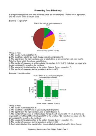
  • 1. Presenting Questionnaire Data (Robert Croker) Page 1 Presenting Data Effectively It is important to present your data effectively. Here are two examples. The first one is a pie chart, and the second one is a column chart. Example 1: A pie chart Things to note: 1. The chart is numbered (Chart 1). 2. The chart has a label (How much do you enjoy sleeping in class?). 3. The legend is on the right hand side, and is labelled (not at all, somewhat, a lot, very much). Note that these labels do not use capital letters. 4. The number of responses is written outside the pie chart (5, 3, 16, 21). Note that you could write the percentages (%) as well as the numbers. 5. The source of the data is written at the bottom (Source: Survey ā€“ question 7). 6. The number of responses for that question is written (n=45). Example 2: A column chart Things to note: 1. The chart is numbered (Chart 2). 2. The chart has a label (Where do you usually study English?). 3. The legend is on the right hand side, and is labelled (Class 3). 4. The number of responses is written outside the top of each column (29, 19, 12). Columns are organized from left to right from the largest (29) to the smallest (12). Note that you could write the percentages (%) as well as the numbers. 5. The source of the data is written at the bottom (Source: Survey ā€“ question 10). 6. The number of responses for that question is written (n=43). 7. Each axis is labelled. Use capital letters for axis labels (Location) but not for items (home). 5 3 16 21 not at all somewhat a lot very much Chart 1: How much do you enjoy sleeping in class? Source: Survey - question 7 (n=45) 0 6 12 18 24 30 home library train/bus 29 19 12 Class 3 Chart 2: Where do you usually study English? (multiple answers possible) Location Source: Survey - question 10 (n=43) Number of Students
  • 2. Presenting Data Effectively Presenting Questionnaire Data (Robert Croker) Page 2 How do you create these charts? You can produce charts easily using Excel or Word, or applications on tablet computers. Another simple way is at this website: http://nces.ed.gov/nceskids/createagraph/ Creating graphs here is an easy step-by-step process. Itā€™s very simple to use ā€“ you can learn to use it by yourself without reading the following explanation. However, if you are the type of person who likes to read the manual before you drive, then you might find this explanation useful. If you get lost, there are explanations of terms in the left hand tabs and a ā€˜create a graph tutorialā€™. To illustrate this site, this guide will walk you through making the column chart from Example 2. This chart took just a few minutes to make. 1. Select your chart: First, select the type of chart you want to create: bar, line, area, pie, or XY. Simply click on the icon of chart that you want to make. But which chart should you use? Bar charts: best for showing totals a) Use a column chart if you want to clearly show the total number of responses to a question. Note: If respondents can choose more than one response (e.g. Where do you usually study English? multiple answers possible), use a column chart not a pie chart. Note: A vertical bar chart is often called a column chart. Line charts: best for showing changes over time a) For example, for showing how population, income, or consumption changes over time. You can show more than one line. Pie charts: best for showing proportions a) For questions where you want to show how many respondents chose an answer when they could only choose one response (e.g. gender, age, hometown, yes-no). b) For scale questions (e.g. strongly agree, agree, disagree, strongly disagree / love, like, dislike, hate). Note: if you have more than five slices in a pie it becomes difficult to read, so use a bar chart instead. XY charts: best for showing relationships between X values and Y values a) For example, to show age/income or answers to scale questions/time spent in another country, use a scatter or bubbles graph. This can illustrate whether these scores cluster together, and where they do so. Note that this website does not calculate the relationships, it only displays the data that you put in.
  • 3. Presenting Data Effectively Presenting Questionnaire Data (Robert Croker) Page 3 2. Design: This tab automatically appears when you click on the chart you have chosen to create. On this tab, you choose the basic design of your graph. For a column chart, you can choose the direction of the columns, and whether to ā€˜stackā€™ them or not. You can also choose their shape and whether you would like them in a pattern (colour is the default). For other types of chart, there are different choices offered. When you have finished, click on the ā€˜Dataā€™ tab on the right hand side. You do not need to click on ā€˜Updateā€™.
  • 4. Presenting Data Effectively Presenting Questionnaire Data (Robert Croker) Page 4 3. Data: If you havenā€™t already done so, click on the ā€˜Dataā€™ tab on the right hand side. In the top panel, write the graph title. Remember to write a chart number (e.g. Chart 2). Capitalize only the first word of the question or statement afterwards. For example: Chart 2: Where do you usually study English? Chart 2: Where students usually study English If students could choose more than one answer, state that here (i.e. multiple answers possible). Then, write the X Axis and Y Axis labels. Capitalize the first letter of each word (Number of Students). Then, state the source. Remember to write the survey question number (Source: Survey ā€“ question 10) and the number of students who answered that question (n=43). Next, specify the dimensions of your data set - the number of items (in this case, 3: home, library, train/bus) and the number of groups (only one class, so 1). However, if you want to ā€˜stack your columnsā€™ and add more classes, you can increase the number of groups. Then, write the names of the items (home, library, train/bus) and input the data (29, 19,12). Note that you cannot input both numbers and percentage - choose one. You can calculate the percentage using a calculator. Finally, decide the minimum and maximum value for your Y axis. The maximum value must be bigger than your highest data (i.e. greater than 29 in this case).
  • 5. Presenting Data Effectively Presenting Questionnaire Data (Robert Croker) Page 5 4. Labels: Next, click on the ā€˜Labelsā€™ tab on the right hand side. This tab really only helps you decide what your labels will look like. The best font size for numbers printed on the chart (29, 19, 12) is usually font size 18. Select that in the top part in the ā€˜Data Labelsā€™ section. You can also choose the position of the numbers on the chart ā€“ in this case, on the outside at the top is easiest to read. The best font size for the other information in your chart is 22, and choose this in the bottom section. This sets the font size for the chart title (Chart 2), the X and Y axes (Number of Students, Location), the items (home, library, train/bus), the legend (Class 3) and the source (Source: Survey ā€“ question 10).
  • 6. Presenting Data Effectively Presenting Questionnaire Data (Robert Croker) Page 6 5. Preview: Click on the ā€˜Previewā€™ tab on the right hand side. This tab helps you check to see what your chart looks like. If you want to edit anything, click on the tab on the right hand side that you want to change. For example, if you want to change the data you have input, click on ā€˜Dataā€™; if you want to change the location or the font size of the labels, click on ā€˜Labelsā€™. Remember that the labels you wrote are actually in ā€˜Dataā€™; only the size and location of the labels is in ā€˜Labelsā€™.
  • 7. Presenting Data Effectively Presenting Questionnaire Data (Robert Croker) Page 7 6. Print / Save: Click on the ā€˜Print/Saveā€™ tab on the right hand side. You can print out the chart directly ā€“ click on ā€˜Printā€™. From here, you could also save your chart as a pdf on Macs. Alternatively, you could download your chart as a pdf or png ā€“ click ā€˜Downloadā€™. You can also email the graph to your email account ā€“ and then go back and edit it later, which is very handy. In that case, write your email address in the box, and then press send. If you would like to start creating a new chart, press on the ā€˜Start Overā€™ at the bottom of the page. Final Words: After you have done all the work of writing and editing your questionnaire and then analyzing your data, it is worthwhile taking a few more minutes to present your data in a visual form. Simple, clear charts will help readers understand your data more quickly and completely. The website introduced here is run by the U.S. National Center for Education Statistics, and is one of the easiest ways of creating charts. However, if you are not sure what to do, look at information on the ā€˜Helpā€™ tab on the left hand side. Best of luck with your chart making! Robert Croker