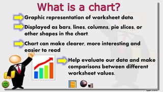
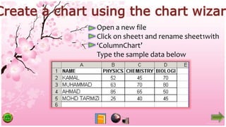
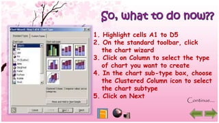
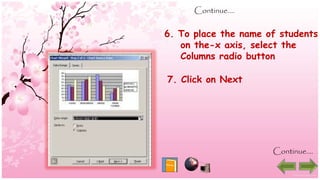
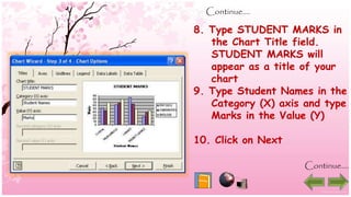
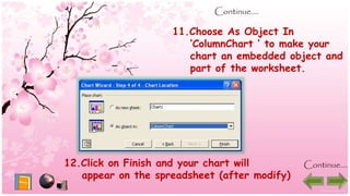
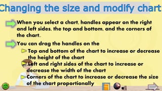
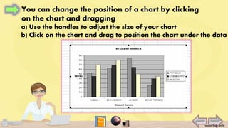
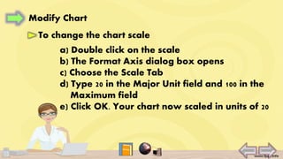
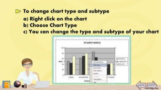
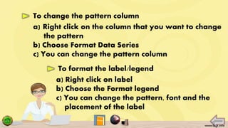
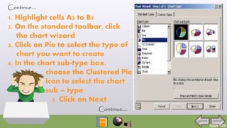
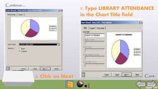
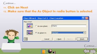
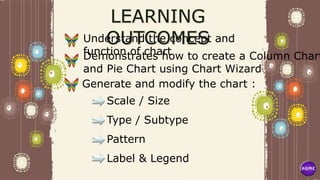
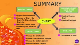
The document provides instructions for creating and modifying column and pie charts in Excel. It explains how to use the Chart Wizard to generate the charts from sample data, and how to perform actions like adjusting the chart size, changing the chart type and scale, modifying data series patterns, and formatting labels and legends. The goal is to demonstrate chart creation and customization skills to students in a Microsoft class.
Insert option is the most important option of MS word. It not only gives you chance to add charts and graphs but also gives you the facility to add your own pictures
In this presentation you will find everything about Insert option of MS word.
Insert option is the most important option of MS word. It not only gives you chance to add charts and graphs but also gives you the facility to add your own pictures
In this presentation you will find everything about Insert option of MS word.
Types of charts in Excel and How to use themVijay Perepa
There are different Chart types and some times we face difficulty to find which chart is suitable for a specific Data set. In this series of Videos, we have discussed about each chart type and when to use etc.
An Introduction to MS word, Its Tools and Features, fonts, ribbons, and many more features of microsoft word. Adding up new templates and starting of MS Word.
A Skills Approach Excel 2016 Chapter 7 Exploring Advanced C.docxdaniahendric
A Skills Approach: Excel 2016 Chapter 7: Exploring Advanced Charts
and Graphics
1 | Page Skill Review 7.1 Last Updated 2/9/18
Skill Review 7.1
In this project, you will analyze U.S. population growth over the last 40 years.
Skills needed to complete this project:
• Applying Quick Styles and Other Formatting to Sparklines
• Changing the Sparkline Type
• Adding Markers to Sparklines
• Adding a Data Series to a Chart
• Creating a Combination Chart
• Formatting Other Chart Elements
• Formatting a Data Point or a Data Series
• Creating a Chart Template
• Inserting a Shape
• Applying Quick Styles and Other Formatting to Shapes
• Applying a Chart Template
• Adding and Removing Trendlines
• Forecasting Values on a Trendline
• Changing Trendline Options
1. Open the start file EX2016-SkillReview-7-1. The file will be renamed automatically to include your
name. Change the project file name if directed to do so by your instructor, and save it.
2. If the workbook opens in Protected View, click the Enable Editing button in the Message Bar at the
top of the workbook so you can modify the workbook.
3. Add Sparklines to the data and apply a Quick Style.
a. On the Population Data worksheet, select cells B4:F13.
b. On the Insert tab, in the Sparklines group, click the Column button.
c. In the Create Sparklines dialog, verify that B4:F13 is the Data Range and specify G4:G13 as the Location
Range. Click OK.
d. On the Sparkline Tools Design tab, in the Style group, apply the Dark Blue, Sparkline Style Dark #6 style.
Click the More button to expand the gallery, then click the first style from the right in the fifth row.
4. Change the Sparklines to lines with markers for all data points and highlight the high point marker in a
different color.
a. On the Sparkline Tools Design tab, in the Type group, click the Line button.
b. On the Sparkline Tools Design tab, in the Show group, click the Markers check box.
c. On the Sparkline Tools Design tab, in the Style group, click the Marker Color button, point to High
Point, and select Red (the second color from the left in the row of standard colors).
5. Create a column chart to represent the population data for Dallas and then add a second series to
represent the overall population of the United States.
a. Select cells A3:F3. Press [Ctrl] and click and drag to select cells A12:F12.
Step 1
Download
start file
A Skills Approach: Excel 2016 Chapter 7: Exploring Advanced Charts
and Graphics
2 | Page Skill Review 7.1 Last Updated 2/9/18
b. On the Insert tab, in the Charts group, click the Column or Bar Chart button, and choose Clustered
Column (the first chart type under 2‐D Column).
c. Click and drag the chart to reposition it immediately below the data.
d. On the Chart Tools Design tab, in the Data group, click the Select Data button.
e. In the Legend Entries (Series) box, click the Add button.
f. Click cell A15 to add ...
Revenue by DepartmentBlue Lake SportsFirst Quarter Sales by CityDe.docxronak56
Revenue by DepartmentBlue Lake SportsFirst Quarter Sales by CityDepartmentAtlantaBostonChicagoSan DiegoSt. LouisTotalApparel $ 2,600$ 3,200$ 3,800$ 3,700$ 3,200$ 16,500Baseball $ 3,500$ 1,200$ 1,350$ 2,100$ 2,475$ 10,625Basketball $ 1,800$ 1,800$ 2,250$ 1,400$ 1,750$ 9,000Bike & Skate $ 1,500$ 1,325$ 1,225$ 2,450$ 1,650$ 8,150Exercise $ 2,650$ 2,875$ 3,250$ 3,775$ 2,950$ 15,500Fishing $ 2,350$ 1,035$ 1,250$ 2,750$ 1,450$ 8,835Footwear $ 1,875$ 2,675$ 3,575$ 3,250$ 2,950$ 14,325Game Room $ 1,300$ 1,500$ 1,900$ 1,050$ 1,275$ 7,025Golf $ 4,750$ 875$ 925$ 5,400$ 1,250$ 13,200Hockey $ 850$ 1,875$ 1,950$ 750$ 1,650$ 7,075Hunting $ 2,000$ 1,000$ 650$ 725$ 950$ 5,325Lacrosse$ 1,750$ 1,800$ 1,750$ 1,375$ 1,150$ 7,825Running $ 1,925$ 2,400$ 2,800$ 2,650$ 2,000$ 11,775Winter Sports $ 1,250$ 34,350$ 2,750$ 550$ 1,550$ 40,450Total$ 30,100$ 57,910$ 29,425$ 31,925$ 26,250$ 175,610
Atlanta RevenueBlue Lake SportsJanuary Sales in AtlantaDepartmentWeek 1Week 2Week 3Week 4TotalApparel $ 235$ 325$ 215$ 450$ 1,225Baseball $ 430$ 250$ 180$ 315$ 1,175Basketball $ 85$ 150$ 90$ 200$ 525Bike & Skate $ 200$ 325$ 75$ 175$ 775Exercise $ 150$ 160$ 180$ 170$ 660Fishing $ 75$ 150$ 85$ 200$ 510Footwear $ 500$ 350$ 275$ 330$ 1,455Game Room $ 45$ 75$ 35$ 15$ 170Golf $ 175$ 350$ 580$ 200$ 1,305Hockey $ 85$ 125$ 50$ 35$ 295Hunting $ 125$ 350$ 475$ 450$ 1,400Lacrosse$ 200$ 50$ 65$ 75$ 390Running $ 165$ 235$ 325$ 180$ 905Winter Sports $ 75$ 15$ - 0$ 15$ 105Total$ 2,545$ 2,910$ 2,630$ 2,810$ 10,895
USING MICROSOFT EXCEL 2016 Guided Project 3-3 (Mac 2016)
Step 1:
Download
start file
Guided Project 3-3 (Mac 2016 Version)
Blue Lake Sports has locations in several major cities and tracks sales by department in each store. For this project, you
create a pie chart that shows each store’s share of golf-related sales for the first quarter. You also create a line chart to
illustrate week-to-week sales for specific departments in one of the stores and insert sparklines in the data.
Skills Covered in This Project
• Create, size, and position a pie chart object. • Create a line chart sheet.
• Apply a chart style. • Apply a chart layout.
• Change the chart type. • Insert and format sparklines in a
worksheet. • Add and format chart elements.
1. Open the BlueLakeSports-03 start file. If the workbook opens in Protected View, click the Enable
Editing button so you can modify it. The file will be renamed automatically to include your name.
Change the project file name if directed to do so by your instructor, and save it.
NOTE: If group titles are not visible on the Ribbon, click the Word menu and select Preferences to
open ...
Blue Lake Sports has locations in several major cities and track.docxmoirarandell
Blue Lake Sports has locations in several major cities and tracks sales by department in each store. For this project, you create a pie chart that shows each store’s share of golf-related sales for the first quarter. You also create a line chart to illustrate week-to-week sales for specific departments in one of the stores and insert sparklines in the data.
[Student Learning Outcomes 3.1, 3.2, 3.3, 3.4, 3.6, 3.8]
File Needed:
BlueLakeSports-03.xlsx
(Available from the
Start File
link.)
Completed Project File Name:
[your name]-BlueLakeSports-03.xlsx
Skills Covered in This Project
Create, size, and position a pie chart object.
Apply a chart style.
Change the chart type.
Add and format chart elements.
Create a line chart sheet.
Apply a chart layout.
Insert and format sparklines in a worksheet.
This image appears when a project instruction has changed to accommodate an update to
Microsoft 365 Apps
. If the instruction does not match your version of Office, try using the alternate instruction instead.
Open the
BlueLakeSports-03
start file. If the workbook opens in
Protected View
, click the
Enable Editing
button so you can modify it. The file will be renamed automatically to include your name. Change the project file name if directed to do so by your instructor, and save it.
Create a pie chart object.
Select the
Revenue by Department
sheet, select cells
A4:F4
, press
Ctrl
, and select cells
A13:F13
.
Click the
Recommended Charts
button [
Insert
tab,
Charts
group].
Choose
Pie
and click
OK
.
Apply a chart style.
Select the chart object.
Click the
More
button [
Chart Design
tab,
Chart Styles
group].
Click the
More
button [
Chart Tools Design
tab,
Chart Styles
group].
Select
Style 12
.
Size and position a chart object.
Point to the chart object border to display the move pointer.
Drag the chart object so its top-left corner is at cell
A21
.
Point to the bottom right selection handle to display the resize arrow.
Drag the pointer to cell
G36
.
Change the chart type.
Select the pie chart object and click the
Change Chart Type
button [
Chart Design
tab,
Type
group].
Select the pie chart object and click the
Change Chart Type
button [
Chart Tools Design
tab,
Type
group].
Select the
All Charts
tab and choose
Pie
in the left pane.
Choose
3-D Pie
and click
OK
.
Format pie chart elements.
Double-click the pie to open its
Format Data Series
task pane.
Click the
Atlanta
slice to update the pane to the
Format Data Point
task pane. (Rest the pointer on a slice to see its identifying
ScreenTip.
)
Click the
Series Options
button in the
Format Data Series
task pane.
Set the pie explosion percentage at
10%
.
Close the task pane.
Click the chart object border to deselect the
Atlanta
slice.
Add and format chart elements in a pie chart.
Click the
Chart Elements
button in the top-right corner of the chart.
Select th.
Synthetic Fiber Construction in lab .pptxPavel ( NSTU)
Synthetic fiber production is a fascinating and complex field that blends chemistry, engineering, and environmental science. By understanding these aspects, students can gain a comprehensive view of synthetic fiber production, its impact on society and the environment, and the potential for future innovations. Synthetic fibers play a crucial role in modern society, impacting various aspects of daily life, industry, and the environment. ynthetic fibers are integral to modern life, offering a range of benefits from cost-effectiveness and versatility to innovative applications and performance characteristics. While they pose environmental challenges, ongoing research and development aim to create more sustainable and eco-friendly alternatives. Understanding the importance of synthetic fibers helps in appreciating their role in the economy, industry, and daily life, while also emphasizing the need for sustainable practices and innovation.
Acetabularia Information For Class 9 .docxvaibhavrinwa19
Acetabularia acetabulum is a single-celled green alga that in its vegetative state is morphologically differentiated into a basal rhizoid and an axially elongated stalk, which bears whorls of branching hairs. The single diploid nucleus resides in the rhizoid.
2024.06.01 Introducing a competency framework for languag learning materials ...Sandy Millin
http://sandymillin.wordpress.com/iateflwebinar2024
Published classroom materials form the basis of syllabuses, drive teacher professional development, and have a potentially huge influence on learners, teachers and education systems. All teachers also create their own materials, whether a few sentences on a blackboard, a highly-structured fully-realised online course, or anything in between. Despite this, the knowledge and skills needed to create effective language learning materials are rarely part of teacher training, and are mostly learnt by trial and error.
Knowledge and skills frameworks, generally called competency frameworks, for ELT teachers, trainers and managers have existed for a few years now. However, until I created one for my MA dissertation, there wasn’t one drawing together what we need to know and do to be able to effectively produce language learning materials.
This webinar will introduce you to my framework, highlighting the key competencies I identified from my research. It will also show how anybody involved in language teaching (any language, not just English!), teacher training, managing schools or developing language learning materials can benefit from using the framework.
Francesca Gottschalk - How can education support child empowerment.pptxEduSkills OECD
Francesca Gottschalk from the OECD’s Centre for Educational Research and Innovation presents at the Ask an Expert Webinar: How can education support child empowerment?
Palestine last event orientationfvgnh .pptxRaedMohamed3
An EFL lesson about the current events in Palestine. It is intended to be for intermediate students who wish to increase their listening skills through a short lesson in power point.
The French Revolution, which began in 1789, was a period of radical social and political upheaval in France. It marked the decline of absolute monarchies, the rise of secular and democratic republics, and the eventual rise of Napoleon Bonaparte. This revolutionary period is crucial in understanding the transition from feudalism to modernity in Europe.
For more information, visit-www.vavaclasses.com
June 3, 2024 Anti-Semitism Letter Sent to MIT President Kornbluth and MIT Cor...Levi Shapiro
Letter from the Congress of the United States regarding Anti-Semitism sent June 3rd to MIT President Sally Kornbluth, MIT Corp Chair, Mark Gorenberg
Dear Dr. Kornbluth and Mr. Gorenberg,
The US House of Representatives is deeply concerned by ongoing and pervasive acts of antisemitic
harassment and intimidation at the Massachusetts Institute of Technology (MIT). Failing to act decisively to ensure a safe learning environment for all students would be a grave dereliction of your responsibilities as President of MIT and Chair of the MIT Corporation.
This Congress will not stand idly by and allow an environment hostile to Jewish students to persist. The House believes that your institution is in violation of Title VI of the Civil Rights Act, and the inability or
unwillingness to rectify this violation through action requires accountability.
Postsecondary education is a unique opportunity for students to learn and have their ideas and beliefs challenged. However, universities receiving hundreds of millions of federal funds annually have denied
students that opportunity and have been hijacked to become venues for the promotion of terrorism, antisemitic harassment and intimidation, unlawful encampments, and in some cases, assaults and riots.
The House of Representatives will not countenance the use of federal funds to indoctrinate students into hateful, antisemitic, anti-American supporters of terrorism. Investigations into campus antisemitism by the Committee on Education and the Workforce and the Committee on Ways and Means have been expanded into a Congress-wide probe across all relevant jurisdictions to address this national crisis. The undersigned Committees will conduct oversight into the use of federal funds at MIT and its learning environment under authorities granted to each Committee.
• The Committee on Education and the Workforce has been investigating your institution since December 7, 2023. The Committee has broad jurisdiction over postsecondary education, including its compliance with Title VI of the Civil Rights Act, campus safety concerns over disruptions to the learning environment, and the awarding of federal student aid under the Higher Education Act.
• The Committee on Oversight and Accountability is investigating the sources of funding and other support flowing to groups espousing pro-Hamas propaganda and engaged in antisemitic harassment and intimidation of students. The Committee on Oversight and Accountability is the principal oversight committee of the US House of Representatives and has broad authority to investigate “any matter” at “any time” under House Rule X.
• The Committee on Ways and Means has been investigating several universities since November 15, 2023, when the Committee held a hearing entitled From Ivory Towers to Dark Corners: Investigating the Nexus Between Antisemitism, Tax-Exempt Universities, and Terror Financing. The Committee followed the hearing with letters to those institutions on January 10, 202
Embracing GenAI - A Strategic ImperativePeter Windle
Artificial Intelligence (AI) technologies such as Generative AI, Image Generators and Large Language Models have had a dramatic impact on teaching, learning and assessment over the past 18 months. The most immediate threat AI posed was to Academic Integrity with Higher Education Institutes (HEIs) focusing their efforts on combating the use of GenAI in assessment. Guidelines were developed for staff and students, policies put in place too. Innovative educators have forged paths in the use of Generative AI for teaching, learning and assessments leading to pockets of transformation springing up across HEIs, often with little or no top-down guidance, support or direction.
This Gasta posits a strategic approach to integrating AI into HEIs to prepare staff, students and the curriculum for an evolving world and workplace. We will highlight the advantages of working with these technologies beyond the realm of teaching, learning and assessment by considering prompt engineering skills, industry impact, curriculum changes, and the need for staff upskilling. In contrast, not engaging strategically with Generative AI poses risks, including falling behind peers, missed opportunities and failing to ensure our graduates remain employable. The rapid evolution of AI technologies necessitates a proactive and strategic approach if we are to remain relevant.
Operation “Blue Star” is the only event in the history of Independent India where the state went into war with its own people. Even after about 40 years it is not clear if it was culmination of states anger over people of the region, a political game of power or start of dictatorial chapter in the democratic setup.
The people of Punjab felt alienated from main stream due to denial of their just demands during a long democratic struggle since independence. As it happen all over the word, it led to militant struggle with great loss of lives of military, police and civilian personnel. Killing of Indira Gandhi and massacre of innocent Sikhs in Delhi and other India cities was also associated with this movement.
Read| The latest issue of The Challenger is here! We are thrilled to announce that our school paper has qualified for the NATIONAL SCHOOLS PRESS CONFERENCE (NSPC) 2024. Thank you for your unwavering support and trust. Dive into the stories that made us stand out!
6. Graphic representation of worksheet data.
Displayed as bars, lines, columns, pie slices, or
other shapes in the chart.
Chart can make clearer, more interesting and
easier to read
Help evaluate our data and make
comparisons between different
worksheet values.
7. Open a new file
Click on sheet1 and rename sheet1with
‘ColumnChart’
Type the sample data below
8. 1. Highlight cells A1 to D5
2. On the standard toolbar, click
the chart wizard
3. Click on Column to select the type
of chart you want to create
4. In the chart sub-type box, choose
the Clustered Column icon to select
the chart subtype
5. Click on Next
Continue….
9. Continue….
6. To place the name of students
on the-x axis, select the
Columns radio button
7. Click on Next
Continue….
10. Continue….
8. Type STUDENT MARKS in
the Chart Title field.
STUDENT MARKS will
appear as a title of your
chart
9. Type Student Names in the
Category (X) axis and type
Marks in the Value (Y)
10. Click on Next
Continue….
11. Continue….
11.Choose As Object In
‘ColumnChart ‘ to make your
chart an embedded object and
part of the worksheet.
12.Click on Finish and your chart will
appear on the spreadsheet (after modify)
Continue….
12.
13. When you select a chart, handles appear on the right
and left sides, the top and bottom, and the corners of
the chart..
You can drag the handles on the
Top and bottom of the chart to increase or decrease
the height of the chart
Left and right sides of the chart to increase or
decrease the width of the chart
Corners of the chart to increase or decrease the size
of the chart proportionally
14. You can change the position of a chart by clicking
on the chart and dragging
a) Use the handles to adjust the size of your chart
b) Click on the chart and drag to position the chart under the data
15. Modify Chart
To change the chart scale
a) Double click on the scale
b) The Format Axis dialog box opens
c) Choose the Scale Tab
d) Type 20 in the Major Unit field and 100 in the
Maximum field
e) Click OK. Your chart now scaled in units of 20
16. To change chart type and subtype
a) Right click on the chart
b) Choose Chart Type
c) You can change the type and subtype of your chart
17. To change the pattern column
a) Right click on the column that you want to change
the pattern
b) Choose Format Data Series
c) You can change the pattern column
a) Right click on label
b) Choose the Format legend
c) You can change the pattern, font and the
placement of the label
To format the label/legend
18. Click on sheet2 and and rename sheet2 with ‘PieChart’
Type the sample data below
Continue….
19. Continue….
1. Highlight cells A3 to B5
2. On the standard toolbar, click
the chart wizard
3. Click on Pie to select the type of
chart you want to create
4. In the chart sub-type box,
choose the Clustered Pie
icon to select the chart
sub – type
5. Click on Next
Continue….
21. 8. Click the Legend property page. Make sure that the Show
Legend Radio button is selected. In the Placement section,
click Bottom
Continue….
Continue….
22. 9. Click the Data Labels property page and click the
‘Percentage’ box under the Label Contains
Continue….
10. Click on Next
Continue….
23. Continue….
11. Click on Next
12. Make sure that the As Object In radio button is selected.
Continue….
24. 13. Click on Finish and your chart will appear on the
spreadsheet
Continue….
25. 1. Choose File -> Save
2. Go to the directory in which you want to
save your file
3. Type Chart in the File Name Field
4. Click on Save
To save your file:
36. QUESTION 4
What the main function of chart?
Processing program that allows for the c
both simple and sophisticated document
Can make data clearer, interesting
and easier to readEnable the user to create dynamic,
informational slide shows through the
use of text, graphics, and animationEasy for users to connect their
diagrams to data sources and to display
their data graphically
42. Page 42
Understand the concept and
function of chartDemonstrates how to create a Column Chart
and Pie Chart using Chart Wizard
Generate and modify the chart :
Scale / Size
Type / Subtype
Pattern
Label & Legend
43. CHART
WHAT IS A CHART?
CREATING A CHART
USING CHART
WIZARD
MODIFY CHART SAVE A FILE
Graphic representation.
Example of Chart : Bar
Chart, Pie Chart, Column
Chart etc.
Make data clearer, more
interesting and easier to
read.
Choose File -> Save
Create a Pie Chart
Change the chart scale
Change chart type and subtype
Change the pattern column
Format the label / legend
Create a Column
Chart
44. Graphic = Gambar
Increase = PenambahanBar Chart = Carta Bar
Line Chart = Carta Line
Pie Chart = Carta Pie
Toolbar = Bar Alatan
Chart Wizard = Wizard Carta
Axis = Paksi
Radio Button = Butang Radio
Directory = Direktori
Drag = TarikWorksheet = Lembaran Kerja
Decrease = Pengurangan
Scale = Skala
Pattern = Paten
File = Fail
Save = Simpan
Modify = Ubah Suai
45. Visit the following websites to learn more about Chart
http://www.excel-easy.com/data-analysis/charts.html
http://office.microsoft.com/en-
001/excel-help/create-a-basic-chart-
RZ001105505.aspx?section=2
http://www.wikihow.com/Create-a-Graph-in-Excel
https://support.office.com/en-au/article/Create-
a-chart-from-start-to-finish-a745775f-98d9-4c63-
bfa8-9c00cd03ff0c
http://www.internet4classrooms.com/excel_
create_chart.htm
https://www.youtube.com/watch?v=R2yEH
46. Day : Monday
Date : 26 January 2015
Time : 07.30 – 08.40
Form : 1 Al-Biruni
Number of Students : 30
Topic : 5.0 Chart
Subtopic : 5.1 What is a Chart?
: 5.2 Creating A Chart Using The Chart Wizard
: 5.3 Modify Chart
Learning Outcomes : At the end of the lesson, students should be
able to:
1) Understand the concept and function of
chart
47. 2) Demonstrates how to create a Colum Chart
and Pie Chart using Chart Wizard
3) Generate and modify the chart :
(a) Scale / Size
(b) Type / Subtype
(c) Pattern
(d) Label & Legend
Prior Knowledge : Students have learned how to create a basic
chart has been provided by Microsoft at last
learning sessions in the fields of learning
Microsoft Word
Scientific Attitude : Being confident and independent and thinking
rationally
48. Noble Value : Being responsible about chart and it must be
used to make data clearer, more interesting
and easier to read
KBKK : Classifying, Observing and using image to
learn
BBM : Microsoft Power Point 2007 Module and slide
presentation
49. Name : Hartinie Binti Mat Ial
Matric Number : L20142009959
Program : ET01SM – Diploma
Pendidikan
Faculty : Fakulti Pendidikan Dan
Pembangunan Manusian
College : Maktab Rendah Sains Mara
Tun Ghazali Shafie, Kuala Lipis