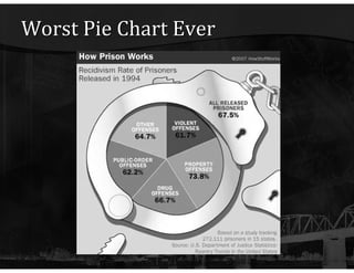
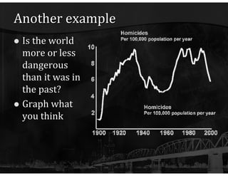
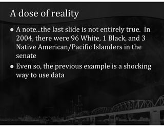
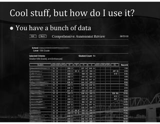
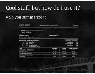
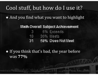
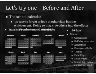
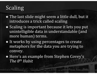
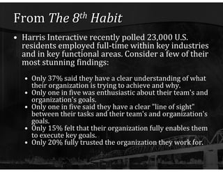
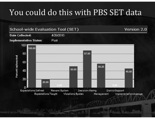
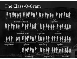
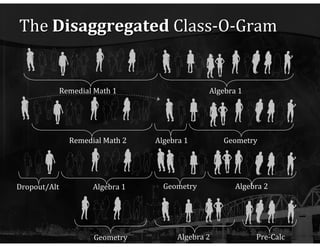
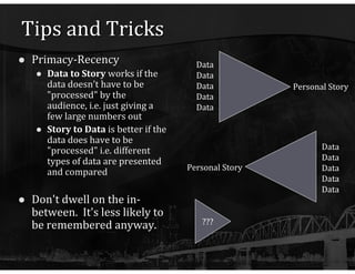
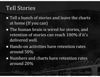
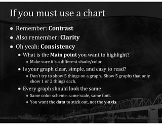
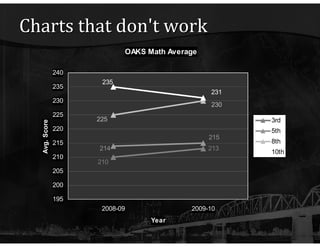
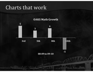
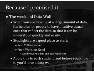
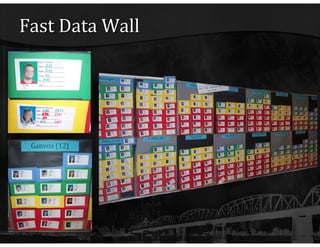
Leveraging Your Data Matthew Matz Morrow County School District
Data in a minute http:// www.youtube.com/watch?v =ImAD8BOBOhw
Welcome First things first Sit back Relax Please ask questions Feel free to stop and discuss Pay close attention...
Because you don't want to miss anything... http:// www.youtube.com/watch?v =Ahg6qcgoay4
Perception is reality But is reality perceived? Nope It can't be The brain has to filter out all kinds of stimuli before it can even begin to process the information it receives. Part of that process in unconsciously selective That's why statements like "you only hear what you want to" exist.
And if you need more proof... http:// www.youtube.com/watch?v = FWSxSQsspiQ
Integrity Because it's very easy to use slight-of-hand with data, we have an obligation to be honest. Even with the best of intentions, it can be easy to skew reality with the wrong kind of chart or graph
The Shrinking Dollar This chart shrinks both dimensions of the bills to represent the change in a single value, therefore distorting the effect of inflation.
Worst Pie Chart Ever
Another example Is the world more or less dangerous than it was in the past? Graph what you think
That's why he's so important! Data helps keep our perception of reality grounded
Adding shock value Think for a moment about the United States Senate It's a representative body, right? Is it ethnically/racially representative? How will you get anyone to care? Shock them, of course. If you haven't already figured this out, the next slide may be offensive, so please take it lightly
"Senate Color by Numbers" from  America (The Book)  by John Stewart
A dose of reality A note...the last slide is not entirely true.  In 2004, there were 96 White, 1 Black, and 3 Native American/Pacific Islanders in the senate Even so, the previous example is a shocking way to use data
Commercial Break – Pop Quiz! How many e-mails were in route? Over 1 million What was the percentage of e-mails containing "miracle banana diet"? 7% How many of those e-mails hit spam filters? 36000 What percentage of people have no idea what Twitter is? 26% How may people left their phones in a cab? 29 How many e-mails were being sent during a business meeting? Over 2 million
Pop Quiz How did you do? People don't generally don't remember numbers So what was the point of that commercial? Sprint's network is  big Sprint's network is  fast Lot's of people already use Sprint
Cool stuff, but how do I use it? You have a bunch of data
Cool stuff, but how do I use it? So you summarize it
Cool stuff, but how do I use it? And you find what you want to highlight If you think that's bad, the year before was  77%
The secret ingredient Contrast People can't remember numbers Sometimes they can't even remember other people They can remember  sharp differences Before and After photos (or even charts) Outliers Comparisons to others Inequities (Unfairness)
Let's try one – Before and After The school calendar It's easy to forget to look at other data besides achievement.  Doing so may clue others into the effects a system has on achievement. 180 days Minus: Conferences Half-day in-service Assemblies Emergency Drills Testing Field Trips Spirit Weeks School days before a 3-day weekend Equals 131 uninterrupted school days
Comparison Comparing the master schedule against diploma requirements This could be used to help determine staffing priorities In case you were wondering about the math: Each bar = (HS FTE) x (sections per FTE) x (% of diploma requirement) i.e. English = 4/24 = 17%
Scaling The last slide might seem a little dull, but it introduces a trick called scaling Scaling is important because it lets you put unintelligible data in understandable (and more human) terms. It works by using percentages to create metaphors for the data you are trying to convey. Here's an example from Stephen Covey's  The 8 th  Habit
From  The 8 th  Habit Harris Interactive recently polled 23,000 U.S. residents employed full-time within key industries and in key functional areas. Consider a few of their most stunning findings: Only 37% said they have a clear understanding of what their organization is trying to achieve and why. Only one in five was enthusiastic about their team's and organization's goals. Only one in five said they have a clear "line of sight" between their tasks and their team's and organization's goals. Only 15% felt that their organization fully enables them to execute key goals. Only 20% fully trusted the organization they work for.
From  The 8 th  Habit If this were a soccer team... Only 4 of the 11 players would know which goal is theirs.  Only 2 of the 11 would care.  Only 2 of the 11 would know what they are supposed to do.  And 9 of the players would be competing against their own team members rather than the opponent.
You could do this with PBS SET data
You could do this with PBS SET data If that school were a Football team All 11 players would know that there were rules But only 3 players would actually know them No player feels the need to make a touchdown And 6 players know not to get penalties 10 players know decisions are made by coaches But 5 players don't trust the coach And nobody feels any support from the owners
The Class-O-Gram Remedial Math 1 Algebra 1 Remedial Math 2 Geometry Algebra 1 Algebra 1 Algebra 2 Geometry Dropout/Alt Geometry Pre-Calc Algebra 2
Scale with Flair You are all 8th graders registering for 9 th  grade classes. The registration form states that your math teacher will select your freshman math class. Each teacher will start with a class (a card) and will either pass or fail that class Passing or failing determines what class is next, and after four classes (years/cards), the teacher will (or won't) "graduate" In the end, a semi-arbitrary choice by staff may determine whether the student graduates, whether they go to college (and if they do, how many thousands of $$ will be spent taking remedial math courses) To set this up, you need a lot of data scaled to the audience/staff you are presenting to. The "Math Map" for your school OAKS scores (disaggregated if you are so inclined) Historical Pass/Fail rates for each math section offered
A "Math Map" From Spaulding HS in Rochester, NH
How to scale this activity If you have a staff of 40 teachers, and a graduating class of 120 students, all of your numbers are divided by 3. For instance, if 21 students are assigned to Advanced Math, 60 students are assigned Algebra 1, and 39 will be assigned Remedial Math, than it's 7, 20, and 13, respectively. If 15 of the 60 kids will likely fail Algebra 1, than 5 of your teachers will "fail" it.
How to really shock them... Disaggregate  this activity Scale the activity using pass/fail and OAKS scores for subgroups such as Latino, ELL, SPED, etc. Or just disaggregate for your largest subgroup. Label your teachers as "Economically Disadvantaged" or not... And in the end, let them reflect on what their status meant in their school.
The  Disaggregated  Class-O-Gram Remedial Math 1 Algebra 1 Remedial Math 2 Geometry Algebra 1 Geometry Pre-Calc Algebra 2 Algebra 1 Algebra 2 Geometry Dropout/Alt
Tips and Tricks Primacy-Recency Data to Story  works if the data doesn't have to be "processed" by the audience, i.e. just giving a few large numbers out Story to Data  is better if the data does have to be "processed" i.e. different types of data are presented and compared Don't dwell on the in-between.  It's less likely to be remembered anyway. ??? Data Data Data Data Data Personal Story Data Data Data Data Data Personal Story
Tell Stories Tell a bunch of stories and leave the charts at home (If you can) The human brain is wired for stories, and retention of stories can reach 100% if it's delivered well. Hands-on activities have retention rates around 50% Numbers and charts have retention rates around 20%
If you must use a chart Remember:  Contrast Also remember:  Clarity Oh yeah:  Consistency What is the  Main point  you want to highlight? Make sure it's a different shade/color Is your graph clear, simple, and easy to read? Don't try to show 5 things on a graph.  Show 5 graphs that only show 1 or 2 things each. Every graph should look the same Same color scheme, same scale, same font.  You want the  data  to stick out, not the  y-axis .
Charts that don't work
Charts that work
Because I promised it The weekend Data Wall When you are looking at a large amount of data, it's helpful for people to have intuitive visual cues that reflect the data so that it can be understood quickly and easily. Stoplights are a good place to start: Red, Yellow, Green Poor, Warning, Good Add brown=no data and blue=excellent Apply this to each student, and before you know it, you'll have a data wall.
Fast Data Wall
Want to know more? Perception Blink  by Malcolm Gladwell Back to School...  and  The Cognitive Art of Educational Technology  by Patrick Crispin http:// www.netsquirrel.com/powerpoint/pedagogy.html Crime The First Measured Century  by PBS http://www.pbs.org/fmc Political Humor America (The Book)   by John Stewart Excellence The 8 th  Habit  by Stephen Covey
Want to know more? Designing Good Graphs The Visual Display of Quantitative Information  by Edward Tufte http:// www.edwardtufte.com/tufte/books_vdqi  Tips for Presentations Resources by Chip and Dan Heath http:// heathbrothers.com /resources/ Looking at Systems Data Updraft Downdraft  by Marilyn Crawford
Thank you!

Leveraging Your Data

  • 1.
    Leveraging Your DataMatthew Matz Morrow County School District
  • 2.
    Data in aminute http:// www.youtube.com/watch?v =ImAD8BOBOhw
  • 3.
    Welcome First thingsfirst Sit back Relax Please ask questions Feel free to stop and discuss Pay close attention...
  • 4.
    Because you don'twant to miss anything... http:// www.youtube.com/watch?v =Ahg6qcgoay4
  • 5.
    Perception is realityBut is reality perceived? Nope It can't be The brain has to filter out all kinds of stimuli before it can even begin to process the information it receives. Part of that process in unconsciously selective That's why statements like "you only hear what you want to" exist.
  • 6.
    And if youneed more proof... http:// www.youtube.com/watch?v = FWSxSQsspiQ
  • 7.
    Integrity Because it'svery easy to use slight-of-hand with data, we have an obligation to be honest. Even with the best of intentions, it can be easy to skew reality with the wrong kind of chart or graph
  • 8.
    The Shrinking DollarThis chart shrinks both dimensions of the bills to represent the change in a single value, therefore distorting the effect of inflation.
  • 9.
  • 10.
    Another example Isthe world more or less dangerous than it was in the past? Graph what you think
  • 11.
    That's why he'sso important! Data helps keep our perception of reality grounded
  • 12.
    Adding shock valueThink for a moment about the United States Senate It's a representative body, right? Is it ethnically/racially representative? How will you get anyone to care? Shock them, of course. If you haven't already figured this out, the next slide may be offensive, so please take it lightly
  • 13.
    "Senate Color byNumbers" from America (The Book) by John Stewart
  • 14.
    A dose ofreality A note...the last slide is not entirely true. In 2004, there were 96 White, 1 Black, and 3 Native American/Pacific Islanders in the senate Even so, the previous example is a shocking way to use data
  • 15.
    Commercial Break –Pop Quiz! How many e-mails were in route? Over 1 million What was the percentage of e-mails containing "miracle banana diet"? 7% How many of those e-mails hit spam filters? 36000 What percentage of people have no idea what Twitter is? 26% How may people left their phones in a cab? 29 How many e-mails were being sent during a business meeting? Over 2 million
  • 16.
    Pop Quiz Howdid you do? People don't generally don't remember numbers So what was the point of that commercial? Sprint's network is big Sprint's network is fast Lot's of people already use Sprint
  • 17.
    Cool stuff, buthow do I use it? You have a bunch of data
  • 18.
    Cool stuff, buthow do I use it? So you summarize it
  • 19.
    Cool stuff, buthow do I use it? And you find what you want to highlight If you think that's bad, the year before was 77%
  • 20.
    The secret ingredientContrast People can't remember numbers Sometimes they can't even remember other people They can remember sharp differences Before and After photos (or even charts) Outliers Comparisons to others Inequities (Unfairness)
  • 21.
    Let's try one– Before and After The school calendar It's easy to forget to look at other data besides achievement. Doing so may clue others into the effects a system has on achievement. 180 days Minus: Conferences Half-day in-service Assemblies Emergency Drills Testing Field Trips Spirit Weeks School days before a 3-day weekend Equals 131 uninterrupted school days
  • 22.
    Comparison Comparing themaster schedule against diploma requirements This could be used to help determine staffing priorities In case you were wondering about the math: Each bar = (HS FTE) x (sections per FTE) x (% of diploma requirement) i.e. English = 4/24 = 17%
  • 23.
    Scaling The lastslide might seem a little dull, but it introduces a trick called scaling Scaling is important because it lets you put unintelligible data in understandable (and more human) terms. It works by using percentages to create metaphors for the data you are trying to convey. Here's an example from Stephen Covey's The 8 th Habit
  • 24.
    From The8 th Habit Harris Interactive recently polled 23,000 U.S. residents employed full-time within key industries and in key functional areas. Consider a few of their most stunning findings: Only 37% said they have a clear understanding of what their organization is trying to achieve and why. Only one in five was enthusiastic about their team's and organization's goals. Only one in five said they have a clear "line of sight" between their tasks and their team's and organization's goals. Only 15% felt that their organization fully enables them to execute key goals. Only 20% fully trusted the organization they work for.
  • 25.
    From The8 th Habit If this were a soccer team... Only 4 of the 11 players would know which goal is theirs. Only 2 of the 11 would care. Only 2 of the 11 would know what they are supposed to do. And 9 of the players would be competing against their own team members rather than the opponent.
  • 26.
    You could dothis with PBS SET data
  • 27.
    You could dothis with PBS SET data If that school were a Football team All 11 players would know that there were rules But only 3 players would actually know them No player feels the need to make a touchdown And 6 players know not to get penalties 10 players know decisions are made by coaches But 5 players don't trust the coach And nobody feels any support from the owners
  • 28.
    The Class-O-Gram RemedialMath 1 Algebra 1 Remedial Math 2 Geometry Algebra 1 Algebra 1 Algebra 2 Geometry Dropout/Alt Geometry Pre-Calc Algebra 2
  • 29.
    Scale with FlairYou are all 8th graders registering for 9 th grade classes. The registration form states that your math teacher will select your freshman math class. Each teacher will start with a class (a card) and will either pass or fail that class Passing or failing determines what class is next, and after four classes (years/cards), the teacher will (or won't) "graduate" In the end, a semi-arbitrary choice by staff may determine whether the student graduates, whether they go to college (and if they do, how many thousands of $$ will be spent taking remedial math courses) To set this up, you need a lot of data scaled to the audience/staff you are presenting to. The "Math Map" for your school OAKS scores (disaggregated if you are so inclined) Historical Pass/Fail rates for each math section offered
  • 30.
    A "Math Map"From Spaulding HS in Rochester, NH
  • 31.
    How to scalethis activity If you have a staff of 40 teachers, and a graduating class of 120 students, all of your numbers are divided by 3. For instance, if 21 students are assigned to Advanced Math, 60 students are assigned Algebra 1, and 39 will be assigned Remedial Math, than it's 7, 20, and 13, respectively. If 15 of the 60 kids will likely fail Algebra 1, than 5 of your teachers will "fail" it.
  • 32.
    How to reallyshock them... Disaggregate this activity Scale the activity using pass/fail and OAKS scores for subgroups such as Latino, ELL, SPED, etc. Or just disaggregate for your largest subgroup. Label your teachers as "Economically Disadvantaged" or not... And in the end, let them reflect on what their status meant in their school.
  • 33.
    The Disaggregated Class-O-Gram Remedial Math 1 Algebra 1 Remedial Math 2 Geometry Algebra 1 Geometry Pre-Calc Algebra 2 Algebra 1 Algebra 2 Geometry Dropout/Alt
  • 34.
    Tips and TricksPrimacy-Recency Data to Story works if the data doesn't have to be "processed" by the audience, i.e. just giving a few large numbers out Story to Data is better if the data does have to be "processed" i.e. different types of data are presented and compared Don't dwell on the in-between. It's less likely to be remembered anyway. ??? Data Data Data Data Data Personal Story Data Data Data Data Data Personal Story
  • 35.
    Tell Stories Tella bunch of stories and leave the charts at home (If you can) The human brain is wired for stories, and retention of stories can reach 100% if it's delivered well. Hands-on activities have retention rates around 50% Numbers and charts have retention rates around 20%
  • 36.
    If you mustuse a chart Remember: Contrast Also remember: Clarity Oh yeah: Consistency What is the Main point you want to highlight? Make sure it's a different shade/color Is your graph clear, simple, and easy to read? Don't try to show 5 things on a graph. Show 5 graphs that only show 1 or 2 things each. Every graph should look the same Same color scheme, same scale, same font. You want the data to stick out, not the y-axis .
  • 37.
  • 38.
  • 39.
    Because I promisedit The weekend Data Wall When you are looking at a large amount of data, it's helpful for people to have intuitive visual cues that reflect the data so that it can be understood quickly and easily. Stoplights are a good place to start: Red, Yellow, Green Poor, Warning, Good Add brown=no data and blue=excellent Apply this to each student, and before you know it, you'll have a data wall.
  • 40.
  • 41.
    Want to knowmore? Perception Blink by Malcolm Gladwell Back to School... and The Cognitive Art of Educational Technology by Patrick Crispin http:// www.netsquirrel.com/powerpoint/pedagogy.html Crime The First Measured Century by PBS http://www.pbs.org/fmc Political Humor America (The Book) by John Stewart Excellence The 8 th Habit by Stephen Covey
  • 42.
    Want to knowmore? Designing Good Graphs The Visual Display of Quantitative Information by Edward Tufte http:// www.edwardtufte.com/tufte/books_vdqi Tips for Presentations Resources by Chip and Dan Heath http:// heathbrothers.com /resources/ Looking at Systems Data Updraft Downdraft by Marilyn Crawford
  • 43.