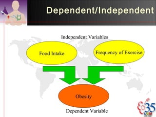
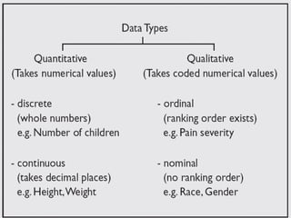
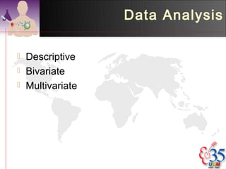
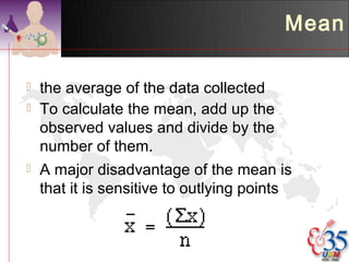
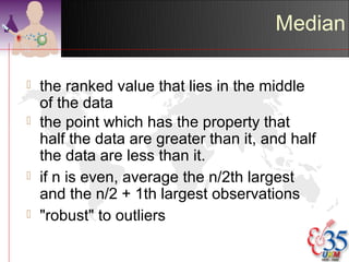
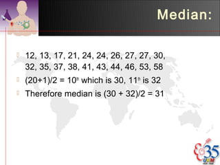
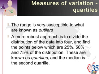
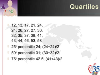
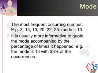
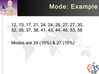
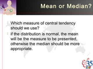
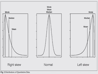
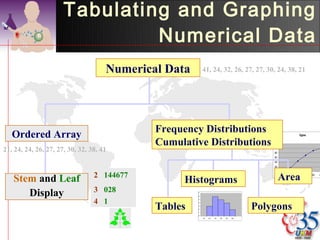
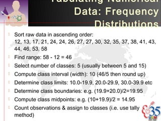
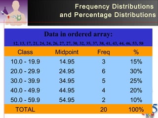
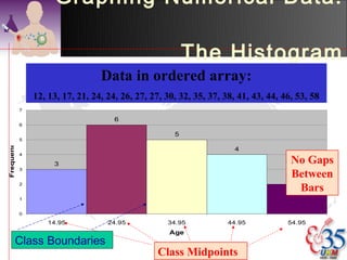
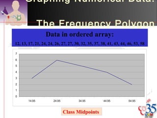
Medicine & Society II


Descriptive Analysis

     Dr Azmi Mohd Tamil
  Dept of Community Health
Universiti Kebangsaan Malaysia
Introduction


Types of Variables
Dependent/Independent

         Independent Variables


Food Intake                 Frequency of Exercise


                  Obesity

              Dependent Variable
Data Analysis

   Descriptive
   Bivariate
   Multivariate
Descriptive

   Summarise a large set of data by a few
    meaningful numbers.
   For the purpose of describing the data
   Example; in one year, what kind of cases are
    treated by the Psychiatric Dept?
   Tables & diagrams are usually used to
    describe the data
   For numerical data, measures of central
    tendency & spread is usually used
Frequency Table

                             Race     F            %
                            Malay    760        95.84%
                           Chinese    5         0.63%
                            Indian    0         0.00%
                           Others     28        3.53%
                           TOTAL     793       100.00%


•Illustrates the frequency observed for each
category
Disease Prevalence:
                  Hypertension

                       Of those previously
140                      diagnosed as
120                      hypertensive;
100                     Only 26% have normal
 80         Normal
                         BP
 60         Brdrline
                        27.1% borderline
            Hiprtnsi
 40                     46.9% hypertensive
 20
  0
      BP
Frequency
                            Distribution Table

• > 20 observations, best          Umur    Bil          %
presented as a frequency        0-0.99            25    3.26%
                                1-4.99            78   10.18%
distribution table.             5-14.99          140   18.28%
•Columns divided into class &   15-24.99         126   16.45%
                                25-34.99         112   14.62%
frequency.                      35-44.99          90   11.75%
                                45-54.99          66    8.62%
•Mod class can be determined
                                55-64.99          60    7.83%
using such tables.              65-74.99          50    6.53%
                                75-84.99          16    2.09%
                                85+                3    0.39%
                                JUMLAH           766
Measurement of Central
 Tendency & Spread
Measures of Central
               Tendency

 Mean
 Mode
 Median
Variability


   Standard deviation
   Inter-quartiles
   Skewness & kurtosis
Mean

   the average of the data collected
   To calculate the mean, add up the
    observed values and divide by the
    number of them.
   A major disadvantage of the mean is
    that it is sensitive to outlying points
Mean: Example

   12, 13, 17, 21, 24, 24, 26, 27, 27,
    30, 32, 35, 37, 38, 41, 43, 44, 46,
    53, 58
   Total of x = 648
   n= 20
   Mean = 648/20 = 32.4
Measures of variation -
                            standard deviation

   tells us how much all the scores in a dataset cluster around the
    mean. A large sd is indicative of a more varied data scores.
   a summary measure of the differences of each observation from
    the mean.
   If the differences themselves were added up, the positive would
    exactly balance the negative and so their sum would be zero.
   Consequently the squares of the differences are added.
sd: Example

                                x     (x-mean)^2     x     (x-mean)^2
   12, 13, 17, 21, 24, 24,
                               12     416.16        32       0.16
    26, 27, 27, 30, 32, 35,    13     376.36        35       6.76
    37, 38, 41, 43, 44, 46,    17     237.16        37      21.16
    53, 58                     21     129.96        38      31.36
                               24      70.56        41      73.96
   Mean = 32.4; n = 20
                               24      70.56        43     112.36
   Total of (x-mean)2         26      40.96        44     134.56
    = 3050.8                   27      29.16        46     184.96
                               27      29.16        53     424.36
   Variance = 3050.8/19
                               30       5.76        58     655.36
    = 160.5684                TOTAL   1405.8       TOTAL     1645
   sd = 160.56840.5=12.67
Median

   the ranked value that lies in the middle
    of the data
   the point which has the property that
    half the data are greater than it, and half
    the data are less than it.
   if n is even, average the n/2th largest
    and the n/2 + 1th largest observations
   "robust" to outliers
Median:

   12, 13, 17, 21, 24, 24, 26, 27, 27, 30,
    32, 35, 37, 38, 41, 43, 44, 46, 53, 58
   (20+1)/2 = 10th which is 30, 11th is 32
   Therefore median is (30 + 32)/2 = 31
Measures of variation -
                            quartiles

   The range is very susceptible to what
    are known as outliers
   A more robust approach is to divide the
    distribution of the data into four, and find
    the points below which are 25%, 50%
    and 75% of the distribution. These are
    known as quartiles, and the median is
    the second quartile.
Quartiles

   12, 13, 17, 21, 24,
    24, 26, 27, 27, 30,
    32, 35, 37, 38, 41,
    43, 44, 46, 53, 58
   25th percentile 24; (24+24)/2
   50th percentile 31; (30+32)/2
   75th percentile 42.5; (41+43)/2
Mode

   The most frequent occurring number.
    E.g. 3, 13, 13, 20, 22, 25: mode = 13.
   It is usually more informative to quote
    the mode accompanied by the
    percentage of times it happened; e.g,
    the mode is 13 with 33% of the
    occurrences.
Mode: Example

   12, 13, 17, 21, 24, 24, 26, 27, 27, 30,
    32, 35, 37, 38, 41, 43, 44, 46, 53, 58

   Modes are 24 (10%) & 27 (10%)
Mean or Median?

   Which measure of central tendency
    should we use?
   if the distribution is normal, the mean
    will be the measure to be presented,
    otherwise the median should be more
    appropriate.
Presentation


Qualitative & Quantitative Data
       Charts & Tables
Presentation


Qualitative Data
Graphing Categorical Data:
                 Univariate Data
                                 Categorical Data


                                                               Graphing Data
 Tabulating Data
The Summary Table
                                                                        Pie Charts
                 CD


            S avings


             B onds                                   Bar Charts               Pareto Diagram
            S toc k s                                              45                                        120
                                                                   40
                                                                                                             100
                        0   10    20   30   40   50                35
                                                                   30                                        80
                                                                   25
                                                                                                             60
                                                                   20
                                                                   15                                        40
                                                                   10
                                                                                                             20
                                                                    5
                                                                    0                                        0
                                                                        S toc k s   B onds   S avings   CD
Bar Chart
          80


                              69

          60


          40


          20
                                                        20
Percent


                                         11

          0
                        Housew ife   Office w ork   Field w ork


               Type of work
Pie Chart


Others
Chinese


           Malay
Tabulating and Graphing
          Bivariate Categorical Data

     Contingency tables:
Table 1: Contigency table of pregnancy induced hypertension and
                               SGA

  Count
                                     SGA
                              Normal       SGA        Total
  Pregnancy induced   No          103          94         197
  hypertension        Yes            5         16           21
  Total                           108         110         218
Tabulating and Graphing
     Bivariate Categorical Data
                     120

   Side
    by
                     100        103

                                           94

    side             80

    charts
                     60


                     40

                                                                       SGA
                     20
                                                                         Normal
             Count


                                                                  16

                      0                                                  SGA
                                      No                    Yes


                           Pregnancy induced hypertension
Presentation


Quantitative Data
Tabulating and Graphing
                               Numerical Data
                                     Numerical Data       41, 24, 32, 26, 27, 27, 30, 24, 38, 21


                                             Frequency Distributions
   Ordered Array                                                                                                 Ogive


                                             Cumulative Distributions                       120

21, 24, 24, 26, 27, 27, 30, 32, 38, 41                                                      100
                                                                                            80
                                                                                            60
                                                                                            40
                                                                                            20
                                                                                             0

                                 2 144677                                                         Area
   Stem and Leaf                                   Histograms
                                                                                                  10   20   30      40   50   6


      Display                    3 028                7

                                                      6


                                 4 1                  5


                                             Tables                                     Polygons
                                                      4
                                                      3

                                                      2
                                                      1
                                                      0
                                                          10   20   30   40   50   60
Tabulating Numerical
                       Data: Frequency
                           Distributions
   Sort raw data in ascending order:
    12, 13, 17, 21, 24, 24, 26, 27, 27, 30, 32, 35, 37, 38, 41, 43,
    44, 46, 53, 58
   Find range: 58 - 12 = 46
   Select number of classes: 5 (usually between 5 and 15)
   Compute class interval (width): 10 (46/5 then round up)
   Determine class limits: 10.0-19.9, 20.0-29.9, 30.0-39.9 etc
   Determine class boundaries: e.g. (19.9+20.0)/2=19.95
   Compute class midpoints: e.g. (10+19.9)/2 = 14.95
   Count observations & assign to classes (i.e. use tally
    method)
Frequency Distributions
                           and Percentage Distributions


                  Data in ordered array:
12, 13, 17, 21, 24, 24, 26, 27, 27, 30, 32, 35, 37, 38, 41, 43, 44, 46, 53, 58

  Class                  Midpoint                 Freq                  %
10.0 - 19.9                14.95                     3               15%
20.0 - 29.9                24.95                     6               30%
30.0 - 39.9                34.95                     5               25%
40.0 - 49.9                44.95                     4               20%
50.0 - 59.9                54.95                     2               10%
 TOTAL                                              20              100%
Graphing Numerical Data:

                                                          The Histogram
                                  Data in ordered array:
                12, 13, 17, 21, 24, 24, 26, 27, 27, 30, 32, 35, 37, 38, 41, 43, 44, 46, 53, 58
            7

                                      6
            6

                                                      5
            5
Frequency


                                                                      4
            4

                     3                                                                No Gaps
                                                                                      Between
            3

                                                                                      2
            2
                                                                                        Bars
            1


            0

                    14.95           24.95           34.95            44.95           54.95
                                                     Age
        Class Boundaries
                                                 Class Midpoints
Graphing Numerical Data:

                The Frequency Polygon
                  Data in ordered array:
12, 13, 17, 21, 24, 24, 26, 27, 27, 30, 32, 35, 37, 38, 41, 43, 44, 46, 53, 58

7

6

5

4

3

2

1

0
        14.95          24.95          34.95          44.95          54.95


                               Class Midpoints
Calculate Measures of
         Central Tendency & Spread

   We can use frequency distribution table
    to calculate;
    •   Mean
    •   Standard Deviation
    •   Median
    •   Mode
Mean


                          Class       Midpoint   Freq   freq x m.p.

   Mean = 659/20       10.0 - 19.9    14.95      3      44.85
           = 32.95      20.0 - 29.9    24.95      6     149.70
   Compare with 32.4   30.0 - 39.9    34.95      5     174.75
    from direct
                        40.0 - 49.9    44.95      4     179.80
    calculation.
                        50.0 - 59.9    54.95      2     109.90

                         TOTAL                   20     659.00
Standard deviation


                                              Mid
                                Class        Point   Freq   f.m.p.   f.mp^2

                                             14.95    3     44.85
s2=((24634.05-(6592/20))/19)   10.0 - 19.9                           670.51


s2=2920.05/19                  20.0 - 29.9   24.95    6     149.70   3735.02

s2=153.69                      30.0 - 39.9   34.95    5     174.75   6107.51

s = 12.4
                               40.0 - 49.9   44.95    4     179.80   8082.01
 Compare with 12.67 from
   direct measurement.         50.0 - 59.9   54.95    2     109.90   6039.01


                               TOTAL                 20     659.00   24634.05
Median

  Class       Freq                     L1 +i *((n+1)/2) – f1
                                                   fmed
10.0 - 19.9    3                       f1 = cumulative freq
                                        above median class
20.0 - 29.9    6                       29.95 + 10((21/2)-9)
30.0 - 39.9    5     median class                      5
                                       29.95 + 15/5 = 32.95
40.0 - 49.9    4                       From direct calculation,
                                        median = 31
50.0 - 59.9    2


 TOTAL        20
Mode

=L1 +i *(Beza1/(Beza1+Beza2))
                                  Class       Freq
=19.95 + 10(3/(3+1))
=27.45
                                10.0 - 19.9    3
                                20.0 - 29.9    6     mode class
   Compare with
    modes of 24 & 27            30.0 - 39.9    5

    from direct                 40.0 - 49.9    4
    calculation.
                                50.0 - 59.9    2

                                 TOTAL        20
Graphing Bivariate Numerical
                              Data (Scatter Plot )
               5.0


               4.5


               4.0


               3.5


               3.0


               2.5
Birth weight


               2.0


               1.5                                                   Rsq = 0.2028
                 30       40     50        60   70   80   90   100


                     Weight at first ANC
Principles of Graphical
                      Excellence
   Presents data in a way that provides
    substance, statistics and design
   Communicates complex ideas with
    clarity, precision and efficiency
   Gives the largest number of ideas in the
    most efficient manner
   Almost always involves several
    dimensions
   Tells the truth about the data
Errors in Presenting Data

   Using “chart junk”
   Failing to provide a relative
    basis in comparing data
    between groups
   Compressing the vertical axis
   Providing no zero point on the vertical
    axis
“Chart Junk”

Bad Presentation
 Minimum charge        Good Presentation
     per visit                  Minimum charge
  1960: $1.00              $        per visit
                       4
   1970: $1.60
                       2
     1980: $3.10
                       0
        1990: $3.80    1960     1970   1980   1990
No Relative Basis

      Bad Presentation      Good Presentation
        A’s received by          A’s received by
  Freq.    students.                students.
300                       30 %
200                       20
100                       10
  0                        0
       Yr1 Yr2 Yr3 Yr4         Yr1 Yr2 Yr3 Yr4
Compressing Vertical Axis

      Bad Presentation   Good Presentation
        HUKM Quarterly          HUKM Quarterly
      $    Profits            $    Profits
200                      50

100                      25

 0                        0
       Q1 Q2   Q3 Q4           Q1   Q2   Q3 Q4
No Zero Point on Vertical
                              Axis

       Bad Presentation                 Good Presentation
                                               HUKM Monthly
       HUKM Monthly                          $   Collection
     $   Collection                     45
45
                                        42
42
                                        39
39                                      36
36
     J F M A M J                        0
                                             J F M A M J
     Graphing the first six months of collection.

Descriptive Analysis in Statistics

  • 1.
    Medicine & SocietyII Descriptive Analysis Dr Azmi Mohd Tamil Dept of Community Health Universiti Kebangsaan Malaysia
  • 2.
  • 3.
    Dependent/Independent Independent Variables Food Intake Frequency of Exercise Obesity Dependent Variable
  • 5.
    Data Analysis  Descriptive  Bivariate  Multivariate
  • 6.
    Descriptive  Summarise a large set of data by a few meaningful numbers.  For the purpose of describing the data  Example; in one year, what kind of cases are treated by the Psychiatric Dept?  Tables & diagrams are usually used to describe the data  For numerical data, measures of central tendency & spread is usually used
  • 7.
    Frequency Table Race F % Malay 760 95.84% Chinese 5 0.63% Indian 0 0.00% Others 28 3.53% TOTAL 793 100.00% •Illustrates the frequency observed for each category
  • 8.
    Disease Prevalence: Hypertension Of those previously 140 diagnosed as 120 hypertensive; 100  Only 26% have normal 80 Normal BP 60 Brdrline  27.1% borderline Hiprtnsi 40  46.9% hypertensive 20 0 BP
  • 9.
    Frequency Distribution Table • > 20 observations, best Umur Bil % presented as a frequency 0-0.99 25 3.26% 1-4.99 78 10.18% distribution table. 5-14.99 140 18.28% •Columns divided into class & 15-24.99 126 16.45% 25-34.99 112 14.62% frequency. 35-44.99 90 11.75% 45-54.99 66 8.62% •Mod class can be determined 55-64.99 60 7.83% using such tables. 65-74.99 50 6.53% 75-84.99 16 2.09% 85+ 3 0.39% JUMLAH 766
  • 10.
    Measurement of Central Tendency & Spread
  • 11.
    Measures of Central Tendency  Mean  Mode  Median
  • 12.
    Variability  Standard deviation  Inter-quartiles  Skewness & kurtosis
  • 13.
    Mean  the average of the data collected  To calculate the mean, add up the observed values and divide by the number of them.  A major disadvantage of the mean is that it is sensitive to outlying points
  • 14.
    Mean: Example  12, 13, 17, 21, 24, 24, 26, 27, 27, 30, 32, 35, 37, 38, 41, 43, 44, 46, 53, 58  Total of x = 648  n= 20  Mean = 648/20 = 32.4
  • 15.
    Measures of variation- standard deviation  tells us how much all the scores in a dataset cluster around the mean. A large sd is indicative of a more varied data scores.  a summary measure of the differences of each observation from the mean.  If the differences themselves were added up, the positive would exactly balance the negative and so their sum would be zero.  Consequently the squares of the differences are added.
  • 16.
    sd: Example x (x-mean)^2 x (x-mean)^2  12, 13, 17, 21, 24, 24, 12 416.16 32 0.16 26, 27, 27, 30, 32, 35, 13 376.36 35 6.76 37, 38, 41, 43, 44, 46, 17 237.16 37 21.16 53, 58 21 129.96 38 31.36 24 70.56 41 73.96  Mean = 32.4; n = 20 24 70.56 43 112.36  Total of (x-mean)2 26 40.96 44 134.56 = 3050.8 27 29.16 46 184.96 27 29.16 53 424.36  Variance = 3050.8/19 30 5.76 58 655.36 = 160.5684 TOTAL 1405.8 TOTAL 1645  sd = 160.56840.5=12.67
  • 18.
    Median  the ranked value that lies in the middle of the data  the point which has the property that half the data are greater than it, and half the data are less than it.  if n is even, average the n/2th largest and the n/2 + 1th largest observations  "robust" to outliers
  • 19.
    Median:  12, 13, 17, 21, 24, 24, 26, 27, 27, 30, 32, 35, 37, 38, 41, 43, 44, 46, 53, 58  (20+1)/2 = 10th which is 30, 11th is 32  Therefore median is (30 + 32)/2 = 31
  • 20.
    Measures of variation- quartiles  The range is very susceptible to what are known as outliers  A more robust approach is to divide the distribution of the data into four, and find the points below which are 25%, 50% and 75% of the distribution. These are known as quartiles, and the median is the second quartile.
  • 21.
    Quartiles  12, 13, 17, 21, 24, 24, 26, 27, 27, 30, 32, 35, 37, 38, 41, 43, 44, 46, 53, 58  25th percentile 24; (24+24)/2  50th percentile 31; (30+32)/2  75th percentile 42.5; (41+43)/2
  • 22.
    Mode  The most frequent occurring number. E.g. 3, 13, 13, 20, 22, 25: mode = 13.  It is usually more informative to quote the mode accompanied by the percentage of times it happened; e.g, the mode is 13 with 33% of the occurrences.
  • 23.
    Mode: Example  12, 13, 17, 21, 24, 24, 26, 27, 27, 30, 32, 35, 37, 38, 41, 43, 44, 46, 53, 58  Modes are 24 (10%) & 27 (10%)
  • 24.
    Mean or Median?  Which measure of central tendency should we use?  if the distribution is normal, the mean will be the measure to be presented, otherwise the median should be more appropriate.
  • 26.
  • 27.
  • 28.
    Graphing Categorical Data: Univariate Data Categorical Data Graphing Data Tabulating Data The Summary Table Pie Charts CD S avings B onds Bar Charts Pareto Diagram S toc k s 45 120 40 100 0 10 20 30 40 50 35 30 80 25 60 20 15 40 10 20 5 0 0 S toc k s B onds S avings CD
  • 29.
    Bar Chart 80 69 60 40 20 20 Percent 11 0 Housew ife Office w ork Field w ork Type of work
  • 30.
  • 31.
    Tabulating and Graphing Bivariate Categorical Data  Contingency tables: Table 1: Contigency table of pregnancy induced hypertension and SGA Count SGA Normal SGA Total Pregnancy induced No 103 94 197 hypertension Yes 5 16 21 Total 108 110 218
  • 32.
    Tabulating and Graphing Bivariate Categorical Data 120  Side by 100 103 94 side 80 charts 60 40 SGA 20 Normal Count 16 0 SGA No Yes Pregnancy induced hypertension
  • 33.
  • 34.
    Tabulating and Graphing Numerical Data Numerical Data 41, 24, 32, 26, 27, 27, 30, 24, 38, 21 Frequency Distributions Ordered Array Ogive Cumulative Distributions 120 21, 24, 24, 26, 27, 27, 30, 32, 38, 41 100 80 60 40 20 0 2 144677 Area Stem and Leaf Histograms 10 20 30 40 50 6 Display 3 028 7 6 4 1 5 Tables Polygons 4 3 2 1 0 10 20 30 40 50 60
  • 35.
    Tabulating Numerical Data: Frequency Distributions  Sort raw data in ascending order: 12, 13, 17, 21, 24, 24, 26, 27, 27, 30, 32, 35, 37, 38, 41, 43, 44, 46, 53, 58  Find range: 58 - 12 = 46  Select number of classes: 5 (usually between 5 and 15)  Compute class interval (width): 10 (46/5 then round up)  Determine class limits: 10.0-19.9, 20.0-29.9, 30.0-39.9 etc  Determine class boundaries: e.g. (19.9+20.0)/2=19.95  Compute class midpoints: e.g. (10+19.9)/2 = 14.95  Count observations & assign to classes (i.e. use tally method)
  • 36.
    Frequency Distributions and Percentage Distributions Data in ordered array: 12, 13, 17, 21, 24, 24, 26, 27, 27, 30, 32, 35, 37, 38, 41, 43, 44, 46, 53, 58 Class Midpoint Freq % 10.0 - 19.9 14.95 3 15% 20.0 - 29.9 24.95 6 30% 30.0 - 39.9 34.95 5 25% 40.0 - 49.9 44.95 4 20% 50.0 - 59.9 54.95 2 10% TOTAL 20 100%
  • 37.
    Graphing Numerical Data: The Histogram Data in ordered array: 12, 13, 17, 21, 24, 24, 26, 27, 27, 30, 32, 35, 37, 38, 41, 43, 44, 46, 53, 58 7 6 6 5 5 Frequency 4 4 3 No Gaps Between 3 2 2 Bars 1 0 14.95 24.95 34.95 44.95 54.95 Age Class Boundaries Class Midpoints
  • 38.
    Graphing Numerical Data: The Frequency Polygon Data in ordered array: 12, 13, 17, 21, 24, 24, 26, 27, 27, 30, 32, 35, 37, 38, 41, 43, 44, 46, 53, 58 7 6 5 4 3 2 1 0 14.95 24.95 34.95 44.95 54.95 Class Midpoints
  • 39.
    Calculate Measures of Central Tendency & Spread  We can use frequency distribution table to calculate; • Mean • Standard Deviation • Median • Mode
  • 40.
    Mean Class Midpoint Freq freq x m.p.  Mean = 659/20 10.0 - 19.9 14.95 3 44.85 = 32.95 20.0 - 29.9 24.95 6 149.70  Compare with 32.4 30.0 - 39.9 34.95 5 174.75 from direct 40.0 - 49.9 44.95 4 179.80 calculation. 50.0 - 59.9 54.95 2 109.90 TOTAL 20 659.00
  • 41.
    Standard deviation Mid Class Point Freq f.m.p. f.mp^2 14.95 3 44.85 s2=((24634.05-(6592/20))/19) 10.0 - 19.9 670.51 s2=2920.05/19 20.0 - 29.9 24.95 6 149.70 3735.02 s2=153.69 30.0 - 39.9 34.95 5 174.75 6107.51 s = 12.4 40.0 - 49.9 44.95 4 179.80 8082.01  Compare with 12.67 from direct measurement. 50.0 - 59.9 54.95 2 109.90 6039.01 TOTAL 20 659.00 24634.05
  • 42.
    Median Class Freq  L1 +i *((n+1)/2) – f1 fmed 10.0 - 19.9 3  f1 = cumulative freq above median class 20.0 - 29.9 6  29.95 + 10((21/2)-9) 30.0 - 39.9 5 median class 5  29.95 + 15/5 = 32.95 40.0 - 49.9 4  From direct calculation, median = 31 50.0 - 59.9 2 TOTAL 20
  • 43.
    Mode =L1 +i *(Beza1/(Beza1+Beza2)) Class Freq =19.95 + 10(3/(3+1)) =27.45 10.0 - 19.9 3 20.0 - 29.9 6 mode class  Compare with modes of 24 & 27 30.0 - 39.9 5 from direct 40.0 - 49.9 4 calculation. 50.0 - 59.9 2 TOTAL 20
  • 44.
    Graphing Bivariate Numerical Data (Scatter Plot ) 5.0 4.5 4.0 3.5 3.0 2.5 Birth weight 2.0 1.5 Rsq = 0.2028 30 40 50 60 70 80 90 100 Weight at first ANC
  • 45.
    Principles of Graphical Excellence  Presents data in a way that provides substance, statistics and design  Communicates complex ideas with clarity, precision and efficiency  Gives the largest number of ideas in the most efficient manner  Almost always involves several dimensions  Tells the truth about the data
  • 46.
    Errors in PresentingData  Using “chart junk”  Failing to provide a relative basis in comparing data between groups  Compressing the vertical axis  Providing no zero point on the vertical axis
  • 47.
    “Chart Junk” Bad Presentation Minimum charge  Good Presentation per visit Minimum charge 1960: $1.00 $ per visit 4 1970: $1.60 2 1980: $3.10 0 1990: $3.80 1960 1970 1980 1990
  • 48.
    No Relative Basis Bad Presentation  Good Presentation A’s received by A’s received by Freq. students. students. 300 30 % 200 20 100 10 0 0 Yr1 Yr2 Yr3 Yr4 Yr1 Yr2 Yr3 Yr4
  • 49.
    Compressing Vertical Axis Bad Presentation Good Presentation HUKM Quarterly HUKM Quarterly $ Profits $ Profits 200 50 100 25 0 0 Q1 Q2 Q3 Q4 Q1 Q2 Q3 Q4
  • 50.
    No Zero Pointon Vertical Axis Bad Presentation  Good Presentation HUKM Monthly HUKM Monthly $ Collection $ Collection 45 45 42 42 39 39 36 36 J F M A M J 0 J F M A M J Graphing the first six months of collection.