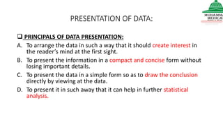
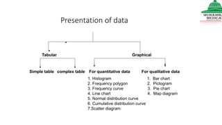
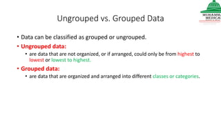
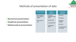
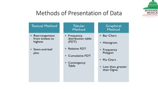
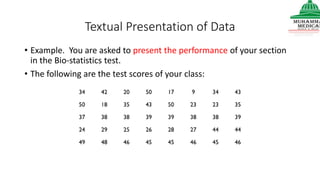
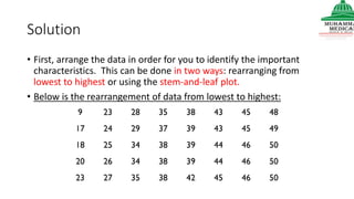
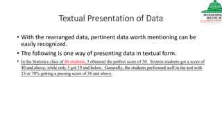
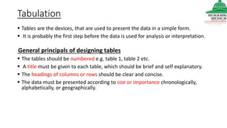
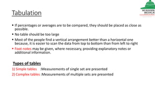
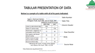
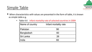
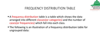
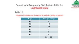
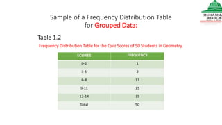
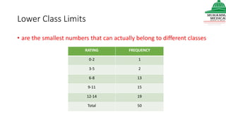
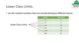
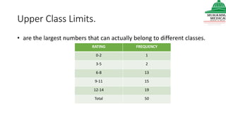
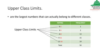
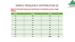
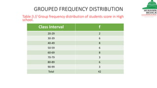
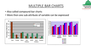
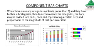
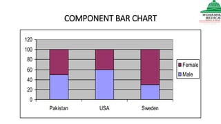
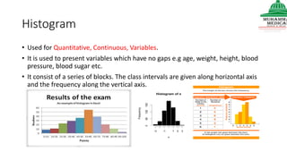
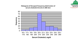
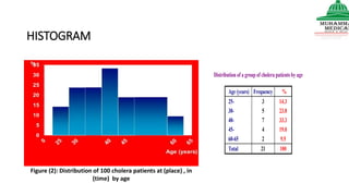
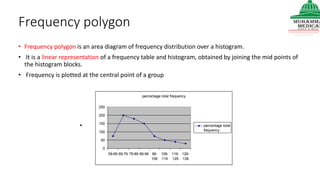
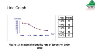
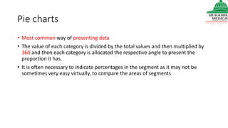
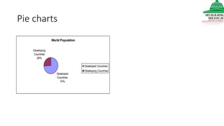
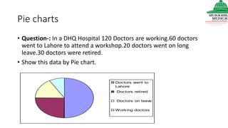
This document provides information on various methods of presenting data, including tabular, graphical, and textual presentation. It discusses principles of data presentation and different types of tables, charts, and diagrams that can be used including simple tables, frequency distribution tables, bar charts, histograms, line graphs and pie charts. It also covers concepts like class intervals, frequency, relative frequency and discusses worked examples of various methods of data presentation.
VIP Call Girls Noida Jhanvi 9711199171 Best VIP Call Girls Near Me
Presentation of Data Principles and Methods
1.
2. PRESENTATION OF DATA:
PRINCIPALS OF DATA PRESENTATION:
A. To arrange the data in such a way that it should create interest in
the reader’s mind at the first sight.
B. To present the information in a compact and concise form without
losing important details.
C. To present the data in a simple form so as to draw the conclusion
directly by viewing at the data.
D. To present it in such away that it can help in further statistical
analysis.
3. Presentation of data
Tabular Graphical
Simple table complex table For quantitative data For qualitative data
1. Histogram 1. Bar chart
2. Frequency polygon 2. Pictogram
3. Frequency curve 3. Pie chart
4. Line chart 4. Map diagram
5. Normal distribution curve
6. Cumulative distribution curve
7.Scatter diagram
4. Ungrouped vs. Grouped Data
• Data can be classified as grouped or ungrouped.
• Ungrouped data:
• are data that are not organized, or if arranged, could only be from highest to
lowest or lowest to highest.
• Grouped data:
• are data that are organized and arranged into different classes or categories.
5. Methods of presentation of data
Numerical presentation
Graphical presentation
Mathematical presentation
7. Textual Presentation of Data
• Data can be presented using paragraphs or sentences.
• It involves enumerating important characteristics, emphasizing
significant figures and identifying important features of data.
8. Textual Presentation of Data
• Example. You are asked to present the performance of your section
in the Bio-statistics test.
• The following are the test scores of your class:
9. Solution
• First, arrange the data in order for you to identify the important
characteristics. This can be done in two ways: rearranging from
lowest to highest or using the stem-and-leaf plot.
• Below is the rearrangement of data from lowest to highest:
10. Textual Presentation of Data
• With the rearranged data, pertinent data worth mentioning can be
easily recognized.
• The following is one way of presenting data in textual form.
• In the Statistics class of 40 students, 3 obtained the perfect score of 50. Sixteen students got a score of
40 and above, while only 3 got 19 and below. Generally, the students performed well in the test with
23 or 70% getting a passing score of 38 and above.
11. Another way of rearranging data is by making use of the
stem-and-leaf plot.
• What is a stem-and-leaf plot?
• Stem-and-leaf Plot is a table which sorts data according to a certain
pattern.
• It involves separating a number into two parts.
• In a two-digit number, the stem consists of the first digit, and the leaf
consists of the second digit.
• While in a three-digit number, the stem consists of the first two digits,
and the leaf consists of the last digit.
• In a one-digit number, the stem is zero.
12. Below is the stem-and-leaf plot of the ungrouped data given in the
example.
• Utilizing the stem-and-leaf plot, we can readily see the order of the data.
Thus, we can say that the top ten got scores 50, 50, 50, 49, 48, 46, 46, 46,45,
and 45 and the ten lowest scores are 9, 17, 18, 20, 23,23,24,25,26, and 27.
16. Tabulation
Tables are the devices, that are used to present the data in a simple form.
It is probably the first step before the data is used for analysis or interpretation.
General principals of designing tables
The tables should be numbered e.g. table 1, table 2 etc.
A title must be given to each table, which should be brief and self explanatory.
The headings of columns or rows should be clear and concise.
The data must be presented according to size or importance chronologically,
alphabetically, or geographically.
17. Tabulation
If percentages or averages are to be compared, they should be placed as close as
possible.
No table should be too large
Most of the people find a vertical arrangement better than a horizontal one
because, it is easier to scan the data from top to bottom than from left to right
Foot notes may be given, where necessary, providing explanatory notes or
additional information.
Types of tables
1) Simple tables :Measurements of single set are presented
2) Complex tables :Measurements of multiple sets are presented
18. TABULAR PRESENTATION OF DATA
MCPegollo/Basic Statistics/SRSTHS
http://www.sws.org.ph/youth.htm
Table Number
Table Title
Column Header
Row Classifier
Body
Source Note
Below is a sample of a table with all of its parts indicated:
19. Simple Table
When characteristics with values are presented in the form of table, it is known
as simple table e.g.
• Table 4.4 Infant mortality rate of selected countries in 2004
Name of country Infant mortality rate
Pakistan 90
Bangladesh 60
Sri Lanka 26
India 60
20.
21. FREQUENCY DISTRIBUTION TABLE
A frequency distribution table is a table which shows the data
arranged into different classes(or categories) and the number of
cases(or frequencies) which fall into each class.
The following is an illustration of a frequency distribution table for
ungrouped data:
22. Sample of a Frequency Distribution Table for
Ungrouped Data:
Table 1.1
Frequency Distribution for the Ages of 50 Students Enrolled in Statistics
23. Sample of a Frequency Distribution Table
for Grouped Data:
Table 1.2
Frequency Distribution Table for the Quiz Scores of 50 Students in Geometry.
24. Lower Class Limits
• are the smallest numbers that can actually belong to different classes
RATING FREQUENCY
0-2 1
3-5 2
6-8 13
9-11 15
12-14 19
Total 50
25. Lower Class Limits.
• are the smallest numbers that can actually belong to different classes
RATING FREQUENCY
0-2 1
3-5 2
6-8 13
9-11 15
12-14 19
Total 50
Lower Class Limits
26. Upper Class Limits.
• are the largest numbers that can actually belong to different classes.
RATING FREQUENCY
0-2 1
3-5 2
6-8 13
9-11 15
12-14 19
Total 50
27. Upper Class Limits.
• are the largest numbers that can actually belong to different classes.
RATING FREQUENCY
0-2 1
3-5 2
6-8 13
9-11 15
12-14 19
Total 50
Upper Class Limits
28. Class Boundaries
• are the numbers used to separate classes, but without the gaps
created by class limits.
• Class boundaries or true limits are the points that demarcate upper
limit of one class and lower limit of the next.
30. Class Boundaries.
• Number separating classes
0 - 2 20
3 - 5 14
6 - 8 15
9 - 11 2
12 - 14 1
Rating Frequency
- 0.5
2.5
5.5
8.5
11.5
14.5
Class Boundaries
31. Class Midpoints.
• The Class Mark or Class Midpoint is the respective average of each
class limits
32. 0 - 1 2 20
3 - 4 5 14
6 - 7 8 15
9 - 10 11 2
12 - 13 14 1
Rating Frequency
Class Midpoints
Class Midpoints.
midpoints of the classes
33. Class Width.
• is the difference between two consecutive lower class limits or two
consecutive class boundaries.
3 0 - 2 20
3 3 - 5 14
3 6 - 8 15
3 9 - 11 2
3 12 - 14 1
Rating Frequency
Class Width
34. SIMPLE FREQUENCY DISTRIBUTION (f)
SCORE f SCORE f SCORE f
22 1 48 1 69 1
23 1 49 2 74 1
32 1 53 1 75 1
34 2 54 2 76 1
37 2 56 2 83 1
38 1 57 1 84 1
44 1 63 1 85 2
45 1 64 1 87 2
46 1 64 4 98 3
47 2 66 1 Total 42
Table:2 // Simple frequency distribution of students score in High
school.
35. GROUPED FREQUENCY DISTRIBUTION
Class Interval f
20-29 2
30-39 6
40-49 8
50-59 6
60-69 8
70-79 3
80-89 6
90-99 3
Total 42
Table:3 // Group frequency distribution of students score in High
school.
36. CUMULATIVE FREQUENCY DISTRIBUTION (Cumf)
Class Interval f Cum f
20-29 2 2
30-39 6 8
40-49 8 16
50-59 6 22
60-69 8 30
70-79 3 33
80-89 6 39
90-99 3 42
Table:4 // Cumulative frequency distribution of student’s score in
High school.
Cumualtive:Incorporating all current and previous data up to the present or at time of
measuring or collecting.(By Addition )
37. RELATIVE FREQUENCY DISTRIBUTION (RF/P)
CI f RF
20-29 2 4.8
30-39 6 14.3
40-49 8 19.0
50-59 6 14.3
60-69 8 19.0
70-79 3 7.1
80-89 6 14.3
90-99 3 7.1
Total 42 100%
Table:5// Relative frequency distribution of student’s score in High
school.
38. Table (III): Distribution of 20 lung cancer patients at the chest department of
Alexandria hospital and 40 controls in May 2008 according to smoking
Complex frequency distribution Table
39. Table (IV): Distribution of 60 patients at the chest department of Alexandria hospital
in May 2008 according to smoking & lung cancer
40.
41. Charts and Diagrams
Charts and diagrams are useful methods of presenting simple data.
They have powerful impact on imagination of people.
Gives information at a glance.
Diagrams are better retained in memory than statistical table.
However graphs cannot be substituted for statistical table, because the graphs cannot have
mathematical treatment where as tables can be treated mathematically.
Whenever graphs are compared , the difference in the scale should be noted.
It should be remembered that a lot of details and accuracy of original data is lost in charts and
diagrams, and if we want the real study, we have to go back to the original data.
42. Common diagrams
• Pie chart
• Simple bar diagram
• Multiple bar diagram
• Component bar diagram or subdivided bar diagram
• Histogram
• Frequency polygon
• Frequency curve
• O give curve
• Scatter diagram
• Line diagram
• Pictogram
• Statistical maps
43. Bar charts
• The data presented is categorical
• Data is presented in the form of rectangular bar of equal breadth.
• Each bar represent one variant /attribute.
• Suitable scale should be indicated and scale starts from zero.
• The width of the bar and the gaps between the bars should be equal throughout.
• The length of the bar is proportional to the magnitude/ frequency of the variable.
• The bars may be vertical or horizontal.
45. MULTIPLE BAR CHARTS
• Also called compound bar charts
• More then one sub-attribute of variable can be expressed
0
10
20
30
40
50
60
Asia Europe Africa Latin
America
USSR North
America
Oceania
PercentageofWorldTotal
Population
Land
46. COMPONENT BAR CHARTS
• When there are many categories on X-axis (more than 5) and they have
further subcategories, then to accommodate the categories, the bars
may be divided into parts, each part representing a certain item and
proportional to the magnitude of that particular item
Pakistan: Growth of Population
0
100
200
300
400
500
600
700
800
1901
1911
1921
1931
1941
1951
1961
1971
1981
1991
2001
Censs Decades
PopulationinMillion
Growth
48. Histogram
• Used for Quantitative, Continuous, Variables.
• It is used to present variables which have no gaps e.g age, weight, height, blood
pressure, blood sugar etc.
• It consist of a series of blocks. The class intervals are given along horizontal axis
and the frequency along the vertical axis.
49. Histogram of Grouped frequency distrinution of
serum cholestrol levels in 200 men
0
10
20
30
40
50
60
70
80
161-
170
171-
180
181-
190
191-
200
201-
210
211-
220
221-
230
231-
240
241-
250
251-
260
Serum Cholestrol, mg/dl
frequency
50. HISTOGRAM
Figure (2): Distribution of 100 cholera patients at (place) , in
(time) by age
Distribution of a group of cholera patients by age
Age (years) Frequency %
25-
30-
40-
45-
60-65
3
5
7
4
2
14.3
23.8
33.3
19.0
9.5
Total 21 100
51. Frequency polygon
• Frequency polygon is an area diagram of frequency distribution over a histogram.
• It is a linear representation of a frequency table and histogram, obtained by joining the mid points of
the histogram blocks.
• Frequency is plotted at the central point of a group
percentage total frequency
0
50
100
150
200
250
59-69 69-79 79-89 89-99 99-
109
109-
119
119-
129
129-
139
percentage total
frequency
52. Line Graph
0
10
20
30
40
50
60
1960 1970 1980 1990 2000
Year
MMR/1000
Year MMR
1960 50
1970 45
1980 26
1990 15
2000 12
Figure (1): Maternal mortality rate of (country), 1960-
2000
53. Line diagram
• Line diagrams are used to show the trend of events with the passage of time.
• Line diagram showing the malaria cases reported throughout the word excluding African region
during 1972-78
10
8
6
4
2
0
1972 73 74 75 76 77 78
C
a
s
e
s
54. Pie charts
• Most common way of presenting data
• The value of each category is divided by the total values and then multiplied by
360 and then each category is allocated the respective angle to present the
proportion it has.
• It is often necessary to indicate percentages in the segment as it may not be
sometimes very easy virtually, to compare the areas of segments
56. Pie charts
• Question-: In a DHQ Hospital 120 Doctors are working.60 doctors
went to Lahore to attend a workshop.20 doctors went on long
leave.30 doctors were retired.
• Show this data by Pie chart.
Doctors went to
Lahore
Doctors retired
Doctors on leave
Working doctors
57. Pictogram
• Popular method of presenting data to those who cannot understand
orthodox charts.
• Small pictures or symbols are used to present the data,e.g a picture of
a doctor to represent the population physician.
• Fraction of the picture can be used to represent numbers smaller
than the value of whole symbol
58. Statistical maps
• When statistical data refers to geographic or administrative areas, it is presented
either as statistical map or dot map.
• The shaded maps are used to present data of varying size. The areas are shaded
with different color or different intensities of the same color, which is indicated in
the key.
59. Scatter diagram
• Scatter diagrams show the relationship between the two variables e.g a positive
correlation/ association between the intake of fat and sugar in the average diets
of 41 countries.
• If the dots cluster round a straight line, it shows evidence of a relationship of a
linear nature.
• If there is no such cluster, it is probable that there is no relationship between
the variables.
60.
61. Mathematical presentation
• Summery statistics.
• Measures of location
• 1- Measures of central tendency
• 2- Measures of non central locations
• (Quartiles, Percentiles )
• Measures of dispersion