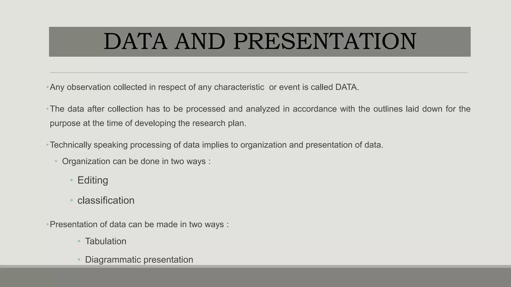
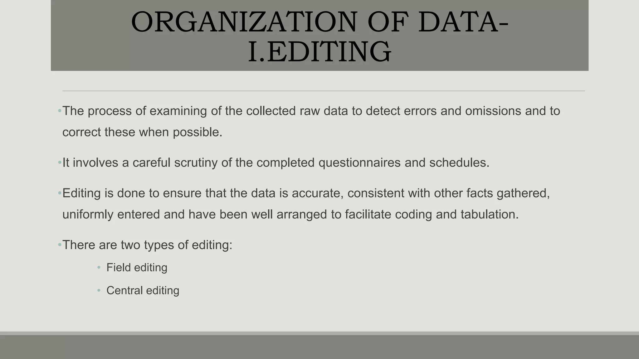
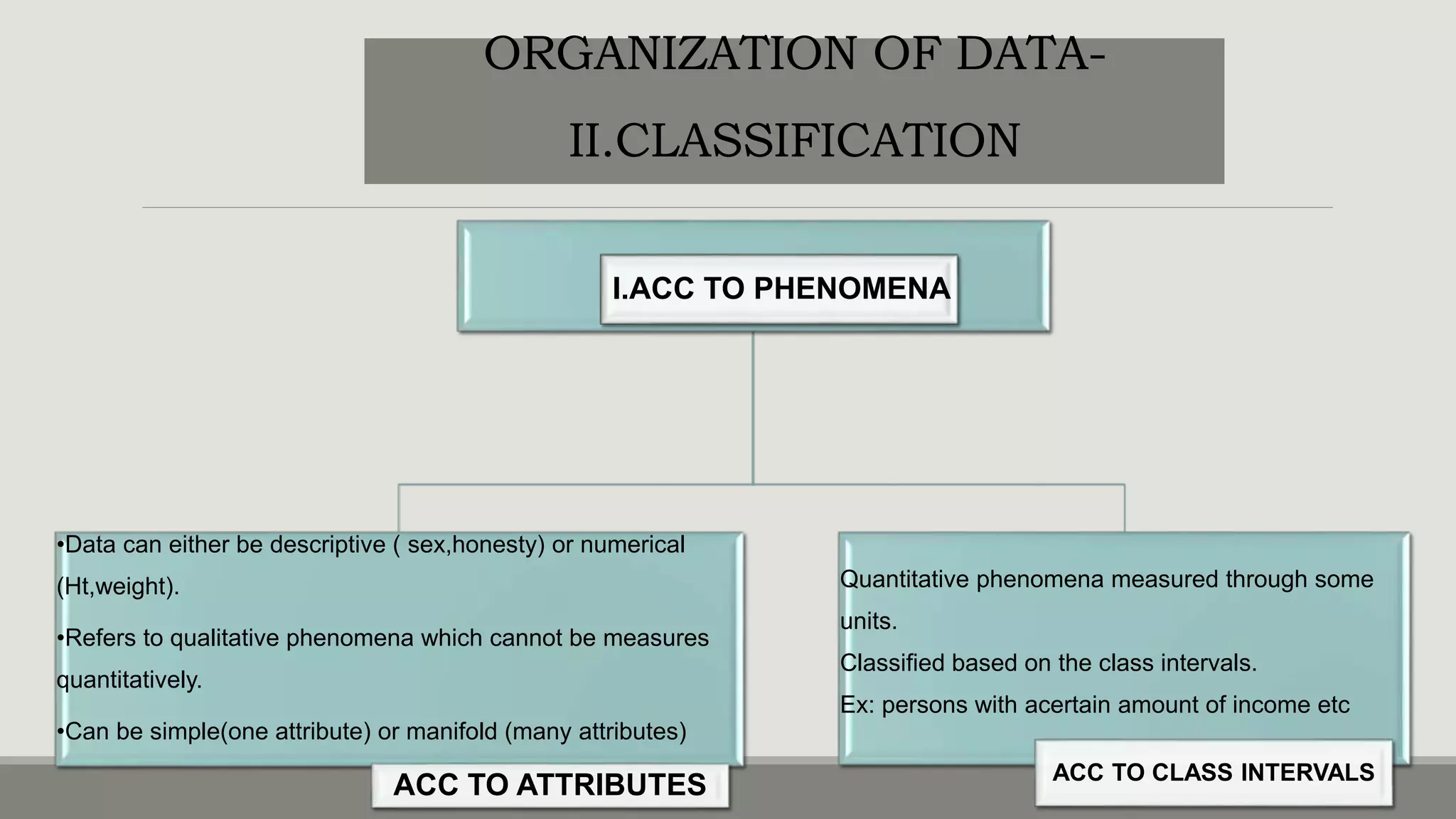
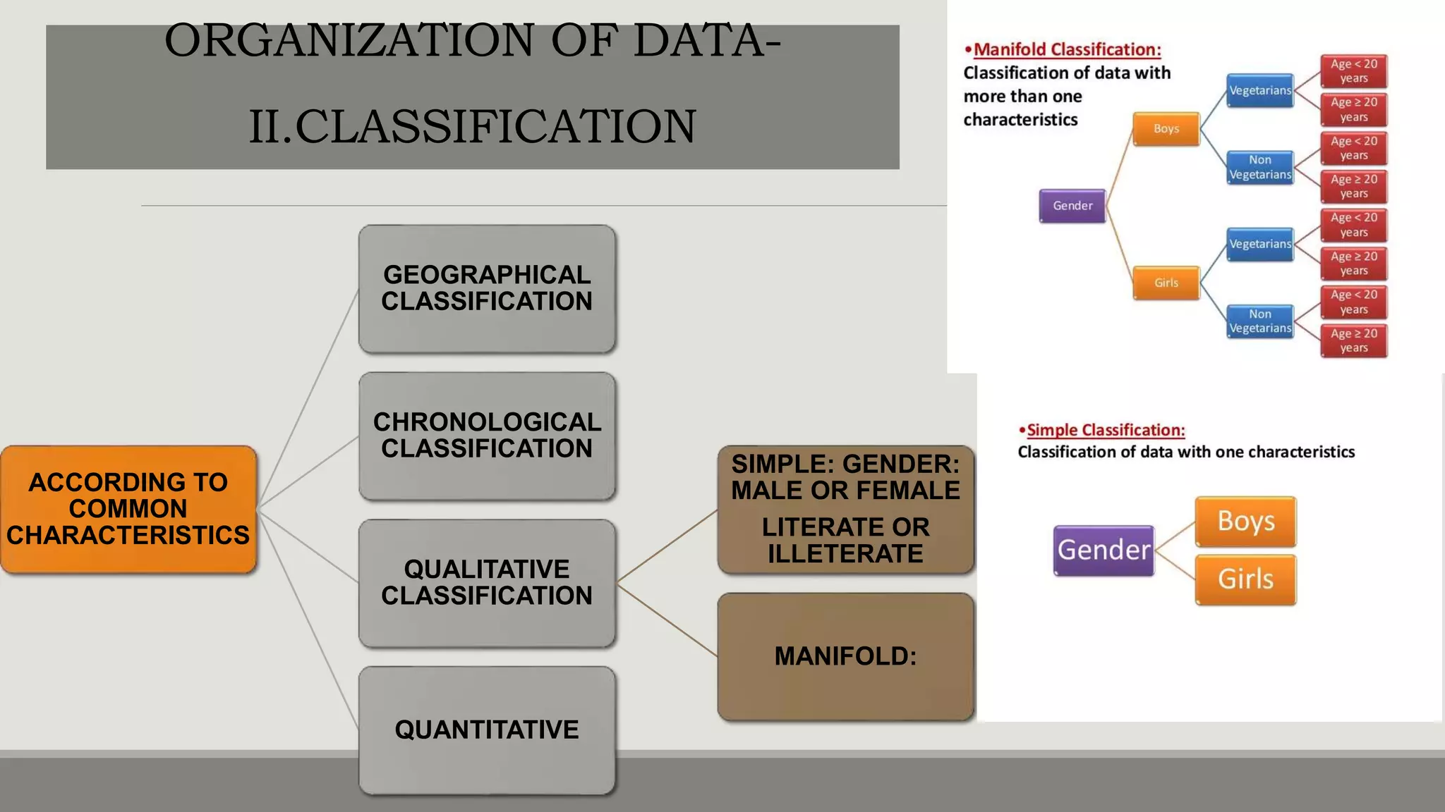
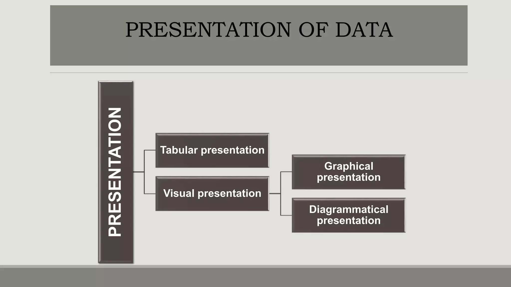
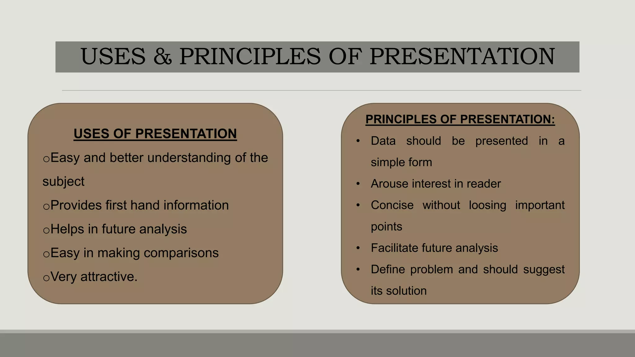
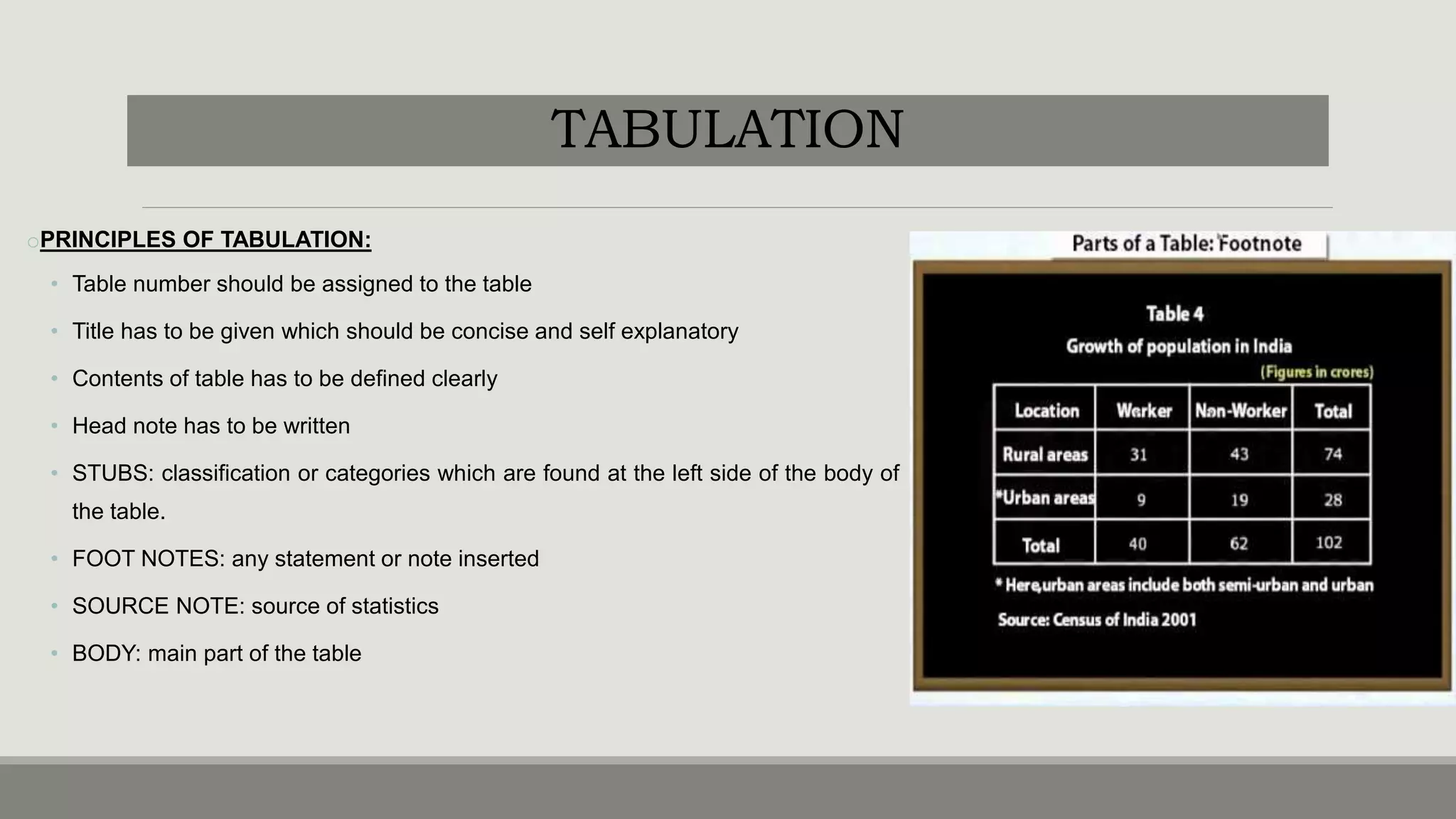
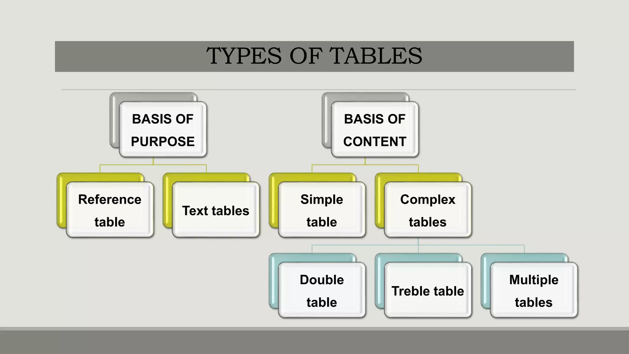
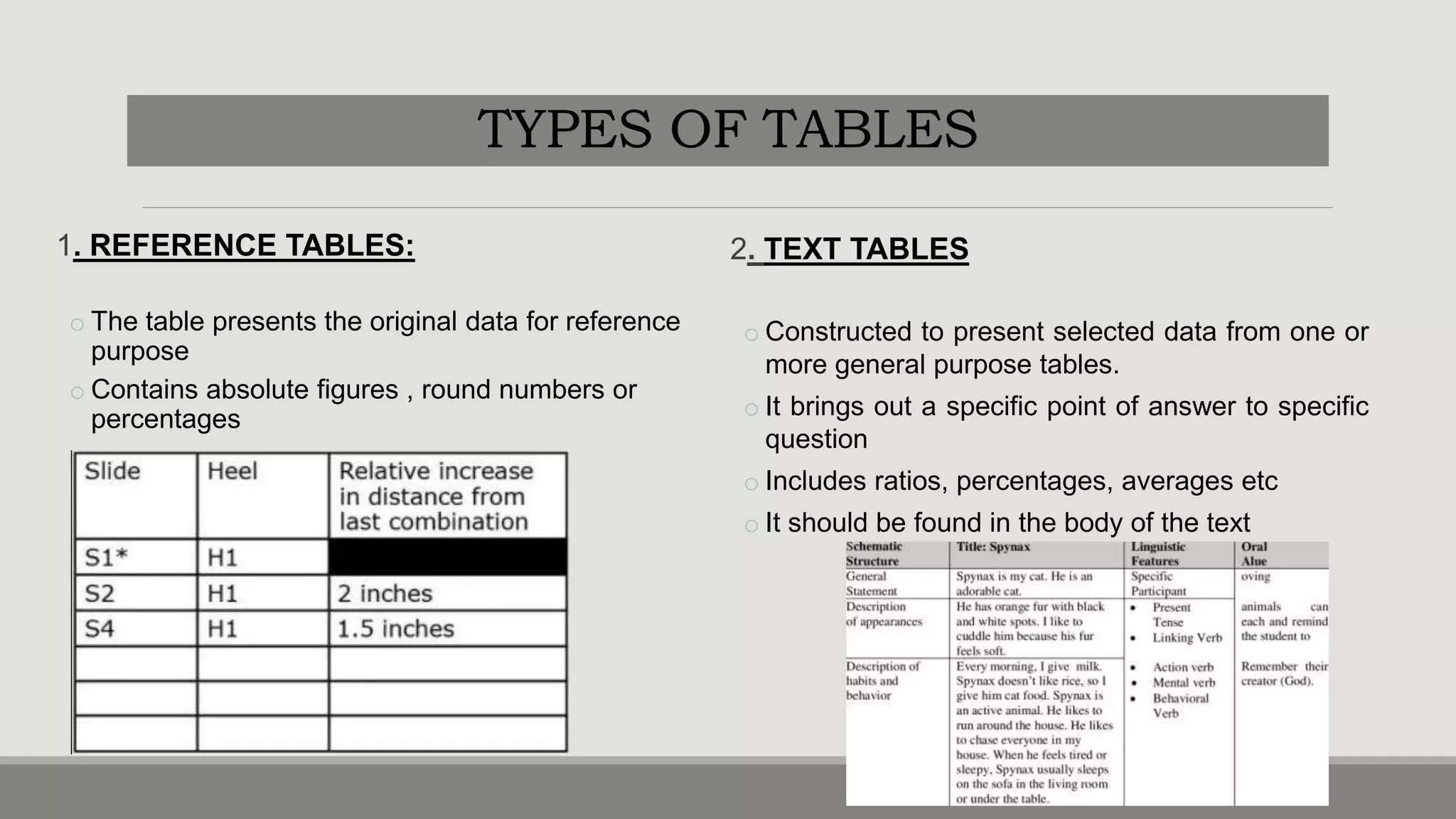
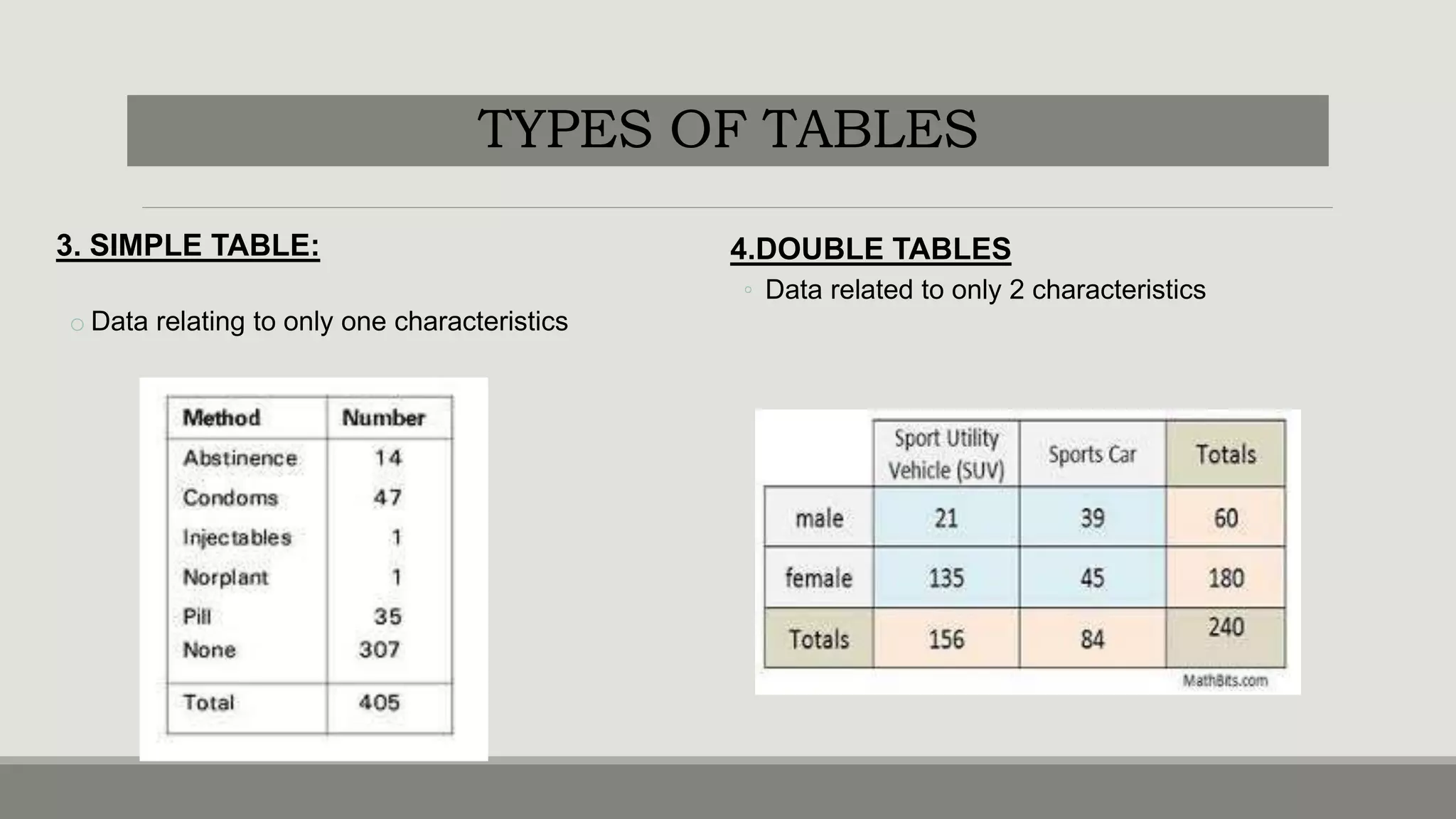
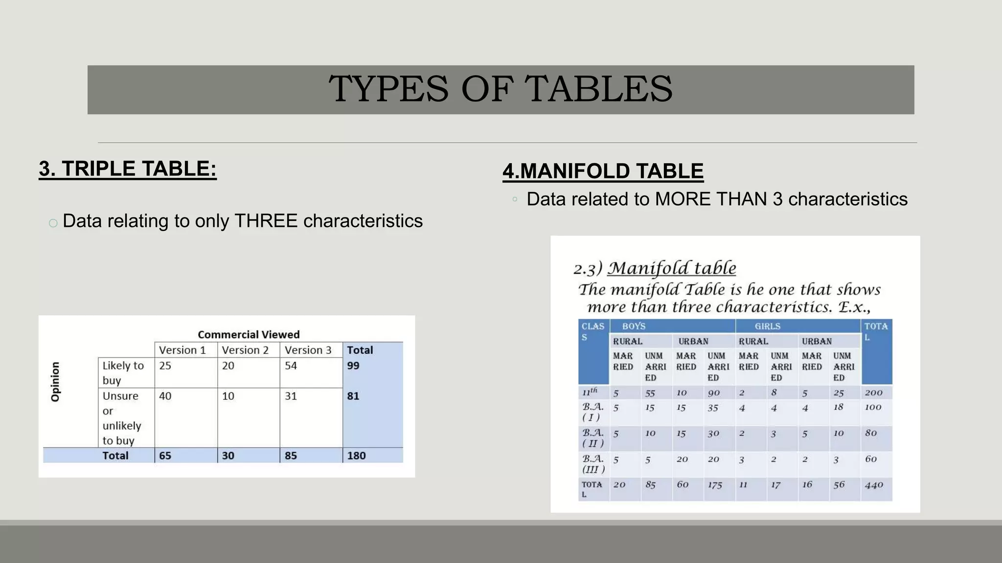
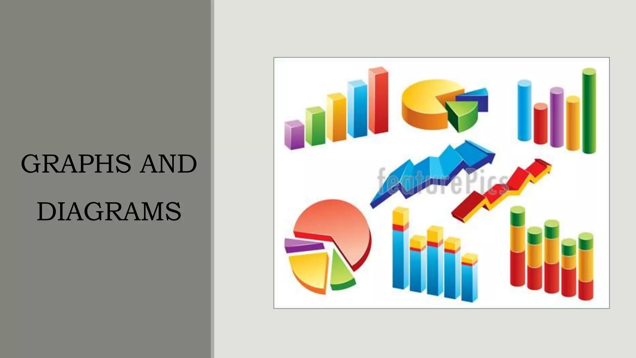
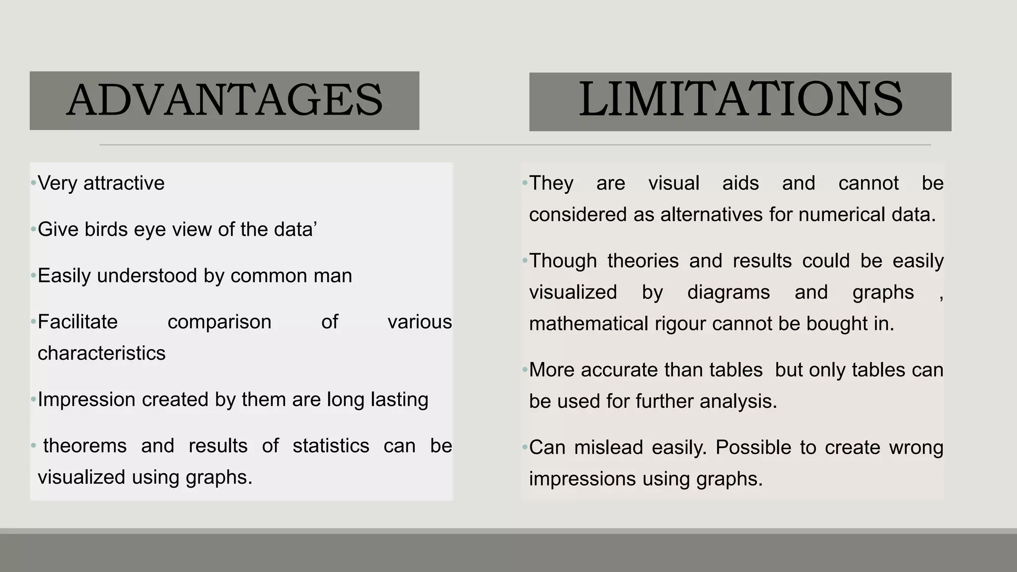
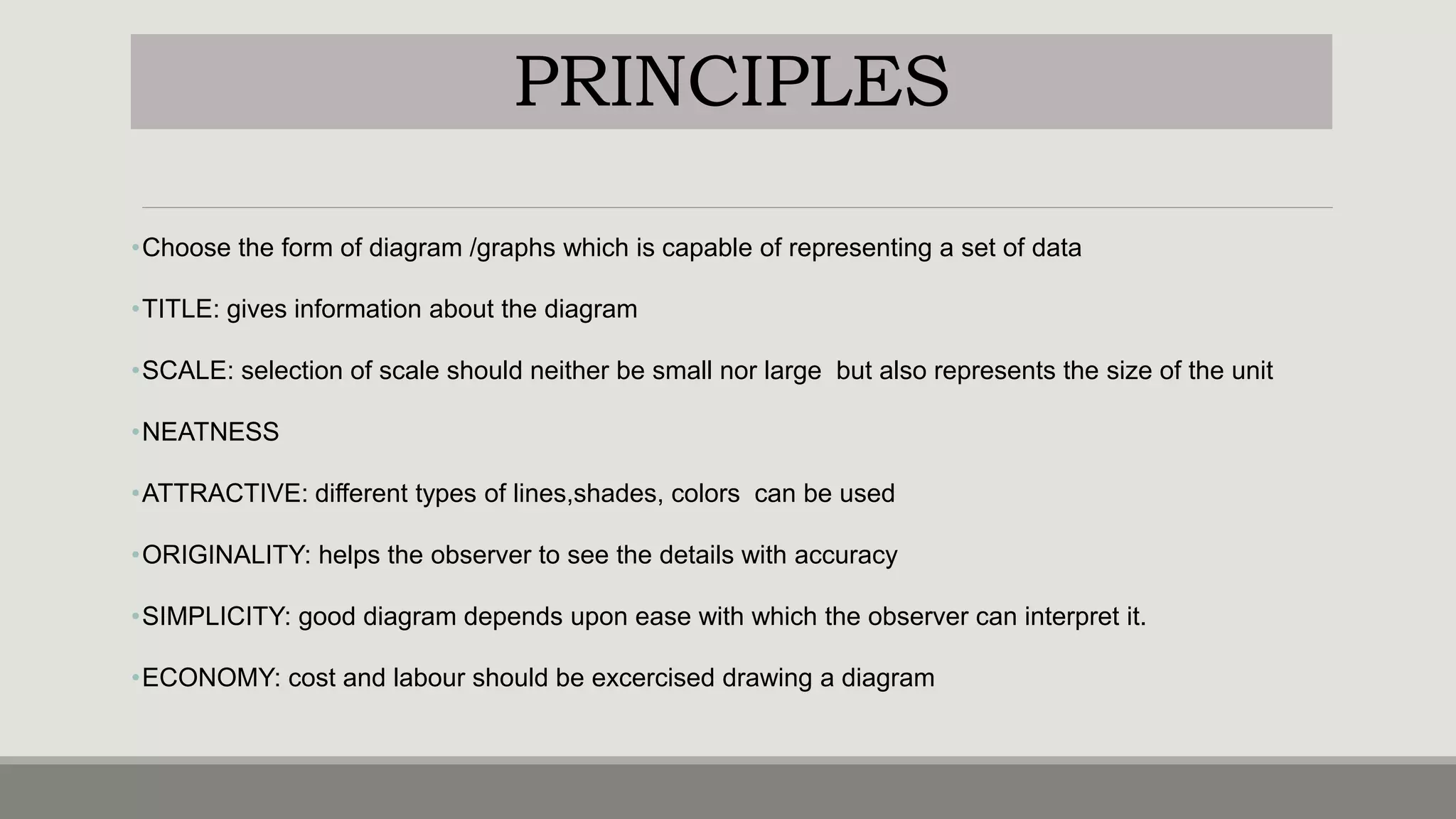
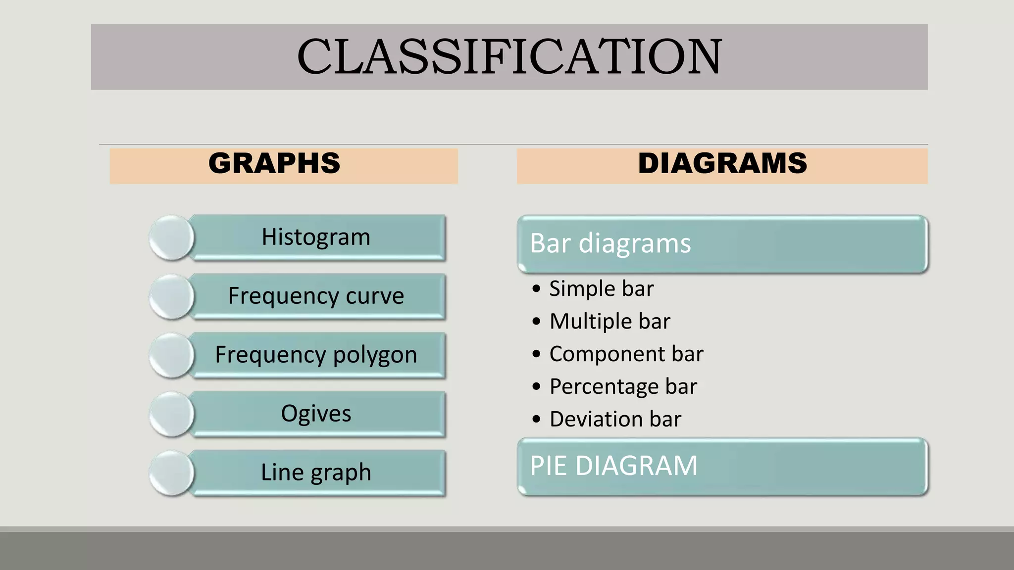
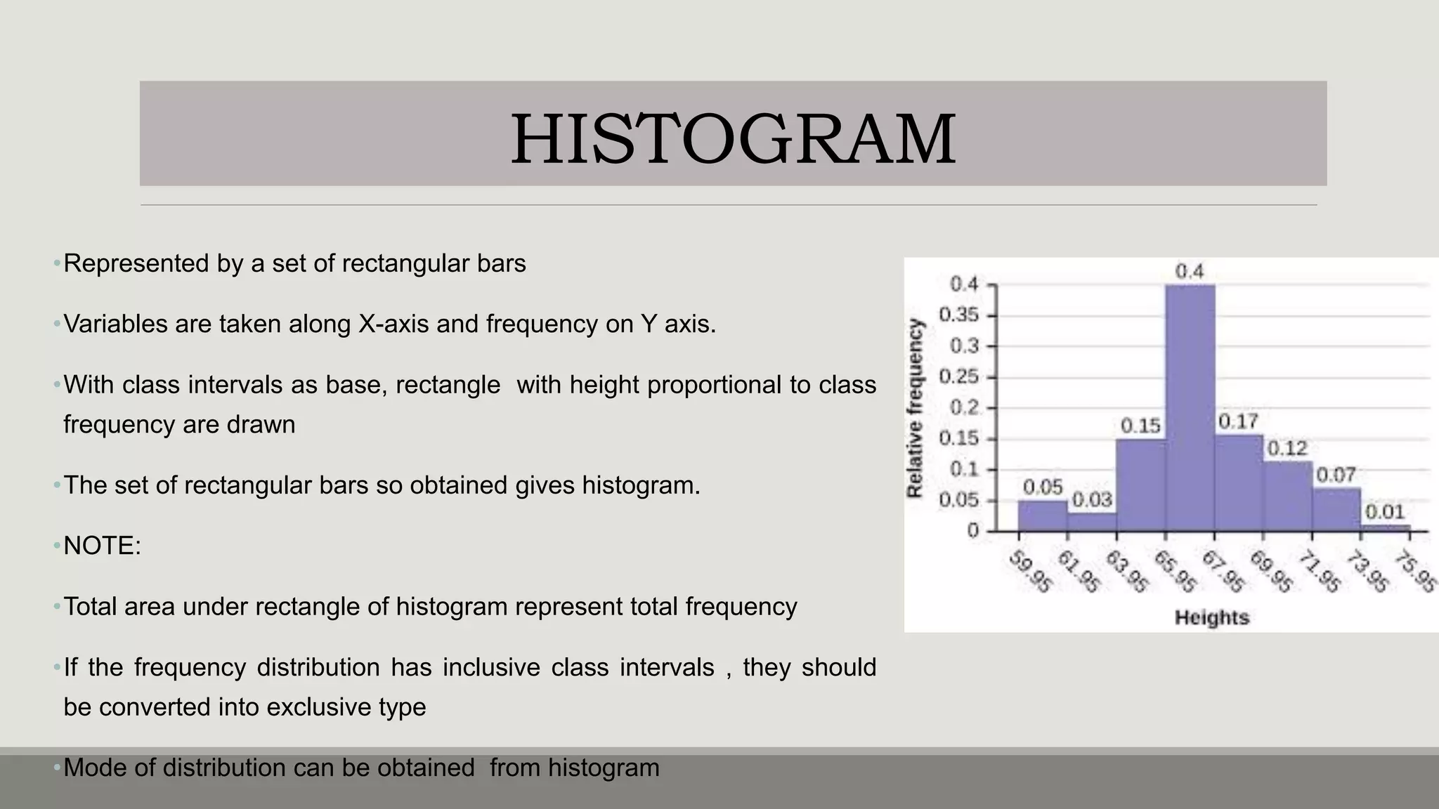
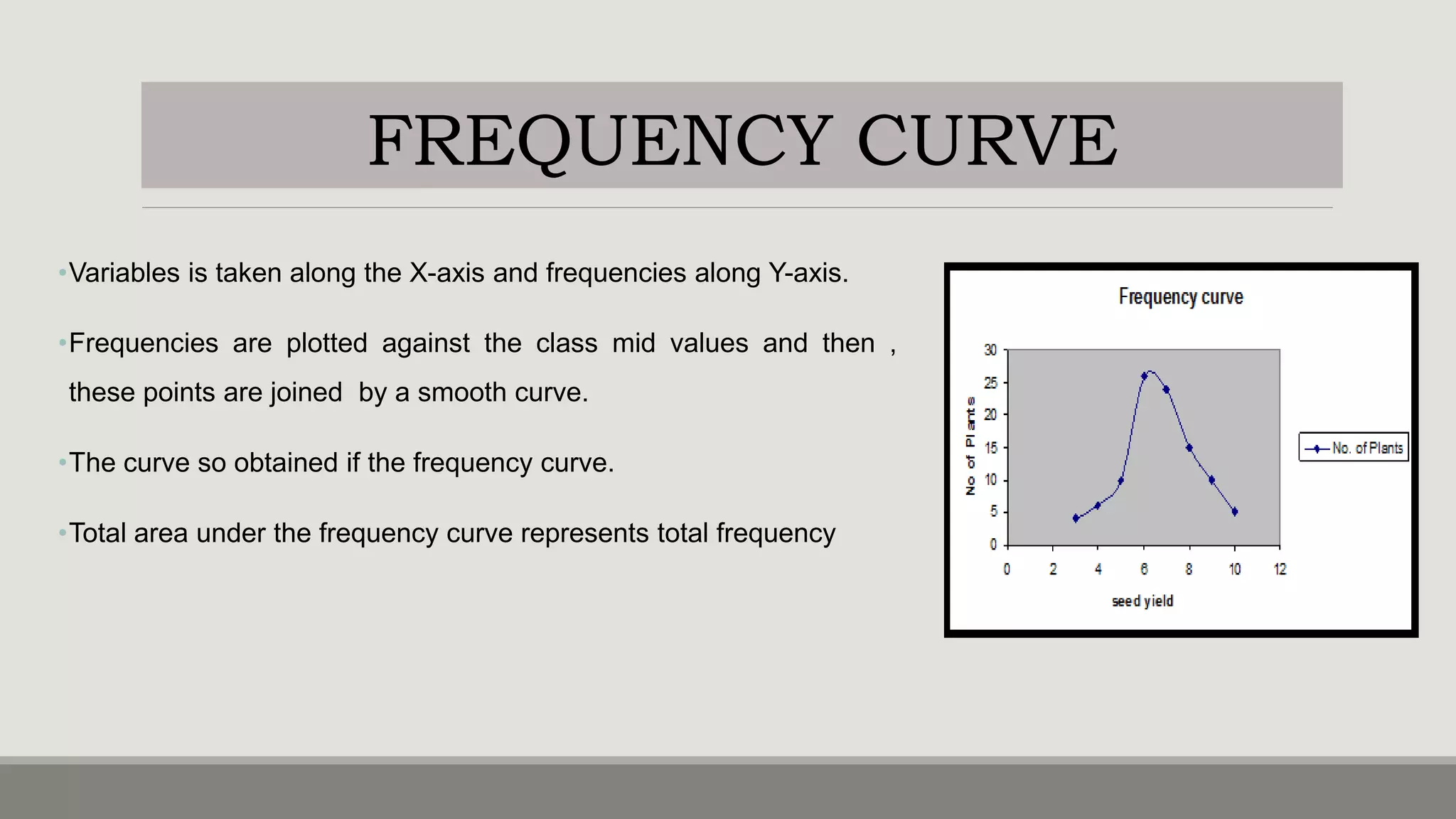
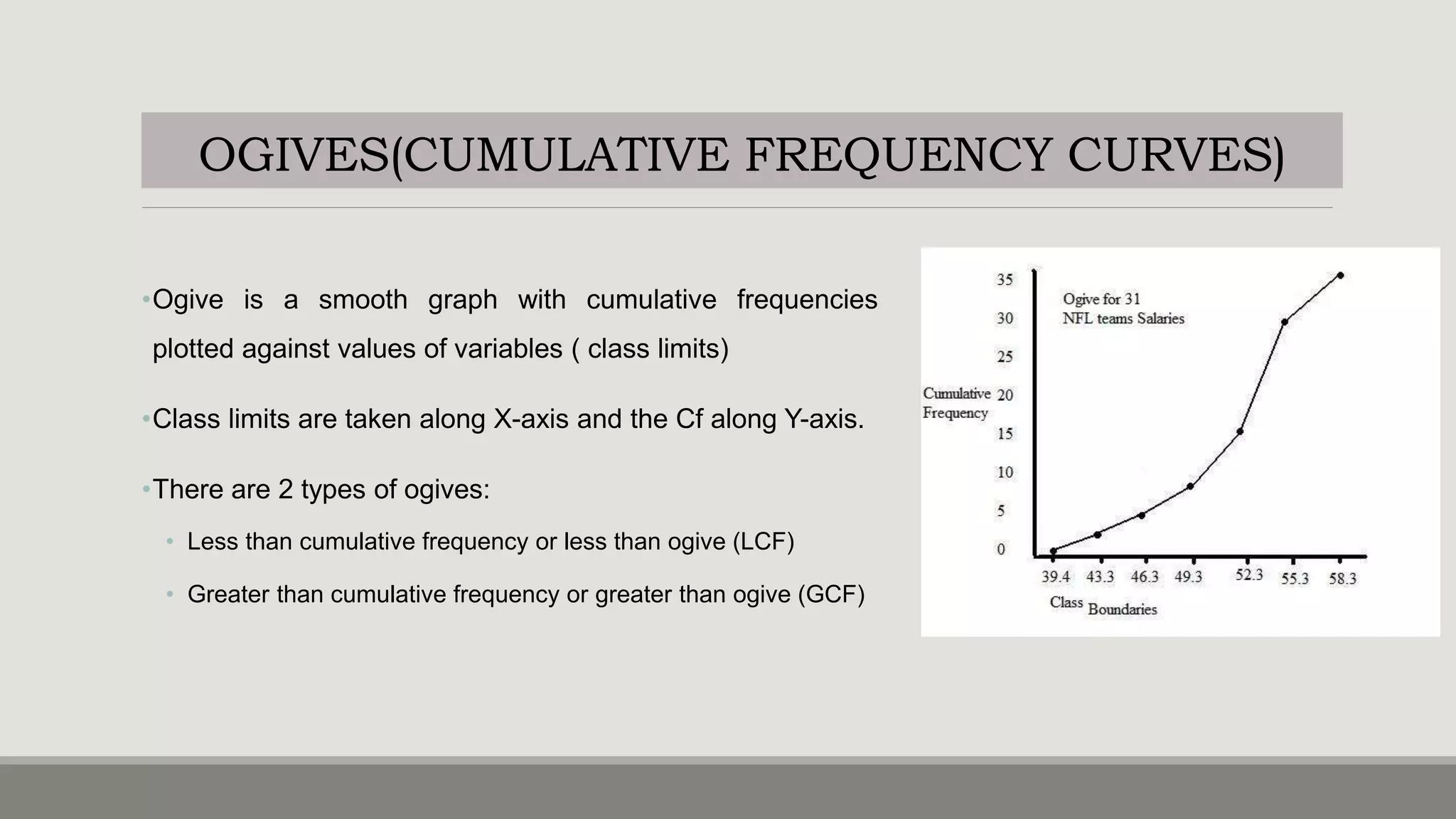
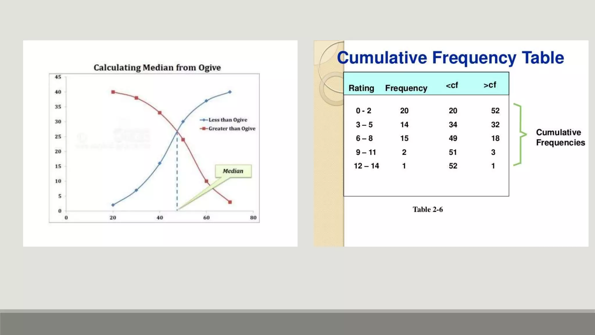
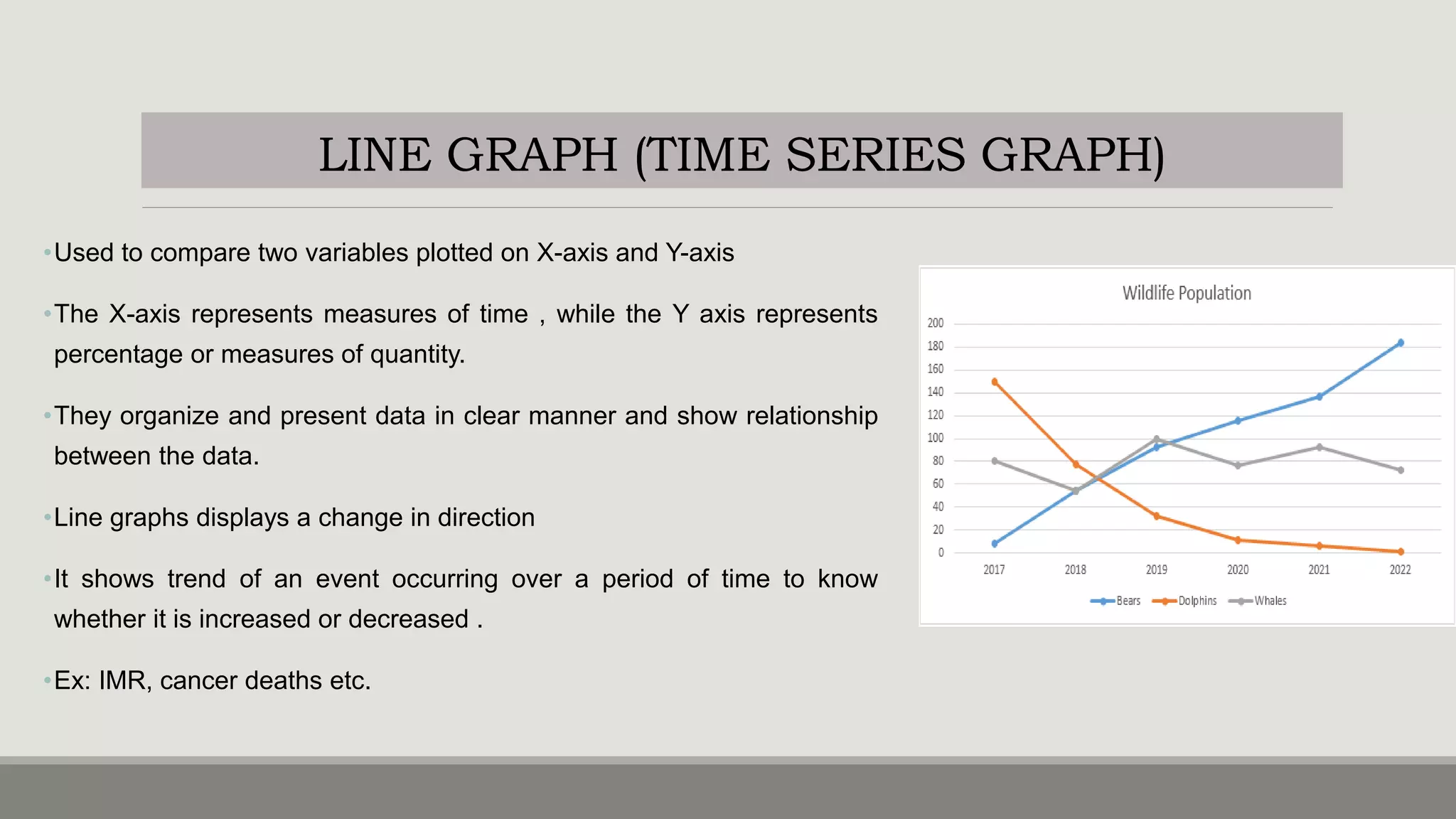
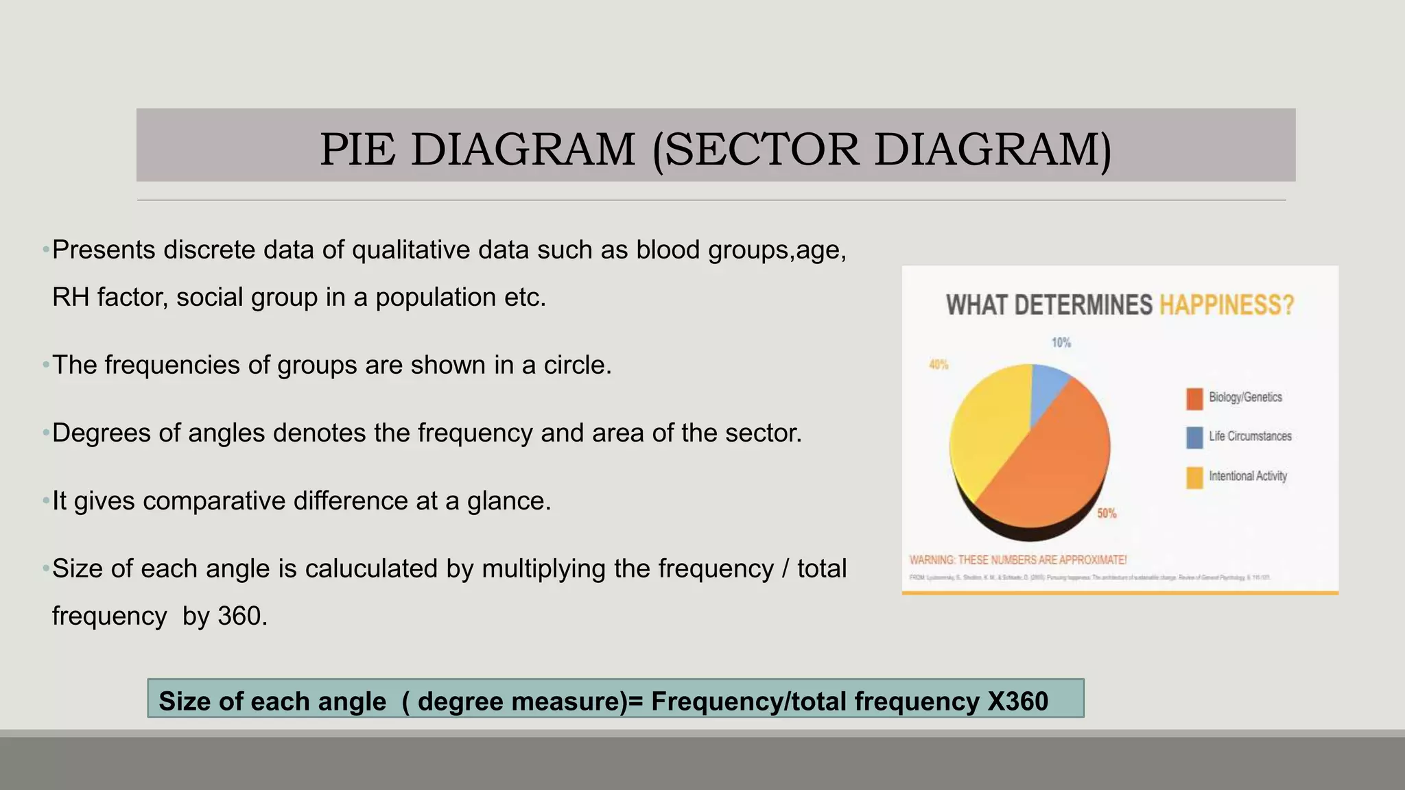
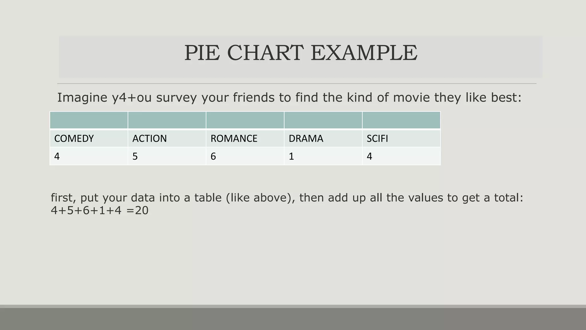
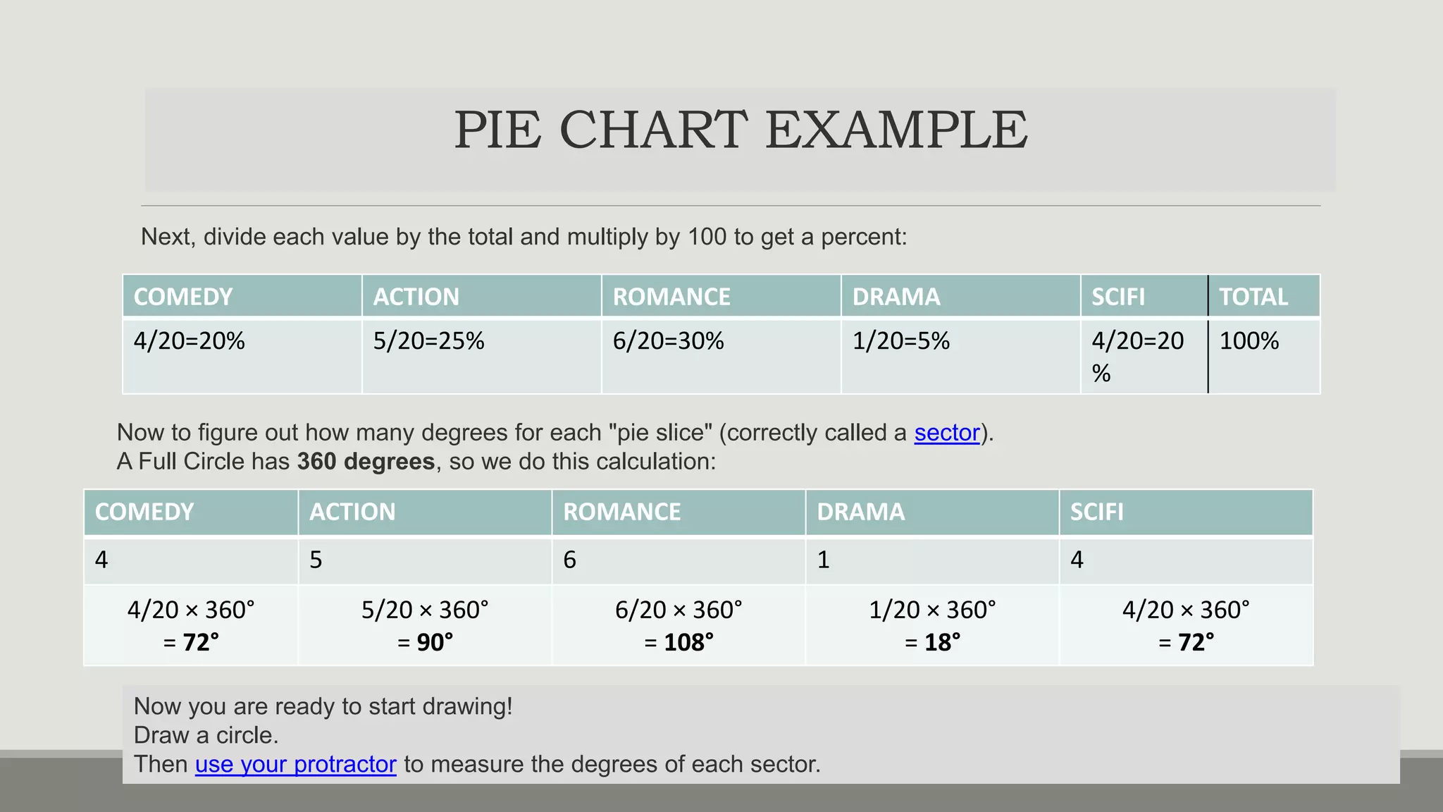
PRESENTATION
OF
DATA
B Y:
M R S . K E E R T H I S AM U E L
AS S T. P R O F E S S O R
V I J AY M AR I E C O N
DATA AND PRESENTATION
•Any observation collected in respect of any characteristic or event is called DATA.
•The data after collection has to be processed and analyzed in accordance with the outlines laid down for the
purpose at the time of developing the research plan.
•Technically speaking processing of data implies to organization and presentation of data.
• Organization can be done in two ways :
• Editing
• classification
•Presentation of data can be made in two ways :
• Tabulation
• Diagrammatic presentation
ORGANIZATION OF DATA-
I.EDITING
•The process of examining of the collected raw data to detect errors and omissions and to
correct these when possible.
•It involves a careful scrutiny of the completed questionnaires and schedules.
•Editing is done to ensure that the data is accurate, consistent with other facts gathered,
uniformly entered and have been well arranged to facilitate coding and tabulation.
•There are two types of editing:
• Field editing
• Central editing
TYPES OF EDITING
FIELD EDITING
•Should be done immediately after interview , preferably
on the very day or next day.
•It is necessary in view of the fact that individual writing
styles often can be difficult for others to understand.
•The researcher reviews the reporter forms for completing
what was written in abbreviated forms or in illegible
forms at the time of recording the respondents
responses.
CENTRAL EDITING
oDone when all the forms were completed and returned to office.
oA thorough editing has to be done by single researcher for a minor
and team of experts if it is a large sample.
oEditor may correct obvious errors like entry in wrong place, entry
recorded in months instead of weeks etc.
oIf any missing information the editor can determine response by
reviewing other information.
oContacts respondent for clarification.
I.ACC TO PHENOMENA
•Data can either be descriptive ( sex,honesty) or numerical
(Ht,weight).
•Refers to qualitative phenomena which cannot be measures
quantitatively.
•Can be simple(one attribute) or manifold (many attributes)
ACC TO ATTRIBUTES
Quantitative phenomena measured through some
units.
Classified based on the class intervals.
Ex: persons with acertain amount of income etc
ACC TO CLASS INTERVALS
ORGANIZATION OF DATA-
II.CLASSIFICATION
ORGANIZATION OF DATA-
II.CLASSIFICATION
ACCORDING TO
COMMON
CHARACTERISTICS
GEOGRAPHICAL
CLASSIFICATION
CHRONOLOGICAL
CLASSIFICATION
QUALITATIVE
CLASSIFICATION
SIMPLE: GENDER:
MALE OR FEMALE
LITERATE OR
ILLETERATE
MANIFOLD:
QUANTITATIVE
PRESENTATION
Tabular presentation
Visual presentation
Graphical
presentation
Diagrammatical
presentation
PRESENTATION OF DATA
USES & PRINCIPLES OF PRESENTATION
USES OF PRESENTATION
oEasy and better understanding of the
subject
oProvides first hand information
oHelps in future analysis
oEasy in making comparisons
oVery attractive.
PRINCIPLES OF PRESENTATION:
• Data should be presented in a
simple form
• Arouse interest in reader
• Concise without loosing important
points
• Facilitate future analysis
• Define problem and should suggest
its solution
TABULATION
oIt is a systematic and logical arrangement of classified data in rows and columns
oIMPORTANCE:
Simplifies complex data
Unnecessary details and repetitions of data can be avoided
Facilitates comparision
Gives identity to data
Reveals pattern within figures which cannot be seen in the narrative form
TABULATION
oPRINCIPLES OF TABULATION:
• Table number should be assigned to the table
• Title has to be given which should be concise and self explanatory
• Contents of table has to be defined clearly
• Head note has to be written
• STUBS: classification or categories which are found at the left side of the body of
the table.
• FOOT NOTES: any statement or note inserted
• SOURCE NOTE: source of statistics
• BODY: main part of the table
PRECAUTIONS
oTable should suit the size of the paper
oCaptions and stubs should be arranged in some systematic order
oUnit of measurement should be clearly defined and given in the table
oFigures should be rounded to avoid unnecessary details in the table and footnote to this effect should be
given.
TYPES OF TABLES
BASIS OF
PURPOSE
Reference
table
Text tables
BASIS OF
CONTENT
Simple
table
Complex
tables
Double
table
Treble table
Multiple
tables
TYPES OF TABLES
1. REFERENCE TABLES:
o The table presents the original data for reference
purpose
o Contains absolute figures , round numbers or
percentages
2. TEXT TABLES
o Constructed to present selected data from one or
more general purpose tables.
o It brings out a specific point of answer to specific
question
o Includes ratios, percentages, averages etc
o It should be found in the body of the text
TYPES OF TABLES
3. SIMPLE TABLE:
o Data relating to only one characteristics
4.DOUBLE TABLES
◦ Data related to only 2 characteristics
TYPES OF TABLES
3. TRIPLE TABLE:
o Data relating to only THREE characteristics
4.MANIFOLD TABLE
◦ Data related to MORE THAN 3 characteristics
GRAPHS AND
DIAGRAMS
ADVANTAGES
•Very attractive
•Give birds eye view of the data’
•Easily understood by common man
•Facilitate comparison of various
characteristics
•Impression created by them are long lasting
• theorems and results of statistics can be
visualized using graphs.
LIMITATIONS
•They are visual aids and cannot be
considered as alternatives for numerical data.
•Though theories and results could be easily
visualized by diagrams and graphs ,
mathematical rigour cannot be bought in.
•More accurate than tables but only tables can
be used for further analysis.
•Can mislead easily. Possible to create wrong
impressions using graphs.
PRINCIPLES
•Choose the form of diagram /graphs which is capable of representing a set of data
•TITLE: gives information about the diagram
•SCALE: selection of scale should neither be small nor large but also represents the size of the unit
•NEATNESS
•ATTRACTIVE: different types of lines,shades, colors can be used
•ORIGINALITY: helps the observer to see the details with accuracy
•SIMPLICITY: good diagram depends upon ease with which the observer can interpret it.
•ECONOMY: cost and labour should be excercised drawing a diagram
GRAPHS
Histogram
Frequency curve
Frequency polygon
Ogives
Line graph
DIAGRAMS
Bar diagrams
• Simple bar
• Multiple bar
• Component bar
• Percentage bar
• Deviation bar
PIE DIAGRAM
CLASSIFICATION
HISTOGRAM
•Represented by a set of rectangular bars
•Variables are taken along X-axis and frequency on Y axis.
•With class intervals as base, rectangle with height proportional to class
frequency are drawn
•The set of rectangular bars so obtained gives histogram.
•NOTE:
•Total area under rectangle of histogram represent total frequency
•If the frequency distribution has inclusive class intervals , they should
be converted into exclusive type
•Mode of distribution can be obtained from histogram
FREQUENCY CURVE
•Variables is taken along the X-axis and frequencies along Y-axis.
•Frequencies are plotted against the class mid values and then ,
these points are joined by a smooth curve.
•The curve so obtained if the frequency curve.
•Total area under the frequency curve represents total frequency
FREQUENCY POLYGON
•Variables is taken along the X-axis and frequencies along Y-
axis.
•Class frequencies are plotted against the class mid values
and then , these points are joined by a straight line.
•The figure so obtained is the frequency polygon.
•Total area under the frequency curve represents total
frequency
OGIVES(CUMULATIVE FREQUENCY CURVES)
•Ogive is a smooth graph with cumulative frequencies
plotted against values of variables ( class limits)
•Class limits are taken along X-axis and the Cf along Y-axis.
•There are 2 types of ogives:
• Less than cumulative frequency or less than ogive (LCF)
• Greater than cumulative frequency or greater than ogive (GCF)
LESS THAN CF (LCF OGIVE)
•Variables is taken along the X-axis and less than
cumulative frequencies along Y-axis.
•LCF are plotted against the respective variable values
•Then these points are joined by a smooth curve
•The resulting graph is an ogive.
GREATER THAN CF ( GCF OGIVE)
Here the variable (class limits) is taken along X-axis
and GCF along the Y-axis.
GCF are plotted against the respective variable values.
Then these points are joined by a smooth curve to
from a GCF ogive.
OGIVES(CUMULATIVE FREQUENCY CURVES)
• The two ogives are drawn together with common axis.
• The points of intersection of the two ogives gives the median point of the distribution.
• Ogives are used to locate partition values ( like median, quartiles , deciles, percentiles)
LINE GRAPH (TIME SERIES GRAPH)
•Used to compare two variables plotted on X-axis and Y-axis
•The X-axis represents measures of time , while the Y axis represents
percentage or measures of quantity.
•They organize and present data in clear manner and show relationship
between the data.
•Line graphs displays a change in direction
•It shows trend of an event occurring over a period of time to know
whether it is increased or decreased .
•Ex: IMR, cancer deaths etc.
DIAGRAMS
PIE DIAGRAM (SECTOR DIAGRAM)
•Presents discrete data of qualitative data such as blood groups,age,
RH factor, social group in a population etc.
•The frequencies of groups are shown in a circle.
•Degrees of angles denotes the frequency and area of the sector.
•It gives comparative difference at a glance.
•Size of each angle is caluculated by multiplying the frequency / total
frequency by 360.
Size of each angle ( degree measure)= Frequency/total frequency X360
Imagine y4+ou survey your friends to find the kind of movie they like best:
COMEDY ACTION ROMANCE DRAMA SCIFI
4 5 6 1 4
first, put your data into a table (like above), then add up all the values to get a total:
4+5+6+1+4 =20
PIE CHART EXAMPLE
PIE CHART EXAMPLE
Next, divide each value by the total and multiply by 100 to get a percent:
COMEDY ACTION ROMANCE DRAMA SCIFI TOTAL
4/20=20% 5/20=25% 6/20=30% 1/20=5% 4/20=20
%
100%
COMEDY ACTION ROMANCE DRAMA SCIFI
4 5 6 1 4
4/20 × 360°
= 72°
5/20 × 360°
= 90°
6/20 × 360°
= 108°
1/20 × 360°
= 18°
4/20 × 360°
= 72°
Now to figure out how many degrees for each "pie slice" (correctly called a sector).
A Full Circle has 360 degrees, so we do this calculation:
Now you are ready to start drawing!
Draw a circle.
Then use your protractor to measure the degrees of each sector.
PIE CHART EXAMPLE
Next, divide each value by the total and multiply by 100 to get a percent:
COMEDY ACTION ROMANCE DRAMA SCIFI TOTAL
4/20=20% 5/20=25% 6/20=30% 1/20=5% 4/20=20
%
100%
BAR DIAGRAM
•Consists of rectangular bars with equal width.
•The bars stand on common baseline with equal gap between one
bar and the other .
•The bars may be either horizontal and vertical.
•The bars are constructed in such a way that their lengths are
proportional to the magnitudes.
•Space between consecutive bars are equal
•All the bars are of equal width
SIMPLE BAR DIAGRAM
•Used to represent when items have to be compared with regard
to a single characteristic.
•Here the items are represented by rectangular bars of equal
width and height proportional to their magnitude.
•The bars are drawn on a common base line with equal distance
between consecutive bars.
•The bars may be shaded.
SUBDIVIDED(component,stacked,proportional)
•The data have items whose magnitudes have two or more components.
•Here the items are represented by rectangular bars of equal width and
highest proportional to magnitude.
•Then the bars are subdivided representing the components
•To distinguish the components from one another clearly, different shades
are applied and an index describing the shades are provided.
•Component bars are drawn when a comparison of total magnitude long
with components is required.
PERCENTAGE BAR DIAGRAM
•To represent items whose magnitudes have two or more components.
•The comparision of components are expressed as percentage of the
corresponding totals.
•The totals are represented by bars of equal width and height equal to
100 each.
•These bars are subdivided according to percentage components.
•The different subdivisions are shaded properly and an index which
describes the shades is provided.
MULTIPLE BAR DIAGRAM
•When there are two or more different comparable sets of values ,
multiple bars are drawn.
•Here sets of rectangular bars of equal width with height
proportional to the values are drawn.
•The bars corresponding to the same unit are placed together
adjacent to one another .
•The diagram is shaded properly and an index is provided.
DEVIATION BAR DIAGRAM
•Useful for presenting net quantities which have both
positive and negative values.
•The positive deviations are presented by bars above the
baseline while negative deviations are presented by bars
below the baseline.
OTHER TYPE (STEM AND LEAF)
•A stem and leaf plot is a quick way to organize large amounts of
data.
•A special table where each data value is split into a leaf (usually
the last digit) and a stem ( the other digits)
•The stem values ate listed down and the leaf values go right or
left from the stem values.
•The stem is used to group the scores and each leaf indicates the
individual scores within each group
OTHER TYPE (SCATTER DIAGRAM)
•Shows relationship between two variables
•If dots cluster around straight line it shows evidence of a
relationship of a linear nature.
•If there is no such cluster , there is no relationship between the
variables.
PRESENTATION OF STATISTICAL DATA

PRESENTATION OF STATISTICAL DATA

  • 1.
    PRESENTATION OF DATA B Y: M RS . K E E R T H I S AM U E L AS S T. P R O F E S S O R V I J AY M AR I E C O N
  • 2.
    DATA AND PRESENTATION •Anyobservation collected in respect of any characteristic or event is called DATA. •The data after collection has to be processed and analyzed in accordance with the outlines laid down for the purpose at the time of developing the research plan. •Technically speaking processing of data implies to organization and presentation of data. • Organization can be done in two ways : • Editing • classification •Presentation of data can be made in two ways : • Tabulation • Diagrammatic presentation
  • 3.
    ORGANIZATION OF DATA- I.EDITING •Theprocess of examining of the collected raw data to detect errors and omissions and to correct these when possible. •It involves a careful scrutiny of the completed questionnaires and schedules. •Editing is done to ensure that the data is accurate, consistent with other facts gathered, uniformly entered and have been well arranged to facilitate coding and tabulation. •There are two types of editing: • Field editing • Central editing
  • 4.
    TYPES OF EDITING FIELDEDITING •Should be done immediately after interview , preferably on the very day or next day. •It is necessary in view of the fact that individual writing styles often can be difficult for others to understand. •The researcher reviews the reporter forms for completing what was written in abbreviated forms or in illegible forms at the time of recording the respondents responses. CENTRAL EDITING oDone when all the forms were completed and returned to office. oA thorough editing has to be done by single researcher for a minor and team of experts if it is a large sample. oEditor may correct obvious errors like entry in wrong place, entry recorded in months instead of weeks etc. oIf any missing information the editor can determine response by reviewing other information. oContacts respondent for clarification.
  • 5.
    I.ACC TO PHENOMENA •Datacan either be descriptive ( sex,honesty) or numerical (Ht,weight). •Refers to qualitative phenomena which cannot be measures quantitatively. •Can be simple(one attribute) or manifold (many attributes) ACC TO ATTRIBUTES Quantitative phenomena measured through some units. Classified based on the class intervals. Ex: persons with acertain amount of income etc ACC TO CLASS INTERVALS ORGANIZATION OF DATA- II.CLASSIFICATION
  • 6.
    ORGANIZATION OF DATA- II.CLASSIFICATION ACCORDINGTO COMMON CHARACTERISTICS GEOGRAPHICAL CLASSIFICATION CHRONOLOGICAL CLASSIFICATION QUALITATIVE CLASSIFICATION SIMPLE: GENDER: MALE OR FEMALE LITERATE OR ILLETERATE MANIFOLD: QUANTITATIVE
  • 7.
  • 8.
    USES & PRINCIPLESOF PRESENTATION USES OF PRESENTATION oEasy and better understanding of the subject oProvides first hand information oHelps in future analysis oEasy in making comparisons oVery attractive. PRINCIPLES OF PRESENTATION: • Data should be presented in a simple form • Arouse interest in reader • Concise without loosing important points • Facilitate future analysis • Define problem and should suggest its solution
  • 9.
    TABULATION oIt is asystematic and logical arrangement of classified data in rows and columns oIMPORTANCE: Simplifies complex data Unnecessary details and repetitions of data can be avoided Facilitates comparision Gives identity to data Reveals pattern within figures which cannot be seen in the narrative form
  • 10.
    TABULATION oPRINCIPLES OF TABULATION: •Table number should be assigned to the table • Title has to be given which should be concise and self explanatory • Contents of table has to be defined clearly • Head note has to be written • STUBS: classification or categories which are found at the left side of the body of the table. • FOOT NOTES: any statement or note inserted • SOURCE NOTE: source of statistics • BODY: main part of the table
  • 11.
    PRECAUTIONS oTable should suitthe size of the paper oCaptions and stubs should be arranged in some systematic order oUnit of measurement should be clearly defined and given in the table oFigures should be rounded to avoid unnecessary details in the table and footnote to this effect should be given.
  • 12.
    TYPES OF TABLES BASISOF PURPOSE Reference table Text tables BASIS OF CONTENT Simple table Complex tables Double table Treble table Multiple tables
  • 13.
    TYPES OF TABLES 1.REFERENCE TABLES: o The table presents the original data for reference purpose o Contains absolute figures , round numbers or percentages 2. TEXT TABLES o Constructed to present selected data from one or more general purpose tables. o It brings out a specific point of answer to specific question o Includes ratios, percentages, averages etc o It should be found in the body of the text
  • 14.
    TYPES OF TABLES 1.REFERENCE TABLES: o The table presents the original data for reference purpose o Contains absolute figures , round numbers or percentages 2. TEXT TABLES o Constructed to present selected data from one or more general purpose tables. o It brings out a specific point of answer to specific question o Includes ratios, percentages, averages etc o It should be found in the body of the text
  • 15.
    TYPES OF TABLES 3.SIMPLE TABLE: o Data relating to only one characteristics 4.DOUBLE TABLES ◦ Data related to only 2 characteristics
  • 16.
    TYPES OF TABLES 3.TRIPLE TABLE: o Data relating to only THREE characteristics 4.MANIFOLD TABLE ◦ Data related to MORE THAN 3 characteristics
  • 17.
  • 18.
    ADVANTAGES •Very attractive •Give birdseye view of the data’ •Easily understood by common man •Facilitate comparison of various characteristics •Impression created by them are long lasting • theorems and results of statistics can be visualized using graphs. LIMITATIONS •They are visual aids and cannot be considered as alternatives for numerical data. •Though theories and results could be easily visualized by diagrams and graphs , mathematical rigour cannot be bought in. •More accurate than tables but only tables can be used for further analysis. •Can mislead easily. Possible to create wrong impressions using graphs.
  • 19.
    PRINCIPLES •Choose the formof diagram /graphs which is capable of representing a set of data •TITLE: gives information about the diagram •SCALE: selection of scale should neither be small nor large but also represents the size of the unit •NEATNESS •ATTRACTIVE: different types of lines,shades, colors can be used •ORIGINALITY: helps the observer to see the details with accuracy •SIMPLICITY: good diagram depends upon ease with which the observer can interpret it. •ECONOMY: cost and labour should be excercised drawing a diagram
  • 20.
    GRAPHS Histogram Frequency curve Frequency polygon Ogives Linegraph DIAGRAMS Bar diagrams • Simple bar • Multiple bar • Component bar • Percentage bar • Deviation bar PIE DIAGRAM CLASSIFICATION
  • 21.
    HISTOGRAM •Represented by aset of rectangular bars •Variables are taken along X-axis and frequency on Y axis. •With class intervals as base, rectangle with height proportional to class frequency are drawn •The set of rectangular bars so obtained gives histogram. •NOTE: •Total area under rectangle of histogram represent total frequency •If the frequency distribution has inclusive class intervals , they should be converted into exclusive type •Mode of distribution can be obtained from histogram
  • 22.
    FREQUENCY CURVE •Variables istaken along the X-axis and frequencies along Y-axis. •Frequencies are plotted against the class mid values and then , these points are joined by a smooth curve. •The curve so obtained if the frequency curve. •Total area under the frequency curve represents total frequency
  • 23.
    FREQUENCY POLYGON •Variables istaken along the X-axis and frequencies along Y- axis. •Class frequencies are plotted against the class mid values and then , these points are joined by a straight line. •The figure so obtained is the frequency polygon. •Total area under the frequency curve represents total frequency
  • 24.
    OGIVES(CUMULATIVE FREQUENCY CURVES) •Ogiveis a smooth graph with cumulative frequencies plotted against values of variables ( class limits) •Class limits are taken along X-axis and the Cf along Y-axis. •There are 2 types of ogives: • Less than cumulative frequency or less than ogive (LCF) • Greater than cumulative frequency or greater than ogive (GCF)
  • 25.
    LESS THAN CF(LCF OGIVE) •Variables is taken along the X-axis and less than cumulative frequencies along Y-axis. •LCF are plotted against the respective variable values •Then these points are joined by a smooth curve •The resulting graph is an ogive. GREATER THAN CF ( GCF OGIVE) Here the variable (class limits) is taken along X-axis and GCF along the Y-axis. GCF are plotted against the respective variable values. Then these points are joined by a smooth curve to from a GCF ogive. OGIVES(CUMULATIVE FREQUENCY CURVES) • The two ogives are drawn together with common axis. • The points of intersection of the two ogives gives the median point of the distribution. • Ogives are used to locate partition values ( like median, quartiles , deciles, percentiles)
  • 27.
    LINE GRAPH (TIMESERIES GRAPH) •Used to compare two variables plotted on X-axis and Y-axis •The X-axis represents measures of time , while the Y axis represents percentage or measures of quantity. •They organize and present data in clear manner and show relationship between the data. •Line graphs displays a change in direction •It shows trend of an event occurring over a period of time to know whether it is increased or decreased . •Ex: IMR, cancer deaths etc.
  • 28.
  • 29.
    PIE DIAGRAM (SECTORDIAGRAM) •Presents discrete data of qualitative data such as blood groups,age, RH factor, social group in a population etc. •The frequencies of groups are shown in a circle. •Degrees of angles denotes the frequency and area of the sector. •It gives comparative difference at a glance. •Size of each angle is caluculated by multiplying the frequency / total frequency by 360. Size of each angle ( degree measure)= Frequency/total frequency X360
  • 31.
    Imagine y4+ou surveyyour friends to find the kind of movie they like best: COMEDY ACTION ROMANCE DRAMA SCIFI 4 5 6 1 4 first, put your data into a table (like above), then add up all the values to get a total: 4+5+6+1+4 =20 PIE CHART EXAMPLE
  • 32.
    PIE CHART EXAMPLE Next,divide each value by the total and multiply by 100 to get a percent: COMEDY ACTION ROMANCE DRAMA SCIFI TOTAL 4/20=20% 5/20=25% 6/20=30% 1/20=5% 4/20=20 % 100% COMEDY ACTION ROMANCE DRAMA SCIFI 4 5 6 1 4 4/20 × 360° = 72° 5/20 × 360° = 90° 6/20 × 360° = 108° 1/20 × 360° = 18° 4/20 × 360° = 72° Now to figure out how many degrees for each "pie slice" (correctly called a sector). A Full Circle has 360 degrees, so we do this calculation: Now you are ready to start drawing! Draw a circle. Then use your protractor to measure the degrees of each sector.
  • 33.
    PIE CHART EXAMPLE Next,divide each value by the total and multiply by 100 to get a percent: COMEDY ACTION ROMANCE DRAMA SCIFI TOTAL 4/20=20% 5/20=25% 6/20=30% 1/20=5% 4/20=20 % 100%
  • 34.
    BAR DIAGRAM •Consists ofrectangular bars with equal width. •The bars stand on common baseline with equal gap between one bar and the other . •The bars may be either horizontal and vertical. •The bars are constructed in such a way that their lengths are proportional to the magnitudes. •Space between consecutive bars are equal •All the bars are of equal width
  • 35.
    SIMPLE BAR DIAGRAM •Usedto represent when items have to be compared with regard to a single characteristic. •Here the items are represented by rectangular bars of equal width and height proportional to their magnitude. •The bars are drawn on a common base line with equal distance between consecutive bars. •The bars may be shaded.
  • 36.
    SUBDIVIDED(component,stacked,proportional) •The data haveitems whose magnitudes have two or more components. •Here the items are represented by rectangular bars of equal width and highest proportional to magnitude. •Then the bars are subdivided representing the components •To distinguish the components from one another clearly, different shades are applied and an index describing the shades are provided. •Component bars are drawn when a comparison of total magnitude long with components is required.
  • 37.
    PERCENTAGE BAR DIAGRAM •Torepresent items whose magnitudes have two or more components. •The comparision of components are expressed as percentage of the corresponding totals. •The totals are represented by bars of equal width and height equal to 100 each. •These bars are subdivided according to percentage components. •The different subdivisions are shaded properly and an index which describes the shades is provided.
  • 38.
    MULTIPLE BAR DIAGRAM •Whenthere are two or more different comparable sets of values , multiple bars are drawn. •Here sets of rectangular bars of equal width with height proportional to the values are drawn. •The bars corresponding to the same unit are placed together adjacent to one another . •The diagram is shaded properly and an index is provided.
  • 39.
    DEVIATION BAR DIAGRAM •Usefulfor presenting net quantities which have both positive and negative values. •The positive deviations are presented by bars above the baseline while negative deviations are presented by bars below the baseline.
  • 40.
    OTHER TYPE (STEMAND LEAF) •A stem and leaf plot is a quick way to organize large amounts of data. •A special table where each data value is split into a leaf (usually the last digit) and a stem ( the other digits) •The stem values ate listed down and the leaf values go right or left from the stem values. •The stem is used to group the scores and each leaf indicates the individual scores within each group
  • 41.
    OTHER TYPE (SCATTERDIAGRAM) •Shows relationship between two variables •If dots cluster around straight line it shows evidence of a relationship of a linear nature. •If there is no such cluster , there is no relationship between the variables.