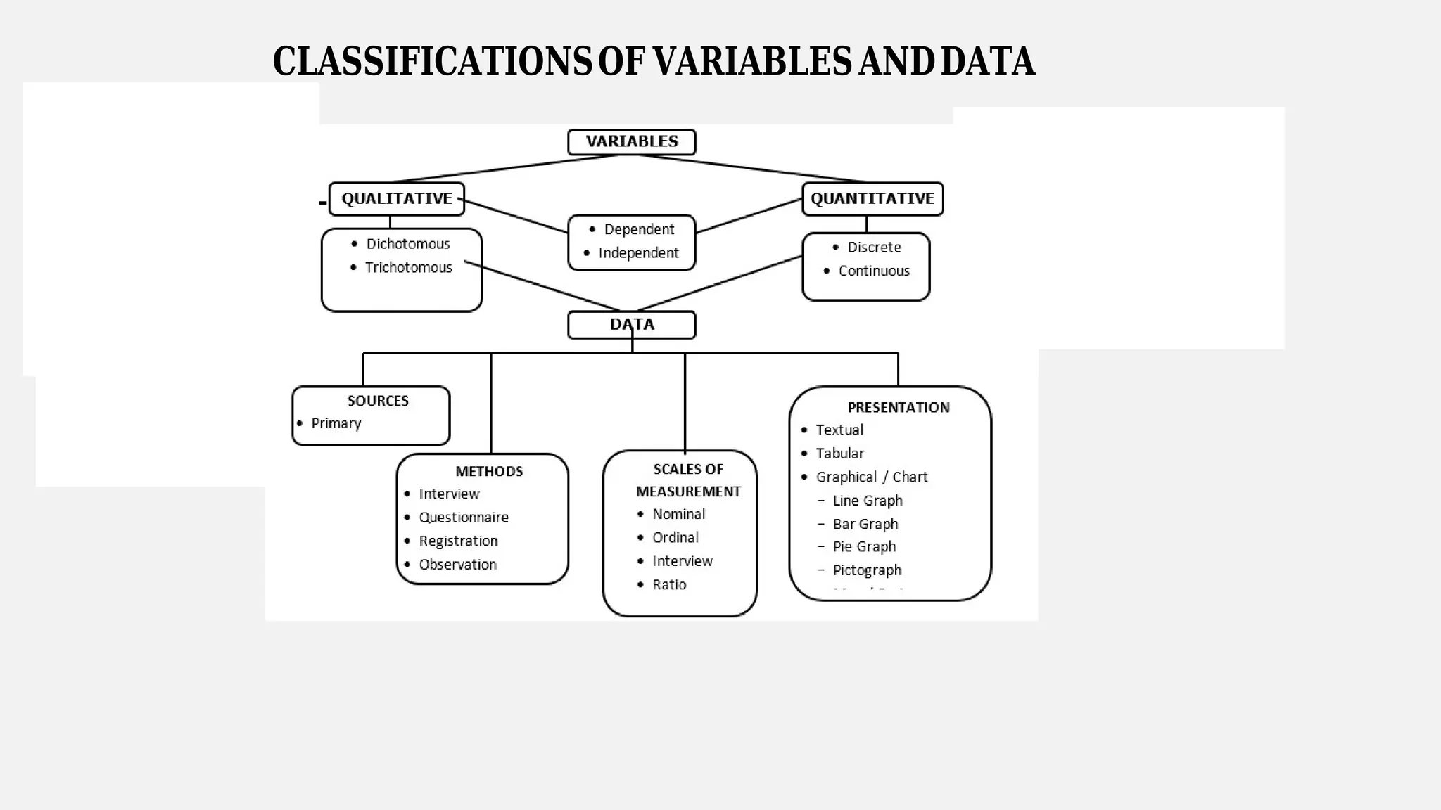
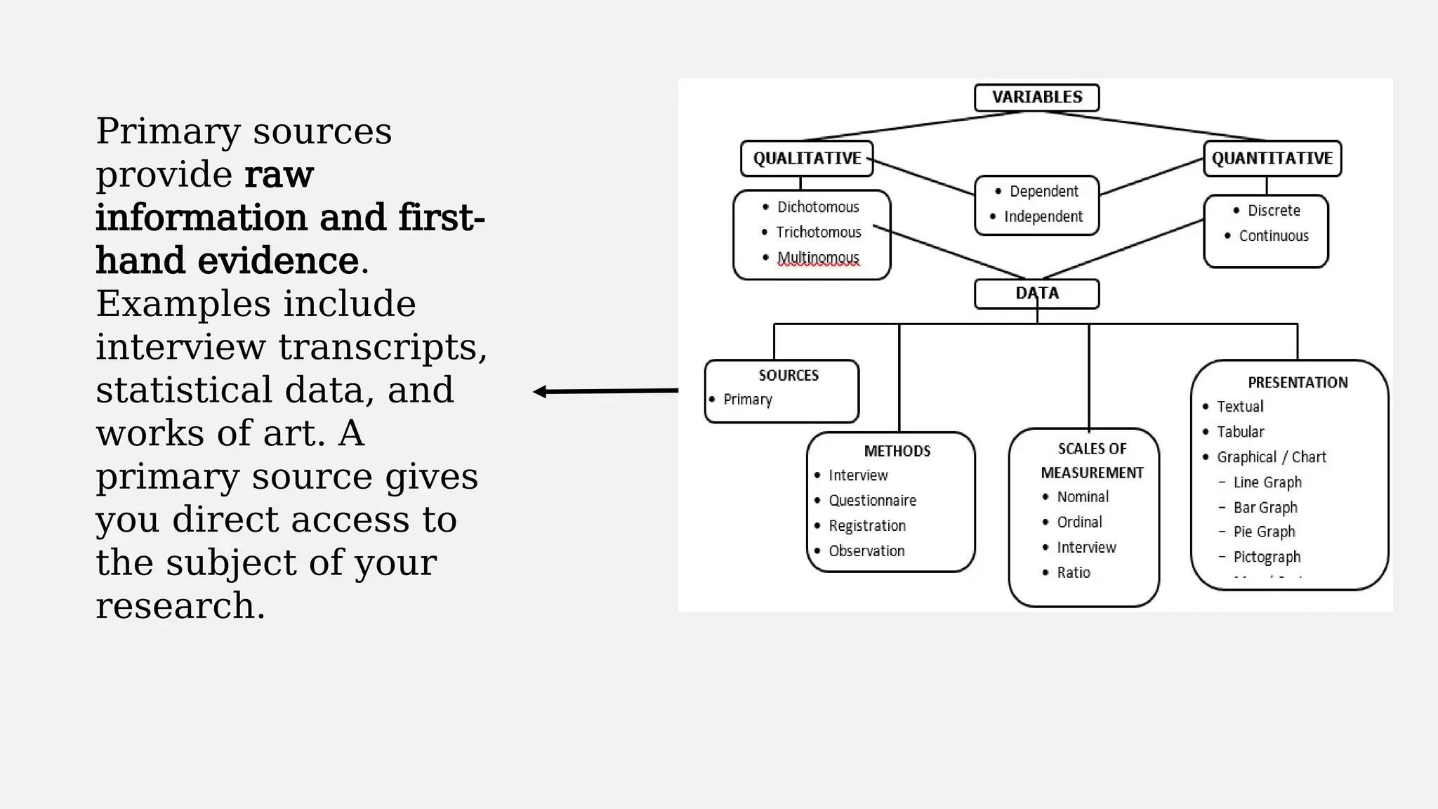
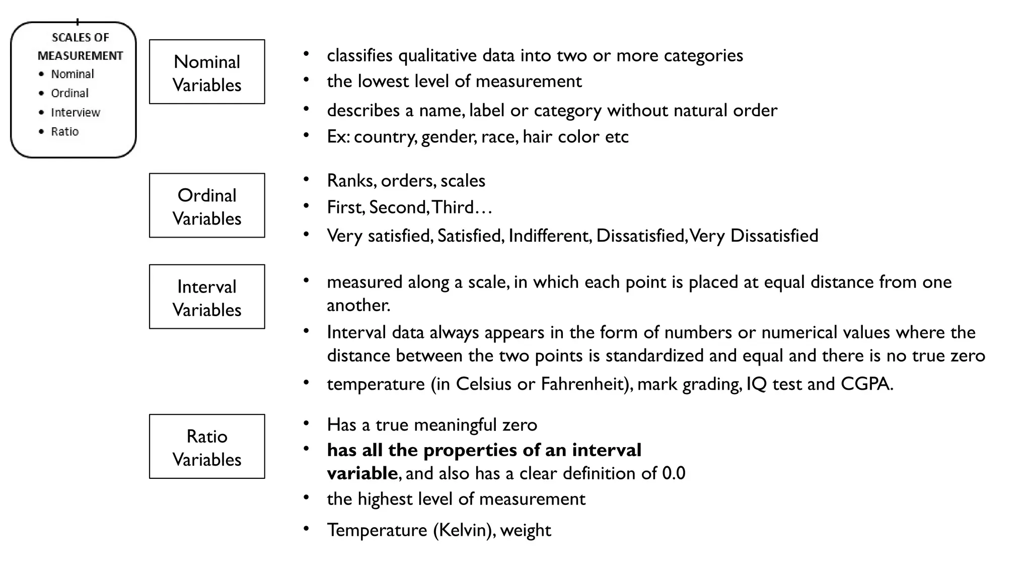
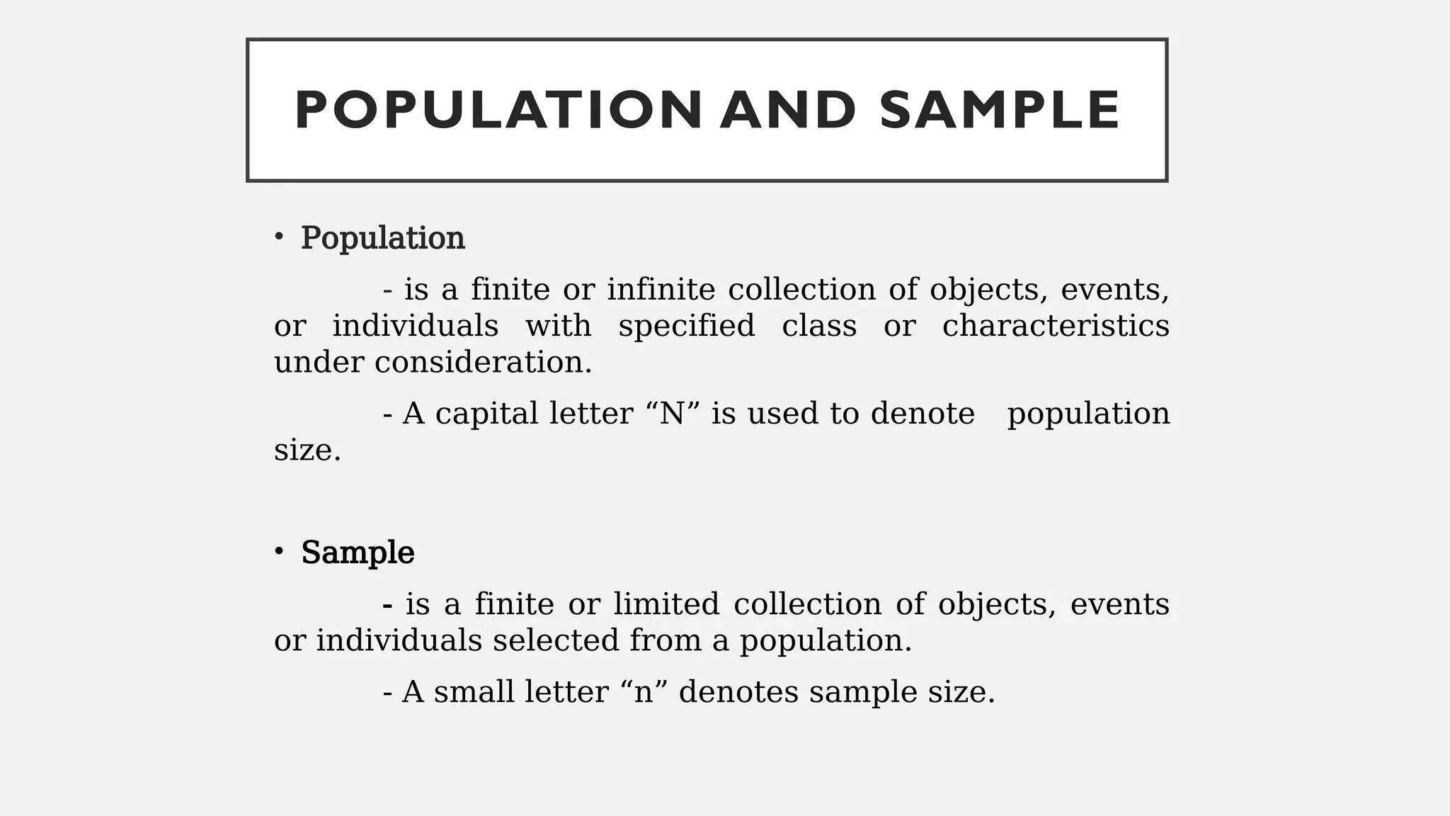
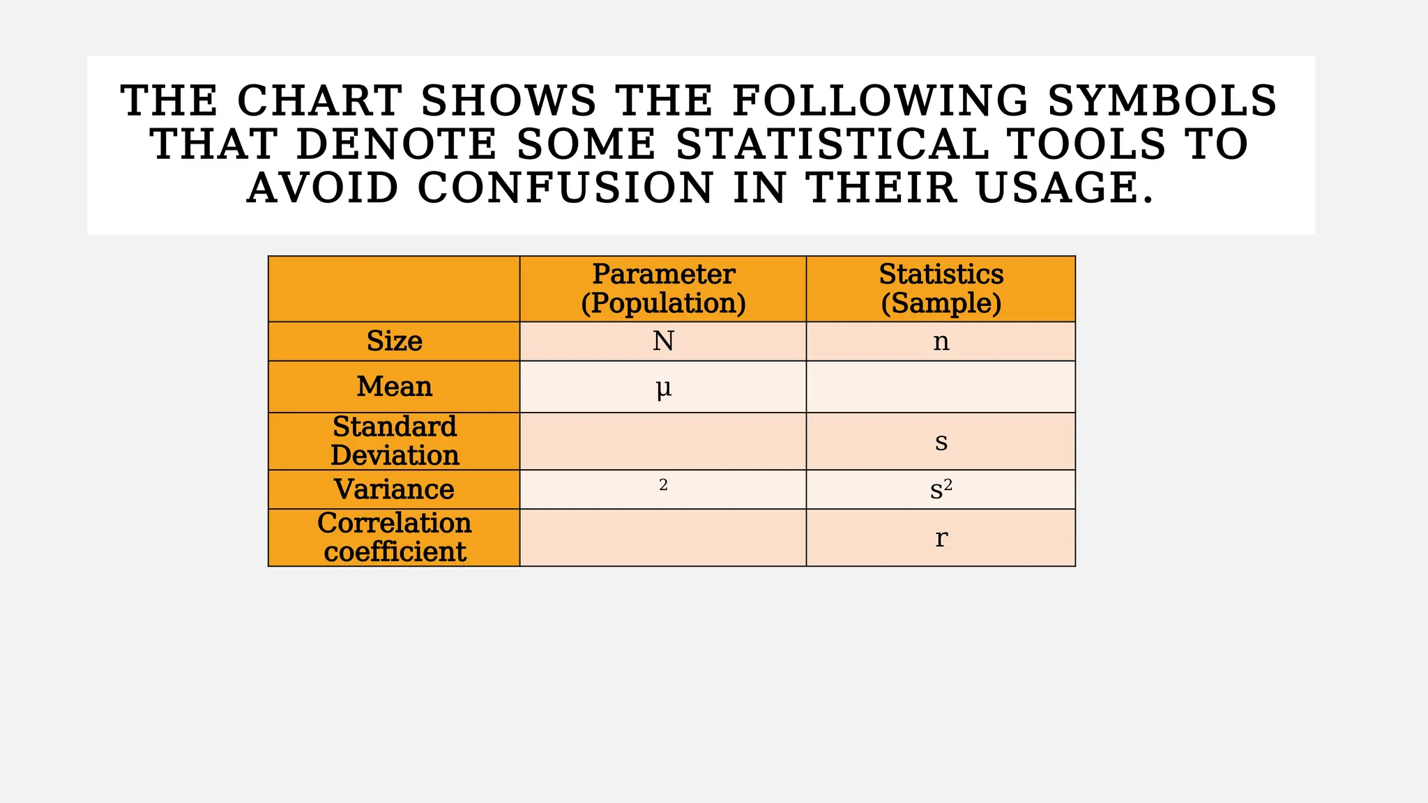
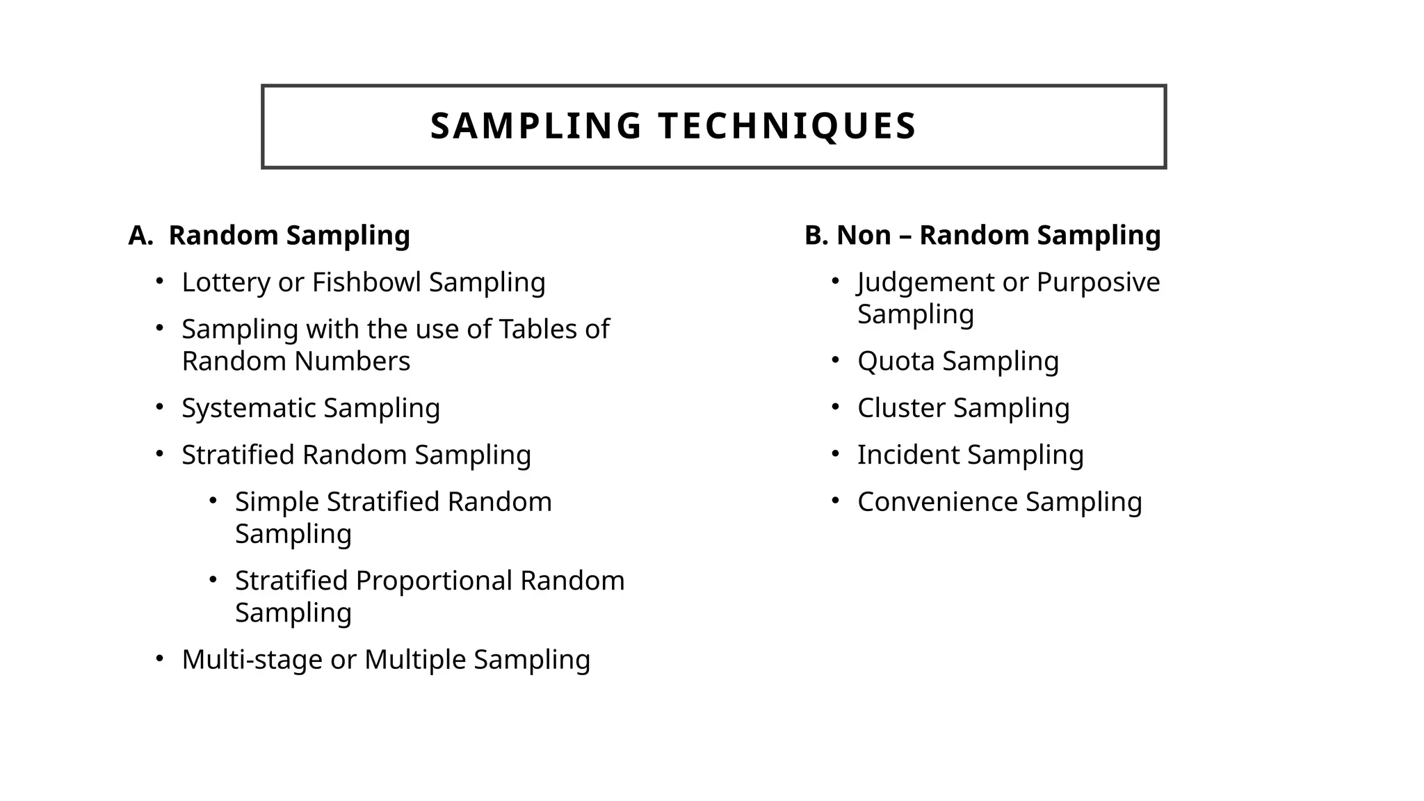
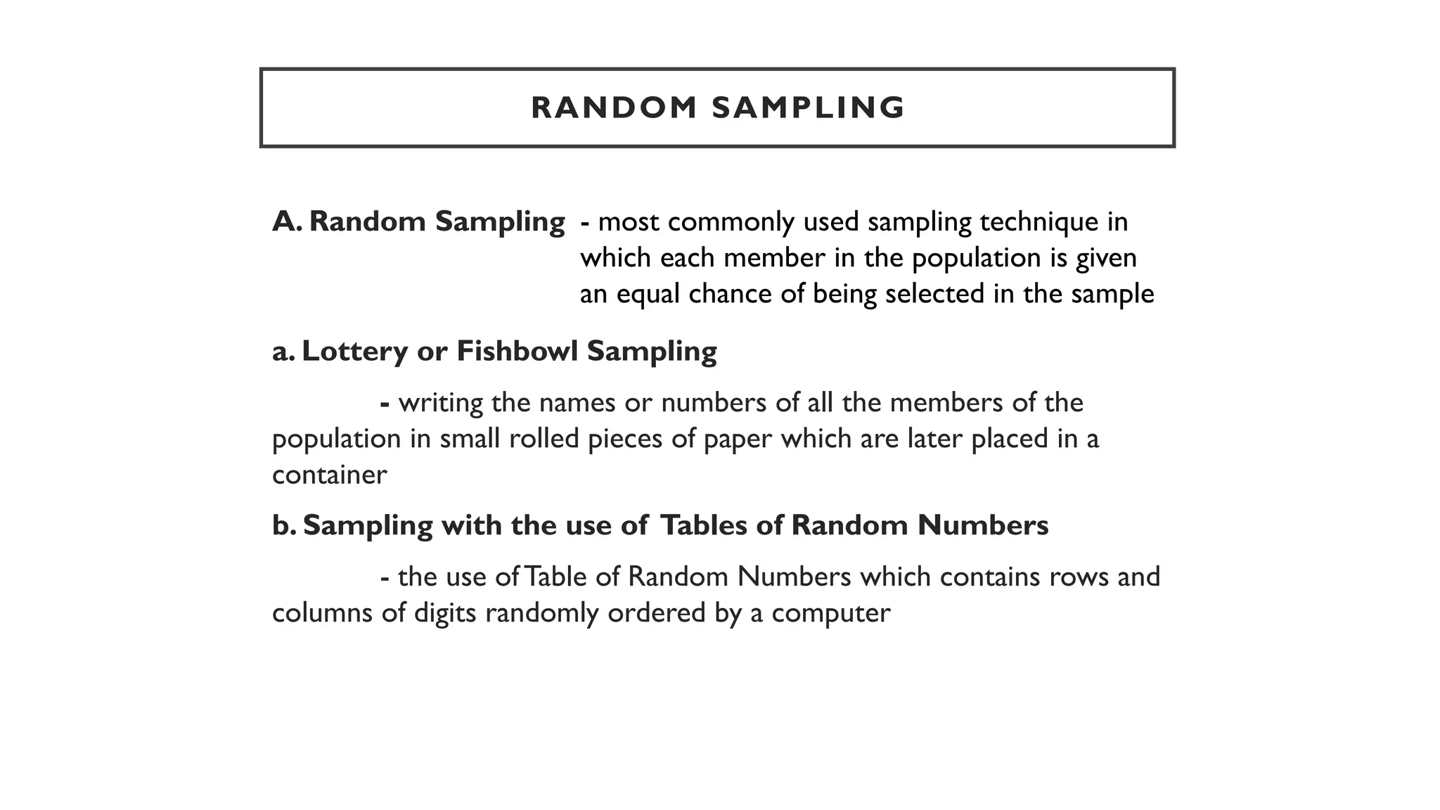
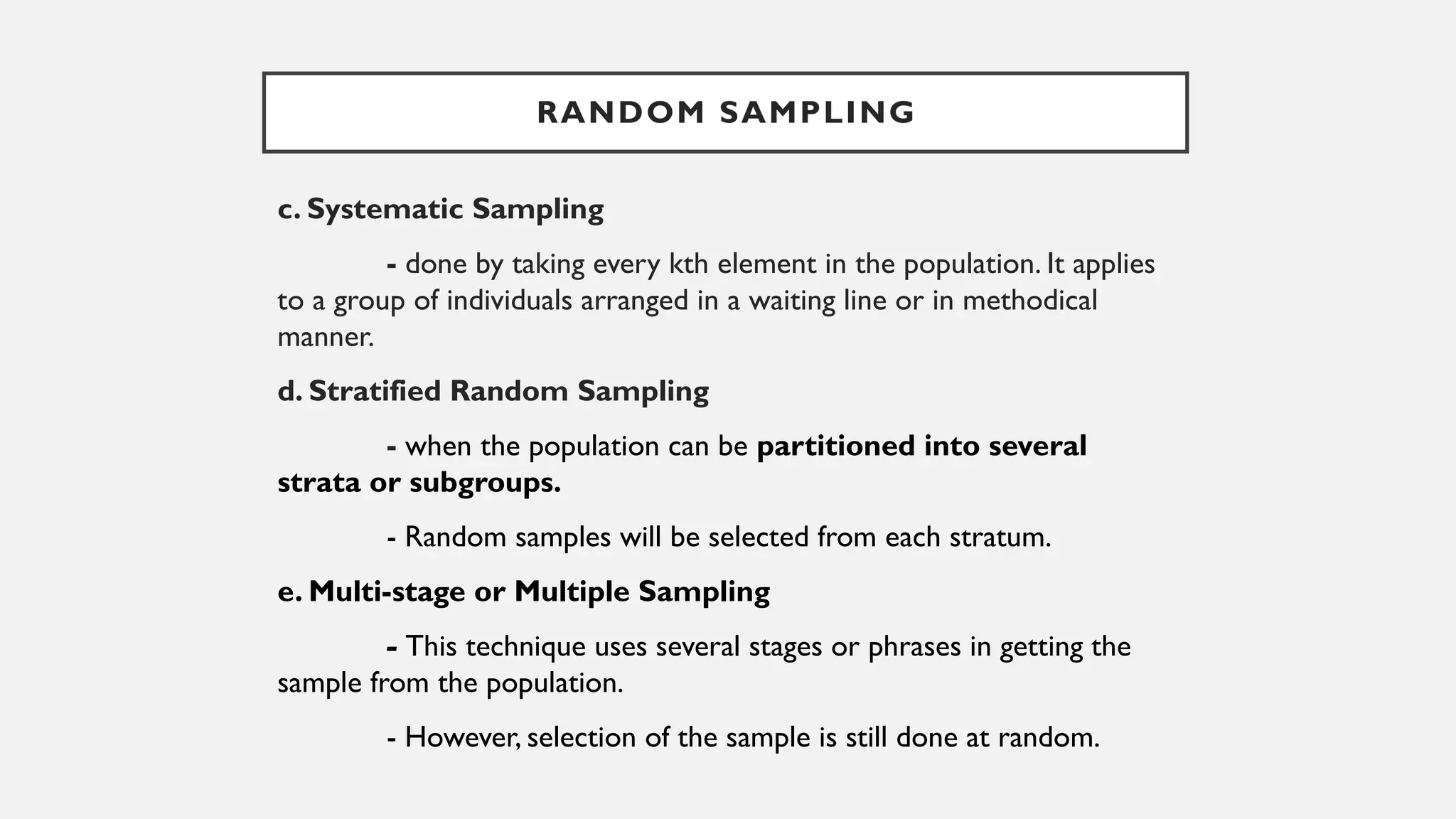
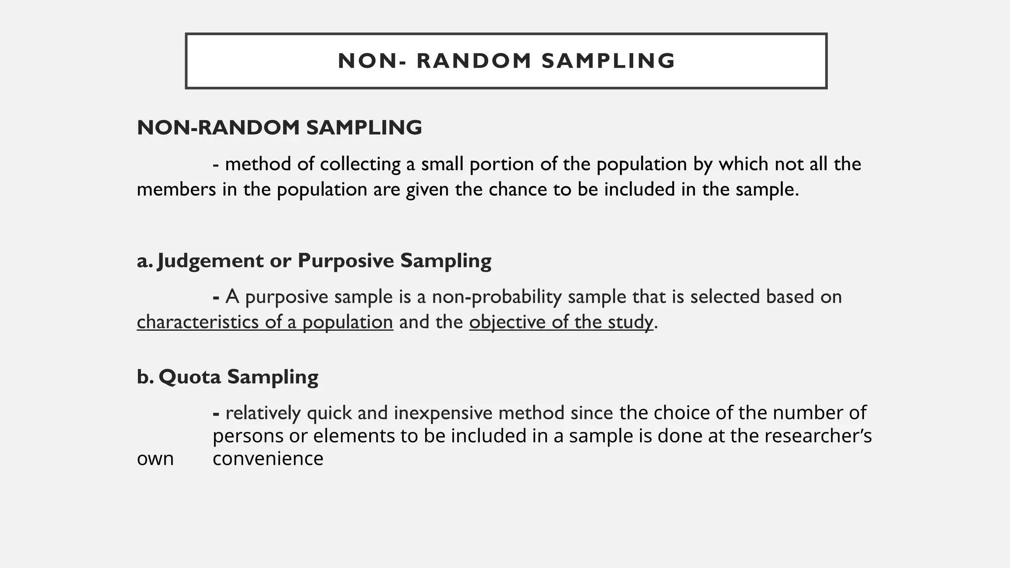
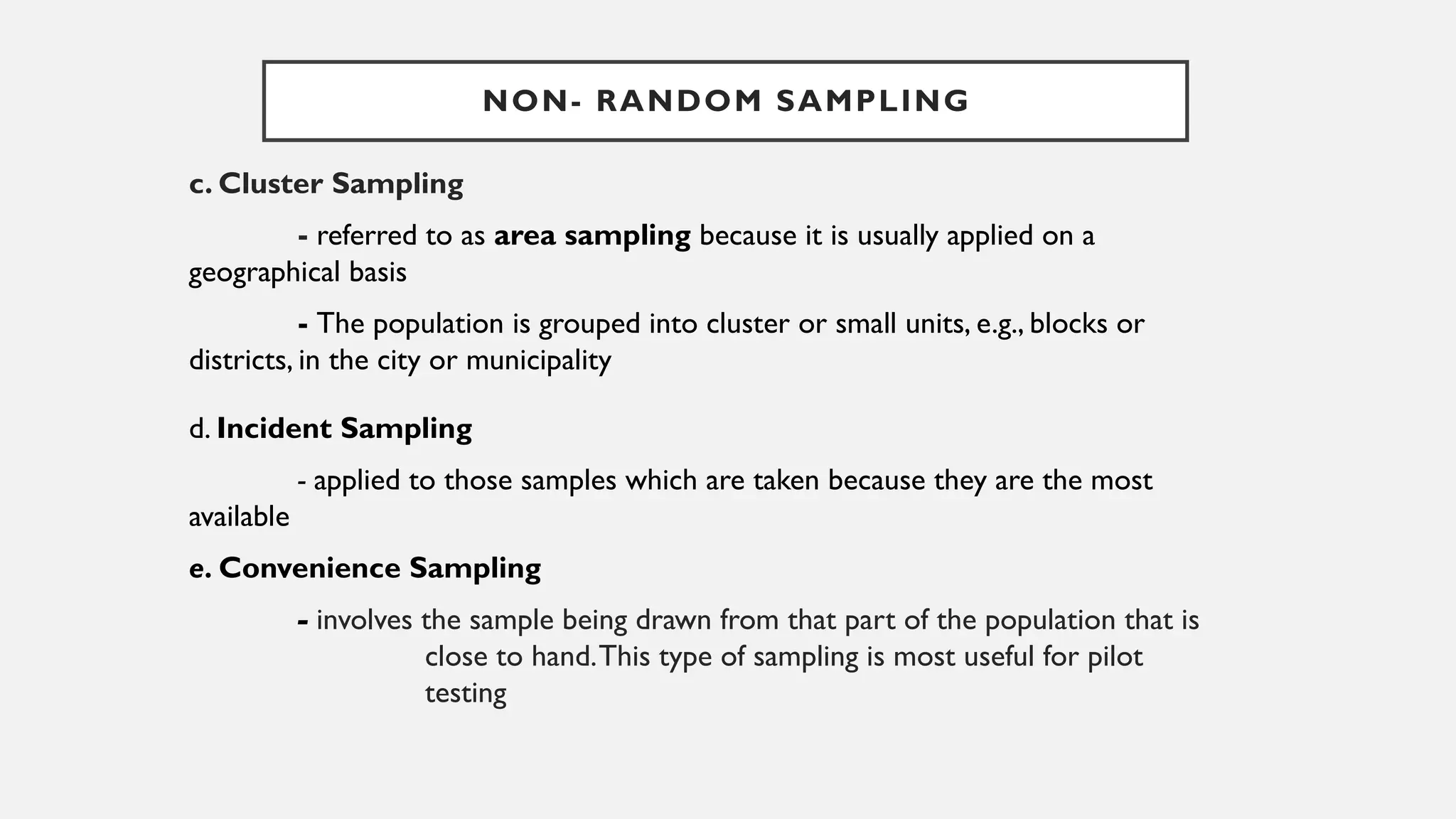
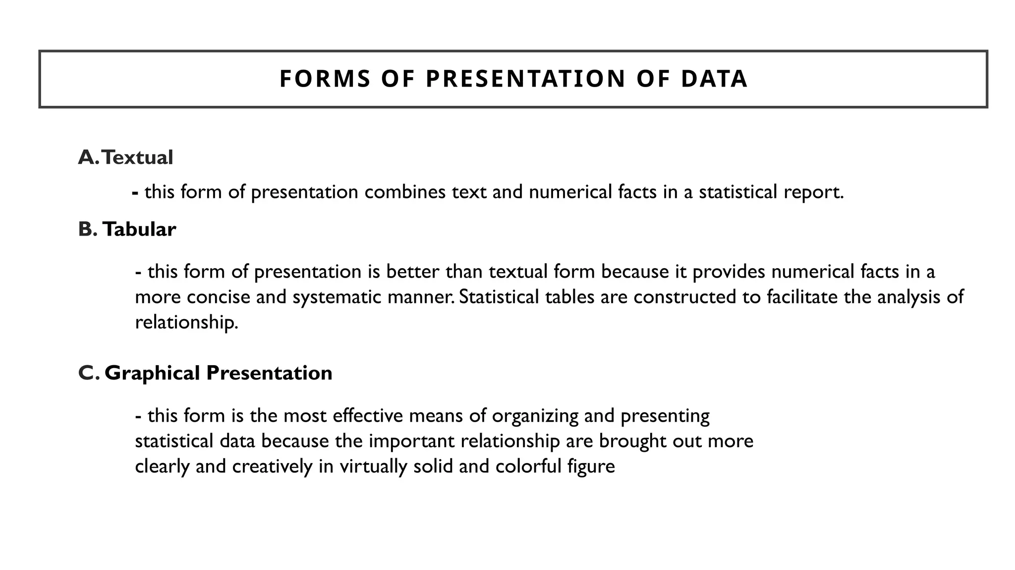
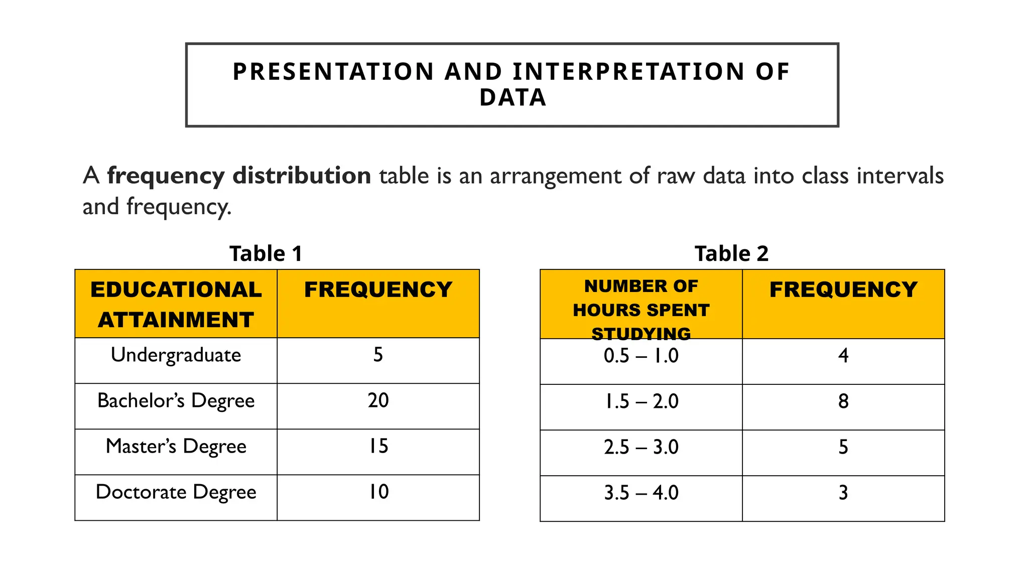
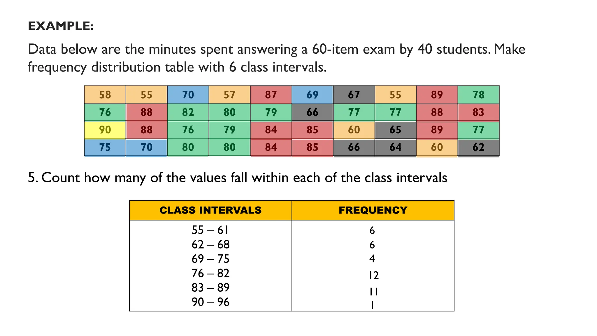
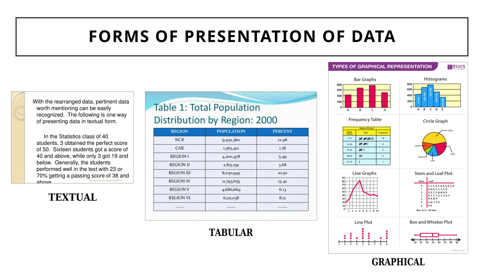
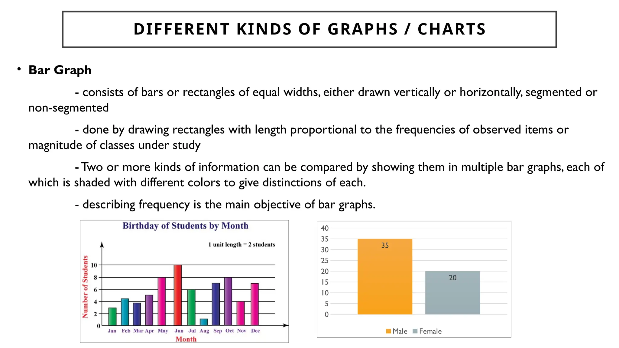
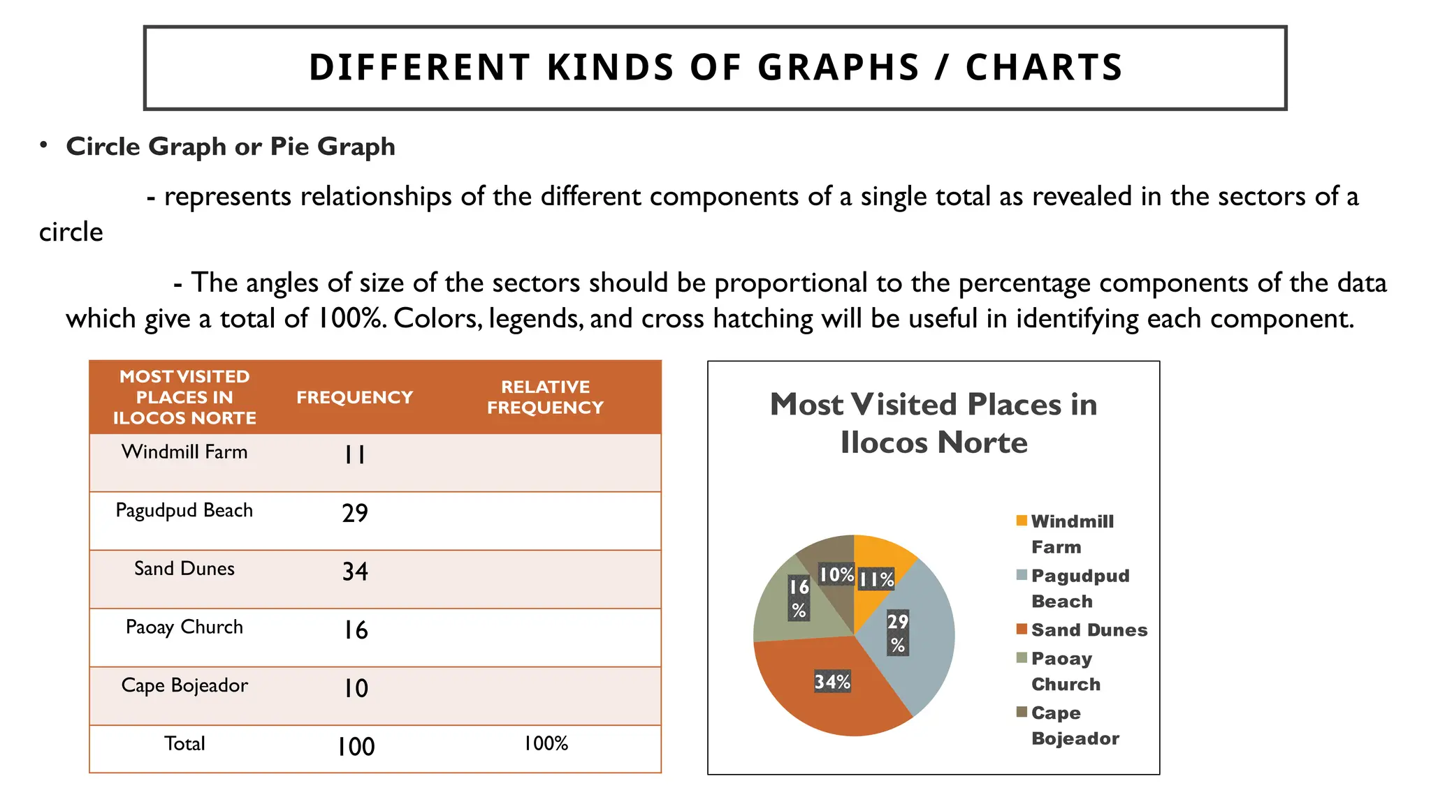
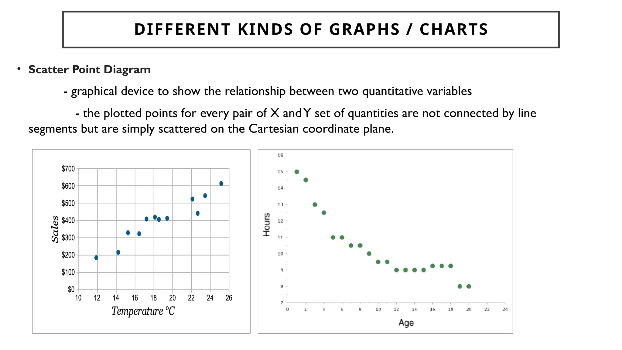
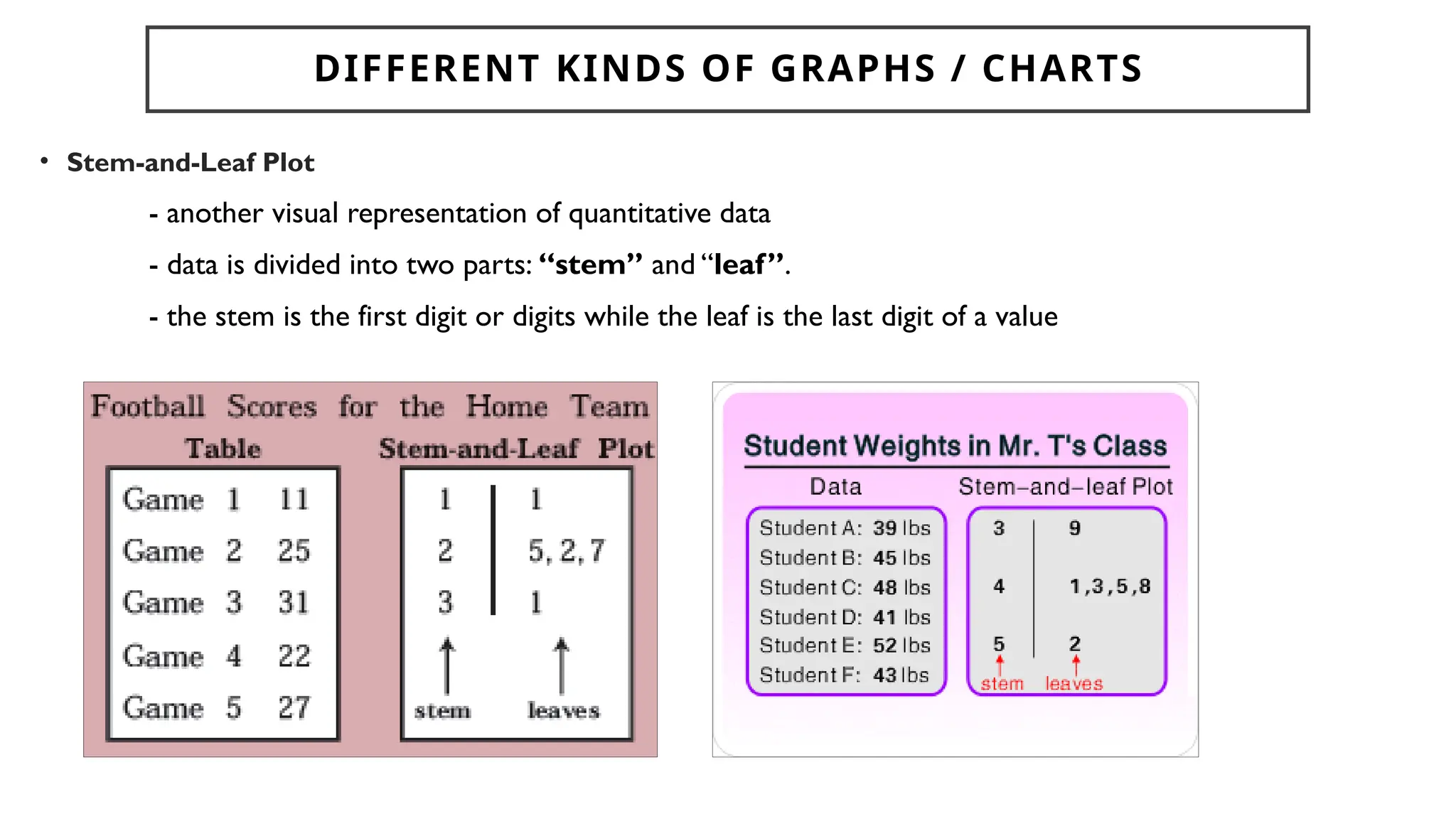
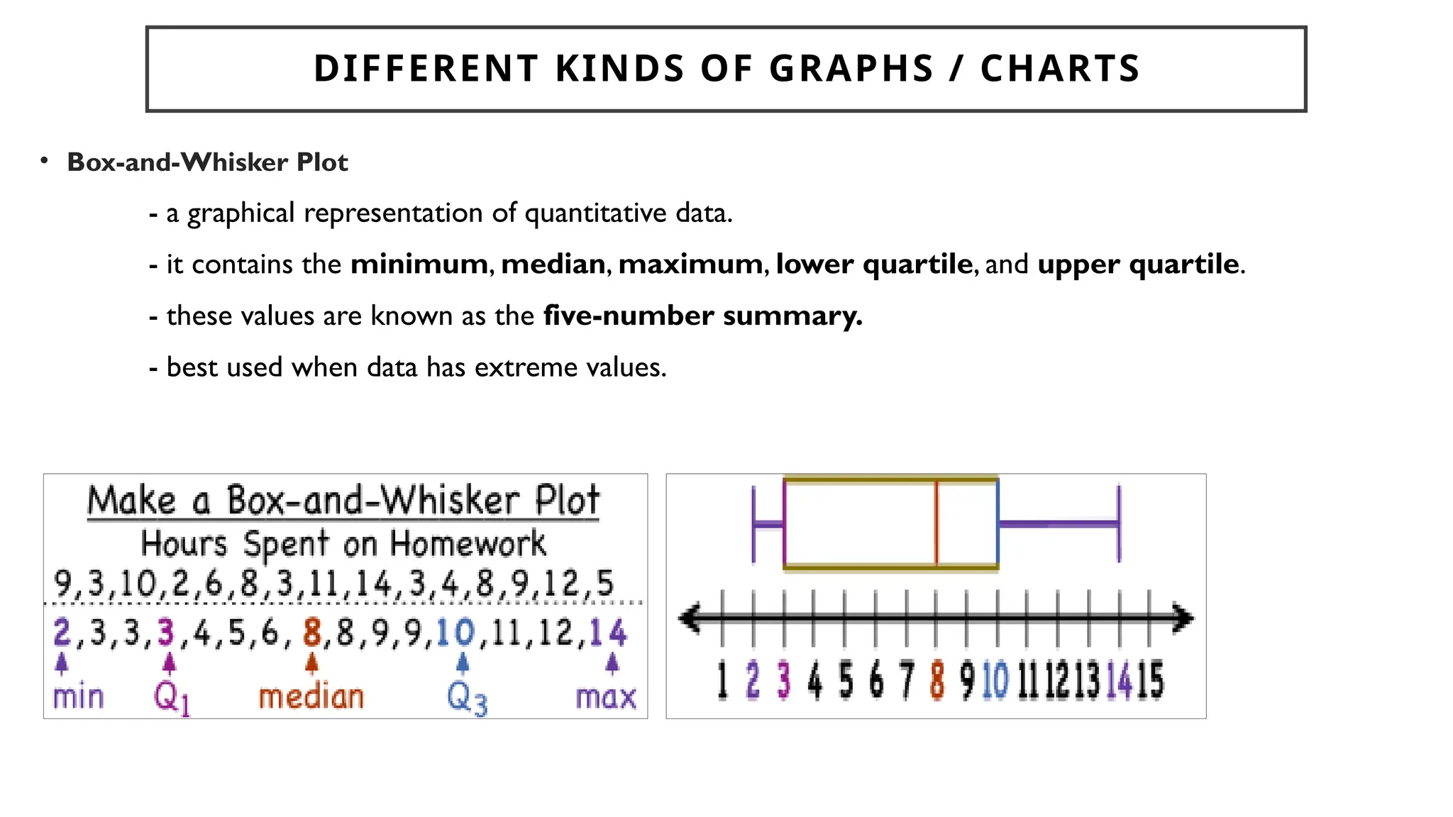
FORMULATION AND
PRESENTATION OF DATA
CHAPTER 4: OVERVIEW
• Classification of Organization of Data
• Presentation and Interpretation of Data
• Measures of Central Tendency
• Measures of Dispersion
• Symmetric and Asymmetric Distributions
Reference: Learn with Mayora. (2022, January 21). Data collection and presentation | Statistics [Video].YouTube. https://www.youtube.com/watch?v=6N2OA34zNEw
CLASSIFICATION AND
ORGANIZATION OF DATA
DATA
• individual pieces of factual information recorded and used for the
purpose of analysis.
• It is the raw information from which statistics are created.
RAW DATA
- data collected in an investigation and they are not organized
systematically
GROUP DATA
- raw data that are presented in the form of a frequency
distribution.
THE PURPOSES OF DATA GATHERING
• characterization (e.g., describing weaknesses and strengths),
• assessment (e.g., evaluating program effectiveness),
• evaluation (e.g., examining the quality of the educational process or
learner outcomes),
• control,
• prediction, and
• improvement.
1. Direct or Interview Method - a person-to-person interaction between
an interviewer and an interviewee
2. Indirect or Questionnaire Method - Written responses are obtained
by distributing questionnaires to the respondents
3. Registration Method - enforced by private organizations or
government agencies for recording purposes.
4. Observation Method - used when the objective is to determine the
cause-and-effect of a certain phenomenon under some controlled
conditions
5. Experimentation - a scientific method of investigation that makes
possible use of all senses to measure or obtain outcomes
METHODS OF COLLECTING DATA
𝐂𝐋𝐀𝐒𝐒𝐈𝐅𝐈𝐂𝐀𝐓𝐈𝐎𝐍𝐒𝐎𝐅 𝐕𝐀𝐑𝐈𝐀𝐁𝐋𝐄𝐒𝐀𝐍𝐃𝐃𝐀𝐓𝐀
A variable is any
characteristics
, number, or
quantity that
can be
measured or
counted.A
variable may also
be called a data
item.
Variables whose
values result
from counting or
measuring
something
Variables that are
not
measurement
variables.Their
values do not
result from
measuring or
counting
DISCRETE QUANTITATIVE DATA CONTINUOUS QUANTITATIVE DATA
• can only take specific numeric values
• number of needle punctures,
number of pregnancies and
number of hospitalizations
• take any value in an interval
• body mass, height, blood pressure and
cholesterol
• Age, height
A student may be 1.6321748755 … metres tall
A student may be 1.63 metres tall
• Countable data
AGE: 22 years, 10 months, 23 days, …hours…minutes
AGE: 22 years
AGE: 274 months
Primary sources
provide raw
information and first-
hand evidence.
Examples include
interview transcripts,
statistical data, and
works of art. A
primary source gives
you direct access to
the subject of your
research.
Nominal
Variables
Ordinal
Variables
Interval
Variables
Ratio
Variables
• Ranks, orders, scales
• First, Second,Third…
• Very satisfied, Satisfied, Indifferent, Dissatisfied,Very Dissatisfied
• measured along a scale, in which each point is placed at equal distance from one
another.
• Interval data always appears in the form of numbers or numerical values where the
distance between the two points is standardized and equal and there is no true zero
• temperature (in Celsius or Fahrenheit), mark grading, IQ test and CGPA.
• describes a name, label or category without natural order
• Ex: country, gender, race, hair color etc
• classifies qualitative data into two or more categories
• the lowest level of measurement
• Has a true meaningful zero
• has all the properties of an interval
variable, and also has a clear definition of 0.0
• Temperature (Kelvin), weight
• the highest level of measurement
POPULATION AND SAMPLE
• Population
- is a finite or infinite collection of objects, events,
or individuals with specified class or characteristics
under consideration.
- A capital letter “N” is used to denote population
size.
• Sample
- is a finite or limited collection of objects, events
or individuals selected from a population.
- A small letter “n” denotes sample size.
THE CHART SHOWS THE FOLLOWING SYMBOLS
THAT DENOTE SOME STATISTICAL TOOLS TO
AVOID CONFUSION IN THEIR USAGE.
Parameter
(Population)
Statistics
(Sample)
Size N n
Mean μ
Standard
Deviation
s
Variance 2
s2
Correlation
coefficient
r
SAMPLING TECHNIQUES
A. Random Sampling
• Lottery or Fishbowl Sampling
• Sampling with the use of Tables of
Random Numbers
• Systematic Sampling
• Stratified Random Sampling
• Simple Stratified Random
Sampling
• Stratified Proportional Random
Sampling
• Multi-stage or Multiple Sampling
B. Non – Random Sampling
• Judgement or Purposive
Sampling
• Quota Sampling
• Cluster Sampling
• Incident Sampling
• Convenience Sampling
RANDOM SAMPLING
A. Random Sampling
a. Lottery or Fishbowl Sampling
- writing the names or numbers of all the members of the
population in small rolled pieces of paper which are later placed in a
container
b. Sampling with the use of Tables of Random Numbers
- the use of Table of Random Numbers which contains rows and
columns of digits randomly ordered by a computer
- most commonly used sampling technique in
which each member in the population is given
an equal chance of being selected in the sample
c. Systematic Sampling
- done by taking every kth element in the population. It applies
to a group of individuals arranged in a waiting line or in methodical
manner.
d. Stratified Random Sampling
- when the population can be partitioned into several
strata or subgroups.
- Random samples will be selected from each stratum.
e. Multi-stage or Multiple Sampling
- This technique uses several stages or phrases in getting the
sample from the population.
- However, selection of the sample is still done at random.
RANDOM SAMPLING
NON-RANDOM SAMPLING
- method of collecting a small portion of the population by which not all the
members in the population are given the chance to be included in the sample.
a. Judgement or Purposive Sampling
- A purposive sample is a non-probability sample that is selected based on
characteristics of a population and the objective of the study.
b. Quota Sampling
- relatively quick and inexpensive method since the choice of the number of
persons or elements to be included in a sample is done at the researcher’s
own convenience
NON- RANDOM SAMPLING
c. Cluster Sampling
- referred to as area sampling because it is usually applied on a
geographical basis
- The population is grouped into cluster or small units, e.g., blocks or
districts, in the city or municipality
d. Incident Sampling
- applied to those samples which are taken because they are the most
available
e. Convenience Sampling
- involves the sample being drawn from that part of the population that is
close to hand.This type of sampling is most useful for pilot
testing
NON- RANDOM SAMPLING
PRESENTATION AND
INTERPRETATION OF DATA
FORMS OF PRESENTATION OF DATA
A.Textual
B. Tabular
C. Graphical Presentation
- this form of presentation combines text and numerical facts in a statistical report.
- this form of presentation is better than textual form because it provides numerical facts in a
more concise and systematic manner. Statistical tables are constructed to facilitate the analysis of
relationship.
- this form is the most effective means of organizing and presenting
statistical data because the important relationship are brought out more
clearly and creatively in virtually solid and colorful figure
A frequency distribution table is an arrangement of raw data into class intervals
and frequency.
PRESENTATION AND INTERPRETATION OF
DATA
EDUCATIONAL
ATTAINMENT
FREQUENCY
Undergraduate 5
Bachelor’s Degree 20
Master’s Degree 15
Doctorate Degree 10
Table 1
NUMBER OF
HOURS SPENT
STUDYING
FREQUENCY
0.5 – 1.0 4
1.5 – 2.0 8
2.5 – 3.0 5
3.5 – 4.0 3
Table 2
EXAMPLE:
Data below are the minutes spent answering a 60-item exam by 40 students. Make
frequency distribution table with 6 class intervals.
1. Determine the lowest and highest values and calculate for the range.The range is the
difference between the lowest and highest values.
Range = highest value – lowest value
Range = 90 – 55
Range = 35
58 55 70 57 87 69 67 55 89 78
76 88 82 80 79 66 77 77 88 83
90 88 76 79 84 85 60 65 89 77
75 70 80 80 84 85 66 64 60 62
EXAMPLE:
Data below are the minutes spent answering a 60-item exam by 40 students. Make
frequency distribution table with 6 class intervals.
2. Calculate the class width by getting the ratio of the range and the number of class
intervals. Round-up the obtained value.
ClassWidth =
58 55 70 57 87 69 67 55 89 78
76 88 82 80 79 66 77 77 88 83
90 88 76 79 84 85 60 65 89 77
75 70 80 80 84 85 66 64 60 62
EXAMPLE:
Data below are the minutes spent answering a 60-item exam by 40 students. Make
frequency distribution table with 6 class intervals.
3. Start the frequency distribution table with the lowest value and add the class width
repeatedly to obtain the lowest limits of the class intervals.
58 55 70 57 87 69 67 55 89 78
76 88 82 80 79 66 77 77 88 83
90 88 76 79 84 85 60 65 89 77
75 70 80 80 84 85 66 64 60 62
CLASS INTERVALS FREQUENCY
55 –
62 –
69 –
76 –
83 –
90 –
EXAMPLE:
Data below are the minutes spent answering a 60-item exam by 40 students. Make
frequency distribution table with 6 class intervals.
4. Since class intervals cannot overlap, obtain the upper limits of each class intervals
58 55 70 57 87 69 67 55 89 78
76 88 82 80 79 66 77 77 88 83
90 88 76 79 84 85 60 65 89 77
75 70 80 80 84 85 66 64 60 62
CLASS INTERVALS FREQUENCY
55 – 61
62 – 68
69 – 75
76 – 82
83 – 89
90 – 96
EXAMPLE:
Data below are the minutes spent answering a 60-item exam by 40 students. Make
frequency distribution table with 6 class intervals.
5. Count how many of the values fall within each of the class intervals
58 55 70 57 87 69 67 55 89 78
76 88 82 80 79 66 77 77 88 83
90 88 76 79 84 85 60 65 89 77
75 70 80 80 84 85 66 64 60 62
CLASS INTERVALS FREQUENCY
55 – 61
62 – 68
69 – 75
76 – 82
83 – 89
90 – 96
6
6
4
12
11
1
FORMS OF PRESENTATION OF DATA
𝐓𝐄𝐗𝐓𝐔𝐀𝐋
𝐓𝐀𝐁𝐔𝐋𝐀𝐑
𝐆𝐑𝐀𝐏𝐇𝐈𝐂𝐀𝐋
DIFFERENT KINDS OF GRAPHS / CHARTS
• Bar Graph
- consists of bars or rectangles of equal widths, either drawn vertically or horizontally, segmented or
non-segmented
- done by drawing rectangles with length proportional to the frequencies of observed items or
magnitude of classes under study
- Two or more kinds of information can be compared by showing them in multiple bar graphs, each of
which is shaded with different colors to give distinctions of each.
- describing frequency is the main objective of bar graphs.
0
5
10
15
20
25
30
35
40
35
20
Male Female
DIFFERENT KINDS OF GRAPHS / CHARTS
• Circle Graph or Pie Graph
- represents relationships of the different components of a single total as revealed in the sectors of a
circle
- The angles of size of the sectors should be proportional to the percentage components of the data
which give a total of 100%. Colors, legends, and cross hatching will be useful in identifying each component.
11%
29
%
34%
16
%
10%
Most Visited Places in
Ilocos Norte
Windmill
Farm
Pagudpud
Beach
Sand Dunes
Paoay
Church
Cape
Bojeador
MOSTVISITED
PLACES IN
ILOCOS NORTE
FREQUENCY
RELATIVE
FREQUENCY
Windmill Farm 11
Pagudpud Beach 29
Sand Dunes 34
Paoay Church 16
Cape Bojeador 10
Total 100 100%
DIFFERENT KINDS OF GRAPHS / CHARTS
• Histogram
- a graph that consist of vertical, rectangular bars which represent the frequency of ranges of values.
- the rectangular bars have no gaps between them.
DIFFERENT KINDS OF GRAPHS / CHARTS
• Line Graph
- it shows relationships between two sets of quantities
- This is done by plotting point of X set of quantities along the horizontal axis against theY set of
quantities along the vertical axis in a Cartesian coordinate plane.
- Those plotted points will be connected by a line segment which finally forms the line graph.
DIFFERENT KINDS OF GRAPHS / CHARTS
• Picture Graph or Pictograph
- visual presentation of statistical quantities by means of drawing pictures or symbols related to
the subject under study
- Legends are sometimes used to represent magnitude of a single unit of the picture then
repetitions of this picture are drawn to indicate differences in quantity
DIFFERENT KINDS OF GRAPHS / CHARTS
• Map Graph or Cartogram
- one of the best ways to present
geographical data
- This kind of graph is always
accompanied by a legend which tells us
the meaning of the lines, colors, or the
symbols used and positioned in a map.
DIFFERENT KINDS OF GRAPHS / CHARTS
• Scatter Point Diagram
- graphical device to show the relationship between two quantitative variables
- the plotted points for every pair of X andY set of quantities are not connected by line
segments but are simply scattered on the Cartesian coordinate plane.
DIFFERENT KINDS OF GRAPHS / CHARTS
• Stem-and-Leaf Plot
- another visual representation of quantitative data
- data is divided into two parts: “stem” and “leaf”.
- the stem is the first digit or digits while the leaf is the last digit of a value
DIFFERENT KINDS OF GRAPHS / CHARTS
• Box-and-Whisker Plot
- a graphical representation of quantitative data.
- it contains the minimum, median, maximum, lower quartile, and upper quartile.
- these values are known as the five-number summary.
- best used when data has extreme values.

WEEK 3 and 4- Formulation and Presentation of Data.pptx

  • 1.
  • 2.
    CHAPTER 4: OVERVIEW •Classification of Organization of Data • Presentation and Interpretation of Data • Measures of Central Tendency • Measures of Dispersion • Symmetric and Asymmetric Distributions
  • 3.
    Reference: Learn withMayora. (2022, January 21). Data collection and presentation | Statistics [Video].YouTube. https://www.youtube.com/watch?v=6N2OA34zNEw
  • 4.
  • 5.
    DATA • individual piecesof factual information recorded and used for the purpose of analysis. • It is the raw information from which statistics are created. RAW DATA - data collected in an investigation and they are not organized systematically GROUP DATA - raw data that are presented in the form of a frequency distribution.
  • 6.
    THE PURPOSES OFDATA GATHERING • characterization (e.g., describing weaknesses and strengths), • assessment (e.g., evaluating program effectiveness), • evaluation (e.g., examining the quality of the educational process or learner outcomes), • control, • prediction, and • improvement.
  • 7.
    1. Direct orInterview Method - a person-to-person interaction between an interviewer and an interviewee 2. Indirect or Questionnaire Method - Written responses are obtained by distributing questionnaires to the respondents 3. Registration Method - enforced by private organizations or government agencies for recording purposes. 4. Observation Method - used when the objective is to determine the cause-and-effect of a certain phenomenon under some controlled conditions 5. Experimentation - a scientific method of investigation that makes possible use of all senses to measure or obtain outcomes METHODS OF COLLECTING DATA
  • 8.
    𝐂𝐋𝐀𝐒𝐒𝐈𝐅𝐈𝐂𝐀𝐓𝐈𝐎𝐍𝐒𝐎𝐅 𝐕𝐀𝐑𝐈𝐀𝐁𝐋𝐄𝐒𝐀𝐍𝐃𝐃𝐀𝐓𝐀 A variableis any characteristics , number, or quantity that can be measured or counted.A variable may also be called a data item. Variables whose values result from counting or measuring something Variables that are not measurement variables.Their values do not result from measuring or counting
  • 9.
    DISCRETE QUANTITATIVE DATACONTINUOUS QUANTITATIVE DATA • can only take specific numeric values • number of needle punctures, number of pregnancies and number of hospitalizations • take any value in an interval • body mass, height, blood pressure and cholesterol • Age, height A student may be 1.6321748755 … metres tall A student may be 1.63 metres tall • Countable data AGE: 22 years, 10 months, 23 days, …hours…minutes AGE: 22 years AGE: 274 months
  • 10.
    Primary sources provide raw informationand first- hand evidence. Examples include interview transcripts, statistical data, and works of art. A primary source gives you direct access to the subject of your research.
  • 11.
    Nominal Variables Ordinal Variables Interval Variables Ratio Variables • Ranks, orders,scales • First, Second,Third… • Very satisfied, Satisfied, Indifferent, Dissatisfied,Very Dissatisfied • measured along a scale, in which each point is placed at equal distance from one another. • Interval data always appears in the form of numbers or numerical values where the distance between the two points is standardized and equal and there is no true zero • temperature (in Celsius or Fahrenheit), mark grading, IQ test and CGPA. • describes a name, label or category without natural order • Ex: country, gender, race, hair color etc • classifies qualitative data into two or more categories • the lowest level of measurement • Has a true meaningful zero • has all the properties of an interval variable, and also has a clear definition of 0.0 • Temperature (Kelvin), weight • the highest level of measurement
  • 12.
    POPULATION AND SAMPLE •Population - is a finite or infinite collection of objects, events, or individuals with specified class or characteristics under consideration. - A capital letter “N” is used to denote population size. • Sample - is a finite or limited collection of objects, events or individuals selected from a population. - A small letter “n” denotes sample size.
  • 13.
    THE CHART SHOWSTHE FOLLOWING SYMBOLS THAT DENOTE SOME STATISTICAL TOOLS TO AVOID CONFUSION IN THEIR USAGE. Parameter (Population) Statistics (Sample) Size N n Mean μ Standard Deviation s Variance 2 s2 Correlation coefficient r
  • 14.
    SAMPLING TECHNIQUES A. RandomSampling • Lottery or Fishbowl Sampling • Sampling with the use of Tables of Random Numbers • Systematic Sampling • Stratified Random Sampling • Simple Stratified Random Sampling • Stratified Proportional Random Sampling • Multi-stage or Multiple Sampling B. Non – Random Sampling • Judgement or Purposive Sampling • Quota Sampling • Cluster Sampling • Incident Sampling • Convenience Sampling
  • 15.
    RANDOM SAMPLING A. RandomSampling a. Lottery or Fishbowl Sampling - writing the names or numbers of all the members of the population in small rolled pieces of paper which are later placed in a container b. Sampling with the use of Tables of Random Numbers - the use of Table of Random Numbers which contains rows and columns of digits randomly ordered by a computer - most commonly used sampling technique in which each member in the population is given an equal chance of being selected in the sample
  • 16.
    c. Systematic Sampling -done by taking every kth element in the population. It applies to a group of individuals arranged in a waiting line or in methodical manner. d. Stratified Random Sampling - when the population can be partitioned into several strata or subgroups. - Random samples will be selected from each stratum. e. Multi-stage or Multiple Sampling - This technique uses several stages or phrases in getting the sample from the population. - However, selection of the sample is still done at random. RANDOM SAMPLING
  • 17.
    NON-RANDOM SAMPLING - methodof collecting a small portion of the population by which not all the members in the population are given the chance to be included in the sample. a. Judgement or Purposive Sampling - A purposive sample is a non-probability sample that is selected based on characteristics of a population and the objective of the study. b. Quota Sampling - relatively quick and inexpensive method since the choice of the number of persons or elements to be included in a sample is done at the researcher’s own convenience NON- RANDOM SAMPLING
  • 18.
    c. Cluster Sampling -referred to as area sampling because it is usually applied on a geographical basis - The population is grouped into cluster or small units, e.g., blocks or districts, in the city or municipality d. Incident Sampling - applied to those samples which are taken because they are the most available e. Convenience Sampling - involves the sample being drawn from that part of the population that is close to hand.This type of sampling is most useful for pilot testing NON- RANDOM SAMPLING
  • 19.
  • 20.
    FORMS OF PRESENTATIONOF DATA A.Textual B. Tabular C. Graphical Presentation - this form of presentation combines text and numerical facts in a statistical report. - this form of presentation is better than textual form because it provides numerical facts in a more concise and systematic manner. Statistical tables are constructed to facilitate the analysis of relationship. - this form is the most effective means of organizing and presenting statistical data because the important relationship are brought out more clearly and creatively in virtually solid and colorful figure
  • 21.
    A frequency distributiontable is an arrangement of raw data into class intervals and frequency. PRESENTATION AND INTERPRETATION OF DATA EDUCATIONAL ATTAINMENT FREQUENCY Undergraduate 5 Bachelor’s Degree 20 Master’s Degree 15 Doctorate Degree 10 Table 1 NUMBER OF HOURS SPENT STUDYING FREQUENCY 0.5 – 1.0 4 1.5 – 2.0 8 2.5 – 3.0 5 3.5 – 4.0 3 Table 2
  • 22.
    EXAMPLE: Data below arethe minutes spent answering a 60-item exam by 40 students. Make frequency distribution table with 6 class intervals. 1. Determine the lowest and highest values and calculate for the range.The range is the difference between the lowest and highest values. Range = highest value – lowest value Range = 90 – 55 Range = 35 58 55 70 57 87 69 67 55 89 78 76 88 82 80 79 66 77 77 88 83 90 88 76 79 84 85 60 65 89 77 75 70 80 80 84 85 66 64 60 62
  • 23.
    EXAMPLE: Data below arethe minutes spent answering a 60-item exam by 40 students. Make frequency distribution table with 6 class intervals. 2. Calculate the class width by getting the ratio of the range and the number of class intervals. Round-up the obtained value. ClassWidth = 58 55 70 57 87 69 67 55 89 78 76 88 82 80 79 66 77 77 88 83 90 88 76 79 84 85 60 65 89 77 75 70 80 80 84 85 66 64 60 62
  • 24.
    EXAMPLE: Data below arethe minutes spent answering a 60-item exam by 40 students. Make frequency distribution table with 6 class intervals. 3. Start the frequency distribution table with the lowest value and add the class width repeatedly to obtain the lowest limits of the class intervals. 58 55 70 57 87 69 67 55 89 78 76 88 82 80 79 66 77 77 88 83 90 88 76 79 84 85 60 65 89 77 75 70 80 80 84 85 66 64 60 62 CLASS INTERVALS FREQUENCY 55 – 62 – 69 – 76 – 83 – 90 –
  • 25.
    EXAMPLE: Data below arethe minutes spent answering a 60-item exam by 40 students. Make frequency distribution table with 6 class intervals. 4. Since class intervals cannot overlap, obtain the upper limits of each class intervals 58 55 70 57 87 69 67 55 89 78 76 88 82 80 79 66 77 77 88 83 90 88 76 79 84 85 60 65 89 77 75 70 80 80 84 85 66 64 60 62 CLASS INTERVALS FREQUENCY 55 – 61 62 – 68 69 – 75 76 – 82 83 – 89 90 – 96
  • 26.
    EXAMPLE: Data below arethe minutes spent answering a 60-item exam by 40 students. Make frequency distribution table with 6 class intervals. 5. Count how many of the values fall within each of the class intervals 58 55 70 57 87 69 67 55 89 78 76 88 82 80 79 66 77 77 88 83 90 88 76 79 84 85 60 65 89 77 75 70 80 80 84 85 66 64 60 62 CLASS INTERVALS FREQUENCY 55 – 61 62 – 68 69 – 75 76 – 82 83 – 89 90 – 96 6 6 4 12 11 1
  • 27.
    FORMS OF PRESENTATIONOF DATA 𝐓𝐄𝐗𝐓𝐔𝐀𝐋 𝐓𝐀𝐁𝐔𝐋𝐀𝐑 𝐆𝐑𝐀𝐏𝐇𝐈𝐂𝐀𝐋
  • 28.
    DIFFERENT KINDS OFGRAPHS / CHARTS • Bar Graph - consists of bars or rectangles of equal widths, either drawn vertically or horizontally, segmented or non-segmented - done by drawing rectangles with length proportional to the frequencies of observed items or magnitude of classes under study - Two or more kinds of information can be compared by showing them in multiple bar graphs, each of which is shaded with different colors to give distinctions of each. - describing frequency is the main objective of bar graphs. 0 5 10 15 20 25 30 35 40 35 20 Male Female
  • 29.
    DIFFERENT KINDS OFGRAPHS / CHARTS • Circle Graph or Pie Graph - represents relationships of the different components of a single total as revealed in the sectors of a circle - The angles of size of the sectors should be proportional to the percentage components of the data which give a total of 100%. Colors, legends, and cross hatching will be useful in identifying each component. 11% 29 % 34% 16 % 10% Most Visited Places in Ilocos Norte Windmill Farm Pagudpud Beach Sand Dunes Paoay Church Cape Bojeador MOSTVISITED PLACES IN ILOCOS NORTE FREQUENCY RELATIVE FREQUENCY Windmill Farm 11 Pagudpud Beach 29 Sand Dunes 34 Paoay Church 16 Cape Bojeador 10 Total 100 100%
  • 30.
    DIFFERENT KINDS OFGRAPHS / CHARTS • Histogram - a graph that consist of vertical, rectangular bars which represent the frequency of ranges of values. - the rectangular bars have no gaps between them.
  • 31.
    DIFFERENT KINDS OFGRAPHS / CHARTS • Line Graph - it shows relationships between two sets of quantities - This is done by plotting point of X set of quantities along the horizontal axis against theY set of quantities along the vertical axis in a Cartesian coordinate plane. - Those plotted points will be connected by a line segment which finally forms the line graph.
  • 32.
    DIFFERENT KINDS OFGRAPHS / CHARTS • Picture Graph or Pictograph - visual presentation of statistical quantities by means of drawing pictures or symbols related to the subject under study - Legends are sometimes used to represent magnitude of a single unit of the picture then repetitions of this picture are drawn to indicate differences in quantity
  • 33.
    DIFFERENT KINDS OFGRAPHS / CHARTS • Map Graph or Cartogram - one of the best ways to present geographical data - This kind of graph is always accompanied by a legend which tells us the meaning of the lines, colors, or the symbols used and positioned in a map.
  • 34.
    DIFFERENT KINDS OFGRAPHS / CHARTS • Scatter Point Diagram - graphical device to show the relationship between two quantitative variables - the plotted points for every pair of X andY set of quantities are not connected by line segments but are simply scattered on the Cartesian coordinate plane.
  • 35.
    DIFFERENT KINDS OFGRAPHS / CHARTS • Stem-and-Leaf Plot - another visual representation of quantitative data - data is divided into two parts: “stem” and “leaf”. - the stem is the first digit or digits while the leaf is the last digit of a value
  • 36.
    DIFFERENT KINDS OFGRAPHS / CHARTS • Box-and-Whisker Plot - a graphical representation of quantitative data. - it contains the minimum, median, maximum, lower quartile, and upper quartile. - these values are known as the five-number summary. - best used when data has extreme values.