Downloaded 75 times


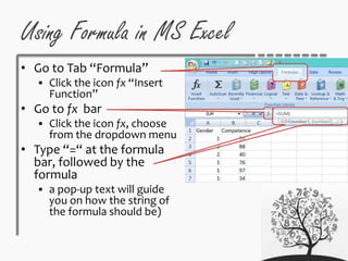
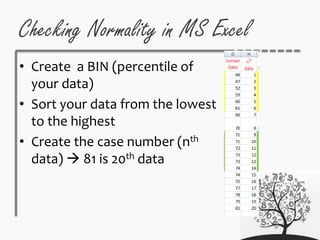
![Using Normality Percentage
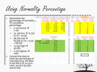
3. Identify the bin
numbers (cut points)
E.g. 100% is 20th data
case in the file 81
97.58% is the approx.
19th data case 79
4. Decide how many times
the data occur within
the bin numbers
[FREQUENCY] 46-47
pts = 1 time, 46-52 pts= 2
times, and so on; the
final one 81 should be
20 times
5. Decide the number of
the data under 47 is 1
score, 47-52 is 2 scores,
and so on.](https://image.slidesharecdn.com/statistics-descriptive-150621191952-lva1-app6892/85/Descriptive-Statistics-35-320.jpg)


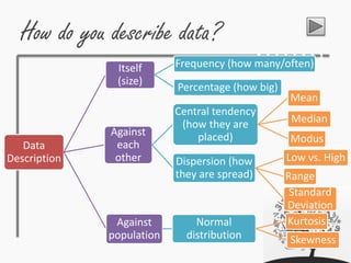
This document provides an overview of statistics concepts including descriptive and inferential statistics. Descriptive statistics are used to summarize and describe data through measures of central tendency (mean, median, mode), dispersion (range, standard deviation), and frequency/percentage. Inferential statistics allow inferences to be made about a population based on a sample through hypothesis testing and other statistical techniques. The document discusses preparing data in Excel and using formulas and functions to calculate descriptive statistics. It also introduces the concepts of normal distribution, kurtosis, and skewness in describing data distributions.