This document discusses organizing and presenting data. It covers:
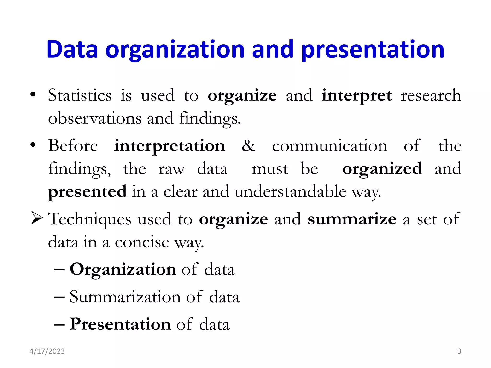
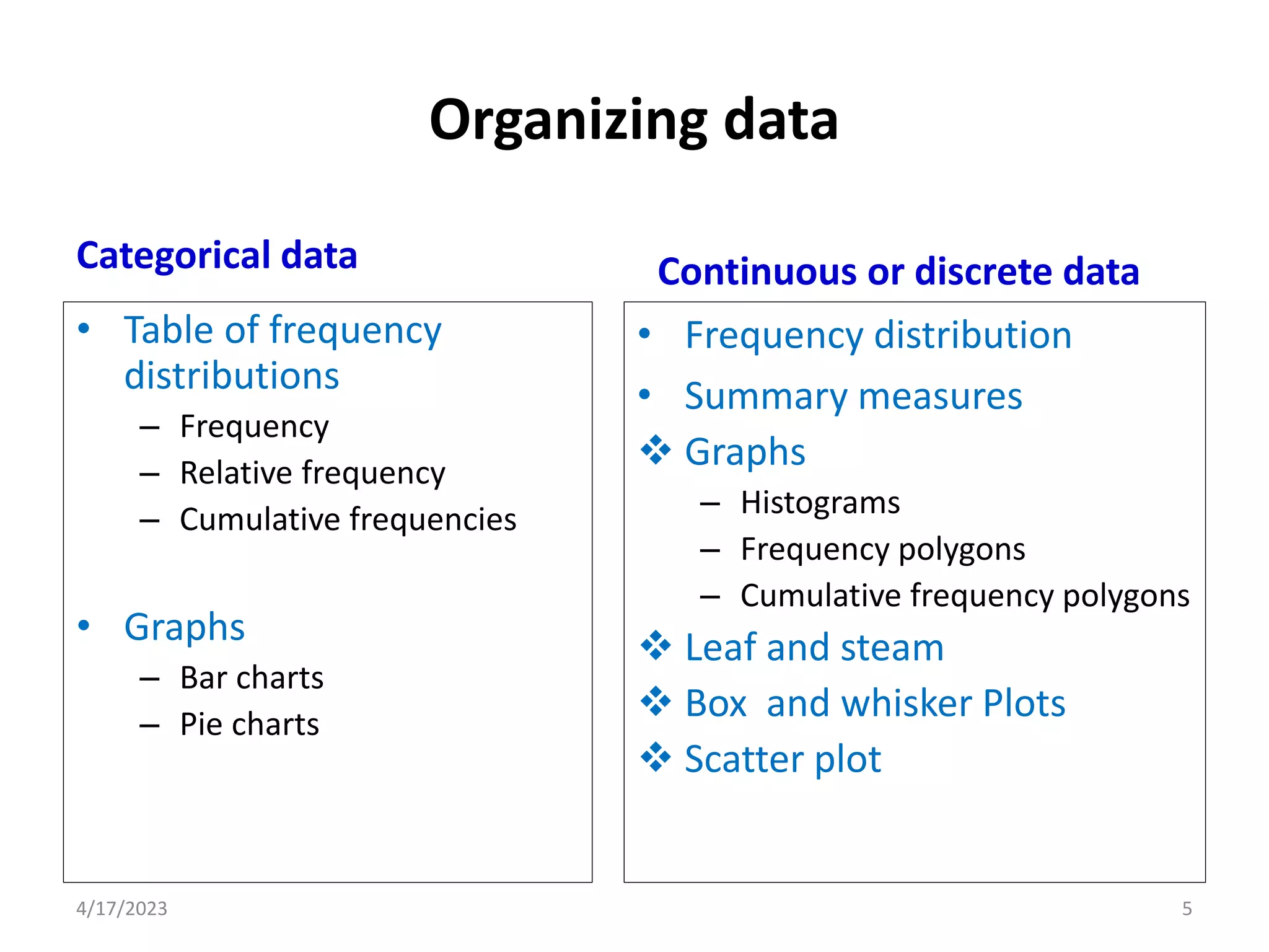
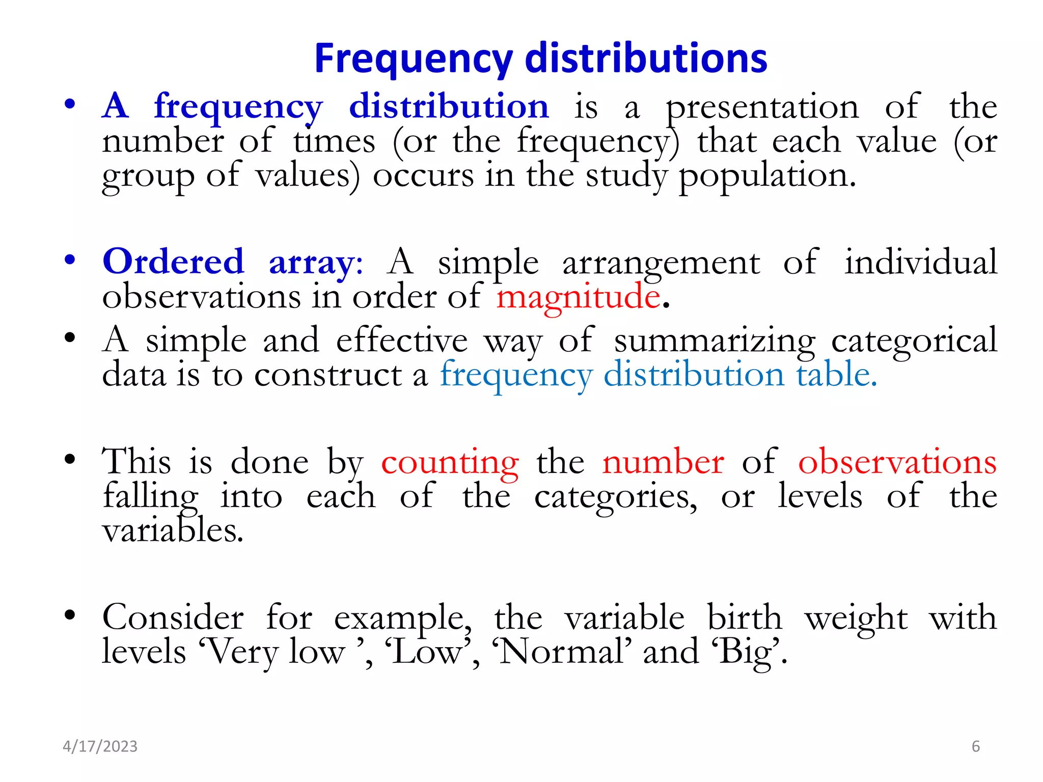
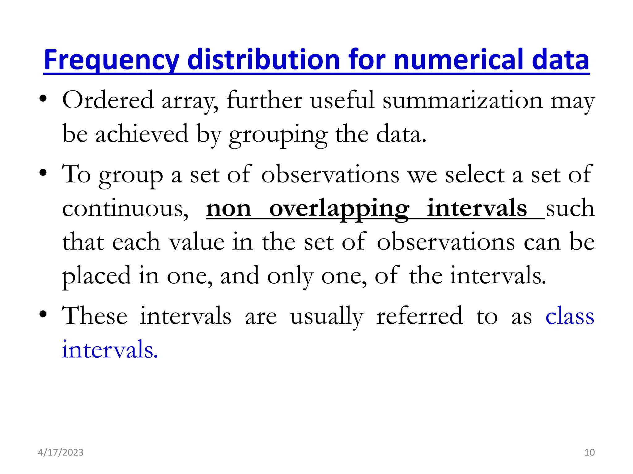
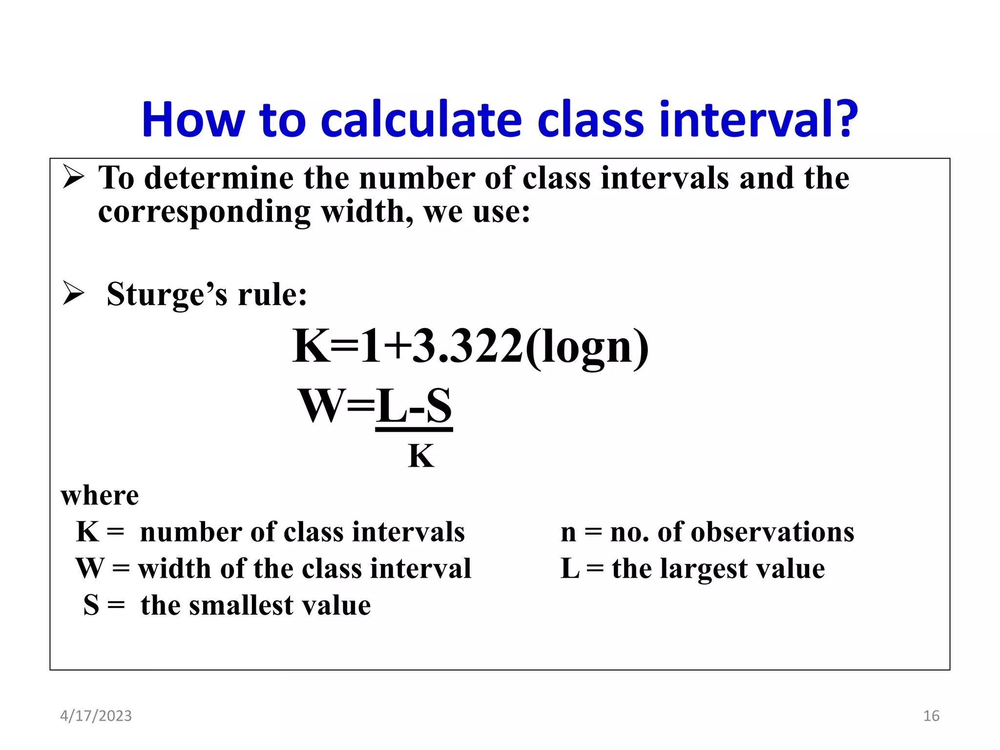
- Organizing raw data through techniques like frequency distributions and grouping. This summarizes the data in a concise way.
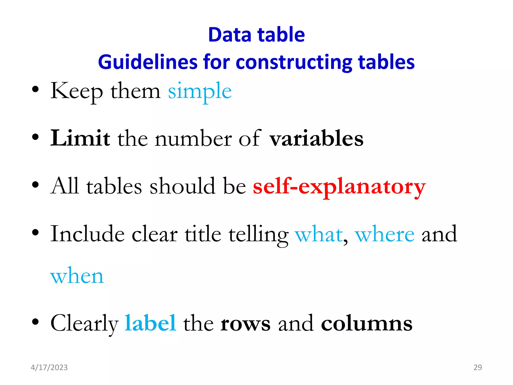
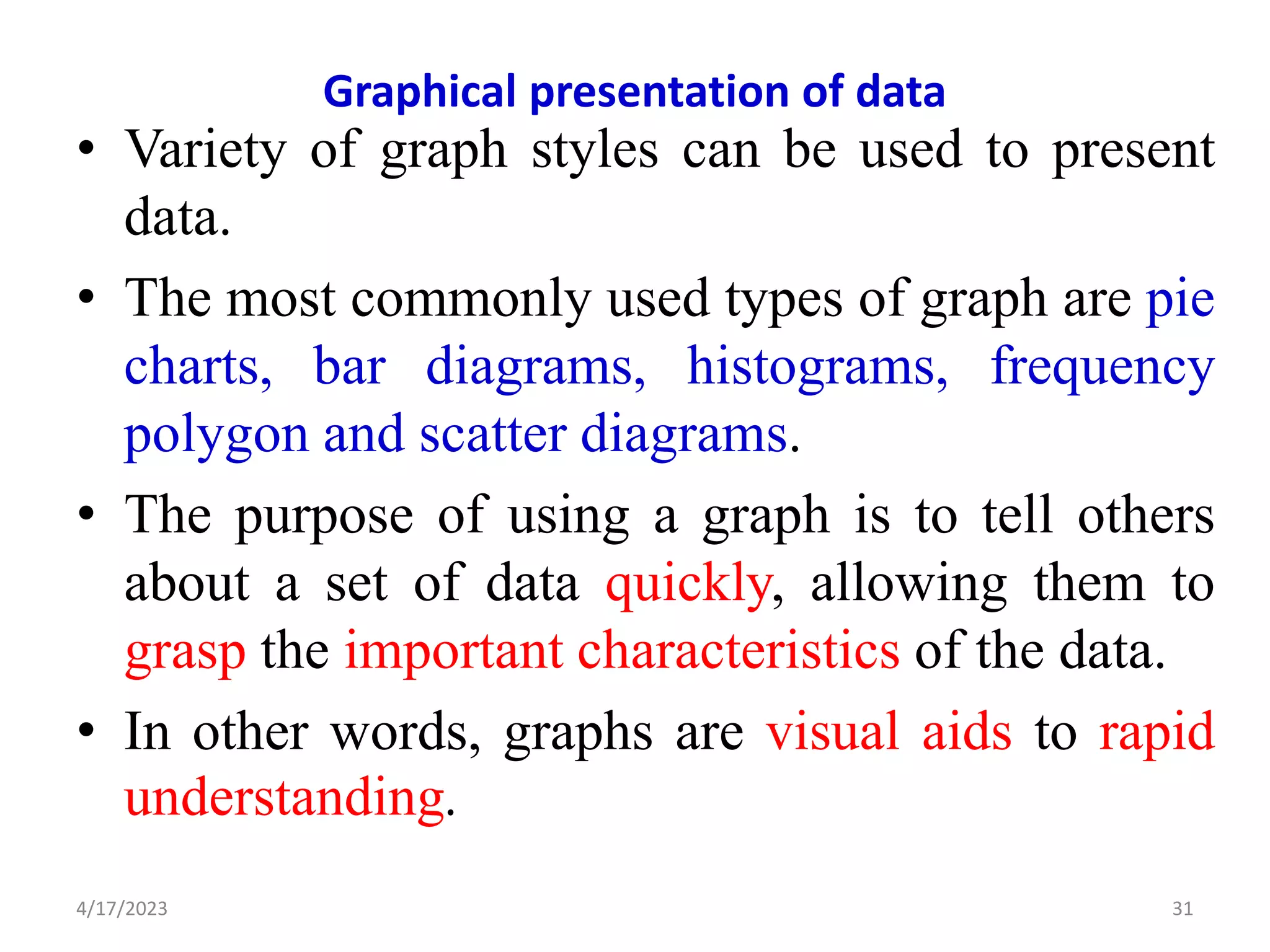
- Presenting organized data through tables and graphs. Common graphs mentioned are bar charts, pie charts, histograms, and scatter plots.
- Key aspects of data presentation like labeling, using titles, and explaining any codes or abbreviations to make the data clear and understandable.