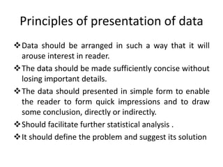
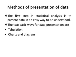
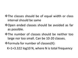
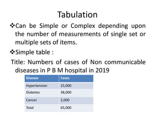
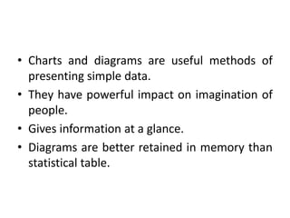
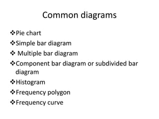
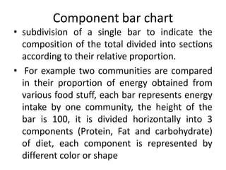
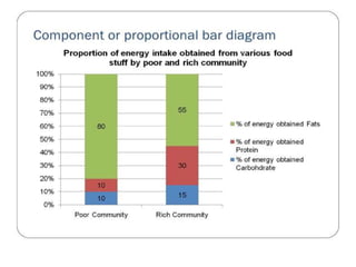
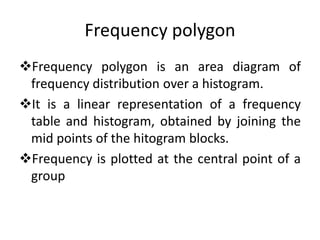
PRESENTATION OF DATA
Dr Ratti Ram Meena
MBBS, MD (Community medicine)
Principles of presentation of data
Data should be arranged in such a way that it will
arouse interest in reader.
The data should be made sufficiently concise without
losing important details.
The data should presented in simple form to enable
the reader to form quick impressions and to draw
some conclusion, directly or indirectly.
Should facilitate further statistical analysis .
It should define the problem and suggest its solution
Methods of presentation of data
The first step in statistical analysis is to
present data in an easy way to be understood.
The two basic ways for data presentation are
 Tabulation
 Charts and diagram
Rules and guidelines for tabular
presentation
Table must be numbered
Brief and self explanatory title must be given to each
table.
The heading of columns and rows must be clear,
sufficient, concise and fully defined.
The data must be presented according to size of
importance, chronologically, alphabetically or
geographically
If data includes rate or proportion, mention the
denominator.
Table should not be too large.
Figures needing comparison should be placed
as close as possible.
The classes should be fully defined, should not
lead to any ambiguity.
The classes should be exhaustive i.e. should
include all the given values.
The classes should be mutually exclusive and
non overlapping.
The classes should be of equal width or class
interval should be same
Open ended classes should be avoided as far
as possible.
The number of classes should be neither too
large nor too small. Can be 10-20 classes.
Formula for number of classes(K):
K=1+3.322 log10 N, where N is total frequency
Tabulation
Can be Simple or Complex depending upon
the number of measurements of single set or
multiple sets of items.
Simple table :
Title: Numbers of cases of Non communicable
diseases in P B M hospital in 2019
Disease Cases
Hypertension 25,000
Diabetes 38,000
Cancer 2,000
Total 65,000
Frequency distribution table with
qualitative data
• Title: Cases of Covid-19 in adults and children
in the months of July and August 2020 in P B
M Hospital
Covid-19
cases
July 2020 August 2020 Total
Adult children Adult children
Symptomatic 120 90 320 80 610
Asymptomatic 416 114 612 88 1230
Total 536 204 932 168 1840
Frequency distribution table with
quantitative data
• Systolic blood pressure level in Hypertensive
patients at the time of diagnosis
Systolic Blood pressure
(mm of Hg)
No of cases
Male Female Total
<140 14 13 27
140-160 8 6 14
>160 6 4 10
Total 28 23 51
Chart and diagram
• Graphic presentations used to illustrate and
clarify information.
• are essential in presentation of scientific data
and diagrams are complementary to
summarize these tables in an easy, attractive
and simple way.
• Charts and diagrams are useful methods of
presenting simple data.
• They have powerful impact on imagination of
people.
• Gives information at a glance.
• Diagrams are better retained in memory than
statistical table.
• However graphs cannot be substituted for
statistical table, because the graphs cannot
have mathematical treatment where as tables
can be treated mathematically.
• Whenever graphs are compared , the
difference in the scale should be noted.
• It should be remembered that a lot of details
and accuracy of original data is lost in charts
and diagrams, and if we want the real study,
we have to go back to the original data
Common diagrams
Pie chart
Simple bar diagram
 Multiple bar diagram
Component bar diagram or subdivided bar
diagram
Histogram
Frequency polygon
Frequency curve
 O give curve
 Scatter diagram
 Line diagram
Pictogram
 Statistical maps
Bar diagram
Widely used, easy to prepare tool for
comparing categories of mutually exclusive
discrete data.
Different categories are indicated on one axis
and frequency of data in each category on
another axis.
 Length of the bar indicate the magnitude of
the frequency of the character to be
compared.
 Spacing between the various bar should be
equal to half of the width of the bar.
3 types of bar diagram:
• Simple Multiple
• compound Component
• proportional
Simple Bar charts
0
200
400
600
800
1000
1200
2015-16 2016-17 2017-18 2018-19 2019-20
Year wise no of patients admitted in ENT hospital
Multiple diagram
• Each observation has more than one value,
represented by a group of bars.
• Percentage of males and females in different
countries, percentage of deaths from heart
diseases in old and young age, mode of
delivery (cesarean or vaginal) in different
female age groups.
Multiple or Compound diagram
0
100
200
300
400
500
600
2015-16 2016-17 2017-18 2018-19 2019-20
Year wise no of patients admitted in ENT hospital
Male
female
Component bar chart
• subdivision of a single bar to indicate the
composition of the total divided into sections
according to their relative proportion.
• For example two communities are compared
in their proportion of energy obtained from
various food stuff, each bar represents energy
intake by one community, the height of the
bar is 100, it is divided horizontally into 3
components (Protein, Fat and carbohydrate)
of diet, each component is represented by
different color or shape
Histogram
Used for Quantitative, Continuous, Variables.
It is used to present variables which have no
gaps e.g age, weight, height, blood pressure,
blood sugar etc.
 It consist of a series of blocks.
The class intervals are given along horizontal
axis and the frequency along the vertical axis.
Frequency polygon
Frequency polygon is an area diagram of
frequency distribution over a histogram.
It is a linear representation of a frequency
table and histogram, obtained by joining the
mid points of the hitogram blocks.
Frequency is plotted at the central point of a
group
Cumulative frequency diagram or
O’give
Here the frequency of data in each category
represents the sum of data from the category
and the preceding categories.
Cumulative frequencies are plotted opposite
the group limits of the variable.
These points are joined by smooth free hand
curve to get a cumulative frequency diagram
or Ogive.
Scatter/ dot diagram
Also called as Correlation diagram ,it is useful to
represent the relationship between two numeric
measurements, each observation being represented
by a point corresponding to its value on each axis.
In negative correlation, the points will be scattered in
downward direction, meaning that the relation
between the two studied measurements is
controversial i.e. if one measure increases the other
decreases While in positive correlation, the points
will be scattered in upward direction.
Presentation of data

Presentation of data

  • 1.
    PRESENTATION OF DATA DrRatti Ram Meena MBBS, MD (Community medicine)
  • 2.
    Principles of presentationof data Data should be arranged in such a way that it will arouse interest in reader. The data should be made sufficiently concise without losing important details. The data should presented in simple form to enable the reader to form quick impressions and to draw some conclusion, directly or indirectly. Should facilitate further statistical analysis . It should define the problem and suggest its solution
  • 3.
    Methods of presentationof data The first step in statistical analysis is to present data in an easy way to be understood. The two basic ways for data presentation are  Tabulation  Charts and diagram
  • 4.
    Rules and guidelinesfor tabular presentation Table must be numbered Brief and self explanatory title must be given to each table. The heading of columns and rows must be clear, sufficient, concise and fully defined. The data must be presented according to size of importance, chronologically, alphabetically or geographically If data includes rate or proportion, mention the denominator.
  • 5.
    Table should notbe too large. Figures needing comparison should be placed as close as possible. The classes should be fully defined, should not lead to any ambiguity. The classes should be exhaustive i.e. should include all the given values. The classes should be mutually exclusive and non overlapping.
  • 6.
    The classes shouldbe of equal width or class interval should be same Open ended classes should be avoided as far as possible. The number of classes should be neither too large nor too small. Can be 10-20 classes. Formula for number of classes(K): K=1+3.322 log10 N, where N is total frequency
  • 7.
    Tabulation Can be Simpleor Complex depending upon the number of measurements of single set or multiple sets of items. Simple table : Title: Numbers of cases of Non communicable diseases in P B M hospital in 2019 Disease Cases Hypertension 25,000 Diabetes 38,000 Cancer 2,000 Total 65,000
  • 8.
    Frequency distribution tablewith qualitative data • Title: Cases of Covid-19 in adults and children in the months of July and August 2020 in P B M Hospital Covid-19 cases July 2020 August 2020 Total Adult children Adult children Symptomatic 120 90 320 80 610 Asymptomatic 416 114 612 88 1230 Total 536 204 932 168 1840
  • 9.
    Frequency distribution tablewith quantitative data • Systolic blood pressure level in Hypertensive patients at the time of diagnosis Systolic Blood pressure (mm of Hg) No of cases Male Female Total <140 14 13 27 140-160 8 6 14 >160 6 4 10 Total 28 23 51
  • 10.
    Chart and diagram •Graphic presentations used to illustrate and clarify information. • are essential in presentation of scientific data and diagrams are complementary to summarize these tables in an easy, attractive and simple way.
  • 11.
    • Charts anddiagrams are useful methods of presenting simple data. • They have powerful impact on imagination of people. • Gives information at a glance. • Diagrams are better retained in memory than statistical table.
  • 12.
    • However graphscannot be substituted for statistical table, because the graphs cannot have mathematical treatment where as tables can be treated mathematically. • Whenever graphs are compared , the difference in the scale should be noted. • It should be remembered that a lot of details and accuracy of original data is lost in charts and diagrams, and if we want the real study, we have to go back to the original data
  • 13.
    Common diagrams Pie chart Simplebar diagram  Multiple bar diagram Component bar diagram or subdivided bar diagram Histogram Frequency polygon Frequency curve
  • 14.
     O givecurve  Scatter diagram  Line diagram Pictogram  Statistical maps
  • 15.
    Bar diagram Widely used,easy to prepare tool for comparing categories of mutually exclusive discrete data. Different categories are indicated on one axis and frequency of data in each category on another axis.  Length of the bar indicate the magnitude of the frequency of the character to be compared.
  • 16.
     Spacing betweenthe various bar should be equal to half of the width of the bar. 3 types of bar diagram: • Simple Multiple • compound Component • proportional
  • 17.
    Simple Bar charts 0 200 400 600 800 1000 1200 2015-162016-17 2017-18 2018-19 2019-20 Year wise no of patients admitted in ENT hospital
  • 18.
    Multiple diagram • Eachobservation has more than one value, represented by a group of bars. • Percentage of males and females in different countries, percentage of deaths from heart diseases in old and young age, mode of delivery (cesarean or vaginal) in different female age groups.
  • 19.
    Multiple or Compounddiagram 0 100 200 300 400 500 600 2015-16 2016-17 2017-18 2018-19 2019-20 Year wise no of patients admitted in ENT hospital Male female
  • 20.
    Component bar chart •subdivision of a single bar to indicate the composition of the total divided into sections according to their relative proportion. • For example two communities are compared in their proportion of energy obtained from various food stuff, each bar represents energy intake by one community, the height of the bar is 100, it is divided horizontally into 3 components (Protein, Fat and carbohydrate) of diet, each component is represented by different color or shape
  • 22.
    Histogram Used for Quantitative,Continuous, Variables. It is used to present variables which have no gaps e.g age, weight, height, blood pressure, blood sugar etc.  It consist of a series of blocks. The class intervals are given along horizontal axis and the frequency along the vertical axis.
  • 24.
    Frequency polygon Frequency polygonis an area diagram of frequency distribution over a histogram. It is a linear representation of a frequency table and histogram, obtained by joining the mid points of the hitogram blocks. Frequency is plotted at the central point of a group
  • 26.
    Cumulative frequency diagramor O’give Here the frequency of data in each category represents the sum of data from the category and the preceding categories. Cumulative frequencies are plotted opposite the group limits of the variable. These points are joined by smooth free hand curve to get a cumulative frequency diagram or Ogive.
  • 28.
    Scatter/ dot diagram Alsocalled as Correlation diagram ,it is useful to represent the relationship between two numeric measurements, each observation being represented by a point corresponding to its value on each axis. In negative correlation, the points will be scattered in downward direction, meaning that the relation between the two studied measurements is controversial i.e. if one measure increases the other decreases While in positive correlation, the points will be scattered in upward direction.