*
4
➢ The dataare presented in paragraph form.
➢ This kind of representation is useful when we are looking to supplement qualitative
statements
with some data.
➢ For this purpose, the data should not be voluminously represented in tables or diagrams.
It just
has to be a statement that serves as fitting evidence to our qualitative evidence and helps
the reader
to get an idea of the scale of a phenomenon.
➢ If the data under consideration is large then the text matter increases substantially. As a
result, the
reading process becomes more intensive, time-consuming and cumbersome
5.
*
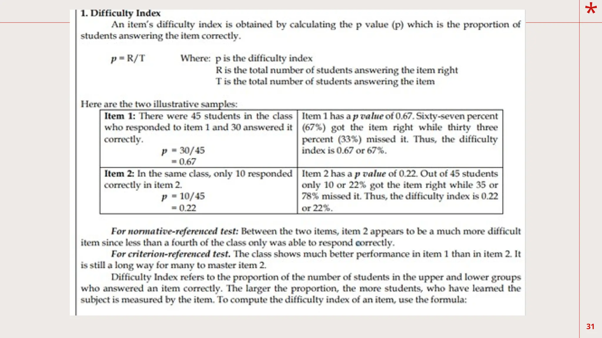
5
Example:
There are about540, 000 Filipinos who
joined the ranks of job seekers.
According to government data, the
number of jobless Filipinos last July
reached 4.35 million, an increase of
more than half-a-million Filipinos from
the
same period last year. The
unemployment rate last July was 12.7%
compared to 11.2% of July last year.
*
➢ The dataare presented in tables to
show relation between the column and
row quantities.
Tables are useful to highlight precise
➢
numerical values; proportions or trends
are better illustrated
with charts or graphics.
Tables summarize large amounts of
➢
related data clearly and allow
comparison to be made among
groups of variables.
Generally, well-constructed tables
➢
should be self-explanatory with four
main parts: title, columns,
rows and footnotes
8.
*
8
➢ A tablefacilitates representation of even large amounts
of data in an attractive, easy to read and
organized manner. The data is organized in rows and
columns.
➢ This is one of the most widely used forms of
presentation of data since data tables are easy to
construct and read.
➢ The advantages of tabular presentation include: ease of
representation; ease of analysis; helps in
comparison, and economical.
➢ Frequency distribution is the most common tabular
presentation.
9.
*
9
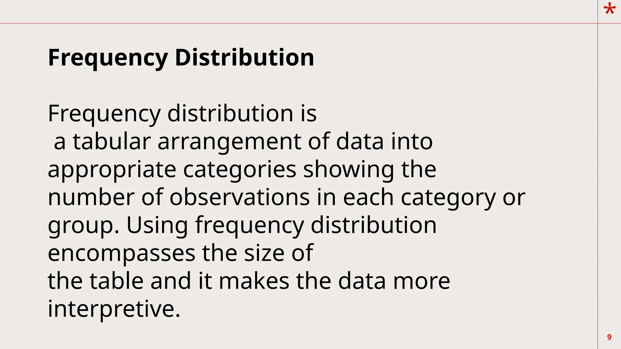
Frequency Distribution
Frequency distributionis
a tabular arrangement of data into
appropriate categories showing the
number of observations in each category or
group. Using frequency distribution
encompasses the size of
the table and it makes the data more
interpretive.
10.
*
10
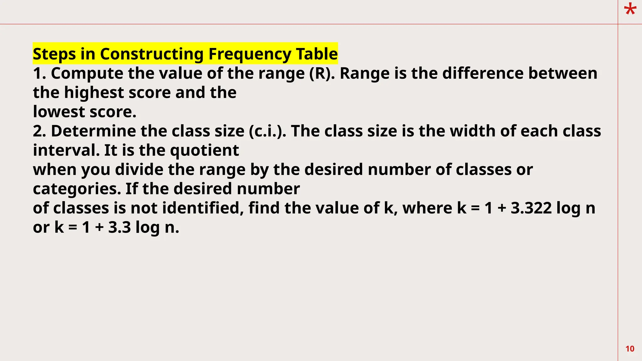
Steps in ConstructingFrequency Table
1. Compute the value of the range (R). Range is the difference between
the highest score and the
lowest score.
2. Determine the class size (c.i.). The class size is the width of each class
interval. It is the quotient
when you divide the range by the desired number of classes or
categories. If the desired number
of classes is not identified, find the value of k, where k = 1 + 3.322 log n
or k = 1 + 3.3 log n.
11.
*
11
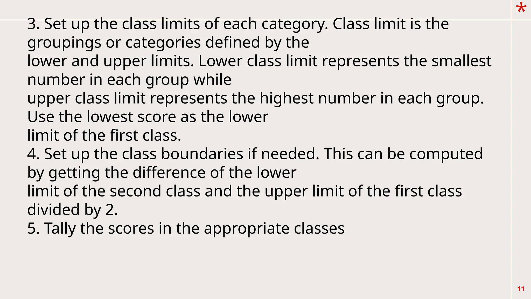
3. Set upthe class limits of each category. Class limit is the
groupings or categories defined by the
lower and upper limits. Lower class limit represents the smallest
number in each group while
upper class limit represents the highest number in each group.
Use the lowest score as the lower
limit of the first class.
4. Set up the class boundaries if needed. This can be computed
by getting the difference of the lower
limit of the second class and the upper limit of the first class
divided by 2.
5. Tally the scores in the appropriate classes
12.
*
12
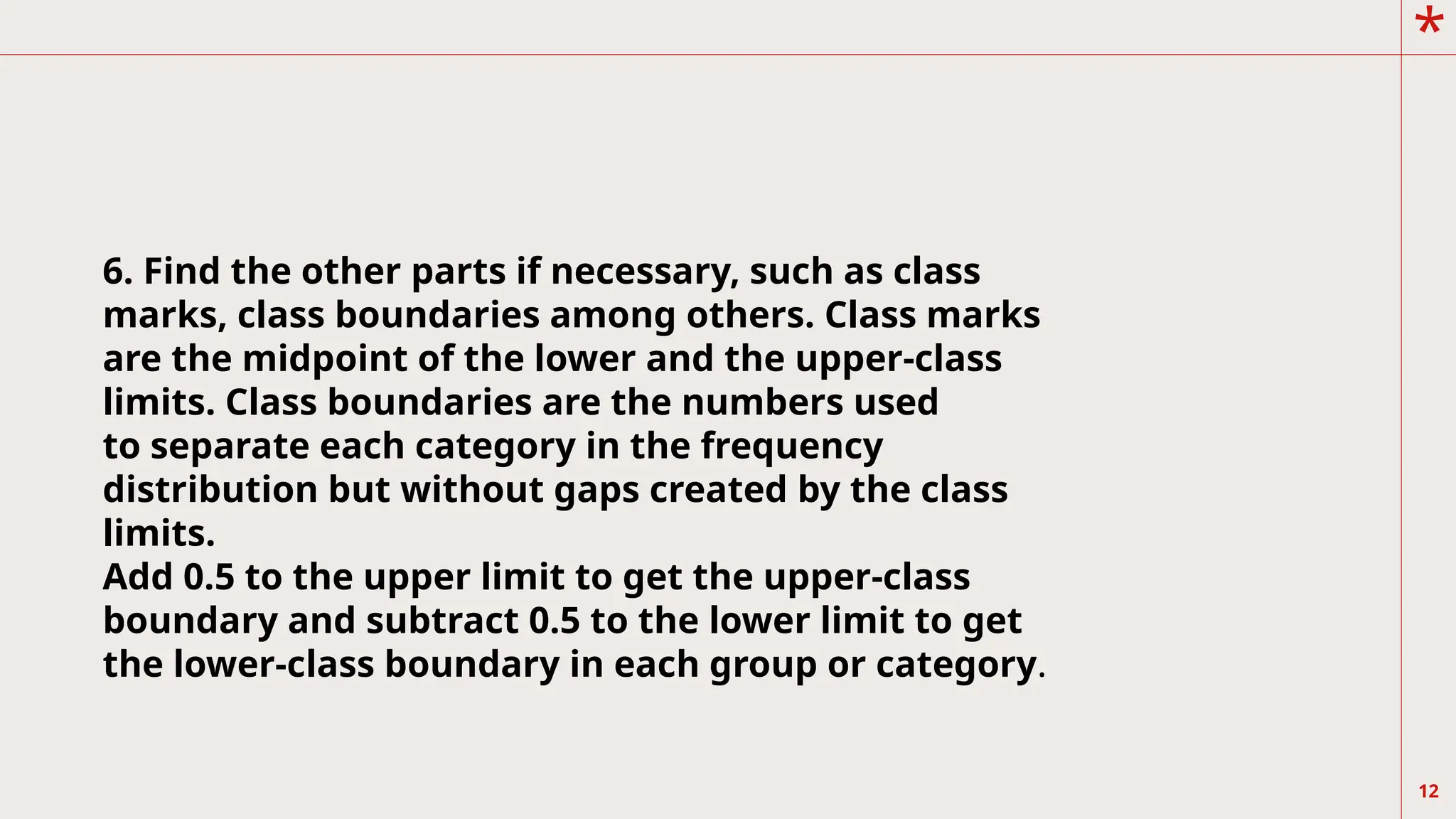
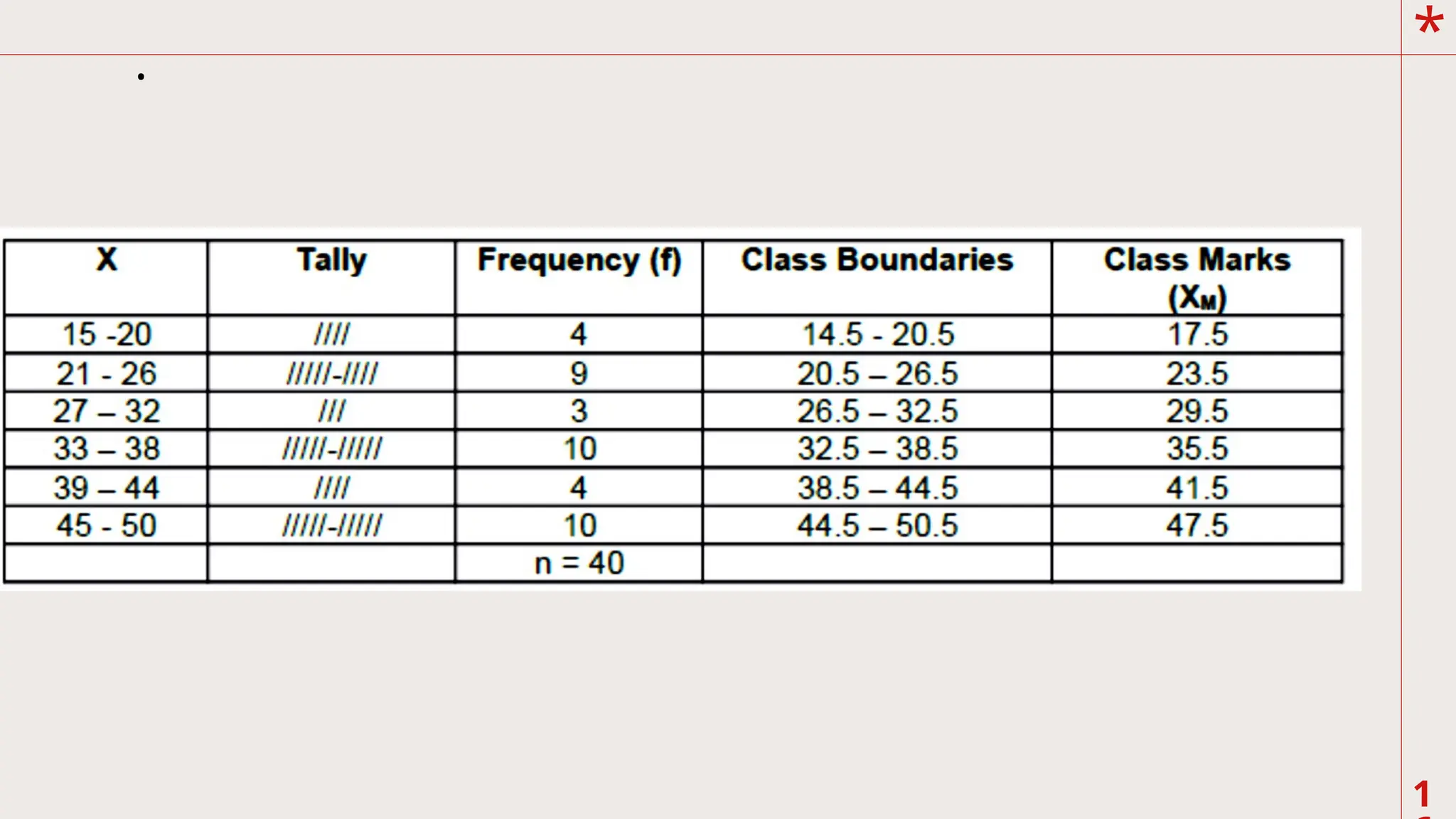
6. Find theother parts if necessary, such as class
marks, class boundaries among others. Class marks
are the midpoint of the lower and the upper-class
limits. Class boundaries are the numbers used
to separate each category in the frequency
distribution but without gaps created by the class
limits.
Add 0.5 to the upper limit to get the upper-class
boundary and subtract 0.5 to the lower limit to get
the lower-class boundary in each group or category.
13.
*
13
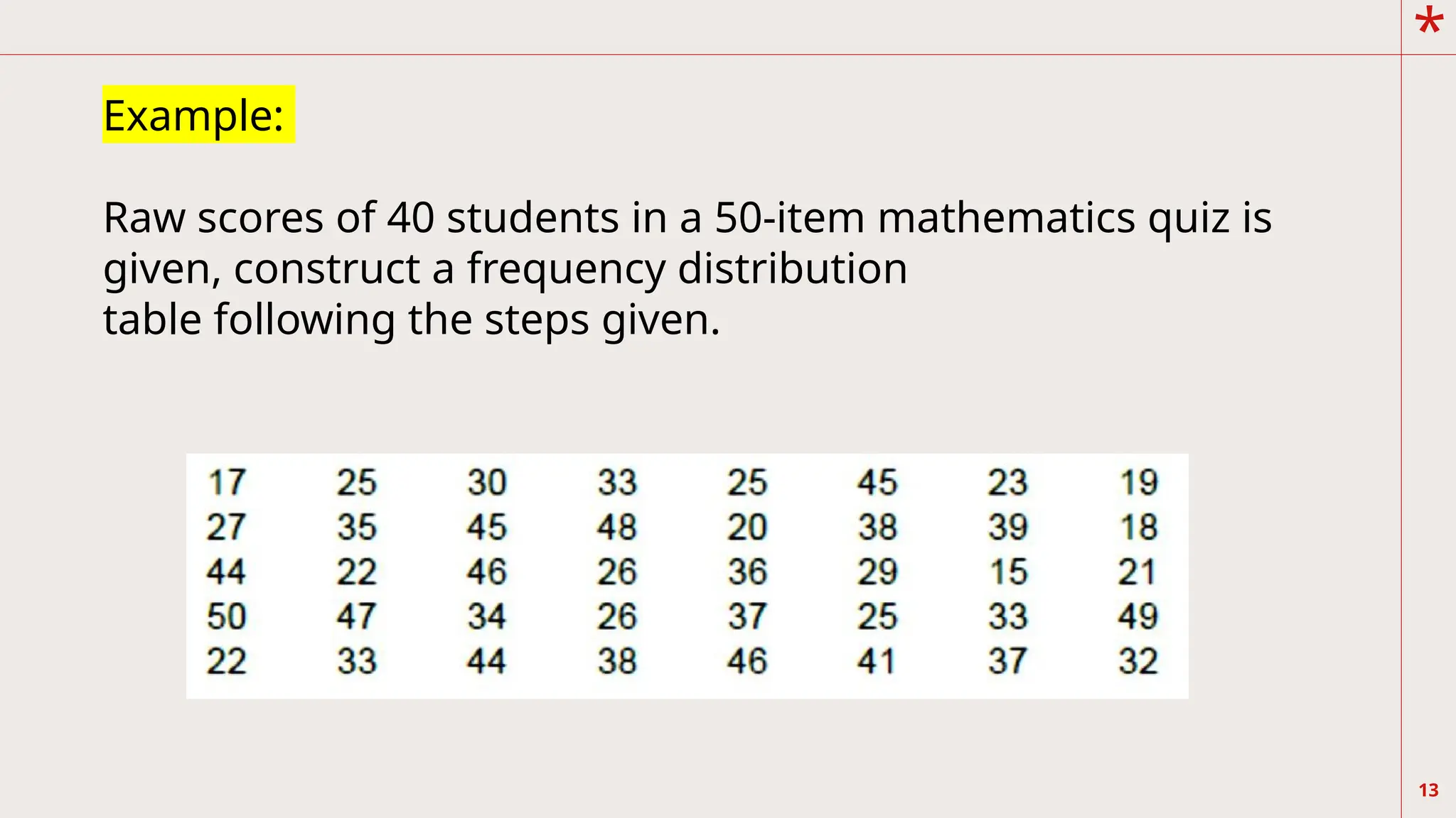
Example:
Raw scores of40 students in a 50-item mathematics quiz is
given, construct a frequency distribution
table following the steps given.
14.
*
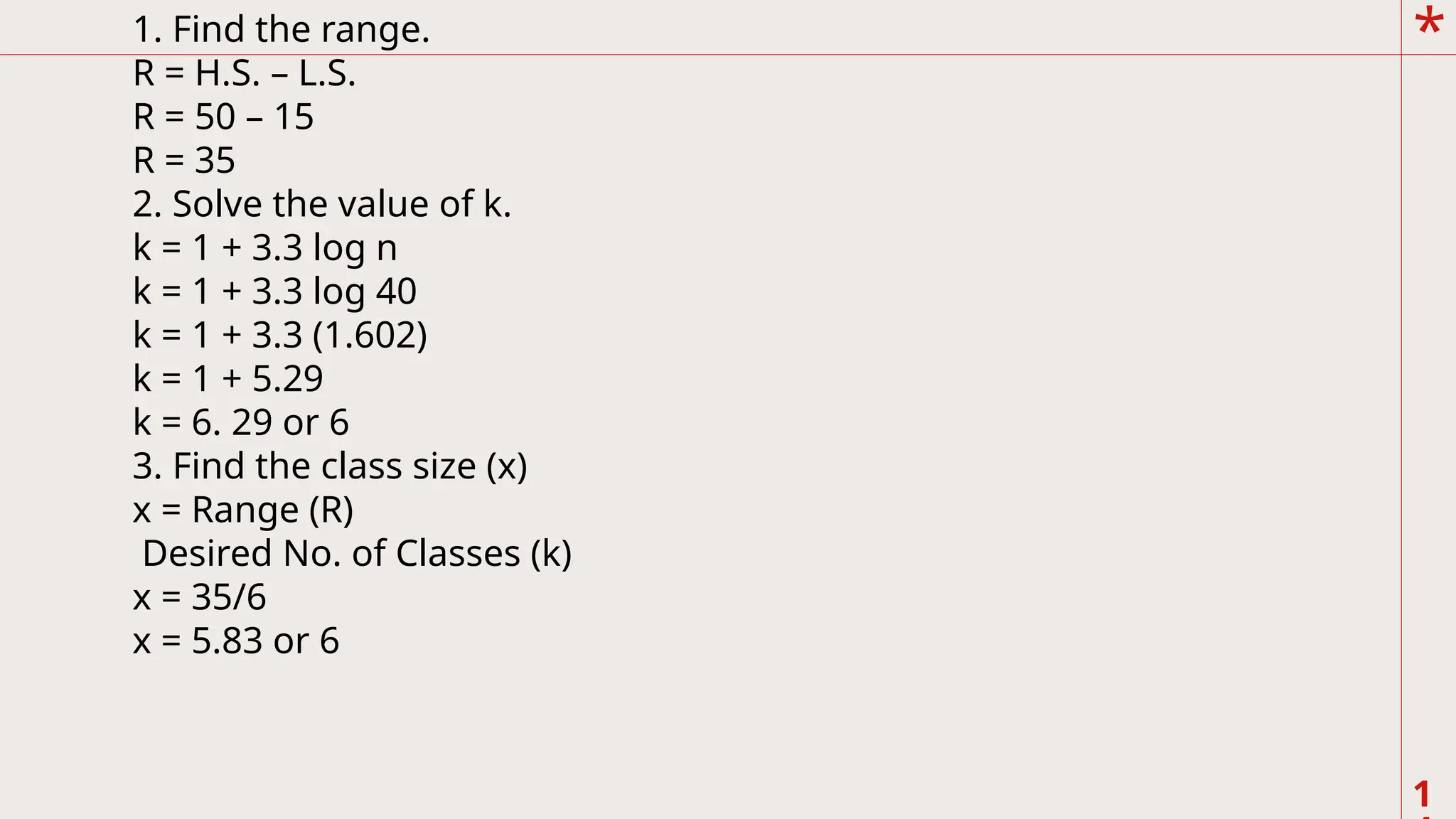
1
1. Find therange.
R = H.S. – L.S.
R = 50 – 15
R = 35
2. Solve the value of k.
k = 1 + 3.3 log n
k = 1 + 3.3 log 40
k = 1 + 3.3 (1.602)
k = 1 + 5.29
k = 6. 29 or 6
3. Find the class size (x)
x = Range (R)
Desired No. of Classes (k)
x = 35/6
x = 5.83 or 6
15.
*
1
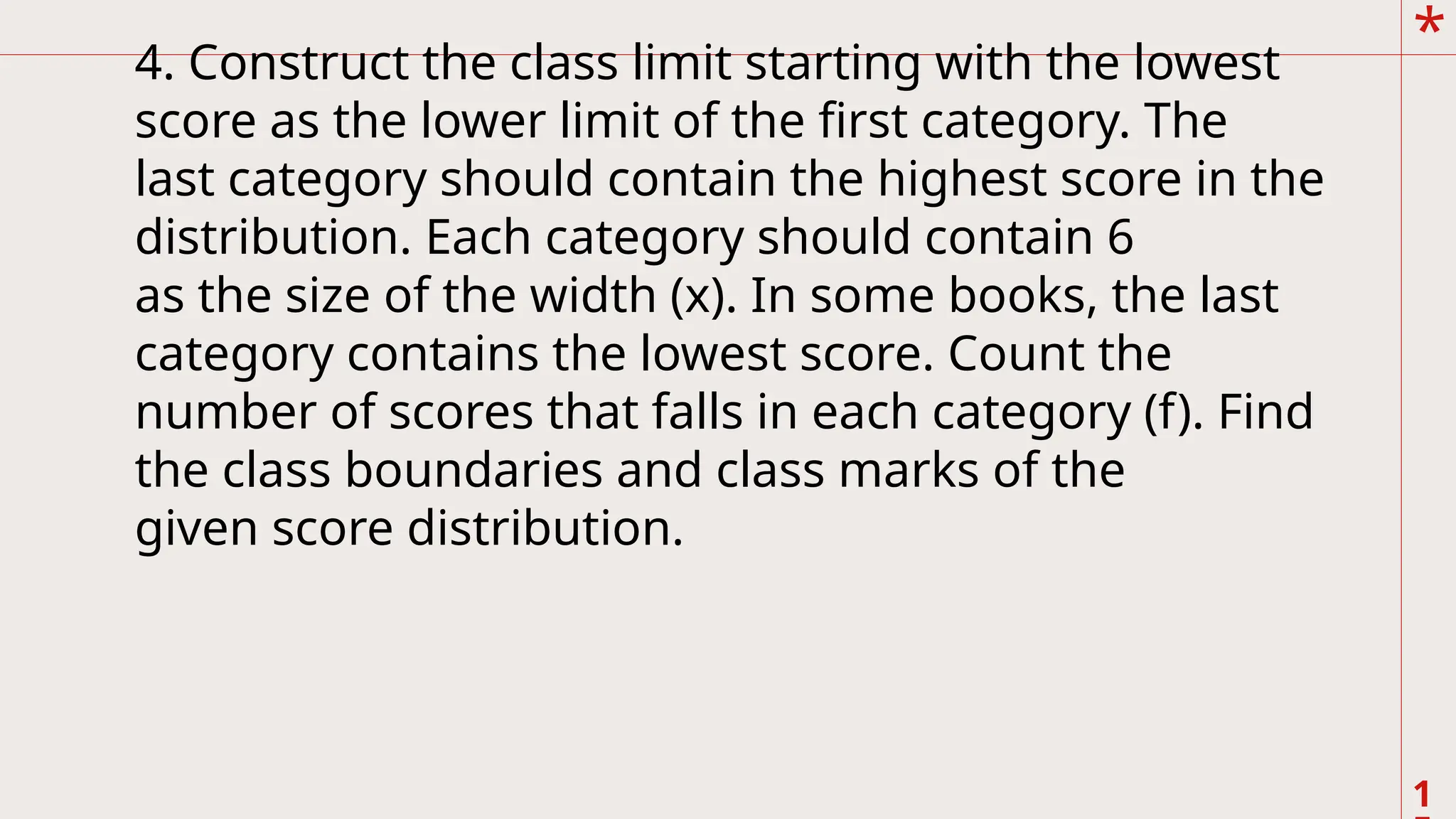
4. Construct theclass limit starting with the lowest
score as the lower limit of the first category. The
last category should contain the highest score in the
distribution. Each category should contain 6
as the size of the width (x). In some books, the last
category contains the lowest score. Count the
number of scores that falls in each category (f). Find
the class boundaries and class marks of the
given score distribution.
*
1
.
aphical Presentation
Graphics areparticularly good for demonstrating a trend in the data that would
t be apparent
tables.
t provides visual emphasis and avoids lengthy text description.
The data are presented in visual form.
t is a picture that displays numerical information
However, presenting numerical data in the form of graphs will lose details of its
ecise values
ich tables are able to provide.
The scores expressed in frequency distribution can be meaningful and easier to
erpret when they
e graphed.
There are methods of graphing frequency distribution: bar graph or histogram
d frequency
ygon and smooth curve.
18.
*
1
.
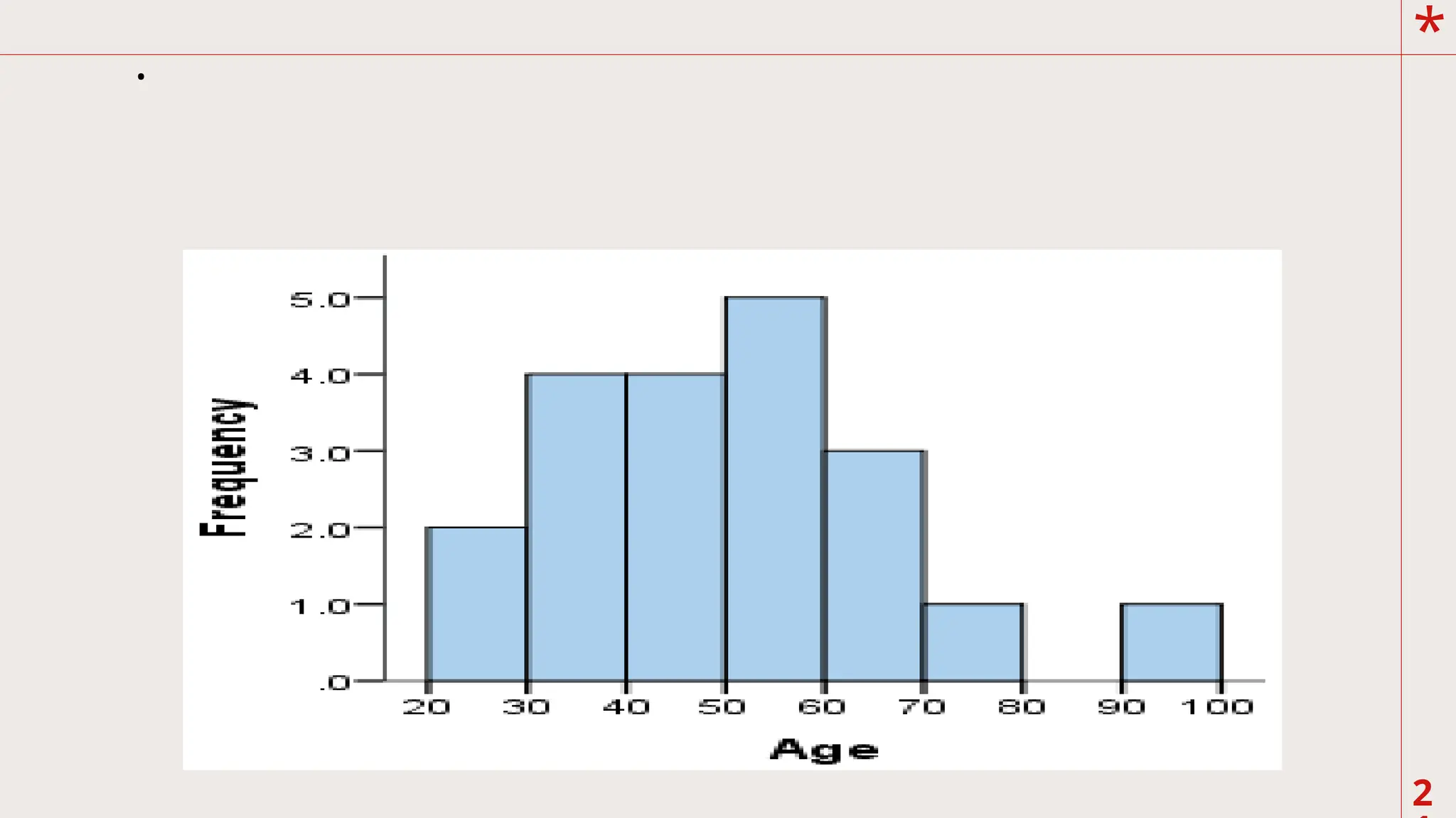
A. Histogram
It consistsof a set of rectangles having bases on
the horizontal axis which centers at the class
marks.
The base widths correspond to the class size and
the
height of the rectangles corresponds to the class
frequencies. Histogram is best used for graphical
representation of discrete data or non-continuous.
19.
*
1
.
A. Histogram
It consistsof a set of rectangles having bases on
the horizontal axis which centers at the class
marks.
The base widths correspond to the class size and
the
height of the rectangles corresponds to the class
frequencies. Histogram is best used for graphical
representation of discrete data or non-continuous.
20.
*
2
.
A. Histogram
It consistsof a set of rectangles having bases on
the horizontal axis which centers at the class
marks.
The base widths correspond to the class size and
the
height of the rectangles corresponds to the class
frequencies. Histogram is best used for graphical
representation of discrete data or non-continuous.
*
2
.
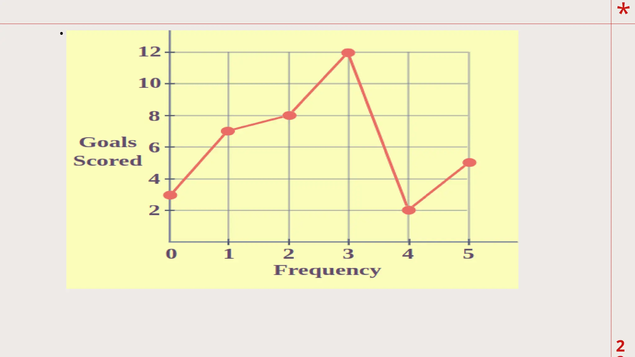
B. Frequency Polygon
Itis constructed by plotting the class marks
against the class frequencies. The horizontal (x)
axis corresponds to the class marks and the vertical
(y) axis corresponds to the class frequencies.
Connect the points consecutively using a straight
line. Frequency polygon is best used in
representing continuous data such as scores of
students in a given test
24.
*
2
.
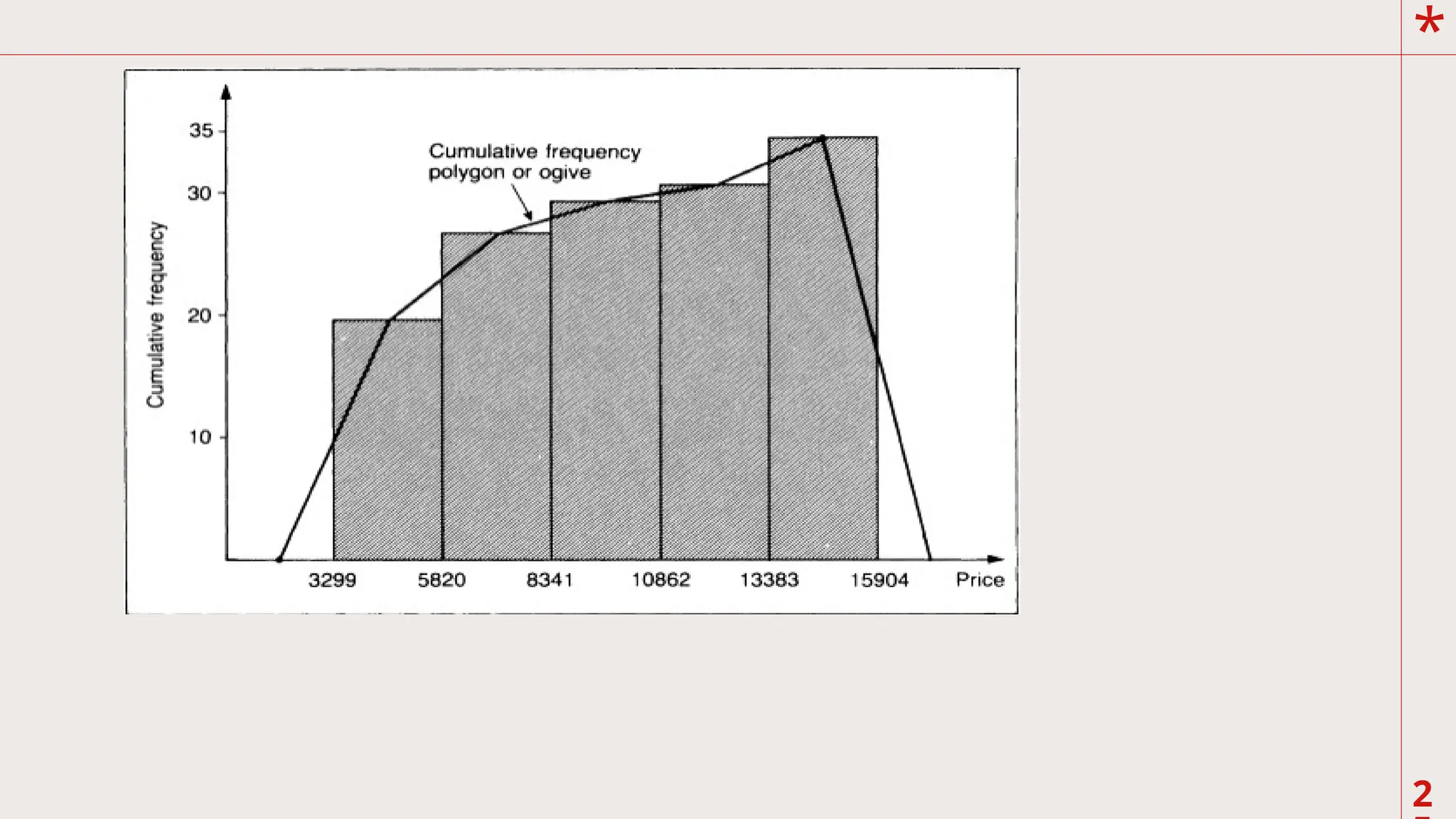
C. Cumulative Frequencypolygon
This graph is quite different from a frequency
polygon because the cumulative frequencies are
plotted. In addition, you plot the point above the exact
limits of the intervals. As such, a cumulative polygon
gives a picture of the number of observations that fall
below a certain score instead of the frequency within a
class interval. The cumulative frequency polygon are
useful to obtain a number of summary measures. The
graph display ogive (pronounced as “o jive”) curves
*
2
.
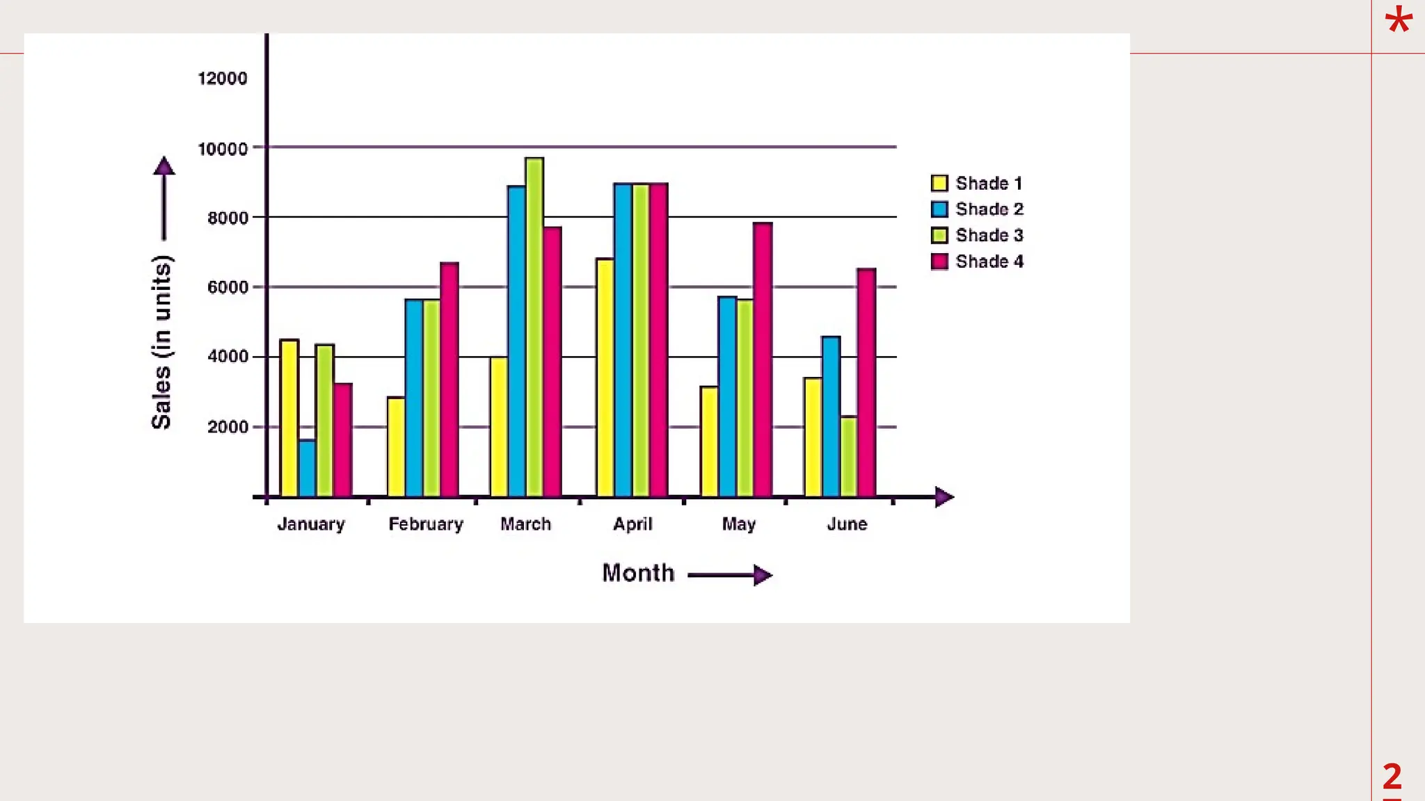
D. Bar Graph
Thisgraph is often used to represent
frequencies in categories of a qualitative variable.
It looks very similar to a histogram, constructed
in the same manner, but spaces are placed in
between the consecutive bars. The columns
represent the categories and the height of each bar
as in a histogram represents the frequency. If
experimental data are graphed, the independent
variable in categories is usually plotted on the xaxis, while the
dependent variable is the test score
on the y-axis. However, since the variable in the
horizontal or x-axis is categorical, bar graphs can
be presented horizontally. Bar graphs are very
useful in comparison of test performance of
groups categorized in two or more variables.
*
29
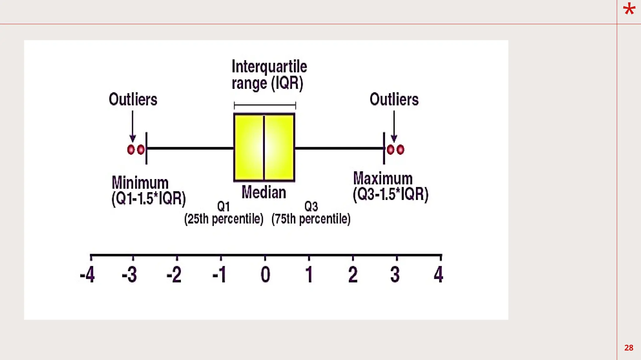
E. Box-and-Whisker Plots
Thisis a very useful graph depicting
the distribution of test scores through their
quartiles. The first quartile, Q1 is the point in
the test scale below, which is 25% of the scores
lie. The second quartile is the median, which
defines the upper 50% and lower 50% of the
scores. The third quartile is the point above
which 25% of the scores lie.
30.
*
30
F. Pie Graph
Onecommonly used method to represent categorical
data is the use of circle graph. You have learned in basic
mathematics that there are 3600 in a full circle. As such, the
categories can be represented by the slices of the circle that
appear like a pie; thus, the name pie graph. The size of the
pie
is determined by the percentage of students who belong in
each
category
*
33
What are thevariations on the shapes of frequency distribution?
A frequency distribution is an arrangement of a set of observations. These
observations in the field
of education or other sciences are empirical data that illustrates situations
in the real world. Let us
remember that in general (in statistics) a distribution refers to the way
data collected is presented (a graphic
representation of a data set), in other words, a distribution is the way a
data set has been arranged to show
the spread of its values: the range the values have, how dispersed are they
from each other, or close, etc.
34.
*
Usually, a distributionis either a frequency
distribution or a probability distribution, and the
type
of distribution depends on the basis of the
arrangement (the basis taken to graph or depict
the data in any
way). While a frequency distribution depicts the
data based on the specific outcomes obtained
from the
study or experiment, the probability distribution
will base its depiction on the chances of each
possible
outcome to happen. Please study the figures
below. 34
*
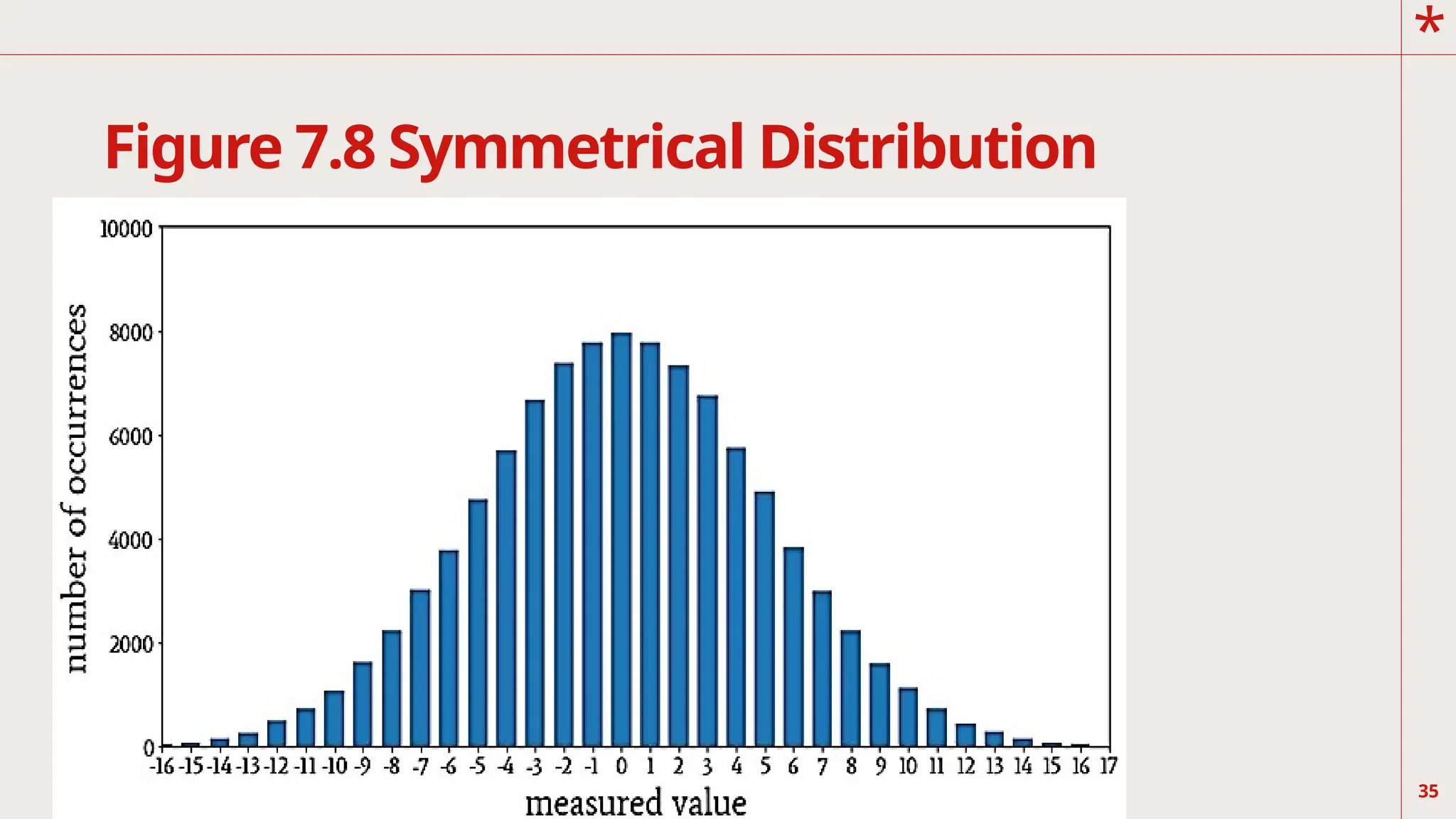
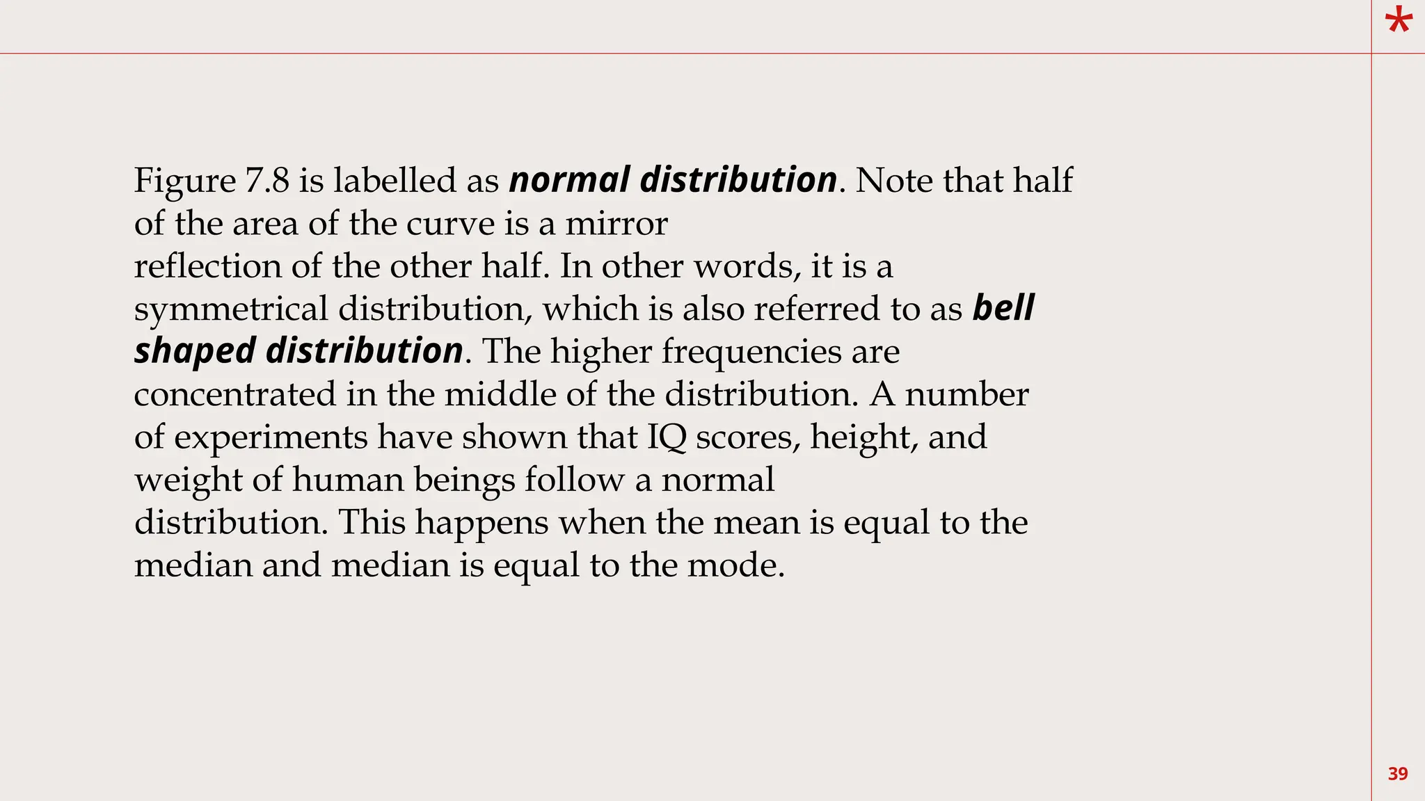
39
Figure 7.8 islabelled as normal distribution. Note that half
of the area of the curve is a mirror
reflection of the other half. In other words, it is a
symmetrical distribution, which is also referred to as bell
shaped distribution. The higher frequencies are
concentrated in the middle of the distribution. A number
of experiments have shown that IQ scores, height, and
weight of human beings follow a normal
distribution. This happens when the mean is equal to the
median and median is equal to the mode.
40.
*
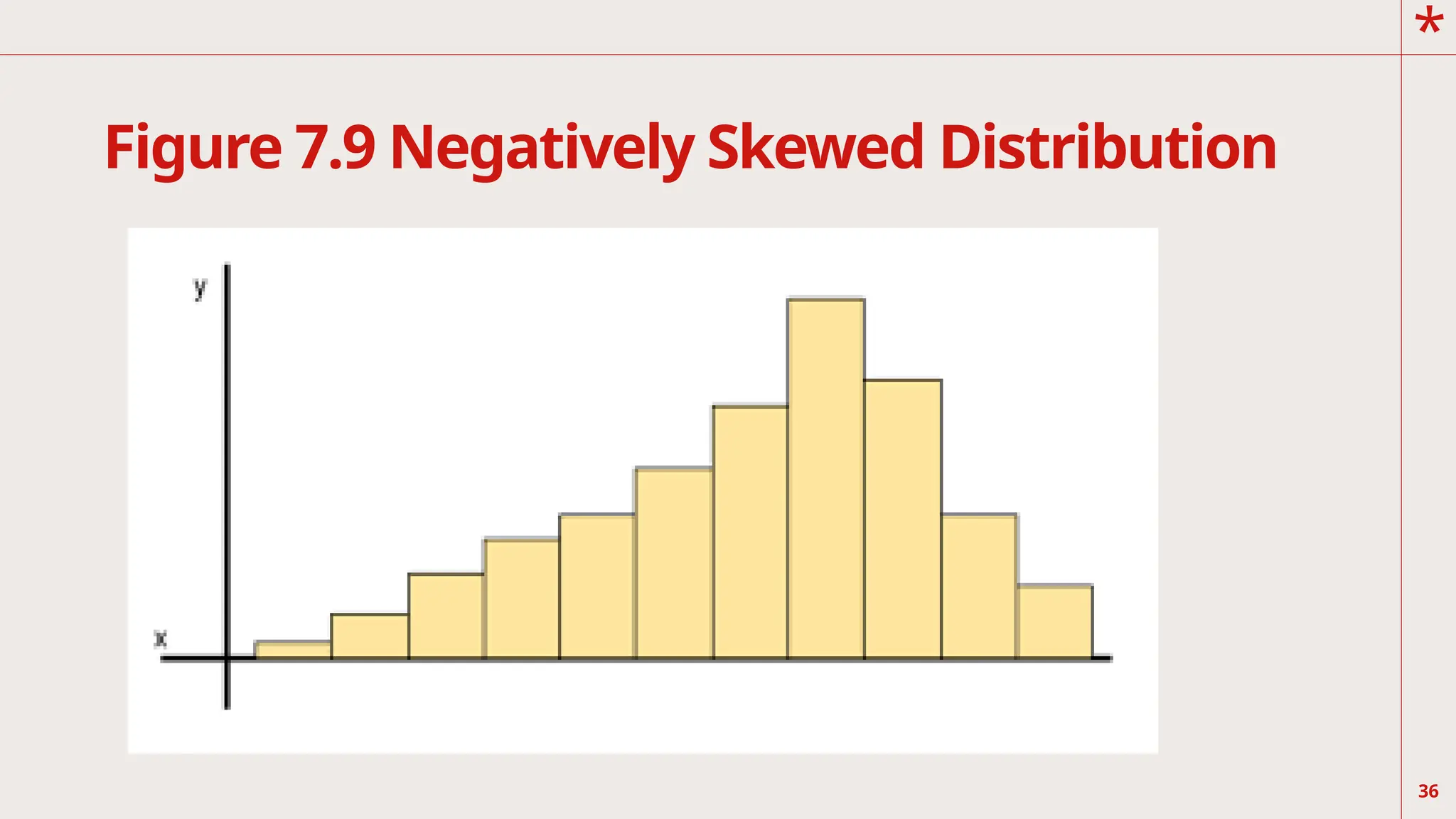
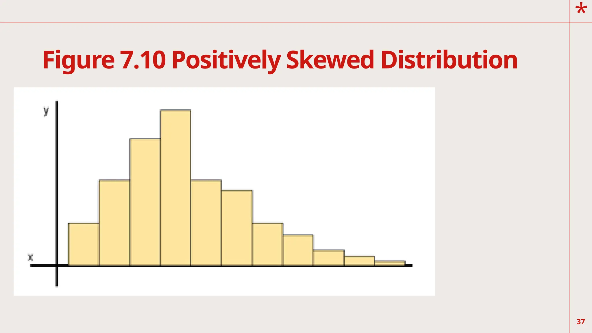
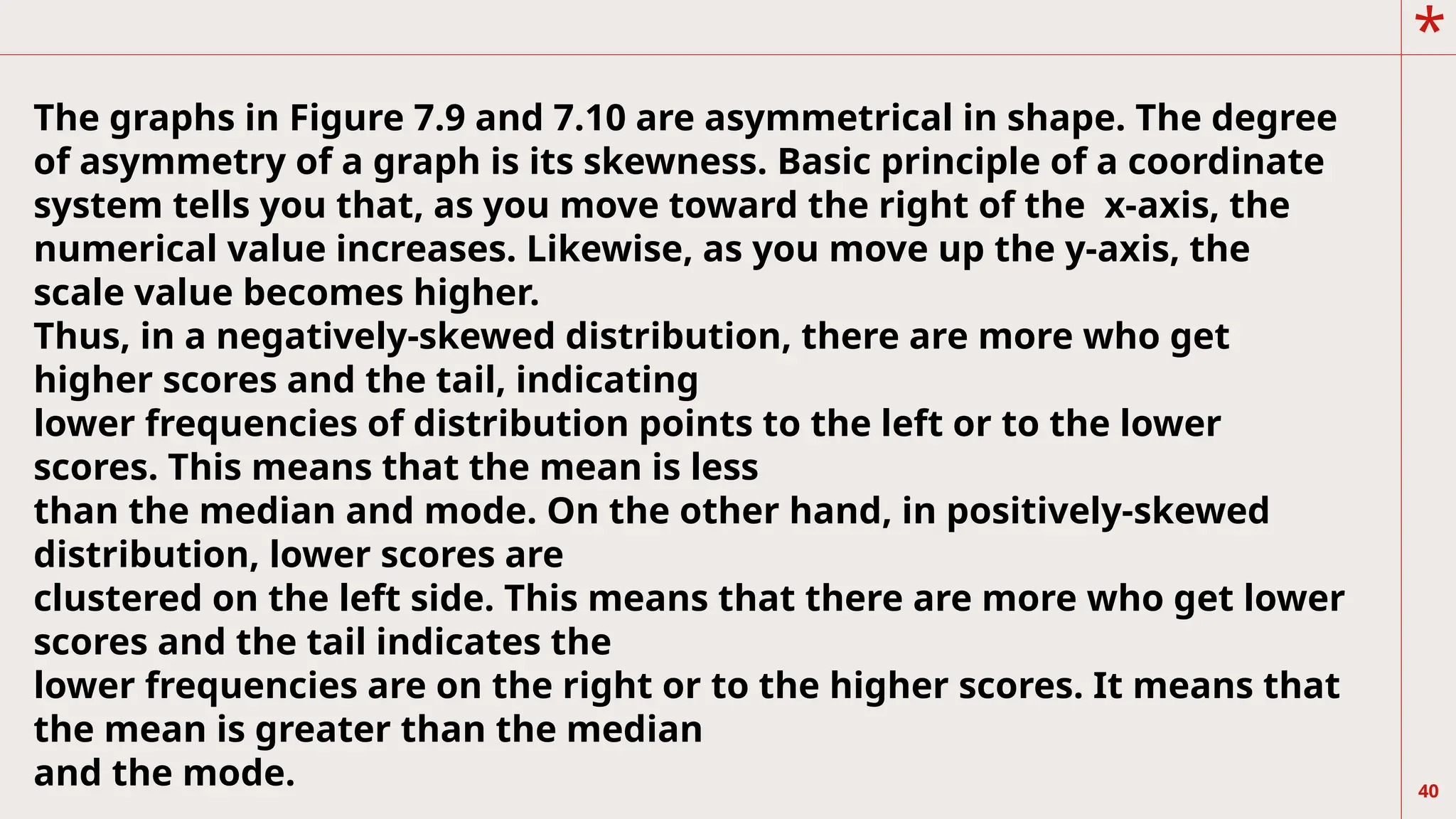
40
The graphs inFigure 7.9 and 7.10 are asymmetrical in shape. The degree
of asymmetry of a graph is its skewness. Basic principle of a coordinate
system tells you that, as you move toward the right of the x-axis, the
numerical value increases. Likewise, as you move up the y-axis, the
scale value becomes higher.
Thus, in a negatively-skewed distribution, there are more who get
higher scores and the tail, indicating
lower frequencies of distribution points to the left or to the lower
scores. This means that the mean is less
than the median and mode. On the other hand, in positively-skewed
distribution, lower scores are
clustered on the left side. This means that there are more who get lower
scores and the tail indicates the
lower frequencies are on the right or to the higher scores. It means that
the mean is greater than the median
and the mode.
41.
*
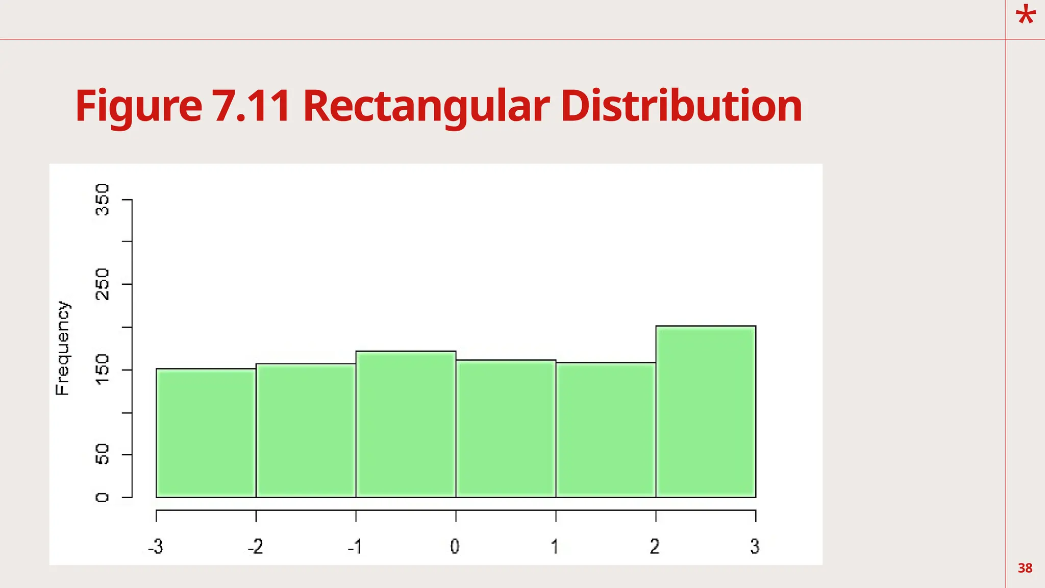
41
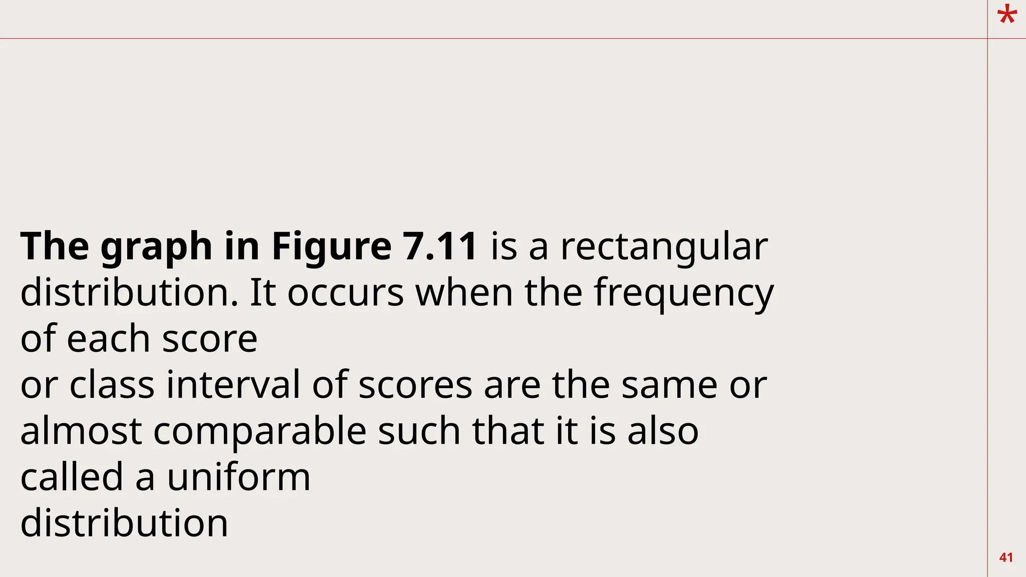
The graph inFigure 7.11 is a rectangular
distribution. It occurs when the frequency
of each score
or class interval of scores are the same or
almost comparable such that it is also
called a uniform
distribution
42.
*
42
We have differentiatedthe four graphs in
terms of skewness, which refers to their
symmetry or
asymmetry (non-symmetry). Another way of
characterizing frequency distribution is with
respect to the
number of “peaks” seen on the curve. Refer
to the following graphs below.
*
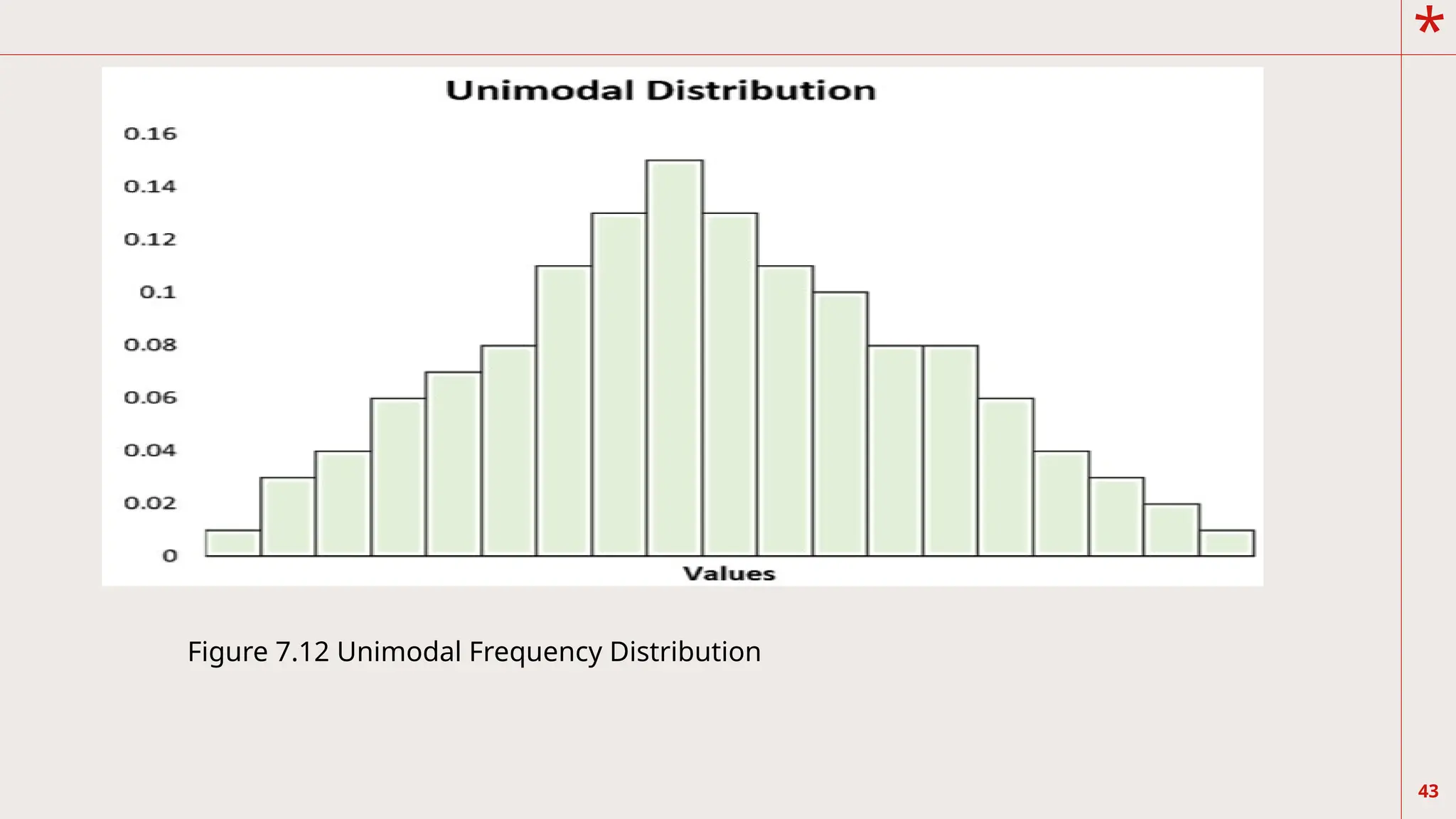
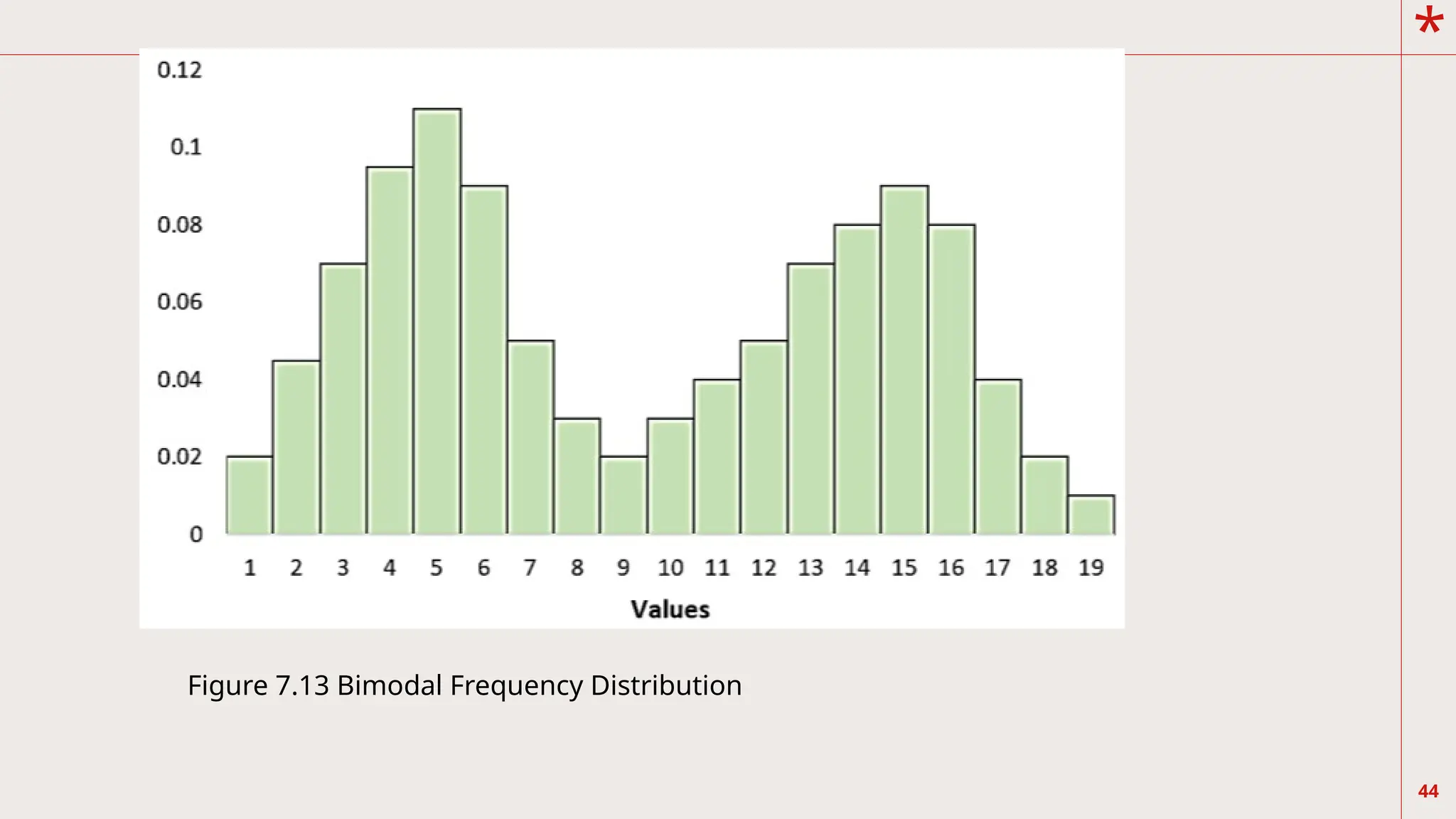
45
You see inFigure 7.12 that the curve has only one
peak. We refer to the shape of this distribution
as unimodal.
On the other hand, Figure 7.13 shows that there
are two peaks appearing at the highest
frequencies. We call this bimodal distribution. For
those with more than two peaks, we call this
multimodal distribution. In addition, unimodal,
bimodal, or multimodal may or may not be
symmetric.
46.
*
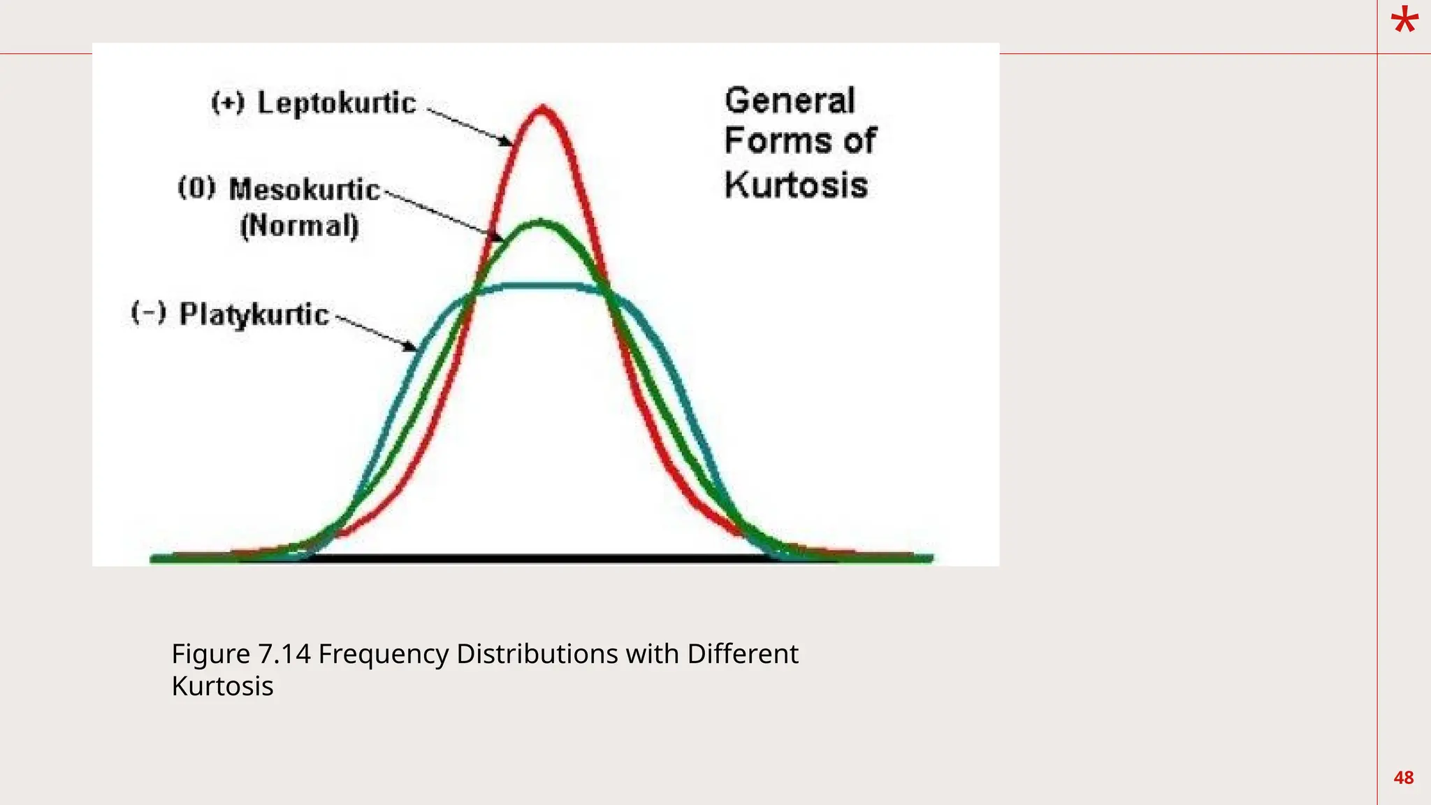
46
Another way ofdifferentiating
frequency distributions is shown
below. Consider now the graphs
of three frequency distributions
in Figure 7.14.
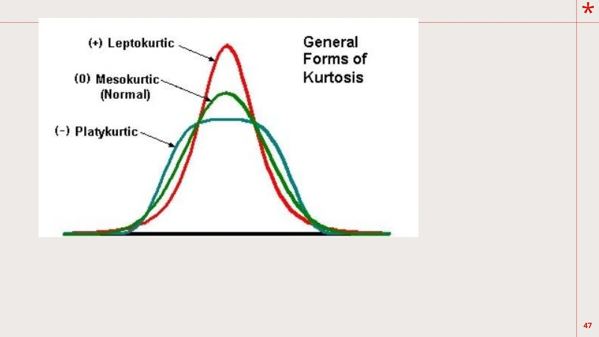
*
49
Kurtosis is theflatness of the distribution,
which is also the consequence of how high or
peaked the distribution is. X is the flattest
distribution. It has a platykurtic (platy, meaning
broad or flat) distribution. Y is the normal
distribution and it is a mesokurtic (meso,
meaning
intermediate) distribution. Z is the steepest or
slimmest, and is called leptokurtic (lepto,
meaning narrow) distribution