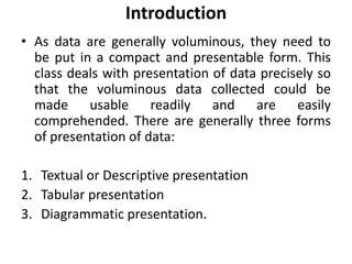
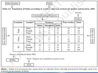
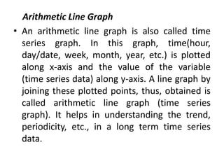
SlideShare a Scribd company logo
1 of 33
DATA PRESENTATION
BY
Dr. Jitendra Patel
Associate Professor
AIPS, Hyderabad, India.
Introduction
• As data are generally voluminous, they need to
be put in a compact and presentable form. This
class deals with presentation of data precisely so
that the voluminous data collected could be
made usable readily and are easily
comprehended. There are generally three forms
of presentation of data:
1. Textual or Descriptive presentation
2. Tabular presentation
3. Diagrammatic presentation.
Textual Presentation of Data
• In textual presentation, data are described
within the text.
• When the quantity of data is not too large this
form of presentation is more suitable. Let’s
clear with the case:
Case: In a bandh call given on 08 September
2005 protesting the hike in prices of petrol
and diesel, 5 petrol pumps were found open
and 17 were closed whereas 2 schools were
closed and remaining 9 schools were found
open in a town of Bihar.
Tabular Presentation of Data
• In a tabular presentation, data are presented in rows (read
horizontally) and columns (read vertically).
• For example see Table 4.1 tabulating information about
literacy rates.
• It has three rows (for male, female and total) and three
columns (for urban, rural and total). It is called a 3 × 3 Table
giving 9 items of information in 9 boxes called the "cells" of
the Table.
• Each cell gives information that relates an attribute of
gender ("male", "female" or total) with a number (literacy
percentages of rural people, urban people and total).
• The most important advantage of tabulation is that it
organises data for further statistical treatment and
decisionmaking.
• Classification used in tabulation is of four kinds:
• Qualitative • Quantitative • Temporal and • Spatial
• Qualitative classification:
When classification is done according to attributes, such
as social status, physical status, nationality, etc., it is
called qualitative classification. For example, in Table 4.1
the attributes for classification are sex and location
which are qualitative in nature.
• Quantitative classification:
In quantitative classification, the data are classified on the basis of
characteristics which are quantitative in nature. In other words these
characteristics can be measured quantitatively.
 For example, age, height, production, income, etc are quantitative
characteristics. Classes are formed by assigning limits called class limits
for the values of the characteristic under consideration. An example of
quantitative classification is given in Table 4.2. Calculate the missing
figures in the Table
• Temporal classification:
In this classification time becomes the classifying
variable and data are categorised according to
time. Time may be in hours, days, weeks, months,
years, etc. For example, see Table 4.3.
• Spatial classification: When classification is
done on the basis of place, it is called spatial
classification. The place may be a
village/town, block, district, state, country,
etc. Table 4.4 is an example of spatial
classification.
Tabulation of Data and Parts of a Table
• To construct a table it is important to learn first
what are the parts of a good statistical table.
• When put together systematically these parts
form a table.
• The most simple way of conceptualising a table is
to present the data in rows and columns
alongwith some explanatory notes.
• Tabulation can be done using one-way, two-way
or threeway classification depending upon the
number of characteristics involved.
• A good table should essentially have the
following:
(i) Table Number
 Table number is assigned to a table for identification purpose.
 If more than one table is presented, it is the table number that distinguishes
one table from another.
 It is given at the top or at the beginning of the title of the table. Generally,
table numbers are whole numbers in ascending order if there are many
tables in a book.
 Subscripted numbers, like 1.2, 3.1, etc., are also used for identifying the
table according to its location.
 For example, Table 4.5 should be read as the fifth table of the fourth chapter,
and so on (See Table 4.5).
(ii) Title:
 The title of a table narrates about the contents of the table.
 It has to be clear, brief and carefully worded so that the interpretations
made from the table are clear and free from ambiguity.
 It finds place at the head of the table succeeding the table number or just
below it (See Table 4.5).
• (iii) Captions or Column Headings:
 At the top of each column in a table a column designation is given to
explain figures of the column.
 This is called caption or column heading (See Table 4.5). (iv) Stubs or Row
Headings Like a caption or column heading, each row of the table has to
be given a heading.
 The designations of the rows are also called stubs or stub items, and the
complete left column is known asstub column.
 A brief description of the row headings may also be given at the left hand
top in the table. (See Table 4.5).
• (v) Body of the Table:
 Body of a table is the main part and it contains the actual data.
 Location of any one figure/data in the table is fixed and determined by the
row and column of the table.
 For example, data in the second row and fourth column indicate that 25
crore females in rural India were non-workers in 2001 (See Table 4.5).
• (vi) Unit of Measurement:
 The unit of measurement of the figures in the table (actual data) should
always be stated alongwith the title.
 If different units are there for rows or columns of the table, these units
must be stated alongwith ‘stubs’ or ‘captions’.
 If figures are large, they should be rounded up and the methodof rounding
should be indicated (See Table 4.5).
• vii) Source:
 It is a brief statement or phrase indicating the
source of data presented in the table.
If more than one source is there, all the
sources are to be written in the source.
Source is generally written at the bottom of
the table. (See Table 4.5).
• (viii)Note:
 Note is the last part of the table.
It explains the specific feature of the data
content of the table which is not self
explanatory and has not been explained
earlier.
Diagrammatic Presentation of Data
 This is the third method of presenting data. This
method provides the quickest understanding of the
actual situation to be explained by data in
comparison to tabular or textual presentations.
 Diagrammatic presentation of data translates quite
effectively the highly abstract ideas contained in
numbers into more concrete and easily
comprehensible form.
 Diagrams may be less accurate but are much more
effective than tables in presenting the data.
 There are various kinds of diagrams in common use. Amongst them the important ones are the
following:
(i) Geometric diagram
(ii) Frequency diagram
(iii) Arithmetic line graph
Geometric Diagram: Bar diagram and pie diagram come in the category of geometric diagram.
The bar diagrams are of three types — simple, multiple and component bar diagrams.
Bar Diagram
 Simple Bar Diagram:
 Bar diagram comprises a group of equispaced and equiwidth rectangular
bars for each class or category of data.
 Height or length of the bar reads the magnitude of data. The lower end of
the bar touches the base line such that the height of a bar starts from the
zero unit.
 Bars of a bar diagram can be visually compared by their relative height and
accordingly data are comprehended quickly. Data for this can be of
frequency or non-frequency type.
 In non-frequency type data a particular characteristic, say production, yield,
population, etc. at various points of time or of different states are noted and
corresponding bars are made of the respective heights according to the
values of the characteristic to construct the diagram.
 The values of the characteristics (measured or counted) retain the identity of
each value. Figure 4.1 is an example of a bar diagram.
• Different types of data may require different modes of
diagrammatical representation.
• Bar diagrams are suitable both for frequency type and
non-frequency type variables and attributes.
• Discrete variables like family size, spots on a dice,
grades in an examination, etc. and attributes such as
gender, religion, caste, country, etc. can be represented
by bar diagrams.
• Bar diagrams are more convenient for non-frequency
data such as incomeexpenditure profile,
export/imports over the years, etc.
• A category that has a longer bar (literacy of Kerala)
than another category (literacy of West Bengal), has
more of the measured (or enumerated) characteristics
than the other.
• Bars (also called columns) are usually used in time
series data (food grain produced between 1980 and
2000, decadal variation in work participation
• Component Bar Diagram:
• Component bar diagrams or charts (Fig.4.3), also called sub-
diagrams, are very useful in comparing the sizes of different
component parts (the elements or parts which a thing is made
up of) and also for throwing light on the relationship among
these integral parts.
For example, sales proceeds from different products,
expenditure pattern in a typical Indian family (components
being food, rent, medicine, education, power, etc.), budget
outlay for receipts and expenditures, components of labour
force, population etc.
• Component bar diagrams are usually shaded or coloured
suitably.
• Multiple Bar Diagram :
• Multiple bar diagrams (Fig.4.2) are used for
comparing two or more sets of data, for
example income and expenditure or import
and export for different years, marks obtained
in different subjects in different classes, etc.
Pie Diagram
• A pie diagram is also a component diagram, but unlike a bar
diagram, here it is a circle whose area is proportionally
divided among the components (Fig.4.4) it represents.
• It is also called a pie chart. The circle is divided into as many
parts as there are components by drawing straight lines
from the centre to the circumference.
• Pie charts usually are not drawn with absolute values of a
category. The values of each category are first expressed as
percentage of the total value of all the categories.
• A circle in a pie chart, irrespective of its value of radius, is
thought of having 100 equal parts of 3.6° (360°/100) each.
To find out the angle, the component shall subtend at the
centre of the circle, each percentage figure of every
component is multiplied by 3.6°.
• An example of this conversion of percentages of
components into angular components of the circle is shown
in Table 4.8.
• Frequency Diagram
• Data in the form of grouped frequency
• distributions are generally represented
• by frequency diagrams like histogram,
• frequency polygon, frequency curve
• and ogive.
Histogram
• A histogram is a two dimensional diagram.
• It is a set of rectangles with base as the intervals between class
boundaries (along X-axis) and with areas proportional to the class
frequency (Fig.4.5).
• If the class intervals are of equal width, which they generally are, the area
of the rectangles are proportional to their respective frequencies.
• However, in some type of data, it is convenient, at times necessary, to use
varying width of class intervals.
• For example, when tabulating deaths by age at death, it would be very
meaningful as well as useful too to have very short age intervals (0, 1, 2,
..., yrs/ 0, 7, 28, ..., days) at the beginning when death rates are very high
compared to deaths at most other higher age segments of the population.
• For graphical representation of such data, height for area of a rectangle is
the quotient of height (here frequency) and base (here width of the class
interval).
• When intervals are equal, that is, when all rectangles have the same base,
area can conveniently be represented by the frequency of any interval for
purposes of comparison.
• When bases vary in their width, the heights of rectangles are to be
adjusted to yield comparable measurements. The answer in such a
situation is frequency density (class frequency divided by width of the
class interval) instead of absolute frequency.
• Frequency Polygon
• A frequency polygon is a plane bounded by straight
lines, usually four or more lines. Frequency polygon is
an alternative to histogram and is also derived from
histogram itself. frequency polygon can be fitted to a
histogram for studying the shape of the curve. The
simplest method of drawing a frequency polygon is to
join the midpoints of the topside of the consecutive
rectangles of the histogram. It leaves us with the two
ends away from the base line, denying the calculation
of the area under the curve. The solution is to join the
two end-points thus obtained to the base line at the
mid-values of the two classes with zero frequency
immediately at each end of the distribution. Broken
lines or dots may join the two ends with the base line.
Now the total area under the curve, like the area in the
histogram, represents the total frequency or sample
size.
Frequency Curve
• The frequency curve is obtained by drawing a smooth freehand curve
passing through the points of the frequency polygon as closely as possible.
It may not necessarily pass through all the points of the frequency polygon
but it passes through them as closely as possible.
Ogive
• Ogive is also called cumulative frequency curve. As there are two types of
cumulative frequencies, for example ‘‘less than’’ type and ‘‘more than’’
type, accordingly there are two ogives for any grouped frequency
distribution data.
• Here in place of simple frequencies asin the case of frequency polygon,
cumulative frequencies are plotted along y-axis against class limits of the
frequency distribution.
• For ‘‘less than’’ ogive the cumulative frequencies are plotted against the
respective upper limits of the class intervals whereas for more than ogives
the cumulative frequencies are plotted against the respective lower limits
of the class interval.
• An interesting feature of the two ogives together is that their intersection
point gives the median Fig. 4.8 (b) of the frequency distribution.
• As the shapes of the two ogives suggest, ‘‘less than’’ ogive is never
decreasing and ‘‘more than’’ ogive is never increasing.
Arithmetic Line Graph
• An arithmetic line graph is also called time
series graph. In this graph, time(hour,
day/date, week, month, year, etc.) is plotted
along x-axis and the value of the variable
(time series data) along y-axis. A line graph by
joining these plotted points, thus, obtained is
called arithmetic line graph (time series
graph). It helps in understanding the trend,
periodicity, etc., in a long term time series
data.
CONCLUSION
• By now you must have been able to learn how
the data could be presented using various
forms of presentation — textual, tabular and
diagrammatic. You are now also able to make
an appropriate choice of the form of data
presentation as well as the type of diagram to
be used for a given set of data. Thus you can
make presentation of data meaningful,
comprehensive and purposeful.
Thank You

More Related Content

What's hot

What's hot (20)

Tabulation of data
Tabulation of dataTabulation of data
Tabulation of data
 
Presentation of data ppt
Presentation of data pptPresentation of data ppt
Presentation of data ppt
 
Data analysis
Data analysisData analysis
Data analysis
 
Four data types Data Scientist should know
Four data types Data Scientist should knowFour data types Data Scientist should know
Four data types Data Scientist should know
 
PRESENTATION OF STATISTICAL DATA
PRESENTATION OF STATISTICAL DATAPRESENTATION OF STATISTICAL DATA
PRESENTATION OF STATISTICAL DATA
 
Data analysis copy
Data analysis   copyData analysis   copy
Data analysis copy
 
Presentation of data
Presentation of dataPresentation of data
Presentation of data
 
Tabular and Graphical Representation of Data
Tabular and Graphical Representation of Data Tabular and Graphical Representation of Data
Tabular and Graphical Representation of Data
 
Introduction To Statistics
Introduction To StatisticsIntroduction To Statistics
Introduction To Statistics
 
Types of data and graphical representation
Types of data and graphical representationTypes of data and graphical representation
Types of data and graphical representation
 
Descriptive statistics
Descriptive statisticsDescriptive statistics
Descriptive statistics
 
DATA Types
DATA TypesDATA Types
DATA Types
 
Numerical & graphical presentation of data
Numerical & graphical presentation of dataNumerical & graphical presentation of data
Numerical & graphical presentation of data
 
Presentationofdata
PresentationofdataPresentationofdata
Presentationofdata
 
Descriptive statistics
Descriptive statisticsDescriptive statistics
Descriptive statistics
 
Data array and frequency distribution
Data array and frequency distributionData array and frequency distribution
Data array and frequency distribution
 
statistical analysis
statistical analysisstatistical analysis
statistical analysis
 
Population and Sample
Population and SamplePopulation and Sample
Population and Sample
 
Basics stat ppt-types of data
Basics stat ppt-types of dataBasics stat ppt-types of data
Basics stat ppt-types of data
 
Displaying data using charts and graphs
Displaying data using charts and graphsDisplaying data using charts and graphs
Displaying data using charts and graphs
 

Similar to Data presentation/ How to present Research outcome data

3. Tabulation of data.pptx
3. Tabulation of data.pptx3. Tabulation of data.pptx
3. Tabulation of data.pptxSGRRIMHS
 
research methodology presentation-6.pptx
research methodology presentation-6.pptxresearch methodology presentation-6.pptx
research methodology presentation-6.pptxvidyasagarsharma0001
 
economicsformsofpresentation-160624135348.pdf
economicsformsofpresentation-160624135348.pdfeconomicsformsofpresentation-160624135348.pdf
economicsformsofpresentation-160624135348.pdfShivamAgrawal911916
 
Presentation of Data using various techniques -reserach.pptx
Presentation of Data using various techniques -reserach.pptxPresentation of Data using various techniques -reserach.pptx
Presentation of Data using various techniques -reserach.pptxAr.Vrushali Dhamne
 
Tabulation of data-Development of Research Instrument/ Tool and Analysis
Tabulation of data-Development of Research Instrument/ Tool and Analysis Tabulation of data-Development of Research Instrument/ Tool and Analysis
Tabulation of data-Development of Research Instrument/ Tool and Analysis ShaharyarShoukatShou
 
tabulation and cross tabulation: data processsing
tabulation and cross tabulation: data processsingtabulation and cross tabulation: data processsing
tabulation and cross tabulation: data processsingssuserb9efd7
 
Chapter 2
Chapter 2Chapter 2
Chapter 2Lem Lem
 
Presentation of data
Presentation of dataPresentation of data
Presentation of dataJENNIALEX1
 
Data-Presentation-and-Interpretation-in-Tabular-Graphical.pptx
Data-Presentation-and-Interpretation-in-Tabular-Graphical.pptxData-Presentation-and-Interpretation-in-Tabular-Graphical.pptx
Data-Presentation-and-Interpretation-in-Tabular-Graphical.pptxshyrahipolitoe
 
Unit 4 editing and coding (2)
Unit 4 editing and coding (2)Unit 4 editing and coding (2)
Unit 4 editing and coding (2)kalailakshmi
 

Similar to Data presentation/ How to present Research outcome data (20)

3. Tabulation of data.pptx
3. Tabulation of data.pptx3. Tabulation of data.pptx
3. Tabulation of data.pptx
 
research methodology presentation-6.pptx
research methodology presentation-6.pptxresearch methodology presentation-6.pptx
research methodology presentation-6.pptx
 
economicsformsofpresentation-160624135348.pdf
economicsformsofpresentation-160624135348.pdfeconomicsformsofpresentation-160624135348.pdf
economicsformsofpresentation-160624135348.pdf
 
Presentation of data
Presentation of dataPresentation of data
Presentation of data
 
Presentation of Data using various techniques -reserach.pptx
Presentation of Data using various techniques -reserach.pptxPresentation of Data using various techniques -reserach.pptx
Presentation of Data using various techniques -reserach.pptx
 
Tabulation of data-Development of Research Instrument/ Tool and Analysis
Tabulation of data-Development of Research Instrument/ Tool and Analysis Tabulation of data-Development of Research Instrument/ Tool and Analysis
Tabulation of data-Development of Research Instrument/ Tool and Analysis
 
Tabulation
TabulationTabulation
Tabulation
 
tabulation and cross tabulation: data processsing
tabulation and cross tabulation: data processsingtabulation and cross tabulation: data processsing
tabulation and cross tabulation: data processsing
 
Tabulation
TabulationTabulation
Tabulation
 
Chapter 4
Chapter 4Chapter 4
Chapter 4
 
VIPIN SINGH PRESENTATION
VIPIN SINGH PRESENTATIONVIPIN SINGH PRESENTATION
VIPIN SINGH PRESENTATION
 
Tabulation
TabulationTabulation
Tabulation
 
Chapter 2
Chapter 2Chapter 2
Chapter 2
 
Tabulation
Tabulation Tabulation
Tabulation
 
Presentation of data
Presentation of dataPresentation of data
Presentation of data
 
Tabulation
TabulationTabulation
Tabulation
 
Data-Presentation-and-Interpretation-in-Tabular-Graphical.pptx
Data-Presentation-and-Interpretation-in-Tabular-Graphical.pptxData-Presentation-and-Interpretation-in-Tabular-Graphical.pptx
Data-Presentation-and-Interpretation-in-Tabular-Graphical.pptx
 
Unit 4 editing and coding (2)
Unit 4 editing and coding (2)Unit 4 editing and coding (2)
Unit 4 editing and coding (2)
 
Intro to statistics
Intro to statisticsIntro to statistics
Intro to statistics
 
Tabulation
TabulationTabulation
Tabulation
 

More from Dr-Jitendra Patel

2. Scope of Pharmacognosy.pptx
2. Scope of Pharmacognosy.pptx2. Scope of Pharmacognosy.pptx
2. Scope of Pharmacognosy.pptxDr-Jitendra Patel
 
isolation and preservation of pure culture
isolation and preservation of pure cultureisolation and preservation of pure culture
isolation and preservation of pure cultureDr-Jitendra Patel
 
Design of experiments BY Minitab
Design of experiments BY MinitabDesign of experiments BY Minitab
Design of experiments BY MinitabDr-Jitendra Patel
 
Minitab- A statistical tool
Minitab- A statistical tool Minitab- A statistical tool
Minitab- A statistical tool Dr-Jitendra Patel
 
Graphs- A tool to present data
Graphs- A tool to present dataGraphs- A tool to present data
Graphs- A tool to present dataDr-Jitendra Patel
 
PAPAIN - An digestive enzymes
PAPAIN - An digestive enzymes PAPAIN - An digestive enzymes
PAPAIN - An digestive enzymes Dr-Jitendra Patel
 
Plagiarism- A Malpractice in Academia
Plagiarism- A Malpractice in Academia Plagiarism- A Malpractice in Academia
Plagiarism- A Malpractice in Academia Dr-Jitendra Patel
 
Sources of Herbs- Biological & Geographical
Sources of Herbs- Biological & Geographical Sources of Herbs- Biological & Geographical
Sources of Herbs- Biological & Geographical Dr-Jitendra Patel
 
PEPSIN Enzyme - An enzyme for protein digestions
PEPSIN Enzyme - An enzyme for protein digestions PEPSIN Enzyme - An enzyme for protein digestions
PEPSIN Enzyme - An enzyme for protein digestions Dr-Jitendra Patel
 
Epi Info- An Statistical Software
Epi Info- An Statistical Software Epi Info- An Statistical Software
Epi Info- An Statistical Software Dr-Jitendra Patel
 
Types of experimental design
Types of experimental designTypes of experimental design
Types of experimental designDr-Jitendra Patel
 
Herbal Drug Preparation - Different Dosage Forms
Herbal Drug Preparation - Different Dosage Forms Herbal Drug Preparation - Different Dosage Forms
Herbal Drug Preparation - Different Dosage Forms Dr-Jitendra Patel
 
MALT EXTRACT- Barley cereals
MALT EXTRACT- Barley cereals MALT EXTRACT- Barley cereals
MALT EXTRACT- Barley cereals Dr-Jitendra Patel
 
Experimental design techniques- why experimental design needed?
Experimental design techniques- why experimental design needed?Experimental design techniques- why experimental design needed?
Experimental design techniques- why experimental design needed?Dr-Jitendra Patel
 
Qualitative test for proteins
Qualitative test for proteinsQualitative test for proteins
Qualitative test for proteinsDr-Jitendra Patel
 
SAS - Statistical Analysis System
SAS - Statistical Analysis SystemSAS - Statistical Analysis System
SAS - Statistical Analysis SystemDr-Jitendra Patel
 
Need of Research- Why Necessary
Need of Research- Why NecessaryNeed of Research- Why Necessary
Need of Research- Why NecessaryDr-Jitendra Patel
 
Classification of Protein by different mode.
Classification of Protein by different mode.Classification of Protein by different mode.
Classification of Protein by different mode.Dr-Jitendra Patel
 

More from Dr-Jitendra Patel (20)

2. Scope of Pharmacognosy.pptx
2. Scope of Pharmacognosy.pptx2. Scope of Pharmacognosy.pptx
2. Scope of Pharmacognosy.pptx
 
isolation and preservation of pure culture
isolation and preservation of pure cultureisolation and preservation of pure culture
isolation and preservation of pure culture
 
Design of experiments BY Minitab
Design of experiments BY MinitabDesign of experiments BY Minitab
Design of experiments BY Minitab
 
Minitab- A statistical tool
Minitab- A statistical tool Minitab- A statistical tool
Minitab- A statistical tool
 
Graphs- A tool to present data
Graphs- A tool to present dataGraphs- A tool to present data
Graphs- A tool to present data
 
PAPAIN - An digestive enzymes
PAPAIN - An digestive enzymes PAPAIN - An digestive enzymes
PAPAIN - An digestive enzymes
 
Plagiarism- A Malpractice in Academia
Plagiarism- A Malpractice in Academia Plagiarism- A Malpractice in Academia
Plagiarism- A Malpractice in Academia
 
Sources of Herbs- Biological & Geographical
Sources of Herbs- Biological & Geographical Sources of Herbs- Biological & Geographical
Sources of Herbs- Biological & Geographical
 
PEPSIN Enzyme - An enzyme for protein digestions
PEPSIN Enzyme - An enzyme for protein digestions PEPSIN Enzyme - An enzyme for protein digestions
PEPSIN Enzyme - An enzyme for protein digestions
 
DIASTASE Enzyme- Amylase
DIASTASE Enzyme- Amylase DIASTASE Enzyme- Amylase
DIASTASE Enzyme- Amylase
 
Epi Info- An Statistical Software
Epi Info- An Statistical Software Epi Info- An Statistical Software
Epi Info- An Statistical Software
 
Types of experimental design
Types of experimental designTypes of experimental design
Types of experimental design
 
Herbal Drug Preparation - Different Dosage Forms
Herbal Drug Preparation - Different Dosage Forms Herbal Drug Preparation - Different Dosage Forms
Herbal Drug Preparation - Different Dosage Forms
 
MALT EXTRACT- Barley cereals
MALT EXTRACT- Barley cereals MALT EXTRACT- Barley cereals
MALT EXTRACT- Barley cereals
 
Experimental design techniques- why experimental design needed?
Experimental design techniques- why experimental design needed?Experimental design techniques- why experimental design needed?
Experimental design techniques- why experimental design needed?
 
Qualitative test for proteins
Qualitative test for proteinsQualitative test for proteins
Qualitative test for proteins
 
SAS - Statistical Analysis System
SAS - Statistical Analysis SystemSAS - Statistical Analysis System
SAS - Statistical Analysis System
 
Need of Research- Why Necessary
Need of Research- Why NecessaryNeed of Research- Why Necessary
Need of Research- Why Necessary
 
Herbs as plant materials
Herbs as plant materialsHerbs as plant materials
Herbs as plant materials
 
Classification of Protein by different mode.
Classification of Protein by different mode.Classification of Protein by different mode.
Classification of Protein by different mode.
 

Recently uploaded

Introduction to ArtificiaI Intelligence in Higher Education
Introduction to ArtificiaI Intelligence in Higher EducationIntroduction to ArtificiaI Intelligence in Higher Education
Introduction to ArtificiaI Intelligence in Higher Educationpboyjonauth
 
Software Engineering Methodologies (overview)
Software Engineering Methodologies (overview)Software Engineering Methodologies (overview)
Software Engineering Methodologies (overview)eniolaolutunde
 
Paris 2024 Olympic Geographies - an activity
Paris 2024 Olympic Geographies - an activityParis 2024 Olympic Geographies - an activity
Paris 2024 Olympic Geographies - an activityGeoBlogs
 
microwave assisted reaction. General introduction
microwave assisted reaction. General introductionmicrowave assisted reaction. General introduction
microwave assisted reaction. General introductionMaksud Ahmed
 
The basics of sentences session 2pptx copy.pptx
The basics of sentences session 2pptx copy.pptxThe basics of sentences session 2pptx copy.pptx
The basics of sentences session 2pptx copy.pptxheathfieldcps1
 
BASLIQ CURRENT LOOKBOOK LOOKBOOK(1) (1).pdf
BASLIQ CURRENT LOOKBOOK  LOOKBOOK(1) (1).pdfBASLIQ CURRENT LOOKBOOK  LOOKBOOK(1) (1).pdf
BASLIQ CURRENT LOOKBOOK LOOKBOOK(1) (1).pdfSoniaTolstoy
 
Mastering the Unannounced Regulatory Inspection
Mastering the Unannounced Regulatory InspectionMastering the Unannounced Regulatory Inspection
Mastering the Unannounced Regulatory InspectionSafetyChain Software
 
Crayon Activity Handout For the Crayon A
Crayon Activity Handout For the Crayon ACrayon Activity Handout For the Crayon A
Crayon Activity Handout For the Crayon AUnboundStockton
 
Contemporary philippine arts from the regions_PPT_Module_12 [Autosaved] (1).pptx
Contemporary philippine arts from the regions_PPT_Module_12 [Autosaved] (1).pptxContemporary philippine arts from the regions_PPT_Module_12 [Autosaved] (1).pptx
Contemporary philippine arts from the regions_PPT_Module_12 [Autosaved] (1).pptxRoyAbrique
 
CARE OF CHILD IN INCUBATOR..........pptx
CARE OF CHILD IN INCUBATOR..........pptxCARE OF CHILD IN INCUBATOR..........pptx
CARE OF CHILD IN INCUBATOR..........pptxGaneshChakor2
 
Incoming and Outgoing Shipments in 1 STEP Using Odoo 17
Incoming and Outgoing Shipments in 1 STEP Using Odoo 17Incoming and Outgoing Shipments in 1 STEP Using Odoo 17
Incoming and Outgoing Shipments in 1 STEP Using Odoo 17Celine George
 
call girls in Kamla Market (DELHI) 🔝 >༒9953330565🔝 genuine Escort Service 🔝✔️✔️
call girls in Kamla Market (DELHI) 🔝 >༒9953330565🔝 genuine Escort Service 🔝✔️✔️call girls in Kamla Market (DELHI) 🔝 >༒9953330565🔝 genuine Escort Service 🔝✔️✔️
call girls in Kamla Market (DELHI) 🔝 >༒9953330565🔝 genuine Escort Service 🔝✔️✔️9953056974 Low Rate Call Girls In Saket, Delhi NCR
 
How to Configure Email Server in Odoo 17
How to Configure Email Server in Odoo 17How to Configure Email Server in Odoo 17
How to Configure Email Server in Odoo 17Celine George
 
KSHARA STURA .pptx---KSHARA KARMA THERAPY (CAUSTIC THERAPY)————IMP.OF KSHARA ...
KSHARA STURA .pptx---KSHARA KARMA THERAPY (CAUSTIC THERAPY)————IMP.OF KSHARA ...KSHARA STURA .pptx---KSHARA KARMA THERAPY (CAUSTIC THERAPY)————IMP.OF KSHARA ...
KSHARA STURA .pptx---KSHARA KARMA THERAPY (CAUSTIC THERAPY)————IMP.OF KSHARA ...M56BOOKSTORE PRODUCT/SERVICE
 
The Most Excellent Way | 1 Corinthians 13
The Most Excellent Way | 1 Corinthians 13The Most Excellent Way | 1 Corinthians 13
The Most Excellent Way | 1 Corinthians 13Steve Thomason
 
mini mental status format.docx
mini    mental       status     format.docxmini    mental       status     format.docx
mini mental status format.docxPoojaSen20
 

Recently uploaded (20)

Introduction to ArtificiaI Intelligence in Higher Education
Introduction to ArtificiaI Intelligence in Higher EducationIntroduction to ArtificiaI Intelligence in Higher Education
Introduction to ArtificiaI Intelligence in Higher Education
 
Software Engineering Methodologies (overview)
Software Engineering Methodologies (overview)Software Engineering Methodologies (overview)
Software Engineering Methodologies (overview)
 
Paris 2024 Olympic Geographies - an activity
Paris 2024 Olympic Geographies - an activityParis 2024 Olympic Geographies - an activity
Paris 2024 Olympic Geographies - an activity
 
Código Creativo y Arte de Software | Unidad 1
Código Creativo y Arte de Software | Unidad 1Código Creativo y Arte de Software | Unidad 1
Código Creativo y Arte de Software | Unidad 1
 
microwave assisted reaction. General introduction
microwave assisted reaction. General introductionmicrowave assisted reaction. General introduction
microwave assisted reaction. General introduction
 
The basics of sentences session 2pptx copy.pptx
The basics of sentences session 2pptx copy.pptxThe basics of sentences session 2pptx copy.pptx
The basics of sentences session 2pptx copy.pptx
 
BASLIQ CURRENT LOOKBOOK LOOKBOOK(1) (1).pdf
BASLIQ CURRENT LOOKBOOK  LOOKBOOK(1) (1).pdfBASLIQ CURRENT LOOKBOOK  LOOKBOOK(1) (1).pdf
BASLIQ CURRENT LOOKBOOK LOOKBOOK(1) (1).pdf
 
Model Call Girl in Bikash Puri Delhi reach out to us at 🔝9953056974🔝
Model Call Girl in Bikash Puri  Delhi reach out to us at 🔝9953056974🔝Model Call Girl in Bikash Puri  Delhi reach out to us at 🔝9953056974🔝
Model Call Girl in Bikash Puri Delhi reach out to us at 🔝9953056974🔝
 
Mastering the Unannounced Regulatory Inspection
Mastering the Unannounced Regulatory InspectionMastering the Unannounced Regulatory Inspection
Mastering the Unannounced Regulatory Inspection
 
Crayon Activity Handout For the Crayon A
Crayon Activity Handout For the Crayon ACrayon Activity Handout For the Crayon A
Crayon Activity Handout For the Crayon A
 
Contemporary philippine arts from the regions_PPT_Module_12 [Autosaved] (1).pptx
Contemporary philippine arts from the regions_PPT_Module_12 [Autosaved] (1).pptxContemporary philippine arts from the regions_PPT_Module_12 [Autosaved] (1).pptx
Contemporary philippine arts from the regions_PPT_Module_12 [Autosaved] (1).pptx
 
CARE OF CHILD IN INCUBATOR..........pptx
CARE OF CHILD IN INCUBATOR..........pptxCARE OF CHILD IN INCUBATOR..........pptx
CARE OF CHILD IN INCUBATOR..........pptx
 
TataKelola dan KamSiber Kecerdasan Buatan v022.pdf
TataKelola dan KamSiber Kecerdasan Buatan v022.pdfTataKelola dan KamSiber Kecerdasan Buatan v022.pdf
TataKelola dan KamSiber Kecerdasan Buatan v022.pdf
 
Model Call Girl in Tilak Nagar Delhi reach out to us at 🔝9953056974🔝
Model Call Girl in Tilak Nagar Delhi reach out to us at 🔝9953056974🔝Model Call Girl in Tilak Nagar Delhi reach out to us at 🔝9953056974🔝
Model Call Girl in Tilak Nagar Delhi reach out to us at 🔝9953056974🔝
 
Incoming and Outgoing Shipments in 1 STEP Using Odoo 17
Incoming and Outgoing Shipments in 1 STEP Using Odoo 17Incoming and Outgoing Shipments in 1 STEP Using Odoo 17
Incoming and Outgoing Shipments in 1 STEP Using Odoo 17
 
call girls in Kamla Market (DELHI) 🔝 >༒9953330565🔝 genuine Escort Service 🔝✔️✔️
call girls in Kamla Market (DELHI) 🔝 >༒9953330565🔝 genuine Escort Service 🔝✔️✔️call girls in Kamla Market (DELHI) 🔝 >༒9953330565🔝 genuine Escort Service 🔝✔️✔️
call girls in Kamla Market (DELHI) 🔝 >༒9953330565🔝 genuine Escort Service 🔝✔️✔️
 
How to Configure Email Server in Odoo 17
How to Configure Email Server in Odoo 17How to Configure Email Server in Odoo 17
How to Configure Email Server in Odoo 17
 
KSHARA STURA .pptx---KSHARA KARMA THERAPY (CAUSTIC THERAPY)————IMP.OF KSHARA ...
KSHARA STURA .pptx---KSHARA KARMA THERAPY (CAUSTIC THERAPY)————IMP.OF KSHARA ...KSHARA STURA .pptx---KSHARA KARMA THERAPY (CAUSTIC THERAPY)————IMP.OF KSHARA ...
KSHARA STURA .pptx---KSHARA KARMA THERAPY (CAUSTIC THERAPY)————IMP.OF KSHARA ...
 
The Most Excellent Way | 1 Corinthians 13
The Most Excellent Way | 1 Corinthians 13The Most Excellent Way | 1 Corinthians 13
The Most Excellent Way | 1 Corinthians 13
 
mini mental status format.docx
mini    mental       status     format.docxmini    mental       status     format.docx
mini mental status format.docx
 

Data presentation/ How to present Research outcome data

  • 1. DATA PRESENTATION BY Dr. Jitendra Patel Associate Professor AIPS, Hyderabad, India.
  • 2. Introduction • As data are generally voluminous, they need to be put in a compact and presentable form. This class deals with presentation of data precisely so that the voluminous data collected could be made usable readily and are easily comprehended. There are generally three forms of presentation of data: 1. Textual or Descriptive presentation 2. Tabular presentation 3. Diagrammatic presentation.
  • 3. Textual Presentation of Data • In textual presentation, data are described within the text. • When the quantity of data is not too large this form of presentation is more suitable. Let’s clear with the case: Case: In a bandh call given on 08 September 2005 protesting the hike in prices of petrol and diesel, 5 petrol pumps were found open and 17 were closed whereas 2 schools were closed and remaining 9 schools were found open in a town of Bihar.
  • 4. Tabular Presentation of Data • In a tabular presentation, data are presented in rows (read horizontally) and columns (read vertically). • For example see Table 4.1 tabulating information about literacy rates. • It has three rows (for male, female and total) and three columns (for urban, rural and total). It is called a 3 × 3 Table giving 9 items of information in 9 boxes called the "cells" of the Table. • Each cell gives information that relates an attribute of gender ("male", "female" or total) with a number (literacy percentages of rural people, urban people and total). • The most important advantage of tabulation is that it organises data for further statistical treatment and decisionmaking. • Classification used in tabulation is of four kinds: • Qualitative • Quantitative • Temporal and • Spatial
  • 5. • Qualitative classification: When classification is done according to attributes, such as social status, physical status, nationality, etc., it is called qualitative classification. For example, in Table 4.1 the attributes for classification are sex and location which are qualitative in nature.
  • 6. • Quantitative classification: In quantitative classification, the data are classified on the basis of characteristics which are quantitative in nature. In other words these characteristics can be measured quantitatively.  For example, age, height, production, income, etc are quantitative characteristics. Classes are formed by assigning limits called class limits for the values of the characteristic under consideration. An example of quantitative classification is given in Table 4.2. Calculate the missing figures in the Table
  • 7. • Temporal classification: In this classification time becomes the classifying variable and data are categorised according to time. Time may be in hours, days, weeks, months, years, etc. For example, see Table 4.3.
  • 8. • Spatial classification: When classification is done on the basis of place, it is called spatial classification. The place may be a village/town, block, district, state, country, etc. Table 4.4 is an example of spatial classification.
  • 9. Tabulation of Data and Parts of a Table • To construct a table it is important to learn first what are the parts of a good statistical table. • When put together systematically these parts form a table. • The most simple way of conceptualising a table is to present the data in rows and columns alongwith some explanatory notes. • Tabulation can be done using one-way, two-way or threeway classification depending upon the number of characteristics involved. • A good table should essentially have the following:
  • 10. (i) Table Number  Table number is assigned to a table for identification purpose.  If more than one table is presented, it is the table number that distinguishes one table from another.  It is given at the top or at the beginning of the title of the table. Generally, table numbers are whole numbers in ascending order if there are many tables in a book.  Subscripted numbers, like 1.2, 3.1, etc., are also used for identifying the table according to its location.  For example, Table 4.5 should be read as the fifth table of the fourth chapter, and so on (See Table 4.5). (ii) Title:  The title of a table narrates about the contents of the table.  It has to be clear, brief and carefully worded so that the interpretations made from the table are clear and free from ambiguity.  It finds place at the head of the table succeeding the table number or just below it (See Table 4.5).
  • 11. • (iii) Captions or Column Headings:  At the top of each column in a table a column designation is given to explain figures of the column.  This is called caption or column heading (See Table 4.5). (iv) Stubs or Row Headings Like a caption or column heading, each row of the table has to be given a heading.  The designations of the rows are also called stubs or stub items, and the complete left column is known asstub column.  A brief description of the row headings may also be given at the left hand top in the table. (See Table 4.5). • (v) Body of the Table:  Body of a table is the main part and it contains the actual data.  Location of any one figure/data in the table is fixed and determined by the row and column of the table.  For example, data in the second row and fourth column indicate that 25 crore females in rural India were non-workers in 2001 (See Table 4.5). • (vi) Unit of Measurement:  The unit of measurement of the figures in the table (actual data) should always be stated alongwith the title.  If different units are there for rows or columns of the table, these units must be stated alongwith ‘stubs’ or ‘captions’.  If figures are large, they should be rounded up and the methodof rounding should be indicated (See Table 4.5).
  • 12.
  • 13. • vii) Source:  It is a brief statement or phrase indicating the source of data presented in the table. If more than one source is there, all the sources are to be written in the source. Source is generally written at the bottom of the table. (See Table 4.5). • (viii)Note:  Note is the last part of the table. It explains the specific feature of the data content of the table which is not self explanatory and has not been explained earlier.
  • 14. Diagrammatic Presentation of Data  This is the third method of presenting data. This method provides the quickest understanding of the actual situation to be explained by data in comparison to tabular or textual presentations.  Diagrammatic presentation of data translates quite effectively the highly abstract ideas contained in numbers into more concrete and easily comprehensible form.  Diagrams may be less accurate but are much more effective than tables in presenting the data.
  • 15.  There are various kinds of diagrams in common use. Amongst them the important ones are the following: (i) Geometric diagram (ii) Frequency diagram (iii) Arithmetic line graph Geometric Diagram: Bar diagram and pie diagram come in the category of geometric diagram. The bar diagrams are of three types — simple, multiple and component bar diagrams. Bar Diagram  Simple Bar Diagram:  Bar diagram comprises a group of equispaced and equiwidth rectangular bars for each class or category of data.  Height or length of the bar reads the magnitude of data. The lower end of the bar touches the base line such that the height of a bar starts from the zero unit.  Bars of a bar diagram can be visually compared by their relative height and accordingly data are comprehended quickly. Data for this can be of frequency or non-frequency type.  In non-frequency type data a particular characteristic, say production, yield, population, etc. at various points of time or of different states are noted and corresponding bars are made of the respective heights according to the values of the characteristic to construct the diagram.  The values of the characteristics (measured or counted) retain the identity of each value. Figure 4.1 is an example of a bar diagram.
  • 16. • Different types of data may require different modes of diagrammatical representation. • Bar diagrams are suitable both for frequency type and non-frequency type variables and attributes. • Discrete variables like family size, spots on a dice, grades in an examination, etc. and attributes such as gender, religion, caste, country, etc. can be represented by bar diagrams. • Bar diagrams are more convenient for non-frequency data such as incomeexpenditure profile, export/imports over the years, etc. • A category that has a longer bar (literacy of Kerala) than another category (literacy of West Bengal), has more of the measured (or enumerated) characteristics than the other. • Bars (also called columns) are usually used in time series data (food grain produced between 1980 and 2000, decadal variation in work participation
  • 17.
  • 18. • Component Bar Diagram: • Component bar diagrams or charts (Fig.4.3), also called sub- diagrams, are very useful in comparing the sizes of different component parts (the elements or parts which a thing is made up of) and also for throwing light on the relationship among these integral parts. For example, sales proceeds from different products, expenditure pattern in a typical Indian family (components being food, rent, medicine, education, power, etc.), budget outlay for receipts and expenditures, components of labour force, population etc. • Component bar diagrams are usually shaded or coloured suitably.
  • 19.
  • 20. • Multiple Bar Diagram : • Multiple bar diagrams (Fig.4.2) are used for comparing two or more sets of data, for example income and expenditure or import and export for different years, marks obtained in different subjects in different classes, etc.
  • 21.
  • 22. Pie Diagram • A pie diagram is also a component diagram, but unlike a bar diagram, here it is a circle whose area is proportionally divided among the components (Fig.4.4) it represents. • It is also called a pie chart. The circle is divided into as many parts as there are components by drawing straight lines from the centre to the circumference. • Pie charts usually are not drawn with absolute values of a category. The values of each category are first expressed as percentage of the total value of all the categories. • A circle in a pie chart, irrespective of its value of radius, is thought of having 100 equal parts of 3.6° (360°/100) each. To find out the angle, the component shall subtend at the centre of the circle, each percentage figure of every component is multiplied by 3.6°. • An example of this conversion of percentages of components into angular components of the circle is shown in Table 4.8.
  • 23.
  • 24. • Frequency Diagram • Data in the form of grouped frequency • distributions are generally represented • by frequency diagrams like histogram, • frequency polygon, frequency curve • and ogive.
  • 25. Histogram • A histogram is a two dimensional diagram. • It is a set of rectangles with base as the intervals between class boundaries (along X-axis) and with areas proportional to the class frequency (Fig.4.5). • If the class intervals are of equal width, which they generally are, the area of the rectangles are proportional to their respective frequencies. • However, in some type of data, it is convenient, at times necessary, to use varying width of class intervals. • For example, when tabulating deaths by age at death, it would be very meaningful as well as useful too to have very short age intervals (0, 1, 2, ..., yrs/ 0, 7, 28, ..., days) at the beginning when death rates are very high compared to deaths at most other higher age segments of the population. • For graphical representation of such data, height for area of a rectangle is the quotient of height (here frequency) and base (here width of the class interval). • When intervals are equal, that is, when all rectangles have the same base, area can conveniently be represented by the frequency of any interval for purposes of comparison. • When bases vary in their width, the heights of rectangles are to be adjusted to yield comparable measurements. The answer in such a situation is frequency density (class frequency divided by width of the class interval) instead of absolute frequency.
  • 26.
  • 27. • Frequency Polygon • A frequency polygon is a plane bounded by straight lines, usually four or more lines. Frequency polygon is an alternative to histogram and is also derived from histogram itself. frequency polygon can be fitted to a histogram for studying the shape of the curve. The simplest method of drawing a frequency polygon is to join the midpoints of the topside of the consecutive rectangles of the histogram. It leaves us with the two ends away from the base line, denying the calculation of the area under the curve. The solution is to join the two end-points thus obtained to the base line at the mid-values of the two classes with zero frequency immediately at each end of the distribution. Broken lines or dots may join the two ends with the base line. Now the total area under the curve, like the area in the histogram, represents the total frequency or sample size.
  • 28.
  • 29. Frequency Curve • The frequency curve is obtained by drawing a smooth freehand curve passing through the points of the frequency polygon as closely as possible. It may not necessarily pass through all the points of the frequency polygon but it passes through them as closely as possible. Ogive • Ogive is also called cumulative frequency curve. As there are two types of cumulative frequencies, for example ‘‘less than’’ type and ‘‘more than’’ type, accordingly there are two ogives for any grouped frequency distribution data. • Here in place of simple frequencies asin the case of frequency polygon, cumulative frequencies are plotted along y-axis against class limits of the frequency distribution. • For ‘‘less than’’ ogive the cumulative frequencies are plotted against the respective upper limits of the class intervals whereas for more than ogives the cumulative frequencies are plotted against the respective lower limits of the class interval. • An interesting feature of the two ogives together is that their intersection point gives the median Fig. 4.8 (b) of the frequency distribution. • As the shapes of the two ogives suggest, ‘‘less than’’ ogive is never decreasing and ‘‘more than’’ ogive is never increasing.
  • 30. Arithmetic Line Graph • An arithmetic line graph is also called time series graph. In this graph, time(hour, day/date, week, month, year, etc.) is plotted along x-axis and the value of the variable (time series data) along y-axis. A line graph by joining these plotted points, thus, obtained is called arithmetic line graph (time series graph). It helps in understanding the trend, periodicity, etc., in a long term time series data.
  • 31.
  • 32. CONCLUSION • By now you must have been able to learn how the data could be presented using various forms of presentation — textual, tabular and diagrammatic. You are now also able to make an appropriate choice of the form of data presentation as well as the type of diagram to be used for a given set of data. Thus you can make presentation of data meaningful, comprehensive and purposeful.