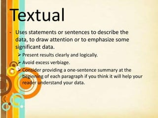
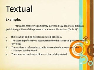
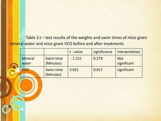
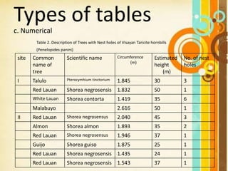
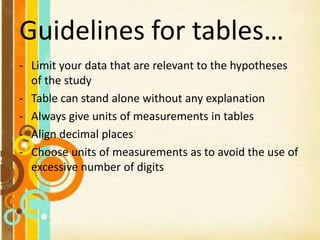
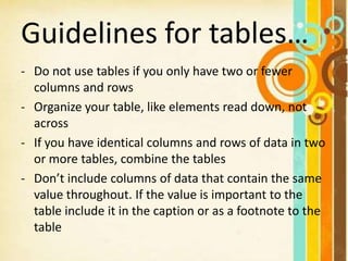
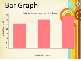
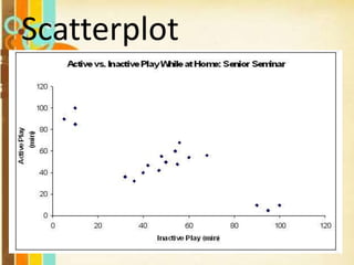
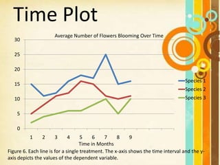
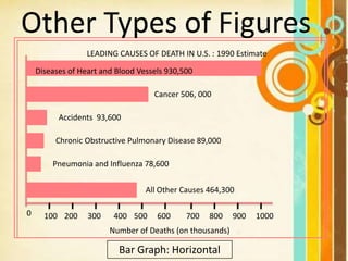
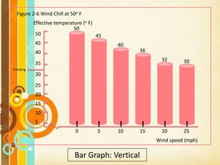
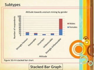
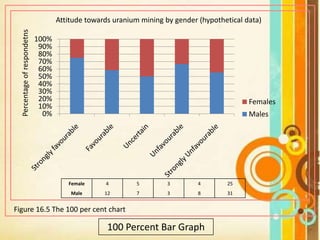
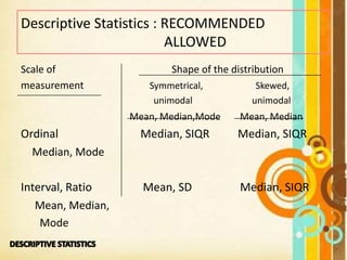
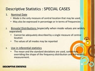
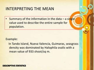
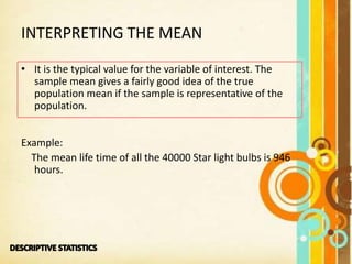
This document provides information on different ways to present data in scientific writing, including textual, tabular, and graphical formats. It discusses guidelines for each format, such as using concise language and referring readers to tables and figures in the textual format. For tables, it recommends limiting to relevant data, including units of measurement, and combining identical tables. Graphical formats should show trends or relationships clearly and avoid too many variables. The document also discusses writing the results section and interpreting common descriptive statistics.
Data can be presented in three methods: textual, tabular, or graphical. Tabular presentation involves organizing data into a table with columns and rows for classification. Graphical presentation uses visual representations like bar graphs, pie charts, and line graphs to show relationships between data points. Different types of graphs are suited to different types of data and comparisons.
This document discusses different types of data and methods for presenting data. It describes qualitative and quantitative data, discrete and continuous data, and primary and secondary data. It also covers nominal and ordinal data. Common methods for presenting data include tabulation and various charts or diagrams. Tabulation involves organizing data into tables, following specific rules. Charts allow visualization of data and include bar charts, histograms, frequency polygons, cumulative frequency diagrams, scatter diagrams, line diagrams, and pie charts. Each chart has specific purposes and guidelines for effective presentation of data.
This document discusses different methods for presenting data visually, including tables, charts, graphs, and diagrams. It describes various types of graphs like bar graphs, line charts, scatter plots, and histograms that can be used to summarize different types of data like categorical, numerical, and relationships between variables. For each graph type, it provides examples and discusses when they are best used to present data clearly and help people understand the significance and trends in the data. The key message is that the correct presentation of data through high-quality tables and graphs is important for efficient and clear communication of results.
This document discusses methods of data collection and presentation. It describes what data is and the different types, including qualitative and quantitative data. The main methods of collecting data are through surveys, observations, and experiments. Data can be presented in textual, tabular, and graphical forms. Textual presentation involves writing out descriptions. Tabular presentation involves organizing data into tables that include headings, columns, rows, and footnotes. Graphical presentation uses visual forms like line charts, bar charts, pie charts, and maps to depict relationships in the data.
This document discusses different methods for organizing data in research. It describes data organization as the process of structuring collected factual information in a way that is accepted by the scientific community. Proper data organization is important for research because it allows facts to be represented in context and helps researchers answer questions and hypotheses. The document then explains three common ways to organize data: frequency distribution tables, stem-and-leaf diagrams, and different types of charts including bar charts, pie charts, line charts, and histograms. Guidelines are provided for constructing each of these data organization methods.
Data presentation/ How to present Research outcome dataDr-Jitendra Patel
In this power point viewer will be able to know about how to present data which is the out comes of any sincere research. The way of presentation is very very important because ultimately it should reach to the particular audience in proper and effective way.
In this PPT viewers will be able to know how to present data obtained as a result of any kind of Research. In report writing the information received need to reach to targeted audience and received data need to reflect in impressive and understandable manner therefore data presentation is very important.
portion covered
1. Data presentation
2. Textual data presentation
3. Tabular data presentation
4. Qualitative Tabular data presentation
5. Quantitative tabular data presentation
6. Temporal tabular data presentation
7. Spatial tabular data presentation
This document defines data and different types of data presentation. It discusses quantitative and qualitative data, and different scales for qualitative data. The document also covers different ways to present data scientifically, including through tables, graphs, charts and diagrams. Key types of visual presentation covered are bar charts, histograms, pie charts and line diagrams. Presentation should aim to clearly convey information in a concise and systematic manner.
The document provides an overview of inferential statistics. It defines inferential statistics as making generalizations about a larger population based on a sample. Key topics covered include hypothesis testing, types of hypotheses, significance tests, critical values, p-values, confidence intervals, z-tests, t-tests, ANOVA, chi-square tests, correlation, and linear regression. The document aims to explain these statistical concepts and techniques at a high level.
This document discusses statistics and their uses in various fields such as business, health, learning, research, social sciences, and natural resources. It provides examples of how statistics are used in starting businesses, manufacturing, marketing, and engineering. Statistics help decision-makers reduce ambiguity and assess risks. They are used to interpret data and make informed decisions. However, statistics also have limitations as they only show averages and may not apply to individuals.
#2 Classification and tabulation of dataKawita Bhatt
The placement of data in different homogenous groups formed on the basis of some characteristics or criteria is called classification. The Table is a systematic arrangement of data in rows and/or column. Here, few basic concepts of classification and tabulation such as class interval, variable, frequency, frequency distribution and cumulative frequency distribution have been explained in a nutshell. This presentation also deals with the basic guidelines for preparing a table. Any suggestion and query are welcomed please drop them in the comments.
Data organization and presentation (statistics for research)Harve Abella
The document discusses various methods of presenting data, including textual, tabular, and graphical displays. It provides examples and definitions of key terms used in data presentation, such as frequency distribution tables, class intervals, class boundaries, class marks, and cumulative frequencies. The document also outlines steps for constructing a frequency distribution table, including determining the number of classes, range, class size, and class limits.
The document discusses tabulation of data, including definitions, types, and preparation of tables. It defines tabulation as the systematic presentation of numeric data in rows and columns to facilitate comparison and analysis. The key types of tabulation are simple/one-way, double/two-way, and complex tabulation based on number of characteristics. Preparing tables involves including only essential data, sufficient detail, and citations in text.
This document defines and discusses quartiles, deciles, and percentiles. Quartiles divide a data set into four equal parts, with the first quartile (Q1) representing the lowest 25% of values. Deciles divide data into ten equal parts. Percentiles indicate the value below which a certain percentage of observations fall. Examples are provided for calculating Q1, Q3, D1 using formulas for grouped and ungrouped data sets. Quartiles, deciles, and percentiles are commonly used to summarize and report on statistical data.
1. The document discusses descriptive statistics, which is the study of how to collect, organize, analyze, and interpret numerical data.
2. Descriptive statistics can be used to describe data through measures of central tendency like the mean, median, and mode as well as measures of variability like the range.
3. These statistical techniques help summarize and communicate patterns in data in a concise manner.
Statistics is the science of dealing with numbers.
It is used for collection, summarization, presentation and analysis of data.
Statistics provides a way of organizing data to get information on a wider and more formal (objective) basis than relying on personal experience (subjective).
This document discusses frequency distributions and methods for graphically presenting frequency distribution data. It defines a frequency distribution as a tabulation or grouping of data into categories showing the number of observations in each group. The document outlines the parts of a frequency table as class limits, class size, class boundaries, and class marks. It then provides steps for constructing a frequency distribution table from a set of data. Finally, it discusses histograms and frequency polygons as methods for graphically presenting frequency distribution data, and provides examples of how to construct these graphs in Excel.
This document discusses various concepts related to data classification and frequency distribution. It defines classification as arranging data into categories based on common characteristics. The four main bases for classification are identified as qualitative, quantitative, geographical, and chronological. Types of classification include one-way, two-way, three-way, and many-way. Key aspects of forming a frequency distribution are discussed such as determining the class intervals, distributing raw data into classes, and calculating cumulative and relative frequencies.
Topic: Frequency Distribution
Student Name: Abdul Hafeez
Class: B.Ed. (Hons) Elementary
Project Name: “Young Teachers' Professional Development (TPD)"
"Project Founder: Prof. Dr. Amjad Ali Arain
Faculty of Education, University of Sindh, Pakistan
Percentiles are positional measures used to indicate an individual's position within a group. They divide a data set into 100 equal parts, with percentiles (denoted Px) indicating what percent of values are less than a specified value. Common percentiles include the median (P50), quartiles (P25, P50, P75), and deciles. Percentiles are calculated using a formula that determines the position number based on the total number of data points and percentile value. This position is then used to find the corresponding value within ordered data.
Introduction to statistics for social sciences 1Minal Jadeja
This document provides an introduction to statistics. It defines statistics as the collection, presentation, analysis, and interpretation of numerical data. Statistics can refer to either quantitative information or a method of dealing with quantitative or qualitative information. There are two main approaches in statistics - descriptive statistics, which deals with presenting data in tables or graphs to get a general picture of a sample, and inferential statistics, which involves techniques for making inferences about a whole population based on a sample. Some key uses and applications of statistics include showing how samples differ from normal distributions, facilitating comparisons, simplifying messages in data, helping to formulate and test hypotheses, and aiding in prediction and inference. However, there are also some limitations to consider with statistics, such
This document provides an introduction to statistics, including definitions, types, data measurement, and important terms. It defines statistics as the collection, analysis, interpretation, and presentation of numerical data. Statistics can be descriptive, dealing with conclusions about a particular group, or inferential, using a sample to make inferences about a larger population. There are four levels of data measurement - nominal, ordinal, interval, and ratio. Important statistical terms defined include population, sample, parameter, and statistic.
The document discusses various methods for presenting data, including tabular, visual, graphical and diagrammatical presentation. It provides guidelines for constructing effective tables, graphs, diagrams and choosing the appropriate method based on the type of data. Tables are useful for presenting exact data while graphs and diagrams make complex data easier to understand visually. The key is to present data in a clear, concise and organized manner that facilitates analysis and understanding.
This document discusses different types of sampling methods used in statistics. It defines key terms like population, sample, and random sampling. It then explains different random sampling techniques like simple random sampling, systematic sampling, stratified random sampling, cluster sampling, and multi-stage sampling. It also discusses the differences between strata and clusters. Finally, it briefly introduces some non-random sampling methods like quota sampling and convenience sampling.
Classify data into Qualitative and Quantitative data.
Scales of Measurement in Statistics.
Nominal, Ordinal, Ratio and Interval
Prepare table or continuous frequency distribution.
This document provides an overview of sampling techniques. It defines key sampling terms like population, sample, sampling frame, and discusses the need for sampling due to constraints of time and money for a full census. The document outlines different sampling methods like simple random sampling, stratified sampling, cluster sampling and multistage sampling. It also discusses non-probability sampling techniques like convenience sampling and snowball sampling. The document emphasizes the importance of representativeness, adequacy and independence for a good sample. It concludes by noting sources of error in sampling like sampling errors and non-sampling errors.
This document discusses various methods of graphically representing data, including bar diagrams, pie charts, histograms, and line graphs. It describes the construction and purposes of simple bar diagrams, multiple bar diagrams, compound bar diagrams, pie charts, and histograms. The document emphasizes that graphical representations are important for conveying insights from data more effectively than tables alone and for understanding patterns.
This document discusses the process of data analysis, which includes editing, coding, classification, and tabulation of raw data collected during research. It explains that after data collection, the researcher must process and analyze the data. Key steps include editing the data for accuracy and completeness, coding the data by assigning numeric or alphabetic values to response categories, classifying the data into groups based on common attributes, and tabulating the data by organizing it into tables for further analysis and interpretation. Computer software can facilitate large-scale data processing and tabulation.
This document provides guidance on conducting data analysis. It discusses the importance of carefully checking data multiple times. The purpose of data analysis is to answer research questions and determine relationships among variables. There are steps to follow both before and after data collection, including determining the analysis method, processing data, interpreting findings, and presenting results. Descriptive statistics summarize sample characteristics through frequencies, averages, and variability measures. Inferential statistics are used to draw conclusions about populations based on samples through statistical tests and evaluating hypotheses.
This document provides an overview of key concepts in probability and statistics including:
1. Definitions of experimental units, variables, samples, populations, and types of data.
2. Methods for graphing univariate data distributions including bar charts, pie charts, histograms and more.
3. Techniques for interpreting graphs and describing data distributions based on their shape, proportion of measurements in intervals, and presence of outliers.
Assignment 3.1 Determining Causes and Effects– Draft VersionThe.docxrock73
Assignment 3.1: Determining Causes and Effects– Draft Version
The following scenarios on which to focus your cause and effect paper. Research the topic and include credible sources to support claims. Identify your purpose clearly, incorporate audience needs, establish a desired tone, and organize information/claims effectively.
2. The director of your state unemployment agency has asked you (a public relations specialist) to write about the causes and effects of unemployment on an individual/family. The paper will be presented to the agency as they make decisions about reaching out to those who need jobs.
Write a four to five (4-5) page paper in which you:
1. Provide a clear thesis statement.
2. Describe the major cause.
3. Describe a leading second cause
4. Describe two (2) economic effects of the cause..
5. Describe two (2) effects on people.
6. Develop a coherently structured paper with an introduction, body, and conclusion.
7. Provide three (3) relevant and credible sources to support claims. Note: Wikipedia and other Websites do not qualify as academic resources.
Your assignment must follow these formatting requirements:
· Be typed, double spaced, using Times New Roman font (size 12), with one-inch margins on all sides; references must follow APA or school-specific format. Check with your professor for any additional instructions.
· Include a cover page containing the title of the assignment, the student’s name, the professor’s name, the course title, and the date. The cover page and the reference page are not included in the required page length.
The specific course learning outcomes associated with this assignment are:
· Associate the features of audience, purpose, and text with various genres.
· Recognize the elements and correct use of a thesis statement.
· Recognize how to organize ideas with transitional words, phrases, and sentences.
· Incorporate relevant, correctly documented sources to substantiate claims.
· Apply the writing process to develop various writing genres.
· Write clearly and concisely about selected topics using proper writing mechanics.
· Use technology and information resources to research selected issues for this course.
Using References in your Lab Writeup
Make sure you both cite the reference that you use in the body of your text, AND
provide a reference list at the end of your writeup.
For example, to cite references within the body of your lab writeup:
In this lab we examined how different fish like to eat different kinds of algae. The red
algae are the largest group of algae (Abbott, 1999). Therefore, we focused on red algae
in this lab. Many red algae are quite edible and some of the best known red algae
include those that are eaten in sushi (sushiworld.com). Algae are also quite nutritious
(Markeley, 2010). Our fish came from tidepools, which are located in the area between
high and low tide (Mahon and Mahon, 1994). According to our lab manual (WOU
Biology, 2011), our fish were col ...
Using References in your Lab Writeup Make sure you both c.docxdickonsondorris
Using References in your Lab Writeup
Make sure you both cite the reference that you use in the body of your text, AND
provide a reference list at the end of your writeup.
For example, to cite references within the body of your lab writeup:
In this lab we examined how different fish like to eat different kinds of algae. The red
algae are the largest group of algae (Abbott, 1999). Therefore, we focused on red algae
in this lab. Many red algae are quite edible and some of the best known red algae
include those that are eaten in sushi (sushiworld.com). Algae are also quite nutritious
(Markeley, 2010). Our fish came from tidepools, which are located in the area between
high and low tide (Mahon and Mahon, 1994). According to our lab manual (WOU
Biology, 2011), our fish were collected during low tide.
Reference List:
Book Abbott, I.A. 1999. Marine Red Algae of the Hawaiian Islands. Bishop Museum Press,
Honolulu.
Journal
Article
Mahon, R. & S.D. Mahon. 1994. Structure and resilience of a tidepool fish assemblage
at Barbados. Environmental Biology of Fishes 41: 171-190.
News
Article
Markeley, G.R. (2010). The Nutritional Benefits of Seaweeds. Amity News, February 25,
2010.
Website "Popular seaweeds in Japanese Cuisine". Accessed online March 15, 2012.
http://sushiworld.com/seaweeds.html.
Lab
Manual
WOU Biology Department (2011). Lab #2: Fish and Algae. Biology 101 Lab Manual.
Note that these show examples of the different types of references you might use.
You should not break your reference list down into these categories, but simply list all
references alphabetically.
WOU Biology 100 Series Graphs Overview
Making a graph is one of the easiest ways to get an idea of the patterns in your data.
Graphing is a fairly straightforward process, but there are a few things to keep in mind.
1. Type of graph. You should think carefully about the kind of data you have before you
decide what type of graph to produce. See Figure 1.
a. Line graphs are useful to show how a factor changes over time or in some other
gradual continuous increment (like temperature or ambient light).
b. Bar graphs are useful to show a total change or overall difference between
different discrete variables (like types of organisms or specific experimental
treatments).
Figure 1. Types of Graphs. The graph on the left is a line graph. The graph on the right is a bar graph.
2. Variables
a. The independent variable is the variable that you change or manipulate in the
experiment. This variable is usually placed along the x (horizontal) axis. In the
case of an experiment where you are observing something that changes over
time, time serves as an independent variable and is always listed on the x-axis. If,
in addition to time, there is a second independent variable (e.g. observing what
happens to two different treatments over time) this variable is usually graphed by
drawing mult ...
The document discusses various methods for displaying data, including text, tables, graphs, and statistical measures. It provides examples and guidelines for each method. The main methods discussed are tables and graphs. For tables, it describes best practices for labeling, formatting, and structuring tables to effectively display data. For graphs, it explains the uses and guidelines for common graph types like bar graphs, pie charts, histograms, and frequency polygons. The overall purpose is to communicate how to present data in a clear, organized, and informative way.
The document provides examples and explanations for creating different types of data displays, including stem-and-leaf plots, frequency tables, histograms, and cumulative frequency tables. It includes sample data sets and step-by-step instructions for making each type of display. Key terms defined include stem, leaf, frequency, interval, and cumulative frequency.
This document provides an overview of statistics and its scope and uses. It discusses that statistics is the science of collecting, analyzing, presenting and interpreting data to test hypotheses. The scope of statistics includes biostatistics, vital statistics, and medical statistics. Some key uses of statistics in nursing sciences are to estimate community health, diagnose problems, determine program priorities, evaluate programs, and study special groups. Data can be presented numerically through tables, graphsically through charts, histograms and other visual representations, or mathematically through formulas and calculations.
The document provides guidance on preparing the Results section of a research paper. It recommends that the Results section:
- Summarize the key findings without providing excessive detail
- Present results objectively without interpretation
- Highlight important findings in text and use tables and figures to complement rather than repeat the data
- Use the past tense and cite results clearly while referring to tables and figures
This document provides instructions and examples for creating stem-and-leaf plots, frequency tables, histograms, and cumulative frequency tables from data sets. It includes step-by-step explanations and examples of how to organize and summarize data using these graphical representations. Key terms like stem, leaf, frequency, interval, and cumulative frequency are also defined. Quiz problems at the end ask the reader to apply the methods by creating a stem-and-leaf plot, frequency table, and histogram from sample data sets.
Please Subscribe to this Channel for more solutions and lectures
http://www.youtube.com/onlineteaching
Chapter 2: Exploring Data with Tables and Graphs
2.3: Graphs that Enlighten and Graphs that Deceive
Writing the results section for scientific publicationAshok Pandey
To introduce participants to the details of communication and writing scientific papers.
To guide researchers in the writing of scientific paper to increase its acceptability for publication in a journal; and
To upgrade the pre-existing knowledge of writing skills in a scientific manner.
The document discusses tabulation and its importance. It provides objectives and rules for tabulating data, including arranging it logically and including totals. It describes key parts of an ideal table like the title, columns, body, and sources. Different types of tabulation are covered, including simple, grouped, and cross tabulation. Grouped frequency tables involve dividing a range into class intervals. Cumulative frequency tables show the sum of frequencies up to a level. Cross tabulation allows comparison of how respondents answered two questions.
This document discusses graphs that can effectively and objectively summarize data versus graphs that can potentially mislead or deceive the viewer. Effective graphs discussed include dot plots, stem-and-leaf plots, time-series graphs, bar graphs, Pareto charts, pie charts, histograms, frequency polygons and ogives. Potentially deceptive graphs discussed are those that do not start the vertical axis at zero, exaggerating differences, and pictographs that depict one-dimensional data with multi-dimensional objects.
This document provides an introduction to medical statistics and presenting data in tables and graphs. It discusses the main methods of data presentation including tabular, graphical, and mathematical presentation. For tabular presentation, it describes the characteristics and types of tables including simple, frequency distribution, and cumulative frequency tables. The main types of graphs covered are bar charts, histograms, frequency polygons, line diagrams, and pie charts. It also discusses measures of central tendency including mean, median and mode, as well as measures of dispersion like range, mean deviation, variance and standard deviation.
SPSS Statistical Package for the Social Sciences is powerful to analyze business and marketing data. This paper intends to support business and marketing leaders the benefits of data analyzing with applied SPSS. It showed the data analysis of job satisfactions on years of experience. As SPSS's background algorithms, it showed the cross tabulation algorithm for cross tabulation table and Pearson chi square algorithm for data significant. And then Sample data ‘demo.sav' was downloaded from Google and was analyzed and viewed. It used IBM SPSS statistics version 23 and PYTHON version 3.7. Aung Cho | Khin Khin Lay ""Applied SPSS for Business and Marketing"" Published in International Journal of Trend in Scientific Research and Development (ijtsrd), ISSN: 2456-6470, Volume-3 | Issue-4 , June 2019, URL: https://www.ijtsrd.com/papers/ijtsrd24013.pdf
Paper URL: https://www.ijtsrd.com/computer-science/data-miining/24013/applied-spss-for-business-and-marketing/aung-cho
This document discusses different types of graphs used to represent frequency distributions: bar graphs, histograms, frequency polygons, pie charts, and OGIVE charts. It provides instructions on how to construct each graph type, including labeling axes, ensuring proportionality, and adding titles and legends. Examples of each graph type are shown using sample data on family sizes. The document concludes that bar graphs, histograms, frequency polygons and pie charts are common ways to show frequency distributions, while OGIVE charts illustrate less than and greater than cumulative frequencies.
Descriptive statistics can summarize and graphically present data. Tabular presentations display data in a grid, with tables showing frequencies of categories. Graphical presentations include bar graphs to show frequencies, pie charts to show proportions, and line graphs to show trends over time. Frequency distributions organize raw data into meaningful patterns for analysis by specifying class intervals and calculating frequencies and cumulative frequencies.
This document provides information on various quality control tools including check sheets, Pareto diagrams, cause and effect diagrams, histograms, stratification, scatter diagrams, and control charts. It explains how to construct and interpret each tool and how they can be used to gather and analyze data to identify problems, determine causes, and evaluate solutions. The tools help quality professionals make data-driven decisions to improve processes and prevent issues.
This document provides information on various methods of presenting data, including tabular, graphical, and textual presentation. It discusses principles of data presentation and different types of tables, charts, and diagrams that can be used including simple tables, frequency distribution tables, bar charts, histograms, line graphs and pie charts. It also covers concepts like class intervals, frequency, relative frequency and discusses worked examples of various methods of data presentation.
This presentation was provided by Steph Pollock of The American Psychological Association’s Journals Program, and Damita Snow, of The American Society of Civil Engineers (ASCE), for the initial session of NISO's 2024 Training Series "DEIA in the Scholarly Landscape." Session One: 'Setting Expectations: a DEIA Primer,' was held June 6, 2024.
LAND USE LAND COVER AND NDVI OF MIRZAPUR DISTRICT, UPRAHUL
This Dissertation explores the particular circumstances of Mirzapur, a region located in the
core of India. Mirzapur, with its varied terrains and abundant biodiversity, offers an optimal
environment for investigating the changes in vegetation cover dynamics. Our study utilizes
advanced technologies such as GIS (Geographic Information Systems) and Remote sensing to
analyze the transformations that have taken place over the course of a decade.
The complex relationship between human activities and the environment has been the focus
of extensive research and worry. As the global community grapples with swift urbanization,
population expansion, and economic progress, the effects on natural ecosystems are becoming
more evident. A crucial element of this impact is the alteration of vegetation cover, which plays a
significant role in maintaining the ecological equilibrium of our planet.Land serves as the foundation for all human activities and provides the necessary materials for
these activities. As the most crucial natural resource, its utilization by humans results in different
'Land uses,' which are determined by both human activities and the physical characteristics of the
land.
The utilization of land is impacted by human needs and environmental factors. In countries
like India, rapid population growth and the emphasis on extensive resource exploitation can lead
to significant land degradation, adversely affecting the region's land cover.
Therefore, human intervention has significantly influenced land use patterns over many
centuries, evolving its structure over time and space. In the present era, these changes have
accelerated due to factors such as agriculture and urbanization. Information regarding land use and
cover is essential for various planning and management tasks related to the Earth's surface,
providing crucial environmental data for scientific, resource management, policy purposes, and
diverse human activities.
Accurate understanding of land use and cover is imperative for the development planning
of any area. Consequently, a wide range of professionals, including earth system scientists, land
and water managers, and urban planners, are interested in obtaining data on land use and cover
changes, conversion trends, and other related patterns. The spatial dimensions of land use and
cover support policymakers and scientists in making well-informed decisions, as alterations in
these patterns indicate shifts in economic and social conditions. Monitoring such changes with the
help of Advanced technologies like Remote Sensing and Geographic Information Systems is
crucial for coordinated efforts across different administrative levels. Advanced technologies like
Remote Sensing and Geographic Information Systems
9
Changes in vegetation cover refer to variations in the distribution, composition, and overall
structure of plant communities across different temporal and spatial scales. These changes can
occur natural.
This slide is special for master students (MIBS & MIFB) in UUM. Also useful for readers who are interested in the topic of contemporary Islamic banking.
Executive Directors Chat Leveraging AI for Diversity, Equity, and InclusionTechSoup
Let’s explore the intersection of technology and equity in the final session of our DEI series. Discover how AI tools, like ChatGPT, can be used to support and enhance your nonprofit's DEI initiatives. Participants will gain insights into practical AI applications and get tips for leveraging technology to advance their DEI goals.
A workshop hosted by the South African Journal of Science aimed at postgraduate students and early career researchers with little or no experience in writing and publishing journal articles.
How to Manage Your Lost Opportunities in Odoo 17 CRMCeline George
Odoo 17 CRM allows us to track why we lose sales opportunities with "Lost Reasons." This helps analyze our sales process and identify areas for improvement. Here's how to configure lost reasons in Odoo 17 CRM
How to Build a Module in Odoo 17 Using the Scaffold MethodCeline George
Odoo provides an option for creating a module by using a single line command. By using this command the user can make a whole structure of a module. It is very easy for a beginner to make a module. There is no need to make each file manually. This slide will show how to create a module using the scaffold method.
How to Make a Field Mandatory in Odoo 17Celine George
In Odoo, making a field required can be done through both Python code and XML views. When you set the required attribute to True in Python code, it makes the field required across all views where it's used. Conversely, when you set the required attribute in XML views, it makes the field required only in the context of that particular view.
it describes the bony anatomy including the femoral head , acetabulum, labrum . also discusses the capsule , ligaments . muscle that act on the hip joint and the range of motion are outlined. factors affecting hip joint stability and weight transmission through the joint are summarized.
Main Java[All of the Base Concepts}.docxadhitya5119
This is part 1 of my Java Learning Journey. This Contains Custom methods, classes, constructors, packages, multithreading , try- catch block, finally block and more.
Walmart Business+ and Spark Good for Nonprofits.pdfTechSoup
"Learn about all the ways Walmart supports nonprofit organizations.
You will hear from Liz Willett, the Head of Nonprofits, and hear about what Walmart is doing to help nonprofits, including Walmart Business and Spark Good. Walmart Business+ is a new offer for nonprofits that offers discounts and also streamlines nonprofits order and expense tracking, saving time and money.
The webinar may also give some examples on how nonprofits can best leverage Walmart Business+.
The event will cover the following::
Walmart Business + (https://business.walmart.com/plus) is a new shopping experience for nonprofits, schools, and local business customers that connects an exclusive online shopping experience to stores. Benefits include free delivery and shipping, a 'Spend Analytics” feature, special discounts, deals and tax-exempt shopping.
Special TechSoup offer for a free 180 days membership, and up to $150 in discounts on eligible orders.
Spark Good (walmart.com/sparkgood) is a charitable platform that enables nonprofits to receive donations directly from customers and associates.
Answers about how you can do more with Walmart!"
1. Data Presentation
Adapted from the Presentation
Of Mrs. Zennifer Oberio
Presented by:
Daleon, Kathryna Maeve V.
Lacsamana, Marco A.
Toledano, Anthon Jay B.
<III-SSC>
2. Outline
• Three ways of Presenting Data
• Textual
• Tabular
• Graphical
• How to Write Your Results
• Other Types of Figures
3. Textual
- Uses statements or sentences to describe the
data, to draw attention or to emphasize some
significant data.
Present results clearly and logically.
Avoid excess verbiage.
Consider providing a one-sentence summary at the
beginning of each paragraph if you think it will help your
reader understand your data.
4. Textual
The results should be short and sweet, without verbiage.
Do not say
“It is clearly evident from Fig. 1 that bird species
richness increased with habitat complexity.”
Say instead
“Bird species richness increased with habitat
complexity (Fig.1)”
5. • To pinpoint a trend, the best or the
representative case
• Do not deliberately leave out anomalous data
6. Textual
Example:
“Nitrogen fertilizer significantly increased soy bean total biomass
(p=0.05) regardless of the presence or absence Rhizobium (Table 1).”
i. The result of adding nitrogen is stated concisely.
ii. The word significantly is accompanied by the statistical probability level
(p= 0.05)
iii. The readers is referred to a table where the data to support the
statement can be found.
iv. The measure used (total biomass) is explicitly stated.
7. Tabular
- allows large amount of data to be sorted
and reorganized in a neat format
- allows data to be organized for further
analysis
- allows the inclusion of only the most
important or relevant data
- facilitates dialogue between the text and
the exact numbers in your results
8. Parts of a table
Table 1 Frequency of Stereotypic Behavior in Captive Lowland Gorillas Under Different
Stimulus With and Without Antidepressants
Group
Females
With
without
Males
With
Without
Females
With
Without
Males
With
Without
Note: Behaviours were taken at 3 second intervals
*1=lowest 4=highest
Title
Stubhead
Stub Morning Responses
Afternoon Responses
Table spanner
1 2 3 4
Table note Divider
56
39
23
48
18 12
32
15
3644
21
41 24
11
25
6
32
53
45
65
22
45
33
56
19
36
25
40
12
29
18
36
Table
body
Column
heads
9. Types of tables
a. Textual (Word) Table
Table 4. Tannin detection on the crude residue extracted from
different parts of mahogany
Test Leaves Bark Seeds
Gelatin test
Ferric
Chloride test
Positive
Condensed
Positive
Condensed
Positive
Condensed
10. Types of tables
b. Statistical table
Table 5. analysis of variance on the mean zones of inhibition
produced by Garin Farm fermented molasses at five different fermentation
periods
Test organism F value Significance Interpretation
Enterobacter
aerogenes
12.006 0.000 Significant
Pseudomonus
aeruginosa
24.654 0.000 Significant
Raltonia solanacearum 5.076 0.009 Significant
Xanthomonus oryzae
pv oryzicola
3.685 0.028 Significant
11. Table 2.t – test results of the weights and swim times of mice given
mineral water and mice given VCO before and after treatments
t - value significance interpretation
Mineral
water
Swim time
(Minutes)
- 1.151 0.279 Not
significant
VCO Swim time
(Minutes)
3.021 0.017 significant
12. Types of tables
c. Numerical
Table 2. Description of Trees with Nest holes of Visayan Taricite hornbills
(Penelopides panini)
site Common
name of
tree
Scientific name Circumference
(m)
Estimated
height
(m)
No. of nest
holes
I Talulo Pterocymhium tinctorium 1.845 30 3
Red Lauan Shorea negrosensis 1.832 50 1
White Lauan Shorea contorta 1.419 35 6
Malabuyo 2.616 50 1
II Red Lauan Shorea negrosensus 2.040 45 3
Almon Shorea almon 1.893 35 2
Red Lauan Shorea negrosensus 1.946 37 1
Guijo Shorea guiso 1.875 25 1
Red Lauan Shorea negrosensis 1.435 24 1
Red Lauan Shorea negrosensis 1.543 37 1
13. Guidelines for tables…
- Limit your data that are relevant to the hypotheses
of the study
- Table can stand alone without any explanation
- Always give units of measurements in tables
- Align decimal places
- Choose units of measurements as to avoid the use of
excessive number of digits
14. Guidelines for tables…
- Do not use tables if you only have two or fewer
columns and rows
- Organize your table, like elements read down, not
across
- If you have identical columns and rows of data in two
or more tables, combine the tables
- Don’t include columns of data that contain the same
value throughout. If the value is important to the
table include it in the caption or as a footnote to the
table
15. Guidelines for tables…
- In presenting numbers, give only significant
figures.
- Brief explanatory footnotes may be provided,
but not excessive experimental detail.
16. Graphical / Pictorial
The main objective in using a graphical device is
that the reader gains additional information (i.e
trends, relationships) from seeing the data in a
graphic display
This is the one main requirement in choosing
graphical devices over tables.
17. Considerations
1. It is constructed in relation to two axes.
2. If displaying only one variable, it is customary to
represent the sub-categories of a variable along
the X axis and the frequency of the category
along the Y axis.
3. It should have a title that describes its contents.
20. Time Plot
0
5
10
15
20
25
30
1 2 3 4 5 6 7 8 9
Species 1
Species 2
Species 3
Average Number of Flowers Blooming Over Time
Time in Months
Figure 6. Each line is for a single treatment. The x-axis shows the time interval and the y-
axis depicts the values of the dependent variable.
21. Guidelines for figures...
- Include a legend. It should be succinct yet provide
sufficient information for the reader to interpret
the figure without reference to the text.
- Provide each axis with brief but informative title.
- Don’t fill the entire page with the graph.
- Don’t extend the axes vary far beyond the range
of the data.
22. How to Write Chapter 4
Results Section
• The presentation of results is made such that
the sequence of data presented answers each
of the objectives stated in Chapter 4.
23. How to Write Chapter 4
Results Section
• Raw data are never included unless they are
needed.
• Present data in converted form.
• Use the text of the paper to state the
results, then refer the reader to a table or figure.
• Do not include the same data in both a table and
a figure.
• Number tables and figures separately beginning
with 1.
24. How to Write Chapter 4
Results Section
• Tables should generally report summary-level
data, such as means and standard deviations.
• Only use a figure (graph) when the data lend
themselves to a good visual representation.
• Avoid using figures that show too many
variables or trends at once.
• use text, tables and figures together for a
more effective result.
25. Example:
“A simple test result is obtained with a primer derived
from the human -satellite... This primer... Labels 6
sites in the PRINS reaction... After 10 cycles of PCR-
IS, the number of sites labeled has doubled (Fig.2b);
after 20 cycles, the number of sites labled is the same
but the signals are stringer (fig. 2c)...
(Rouwendal et al., July 93:80)”
The sample points out what is important in the
accompanying figure. It makes us aware of
relationships that we mat not notice quickly and is
important to the following discussion.
26. How to Write Chapter 4
Results Section
• Do not repeat all of the information in the text
that appears in a table. Summarize it.
Example:
“The temperature of the solution increased
rapidly at first, going from 50o to 80o in the
first three minutes (Table 1).”
27. How to Write Chapter 4
Results Section
• Do not abuse data graphics by referring to
them as: “It is clearly seen in Figure 1 that...”
• A table’s legend appears above it, while the
legend for a figure appears below the figure.
• Sparse or monotonously repetitive data need
not be tabulated or graphed.
• If only a few determinations were made or
need to be presented, give data in the text.
28. Other Types of Figures
LEADING CAUSES OF DEATH IN U.S. : 1990 Estimate
0 100 200 300 400 500 600 700 800 900 1000
Diseases of Heart and Blood Vessels 930,500
Cancer 506, 000
Accidents 93,600
Chronic Obstructive Pulmonary Disease 89,000
Pneumonia and Influenza 78,600
All Other Causes 464,300
Bar Graph: Horizontal
Number of Deaths (on thousands)
29. Figure 2-6 Wind Chill at 50o F
Effective temperature (o F)
Wind speed (mph)
50
45
40
35
30
25
20
15
10
5
50
45
40
36
32 30
0 5 10 15 20 25
Freezing
Bar Graph: Vertical
30. Subtypes
Figure 16.4 A stacked bar chart
Attitude towards uranium mining by gender
0
10
20
30
40
50
60
70
80
90
100
Males
Females
Numberofrespondents
Attitude
Stacked Bar Graph
31. Figure 16.5 The 100 per cent chart
0%
10%
20%
30%
40%
50%
60%
70%
80%
90%
100%
Females
Males
Attitude towards uranium mining by gender (hypothetical data)
Percentageofrespondetns
Female 4 5 3 4 25
Male 12 7 3 8 31
100 Percent Bar Graph
32. Figure 2-9 Pareto Chart Conditions That Might cause Lateness
20
15
13
9
8
5
3
Pareto Chart
34. Pie Chart
Pie Chart of Percentage of Plant Species in Habitat
Succulents
30%
Shrubs 25%
Annuals 20%
Trees 25%
Figure 7. Shown in the percentage of each type of pant in a fictitious habitat
39. A Guide to Writing in the Biological Sciences
http://classweb.gmuu.edu/biologyresources/writingguide/Results.htm
How To Write a Scientific Paper
By Susan Cordova for the New Mexico Junior Academy of Science
The Scientific Paper
A treatise by Gary Dillard
http://bioweb.wku.edu/courses/Biol398/Paper/paperText.html
Writing Guidelines
Writing in Science
http://writing.colostate.edu/guides/processes/science/pop2a.cfm
Elements of Scientific Papers and of Proposals
http://www.iit.edu/~tc/paper-elements.htm
Notes on the Structure of a Scientific Paper
40. Descriptive Statistics : RECOMMENDED
ALLOWED
Scale of Shape of the distribution
measurement Symmetrical, Skewed,
unimodal unimodal
Mean, Median,Mode Mean, Median
Ordinal Median, SIQR Median, SIQR
Median, Mode
Interval, Ratio Mean, SD Median, SIQR
Mean, Median,
Mode
41. 1. Nominal Date
• Mode is the only measure of central location that may be used;
• May also be expressed in percentage or in terms of frequencies
2. Bimodal Distributions (especially when mode values are widely
separated)
• Cannot be adequately described by a single measure of central
location
• The values of all modes may be reported
3. Use in inferential statistics
• The mean and the standard deviations are used, sometimes
overriding the shape of the frequency distribution and the level of
measurement.
Descriptive Statistics : SPECIAL CASES
42. INTERPRETING THE MEAN
• Summary of the information in the data – a single
value used to describe the entire sample for
population.
Example:
In Tando Island, Nueva Valencia, Guimaras, seasgrass
density was dominated by Halophila ovalis with a
mean value of 933 shoot/sq m.
43. INTERPRETING THE MEAN
• It is the typical value for the variable of interest. The
sample mean gives a fairly good idea of the true
population mean if the sample is representative of the
population.
Example:
The mean life time of all the 40000 Star light bulbs is 946
hours.
44. INTERPRETING THE MEAN
• Maybe used to make relative comparisons that are
confined to the data sets. May NOT be used to make
inferences about statistically significant differences.
Example:
The mean salinity in the 4 study sites ranges from
30.5 ppt to 37.8 ppt. Relatively, the study area in
Tando, Guimaras had the most saline waters while
that of Looc, Romblon had the least saline waters.
45. INTERPRETING THE STANDARD DEVIATION
Example:
No. of species of Nerita in selected island in the Phils.
Large Island Mainland
4 2 3 9 6 8
2 2 2 7 10 3
6 2 2 9 6 3
3 3 2 7 2 3
Mean = 2.8 + 1.22 Mean = 6.2 + 2.75
46. INTERPRETING THE STANDARD DEVIATION
Used to asses the extent to which the data disperse; how
the values differ from the mean.
Example:
Mainland
9 6 8 Stad.Dev. =.2.75
7 10 3 Mean = 6.1
9 6 3 N= 12.00
7 2 3
Magnitude
Mean = 6.1 + 2.75 (3.35-8.85)
0
1
2
3
4
2 4 6 8 10
Column1
47. INTERPRETING THE MEAN
Gives an idea of the consistency of values
Example:
In big blossom green house, the mean diameter of
hybrid A rose bushes is 6.0 + 3.07 inches while that
of hybrid B is 6.0 + is 1.07 inches. This means that
the blossoms of hybrid are less consistent than
those of hybrid B. So if a garden wants a bush that
consistently produces roses close to 6 inches in
diameter, he must use hybrid B.
48. REFERENCES
Aczel AD. 1995. Statistics concepts and applications. Chicago: Irwin. 533 p.
Brase CH, Brase CP. 1995 . Understandable statistics concepts and methods fifth
edition. Lexington, Massachusetts; D.C. Health and Company. 849 p.
Freund JE, Simon GA. 1997. Modern Elementary Statistics. Singapore: Prentice Hall
International, Inc. 612 p.
Iman RL. 1995. A data based approach to statistics concise version. Belmont: Duxbury
Press. 577 p.
Kiess HO. 1996. Statistical concepts for the behavioral scinces second edition. Boston:
Allyn and bacon. 604 p.
Milton JS, McTeer PM, Corbet JJ. 1997. Introduction to statistics. New York: The
Mcgraw-Hill Companies, Inc. 622 p.