The document discusses principles and methods for presenting data, including:
- Data should be arranged to interest readers while maintaining important details simply.
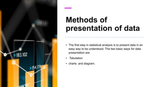
- The two basic methods are tabulation and charts/diagrams.
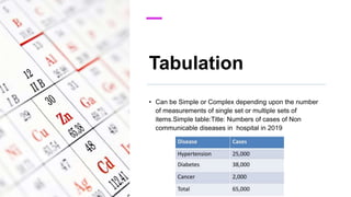
- Tabulation rules include numbering, titling, defining headings clearly.
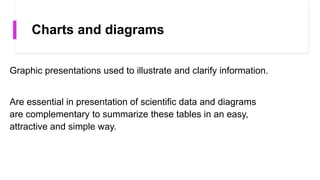
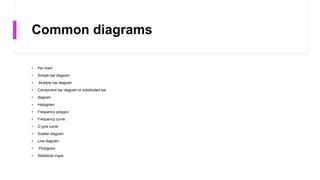
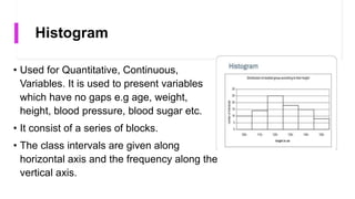
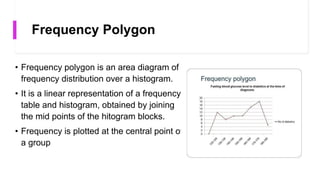
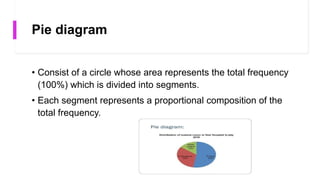
- Common charts are pie charts, bar diagrams, histograms, frequency polygons, and scatter diagrams. Each has strengths for different data types.