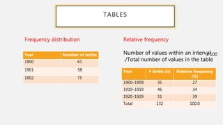
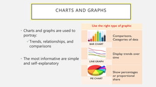
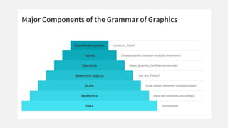
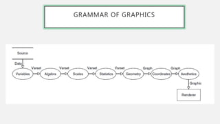
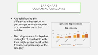
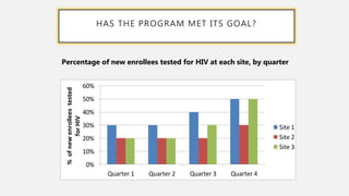
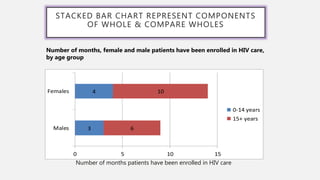
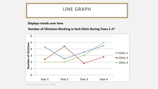
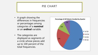
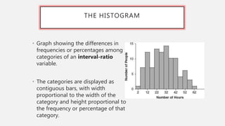
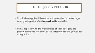
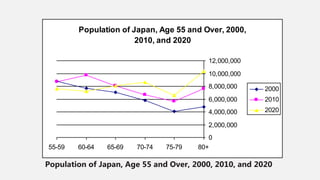
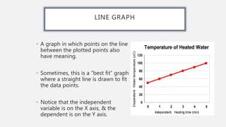
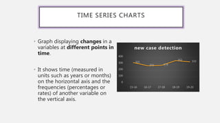
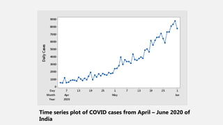
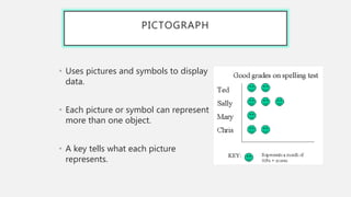
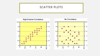
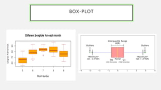
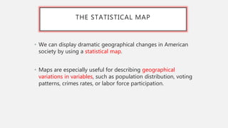
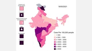
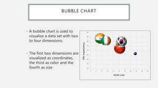
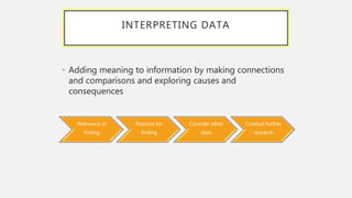
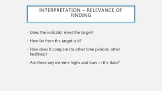
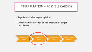
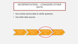
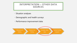
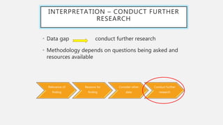
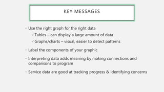
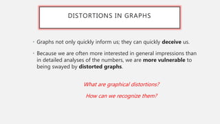
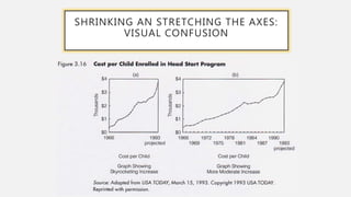
DATA VISUALIZATION
Presenter - Dr. Naveen Shyam
Department of community medicine,
SNPH,MGIMS ,sevagram
WHAT IS DV?
WHY DV IS
IMPORTANT?
SUMMARIZING DATA- BASIC GUIDANCE
• Tables
• Simplest way to summarize
data
• Charts and graphs
• Visual representation of
data
• Ensure graphic has a title
• Label the components of your
graphic
• Indicate source of data with
date
• Provide number of
observations (n=xx) as a
reference point
• Add footnote if more
information is needed
Data are presented as
absolute numbers or
percentages
GRAMMAR OF TABLES
TABLES
Year Number of births
1900 61
1901 58
1902 75
Frequency distribution
Year # births (n) Relative frequency
(%)
1900–1909 35 27
1910–1919 46 34
1920–1929 51 39
Total 132 100.0
Relative frequency
Number of values within an interval
/Total number of values in the table
x 100
CHARTS AND GRAPHS
• Charts and graphs are used to
portray:
Trends, relationships, and
comparisons
• The most informative are simple
and self-explanatory
GRAMMAR OF GRAPHICS
• Always start with the data, identify the dimensions you want to visualize.
DATA and
MAPPING • Confirm the axes based on the data dimensions, positions of various data
points in the plot. Also check if any form of encoding is needed including size,
shape, color and so on which are useful for plotting multiple data dimensions.
AESTHETICS
• Do we need to scale the potential values, use a specific scale to represent
multiple values or a range?
SCALE
• These are popularly known as ‘geoms’. This would cover the way we would
depict the data points on the visualization. Should it be points, bars, lines
and so on?
GEOMETRIC OBJECTS
• Do we need to show some statistical measures in the visualization like measures
of central tendency, spread, confidence intervals?
STATISTICS
• Do we need to create subplots based on specific data dimensions?
FACETS
• What kind of a coordinate system should the visualization be based on —
should it be cartesian or polar?
CO-ORDINATE SYSTEM
COMPONENTS OF THE LAYERED GRAMMAR
OF GRAPHICS
GRAMMAR OF GRAPHICS
BAR CHART
COMPARING CATEGORIES
• A graph showing the
differences in frequencies or
percentages among categories
of a nominal or an ordinal
variable.
• The categories are displayed as
rectangles of equal width with
their height proportional to the
frequency or percentage of the
category.
17 16
35 41
5
27
58 52
0
50
100
geriatric depression &
dependency
depression present no depression
HAS THE PROGRAM MET ITS GOAL?
0%
10%
20%
30%
40%
50%
60%
Quarter 1 Quarter 2 Quarter 3 Quarter 4
%
of
new
enrollees
tested
for
HIV
Site 1
Site 2
Site 3
Percentage of new enrollees tested for HIV at each site, by quarter
STACKED BAR CHART REPRESENT COMPONENTS
OF WHOLE & COMPARE WHOLES
3
4
6
10
0 5 10 15
Males
Females
0-14 years
15+ years
Number of months patients have been enrolled in HIV care
Number of months, female and male patients have been enrolled in HIV care,
by age group
LINE GRAPH
0
1
2
3
4
5
6
Year 1 Year 2 Year 3 Year 4
Number
of
clinicians
Clinic 1
Clinic 2
Clinic 3
Number of Clinicians Working in Each Clinic During Years 1–4*
*Includes doctors and nurses
Displays trends over time
PIE CHART
59%
23%
10%
8%
Percentage of All Patients Enrolled by Quarter
1stQtr
2nd Qtr
3rdQtr
4thQtr
• A graph showing the
differences in frequencies
or percentages among
categories of a nominal
or an ordinal variable.
• The categories are
displayed as segments of
a circle whose pieces add
up to 100 percent of the
total frequencies.
THE HISTOGRAM
• Graph showing the differences in
frequencies or percentages among
categories of an interval-ratio
variable.
• The categories are displayed as
contiguous bars, with width
proportional to the width of the
category and height proportional to
the frequency or percentage of that
category.
THE FREQUENCY POLYGON
• Graph showing the differences in frequencies or percentages
among categories of an interval-ratio variable.
• Points representing the frequencies of each category are
placed above the midpoint of the category and are jointed by a
straight line.
Population of Japan, Age 55 and Over, 2000, 2010, and 2020
Population of Japan, Age 55 and Over, 2000,
2010, and 2020
0
2,000,000
4,000,000
6,000,000
8,000,000
10,000,000
12,000,000
55-59 60-64 65-69 70-74 75-79 80+
2000
2010
2020
LINE GRAPH
• A graph in which points on the line
between the plotted points also
have meaning.
• Sometimes, this is a “best fit” graph
where a straight line is drawn to fit
the data points.
• Notice that the independent
variable is on the X axis, & the
dependent is on the Y axis.
TIME SERIES CHARTS
• Graph displaying changes in a
variables at different points in
time.
• It shows time (measured in
units such as years or months)
on the horizontal axis and the
frequencies (percentages or
rates) of another variable on
the vertical axis.
321
272 279
352 333
0
100
200
300
400
15-16 16-17 17-18 18-19 19-20
new case detection
Time series plot of COVID cases from April – June 2020 of
India
PICTOGRAPH
• Uses pictures and symbols to display
data.
• Each picture or symbol can represent
more than one object.
• A key tells what each picture
represents.
SCATTER PLOTS
A graph of data that is a set of points.
BOX-PLOT
Box Plot
THE STATISTICAL MAP
• We can display dramatic geographical changes in American
society by using a statistical map.
• Maps are especially useful for describing geographical
variations in variables, such as population distribution, voting
patterns, crimes rates, or labor force participation.
BUBBLE CHART
• A bubble chart is used to
visualize a data set with two
to four dimensions.
• The first two dimensions are
visualized as coordinates,
the third as color and the
fourth as size 50
55
60
65
70
75
80
85
90
5 7 9 11 13 15 17 19 21 23 25
life
expectancy
birth rate
INTERPRETING DATA
• Adding meaning to information by making connections
and comparisons and exploring causes and
consequences
Relevance of
finding
Reasons for
finding
Consider other
data
Conduct further
research
INTERPRETATION – RELEVANCE OF
FINDING
• Does the indicator meet the target?
• How far from the target is it?
• How does it compare (to other time periods, other
facilities)?
• Are there any extreme highs and lows in the data?
Relevance of
finding
Reasons for
finding
Consider other
data
Conduct further
research
INTERPRETATION – POSSIBLE CAUSES?
• Supplement with expert opinion
• Others with knowledge of the program or target
population
Relevance of
finding
Reasons for
finding
Consider other
data
Conduct further
research
INTERPRETATION – CONSIDER OTHER
DATA
• Use routine service data to clarify questions
• Use other data sources
INTERPRETATION – OTHER DATA
SOURCES
• Situation analyses
• Demographic and health surveys
• Performance improvement data
Relevance of
finding
Reasons for
finding
Consider other
data
Conduct further
research
INTERPRETATION – CONDUCT FURTHER
RESEARCH
• Data gap conduct further research
• Methodology depends on questions being asked and
resources available
Relevance of
finding
Reasons for
finding
Consider other
data
Conduct further
research
KEY MESSAGES
• Use the right graph for the right data
Tables – can display a large amount of data
Graphs/charts – visual, easier to detect patterns
• Label the components of your graphic
• Interpreting data adds meaning by making connections and
comparisons to program
• Service data are good at tracking progress & identifying concerns
DISTORTIONS IN GRAPHS
• Graphs not only quickly inform us; they can quickly deceive us.
• Because we are often more interested in general impressions than
in detailed analyses of the numbers, we are more vulnerable to
being swayed by distorted graphs.
What are graphical distortions?
How can we recognize them?
SHRINKING AN STRETCHING THE AXES:
VISUAL CONFUSION
WHY USE CHARTS AND GRAPHS?
• What do you lose?
×Ability to examine numeric
detail offered by a table
×Potentially the ability to see
additional relationships within
the data
×Potentially time: often we get
caught up in selecting colors
and formatting charts when a
simply formatted table is
sufficient
• What do you gain?
Ability to direct readers’
attention to one aspect of the
evidence
Ability to reach readers who
might otherwise be intimidated
by the same data in a tabular
format
Ability to focus on bigger picture
rather than perhaps minor
technical details
DATA VISUALIZATION TOOLS-
AN INTRODUCTION
THANK YOU

Data visualization.pptx

  • 1.
    DATA VISUALIZATION Presenter -Dr. Naveen Shyam Department of community medicine, SNPH,MGIMS ,sevagram
  • 2.
    WHAT IS DV? WHYDV IS IMPORTANT?
  • 4.
    SUMMARIZING DATA- BASICGUIDANCE • Tables • Simplest way to summarize data • Charts and graphs • Visual representation of data • Ensure graphic has a title • Label the components of your graphic • Indicate source of data with date • Provide number of observations (n=xx) as a reference point • Add footnote if more information is needed Data are presented as absolute numbers or percentages
  • 5.
  • 6.
    TABLES Year Number ofbirths 1900 61 1901 58 1902 75 Frequency distribution Year # births (n) Relative frequency (%) 1900–1909 35 27 1910–1919 46 34 1920–1929 51 39 Total 132 100.0 Relative frequency Number of values within an interval /Total number of values in the table x 100
  • 7.
    CHARTS AND GRAPHS •Charts and graphs are used to portray: Trends, relationships, and comparisons • The most informative are simple and self-explanatory
  • 8.
    GRAMMAR OF GRAPHICS •Always start with the data, identify the dimensions you want to visualize. DATA and MAPPING • Confirm the axes based on the data dimensions, positions of various data points in the plot. Also check if any form of encoding is needed including size, shape, color and so on which are useful for plotting multiple data dimensions. AESTHETICS • Do we need to scale the potential values, use a specific scale to represent multiple values or a range? SCALE • These are popularly known as ‘geoms’. This would cover the way we would depict the data points on the visualization. Should it be points, bars, lines and so on? GEOMETRIC OBJECTS • Do we need to show some statistical measures in the visualization like measures of central tendency, spread, confidence intervals? STATISTICS • Do we need to create subplots based on specific data dimensions? FACETS • What kind of a coordinate system should the visualization be based on — should it be cartesian or polar? CO-ORDINATE SYSTEM
  • 9.
    COMPONENTS OF THELAYERED GRAMMAR OF GRAPHICS
  • 11.
  • 12.
    BAR CHART COMPARING CATEGORIES •A graph showing the differences in frequencies or percentages among categories of a nominal or an ordinal variable. • The categories are displayed as rectangles of equal width with their height proportional to the frequency or percentage of the category. 17 16 35 41 5 27 58 52 0 50 100 geriatric depression & dependency depression present no depression
  • 13.
    HAS THE PROGRAMMET ITS GOAL? 0% 10% 20% 30% 40% 50% 60% Quarter 1 Quarter 2 Quarter 3 Quarter 4 % of new enrollees tested for HIV Site 1 Site 2 Site 3 Percentage of new enrollees tested for HIV at each site, by quarter
  • 14.
    STACKED BAR CHARTREPRESENT COMPONENTS OF WHOLE & COMPARE WHOLES 3 4 6 10 0 5 10 15 Males Females 0-14 years 15+ years Number of months patients have been enrolled in HIV care Number of months, female and male patients have been enrolled in HIV care, by age group
  • 15.
    LINE GRAPH 0 1 2 3 4 5 6 Year 1Year 2 Year 3 Year 4 Number of clinicians Clinic 1 Clinic 2 Clinic 3 Number of Clinicians Working in Each Clinic During Years 1–4* *Includes doctors and nurses Displays trends over time
  • 16.
    PIE CHART 59% 23% 10% 8% Percentage ofAll Patients Enrolled by Quarter 1stQtr 2nd Qtr 3rdQtr 4thQtr • A graph showing the differences in frequencies or percentages among categories of a nominal or an ordinal variable. • The categories are displayed as segments of a circle whose pieces add up to 100 percent of the total frequencies.
  • 17.
    THE HISTOGRAM • Graphshowing the differences in frequencies or percentages among categories of an interval-ratio variable. • The categories are displayed as contiguous bars, with width proportional to the width of the category and height proportional to the frequency or percentage of that category.
  • 18.
    THE FREQUENCY POLYGON •Graph showing the differences in frequencies or percentages among categories of an interval-ratio variable. • Points representing the frequencies of each category are placed above the midpoint of the category and are jointed by a straight line.
  • 19.
    Population of Japan,Age 55 and Over, 2000, 2010, and 2020 Population of Japan, Age 55 and Over, 2000, 2010, and 2020 0 2,000,000 4,000,000 6,000,000 8,000,000 10,000,000 12,000,000 55-59 60-64 65-69 70-74 75-79 80+ 2000 2010 2020
  • 20.
    LINE GRAPH • Agraph in which points on the line between the plotted points also have meaning. • Sometimes, this is a “best fit” graph where a straight line is drawn to fit the data points. • Notice that the independent variable is on the X axis, & the dependent is on the Y axis.
  • 21.
    TIME SERIES CHARTS •Graph displaying changes in a variables at different points in time. • It shows time (measured in units such as years or months) on the horizontal axis and the frequencies (percentages or rates) of another variable on the vertical axis. 321 272 279 352 333 0 100 200 300 400 15-16 16-17 17-18 18-19 19-20 new case detection
  • 22.
    Time series plotof COVID cases from April – June 2020 of India
  • 23.
    PICTOGRAPH • Uses picturesand symbols to display data. • Each picture or symbol can represent more than one object. • A key tells what each picture represents.
  • 24.
    SCATTER PLOTS A graphof data that is a set of points.
  • 25.
  • 26.
    THE STATISTICAL MAP •We can display dramatic geographical changes in American society by using a statistical map. • Maps are especially useful for describing geographical variations in variables, such as population distribution, voting patterns, crimes rates, or labor force participation.
  • 28.
    BUBBLE CHART • Abubble chart is used to visualize a data set with two to four dimensions. • The first two dimensions are visualized as coordinates, the third as color and the fourth as size 50 55 60 65 70 75 80 85 90 5 7 9 11 13 15 17 19 21 23 25 life expectancy birth rate
  • 29.
    INTERPRETING DATA • Addingmeaning to information by making connections and comparisons and exploring causes and consequences Relevance of finding Reasons for finding Consider other data Conduct further research
  • 30.
    INTERPRETATION – RELEVANCEOF FINDING • Does the indicator meet the target? • How far from the target is it? • How does it compare (to other time periods, other facilities)? • Are there any extreme highs and lows in the data?
  • 31.
    Relevance of finding Reasons for finding Considerother data Conduct further research INTERPRETATION – POSSIBLE CAUSES? • Supplement with expert opinion • Others with knowledge of the program or target population
  • 32.
    Relevance of finding Reasons for finding Considerother data Conduct further research INTERPRETATION – CONSIDER OTHER DATA • Use routine service data to clarify questions • Use other data sources
  • 33.
    INTERPRETATION – OTHERDATA SOURCES • Situation analyses • Demographic and health surveys • Performance improvement data Relevance of finding Reasons for finding Consider other data Conduct further research
  • 34.
    INTERPRETATION – CONDUCTFURTHER RESEARCH • Data gap conduct further research • Methodology depends on questions being asked and resources available Relevance of finding Reasons for finding Consider other data Conduct further research
  • 35.
    KEY MESSAGES • Usethe right graph for the right data Tables – can display a large amount of data Graphs/charts – visual, easier to detect patterns • Label the components of your graphic • Interpreting data adds meaning by making connections and comparisons to program • Service data are good at tracking progress & identifying concerns
  • 36.
    DISTORTIONS IN GRAPHS •Graphs not only quickly inform us; they can quickly deceive us. • Because we are often more interested in general impressions than in detailed analyses of the numbers, we are more vulnerable to being swayed by distorted graphs. What are graphical distortions? How can we recognize them?
  • 37.
    SHRINKING AN STRETCHINGTHE AXES: VISUAL CONFUSION
  • 38.
    WHY USE CHARTSAND GRAPHS? • What do you lose? ×Ability to examine numeric detail offered by a table ×Potentially the ability to see additional relationships within the data ×Potentially time: often we get caught up in selecting colors and formatting charts when a simply formatted table is sufficient • What do you gain? Ability to direct readers’ attention to one aspect of the evidence Ability to reach readers who might otherwise be intimidated by the same data in a tabular format Ability to focus on bigger picture rather than perhaps minor technical details
  • 39.
  • 40.