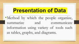
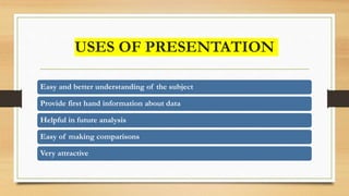
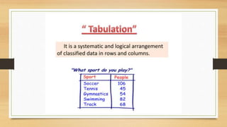
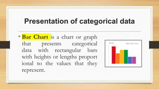
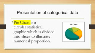
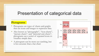
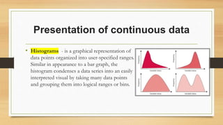
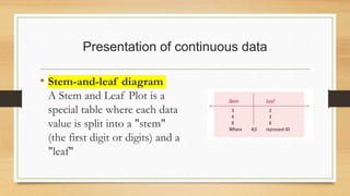
This document discusses principles and methods for presenting quantitative data. It describes how presentation of data through tools like tables, graphs, and diagrams can help organize, summarize, and communicate information in an easy to understand way. Specific types of charts and graphs are described for presenting categorical data like bar charts, pie charts, and pictograms, as well as continuous data through histograms and stem-and-leaf diagrams. The goals of data presentation include facilitating understanding, comparisons, future analysis, and problem solving.