Downloaded 188 times

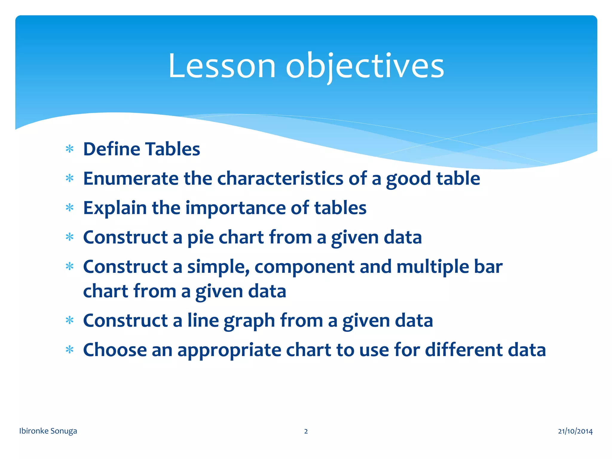

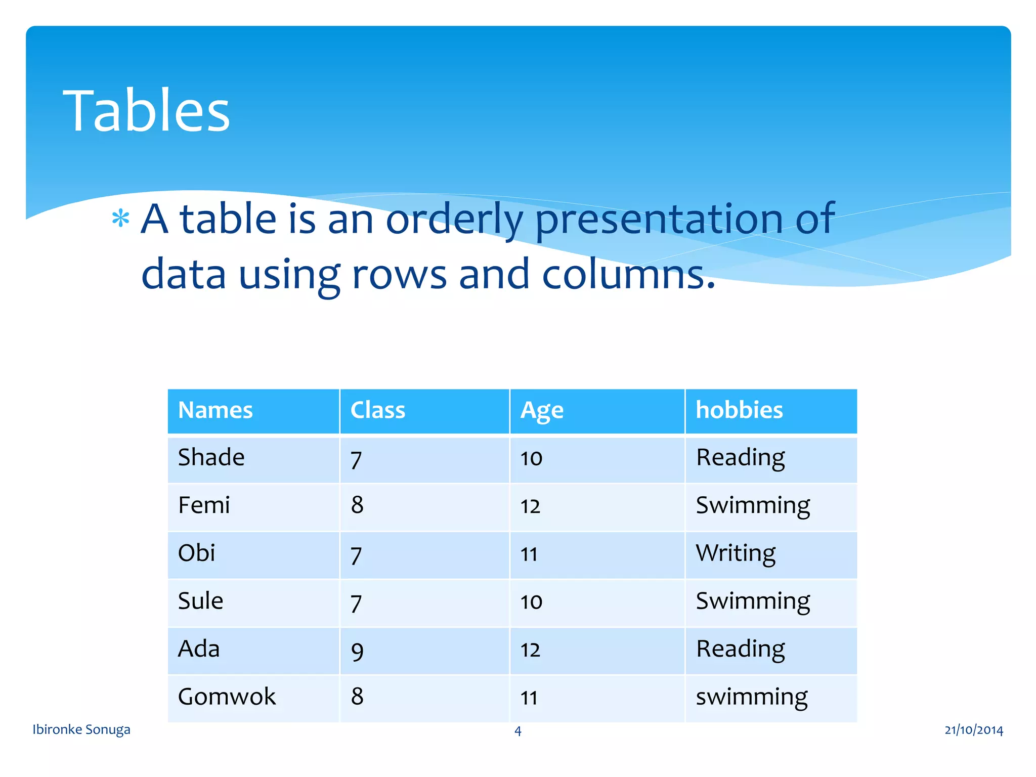
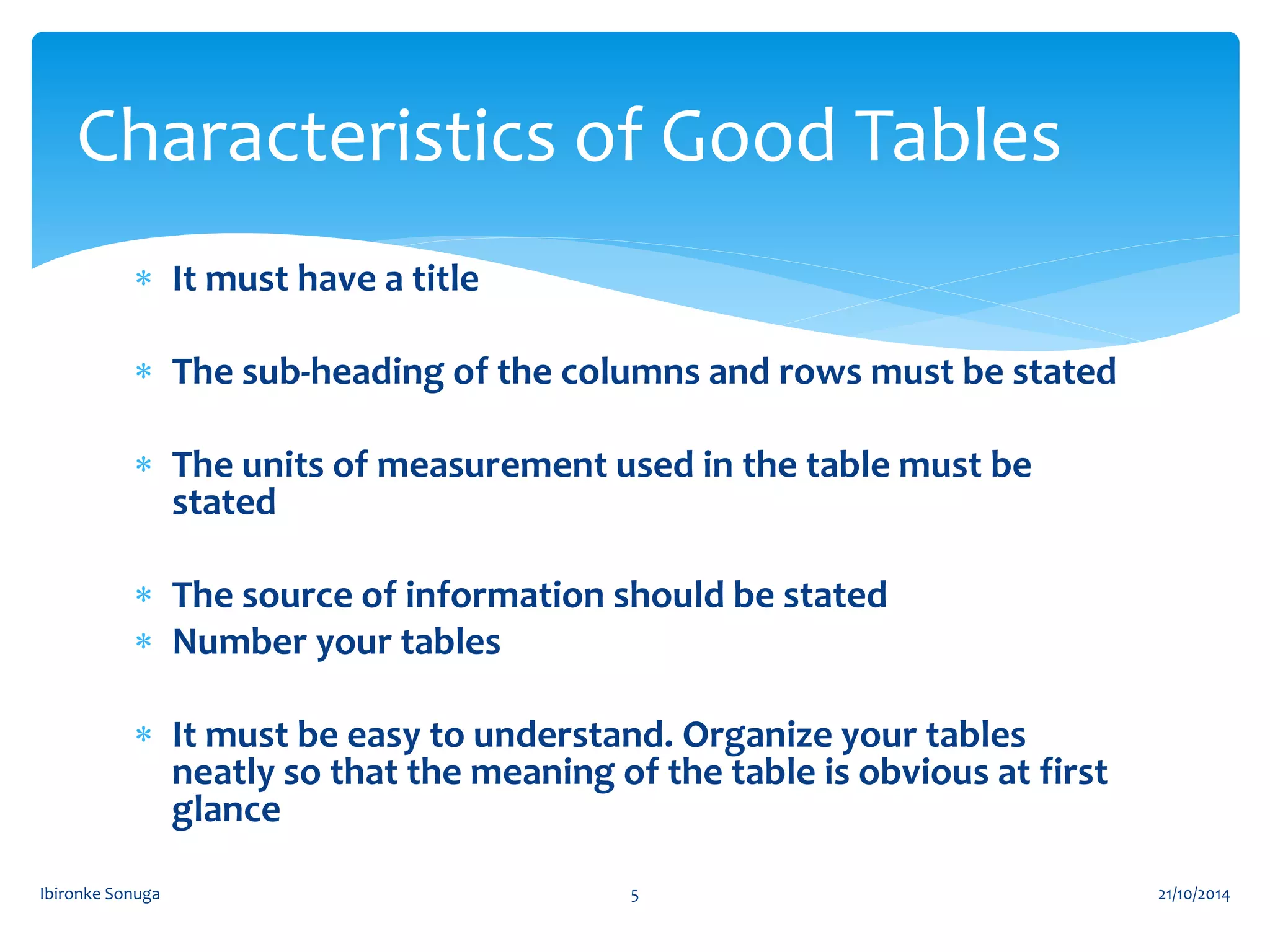
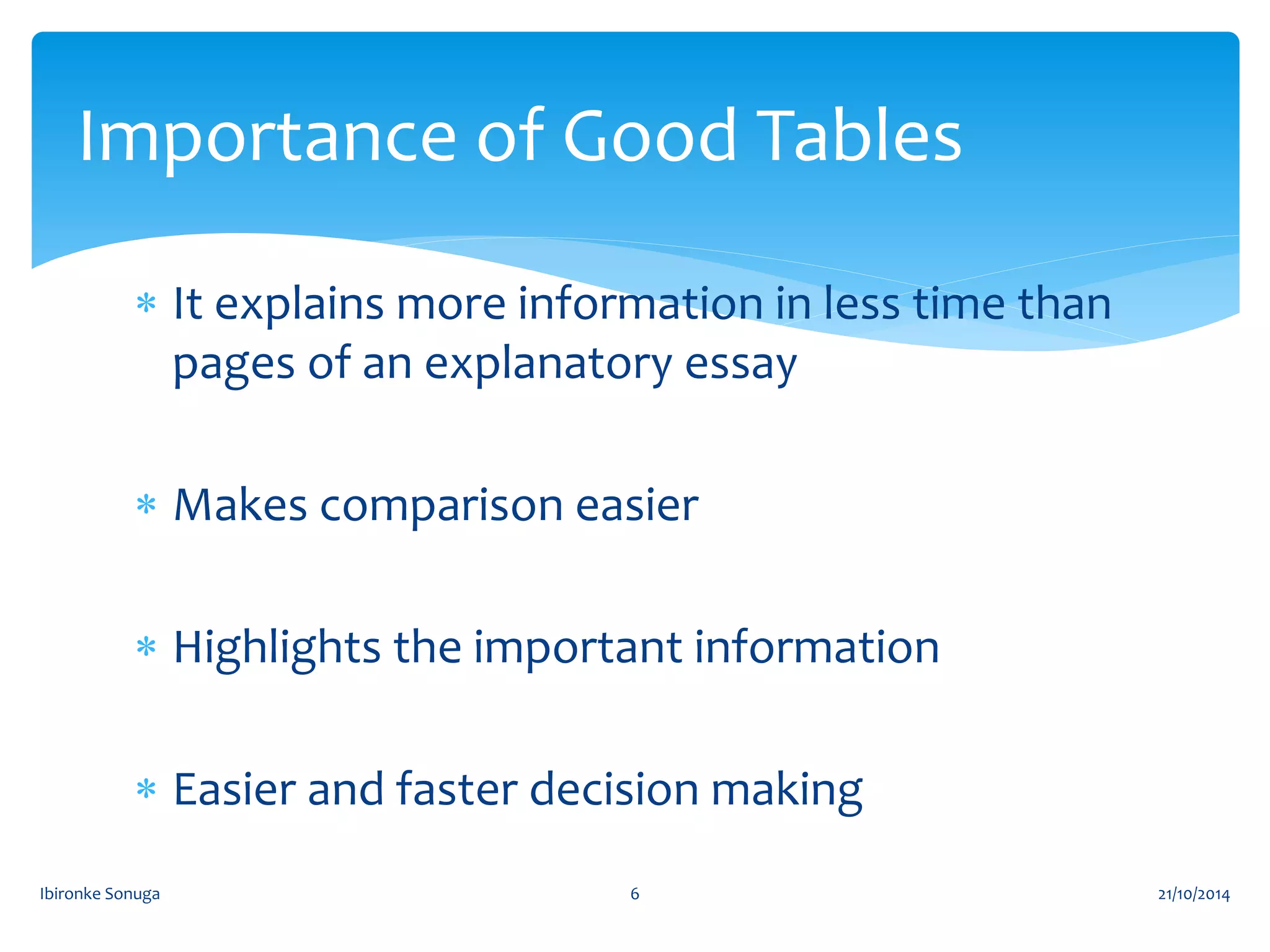


The document discusses different types of tables and charts used to visually present data, including their definitions, characteristics, and construction. It defines tables, pie charts, bar charts (simple, component, and multiple), histograms, and line graphs. The document provides examples of how to construct a pie chart from given data and describes the importance of tables for concisely presenting information. The overall goal is to teach how to choose and create the appropriate visual representation for different data.